
|
||
|
Portland art blog + news + exhibition reviews + galleries + contemporary northwest art
|
||
|
Thursday 04.04.19 Spring Cleaning Cluster Reviews This month marks my Twentieth Anniversary of moving to Portland and arguably that decision changed Portland in many ways (addressing history history with, Judd and Rothko, and a new appreciation of new media with Pipilotti Rist, Hank Willis Thomas and Cao Fei + talent scouting locals, etc). Simply put, I challenge Portland. There is still much more is to be done as the city doesnt effectively support its best artists yet (other cities do it for us... but still cmon). Considering all this, I've been spending a lot of time looking at art, with a one night Spring Equinox show as well (it was very underground on purpose). As part of my spring cleaning process here is a cluster of reviews, with an eye towards exposing some common threads and themes. Key: "*" Indicates show still open and "**" indicates it is still open for today's First Thursday (yes PAM is open for First Thursday). As you can see Portland's art scene is far from dead, challenges sometimes strengthen things and I see evidence of it here.
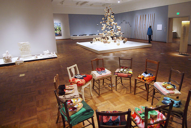 Main exhibition space of The Map Is Not The Territory with Charlene Vicker's Remember Redwing (fg) The Map is Not the Territory is the Portland Art Museum's revolving triennial replacement for the Contemporary Northwest Art Awards (which among artists was nicknamed the conservative art awards). For this program instead of a stereo typically "Northwest" approach to traditional materials and subject matter like rain, glass, trees and fetish of effortful handwork the show has thankfully taken on an anthropological approach, which is essentially an expose on the human experience. I found it more satisfying than the CNAA's or any of the other weak institutional regional surveys Portland has been routinely subjected to recently. Mostly that is because this show felt connected to the times rather than trying to ingratiate itself among various special interest patronage factions. In short the work felt personally involved rather than a checklist of token inclusions. Themes like border crossings, ancestors, roots, food, shelter and the uneasy dance of the natural and man made are all topical and relevant, if a little obvious themes to explore. Think of this a as a show where PAM evolves from merely a map to patronage to one that asks the broad question of, "What are we doing here?" 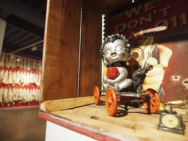 Willy Little (fg) and Reneee Billingslea at Archer Gallery ... (more) Posted by Jeff Jahn on April 04, 2019 at 13:07 | Comments (0) PermalinkSunday 01.13.19 January Review Roundup With one foot firmly in 2019 now is a good time to look at what the Portland art scene has on view with some short reviews.
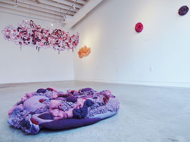 Residual Membranes at PCC's Paragon Arts Gallery (fg) Exuviation Amanda Triplett is a serious talent and everyone should take note of this exhibition at PCC Cascade's Paragon Arts Gallery. Combining recycled fabric crafts and coupling it to some of Eva Hesse's postminimalist forms she joins a few of my favorite artists like Ellen George and Laura Fritz as artists who explore the borders of the natural and unnatural through material comportment. It is a form that seems ill understood by a lot of dudecentric artworld dialogics. The most standout work here, Third Skin, is a riot of oranges and pinks made from reclaimed fibers arrayed like the offspring of a fishermen's net and the small intestines of a Jabberwocky make it both fantastical and a ...(more) Posted by Jeff Jahn on January 13, 2019 at 10:32 | Comments (0) PermalinkMonday 12.31.18 2018 Summary 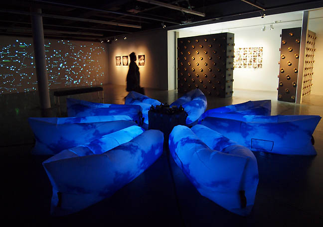 Horatio Law's DACA Lounge: A Dream Sanctuary at Archer Gallery last Spring 2018 was a difficult year for the Portland art scene (like the disappearance of Marylhurst University, talks of school mergers and the impending downgrade of the Hoffman Gallery), but it also saw the growth of some new venues and a lot of very strong exhibitions. Here is a look back at our most read posts and what follows here is just a bit of a summary. Yes the in depth "Portlandageddon" post is still coming in 2019 and will discuss where we are and what could or should happen. With that, enjoy the following summary of what PORT covered... sadly I think we all still miss Carol Yarrow, I still think of her every day. 2018 was an incredibly strong year for exhibitions as our most read reviews indicate: 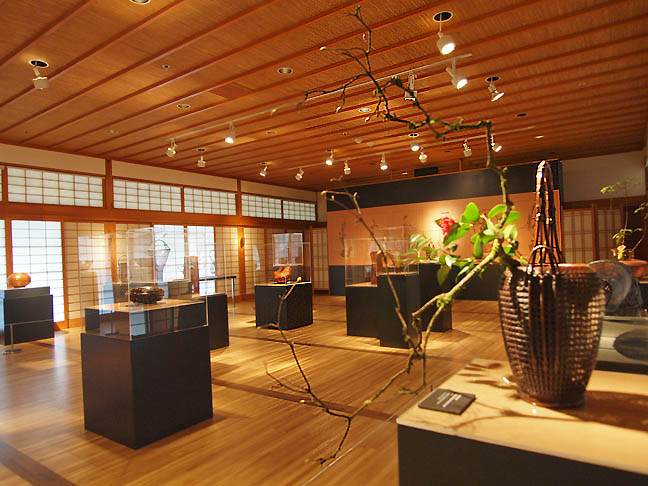 Hanakago at the Portland Japanese Garden was incredible Hanakago at the Portland Japanese Garden showed just why they are consistently the highest caliber cultural cultural institution Portland has. ...(more) Posted by Jeff Jahn on December 31, 2018 at 19:40 | Comments (0) PermalinkSunday 12.09.18 Loss of Material Evidence at Hoffman Gallery 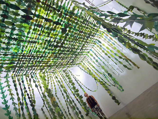 Comforter, Maria T.D. Inocencio (all photos Jeff Jahn) Arguably one of the strongest and easily the most intensive two person exhibition ever to be mounted in in Portland, Loss of Material Evidence by Mark R. Smith and Maria T.D. Inocencio at Lewis and Clark College's Hoffman Gallery, ends today. It also capstones its consummate curator's 20 year run in a blatant example of University administrative myopia and disregard for cultural offerings in higher education. First, let's concentrate on the exhibition as LoME is a tour de force in material as memory and pattern as personality translated via sustained activity/interaction with family members and other loved ones. This exhibition successfully goes into places where contemporary art often fails, specifically the persistence of personal familial affinity as a means of building meaning. It doesn't hurt that the two artists themselves constitute a family unit but I also appreciate how they both integrate and separate their individual voices. Perhaps, one can think of this as a memorable Thanksgiving dinner? For myself that what this constitutes, an extensive extended family feast... with all the simmering conflicts and savored time spent in reminiscence. All families, especially US families have to deal with the stuff the accumulate, but Mark and Maria made it into art and it cant help but be a gen X commentary. 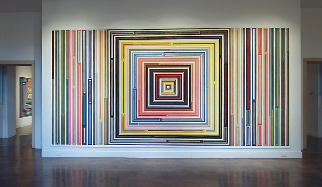 Time Tunnel Visitors are greeted by Time Tunnel, a large collaborative labyrinth wall piece by the two artists. Marriage is in itself a kind of time tunnel and each contributed in distinct ways. Maria apparently contributed the intensive structure while Mark's impressive eye for color, texture and pattern make visually absorbing. As someone who pays close attention to couples in the arts (being in a one myself) I cannot stress how rare a successful and integrated collaboration like this is. Sure, it might resemble high modernism but what it really constitutes is nonverbal monolith of what a close knit team can do. Perhaps only in Portland is the subject domestic machinations fetished and put on display like this exhibition and it is a major element of what Portland's art scene does better than any other in the USA. What Time Tunnel does well is introduce the viewer to the mesmerizing effect of material as a kind of token evidence of a life lived. Being constructed of fabrics that had previous uses it presents an engaging and partial picture... presenting the scope of the subject matter. In particular, that of families that accumulate stuff, which is then dealt with as they age and eventually pass on. I am generation X and have personally had to deal with much of this already. Do L&C students realize how important a subject this is? ... (more) Posted by Jeff Jahn on December 09, 2018 at 10:05 | Comments (0) PermalinkSaturday 11.10.18 November Reviews This November has perhaps the strongest selection of area shows in years and its the last day for the one at the Archer, so I suggest you get out there and soak it all in after this election week. Somehow art gives perspective.
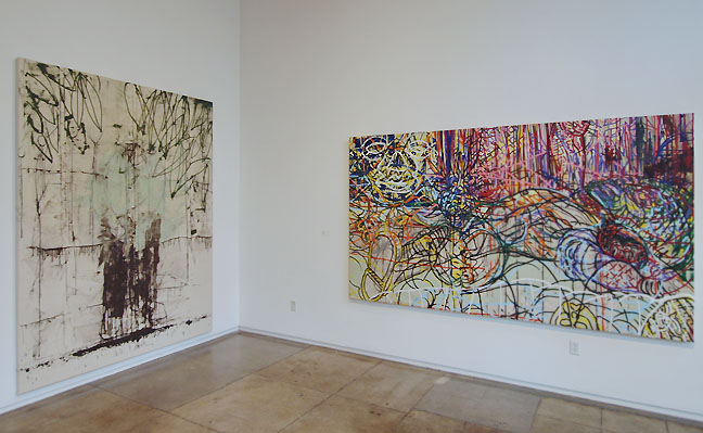
This month is Victember! Victor Maldonado's Liberation Stories at Froelick Gallery is one of the strongest painting shows Ive ever seen in Portland, which is interesting because the artist tends to be more of a conceptualist. But here he's visceral, engaging the history of street art, Philip Guston, Baselitz, Guggenheim Mural era Pollock and perhaps even Hermann Nitsch? The thing is it all comes from being the city of Portland's most visible Mexican/American artist who is paradoxically "not Mexican enough" and at the same time always summoned to be on any multicultural panel (the essential voice who is always on the panel but never given the award, which makes me furious). The truth is Victor has always walked a tightrope... being a bit of a provocative troublemaker as an artist and as a great ombudsman as an administrator. These paintings just burn through all the stereotypes and their tornadic vorticies coalesce into bodyslammed wrestlers... or are the dead? Always too smart, too nice, too handsome, too considerate and too perceptive to sit into left and right wing political schemas his works are troubling and put the viewers on the ropes in paintings like The Fallen and Ofrenda. I like his newfound confidence, now on display many years after earning his US citizenship, Victor is taking the victory lap nobody seemed to be willing to give him (including himself). True, he's a friend and I couldnt be prouder of him but ultimately this is a cultural comeuppance. Victor's paintings simply cannot be ignored... and in any other progressive city besides Portland would have been celebrated more. But Portland's institutions do not acknowledge true provocateurs like Victor... yet it is exactly what the smugly woke need. The "liberation" here is the fact that Victor has been crucial for over a decade and somehow despite not really thinking of himself as a masterful painter has become just that. The sheer economy and bravura of works on display arent about revisiting traumas... they are a all in your face testaments to the considered vitality paint can convey. No more hiding, this is the strongest solo painting show in years from the Pacific Northwest (only about half of the recent works are on display). *He also has an excellent Chapel on Display at the Archer Gallery and today is the last day to see it. Liberation Stories | October 30 - December 1st Froelick Gallery 714 NW Davis 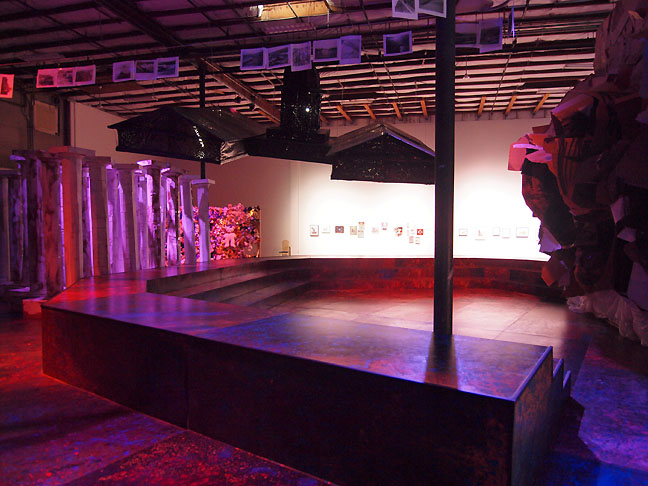 Abigail DeVille at PICA Ever since PICA shortsightedly abandoned their excellent space in the Weiden + Kennedy building in 2004 weve been hungry for them to reinstitute a regular visual arts program and over the years they have done it with fits and starts. Now with a home they own those expectations have finally come to fruition. PICA's latest exhibition, Abigail DeVille's The American Future, brings something timely and ambitious in the massively caverness warehouse space PICA now inhabits. DeVille is a rising international star and the exhibition's sheer theatricality is a major payoff for anyone visiting. There is a ziggurat made from piles of Street Roots newspapers, a deathstar like version of Pioneer Square's Federal courthouse looming over a re-imagined approximation of "Portland's Livingroom" Pioneer Square as well as art by PEAR youth on the walls. The whole show is more of a series of set pieces... (more) Posted by Jeff Jahn on November 10, 2018 at 9:56 | Comments (0) PermalinkSunday 10.28.18 Spooky reviews Even though every day in Portland is Halloween, October has some of the best shows of the year. Perhaps it is because the bar has already been raised? Here are some short reviews I suggest you check out (yes the big Portlandaggddon essay is coming soon):
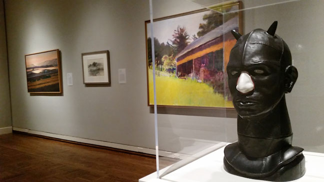
Far Right Nancy Grossman's Cob I, at PAM's Modern American Realism from the Smithsonian Museum Perhaps one would expect a show titled Modern American Realism: Highlights from the Smithsonian's Sara Roby Collection to be about staid Americana but the opposite is true. In fact one could just as easily call this American Surrealism. The iconic Edward Hopper has such a mood, Louise Nevelson's work is like a gothic child of surrealist assemblage and wood from the first portion of the industrial revolution and Paul Cadmus owes a lot to Georgio de Chirico with its long shadowed architectural arcades. Jack Levine's Inauguration is a surreal fantasy combining three separate presidents being sworn in, playing with the electorate's projections of the assumption of power. But the best cases are Nancy Grossman's Cob I and Theodore Roszak's works which all the Goth's are gonna Love. The exhibition is full of first rate works coming from the Smithsonian and it is a wonderful reminder of how wierd American Realism can be.. and still is. It is a national strength, the acceptance of so many alternate realities and it is a perfect show for these scary times and looming election, whatever your politics. Modern American Realism | October 20 2018 - April 28 2019 Portland Art Museum 1219 SW Park 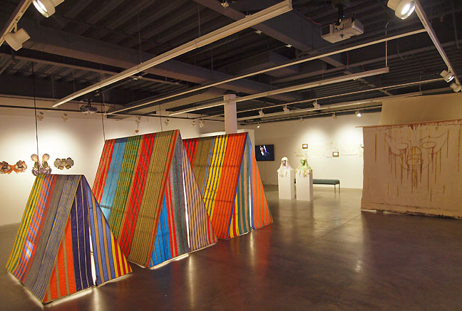 Work by Sonnenberg, Dwyer, Endo and Maldonado I Say, "Radical!" You Say, "Feminist!" is one of those shows about gender, identity and the human body that you'd think had been done a million times in the Portland area, but in fact I havent seen this sort of edgy survey of artists working in the subject attempted in a very long time. Way to keep a keener edge 'Couv and people who are really fired up should find it to their tastes. At the Archer you will find a who's who of up and comers as well as experienced guides like: Roz Crews, Kelly Bjork, Wynde Dyer, Emily Endo, Alexa Feeney, Klara Glosova, Junko Iijima, Tyler Mackie, Victor Maldonado, Patricia Melton, Matthew Offenbacher, Alyson Provax, Kelly Rauer, Maggie Sasso, Paul Mpagi Sepuya, Ann Leda Shapiro, Naomi Shersty, Alisa Sikelianos-Carter, Anthony Sonnenberg, Alexander Wurts. Though to tell the truth they could probably restage the show every year for 5 years without using the same names. The thing is the show seems to be actually curating work that invigorates and bounces off each other... none of the old, "who can humblebrag the best" that has become a cul-de-sac of tepid liberal elite thinking. With today's news nothing could be more relevant than visiting this show. That said the exhibition is a bit overhung and some of the best works are in too much competition for space. The highlights include Anthony Sonnenberg's big sparkly naked men, Victor Maldonado's Lucha Chapel, Alexander Wurts's festive Current Vibe video, Junko Iijima's big pink fabric adventures, Naomi Shersty's hauntingly retro The Following and everything by Wynde Dyer. Perhaps with some editing this could have been an all time great show for the region but being too ambitious for the amount of space it suggests larger venues (like the old Art Gym) should have taken this on at this scale. I Say Radical, You Say Feminist | September 25 - November 10 Closing Reception November 6 2-4PM Archer Gallery Clark College 1933 Fort Vancouver Way Vancouver Washington ...(more) Posted by Jeff Jahn on October 28, 2018 at 9:40 | Comments (0) PermalinkWednesday 09.26.18 September review cluster Some complain about the state of "New Portland" but the actual art being produced in the city right now is especially strong. In fact, the current lineup of exhibitions is remarkably sharp and is perhaps being catalyzed the greater pressures of the moment? Certainly artists in Portland have a lot to discuss. As I have traveled in the state and elsewhere I keep coming back to some of my favorites, all of which have a certain dark tinge to them. It is as if contemporary art is telling dark fairy tales we wish weren't but already know to be so true so here is a series of short reviews:
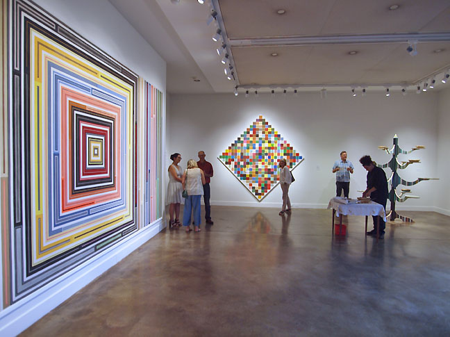 Mark Smith and Maria T.D. Inocencio at Lewis and Clark College Arguably the strongest and easily the most extensive exhibition in Portland this month is Loss of Material Evidence by Mark R. Smith and Maria T.D. Inocencio at Lewis and Clark College's Hoffman Gallery. It is a tour de force in material as memory and pattern as personality translated via sustained activity/interaction with family members and other loved ones. This exhibition successfully goes into places where contemporary art often fails, specifically the persistence of the personal and the building of meaning... (more) 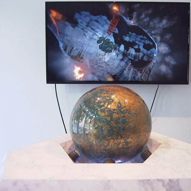 Tabitha Nickolai at Williamson Knight ...(more) 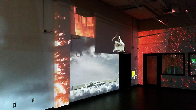 Fernanda D'Agostino at Open Signal Perhaps no art institution is more in touch with the pulse of culture in Portland than Open Signal is and Fernanda D'Agostino's Mapping (Borderline) is a very successful example of why... (more) Posted by Jeff Jahn on September 26, 2018 at 22:16 | Comments (0) PermalinkSunday 08.12.18 Portland Art Adventures I like the adventure and mental challenge that looking around an interesting art city like Portland can provide. There really is no substitute for experience. Here are some things the truly adventurous should have a look at:
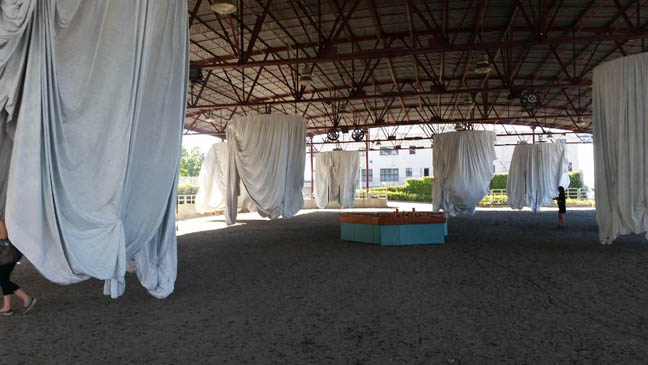 Ann Hamilton's Habitus in Portland I appreciate having an Ann Hamilton piece around to look at but habitus in Portland might have gotten away from the artist and curator. Restaging an idiomatic installation piece in a different city, with different materials is tricky. In the Philadelphia version the soft fabric, which contrasted with hard concrete was replaced with Tyvek and a soft dusty floor with less spatial compression here in Portland, doing it no favors. Thus, Portland's habitus lacks the dreamy frission of contrasts + scale of the original. Also, those substitutions change all of the contexts and meanings in less successful ways.... sequels are notoriously problematic (in ways I wish to touch on in a larger article I am at work on). You can look at the Philadelphia version of habitus here, it is far more successfulfor those reasons (site sensitivity, context etc) and many more Ill touch on later. Till then, go and see for yourself... also definitely catch these two more rewarding shows by R.B Kitaj and Jenny Holzer. 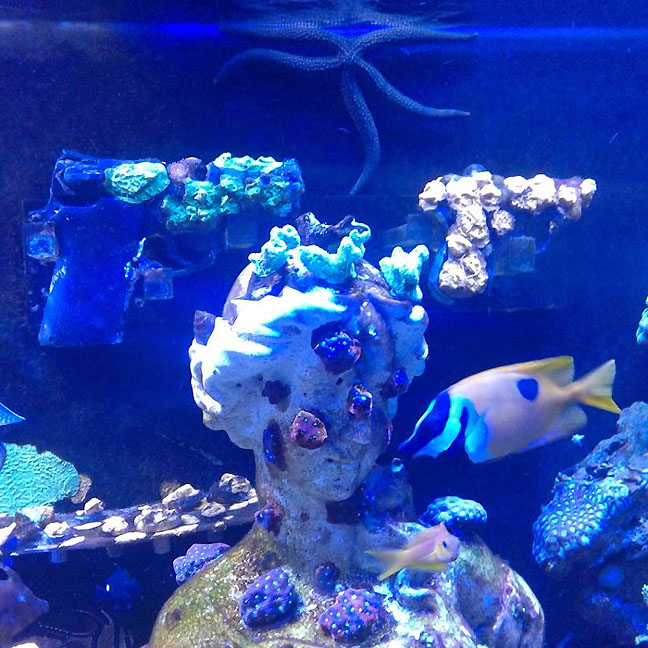 Guns in the Hands of Artists at Moloko Brian Borrello's Guns in the Hands of Artists series of collaborative exhibitions is incredibly relevant ongoing project but most of the time its taking place far away from the artist's home base of Portland. That why I relished the opportunity to view this research and development installation for turning guns into a coral reef at Moloko, Portland's coral reef cocktail lounge. I like the way it insinuates itself into a less formal art environment, though Moloko is an artist hangout. ... (more) Posted by Jeff Jahn on August 12, 2018 at 9:46 | Comments (0) PermalinkSunday 07.29.18 Alia Ali's Borderland at Bluesky 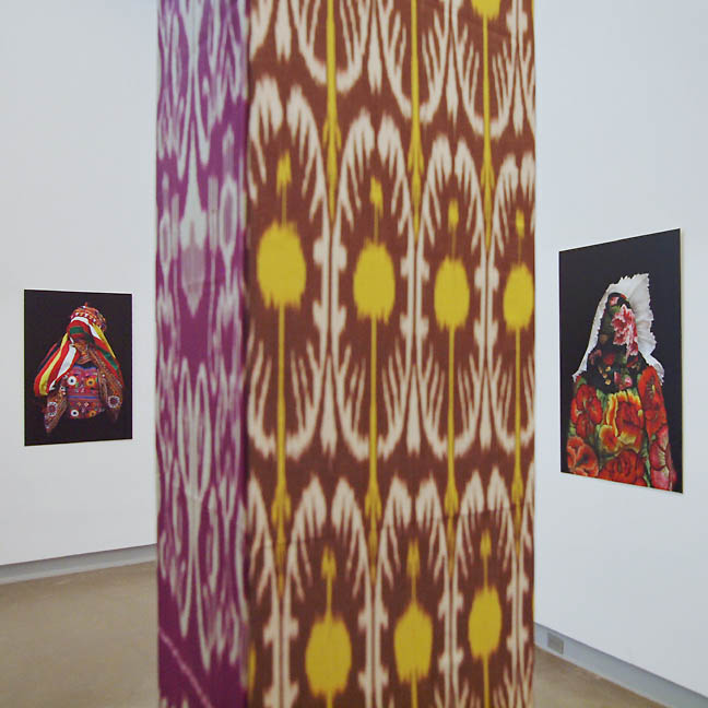 Alia Ali's Borderland at Bluesky Borderland is one of the best shows Portland has seen all year and today is your last day to see it at Bluesky Gallery. Alia Ali's exhibition doesnt sit neatly into any genre and as such provides welcome relief from all the twee, "treat the gallery as a studio" shows that masquerade in pseudo-proustian shallow palimpsest hood. It also wont award anyone their woke merit badge. It interrogates nothing and in general treats language and labels like the training wheels of understanding that they are. .... (more) Posted by Jeff Jahn on July 29, 2018 at 10:02 | Comments (0) PermalinkSaturday 07.14.18 One To See: R.B. Kitaj's The Studio Where I Died 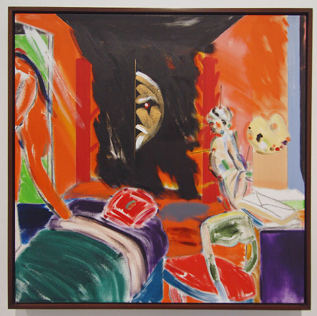 R.B. Kitaj, The Studio Where I Died (2005) This show brings together over a dozen works that span the artist's career with a special suite of late work in the back rooms. Many of these gems were painted in Los Angeles in the 2000’s. 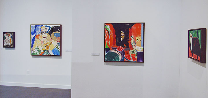 Install view R.B. Kitaj A Jew: Etc., Etc. at OJMHCE In these paintings we see a colorful tragedy, a piquant blend of West Coast light and European winter. Kitaj was born in the US but trained as an artist and lived mostly in England where he maintained a life long friendship with the painter David Hockney. ...(more) Posted by Jesse Hayward on July 14, 2018 at 9:46 | Comments (0) PermalinkThursday 07.05.18 Summer Show Strut Many art cities check out during the Summer but Portland's weather is great and San Francisco + NYC residents vacation here in droves. The net result is "summertime" is a strong time for shows. Sure there are the ubiquitous summer group shows but these solo efforts are incredibly strong and relevant. Nobody knows the art scene better and here are my picks with short reviews:
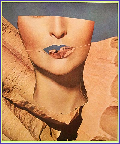 Eva Lake Anonymous Woman #63 Eva Lake's collage work has been the strongest and edgiest overtly feminist work in Portland for years now... but Portland generally doesnt give awards or accolades for being relevant and edgy. Please defy that embarrassingly idiotic and cliquish logic (in an otherwise very relevant and edgy city) by checking out her latest show Through the Ages at Augen Gallery, where she takes on fetishes of ruined antiquity and fresh feminine beauty as the anthropological paradox that it is. The show is a bit of a mini surver going from 2018 work way back to the targets. One of Eva's latest Her Highness #3 with its skeletal body of an enlightend bodhisatva and a model's face alone gives me chills. Eva's been doing well in NYC and internationally... so as it typically is, Portland usually neglects its strongest artists only to let the world pick up the slack. Yes, see it... this is a strong group of works that posits the idea that power is an edifice that asks women to jump through an extra series of hoops for paradoxical trade offs. Like local awards panels, sometimes those hoops are even other women and men simply arent as hard on each other. Through The Ages | July 5 - August 4 Opening Reception: July 5 6-8PM Artist Talk: July 14, Noon Augen Gallery 716 NW Davis 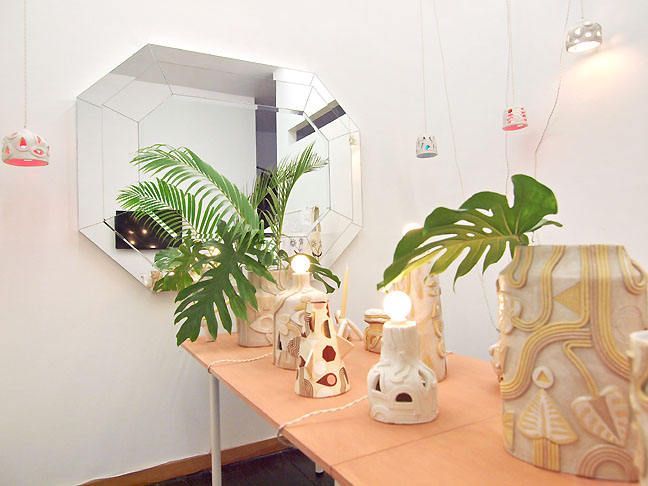 Dust to Dust is doing an intriguing job of bringing somewhat functional art to N Mississippi ve in the back of Beacon Sound and their latest show Vala Rae is every bit as 1970's as it sounds. Comprised of milky ceramics with occult markings and lots of pre-columbian references including the Moche culture, the whole thing comes off like wandering into some evolved pleasure society ala Zardoz or Logan's Run movie sets. Even Jorge Pardo did similar almost kitschy things at LACMA years ago. Or maybe it is a combination of the Isis mystery cult from Roman times combined with a Florence and the Machine video set? What I truly enjoy the most though is the way this hybrid space is addressing the pressure traditional galleries are facing. True, Vala and Rae are both alumni of Motel Gallery (perhaps the original Portland hybrid) and other hybrids like Nationale and Land have been in effect for a long time but somehow this show feels like a journey that unfolds in ways those other hybrid spaces rarely did. There is a movie set like concentration to it being in the labrynthine back of the shop and the artist's use of mirrors and tables create a staging that is an engrossing summer adventure. VALA RAE | June 22 - August 5 Dust to Dust 3636 N Misssissippi 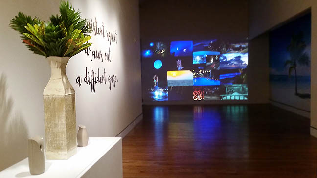 Venus Retrograde @ PAM Perhaps no show fits the summertime agenda more than Hannah Piper Burns Apex series show at the Portland Art Museum(open for free on First Thursdays). Titled Venus Retrograde it explores my least favorite television show of all time, The Bachelor. Not that Burns particularly condones it either, she pulls apart its reality show grammar of engineered emotional trainwrecks and predictable dating orthodoxies and heteronorm cliches. The expectations are of course for some sort of exploitative emotional gladiatorial battle. I have a hard time with reality TV and the Bachelor in Paradise would qualify as my personal hell. Still, there is a lot to consider here. Reality TV lead to our current president and his ratings based moral code. Also, so many adopt what they see on these shows as benchmarks for their own lives. Honestly the whole thing makes my skin crawl and I find the way reality TV stars in these shows become emotional restaveks, repugnantly selling themselves for ratings. The value here is that Burns' morbid fascination and deconstruction of this media phenomena reveals how the sausage is made. Kudos to the curator who has focused the Apex series... it has been been waffling since its strong inception then slide away from consequentiality but with Sam Hamilton , Dawn Cerny and now Hannah Piper Burns has turned away from show after show of artists who reiterate the most common cliches of Northwest Art (traditional craft and figuration) to challenging expectations with multimedia shows by artists who arent over exposed locally, yet often active outside the region. Apex is reintroducing the museum audience to the fact that what we think of Northwest Art really cannot be tidily summarized then performed to a captive audience. Its reintroducing us to the diversity of practices here and the fact that they are showing all over the world regularly. Shouldn't we know ourselves better than the rest of the world does? Often that hasn't been the case? Now, its better and the series is showing us a plethora of multi media artists who arent playing to to stereotypes (which were never more than a 3rd of what the region produced since the 21st Century began). We arent used to the Portland art museum being relevant to the very international local art scene so this is a huge positive. Venus Retrograde | February 24 - August 14 Open for Free on First Thursday 5-8PM Apex Gallery (Schnitzer Center of Northwest Art) Portland Art Museum 1218 SW Park Ave ...(more) Posted by Jeff Jahn on July 05, 2018 at 14:02 | Comments (0) PermalinkSaturday 05.05.18 DACA Lounge at Archer Gallery  DACA Lounge: A Dream Sanctuary at Archer Gallery Immigration policies for the United States of America have always been an impromptu patchwork of reactionary policies that put a quick bandage on whatever current situation prompted that action. During President Obama's 8 years DACA or Deferred Action for Childhood Arrivals was put in place as a stop-gap when Congress did not ratify the Dream Act into law to address the plight of children of illegal immigrants who have known no other existence besides being in The United States of America. It was a moment when the USA started to talk about things it generally left unsaid and nearly 800,0000 kids have applied for the program. In the current, rather reactionary political climate the fate of the DACA program is held hostage as a political pawn, creating an uncertain, extremely stressful situation for these kids. To this enter Horatio Hung-Yan Law's latest art exhibition DACA Lounge: A Dream Sanctuary. It is one of the most poignant and timely exhibitions the area has ever hosted. Interesting but not surprising that art is being a better host than a country. Law even ...(more) Posted by Jeff Jahn on May 05, 2018 at 9:00 | Comments (0) PermalinkWednesday 04.18.18 JSMOA's Crimson Cube at WSU 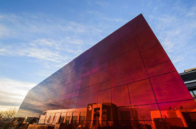 the new "Crimson Cube" at WSU (photo Bob Hubner) A little over a week ago I was fortunate to catch the opening of the new Jordan Schnitzer Museum of Art at Washington State University in Pullman. Nicknamed the "Crimson Cube" for the structure's exterior it gives students and other visitors a landmark to navigate by. It is a nice touch since so many other University art spaces are hard to find and seem tied only to art departments, which often have little pull on campus politically and makes the susceptible to cuts. No problem with that here because the cube is intentionally at the heart of things at WSU. 20 years ago this sort of reflective glass structure would have read as corporate but the cantilever that is subtly off other building's grid axis and the red color are distinctly more curious than an office tower's comportment. The overall effect is, "what is that?" and the JSMOA's comparative minimalism recalls David Chipperfield's excellent library in Des Moines. That curiosity prompt is a good place to start for any art museum and has its roots in Robert Smithson's mirrored displacement works without the specificity that Art has. That is left for inside. 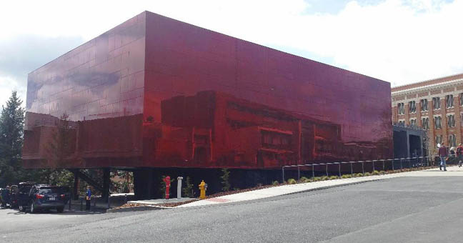 The skies over the JSMOA influence how extroverted the building behaves and its branding is low key, prompting questions... 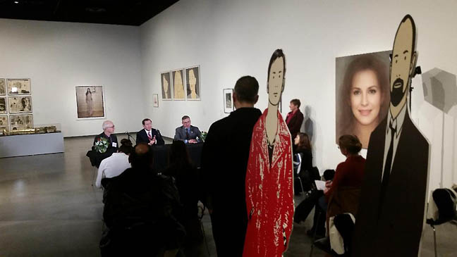
Press briefing in the Person(a) exhibition in the Harmon/Wright Gallery ...(more) Posted by Jeff Jahn on April 18, 2018 at 9:00 | Comments (0) PermalinkSaturday 03.24.18 Hanakago: The Art of Bamboo and Flowers at Portland Japanese garden Spring in Portland is incredibly dramatic and the latest exhibition Hanakago: The Art of Bamboo and Flowers at Portland's Japanese Garden is the perfect instrument to sharpen ones senses and appreciation for the season as life awakens around us. There is something about the dried and shaped bamboo among recently cut flowers that suggests the withered husks of life as vessels of contemplation, grace and virtues in life. Both the bamboo and flowers highlight both control and variation through respect. They are perceptual paths to awe and understanding. When the viewer is among these bamboo and flower objects... the weave, the intention and care catches the light and filters our perception towards the fragility that forms constructed in webs of respectful intention entail. We live in an age where consideration and grace can be on short supply so Hanakago is a refreshing respite.
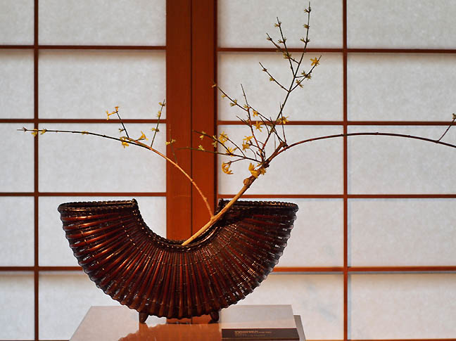
A breeze from long ago, Chinkuunsai III (2012), all photos Jeff Jahn Hanakago is comprised of an impressive array of bamboo baskets and art from Portland collector Peter Shinbach's collection. Many are further brought to life with the ikebana art of Mrs. Etsuho Kakihana and those who study with her... ...(more) Posted by Jeff Jahn on March 24, 2018 at 22:01 | Comments (0) PermalinkWednesday 02.28.18 Travelogue look back at 2017 To describe 2017 as the most intense of years does not begin to do it justice. It was a year of upheavals... and the death and births of many things (my father and many others included). 2017 was also the year I logged the largest # of travel miles (all without leaving the USA or even visiting the East Coast from my West Coast base in Portland Oregon). Every time I turned around I was either unpacking or preparing for another sojourn. But now as 2018 is now solidly under way I'd like to revisit many of the most memorable things I saw and why... what is travel after all if you can't think back and take stock?
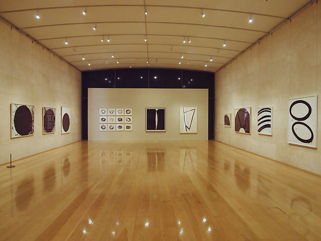 Richard Serra Prints at Nasher Sculpture Center, Dallas Texas One of the very best things I saw was also one of the first. A Richard Serra print show at the Nasher Sculpture Center in Dallas. This was the first time 2D work has been displayed in this gallery designed specifically for sculpture. The image above shows just how powerful and ideal it was. Imagine an ivory colored cathedral festooned with black forms that acted almost like music notation on the page... (more) 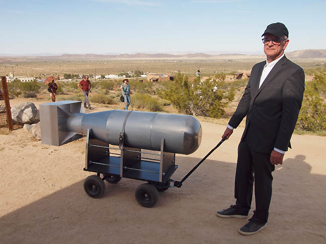 Stephen Whisler, Walking the Bomb at the 2017 Treenial, Joshua Tree California Later I visited Joshua Tree California for their Treenial weekend art festival.... The Kerry James Marshall Mastry exhibition at MoCA was extremely memorable.... (more) 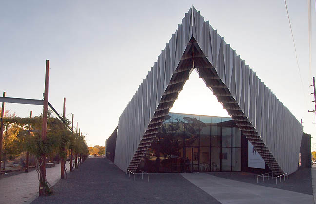 We also took in the newly reopened Site Santa Fe designed by SHoP architects. Basically it no longer has the warehouse feel of the old Dave Hickey Beau Monde Biennial and has replaced it with a slicker experience. Its likely more functional... (more)
Posted by Jeff Jahn on February 28, 2018 at 9:36 | Comments (0) PermalinkSunday 07.09.17 Clay Mahn's Bad Habits at FalseFront 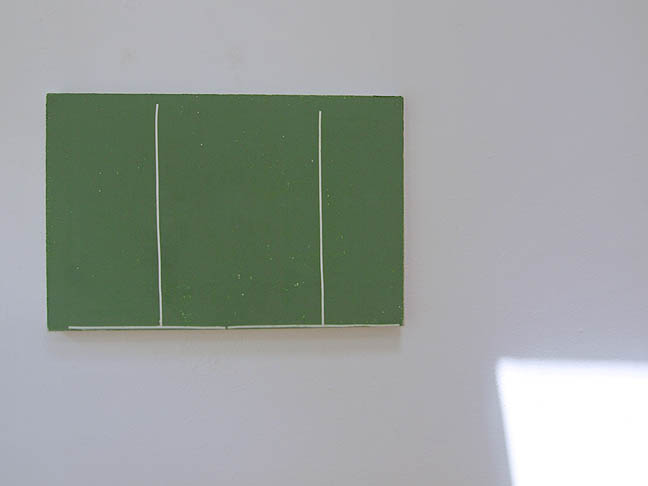 Bad Habit (B) at Falsefront Portlanders are stressed, blood has been spilled along ideological and racial lines recently and our own government appears to be trolling the entire United States as political shell games are being played. In short nerves are raw. Finding an exhibition that speaks eloquently and meaningfully in these somewhat less than nuanced times has been difficult. Yet, one has presented itself and its like breathing clean air for the first time in so many months. Funny thing, the exhibition is called Bad Habits... 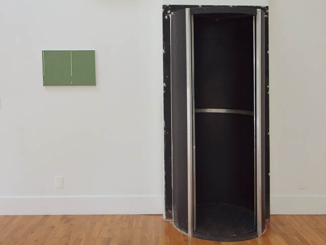
The show is hung at FalseFront, one of my favorite alternative spaces. It is an art gallery in front of a house in a charming residential Northeast Portland neighborhood. Thankfully it is about as far from Documenta as you can get, no crowds, no Obrist wannabes... just 3 small green paintings on linen in a room with ample natural light that mercifully overpowers the gallery lighting. .... (more) Posted by Jeff Jahn on July 09, 2017 at 10:23 | Comments (0) PermalinkSunday 04.09.17 The Rodin experience at PAM 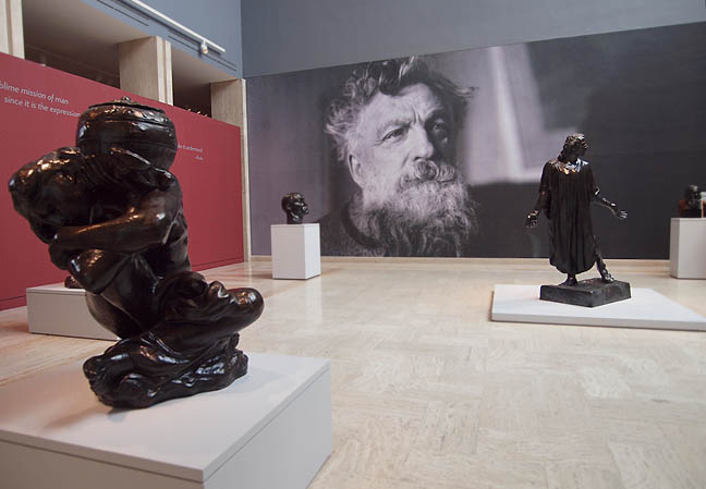 One of The Burghers of Calais, Jean de Fiennes, Clothed (center right) by Laurel Reed Pavic An enormous headshot of Auguste Rodin greets visitors to the Portland Art Museum's Rodin: The Human Experience. His face is wall-sized, bearded, with crinkly, twinkly eyes; it is everything we want to see in our artistic geniuses. The show is part of a celebration of the sculptor's work 100 years after his death in 1917. The sculptures are all from the Iris and Gerald B. Cantor Collections and part of Portland Art Museum's drive to "bring the world to Oregon" in the words of Director and now Chief Curator Brian Ferriso. The works in the exhibition are a fascinating smattering from Rodin's extensive oeuvre. The exhibition begins in the atrium with four studies or reprisals for Rodin's "breakout" commission for The Burghers of Calais (1884-1895) and two Caryatids. A cast of Jean de Fiennes, Clothed anchors the atrium grouping and provides an opportunity for a wall tag to introduce Rodin's famous public monument. The Monumental Head of Jean d'Aire to the left is also inspired by The Burghers though the head wasn't modeled until... (more) Posted by Guest on April 09, 2017 at 11:02 | Comments (1) PermalinkWednesday 02.08.17 Resist at Una Gallery We live in far too interesting of times and artists act somewhat like canaries in the coal mine for the rest of civilization. Often existing right on the brink, they find the tensions of the age and the unsettling of the ways our daily routines become furrowed into ruts. They also uncover new paths and understandings through their work and both aspects speak for their importance. It also means that they are left more exposed, like clusters of nerve endings at crucial parts and the extremities of the civic body.
Most get their starts in alternative spaces, which are a big part of why Portland is an interesting art city (we have many though we have lost some good ones). Since most of our more established art institutions are still playing catch up or trying to find their edge, the alternative spaces are what drive Portland's reputation. As I showed the Wall Street Journal years ago, alternative spaces and lifestyles are always on the front lines of a vibrant cultural scene, yet it is these spaces and cheap studio space that are endangered by Portland's relatively new status as a hot real estate investment city. 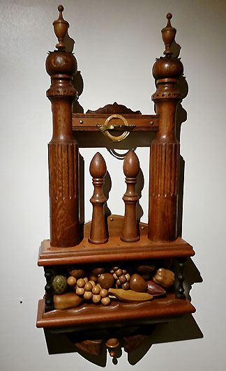 Dan Pillars, Wedding at Una Gallery That's why RESIST, Una gallery's third show is important and presents Portland as a vital contemporary art scene within the protective non profit Everett Station Lofts enclave. Una's mission statement for presenting "non-established" and "experimental" contemporary artists with less mainstream identities was a big reason they were awarded a Precipice Fund grant late last year (I was one of the 4 panelists). I am happy to report that in 2017 Una is already delivering with provocative, sometimes excellent work... (more) Posted by Jeff Jahn on February 08, 2017 at 13:37 | Comments (0) PermalinkSaturday 12.31.16 Saying goodby to 2016 As a year end exercise let's look at PORT's most read posts of 2016. It says a lot about Portland and the international audience that PORT reaches.
[About PORT] Recently I was reminded that PORT needs to remind people how and why we do what we do because PORT is innovative (forgive us if Ive repeated this but not everyone knows the spiel). Standard stuff, PORT reaches an enormous # of readers each year (over 1.5 million unique ones annually) and with 2016 being so tumultuous our readers turned to us to give the context that our depth, experience and prescience offers. Stylistically we purposefully avoid being an uninvolved observer (the province of the rapidly dying world of journalism) and instead adhere to the sense of being an on site historical observer and interlocutor (ala Herodotus, Baudelaire and a lot of art criticism out of London over the past 25 years). . . . It is my belief that true understanding doesn't come through consensus but rather through being intellectually curious about the perceptually divergent mechanisms that inform dissent and consent. PORT thanks our readers and sponsors who make this effort possible. [End wonky digression] That said, here are our 13 most read posts of 2016. In no particular order, these articles collectively paint a very interesting picture of Portland's art scene in 2016. I'll publish a more probing review as 2017 begins (yes things like institutional shifts at the Japanese Garden, PNCA, Portland building, James Beard Public Market and The Portland Art Museum etc. will get the space they deserve) ... till then chew on these: 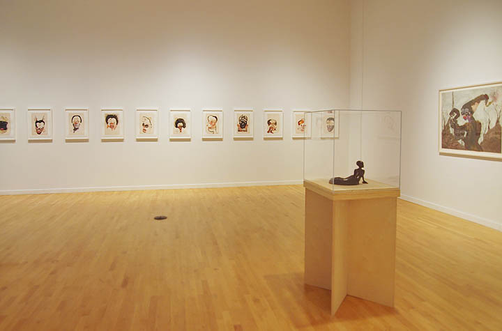 Installation view: The Human Hybrid at PNCA's 511 Gallery (from the Collection of Jordan D. Schnitzer's Family Foundation) 2016 Was definitely a year for the ladies and Victor Maldonado's interview with Wangechi Mutu was insightful. We did a lot of prep for this, bringing in anthropological subjects and in particular I felt that Victor and Wangechi would have intersecting experiences as foreigners from syncretic cultures who attended elite art schools in the USA. The exercise did not disappoint. 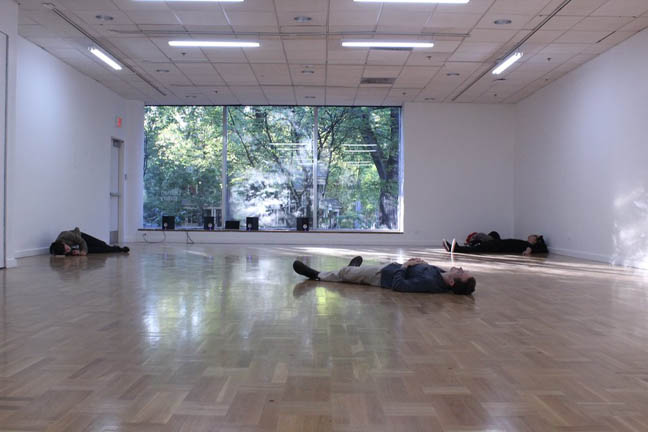 Littman Gallery, PSU. 9/9/2016 for Ben Glas' Inging (Variation3) ... (more including Rothko, Warhol, Amazons, New Media and Blake Byrne) Posted by Jeff Jahn on December 31, 2016 at 10:44 | Comments (0) PermalinkSaturday 08.27.16 Double Difference at Indivisible 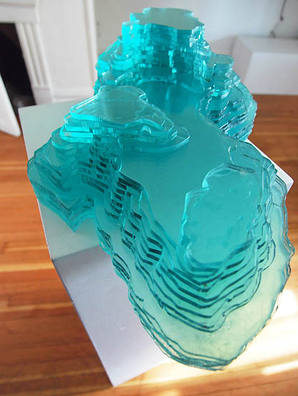 Linda Wysong, Hidden Topographies (2016) Linda Wysong and Linda K. Johnson have been been collaborating and executing co-orbital projects regarding the shifting and layered landscape of Portland for over 25 years. They find gravity in concrete, gravel and paved streetscapes and its roots are indebted to Robert Smithson and Co.'s fascination with the industrial ruins of Passaic New Jersey. Yet unlike their forbear prophets they continually focused on Portland. The result is a bit like running into an old miner who remembers the multiple gold rush times who can regale you with tales of claim jumpers, visionaries and hornswagglers. Except they are not swaggeling any horns. Wysong is a mapmaker at heart, dealing in topographies both mental and physical, Johnson is more of a documentary observer... Posted by Jeff Jahn on August 27, 2016 at 11:00 | Comments (0) PermalinkFriday 05.27.16 Diane Jacobs' Homage at Weiden + Kennedy As a child I studied Greek culture intensely and always felt the Amazons were particularly interesting because it seemed like they challenged the Greek order, which most of Western Civilization is built upon. I suppose that being raised by predominantly by females (many of my relatives being quite tall) presented the idea that women were tough was always a given, rather than an eccentric notion. The world is catching up to this truth... s.l.o.w.l.y.
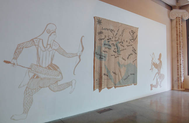 What little most people know of the legendary Amazon women has come to us from a short entry by Herodotus and other ancient Greeks. Because of this many probably assume that the Amazons were Greeks themselves (false, in fact they were a rival civilization), were a women-only society (false, in many tribes the women were simply equal in every way... including as warriors) and instead of one breast as reported by Herodotus they had two (in the bronze age one simply does not perform cosmetic mastectomies without antibiotics etc. and was propaganda for shock effect).... (more) Posted by Jeff Jahn on May 27, 2016 at 12:13 | Comments (0) PermalinkSaturday 04.30.16 Bonnie Bronson and Mary Henry 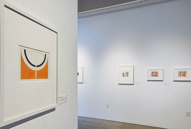 Mary Henry, The Fabric of Space at Jeffrey Thomas Fine Art (all photos Jeff Jahn) For the past decade or so female artists have been a subject to a refocusing of scrutiny in the art world. My critic colleague Jerry Saltz has railed against institutions and a market, which still dont seem to value the the contributions of women. Still, artists like; Helen Frankenthaler, Hilma af Klint, Ruth Asawa, Judy Chicago, Anne Truitt, Kara Walker, Julie Mehretu, Dana Shutz, Wengechi Mutu and Mickalene Thomas have all seen their stars rising and there have been numerous exhibitions not the least of which was the opening exhibition of Hauser Wirth & Schimmel which presented many crucial artists (who happen to be women) both historical and contemporary in one exhibition. Clearly this is a moment... (more) Posted by Jeff Jahn on April 30, 2016 at 12:01 | Comments (0) PermalinkFriday 12.11.15 Erik Geschke's Amalgam 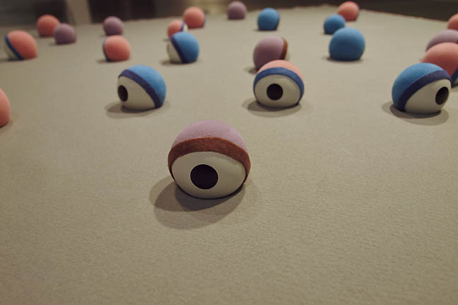 Detail of Erik Geschke's Arena (2015), all photos Jeff Jahn At the end of the year there is always at least one really worthwhile exhibition that sneaks in before the calendar runs out. Currently, there are lots of fine iterative exhibitions that present incremental artistic strides in Portland right now but Erik Geschke's Amalgam at PCC Sylvania is the most satisfying. In no small part this is because Amalgam gives us the real scope of Geschke's recent work, allowing us to explore and absorb his somewhat twisted practice in multifaceted detail... (more) Posted by Jeff Jahn on December 11, 2015 at 15:51 | Comments (0) PermalinkSaturday 11.14.15 Demos: Wapato Correctional Facility by Ernest 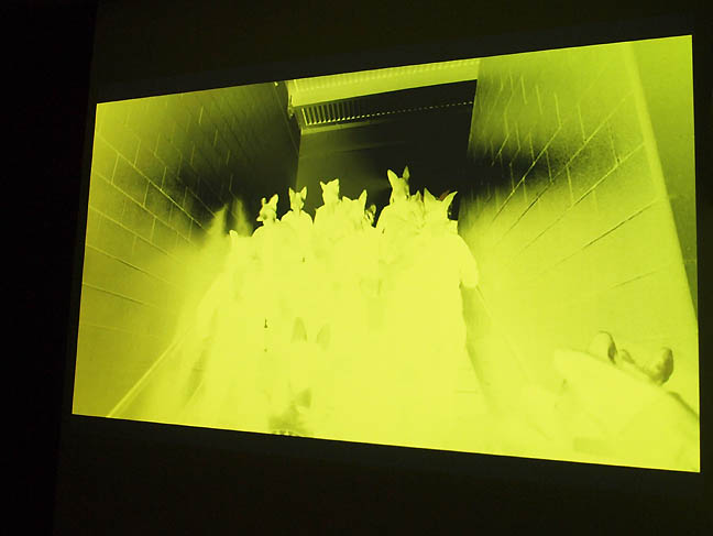 Scene From Demos: Wapato Correctional Facility by Ernest (all photos Jeff Jahn) PORT has been covering C3: Initiative's first residency program with Bay Area based Ernest for several years now and since there is just over a week left of their strong capstone exhibition Demos: Wapato Correctional Facility I felt it was a good time to report and evaluate. Though a lot of residency exhibitions turn into a sort of disparate show and tell exercise, Ernest's multi-year project has been both a longer engagement and ultimately more... (more) Posted by Jeff Jahn on November 14, 2015 at 13:36 | Comments (0) PermalinkTuesday 11.10.15 Art News Looks like Portland's Paul Bunyan is about to get some care. I come from the Midwest where Bunyans are plentiful but I like ours best and kinda wish more of our public art came off like this instance does. He is a greeter, and designed to be one... a lot of public art is the product of convoluted interests that commission them leading the work to serve too many masters. Of recent public art pieces none is more successful than Jorge Pardo's streetcar stop and it works precisely because it doesn't embrace some obvious things like rain shelter. Instead it gives people a beacon. Paul Bunyan is similar. Sunny disposition with his grin and trusty axe.
I am with Portland's Horatio Law on this, the term "ghetto" means many things to many people and has massive historical precedent in Chinatown. Trying to whitewash history with less loaded language is never the right way to handle these things. The Jews, Italians, Irish, Chinese, Puerto Ricans etc. have all been ghettoized in this country at one time or another and to cede that term to one group over another obscures the pattern and actually re-writes history in a false way. Artists sometimes remind us that committees can sometimes be very bad at addressing history. An interesting idea, the Broad as a gateway contemporary art museum? I see it differently as every collector has a unique perspective... when they donate works to a more generalized museum their point of view gets diluted. I like strong points of view, even if I completely disagree with them. The Barnes Collection, The Frick, The Menil... they have a certain integrity that can get lost in the multi-patron museum shuffle. A fascinating interview with an architect that embraces entropy. Watch this one. Posted by Jeff Jahn on November 10, 2015 at 12:19 | Comments (0) PermalinkSaturday 10.17.15 In a Rhythmic Fashion at Hap Gallery 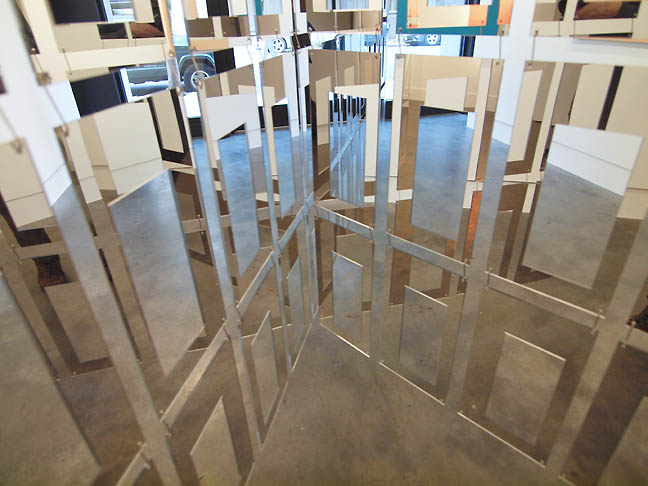 In a Rhthmic Fashion at Hap Gallery (all photos Jeff Jahn) On the whole the quality and sophistication of art exhibitions in Portland has improved in the last few years, but in that same time the # of fully realized, surprising and meticulously executed ones has declined as of late. The current Alien She, Seeing Nature and recent Ai Weiwei shows can be excluded because those are Museum shows... what I'm talking about are exhibitions by lesser knowns. Perhaps it is because most of the energy worth paying attention to here has fractured into small experimental spaces and individual artist studios where they save their best work and most realized efforts for exhibitions around the globe rather than at home? Portland has a lot of very active globally active contemporary artists. In fact, I've heard it straight from the artists themselves that they save their best efforts for elsewhere. Thus, despite the sudden spate of rent hikes Portland is still a great place to create and workshop experimental work among peers and export it. We are still far cheaper than other west coast cities. Still, venue-wise Portland can be weirdly conservative, half-baked or pedestrian/patronizing. Example: putting one or two humblebraggy objects in a white room. That's very weak sauce and curatorial studies 101. It means something has been missing and though I enjoy discussing the promising new artists who have just been discovered it is also nice to see a show that top to bottom owns and executes in a way that is clear, layered, challenging and resonant beyond the artist's statement and circle of friends. In other words, a truly world class show that you happen upon rather than expect... (more) Posted by Jeff Jahn on October 17, 2015 at 12:38 | Comments (0) PermalinkThursday 07.30.15 A Case For Abstraction: No Boundaries 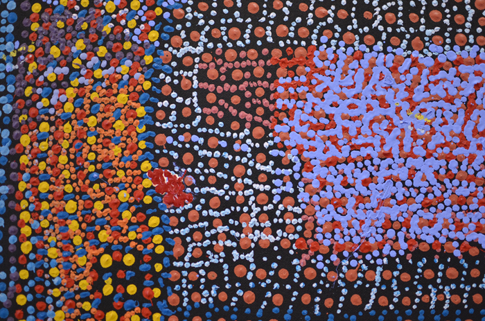 "Warlpapuka" (Detail), Tommy Mitchell, 2012, Synthetic polymer paint on canvas, 40" x 40" Forgive me. In the middle of summer, this review is late. The heat this year is thick and heavy, wrapping around me like a needy lover. The days are long and drowsy, and the passing of time is difficult to feel. The ground beneath my feet is sharp and thirsty and flammable, while my body is the source of a river of sweat that makes a salty warm waterfall of my person. I am a waterfall person. . . (more) Posted by Amy Bernstein on July 30, 2015 at 9:44 | Comments (0) PermalinkFriday 06.26.15 Ethan Rose Entwined at PDX Contemporary 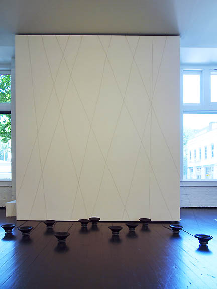 Ethan Rose's Entwined at PDX Contemporary (all exhibition photos Jeff Jahn) It seems if like Ethan Rose's latest, Entwined, at PDX Contemporary is on the right path because all elements; sound, strings, speakers and works created utilizing those elements present a truly democratic experiential cacophony in black and white... (more) Posted by Jeff Jahn on June 26, 2015 at 19:11 | Comments (0) PermalinkTuesday 05.12.15 Julia Oldham at Portland Pataphysical Society 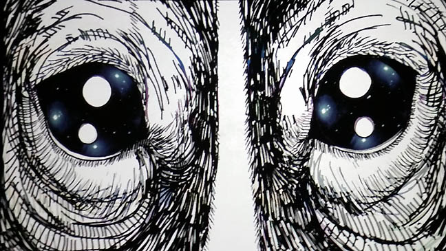 Still from Laika's Lullaby Julia Oldham's Farewell Brave Voyager at the Portland Pataphysical Society may be the most emotionally demanding exhibition one will see in Portland all year. It is easily the strongest solo show on view at the moment, presenting a tale of science, sacrifice and a compelling combination of whimsy laced with a lethal dose of tragedy. Those are all hings that have always accompanied scifi thrillers like Gravity, Alien and 2001: A Space Odyssey. Where this video art exhibition differs is it plays more upon rawer empathy than a filmmakers emotional buy-in and adrenaline management. Because it deals in a more unconditional empathy most sensitive Portlanders will have some trouble with this exhibition, which follows the fates of two dogs and a robot in space. Still, it is really worth a visit if you love explorers and or animals as it fleshes out the most existential of moments, that impending final one. Be prepared, on opening night there were several visitors weeping openly. One of the dogs depicted, Laika, is historical... being first sentient Earthling to explore space aboard the Sputnik 2 spacecraft in 1957. According to conflicted accounts she died 4 hours into the flight after completing as many orbits, while the stress and high temperatures sealed her fate. These are dry facts but Oldham handles the historical account with respectful graphic design and production quality worthy of such sacrifice. 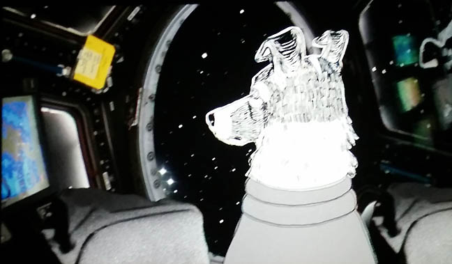 Still from Laika's Lullaby The largest video Laika's Lullaby, depicts her compelling situation as Sputnik 2 leaves the planet with its payload. The hopeful opening sequences do not foreshadow the death sentence committed in the name of human curiosity. Instead, the cartoon imagery evokes the kind of intrepid curiosity that Star Trek and other dramas have made into the hallmark of space exploration. The eager hopefulness that most dogs posses is perfectly conveyed here and by all accounts Laika was chosen for the mission because of her calm demeanor. As time passes though... (more) Posted by Jeff Jahn on May 12, 2015 at 9:46 | Comments (0) PermalinkThursday 03.19.15 Jonah Porter's Kiasmus 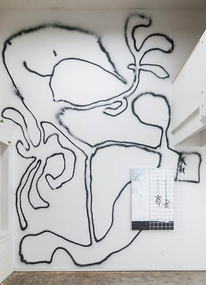 Sqlit-Liqs from Kiasmus In a gallery free of explanatory texts, price tags and an official name, we find four paintings by local artist Jonah Porter. We see vellum, mesh fabric and fiberglass in support of black ink, latex and spray paint. Everything is on the wall. Everything is black, dark blue, grey or white. Everything is bleak and magical, lush and sparse. ...(more) Posted by Jesse Hayward on March 19, 2015 at 12:46 | Comments (0) PermalinkThursday 02.26.15 Populist Visionaries: Finster and Abernathy 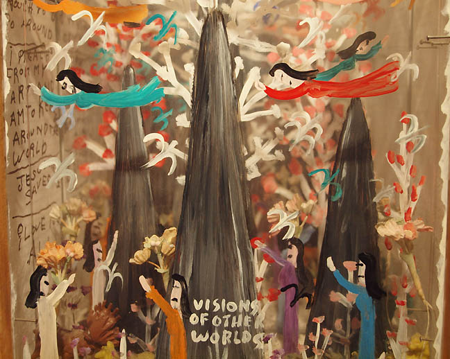 Howard Finster, Landscape with Jewls (1990) Collection of Peter Buck at PMOMA This February two solo shows in Portland seem to capture the current zeitgeist of the city and beyond. The micro survey of folk art icon Howard Finster, Space Is My Future at the Portland Museum of Modern Art and Tori Abernathy's Make Yourself at Home at HQ Objective both offer themselves as generous hosts with wildly divergent evangelistic/activist zeal that question the status quo. Though completely different these two exhibitions are tempered with a well-intentioned goal of sharing information for the improvement of the human race, something rarely seen in art exhibitions, which tend to be more abstruse in their aims... (more) 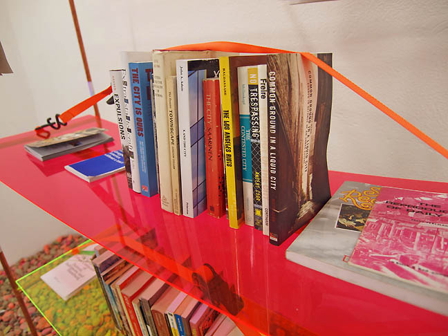
Tori Abernathy, Make Yourself at Home (detail) at HQ Objective Posted by Jeff Jahn on February 26, 2015 at 13:11 | Comments (0) PermalinkFriday 01.30.15 Victoria Haven's Subtitles at PDX 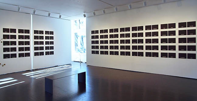 Subtitles by Victoria Haven at PDX Contemporary (photos Jeff Jahn) Everyone, left to his own devices, forms an idea about what goes on in language which is very far from the truth -Ferdinand de Saussure I'm not sure if I was able to "enter a void-like state" as per the request of the press release for Victoria Haven's "Subtitles" at PDX Contemporary but I can assure you that there were certainly moments of quiet reflection and introspection. With one hundred sets of wood block prints done in four editions, the amount of labor involved is on its own worth mentioning. Each individual part to this extensive whole is made up of two laser etched wood blocks printed together in jet black ink with one single word set low enough in the composition to suggest the name sake of the show. "Subtitles" is a slow dance with semiotic principals where in which the Art is found through the relationship of two seemingly unrelated words.... (more) Posted by Christopher Moon on January 30, 2015 at 14:40 | Comments (3) PermalinkWednesday 01.21.15 Richard Mosse's "The Enclave" at PAM 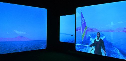 Installation view of Richard Mosse's "The Enclave", at the Portland Art Museum In the end, all you have is what is in front of you: where an image begins and ends, where a photographer is telling you to look, what to pay attention to. You have the body of the thing, the form. You have color and time. You have the way in which this is all done and what these choices mean. These are the ways in which you begin to decipher a visual language. . . (more) Posted by Amy Bernstein on January 21, 2015 at 14:35 | Comments (0) PermalinkWednesday 12.31.14 Best and Worst of 2014 2014 was an odd, placeholder kind of year. Few exhibitions blew people away (especially
the reheated attempts at mostly regional survey shows) and many artists saved
their best efforts for shows outside of town. This continues to prove my thesis
that Portland is used more as a base for developing international activity than
as a place where you can see what is really going on... at least institutionally.
That needs to change and it is a corner that must be turned for the city's cultural
health. For example, if an artist is doing work that is on fire, then the community
should single out and support that excellence in a serious way. That said everyone
seems to be waiting for 2015. In 2015 there will be a new Maya Lin, a new bridge
and we wil finally see PNCA's new 511 building become the cultural anchor of NW
Portland? No institution has caught the new Portland wave of energy as well as
PNCA has but that has come at a cost, rapid change and the ill fitting clothes
that kind of change creates. Some call the style “Portland eclectic.”
Portland will say goodby to PNCA's Goodman Building in early 2015 and in many
ways it herald's thew way Portland is beginning to present itself differently.
That said I will focus a lot on curatorial presentation in this list.
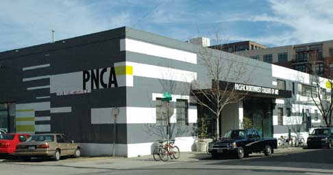 Goodbye to PNCA's Goodman Building Best and Worst 2014: Best question of 2014: Will Bruce Guenther's curatorial replacement continue to give the Portland Art Museum an... (much more) Posted by Jeff Jahn on December 31, 2014 at 16:02 | Comments (0) PermalinkSunday 11.30.14 Get All That Is Coming To You / the reclamation of Lafe Pence 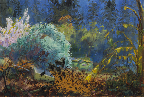 Gabriel Liston, Get All That You Have Coming To You The history of Portland is fraught with fits and starts, arbitrary decisions and long term planning. Still that history is just a construct of illustrational tales we tell ourselves about the path to now. The reality is far more complicated tales. Then there are history paintings, which can be fictional folklore reflecting civic ideals and neurosis and/or it can be embody some degree of accuracy. Also, unlike the History Painting of the past, today's artists aren't held up as verified illustrators projecting onto the present. ...(more) Posted by Jeff Jahn on November 30, 2014 at 13:12 | Comments (0) PermalinkWednesday 11.26.14 Artissima 2014: Travelogue by Merridawn Duckler The Italian artist Maurizio Cattalan "non-curated" Shit and Die, a scatological sub-element of the 2014 art fair in Turin, known as Artissima. I went to the commercial fair wondering if this septic spirit seeped over. Cattalan's aesthetic of theft, effigy and atavism are deeply modern. His kneeling Hitler's and suicidal Pinocchio's suggest an idealist's bruised notion of the world and the schoolboy's bravado; he exposes hypocrisy, but claims to start with himself.
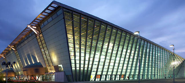 Lingotto Fiere, Torino Italy But Artissima, in Oval Lingotto Fiere, built to accommodate the 2006 Winter Olympic Games, is unabashedly beautiful—both the gorgeous Italians wandering the stalls and the gorgeous art hung inside them. Floor-to-ceiling glass is more palazzo than cathedral; made to impress humans, not gods... (more) Posted by Guest on November 26, 2014 at 19:21 | Comments (0) PermalinkSaturday 11.15.14 Kazumi Murose at Portland Japanese Garden 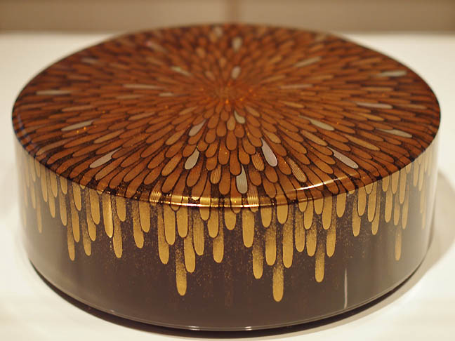 Kuzumi Murose "Hyakka" (one hundred flowers), 2012 (photo Jeff Jahn) It is your last weekend to catch it but Urushi: Masterpieces of Lacquerware featuring the work of Kazumi Murose is an exceptional reason to visit Portland's stunning Japanese Garden. The ice from the cold with the Fall colors are also auspiciously in full effect. Lacquer is an ancient and painstaking way to create incredibly strong yet delicate objects from the resin sap of sumac trees and Portland is lucky to have Kazumi Murose, a National Living Treasure of Japan. That designation is given to fifty craftpersons working in a medium with an ancient tradition in Japan... (more) Posted by Jeff Jahn on November 15, 2014 at 14:46 | Comments (0) PermalinkFriday 10.31.14 David Hockney's The Arrival of Spring 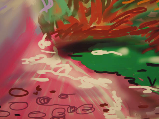
(detail) The Arrival of Spring in Woldgate, East Yorkshire in 2011 (photo Jeff Jahn) For painters interested in alternative methods there are a few must see hyper sensual shows in New York like Chris Ofili's Night and Day at the New Museum and the heavy weight Matisse Cut Outs at MoMA. Both present painters with a tantalizing ability to reinvent themselves but perhaps the most exciting reinvention exhibition is David Hockney's The Arrival of Spring at Pace, which ends this Saturday. 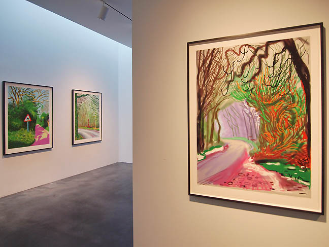 (at right) The Arrival of Spring in Woldgate, East Yorkshire in 2011 (at right) The Arrival of Spring in Woldgate, East Yorkshire in 2011
Consisting of prints made using an iPad, a 9 channel aggregate video and a series of drawing completed after Hockney suffered a mild stroke, all of the works depict a kind of homecoming as Woldgate is an ancient Roman road that Hockney first encountered at age 15. Posted by Jeff Jahn on October 31, 2014 at 7:04 | Comments (0) PermalinkThursday 10.16.14 Abigail Anne Newbold at PNCA's Feldman Gallery Portland's art scene is having a very strong month this October (mostly in painting and photography... much of the installation has been undercooked), but of all the shows the one that I keep returning to is Abigail Anne Newbold's installation, Borderlander's Outfitter at PNCA's Feldman Gallery.
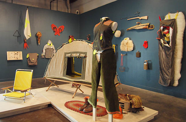 Borderlander's Outfitter The exhibition presents itself as a hipsterish quartermaster's gear dispensary or a tool library with an anthropological array of artifacts from a summer survival weekend in the project room. Everything is clothed in fairly recognizable purpose except that everything is a hair off. For example... (more) Posted by Jeff Jahn on October 16, 2014 at 15:18 | Comments (0) PermalinkWednesday 04.30.14 Andrea Geyer's Three Chants Modern at PICA 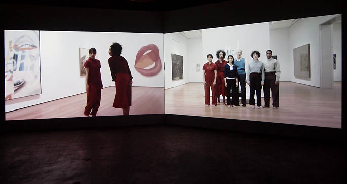 Three Chants Modern at PICA by Andrea Geyer (photos Jeff Jahn) Creation myths are revealing fabrications and contemporary art in America has one. Perhaps the most telling element of which can be summoned through asking the simple question, who started MoMA? … that crucial institution of the Twentieth Century, which both championed and contextualized modern and contemporary art? If queried many would say, “Alfred Barr Jr.” (MoMA's first director and architect of that first contextual framework) or Nelson Rockefeller (who put up the money) but it was his mother Abby and her compatriots Lillie P. Bliss and Mary Sullivan who conceived and chartered the idea, bringing everyone to the table. MoMA acknowledges this fact openly but without context it remains remote and abstracted in the minds of visitors and the world at large when they discuss the museum. Where is the context? In that absence, enter Andrea Geyer, whose research based art on display in Three Chants Modern at PICA is as much a seance that reconvenes the spirit of women at MoMA as it is a re-sequencing of the visitor's experience of the museum. Lucky for Portland, PICA is presenting the US premier of the work which consists of a photograph, an installation and a dual channel video. It is an important exhibition and it brings the current crisis at MoMA (perhaps the defining one of the institution) into sharp relief... (more) Posted by Jeff Jahn on April 30, 2014 at 16:41 | Comments (0) PermalinkSaturday 03.22.14 Anything but artifacts: John Brodie + F&D Cartier In the Twentieth Century artists started obsessing about the life of objects like no time in history. It was a confluence of ideas from the East like, Buddhism, Shintoism, Taoism and Tahitian etc.. as they mixed with emerging late 19th century European ideas around property and industrialization. It created an anxiousness within very distinct world views that made a sense of the avant-garde possible.
With Kandinsky there was a sense of active engagement with the viewer akin to music, Kurt Schwitters turned stuff into an environment, Picasso and Braque used collage and eventually Robert Rauschenberg created combines to made art out of anything (we can credit Dada and Arte Povera too). These developments lead to a heightened sense that some objects had an active life as a presence or art and some became a precious artifacts, both venerated and dead. Of course there are many shades of gray in between the two polarities of active object and artifact and Art can be found along all spectrums. For example Carol Bove has used shelving to make collections of books and photographs into presentations of artifacts as Art. Before her intervention the books are simply material objects that can be activated by reading them... but in her case the art making is a privileging veneration that makes them unavailable. 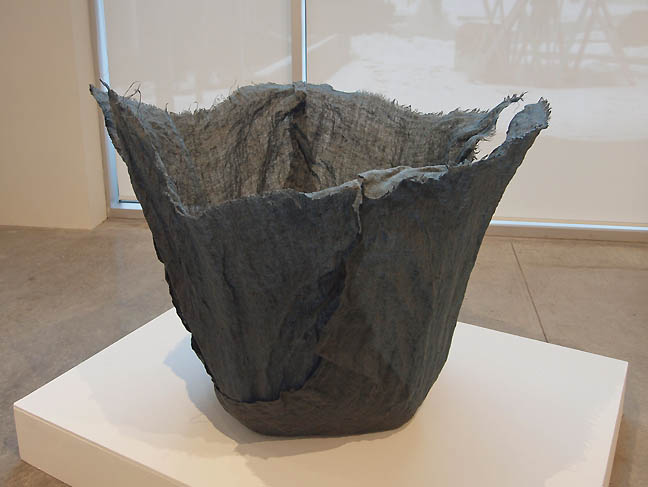 John Brodie's Blue Vessel at Linfield College This month, two exhibitions present a series compelling ruminations on art objects as artifacts and material with John Brodie's Versus Artifacts at Linfield College and F&D Carter's Wait and See at Blue Sky. 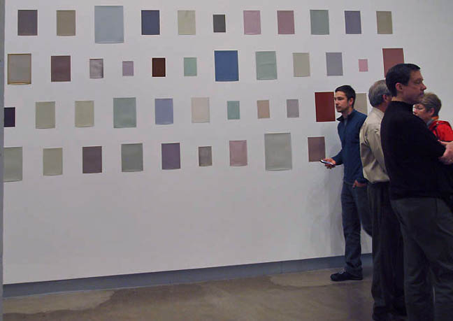 F&D Cartier's Wait and See at Blue Sky Artifacts are objects that acquire relevance, value and therefore protection over time, whereas art is authored by an artist. To play out that logic... (more) Posted by Jeff Jahn on March 22, 2014 at 1:09 | Comments (0) PermalinkWednesday 02.26.14 Terry Toedtemeier's Skies It has been a little over
five years since photographer and curator Terry Toedtemeier passed away and
though many of us still think about the man we haven't had much chance to take
in his full legacy as an important photographer. PDX Contemporary's current
show, Skies gives us all a tantalizing preview, which will lead up to a full retrospective
at the Tacoma Art Museum. Though the title Skies, might make one think first of
Stieglitz’s groundbreaking Equivalents series the show is more rooted in
landscape and in particular, the way Toedtemeier engaged other landscape photographers
as if they were part of the atmosphere in which he breathed as the Portland Art
Museum's curator of photography.
In fact, only one photo seems to be chiefly of the sky, which makes sense since Toedtemeier's photos are never just about the subject in view. Instead, they infer and reference the mechanisms of geology, art history and human nature as a part of nature... never separate. 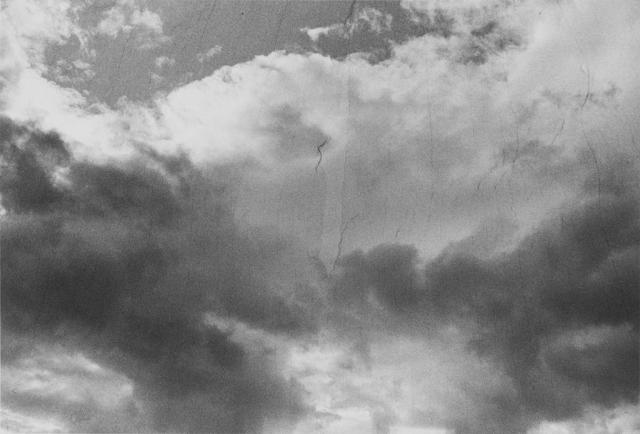 Untitled (Screen at Golf Course Near Hillsboro) Thus, the exhibition's standout image of "skies" as seen through the torn netting of a golf course isn't just that... I remember him describing the netting as like runs in fishnet stockings or film grain. The point being that the filters revealed the way points of pigment coalesce on our rods and cones, which are then reassembled as an image. In fact, it is a fantastic image... (more) Posted by Jeff Jahn on February 26, 2014 at 7:08 | Comments (0) PermalinkWednesday 01.15.14 Paul Clay's Leda and the Swan One of the most successful things about the embattled Portland Building is its art programming in the lobby. As one of the few spaces that specifically caters to multimedia installation art, it even supports the artists by providing a stipend for the work and has been instrumental in the careers of artists like Damien Gilley, Bruce Conkle and Laura Hughes. All found a way to engage the otherwise oppressed workers in this flawed office building and I'm a little surprised such spaces aren't more common considering the success of this program run by RACC (from 2002-3 I was on the selection committee) .
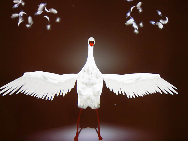 Leda and the Swan by Paul Clay at the Portland Building The latest exhibition, by interactive video artist Paul Clay, Leda and the Swan, deserves mention on that list of noteworthy new media artists as well... (more) Posted by Jeff Jahn on January 15, 2014 at 16:17 | Comments (0) PermalinkWednesday 01.01.14 Last Words: Portland's Visual Art Scene in 2013 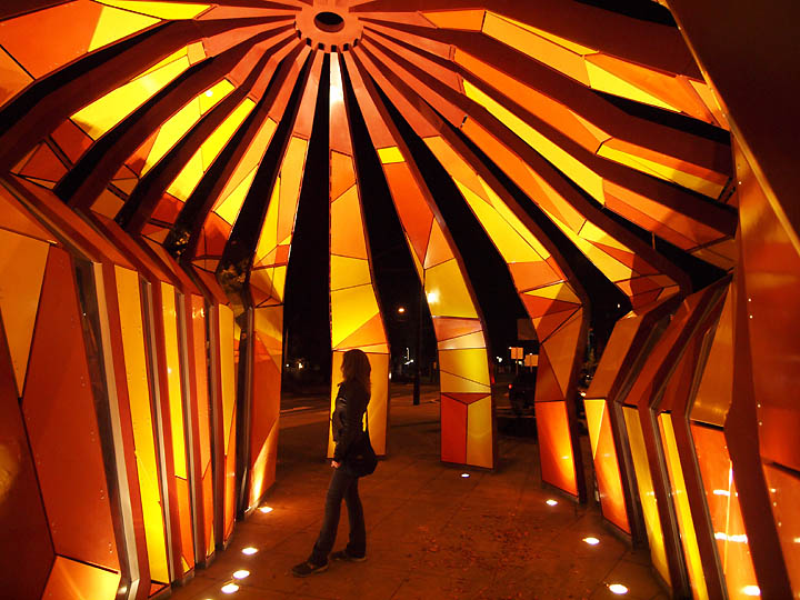 Jorge Pardo's Streetcar Stop for Portland (detail inside at night), Best Installation 2013 (all photos Jeff Jahn) Complacency is a state of mind that exists only in retrospective: it has to be shattered before being ascertained. -Vladimir Nabokov Portland's art scene was incredibly active in 2013 so I wouldn't describe it as year defined by complacency but like some aspects of 2012, specters at the institutional level still linger (mostly a divide between too much interest in old regional stereotypes to the exclusion of an immense influx of more varied and internationally relevant work). Still gains were made, such as when RACC changed their grant language to invite independent curatorial projects and new media to apply for project grants. The other fact is that Portland's living art scene still remains a meritocracy largely underinfluenced or spoiled by the art market. Since Portland is both small and hot in terms of international interest, complacency should be our chief area of concern. Do we support what we already know better than what challenges us? I counter that criticism is a cure for complacency, and by that I mean real criticism... not the kinds that merely flatter and reiterate artists statements as a kind of marketing for friends, community support and favored galleries or simple rants. I'm writing specifically about criticism that expands the discussion and illuminates the pressure points, right or wrong it matters not as long as there is informed intellect and integrity at work. Criticism will ruffle feathers (even when positive) and cannot be expected to go down any smoother than the visual art can be expected to. Practicing this type of criticism is an earned errand and 2014 marks my 15th year in the city.... (more) Posted by Jeff Jahn on January 01, 2014 at 18:45 | Comments (0) PermalinkTuesday 12.17.13 Ben Buswell at Upfor  Ben Buswell's We Live Only Through Ourselves Since Picasso and Braque's introduction of analytical cubism, followed later by Robert Smithson and today Doug Aitken, Josiah McElheny etc. , faceted images and the subsequent defraction or dislocation of experience have established themselves as important threads in contemporary art. To that pedigreed history add Ben Buswell's first Portland solo show at Upfor gallery, which mixes the artist's personal history with design and landscape as Smithsonesque crystalline objects... (more) Posted by Jeff Jahn on December 17, 2013 at 10:47 | Comments (0) PermalinkThursday 11.14.13 Sean Healy's Smudge at Pacific University 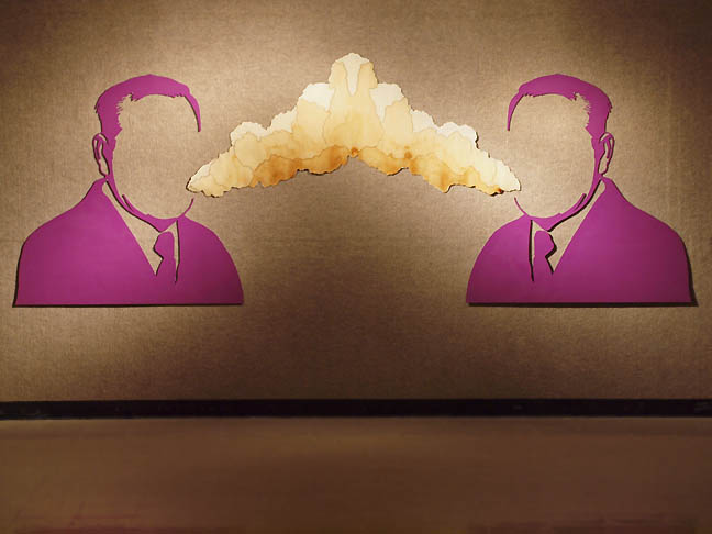
Sean Healy's Beer Breath It has been over 2 years since Oregon has been treated to a Sean Healy exhibition and Smudge, by virtue of the fact that it is a non-commercial show is perhaps the artist's most satisfying effort to date. With its smart graphic and material sensibilities that... (more) Posted by Jeff Jahn on November 14, 2013 at 13:36 | Comments (0) PermalinkWednesday 10.16.13 Brenna Murphy at Upfor Pattern is information. Whether it be; lace, proteins, cities, ceremonies, binary code, languages or maps of the internet, all have a crystalline organized structure to them. Patterns are used extensively in places of worship, military maneuvers, theaters, sporting events, dance clubs and other large public gathering spaces, employing recurring visual motifs to emphasize collective attention.
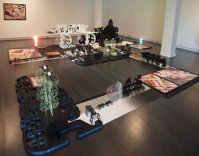
Brenna Murphy's Lattice~Face Parameter Chant Simply, our brains (and computers) are trained to recognize pattern and it is precisely why Brenna Murphy's Lattice~Face Parameter Chant at Upfor gallery is the most talked about show in town this month (beating out hefty competition from Chuck Close, The CNAA's, Dinh Q. Le and Josiah McElhney etc.). All of these are worthy shows but Murphy's is exquisite and a moment of revelation for the Portland art scene, which hasn't had a show like this in a commercial gallery since the much missed NAAU space shut its doors in 2012. 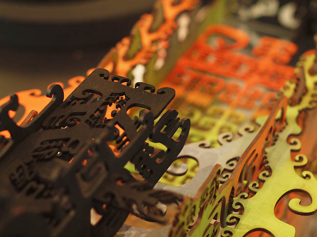
Why is it so interesting? Partly, it is because Murphy's anthropological gumbo of patterns gives nods to Mayan, Chinese and Navajo designs, mostly rendered by computers... simply resonates more with our times. We live in an age where everything has been reduced data and algorithms to process it. Conversely, one can also think of Murphy's installation as a labyrinth of access or a type of encryption as personal expression... (more) Posted by Jeff Jahn on October 16, 2013 at 4:51 | Comments (0) PermalinkSaturday 09.28.13 Different worlds, Eric Stotik and Alex Mackin Dolan Portland's art scene is full of schism's and divides (often generational) but
two artists from two completely different universes Eric
Stotik (a 1990's standout) and Alex
Mackin Dolan (a 2012 PNCA grad) happen to be exhibiting 7 blocks from one
another. To add some urgency, this is the last weekend for their shows.
As artists Stotik and Mackin Dolan's universes (circles of fellow artists, collectors, curators and critics) likely never intersect but what they each share is a hermetic zeal for their obsessions. Both are deep alchemists combining visual minutiae that seem to exist as as a kind of global existential unconscious. 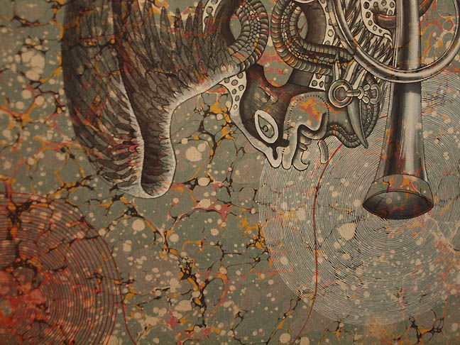 Eric Stotik, Untitled LR233 (bird, octopus, horn), 2013 (detail) 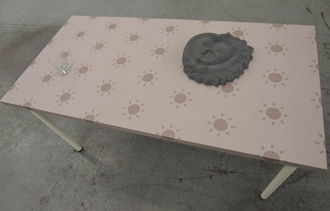 Alex Mackin Dolan's Sun Table Stotik works with the darkness and secrets which humanity keeps... Dolan with the existential sunshine of blotting out the world and turning to pursuits within. ...(more) Posted by Jeff Jahn on September 28, 2013 at 10:50 | Comments (0) PermalinkSaturday 08.31.13 Yoonhee Choi at Blackfish Most art today is very goal oriented... so much so that it discovers nothing so much as the outcome it proposed from the outset (which is usually a secret handshake for some subculture acceptance rather than a personal exploration). In short it "belongs" to a discreet discussion or group rather than extend its orbit and relevance. This is a narrowing of Art's capabilities, which is a parochialism and I find it too linear. It is just too predicated upon finding or attracting an defined audience or peer group (which has already been isolated by much more savvy marketers in the non art world). Whereas, the truly great stuff just sits outside the standard definitions and doesn't need to draw a crowd. It is neither trying to be professional, nor is it fitting in... it simply persists in its exceptionalism. Besides, the problem with goals is that they typically shut down the process right when it could become interesting and unanticipated. In short, to quote the late Robert Hughes art should be an avocation not a vocation.
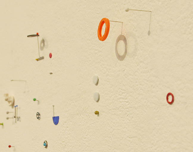
Mooring (detail) In contrast to the parochials, Yoonhee Choi is an artist who is all about distilling the immediacy of the moment with a kind of designer's shorthand. It is stripped down with an elegant urgency and as such her work is a sensitive instrument of the present... (more) Posted by Jeff Jahn on August 31, 2013 at 11:03 | Comments (0) PermalinkSaturday 05.18.13 Folkert de Jong at Portland Art Museum 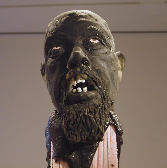 Detail of Folkert de Jong's Operation Harmony (all photos Jeff Jahn) Believe it or not, the edgiest exhibition in the city of roses is at the Portland Art Museum. For the record this does happen from time to time and the exhibition in question by Dutch artist Folkert de Jong in the Miller-Meigs series space at PAM definitely eludes most easy definitions. With its mutilated bodies, whimsical materials and Dutch post colonial conceits, I'm still uncertain if I find it disturbingly provocative or yet another over-calculated international art farce, strategically designed to titillate and disgust? Ah, but such is the... (more) Posted by Jeff Jahn on May 18, 2013 at 14:22 | Comments (0) PermalinkMonday 04.08.13 Thoughts on Brian Ferriso's tenure at PAM and talk at Jimmy Mac's Tonight 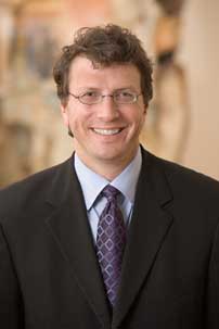 PAM's Executive Director Brian Ferriso Tonight, Randy Gragg will interview Brian Ferriso, the Portland Art Museum's Executive Director at Jimmy Mac's at 6:00PM. Here is a primer packed with a few things nobody else is likely to address: Now in his 7th year, Ferriso is basically priming Portland for what could be considered the final stage of his steady but important reshaping of PAM from a rambling and pragmatic program and collection based on the gilded Francophile blockbusters of his predecessor to one based on the best museum practices with an eye for historical relevance. With a series of excellent hires in the curatorial and education departments and several not so sexy but very important endowment building initiatives (like endowing curatorial positions)... Ferriso has transformed PAM from a constantly reshuffled house of cards to one that plays its hand like the house should, conservatively and consistently. Ferriso has given Portland's cultural flagship an even keel and the ability to avoid icebergs. Yes, he charted a course through a minefield when the economy went off a cliff in 2008! He's also been the justifying force behind contemporary and modern exhibitions like China Design Now, Disqueted, Carrie Mae Weems, "dossier shows" like last year's Flesh and Bone (culled from the permanent collection)as well as the most important exhibition in the last 50 years for the Museum and last year's homecoming Mark Rothko exhibition. The Rothko show was especially important as even those who had been somewhat unimpressed with PAM walked away thinking... "that was major, good job!" I heard those words over and over again from other Portland art scene insiders. He also oversaw a tremendous image and programmatic makeover that is much more contemporary. Last but not least, Ferriso has made it a priority to find free days at the museum. Overall, Id give him an A- (possibly an A if he can do a great expansion, which will require a lot of donor education, a great director needs great patrons) ... and he will be courted by other museums in the years to come. I predict he will be director of LACMA, Hirschhorn, Art Institute of Chicago or the Fine Arts Museums of San Francisco eventually. The guy is THAT good and we should support his vision of seriousness for PAM and Portland. He's both honest and pragmatic, refreshingly he is smart enough to recognize an important truth when it crosses his path. He is a good listener and only clears his throat when he has something important to say. Still Ferriso's job is not complete and he is one of those very rare museum directors who actually acknowledges where work needs to be done. Here is a review of his first year in office and here is a current to do list: ...(more after the jump) Brian Ferriso: Bright Lights Discussion April 8th | 6:00 PM (Doors at 5:30, free but get yourself a drink or a snack) Jimmy Mac's | 221 NW 10th Posted by Jeff Jahn on April 08, 2013 at 11:57 | Comments (0) PermalinkMonday 04.01.13 Paula Rebsom's Threshold at Marylhurst 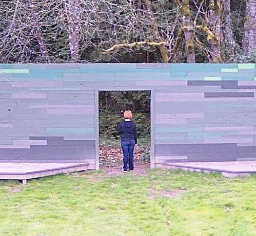 Detail of Paula Rebsom's THRESHOLD There is a group of often Portland based artists who are all interested in the way design reveals the animal quotient in viewers. It is an art of interlocution, where design language is bait and therefore the presence of man directs and distills the gaze into a simultaneously concentrated and shattered perception. It is related to design, minimalism, technology and the light & space movement... One of the most interesting recent projects within this genre is Paula Rebsom's THRESHOLD: Surveying the Domestic Wild recently installed on the Marylhurst University campus and funded by RACC. The work consists of a porch-like terraced 50 ft green wall with viewing slits and one doorway situated on the edge of the quad and the woods behind. It uses the design language of both a hunting blind, digital pixels(to signify surveillance) and a back yard patio... (more) Posted by Jeff Jahn on April 01, 2013 at 13:20 | Comments (0) PermalinkThursday 03.21.13 Stephen Scott Smith's SEEYOUYOUSEE 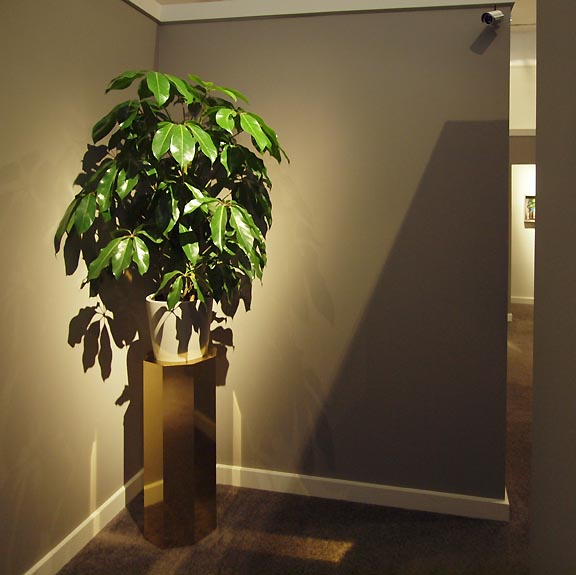 Stephen Scott Smith at Breeze Block is a maze of glimpses This month Stephen Scott Smith definitely wins the prize for ambition and immersive follow-through for his solo show SEEYOUYOUSEE at Breeze Block Gallery. Years ago Smith caught PORT's attention for his Matthew Barney tinged spectacle but this show certainly ups the ante production wise by installing a Kubrickian maze of suburban lobby-like interstitial spaces within the gallery over a 2 month period. At first SEEYOUYOUSEE seems like a test of one's navigational skills but each turn only rewards the viewer with constant surveillance and sheetrock-enforced constriction... (more) Posted by Jeff Jahn on March 21, 2013 at 12:29 | Comments (0) PermalinkWednesday 02.27.13 Derek Bourcier's More Doubt and Wonder at PSU's Littman Gallery Tomorrow, February 28th is the last day for an intriguing debut for Portland artist Derek Bourcier, he's also giving an artists talk with coffee from 1-2PM at PSU's Littman Gallery. The fact that a coffee chat gets such high billing here is in keeping with Bourcier's sly self-deprecating slight of hand, evident in most of the works.
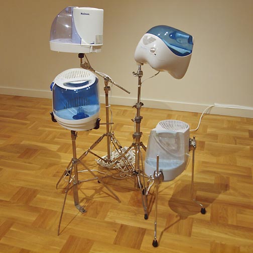 Derek Bourcier's Mr. Lonely Take for instance the most visually arresting piece in the show, "Mr. Lonely." Consisting of several humidifiers mounted on drum hardware and humidity from a basement room it is a fairly frank paean to frustrated male ambitions. It has its roots in the work of Charles Ray whose pathos is disarming while it's grandaddy Marcel Duchamp made found objects legit. I'd even be willing to label this run of the mill immature navel gazing designed to amuse art school friends if it weren't very common for young men in their 30's or older to be forced to move back in with their families in this sluggish economy. The effect is soul crushing and I've known a few such men who chose to die at their own hands rather than endure that situation. ...(more) Posted by Jeff Jahn on February 27, 2013 at 22:02 | Comments (0) PermalinkSunday 02.03.13 What Can Sigmar Polke Teach Us? 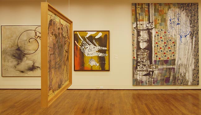 Works by Sigmar Polke from the Nicolas Berggruen Charitable Trust (L to R) Providentia-Schleife (1986), Untitled (1989), Druckfehler (1986), Lumpy Hinter dem Ofen (1983), Untitled (1983), photo Jeff Jahn by Victor Maldonado Today, February 3rd, 2013 is your last opportunity to view eight wall works and one suspended work by legendary German Pop artist Sigmar Polke at the Portland Art Museum. The suspended work, Untitled (1989), is a mixed media on synthetic fabric double-sided masterpiece, singular in nature and unlike any of the output from America's Pop-fathers, Rauschenberg and Johns, of whom Polke was an early adopter. Perhaps Warhol's serial approach to screen printed pictures also echos in this exhibit but it is the hand-made nature of these nine pieces that imbues them with a sense of lasting power. ...(more) Posted by Victor Maldonado on February 03, 2013 at 12:08 | Comments (0) PermalinkMonday 12.31.12 Looking back at 2012: best and worst 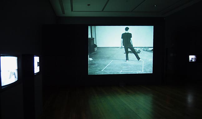 Bruce Nauman, Basements at Reed College, (far left) Wall-Floor Positions, 1968, (large center) Dance or Exercise on the Perimeter of a Square (Square Dance) 1967-68 (photo Jeff Jahn) 2012 held what was perhaps the highest quality collection of exhibitions in Portland's history... partly because most of the major institutions really stepped up their game when it came presenting major artists (since when does Portland ever have 2 Bruce Nauman shows in one year?)... while the very vital street level contemporary scene added a great deal of new intrigue and conceptual rigor to the mix. I also penned an Op Ed in the Tribune about Portland's current cultural prominence and how to keep that momentum going. Still, there is a schism between Portland's most cutting edge artists and its top tier institutions/awards who seem more comfortable with mid-late career and academic concerns than challenging/interesting art with a fine edge (the kind that most professors have trouble keeping). (... much more with; Rothko, Nauman, Kelley, Arnold, Cornaro, Schenk, Thompson etc...) Posted by Jeff Jahn on December 31, 2012 at 21:11 | Comments (0) PermalinkMonday 12.17.12 Fighting Men at Lewis and Clark 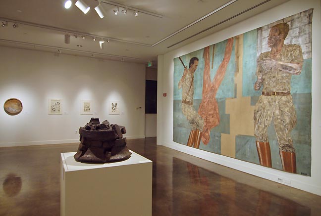
Fighting Men, (Foreground L to R) Peter Voulkos Untitled ice bucket 1998 and Leon Golub Interrogation I (2), 1980-81, Acrylic on linen, 120 x 176 inches, The Broad Art Foundation, Santa Monica, Art (c) Estate of Leon Golub/Licensed by VAGA, New York, NY, (Background L to R) Voulkos, Kirby, Kirby and Kirby (photo Jeff Jahn) At first glance, Fighting Men at Lewis & Clark College's Hoffman Gallery appears to be an amalgamation of modernist ideals, the ruptured functionality of ceramics seen in the work of Peter Voulkos, the futurism of the early comic books of Jack Kirby, and the eerie, abstract depictions of war in the paintings Leon Golub. However, the three distinct bodies of work play off and compliment each other by building dialogues around dissent, power, violence, masculinity, and authority. An overarching power struggle between the work is what brings this exhibition to life.... (more) Posted by Drew Lenihan on December 17, 2012 at 1:57 | Comments (1) PermalinkTuesday 12.11.12 That's a negative?  The critic Robert Hughes, who died at age 74 earlier this year. Most artists completely misunderstand criticism and the motivations of critics... especially the ones who try their hand at criticism themselves (usually to flatter friends and potential friends). Usually, the flatterers stop somewhere between 6 months and 2 years because they begin to understand or feel the blowback. Basically, criticism is a benchmark and a vantage point for a certain type of perceived understanding. Academicians (as opposed to intellectuals) like to describe a crisis in criticism... which is a paper tiger fabrication. Criticism is crisis. It thrives on being on the edge of relevance and the inane because it helps sharpen the delineation between the two. A good critic writes negative reviews and even takes issue with aspects of shows they like. The Huffington Post just did a list of their favorite negative lines from 2012. The HuffPo's list is ok but I much prefer this one: Roberta Smith on the Met's Cloud City "It can be interesting to read about Mr. Saraceno's art, especially the incredible effort involved in realizing it, but as you read quotations from his highly knowledgeable, skilled, enthusiastic collaborators, the works also assume a too-big-to-fail aspect. Too many people enjoy working on, bouncing on and navigating these things. They must be good." How about PORT? Here's a key bit from Amy's critical review of Interior Margins: "The direction of the reader's attention to the artists' body is a reason to give pause. How exactly do they "enact the female body?" What "swelling forms" exist within this exhibition? Perhaps Judy Cooke's graphic black shapes could be seen as "swelling," but this is a stretch. The language is almost strange, irrelevant sounding. If this was a group of male abstractionists, no such reference to the artists' bodies would have been made at all. It is almost as if the celebration of the rarity of female artists working in an abstract vernacular gives allowance to highlight the physicality of being female. The impetus for these abstractionists does not visibly have to do with being female. This is not an exhibition concerned with gender identity. These artists are dealing with ideas of material and language, existential philosophies, and meanings of process- as so many artists who make abstract work do. The fact that these artists are female is an exciting reason as any to have a show; it is simply that the show's statement seems to deflate the intellectual aspect of this experience somewhat and replace it with the body. It is misleading. The interesting aspect of the female part of it is to see the continuation and variety of the tradition of women making abstract objects and images and to gather them together to see what is happening now. This is the essence of Interior Margins. What is feminine about the show is indefinable, perhaps because femininity itself is indefinable. Yet then again, so is personhood. There is an eloquence to the show, an essence of tactility, and an utter lack of violence. There is a thoughtful measure and a graceful formal consideration that is clear and well designed." In Portland only PORT had the will to critique a somewhat polite show for what it was, interesting but missing key components of the discussion. It is completely constructive by being less than purely celebratory. ...(More, including Joe Macca + Gary Robbins and Travis Fitzgerald) Posted by Jeff Jahn on December 11, 2012 at 11:33 | Comments (0) PermalinkThursday 12.06.12 A Seat At The Table? Considering Soft Power: MK Guth and Mark Smith "Only through art can we emerge from ourselves and know what another person sees" -Marcel Proust
Proust is utterly wrong with that quote of course, but it is a sentiment of yearning and perhaps a tad religious one at that. Instead, Art tends to be as subjective as anything else... though visiting someone's home or having a meal together is a kind of shared experience that is similar to looking at art or a performance together. In fact, all meals are performances and there is a power in such communion. The point being that art doesn't have any special authority, only that it has license to make unexpected demands on those that experience it. Sometime between the time of Lascaux and Titian though, art experiences became increasingly elitist and about projecting power. This was the hard power of class authority or social station. Georges de La Tour, Porridge Eaters (1625) In the 1600's a painter by the name of Georges de La Tour broke from the traditional baroque painting subjects like academic history scenes (history through the lens of those in power) and patron portraits to focus on genre scenes of commoners at work and play. Rather than using the image to project authority or hard power in an icon it projected a pervasive or soft power of secular domestic life and simple everyday pursuits. ...(more) Posted by Jeff Jahn on December 06, 2012 at 13:17 | Comments (0) PermalinkWednesday 10.24.12 Cumulus at Northview Gallery 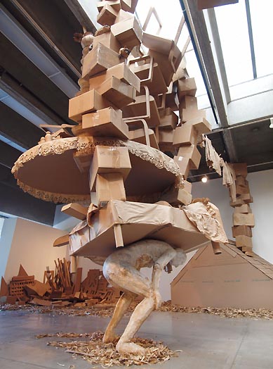
Vicky Lynn Wilson's Cumulus at PCC Sylvania's Northview Gallery (all photos Jeff Jahn) October 2012 might go down as one of the best months in the history of the Portland art scene with strong solo shows from; Sigmar Polke, Kara Walker, Corey Arnold, Francis Celentano, MK Guth, Marie Watt, Linda Hutchins, Wid Chambers, Victor Maldonado, Photographer Hal, Daniel Heffernan, Jordan Tull, Isabelle Cornaro and Vicky Lynn Wilson that everyone should see if they haven't already (most end in the coming days). Although PCC Sylvania is somewhat of a special trek, Vicky Lynn Wilson's Cumulus at the Northview Gallery is arguably the most extensive effort this month... (more) Posted by Jeff Jahn on October 24, 2012 at 13:24 | Comments (0) PermalinkFriday 10.19.12 Flesh & Bone at PAM 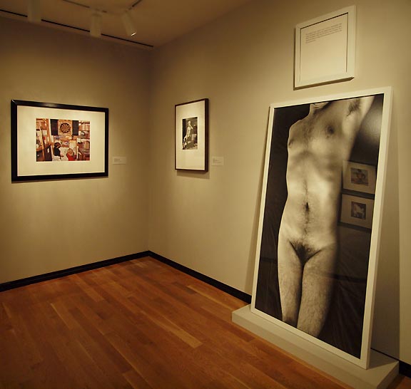 Install view of Flesh & Bone at Portland Art Museum (on right) Sophie Calle, Autobiographies/Amnesia On loan from the British Museum, the Body Beautiful show at Portland Art Museum is creating quite a buzz with its strong classical greek depictions of the human form in sculpture, jewelry, and idols. But don't forget to see PAM's complementary showing of photography examining the body, Flesh & Bone. Pulled from PAM's permanent collection, this group of images explores the potential of the body as a site of expression in modern and contemporary photography and spans three rooms on the second floor of PAM's Jubitz Center. ...(more) Posted by Drew Lenihan on October 19, 2012 at 10:35 | Comments (0) PermalinkThursday 10.11.12 Changes | Happy Birthday: A Celebration of Chance and Listening at PNCA's Feldman Gallery 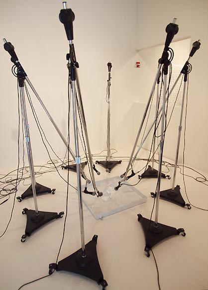 Paul Kos, Sound of Ice Melting (photo Jeff Jahn) I re-learned the coin arrangements of the I Ching just for this exhibition. In that it is a birthday celebration, I thought I'd bring an appropriate gift: (more) Posted by Patrick Collier on October 11, 2012 at 12:55 | Comments (0) PermalinkMonday 09.24.12 Isabelle Cornaro at PICA's TBA Festival 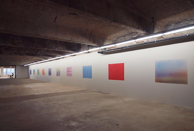 Isabelle Cornaro's Reproductions (all photos Jeff Jahn) Of all the Time Based Art festival's visual art offerings under the End Things umbrella, Isabelle Cornaro's large scale solo show comes off as the most satisfying, probing and relevant to the curatorial theme this year. Perhaps it is because the Washington High School venue just feels inherently didactic or full of provisional festival strategies, but it is also because Cornaro's very large and sustained exhibition at PICA's downtown headquarters is so wholly consumed with zen-like circular logic... which I'd argue is the real theme of the End Things suite of shows. In fact, all of the process oriented exhibitions explore how objects don't really have a beginning or an end as much as a moment of inertia in the mind of the viewer. ... (more) Posted by Jeff Jahn on September 24, 2012 at 18:40 | Comments (1) PermalinkThursday 09.13.12 The Tharp Effect: figuring Tharp, Fidler and Wall 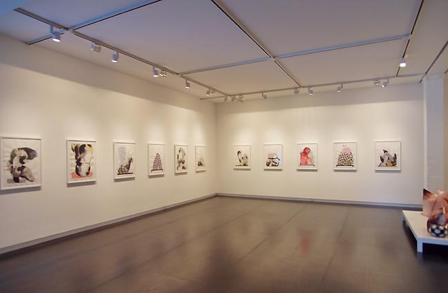 Installation view of Storm Tharp's Holding a Peach (works on paper) All photos Jeff Jahn Over the years, certain artists make technical and conceptual breakthroughs that connect so profoundly with others that it opens career possibilities for other practitioners with even tertiary similarities. I call it the boat and the wake. Coincidentally, the wake gives an indication of the speed and draft of the boat. Historically there have been boats like Claude Monet's Haystacks, Matisse's Fauvist paintings, Picasso and Braque with Cubism, Warhols soup cans, Jackson Pollock's action painting, Judd's 1964 solo show, Andreas Gursky's photographs and the Royal Art Lodge's dark little cartoons on paper. All of which ushered in new eras of appreciation and collecting patterns. In 2007 Storm Tharp had his breakthrough show We Appeal to Heaven (which I was inspired to write the defining review for... 5 years later it still gets a lot of traffic). At that time figurative works on paper were already common due to the Royal Art Lodge's own boat effect but Tharp's show did something different than their more illustration driven work. Tharp's show went from cartoons to portraits and seemed to encapsulate the fragile fiction that is mortality without being an illustration and wet on wet techniques were part of it. ... (more) Posted by Jeff Jahn on September 13, 2012 at 16:06 | Comments (0) PermalinkWednesday 08.08.12 Remote Events and Vanished Objects at PSU 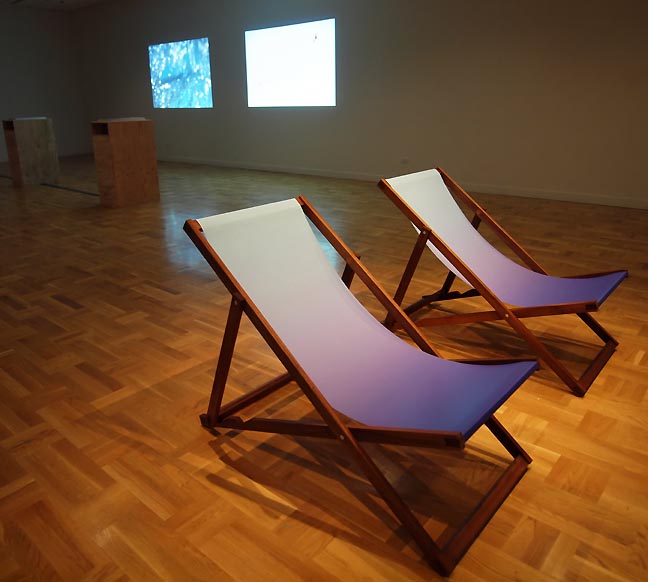
Remote Events and Vanished Objects (Installation View) This year, the Portland art scene's summer season is populated with many surprisingly tepid group shows yet somehow, Kyle Thompson and Caitlin Ducey's Remote Events and Vanished Objects at PSU harnesses the Northern Hemisphere's sunny season and bonheur de vivre with panache. The fact that everything on display seems emotionally distant and or actually directing our attention towards a place unknown and far away only re-emphasizes its sense that the gallery goer should be planning what to do when they get back outside into the sun and it is this existential negation of the gallery's built environment that makes this show stand out. Sparse and visually rewarding, the installation at Portland State University's Littman Gallery judiciously allows each artist to provide only two pieces, then symmetrically pairs... (more) Posted by Jeff Jahn on August 08, 2012 at 16:35 | Comments (0) PermalinkTuesday 07.10.12 Let's Get Physical: a kinesthetic aesthetic at Place 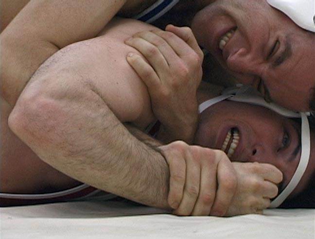
Type A's Dance The widely accepted notion, at least among self-professed artists, is that life is art. And, if that is so, then it magically follows that everyone is an artist, which I'd be happy to embrace if making art was not such a struggle with that as the intended goal. The life of an artist is one of sacrifice. Art about struggle, whether emotional or political, even as performance... well, it's still art... (more) Posted by Patrick Collier on July 10, 2012 at 21:33 | Comments (0) PermalinkThursday 06.21.12 Chase Baido's Enter: The Troll at PSU  Chase Baido's Enter The Troll at PSU's AB lobby gallery Every year a hoard of recent graduates is unleashed upon the art world and about 90% of them use one of these hackneyed strategies for their thesis exhibitions; some sort of mattress, raw wood or plywood, something about masturbation, people standing uncomfortably in their underwear or in the nude, crystals, some sod transported to a gallery or some very standard feminist critique. This year is no exception... (more) Posted by Jeff Jahn on June 21, 2012 at 10:27 | Comments (0) PermalinkThursday 06.14.12 Mike Kelley at the Portland Art Museum 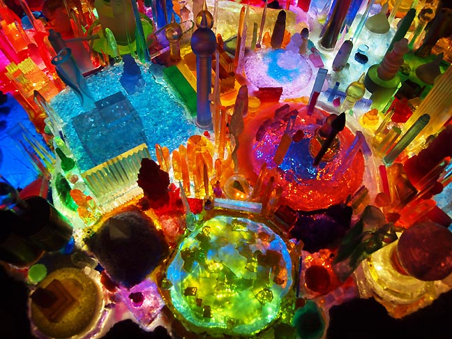
Detail of Mike Kelley's City 0000 (2009-2011), all works lent by Nicolas Berggruen Charitable Trust (all photos Jeff Jahn) There are some artists whose work always seems to exist out of time because it deals in themes drawn from a past that never really seems to leave us, namely the roots of civilization and the nostalgic sense of the individual moving within its matrix of hierarchies and permissions. This is a special class of artist, ones who engage the world almost as if they are cultural anthropologists, often through personal source material. Mike Kelley was such an artist and similar to Cy Twombly his work always seemed to be a humanistic island unto itself and difficult to place in an art historical lexicon that even today is still driven by timelines and trendy stylistic arbitrage. Instead, with Kelley there was always a persistent melancholy, melded with childhood ideals and notions of adult normalcy and transgression, all suffused with a strong Catholic upbringing whose traditions of syncretism... (more) Posted by Jeff Jahn on June 14, 2012 at 17:14 | Comments (0) PermalinkThursday 05.24.12 Rumblings for EFF at Gallery Homeland I've always liked the video installation art shows that the Portland Experimental Film Festival has done each year because there is nothing like a big dark crowded room full of video screens and projections. This year is no exception and though nothing strikes me a particularly outstanding this effort put on by Gallery Homeland and Grand Detour is very solid affair.
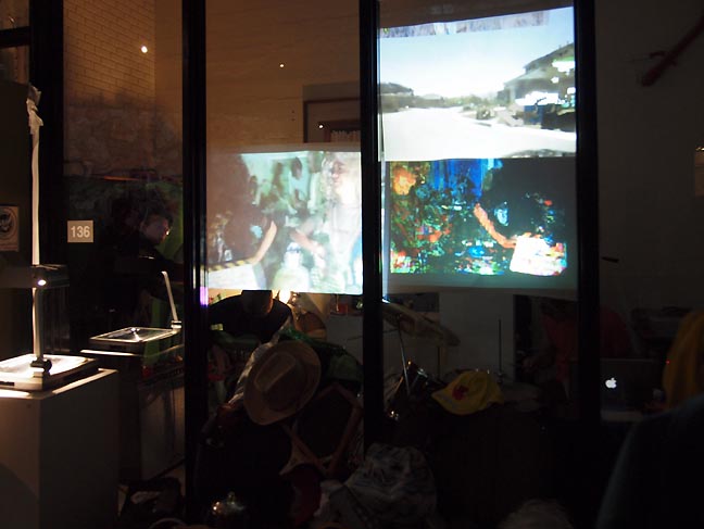 Wierd Fiction performing at Rumblings What's more it has all the frenetic yet soldid energy everyone seemed to want from the 2011 Contemporary Northwest Art Awards and the Portland2012... but did not get. What's more with a bag of Bollywood (chutney flavored) popcorn this show delivered the kind of festival atmosphere/art that larger scale art scene's like Portland require (17,000+ artists last I heard) of its institutions. It is a kind of social "get out of the studio" mixer that such rambling group shows become venues for. Here are some thoughts: ...(more) Posted by Jeff Jahn on May 24, 2012 at 12:53 | Comments (1) PermalinkWednesday 05.16.12 Heidi Schwegler's The Known World at Chambers 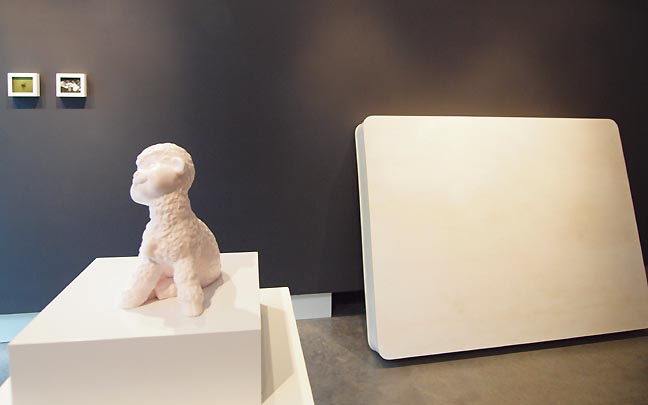 Heidi Schwegler's This is You (FG), (BG right) Popular Delusion "He did not think of himself as a tourist; he was a traveler. The difference is partly one of time, he would explain. Whereas the tourist generally hurries back home at the end of a few weeks or months, the traveler, belonging no more to one place than the next, moves slowly, over periods of years, from one part of the earth to another. Indeed, he would have found it difficult to tell, among the many places he had lived, precisely where it was he felt most at home." Paul Bowles, The Sheltering Sky That passage from the Sheltering Sky remains the penultimate dissection of the varied perceptual vortex of travel. It also provides a good deal of insight into Heidi Schwegler's purposefully disconnected solo show The Known World at Chambers 916. All of which is is poetic because it marks her return to the Pearl District after a long silent period and then a series of uneven non profit exhibitions. I've been watching her closely since she was the star of the 1999 Oregon Biennial... (more) Posted by Jeff Jahn on May 16, 2012 at 22:23 | Comments (0) PermalinkTuesday 05.01.12 Among Friends; Joe Macca's Two Man Show at Marylhurst's Art Gym 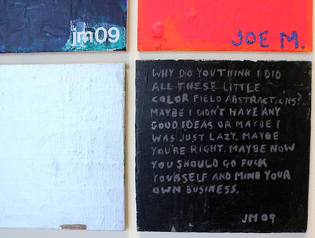
If one were to take the two Cs in Joe Macca's last name, rotate them clockwise 90 degrees and smoosh them together, his name might then read as "Joe Mama," calling to mind the type of joke that relies on tasteless creativity in pursuit of one-upmanship. Stupid, ugly, poor, fat, or any other derogatory term these slams are built around, in the wrong setting are fightin' words. But these jokes don't always lead to violence. In organized "Yo Mama" contests, opponents compete to see who can come up with the vilest yet creative analogy. An agreement among like-minded practitioners to participate implies camaraderie and the understanding that by engaging in the activity, one must endure the abuse along with the risk that an element of truth lays therein. And even though brashness counts, if the teller of the joke fails in delivery or creativity, that would-be comedian then becomes the object of ridicule... (more) Posted by Patrick Collier on May 01, 2012 at 21:02 | Comments (0) PermalinkFriday 04.27.12 Richard Milgrim and Hiroshi Senju at the Portland Japanese Garden 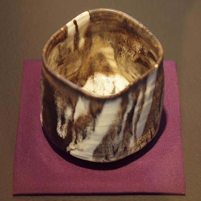 Richard Milgrim, Canyon, (Konko-Gama 2004) photo Jeff Jahn Currently, the Portland Japanese Garden is hosting a fantastic dual exhibition, Meditative Moments, consisting of noted Chado (Japanese tea ceremony) ceramicist Richard Milgrim's works along with paintings by “waterfall artist” Hiroshi Senju. It is an inspired pairing. Milgrim is in fact the first and only non Japanese Master Chado ceramicist and though this practice is by definition “traditional” (often a pejorative in the West not so in the East) this is indeed a working and evolving tradition of which Milgrim is one of its chief innovators. Because Chado ceramics are an inherently Zen practice, his unique East meets West approach (with studios in Kyoto and Concord Massachusetts) suffuses everything from his penchant for dark brown (traditional Japanese) and creamy white glazes (his primary glaze in the USA). Both glazes being very similar to his dark hair and light skin to the way his name “Richard” translates to with a pictogram of Sen no Rikyu the founder figure of Chado. Similarly Zen in coincidence, I was honored to be given a chance personal tour, concluding with sharing tea with Milgrim (prepared by his wife)... (more) Posted by Jeff Jahn on April 27, 2012 at 14:40 | Comments (0) PermalinkSaturday 03.10.12 Vastness: Joe Thurston and Arcy Douglass 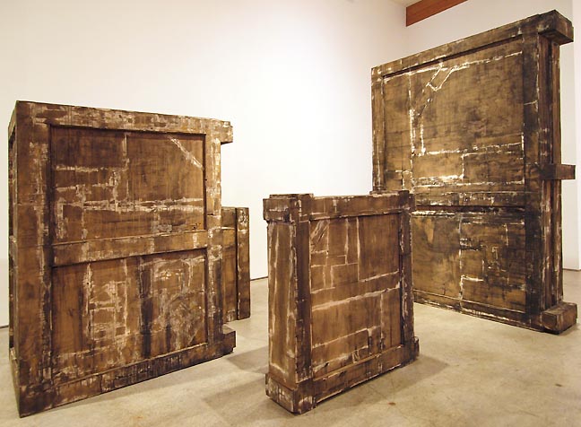 Joe Thurston's Nothing Leading Anywhere Any More Except to Nothing (photo Jeff Jahn) In this month of Rothko's vast personal spaces populated by nothing but color and texture two current Portland artists, Joe Thurston and Arcy Douglass have also found a way to tap into a related sense of the endless. In fact, they are two of the most convincing solo shows by living Portland artists in recent memory. Yes, people make a big deal of group shows, mostly as a kind of social event but it is solo shows such as these, which ultimately determine who is who. In this case both Thurston and Douglass, though in different places in their career have shown themselves to be A-listers who conceive and execute in a relentless way that a lot of academics simply cannot. For living Portland artists they constitute the best two shows up in March... nothing else is even close... (more) 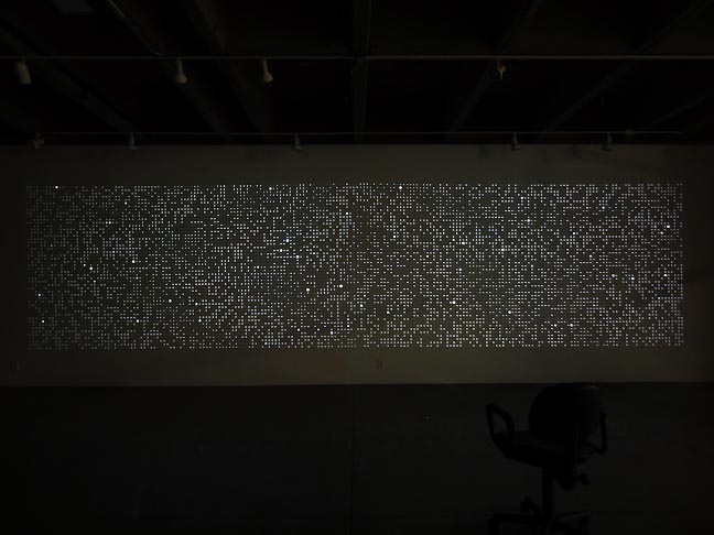 Arcy Douglass' Ten Thousand Things at PCC Sylvania Posted by Jeff Jahn on March 10, 2012 at 19:48 | Comments (0) PermalinkThursday 02.16.12 Trickle down inspiration: the economy of Bruce Nauman's Basements at Cooley Gallery 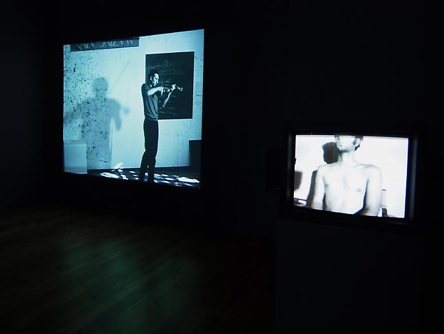 (left) Violin Film #1 (Playing the Violin as Fast as I Can) 1967-68, (right) Flesh to White to Black to Flesh, 1968 (photo Jeff Jahn) As I entered the Reed College library, I could see a woman sitting in the foyer of Cooley Gallery. She waved me around through the library check-out area and stood as I approached. “Welcome to Cooley Gallery!” I did feel welcomed, entered into the darkened space, and was pleasantly surprised to see that there were several works on display. I would also like to mention the sounds that greeted me, even though that will lead me astray of my thesis. Let me just say that it was a pleasant cacophony, not inappropriate to the time these pieces were made, that is, when John Cage was showing us how to listen to sounds anew. (Or, for that matter, the movement in some of the videos appreciated because of Cunningham’s innovative ideas about choreography.) My sentiment, if it can be called that, would be parenthetical were it not for the relative place Nauman holds in the overall history of art, and specifically in regards to film and video performance work, And, as with Setting a Good Corner, I was, metaphorically speaking, at home. Nevermind that the title for this exhibition is Basements and my studio is in my basement, or that these pieces contain what become ritualized activities and that I burn incense while I work. No, these similarities are too simplistic. I felt I knew his mind, meaning that there is a point in the very early stages of a creative process where one says to oneself, “Do anything. Build from there.” Busy, busy, busy are these pieces; but merely busy work made into art? No, they are purposeful, even if the points of some are elusive... (more) Posted by Patrick Collier on February 16, 2012 at 7:02 | Comments (1) PermalinkTuesday 02.14.12 Travis Fitzgerald and Gary Robbins at 12128 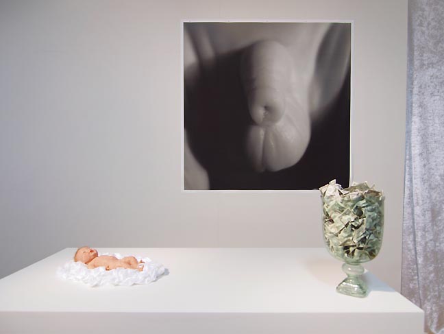
if it is a crown it means it belongs to a king at 12128 New births are the most portentous of all events in humanity. Socially the child is considered completely innocent, for both the first and last time in their life. The child's potential is impossible to gauge and the pride of the parents along with the effusive adoration from others is unassailably justified... (more) Posted by Jeff Jahn on February 14, 2012 at 22:26 | Comments (0) PermalinkWednesday 01.25.12 Interior Margins: A Question of Language 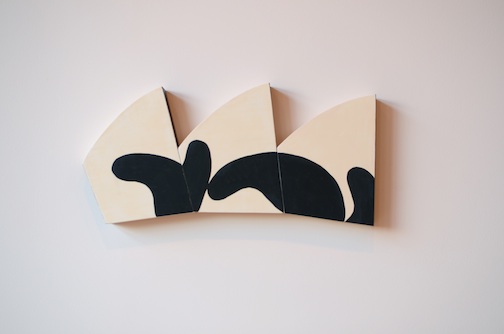 "Animal", Judy Cooke, 2011 There are just three short days left to see the exhibition Interior Margins at the Lumber Room. Granted, this is not much time to observe and ponder the abstract experiments of the artists exhibiting therein, but to miss the questions posed by this eloquent exhibition entirely would be quite a loss. As one of the newer exhibition spaces to Portland, the Lumber Room is a fantastic addition, enriched by a live-in residency program that is on display as part of the gallery. . .(more) Posted by Amy Bernstein on January 25, 2012 at 7:31 | Comments (0) PermalinkTuesday 01.17.12 Memory and Anonymous I've made no secret that I'm a little tired of the curatorial crutch of installing grayscale work (photography exempt of course) but two shows this month, titled Memory and Anonymous explore both the reasons for my antipathy and a secret appreciation for the underlying aesthetic. These conflicted feelings are interesting as less colorful shows always seem to be both an easily achieved form of elegance and a well worn road to generic accessibility.
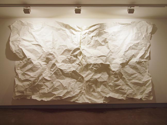 Memory First off is Memory by Jerry Mayer and Ellen George at the Nine Gallery. Extremely simple and elegant the show consists of one large sheet of paper that has been folded and unfolded so much that it resembles a topographic map of the Himalayas. This is riffing on the trope of art as palimpsest as the paper records the wear and... (more) Posted by Jeff Jahn on January 17, 2012 at 16:41 | Comments (0) PermalinkSaturday 12.31.11 2011 in the rear view mirror 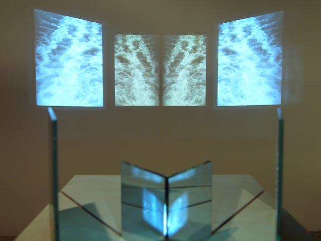 Kyle Thompson, I Hate The Sound of Guitars A: No Survivors at Recess (photo Jeff Jahn) 2011 was an interesting year that saw a lot of strong shows in the numerous university galleries and a bunch of new artists to watch. In many ways though it lacked 2010's punch (much missed were NAAU's experimental yet well conceived non-commercial shows and a satisfying major museum exhibition) so it seemed almost preparatory for 2012. Still, with solo and group shows by Martin Kippenberger, Philip Iosca, Damien Gilley and Jordan Tull, Adam Sorensen, Marieke Verbiesen, Zachary Davis, Laura Hughes, David Eckard, Midori Hirose, Matt McCormick and a few wild shows at Rock's Box and 12128 it was still a strong year. With all of the constant attention for Portlandia and Grimm it also seemed like Portland is simply a hotter topic than it has ever been before. The Budd Clark Commons was a major architectural moment for the city. University galleries like the Archer Gallery, the White Box, Linfield, The Feldman Gallery, the Cooley and PSU's Littman kept things lively but alt spaces like Worksound, Appendix, Half/Dozen, Falsefront, Rock's Box, Gallery Homeland (who staged a show in Houston too), Recess, Place and 12128 were where the stars of the future could be found. Who to watch in 2012 based on their 2011 break out: Kyle Thompson... (much more) Posted by Jeff Jahn on December 31, 2011 at 23:24 | Comments (3) PermalinkThursday 12.15.11 Martin Kippenberger at Portland Art Museum 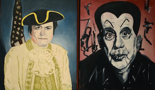 "Larry Flynt (The Anarchist's Choice), Mephitic Millowitsch, Martin Kippenberger, 1984 Thank the art gods Martin Kippenberger was a terror. His paintings and drawings at PAM (on view until February 19) relay an enfant terrible at his finest, mocking and menacing, a salty and ingratiated middle finger raised to the art world like a lighthouse,. . .(more). Posted by Amy Bernstein on December 15, 2011 at 11:18 | Comments (0) PermalinkWednesday 12.07.11 The Score III There were numerous excellent shows I simply did not have time to cover over the last 6 months and The Score as an ongoing series of reviews is a way to catch up and take note. What's more, three very good shows; Museion,
David Eckard's survey (feature article coming soon) and The Bonnie Bronson Fellows
show all end this week.
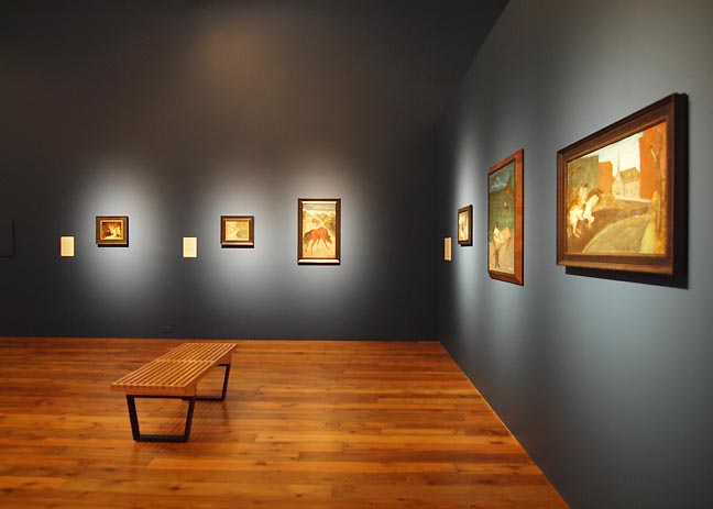 Museion at Reed College (photo Jeff Jahn) Museion at the Cooley Gallery ends today so it is your last chance to see what Reed has in the vaults. For example ,they have a more varied and numerous collection of Milton Avery's than PAM has. Also, their Rothko is strangely fleshy... (more Recess, Half/Dozen, Worksound and Apex) Posted by Jeff Jahn on December 07, 2011 at 12:12 | Comments (0) PermalinkTuesday 11.29.11 Alfredo Jaar and Carsten Holler 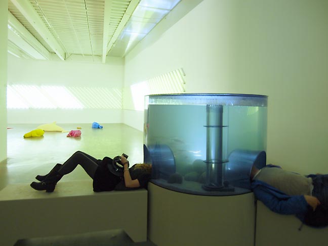 Carsten Holler's Double Light Corner (2011), Animal Group (2011) and Aquarium (1996) at the New Museum (photo Jeff Jahn) It isn't often that I write about programmatic archetypal curatorial strategies used in art exhibitions but two recent experiences; visiting Carsten Holler's Experience retrospective at the New Museum and Alfredo Jaar's talk "It is Difficult" sponsored by OCAC raise questions about the role of the artist and institution as well as how they ultimately interface with their viewers. 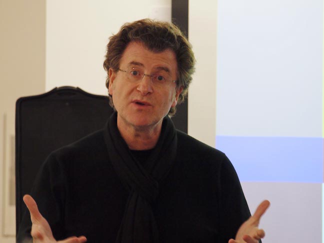
Alfredo Jaar speaking in Portland October 14th (photo Jeff Jahn) Though Holler and Jaar couldn't be more different, both highlight the way the art experience is attenuated by how the artist/institution divide is negotiated (Jaar is very selective and insists on carte blanche). True, all art exhibitions represent a kind of experience but some are intended primarily as such... (more) Posted by Jeff Jahn on November 29, 2011 at 14:47 | Comments (0) PermalinkTuesday 11.15.11 Geoffrey KixMiller at Appendix 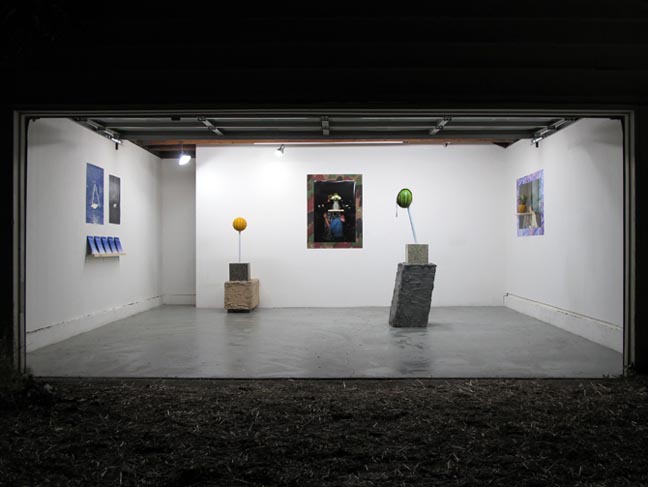 Geoffrey KixMiller at Appendix Project Space Quick, let's play word association: "cheap." Nothing? Okay, linoleum." Yeah, grandma's kitchen floor. That's exactly what I was thinking. But evidently, that's not what Geoffrey KixMiller, Philly-based artist who is now showing at Portland's Appendix Project Space, was thinking. It took me ages to find this gallery—supposedly one of two "it" places to see art in Portland right now—but wandering in the dark through the backstreets of the Alberta arts district, I finally saw a tiny unlit alleyway next to a gym... (more) Posted by Guest on November 15, 2011 at 13:41 | Comments (0) PermalinkWednesday 10.26.11 2011 Art + Environment at the Nevada Museum of Art in Reno 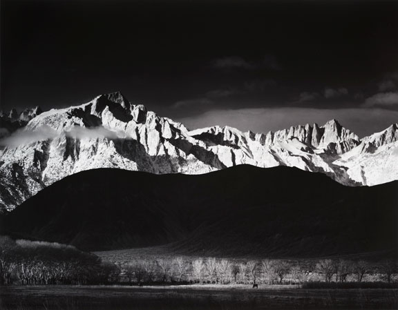 Ansel Adams, Winter Sunrise from Lone Pine, Sierra Nevada, 1944 This fall, the Nevada Art Museum hosted its second Art + Environment Conference. Starting with the opening talk by David Walker, the Executive Director of NAM, and William Fox, the Director for the Center for Art+Environment, the conference explored the implications, problems and opportunities of living in the Anthropocene era. Anthropocene is a term coined by Eugene Stoermer to describe our current time, when the influence of human activity on the lithosphere has been so significant as to warrant its own geological era. While the influence of human activity on the planet is undeniable, a deeper question, especially for artists, is how does recognition of the Anthropocene era influence the work that we choose to make and experience. More... Posted by Arcy Douglass on October 26, 2011 at 15:10 | Comments (0) PermalinkSunday 10.09.11 Philip Iosca at PNCA's Manuel Izquierdo Gallery 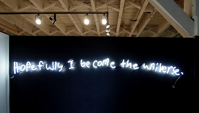 HOPEFULLY I BECOME THE UNIVERSE With all the attention on mass movements, the toppling of tyrants and an ultra polarized political climate in Congress it reminds me why I ultimately trust art more than people. Somehow art shrinks the world, giving greater freedom and agency to the individual's existential plight and perceptions (though it ultimately takes freedom to make art possible). Perhaps no exhibition in Portland illustrates that dynamic better than Philip Iosca's lastest show, "Hopefully I Become the Universe," at PNCA's often influential Manuel Izquierdo Gallery. The show is powerful, restrained and ultimately heartbreaking through how it respectfully poses tough but poetic questions about suicide (perhaps the most loaded of existential decisions) by creating a series of open ended memorials for a handful of young men under extreme pressure. Individually, these young gay men decided to end it all in a string of deaths last year that shocked the nation. One year later, Philip Iosca noticed how these victims had begun to fade from the 15 minute news cycle and the national consciousness and just couldn't stop thinking about them. ...(more) Posted by Jeff Jahn on October 09, 2011 at 15:12 | Comments (0) PermalinkWednesday 09.21.11 An Evidence of Bricks: An Evidence of Doors, TBA 11  Detail from "European International LTD, Touch and Go", 2010, Cristina Lucas Destruction is evolution in its most ferocious desperation. This year, PICA's Time Based Art Festival uses an "Evidence of Bricks" to describe the state of what it features, resolutely offering revolution as an hors d'ouevre in its title, a petite morsel with which to smash ideologies and ancient paradigms. . .(more) Posted by Amy Bernstein on September 21, 2011 at 6:40 | Comments (0) PermalinkFriday 08.26.11 Unfinished Business at PDX 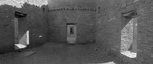
Terry Toedtemeier, Untitled (Chaco Canyon) I think Terry Toedtemeier would have been amused and proud that his Unfinished Business show at PDX Contemporary ends in just two days, but that is the recursively zen and improbable way the gregarious curator of photography rolled until his untimely death in 2008... (more) Posted by Jeff Jahn on August 26, 2011 at 9:48 | Comments (2) PermalinkWednesday 08.03.11 New York Nuggets 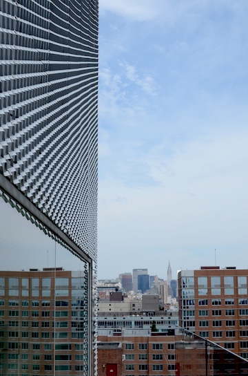 View of the city from the top of the New Museum, 2011, Amy Bernstein The summer in the country's art capital is vibrant with some of the best shows of the year, despite being the typically slow season. If you happen to be heading to the other coast, these are some of the most vibrant and the most riveting shows in the city at the moment. . .(more) Posted by Amy Bernstein on August 03, 2011 at 22:40 | Comments (0) PermalinkSaturday 07.30.11 Laurie Herrick retrospective 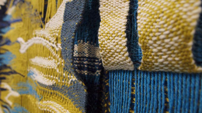 Detail of Laurie Herrick's Crater, 1969 (all photos Jeff Jahn unless otherwise noted) This Summer I sense that many Portlanders feel a little robbed... no it is not the Juneuary we just experienced. Personally, I'll take 65-72 degree days that over the blast furnace much of the country has experienced. Instead, it's the lack of a strong, in depth look at the arts that are the hallmark of major museums. In fact PORT's writers have been traveling to other cities to catch great shows like Lee Ufan at the Guggenheim or Picasso/Braque at the Modern Fort Worth, etc. So now that Summer is finally here in the very manageable 80's we still want to dive into a museum for some cool contemplation. What are the options? 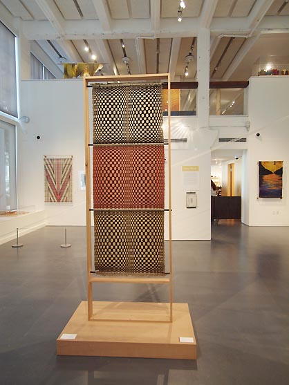 Exhibition view: Laurie Herrick Weaving, Yesterday, Today and Tomorrow This is the last day but the Museum of Contemporary Craft has pretty much the only game in town with it's very engaging retrospective of mid 20th century designer and weaver Laurie Herrick (1908-1995). Design was always important for the young, initially LA based Herrick who first developed men's neckties and worked as a ... (more) Posted by Jeff Jahn on July 30, 2011 at 10:45 | Comments (0) PermalinkWednesday 07.13.11 Paths of Destruction: Neidhardt, Picton and Verbeisen 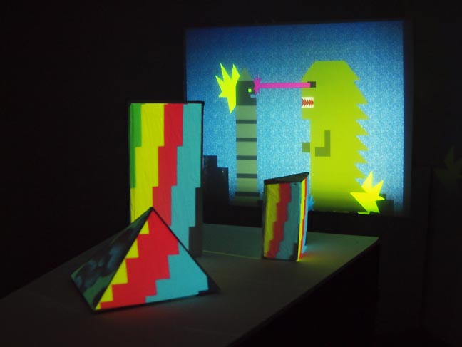 Marieke Verbiesen's Plan 10 at PNCA's Feldman Gallery It's rare when there is a theme amongst some of the better shows in Portland but that is just what is happening this July. Maybe it is a sign of our turbulent times or the simple fact that a few galleries want to put the screws to viewers during the normally happy go lucky Summer but July brings a trio of shows with destructive tendencies by Jim Neidhardt, Matthew Picton and Marieke Verbiesen... (more) Posted by Jeff Jahn on July 13, 2011 at 22:16 | Comments (0) PermalinkFriday 07.01.11 Whose Logic?: Richard Barnes at Blue Sky Gallery 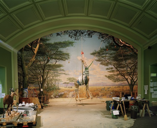 "Giraffe", California Academy of Sciences, 2005, Richard Barnes The exhibition 'Animal Logic' up at Blue Sky Gallery is a question in the quirkiness of the human species. Rendered in large photographs, framed delicately and deliberately behind glass, these works are specimens in themselves. . .(more) Posted by Amy Bernstein on July 01, 2011 at 7:45 | Comments (0) PermalinkWednesday 06.22.11 Rebel Life: Wes Lang's "A Head Full of Dead"  "Wes Lang's Greatest Hits" (Detail), Wes Lang, 2010 Brooklyn based artist Wes Lang's "A Head Full of Dead" at the downtown Stumptown cafe is an exhibition of the (High)times. . .(more) Posted by Amy Bernstein on June 22, 2011 at 21:57 | Comments (0) PermalinkSaturday 05.21.11 Notes on Open Engagement 2011  (Fear Him) I was speaking with a friend last week in Los Angeles. It was a short visit, yet in catching up, I mentioned I would be covering Open Engagement for PORT. Being of a socially just mind, he said he would some day like to attend and wished me a good time. I responded with signs of lingering doubt, and perhaps a tad too much sarcasm when I went on to give as an example of the 'happenings', the Best Friends for a Day project. His response was, "You won't know unless you try it. You might meet someone whom you will be very sad to see leave at the end of that day. Perhaps even devastated." He was serious, and I suspect we parted on slightly less amicable terms... (more) Posted by Patrick Collier on May 21, 2011 at 16:25 | Comments (8) PermalinkThursday 05.19.11 Storm Tharp curates the Lumber Room 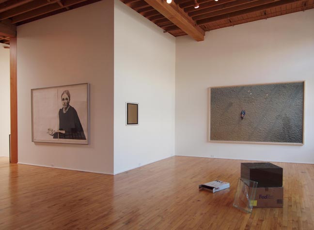 (L to R) Tharp's The Decorator, Matt Sheridan Smith, Walead Beshty and Richard Misrach The secret lives of art residing in private collections are generally just as private as the collectors that have acquired them, but when Sarah Meigs asked Storm Tharp to curate her collection to better explore a work of his “The Decorator”, they both turned that dynamic inside out. It's complicated to discuss but Sarah still remains relatively low key... (more) Posted by Jeff Jahn on May 19, 2011 at 14:54 | Comments (0) PermalinkTuesday 05.10.11 The Score 2: space to grow Since I'm now beginning my 13th year of living in Portland I thought another
iteration of the score was in order. A
lot has changed, in fact back in 1999 people kept saying "things never change
here." I very publicly bet against them by doing some curating and writing in
2000 and the rest is history
(stasis is always a terrible bet). Now the scene has made a habit of of it's
perpetually growing international profile and the question is more about how
the scene will direct its energy rather than simple regionalist grumbling. In
short, everyone that gets talked about here has simply upped their game and
international profile and The Score is just another way to keep tabs of this
new reality. Some feel criticism should be be gentle... but that generally
means they simply want to ingratiate themselves, which is fine but it's also
important to take a stand, especially when things are obviously wrong. Sometimes
the critic's role is to say what everyone perhaps already knows but needs to
say publicly. It keeps us honest and therefore a stronger art scene.
 (all photos Jeff Jahn) Perhaps the biggest change is the proliferation of alternative spaces and a generally higher level of sophistication, typified by huge influx of installation/new media art to a one time more traditional painting and crafted object art scene (not that they need to be mutually exclusive). There is room for both in any worthwhile scene. ... (more) Posted by Jeff Jahn on May 10, 2011 at 0:48 | Comments (0) PermalinkTuesday 04.26.11 "You'll Never Walk Alone", A Testimony of Creative Community, at Worksound  "A God is Passing By" (Detail), 2007 "A God is Passing By" (Detail), 2007"You'll Never Walk Alone" is the brazen statement made by the title of the current exhibit up at one of the many lively alternative exhibition spaces in Portland: Worksound. Curated by the Belgian based artist, Vanessa Van Obberghen, "You'll Never Walk Alone" is an exhibition of comradery. Based on the necessity and confluence of great minds and creative peers,. . .(more) Posted by Amy Bernstein on April 26, 2011 at 10:35 | Comments (0) PermalinkWednesday 04.13.11 Hung Keung's Bloated City | Skinny Language 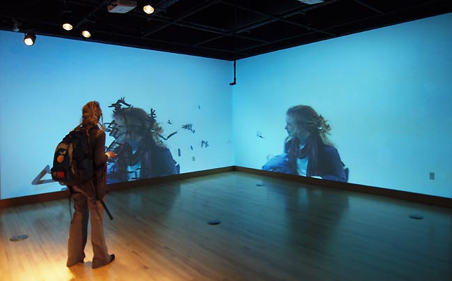
Hung Keung's Bloated City | Skinny Language at the the U of O's White Box is easily the most engaging exhibition this month in Portland. It's an interactive affair where viewers are greeted by floating Chinese characters that seem to drift and sway in a haphazardly poetic wind until...(more) Posted by Jeff Jahn on April 13, 2011 at 13:02 | Comments (0) PermalinkTuesday 04.05.11 Sound Moves in Color: Nick Cave at SAM 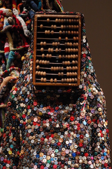 "Meet Me at the Center of the Earth", Seattle Art Museum 2011 What does the sound of protest look like? What is the shape and color of its voice? For the artist Nick Cave, protest is an aggressive celebration, a measure of life itself, a reified form of soul. Existence is an event to be heard, . . .(more) Posted by Amy Bernstein on April 05, 2011 at 18:54 | Comments (0) PermalinkNo Painting Left Behind at Rocksbox 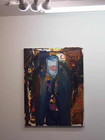 What awaits downstairs at Rocksbox With seventeen paintings from the collaborative efforts of Erin Allen, Keith Broadwee and Issac Gray on the first floor, and another eight (one multi-panel) by the Icelandic group Gotulist i bjorg kassi!, on the smaller, second floor of Rocksbox, ecstatic enthusiasm is evidenced in the sheer number of loose, almost haphazard pieces. Think a two-dimensional version of Paul McCarthy’s “Painter” or “Family Tyranny” without the suggestiveness his props provide. Envision very literal scatology and sacrilege that comes from more sophomoric, if equally troubling subject matter of the master... (more) Posted by Patrick Collier on April 05, 2011 at 8:28 | Comments (0) PermalinkTuesday 03.22.11 Matt McCormick's Great Northwest  Matt McCormick, "The Oregon Coast," 2011, C-print I've lived in the Northwest since infancy, raised among its persistent rains and startling sunsets, dense wildlife and endless trees. Now for the first time, I'm on the cusp of a probable move away from my beloved Cascadia. So it was particularly poignant for me to settle into the couch in Matt McCormick's studio to watch The Great Northwest, a 75 minute ode to change, timelessness, natural beauty and the intangible experiences that define this region. (More.) Posted by Megan Driscoll on March 22, 2011 at 8:19 PermalinkThursday 03.17.11 Re/activate, Basalt and Soft Edge as Art-chitecture 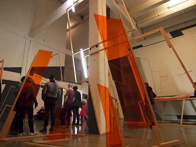
Re/activate during March 1st Thursday's opening I can't recall a time a young emerging artist has hit Portland as hard and often as Damien Gilley has... and in March 2011 he just doubled down with 2 major shows at W+K and Linfield Gallery. He's one of several artists (Jordan Tull, Josh Smith, Eric Franklin and Gilley) with shows up this month that I wish to discuss. First, let's define provisional architecture as illusionary, test form or unfinished space/structures and or materials in space presented in a way that doesn’t distinguish itself as a finished object that can exist without the space that contains it. Provisional architecture doesn’t just modify space it re-schematizes it, turning finished space into an expanded unfinished (or unfinishable) potential space. It opens space and possibilities rather than dwell in it... (more) Posted by Jeff Jahn on March 17, 2011 at 8:05 | Comments (1) PermalinkThursday 03.10.11 Kris Hargis' Me and You at Froelick Gallery 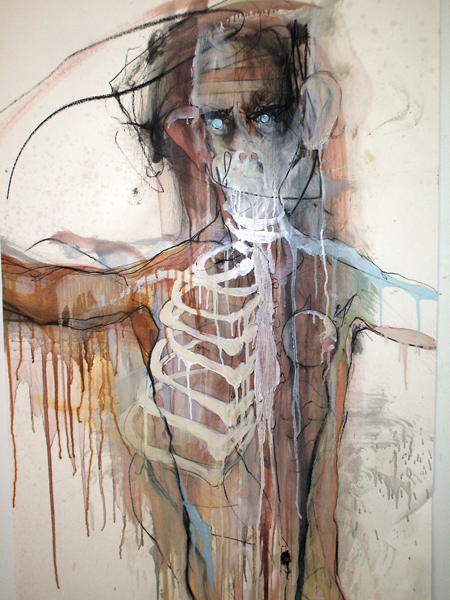
To The Hills Kris Hargis has begun this journey of discovery, or so the press release for his current show at Froelick would have us believe, “turn(ing) his attention to the trials faced by service members as they return from the battlefield to everyday life.” However, a qualification remains... (more) Posted by Patrick Collier on March 10, 2011 at 9:17 | Comments (2) PermalinkFriday 02.25.11 Jay Steensma at Pulliam Gallery 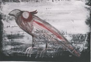 ay Steensma - JS465 Untitled Bird There are degrees of "have-to" when it comes to making art, perhaps regulated by a self-consciousness that all artists have in various manifestations. It is somewhere on this continuum that distinctions are made regarding who is the outsider, the hack, the naif, the fine artist, or the Sunday painter. All are false as generalities, as a sum total of mitigating factors are often compromised in order to categorize... (more) Posted by Patrick Collier on February 25, 2011 at 1:59 | Comments (1) PermalinkWednesday 02.23.11 COLLECT FOUR at White Box 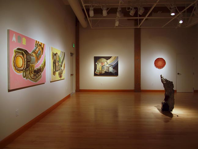 Installation view (L to R) Jason Traeger Unitiled 2, 3, 4 and Benjamin Young's Ejection & Self Help Hayward isn't discovering anyone here, but he is giving four of Portland's most promising recent talents; Benjamin Young, Jason Traeger, Matthew Green and Midori Hirose a nice stage to spar and highlight one another upon... (more Posted by Jeff Jahn on February 23, 2011 at 9:34 | Comments (1) PermalinkFriday 02.18.11 An Alphabet Is Not a Book of Poetry: Elspeth Pratt at Reed's Cooley Gallery 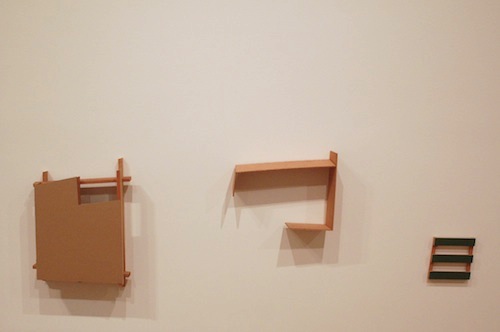 Unrelated, Elspeth Pratt, 2007 Elspeth Pratt's sculptures are simple. Mostly elegant quadrilaterals, they sit against the walls and on the floor of Reed's Cooley Gallery wide mouthed and hardy, in spite of their meager lines. They are instantly pleasing formally, drawing the viewer in with tactile conventions that are generous in their physical accessibility. These sculptures present their ideas quietly, . . .(more) Posted by Amy Bernstein on February 18, 2011 at 4:30 | Comments (0) PermalinkFriday 02.11.11 Ishimoto Yasuhiro's Katsura at Portland Japanese Garden 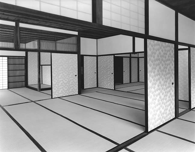 Credit (c) Ishimoto Yasuhiro, Interior of the Old Shoin Viewed from the East The Portland Japanese Garden's Katsura exhibition and The Ma of Modernism offer a rewarding look at Japanese architecture and form. The Katsura Detached Palace is one of those all time masterpieces of architecture, like the Parthenon, St. Peter's Basilica or The Great Pyramid... its mere existence conveys much more than a series of rooms and an exterior form. It's an embodiment of an idealized worldview and therefore acts as a symbol of national identity that goes way beyond individuals, becoming so emblematic that its reputation transcends that culture. In fact, it so impressed the Bauhaus' Walter Gropius upon visiting it that in many ways its design DNA can be found everywhere in high modernist architecture. It has gone beyond architecture and become an idea. Yet, the palace itself is more of an incidental jumble that conveys a sense of enduring imperial succession rather than Gropius's high modernist architectural language. Lately, deconstructionist architects like Herzog & De Meuron and Rem Koolhaas have made careers of this elegant type of structural dissonance... (more) Posted by Jeff Jahn on February 11, 2011 at 15:38 | Comments (0) PermalinkFriday 01.21.11 "Between My Head and My Hand There is Always the Face of Death" 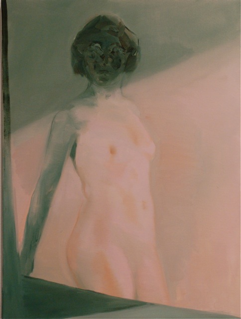 "To Conjure You Up and Make You Fade" 2009, Kaye Donachie "Between My Head and My Hand There is Always the Face of Death" is the title of Kristan Kennedy's latest curatorial foray at PNCA's Feldman Gallery. An appropriated quote from the late artist Francis Picabia, the quote hints at the existential nature of the exhibition, encompassed by the continuation of the unbelievably long and rich history of figurative painting. This history, exhausted and revived interminably, mimics. . .(more) Posted by Amy Bernstein on January 21, 2011 at 5:46 | Comments (1) PermalinkThursday 01.06.11 DE May's The Template Files at PDX Art of any genre's greatest strength and weakness is its ability to nearly become
something, without actually being forced to commit to fully becoming that thing.
Think of it as a butterfly just as it breaks free of the chrysalis... not a
moment before or after. It is a delicate moment between entropy and becoming
something new through accretion and artists like Richard Tuttle and Jackson
Pollock are masters of it.
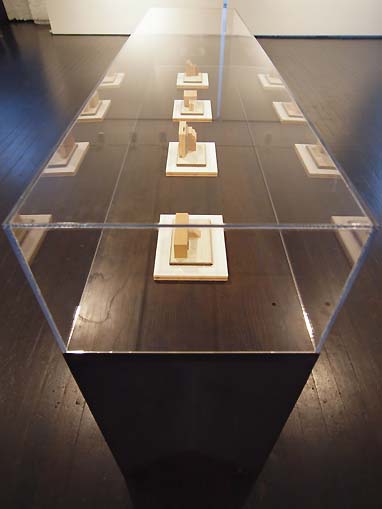 Untitled (exterior storage) [photo jeff jahn) Similarly, as one of the most adept artists on the west coast DE May's work traffics in the concentrated residue of planning in contemplation... (more) Posted by Jeff Jahn on January 06, 2011 at 15:46 | Comments (0) PermalinkFriday 12.10.10 Torben Eskerod at Blue Sky Gallery 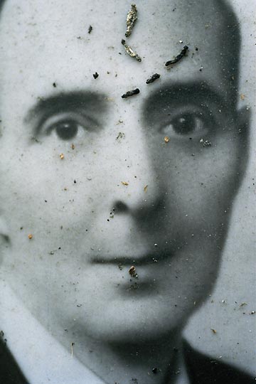
As we get older, the photographs of family members kept in albums increasingly become mementos of the dearly departed. For a matriarch or patriarch of the family, a particularly memorable or essential image may get installed into the face of a tombstone. Doing so maintains the semblance of the living relationship. Yet, stories passed from one generation to the next are not enough to keep that image sharp and new copies do not replace the worn and weathered when the time... (more) Posted by Patrick Collier on December 10, 2010 at 11:48 | Comments (4) PermalinkWednesday 11.17.10 Vanessa Renwick at PDX Across the Hall 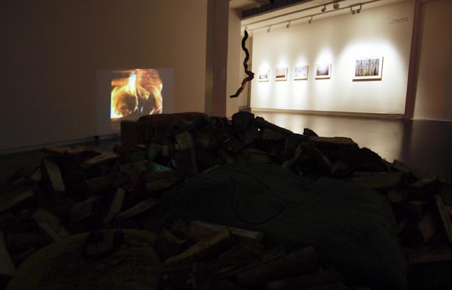 as easy as falling off a log (installation view) photo: Jeff Jahn In 1957 the State of Oregon outlawed the use of splash dams on Oregon waterways. Splash dams were built on rivers and creeks as a way to back up water in a sufficient volume to propel logged trees downstream. The flood caused by the sudden gush of water, plus the massive number of logs, scoured the waterways down to the bedrock, thereby making those streams inhospitable to the spawning salmon that required gravel beds (redds) to lay and fertilize eggs. Only after a series of lawsuits by anglers and environmentalists was the practice terminated nationwide. Often the rush of logs downstream would cause logjams... (more) Posted by Patrick Collier on November 17, 2010 at 9:08 | Comments (0) PermalinkSunday 10.31.10 Picasso 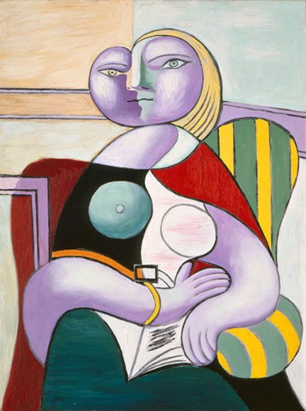 Picasso, The Reading, 1932 Re-reading Picasso as Power Object I went to the Picasso exhibition at the Seattle Art Museum two days in a row. There was a lot to see. The work is from the Musee Picasso in Paris and will eventually travel to San Francisco and then to Virginia. It is always a little strange to finally confront work that you have looked at for years in books and magazines. Like most people, I feel like have a relationship with almost all of the paintings in the exhibition even though I was seeing them in person for the first time. Somehow every time we have been in Paris we have never made it to the Picasso Museum. For everyone out there who is not planning on going to Paris any time soon, seeing the work in Seattle or San Francisco might be a once in a lifetime experience. So ignore the lines, the swarms of school children and the constant fragments of narratives spilling from the omnipresent audio guides practically howling through the galleries and queue up. It is worth it. When we are talking about Picasso, it is never clear who we are talking about. Are we talking about the man? The artist? The father? The husband? The lover? Whenever I think about Picasso, I think about the Tibetan word Tulpa whose closest translation is "thought form." According to Wikipedia, it is a physical manifestation of psychic energy. When I am walking through the exhibition, there is Picasso as an artist and then there is the Tulpa. 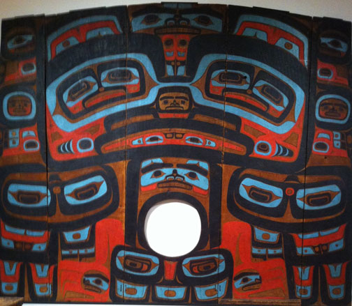 Tlignit, Yeil X'eenh (Raven Screen) circa 1810-1910 at the Seattle Art Museum Posted by Arcy Douglass on October 31, 2010 at 7:07 | Comments (0) PermalinkFriday 10.29.10 The Score October 2010 Because PORT's readers like to know what is up and because I like to keep score of sorts... The Score will be a new semi-monthly regular feature on PORT. It gives me a chance to do very quick reviews and or comment on things that I haven't been able to work into larger articles and reviews. What's more, because sometimes very worthy shows get completely ignored The Score gives me the chance to go back a month or so and note the notables that fell through the cracks. 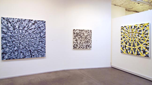 Michael Knutson at Blackfish The best new show up for the month of October 2010 was Michael Knutson's latest outing Translucent Fields and Cubic Knots at Blackfish... (more) 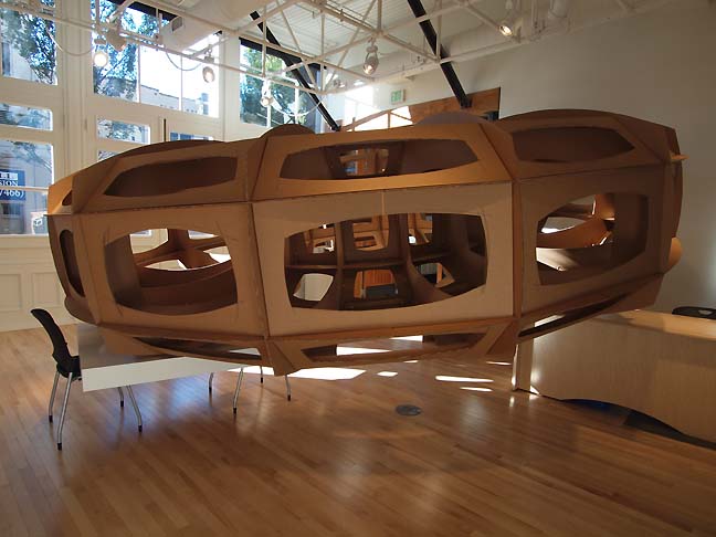 A work by Melis van den Berg at Ontologue Posted by Jeff Jahn on October 29, 2010 at 23:12 | Comments (0) PermalinkThursday 10.28.10 David Corbett at Linfield 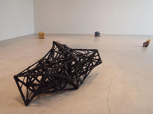 Past Craft (fg) Star, Canadian Print Job (2), Space Junk (bg, left to right) Reminiscent of structural engineering and material entropy David Corbett's New Work at Linfield College finally allows area viewers the chance to take stock of an interesting artist who till now has been relegated to too many group shows. Without the distractions of other artists we can now survey works like Tower, Canadian Print Job, Space Junk and the intentionally less remarkable Bore. You gotta love the counter intuitive idea of making one little brown sculpture purposefully duller than the others. Nice move... (more) Posted by Jeff Jahn on October 28, 2010 at 12:29 | Comments (0) PermalinkMonday 10.25.10 The Often Monochromatic, Sometimes Off-Color World of Jacques Flechemuller at PDX Contemporary It is an assumptive thesis based more on memory than research that proposes
color television brought about the demise of a perfect world. There was a time
when movie theaters showed newsreels and film shorts, and newspapers had fewer
photos and more illustrations. This was in the black and white world before
and after World War II. Oh, there was color in some media, but it was a rarity,
yet more of a harbinger. Technicolor, Kodachrome and other similar technologies
aided to the end of a wonderful, simpler era.
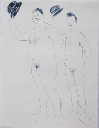 L+H 2009 What would a perfect world look like? It would have young children sitting cross-legged on the floor watching a small, 1955 television screen, laughing with glee. Chimpanzees in dresses do tricks that make them look more human, and old Laurel and Hardy films make monkeys out of everyone. It is a formative world for those children. Sixty-five years later, chimps neurotically masturbate in real-world captivity and, for Jacques Flechemuller, Laurel and Hardy are naked and fairly well endowed. How can one not chuckle?... (more) Posted by Patrick Collier on October 25, 2010 at 10:30 | Comments (0) PermalinkFriday 10.22.10 Lee Kelly Retrospective at Portland Art Museum 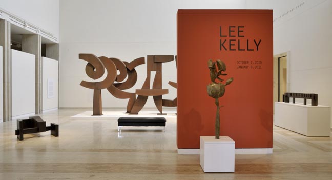 Installation view with Memory 99, Cor-Ten 1999 (background), Maquette for Gate F, Candlestick Park 1973 (far right) The Lee Kelly exhibition currently on view at the Portland Art Museum contains a balanced mix of early, mid, and later works while featuring a broad spectrum of Kelly's language. From his first oil paintings at the Museum Art School to his more recent colored steel sculpture, Kelly retains a playful yet inspiring approach to art making. The inclusion of Kelly's larger scale sculpture Memory 99, as well as a video interview with Kelly on his life and process, strengthen the retrospective. They provide the viewer greater intimacy with the work of Kelly and a better understanding of it's origins, in particular, pointing out the influences of his formative years in rural farmland... (more) Posted by Jascha Owens on October 22, 2010 at 9:50 | Comments (0) PermalinkTuesday 10.19.10 PAM's 50 works from the Dorothy and Herbert Vogel Collection 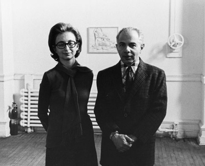 Dorothy and Herbert Vogel Last year, PORT was the only area publication to note that the Portland Art Museum was going to get a very generous gift of 50 works from The Dorothy and Herbert Vogel Collection. Now those works are on display at PAM and it reifies the general consensus that the couple were some of the best eyes for collecting to ever walk the earth (they weren't rich either). First of all these 50 works (dispersed from their 2500 work collection, mostly on paper or small fragile sculpture)... (more) Posted by Jeff Jahn on October 19, 2010 at 13:08 | Comments (0) PermalinkThursday 09.16.10 Eva Speer's Landscaping at Charles A. Hartman Fine Art 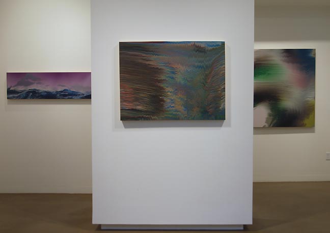 From Eva Speer's Landscaping (L to R) Collection, Slipways #1 & #2 It's the Pacific Northwest, so of course there is a fascination with landscape. Just as the Hudson River School of painting, Ansel Adams, and the f64 photographers and artists who live in the Northwest have no choice but to be in awe of the nature that surrounds them. Those who agree with the previous statement may be unaware that such an assertion is political at best or, at worse, exclusionary. However, it is hardly more so than the opinion that within a progressive art history, landscape painting has been dead for over 150 years. Some may wonder why everything must be deemed political while others maintain that to ignore the political gives short shrift to an ethical awareness in artistic choices. However, for some reason the argument persists less vociferously when the percentage of greenery overwhelms the total yardage of asphalt... (more) Posted by Patrick Collier on September 16, 2010 at 8:32 | Comments (3) PermalinkTuesday 09.07.10 Laura Hughes at Appendix  Laura Hughes 2010 The Span of an Instant I saw a beautiful piece at the Appendix Gallery: Here is a link to a piece Laura Hughes did in the Portland Building. Yes, it is much like Mary Temple's work, that you might have seen at Western Bridge but Hughes has the audacity to twist the screw... (More) Posted by Alex Rauch on September 07, 2010 at 7:22 | Comments (0) PermalinkFriday 08.27.10 Kertesz and Waselchuk exhibitions Though this August has been littered with weakish summer group shows two excellent
solo photography exhibitions next door to one another should not be missed, it is
their last weekend. At Charles Hartman Fine Art there is a fantastic museum level
exhibition spanning the entire career of master
photographer Andre Kertesz. Next door at Blue Sky Gallery it is the sobering
prison hospice care documentation of Lori Waselchuk.
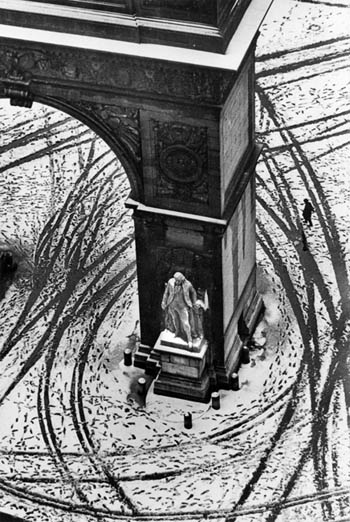 Andre Kertesz Washington Square, Winter (1966) At Charles Hartman the roughly chronological display covers classic Kertesz images like Lovers (1915) taken in Budapest to the iconic Mondrain's Glasses and Pipe (1926) from his Paris years to the fantastic Washington Square, Winter (1966) Taken in New York City. Kertesz is a master of geometric composition as Mondrian's Glasses and Pipe demonstrates with its asymmetrical table corner forming a tense pyramid on which the ascetic circles of the bowl, pipe and glasses rest in a seemingly offhand repose. Those three elements form... (more) Posted by Jeff Jahn on August 27, 2010 at 9:17 | Comments (0) PermalinkSaturday 08.21.10 Drake Deknatel's Small Paintings at Elizabeth Leach 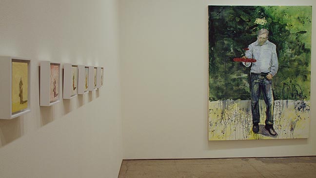 Drake Deknatel at Elizabeth Leach Gallery As a relative newcomer to the greater Northwest art community, I am often at a loss when discussions arise regarding all but the most prominent of local artists. The upside of this situation is that it is still possible for me to be surprised... (more) Posted by Patrick Collier on August 21, 2010 at 15:07 | Comments (0) PermalinkTuesday 08.17.10 Kelly Rauer's Shaping Sequence at NAAU "There is a point where in the mystery of existence contradictions meet;
where movement is not all movement and stillness is not all stillness; where the
idea and the form, the within and the without, are united; where infinite becomes
finite, yet not" - Rabindranath Tagore (Nobel Prize for literature 1913)
 Kelly Rauer's Shaping Sequence at NAAU Consisting of numerous isolated videos of slow moving body parts Kelly Rauer's Shaping Sequence at NAAU is a fleshy tribute to kandinsky's compositional technique of having convexities answering concavities. It's even more even more obviously related to Georgia O'Keeffe, another Kandinskyite. Even more related is the work of O'Keefe's husband, Alfred Steieglitz, whose incredibly loaded photos of O'Keefe's hands set up a dialogocal art historical conversation between both photography and video art here. In fact Shaping Sequence acts quite a bit more like an installation of photographs rather than a single video piece or a dance performance... (more) Posted by Jeff Jahn on August 17, 2010 at 13:48 | Comments (0) PermalinkFriday 07.30.10 Tabor Robak's Quarterback at Appendix  Tabor Robak's Quarterback After navigating the intense Last Thursday Alberta Street crowds of revelers I was grateful to reach Appendix Project Space, which along with Littlfield has become the experimental installation/performance art hot spot in Portland (though there seem to be new spaces popping up in unexpected places all of the time)... (more) Posted by Jeff Jahn on July 30, 2010 at 23:14 | Comments (0) PermalinkSaturday 07.24.10 Under the radar reviews Many art scenes shut down in the summer, Portland's doesn't. There are several
high profile shows like Ai
Weiwei and Sol
Lewitt that everyone should make a point of catching but part of the fun of
summer is just walking around so here are some very worthy lower profile shows
that deserve some attention.
 Laura Hughes' Passed Presence at the Portland Building Laura Hughes (a recent PNCA grad) has the potential to be one of the most exciting new artists on the Portland scene. Consisting of faux shadows in Michael Graves infamous Portland Building, Passed Presence is Hughes first project after graduation and the work is considerably sparer and more subtle to what I saw from her prior thesis work. It also somewhat rehabilitates the not entirely effective postmodern design with a somewhat modernist ... (more) Posted by Jeff Jahn on July 24, 2010 at 11:38 | Comments (0) PermalinkWednesday 07.07.10 Cris Bruch at Elizabeth Leach Gallery 
Cris Bruch's Rejoinder (2010) Cris Bruch’s exhibition, Gather and Wait at Elizabeth Leach Gallery, seduces with meticulous craft and sensuous forms that are nevertheless familiar. For anyone with a modicum of exposure to modern art, many of his sculpture call up the name of another artist, Martin Puryear, whose work has made this style of abstraction iconic. Associations can be made with Richard Rezac’s work as well; yet similarities can always be found between artists working with a particular material, and no single artist holds a monopoly on subject matter or form. It is what each artist does with the material and ideas that is ultimately judged. In 2007, a twenty-year survey of Bruch’s work, How Did I Get Here?, at Lawrimore Project in Seattle, solidified his position as a major artistic voice in the Northwest. Initially known for his more performance-based sculptural work, early on he was seen as more of a talented curiosity with a decidedly political narrative than the commissioned abstract artist that he has become today. Yet, even... (more) Posted by Patrick Collier on July 07, 2010 at 8:32 | Comments (5) PermalinkFriday 06.18.10 When is a Raven Like a Writing Desk? Bailey Winters tackles narrative head-on. Let me tell you a story: A human hand picked up a tool, dipped it in pigment, and made an image. Over time, the hand learned to perfectly replicate the world with its brush. But it soon grew tired of imitation, breaking down the image further and further until it dissolved into impenetrable shapes and colors. And then it was declared dead, over, done, deceased, obsolete. But the human spirit persists, and with it the urge to layer pigment into image. So the hand soldiered on, ignoring accusations of theatricality, embracing somber color fields alongside seductive figures, creating and recreating, and always, forever, painting.
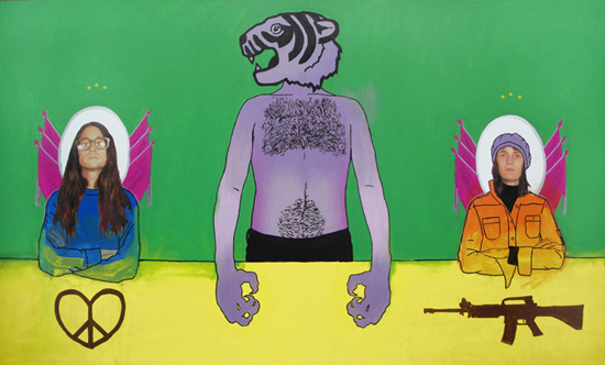 Title: As a result of his relationship with the press, the outside world viewed Matias as the TDA's leader. However, within the organization, Matias and Melissa were seen as equal ranking officers - each determined to steer the party in opposite directions. He wanted the group to increase in numbers, begin non-violent operations, and become more involved with left-wing student movements. She believed in presenting the TDA as "a militant group who demanded equality and basic rights for all people." While Matias felt comfortable speaking freely to the press and negotiating deals with businesses for food and supplies, Melissa consistently refused to work with anyone she felt was a part of the capitalist system. In 2001, Melissa's influence over the group strengthened and The Tiger Den Association changed their name to The Tiger Den Army. Painting in this century is inevitably laden with generations of artistic and theoretical baggage. To apply paint to canvas is to recall the entire canon of Western art history, with all its conflicts, anxieties, and overwrought arguments. Yet, in his current show at the New American Art Union, Bailey Winters manages to inject new life into the tired history of painting. He brings near-perfect technique to a balls-out embrace of narrative (and narrative art forms) in a series that manages to enchant, entertain, and engage. In other words, these are paintings that you can really sink your teeth into - and enjoy chewing. (More...) Posted by Megan Driscoll on June 18, 2010 at 17:14 | Comments (0) PermalinkTuesday 06.15.10 Eva Lake's Targets at Augen Gallery  Target NO.42 (Lana In a month with some serious talent on display, Eva Lake's Targets show at Augen Gallery easily speaks the strongest. It possesses a clear, personal voice that can only come from hard won experience and self-knowledge, melding Robert Indiana style Pop constructions and Richard Hamilton collage with the power/fragility of Hollywood's glamour factory. Rather than mere pop-mongering or simple Hollywood fetishism, Targets feels like the product of a long relationship between fashion, art, glamour and the perils and use of power of being in the public eye... not unlike Lake herself who has been a longtime stalwart of the 80's east village scene and Portland's renaissance in the past decade or so. This is a woman whom most people in the scene have a strong opinion about and they should... because she's good. With its visceral college materials viewing Targets is almost like paging through a bunch of old an new fashion magazines at a vintage clothing store and it's mobius strip like quality feels like Fritz Lang meets Man Ray (classic Hollywood was built upon the langugages of surrealism and the mid-century German film making with the added allure of American-style glamour). What's more it manages to make the sociological discussions around famous women more than some statistical chart or TMZ style exploitation (art is good at unpacking Hollywood without rendering it dull) ... (more) Posted by Jeff Jahn on June 15, 2010 at 15:06 | Comments (0) PermalinkWednesday 06.02.10 Scarecrow at Reed College 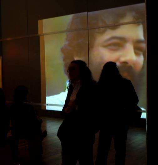
Viewers watching Lynda Benglis' The Amazing Bow Wow Reed College's Scarecrow is a fantastic presentation of unconventional art that investigates the complexities of inhabiting our human bodies. Inspired by Russian philosopher Mikhail Mikhailovich Bakhtin, and his works on the grotesque, Scarecrow gathers art that forces us to reevaluate our relationship with the uncommon and abject. Through the presentation of works such as Warhol's Screen Tests and Rauchenberg's performance Pelican, the multifaceted body is revealed while previous notions of corporeality are undone... (more) Posted by Jascha Owens on June 02, 2010 at 7:06 | Comments (1) PermalinkFriday 05.28.10 May 2010 reviews May has been an exceedingly good month for shows in Portland and even though
Cy
Twombly, Disquieted
and Donald
Judd have ended there's still time to catch Scarecrow
and other extra worthy shows. Honestly, I can't a remember a month in Portland
when we've had so many high quality or at least provocative shows both local and
international in scope? In fact, both the Everett Station Lofts and Last Thursday
delivered strong surprises (which somehow weren't sniffed out by the recent attempted/impossible
survey of the scene).
Here are a few quick reviews that give one a taste of what else was going on in the Portland art scene for May: 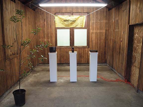 Hometouch at Littlefield At Littlefield Zach Rose's Hometouch, the artist presented a hilarious mock trade show/infomercial sales situation. The three sleek blinking black boxes on pedestals promise some sort of technology and the cheesy pot ash tree gives the whole affair an air of corporate ennui emphasized by the sign which is expertly presented as anything but home-y. The installation raises lots of questions with no answers. Might one of the black boxes be a game console that can help you exercise or play tennis without leaving the home or is it a wireless controller that will organize the activities of every electronic device in the room? No answers here, just crickets and I enjoyed the near perfect deadpan presentation. It wouldn't be as effective in a traditional white box gallery either. Overall, technology can be considered an endless incursion into one's personal and or home life and Rose's mock celebration/exposition... (more) Posted by Jeff Jahn on May 28, 2010 at 12:54 | Comments (0) PermalinkThursday 05.13.10 Disquieted at PAM 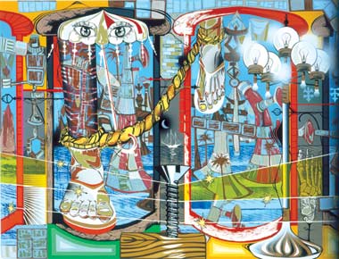 Untitled 2002, Lari Pittman The most recent, long running show at the Portland Art Museum, Disquieted, is an exhibition rife with contradiction and conundrum. Opalescent and beefy with the reputation of its artists, Disquieted boasts an exhibition to impress and seduce. . .(more) Posted by Amy Bernstein on May 13, 2010 at 7:03 | Comments (2) PermalinkTuesday 05.11.10 Bill Will at Nine Gallery 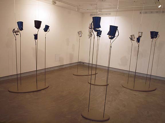 Bill Will at Nine Gallery It has been observed that when an art opening is attended mostly by fine artists, many of the conversations are not so much dialogic as they are recitations of résumés, perhaps more like what others would say of some presbyters networking rather than engaging in fellowship. One might also liken it to maneuvering through a sales meeting in an attempt to get the boss' ear. Insiders may accept the rules of the game while those unfamiliar with these social settings, rightfully so, would find the practices wholly unsatisfying, and even rude. This is how I remember artists' receptions in Chicago some years ago. It was not uncommon for someone to leave a conversation without so much as a parting nod, only to set up camp next to someone of supposed greater social stature (curator, gallerist, critic, collector) and more beneficial to one's art career... (more) Posted by Patrick Collier on May 11, 2010 at 11:16 | Comments (1) PermalinkThursday 04.29.10 Jesse Hayward at Linfield College 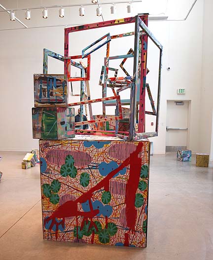
Despite a glut of group exhibitions at institutions for the past few months the most radical yet well executed show by a local artist has been Jesse Hayward's installation, The Kitchen Counter Collective at Linfield College's Gallery in McMinnville. It ends May 1st so this is your last chance. What's more the show even expands upon his highly successful exhibition in last year's TBA festival (where viewers could rearrange blocks that were also paintings), making this latest outing one of the strongest genre bending exhibitions of painting, sculpture and social interaction I've seen anywhere in recent years. Hayward began his art practice learning directly from Sol LeWitt and Karl Benjamin, so it's been a long road of experimental shows, which now seems fully developed... (more) Posted by Jeff Jahn on April 29, 2010 at 9:19 | Comments (0) PermalinkSunday 04.04.10 The Humorous Mystic: Midori Hirose at Nationale  "Gradient X" (Detail) 2009, Midori Hirose To write on a show that has already come down may seem to some a moot point. Yet, there are things past that do not leave us. There are works and events that fester and bloom in the brain as experience that is at once nebulous and unknowable to our speech. . .(more) Posted by Amy Bernstein on April 04, 2010 at 8:46 | Comments (0) PermalinkFriday 04.02.10 Victor Maldonado at Froelick Gallery 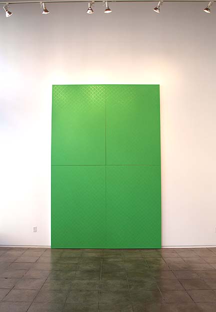 Victor Madonado's Gate at Froelick Gallery A near ever present stalwart in the Portland art scene Victor Maldonado's "Less" at Froelick Gallery shows the artist moving beyond the general influence of his MFA at the Art Institute of Chicago and Sigmar Polke and more into his own voice (which springs from a personality that is persistent, curious and energetic). Moreover, it's a sly game of optics, funny formal elements and his trademark consumer commentary... only way more subtle and successful than before. As one of the brightest painters in Portland, it seems like it has taken him a while to integrate all that thinking into something, but now it has gelled. Ironically, "Less" is Maldonado's breakout show on all levels, conceptually, coherently and from all the chatter this show is generating, critically. All this is good as painters typically don't hit their full stride until their 30's or 40's, another of Portland's defining characteristics; artists here are actually allowed decades to develop (New York and LA not so much, although "develop" is a synonym for "struggle"). ...(more) Posted by Jeff Jahn on April 02, 2010 at 14:57 | Comments (0) PermalinkFriday 03.12.10 The darkness will hold, for now I have been thinking about motivations for criticism lately. Art criticism is more than a simple popularity contest aimed at amusing or endearing oneself (or your employer) to the art scene or an exercise in lazy caricatures that ignore the details and context at hand for snark's sake (that has a place as social theater but isn't criticism). Instead, it's about context and sharing a process of perceptual evaluation. What's more it seemed like it was time to explore a group of current shows with a mutual thread around the darkness of Winter and Portland's predilection for niorish
arcana:
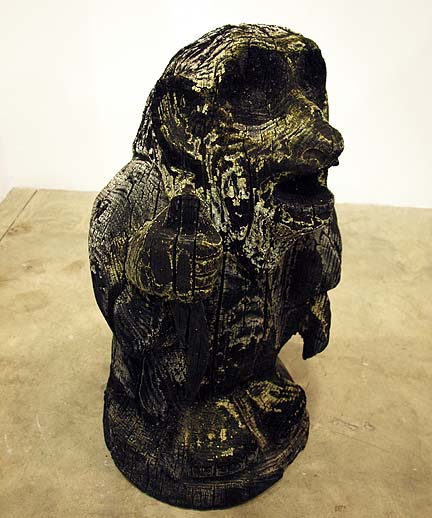 Matthew Green's Nibog at Fourteen30 (photo Jeff Jahn) Dark: A Show to Winter at Fourteen30 appropriately ends tomorrow (a week before the Spring Equinox). Typical of the Blood Family Rainbow's curatorial collaborations it has a dark, gothic, even occult focus. It's a good show with the first room being significantly stronger than the others. This is partially because 3 of the 4 best pieces (By Matthew Green, Sven Stuckenschmidt and Molly Vidor) are in the first room... (more) Posted by Jeff Jahn on March 12, 2010 at 17:09 | Comments (0) PermalinkTuesday 02.23.10 Leon Golub at PAM The work of Leon Golub at the Portland
Art Museum is an interesting introduction to his raw and fearless contributions
to modern painting. The show, composed mostly of portraiture made during the 70's
as well as a larger sans-stretcher painting, typical of his most recognized style,
resides on the bottommost floor of the Jubitz Center for Modern and Contemporary
Art.
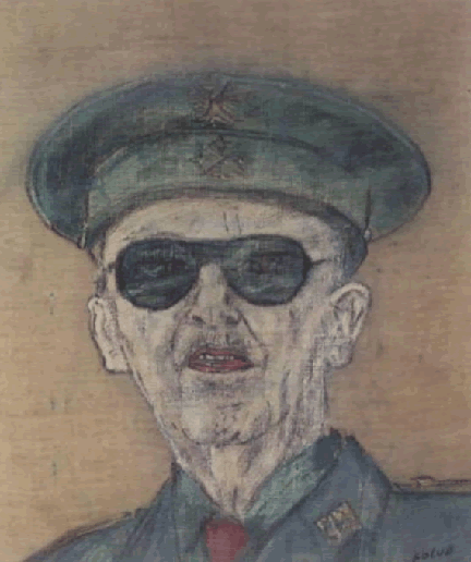 Francisco Franco (1975), 1976, Acrylic on linen, 20x17 in The Broad Art Foundation, Santa Monica Golub's work seems well suited as the ambassador of postmodern and contemporary concepts, with its classical command of the figure and raw use of materials. His paintings are unassuming in a strange way. Certainly the figures and the investigations of power relations resonate outwardly but the paint itself rests quite silently. As nearly a bland porridge of line and canvas stained with paint, Golub's works rely on neither intricacy nor grandiose gesture, but opt rather to produce a pure and unobstructed image. ...(more) Posted by Jascha Owens on February 23, 2010 at 9:45 | Comments (0) PermalinkWednesday 02.10.10 Cy Twombly 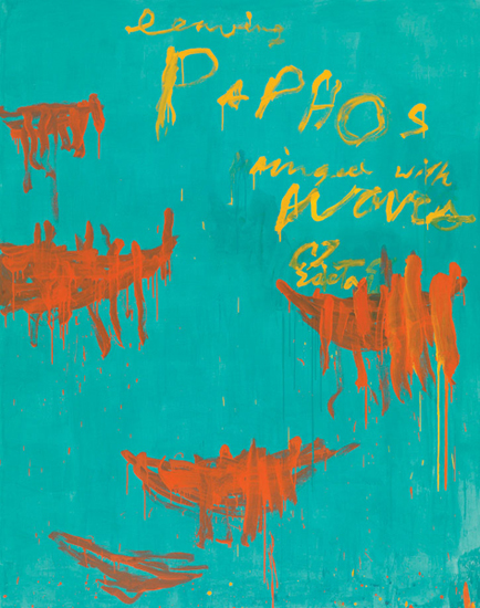 Cy Twombly, "Leaving Paphos Ringed With Waves III," 2009 One of the first things that I notice when I am lucky enough to be able to stand in front of a work by Cy Twombly is the material. The paint is allowed to find a life of it's own. Very few painters use the natural character of the material with the same freedom the way that he does. It is given enough space so that it is fully allowed to express its own possibility. Twombly doesn't need to change or challenge that basic possibility; he is able to use it to forge his own language. (More.) Posted by Arcy Douglass on February 10, 2010 at 19:27 | Comments (7) PermalinkSaturday 02.06.10 Vantage at Archer Gallery 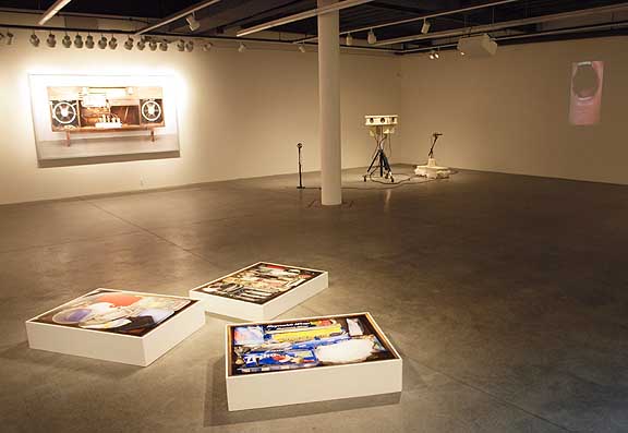 Vantage (L to R) Layman, Pond and Slappe The Archer Gallery's Vantage is a tightly curated and well presented rumination on the participatory rapport between art subject and viewers. As new Archer curator Blake Shell's first big show (that she programmed) it is telling that she chose to scrap all of the movable walls that once cluttered the fine space, affording all pieces sight line opportunities with one another. It's a welcome break from many northwest curators' fetish of cloistered, discreet spaces that keep works from forming interesting visual and conceptual aggregates. It also forces the show to have less work. Thus, Vantage is noteworthy for how good it looks as a gestalt. Pay attention Portland and Seattle galleries and curators, Vancouver Washington just showed you how it's done! ... (more) Posted by Jeff Jahn on February 06, 2010 at 14:18 | Comments (0) PermalinkMonday 01.25.10 Roth, Nagy and Fenker alt-space explorations This January three Portland alt-spaces explore the ways simple materials and
space can articulate and complicate each other.
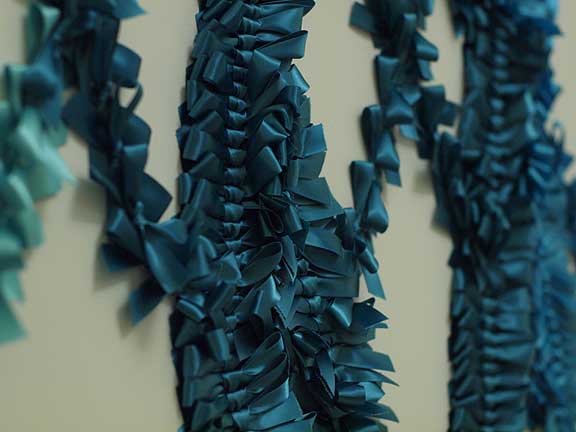 Molly Roth at Gallery Homeland At Gallery Homeland Molly Roth's, "A story about Some People Changing" is a not to be missed show (it ends on January 31st). Roth has a fascinating way of drowning sentimentality in nearly abstract multi-vectored semiotics of language via the application of satin bows. For example, her "Everything must have an end except my love for you (Niagara)" at first glance has the look of legible script but it's a kind of mirror image pantomime of a signature... (more) Posted by Jeff Jahn on January 25, 2010 at 17:06 | Comments (4) PermalinkTuesday 01.19.10 Cochrane & Middendorf + Gray & Paulsen at The Art Gym 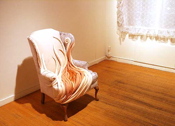 Beloved Mother (from The Dregs) Like no other people except the ancient Egyptians, Americans are obsessed with the accumulation of stuff. The mantra of ownership of property (via enlightenment philosopher John Locke) practically defines our consumerist national character. Philosophically, Locke considered property both material and more abstract to be a natural right, a kind of talisman imbued with the value of labors undertaken and exchanged to acquire them. America was the first country to apply these rules evenly across all social strata. 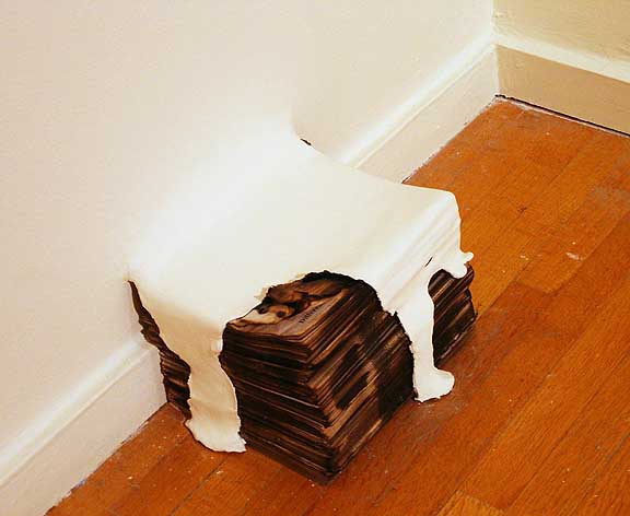 a pile of burnt newsprint from "The Imaginative Qualities of Actual Things" Still, the Egyptians differed from Americans in one telling respect; property and death were entwined in a hermetic dance of preparations, while Americans do everything in their power to avoid addressing death… often using stuff as a distraction from the inevitable. Alas, no pack rat has enough stuff to keep death from getting in the door. Still many try. Exploring similar memes two well curated shows at the Art Gym; Brandy Cochrane and Paul Middendorf's, "The Dregs" and Anna Gray and Ryan Wilson Paulsen's, "The Imaginative Qualities of Actual Things," do an interesting job of prompting philosophical discussions around the stuff that people own... (more) Posted by Jeff Jahn on January 19, 2010 at 2:56 | Comments (0) PermalinkThursday 12.31.09 It's Immaterial In the current pair of exhibitions at the Museum of Contemporary Craft, curator Namita Gupta Wiggers dives headfirst into one of the big questions that plague "marginalized" artistic disciplines. The shows resurrect that classic query: If it's not "fine art," then what is craft?
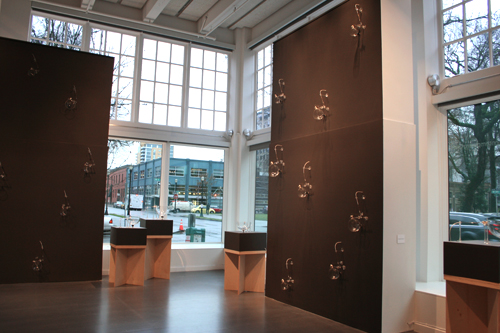 Ethan Rose & Andy Paiko, "Transference," 2009, installation view (More.) Posted by Megan Driscoll on December 31, 2009 at 8:47 | Comments (0) PermalinkFriday 12.18.09 Brian Gillis at PCC Cascade Gallery 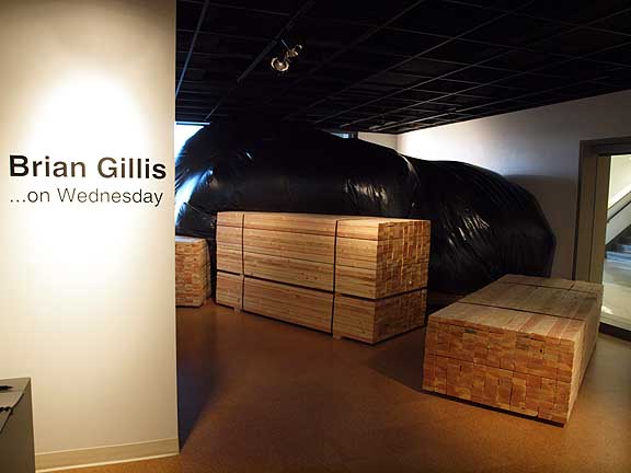
Brian Gillis' …On Wednesday at the PCC Cascade gallery is an enigma wrapped in a cloak of over-familiarity and inconclusive evidence. It consists of several pallet loads of 2x4's, a giant bulbous black form and... (more) Posted by Jeff Jahn on December 18, 2009 at 15:43 | Comments (0) PermalinkWednesday 12.09.09 OPS at PSU's Autzen Gallery 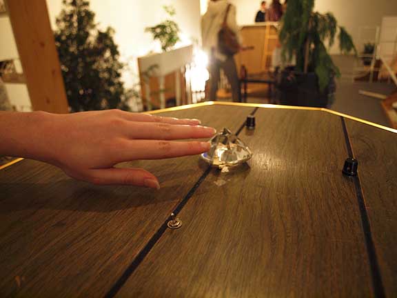
It may be the last month of 2009 but make no mistake Oregon Painting Society's latest show Radiant Dream Face at PSU's Autzen Gallery is one of the year's best. A year ago OPS burst onto the scene with a hodge-podge trippy aesthetic that was more Victorian natural history museum full of heraldry (ala group member Jason Traeger) and an exciting amalgam of the various members who each kinda did their own thing. It was an exciting opener but after a year of wood shedding they have come out with a strong unified group aesthetic, something they call, "a starship fashioned from the dreams and detritus of late-20th century West Coast America." And yes, despite their name they are more of an installation art/performance group than painters... (more) Posted by Jeff Jahn on December 09, 2009 at 15:54 | Comments (0) PermalinkWednesday 12.02.09 The Figure Idealized at PAM and Reed College 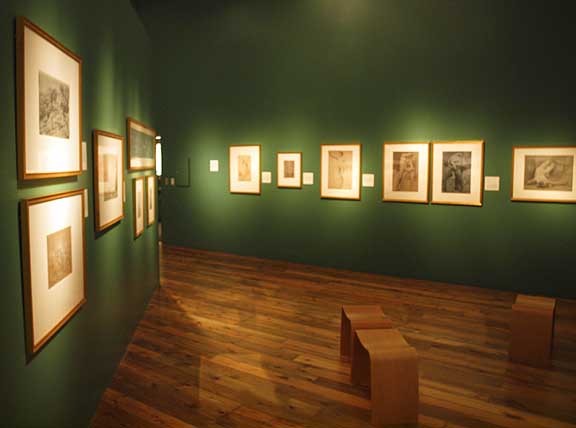 The language of the Nude (installation view) Reed College (ends December 5th 2009) When I entered the Cooley Gallery at Reed College on a dark Tuesday evening I was accosted by a hauntingly intrusive TV set. Antoine Catala's "Portrait of a Curator" captured me convincingly unto undulating surfaces and psychedelic glitches. Thereafter, a distortion of melted profiles sank in and out of focus conjuring images of expressionist portraits. Dissected like a set of Muybridge's motion photographs, the faces contained by Catala's screen brought questions of psychological content, of the ghost within the machine, and the very nature...(more)  Raphael's Woman with the Veil (1514-1515) at the Portland Art Museum Posted by Jascha Owens on December 02, 2009 at 11:56 | Comments (0) PermalinkThursday 11.26.09 A gaggle of November reviews Because of the holidays November is often overstuffed with worthy shows and
not enough time to see or review all of them properly... so I thought I'd put
together a series of shorts on things you can see while shopping or walking
off the turkey. Besides the highly recommended Broadcast
at Lewis and Clark College and China
Design Now at PAM here are few things that go beyond art school posturing.
As a bonus a great deal of the work comes from around the globe, Portland definitely
isn't navel gazing;
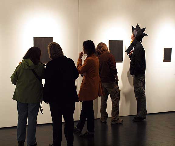
I particularly liked Arnold Kemp's debut at PDX Contemporary. Perhaps the tightest show put on in that gallery since Storm Tharp's 2007 tour de force, Kemp's effort is an interesting kind of rehabilitated formalism related a tiny bit to Yves Klein... it is obsessed with the color black while inviting all its myriad associations (rather than a proscriptive prophylactic discourse). I like the approach. Even the all black paintings went over well on 1st Thursday... (more) Posted by Jeff Jahn on November 26, 2009 at 0:35 | Comments (0) PermalinkWednesday 11.18.09 Long Haired Iconoclasts and Renegade Pirates: Broadcast at Lewis and Clark 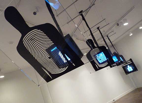 Hostage, Dara Birnbaum, 1994 Lewis and Clark's Hoffman Gallery showcases a didactic display of the questioning of media this month in its exhibition Broadcast. The pieces in Broadcast span a timeline originating in the 1960's and includes a lineup of artists whose commentary ranges in tone from absurdist to anarchist, mystic to murderer. Broadcast applauds a criticality that is at once satirical and provoking, the absence of which, it warns, engenders an inertia of thoughtlessness that is as sneaky as a flu and as dangerous as anthrax. (more) Posted by Amy Bernstein on November 18, 2009 at 6:42 | Comments (0) PermalinkFriday 10.23.09 Processions: an Elaborative Cartography at PSU  Processions: an Elaborative Cartography (detail) For the past few months a group of artists consisting of; Maggie Casey, Zachary Davis, Joshua Pavlacky and Benjamin Young has demanded increasing attention in the Portland art scene by opening an unlikely space in a garage. It is called Appendix and it's just off Alberta Street. Though always experimental, their earlier site specific exhibitions at Appendix Gallery and Tractor have ranged from promising to some of the best of the year. But the thing that really got my attention was... (more) Posted by Jeff Jahn on October 23, 2009 at 23:59 | Comments (0) PermalinkMonday 10.19.09 Memory/Frequency at Worksound Memory/Frequency is a tightly curated show that explores cognitive dissonances
and synchronicities through the work of three PNCA professors; Carl Diehl, Lennie
Pitkin and Tracey Cockrell. It's a taut, liminally fringed show at Worksound that
is even more mysterious for the fact that its curator has chosen to remain anonymous.
Rest assured though, whomever put these three in one place definitely knows their
stuff.
 Carl Diehl's Puzzling the Ficto-Quizzical (w/Weird Fiction) digital/electronic video, 2009 photo Jeff Jahn As shows go, Memory/Frequency is uneasy in character but excellent and it is perversely infused with... (more) Posted by Jeff Jahn on October 19, 2009 at 11:58 | Comments (1) PermalinkFriday 09.25.09 New Designs on Portland 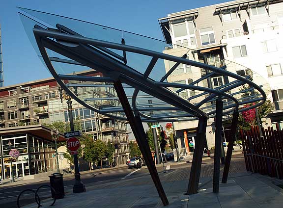 The design for the new leaf-shaped Rainwater Pavilion for the Tanner Springs urban wetland park in the Pearl District is pretty impressive. The pavilion designed by Herbert Dreiseitl (like the rest of the park) conjures "Space Elves" in my mind, something that would be hokey...(more) Posted by Jeff Jahn on September 25, 2009 at 11:30 | Comments (15) PermalinkMonday 09.21.09 Mike Kelley and Michael Smith at SculptureCenter 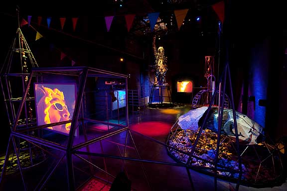 A Voyage of Growth and Discovery Installation view, Image c. 2009 SculptureCenter and the artists Photo: Jason Mandella Voyages are an incredibly rich subject, let's briefly consider; The Odyssey, The Rhyme of the Ancient Mariner, King Kong, Francis Alÿs's paseos, Kubrick's 2001, The Heart of Darkness, Moby Dick, Thor Heyerdahl's Kon Tiki, numerous HG Wells stories, Watteau's Pilgrimage to Cythera, Gulliver's Travels, Richard Long's walks, Star Wars A New Hope, Star Trek's 5year mission, Spinal Tap, Christina Rossetti's The Goblin Market, Swan Lake, The Wizard of Oz, the trials of Heracles, the quest for the Holy Grail, The Canterbury Tales, Saturday Night Fever, The Exodus, The Lord of the Rings, Pierre Huyghe's A Journey that Wasn't, Beowulf , The Epic of Gilgamesh, Leif Erikson, Gordon Lightfoot's the wreck of the Edmund Fitzgerald, Battlestar Galactica, The Ballad of John and Yoko, The Hajj, The Apollo program and Martin Luther King's march to Washington and subsequent I Have A Dream speech… Needless to say voyages both fictional and real are a defining aspect of the human experience. Not surprisingly then that Mike Kelley and Michael Smith's new show at SculptureCenter was the highlight (living artist wise) during my own recent travels to New York. Titled, A Voyage of Growth and Discovery, this joint show consisting of Burning Man video of Smith as Baby Ikki, stuffed animals, custom playground equipment, lights, streamers, a scrap metal sculpture of Ikki and dance music successfully conjured the engine of constant infancy that makes the United States what it is... (more) Posted by Jeff Jahn on September 21, 2009 at 12:01 | Comments (0) PermalinkWednesday 09.09.09 Call and Response as Critical Chorus  In a world increasingly fixated upon the propulgation, proliferation, production, fetishizing, and pushing of objects and things that we somehow need, it is ironic that we question less and less the inherent significance of these particular objects as symbols. They literally fill up and inhabit the space of our lives in the most tangible way, reflecting. . .(more) Posted by Amy Bernstein on September 09, 2009 at 14:15 | Comments (0) PermalinkFriday 09.04.09 Experiencing Art At PICA's TBA Opening  Fawn Krieger - National Park at the PICA TBA Festival Last night's opening of PICA's Time Based Art Festival was quite a scene. The walls of once abandoned Washington High School were once again filled with people. Ages must have ranged from 0 to 100. The walls were decorated with colored copier paper and colored rubber band garlands adored the front staircase. A film superimposed on the front of the school, traced the windows and beams, played with color and light, and distorted the surfaces. Two floors of classrooms were filled a artist's installations. The art ranged from video pieces of people on drug trips to configurable living paintings in the form of hundreds of abstractly painted cubes. Posted by Guest on September 04, 2009 at 14:37 | Comments (1) PermalinkTuesday 09.01.09 Rose McCormick's Grande Ronde at NAAU  Historically reflection pools have been the province of memorials like the Taj Mahal, Lincoln Memorial Reflecting Pool and the Oklahoma City Memorial, etc… all have a solemn shrine like aspect that encourages visitors to personalize and empathize amongst other more imposing and idiosyncratic edifices in their immediate environs. In a very real sense as well as philosophically, these pools bring far away objects into closer more temporally present view. Like this exhibition, those structures are all inherently existential and imbued with a sense of history, but instead of civic level grandiosity Grande Ronde acts as kind of personal shrine to McCormick's own shifting and inherently subjective art practice... (more) Posted by Jeff Jahn on September 01, 2009 at 8:06 | Comments (0) PermalinkSaturday 08.22.09 An Expeditionary Journal at U of O's White Stag Block 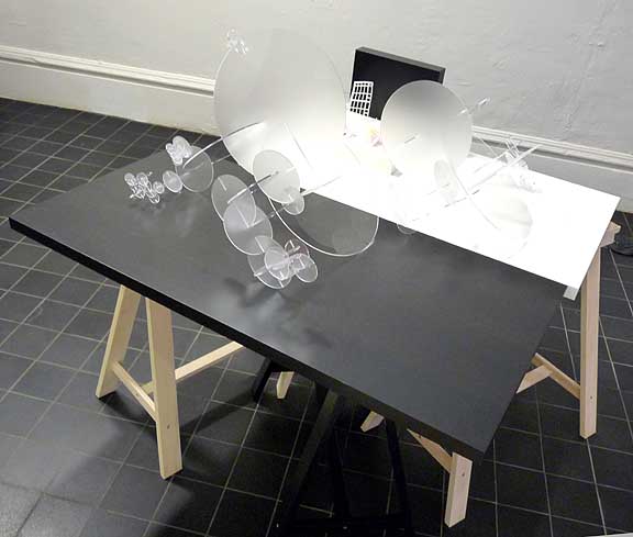 Till now, episodic moments like the Glen Adamson lecture and some of Matthew Stadler's events at the White Stag building have been a bit of a very promising question mark regarding how the U of O will fit into Portland's very active civic fabric. That's where the show, "An Expeditionary Journal: Artifacts of an investigation of new technology, undertaken in the open spirit of Enlightment experimentation," comes in. It doesn't require a formal gallery and instead is presented a bit like the remains of a workshop in one of White Stag's common areas the Fab Lab. The effect works surprisingly well, keeping this work grounded in experimentation so its investigatory élan isn't traded for white box preciousness...(more) Posted by Jeff Jahn on August 22, 2009 at 13:48 | Comments (0) PermalinkSaturday 08.15.09 Ty Ennis' You'll Love It Here at NAAU 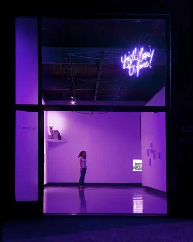 In 1999 Portland artist Ty Ennis learned he had grown up adjacent to Spokane's notorious serial killer Robert Lee Yates Jr. In response, Ennis' latest show, "You'll Love It Here," presents a lurid double poisoned well of memory. The show ends this weekend but for Ennis and the other people Yates touched, this proximity to human darkness will never fully come to term. If your life has ever been touched by a murderer I suspect you'll find this show powerfully hollow and unresolved in that terribly familiar way I wont be able to properly convey unless you've experienced it... (more) Posted by Jeff Jahn on August 15, 2009 at 14:10 | Comments (0) PermalinkThursday 08.06.09 Jordan Tull's debut at Tractor Gallery 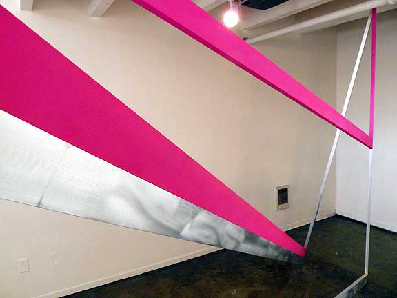 Reflexion (detail) Jordan Tull's Reflexion marks another exciting introduction at Tractor Gallery, which has lately become the place in Portland for new installation artists to make a serious debut (pointed out by PORT and menton in the New York Times before other local sources). What's more the level of ambition in the aluminum fabrication here puts most other Portland art spaces to shame (this isn't an indie aesthetic at all). Thus, Tull's effort really stands out, even in comparison to other Tractor shows. For example, instead of simply having the work fabricated for him Tull did the work himself collaborating with a CAD design programmer to achieve today's ridiculous (but industrially typical)levels of precision... (more) Posted by Jeff Jahn on August 06, 2009 at 17:12 | Comments (0) PermalinkThursday 07.30.09 Revisiting Specific Summer Objects There are some good shows that come down this weekend but as July comes to
a close my mind drifts to a few other specific objects that beg to be looked
at again.
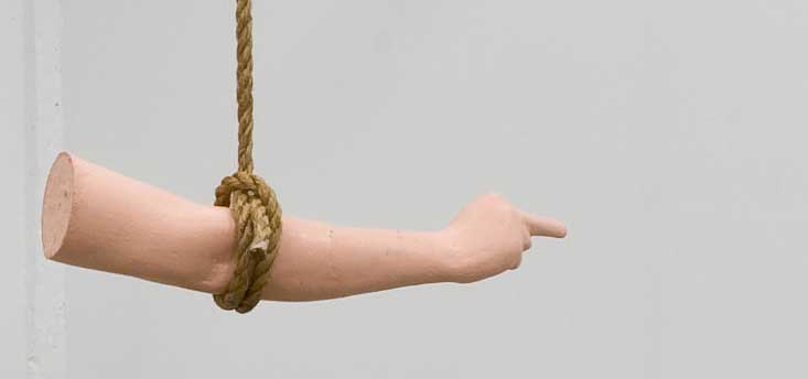 (Detail) Patrick Rock, Never Give An Inch Fourteen 30's current group show is your typical summer potpourri fare but it does paint a remarkably good portrait at this new gallery's maiden year and generally very Californian gist. ... (more) Posted by Jeff Jahn on July 30, 2009 at 18:09 | Comments (5) PermalinkFriday 07.17.09 Amy Stein at Blue Sky At Blue
Sky, Amy Stein's Domesticated series does a good job of portraying the loaded
interaction between animals and supposedly more domesticated environs. Thus,
the animals are both ecological signifiers and manifestations of that old Victorian
fear of our own animal nature.. but instead of the genteel Dr. Jeckl and brutish
Mr Hyde the series is based on real stories from local newspapers and oral histories.
The images are set in Matamoras Pennsylvania, a small town which borders a state
forest.
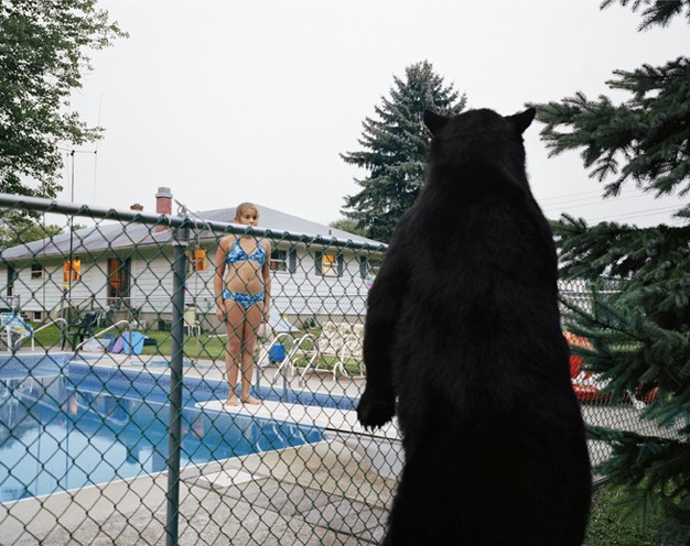 Watering Hole (2005) Yet, despite this documentary starting point the strongest works also tend to be the most theatrical, taking the diorama into the realm of drama... (more) Posted by Jeff Jahn on July 17, 2009 at 17:21 | Comments (0) PermalinkFriday 07.10.09 Midori Hirose & Joshua Orion Kermiet at Fontanelle 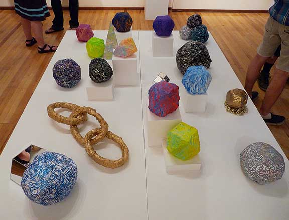
Work by Hirose and Kermiet, the two patterned boulders in the foreground are by Kermiet the Polyhedrons are Hirose's The most exciting show in Portland this month is the dual debut of Midori Hirose and Joshua Orion Kermiet at Fontanelle Gallery. In fact, just seeing the array on the floor pedestal alone left me feeling like somehow Brancusi was once again relevant to the artists of today and not just as an unreachable benchmark for their own (often) more ironic yet stifled ambitions. Kermiet's work is less geometric, more organic/lumpy and camouflaged than Hirose's. It reminds me of artists like Ara Peterson (who is way better) and all of the other contemporary psychedelic patterning in vogue since the 2002 Whitney Biennial. But it is Hirose's work with its tension between crystalline gradients and textured... (more) Posted by Jeff Jahn on July 10, 2009 at 8:12 | Comments (0) PermalinkThursday 06.11.09 Ben Young at Tractor Group shows often act as social mixers
or reconnectors and thus provide an important opportunity to tease out trends
and renew friendships... but for me it's the solo shows that provide the more
satisfying art viewing experiences.
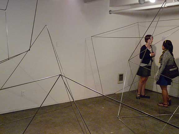 Ben Young's Platonically Imperfect at Tractor This June was short on new solo show excitement with, DE May at PDX and the interesting and well hung debut of Joe Bartholomew ... but overall the solo offerings seemed very minimal, pun intended. Then I came upon Ben Young's Platonically Imperfect at Tractor, probably the most surprising, almost magical...yet rigorous debut I've seen in years at the Everett Station Lofts. Tractor is a space to watch... (more) Posted by Jeff Jahn on June 11, 2009 at 15:59 | Comments (1) PermalinkFriday 05.29.09 Greer and Ides, catch these busy shows on their last days 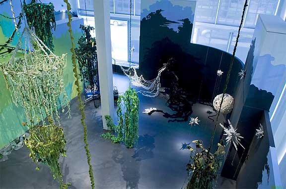 Mandy Greer at MoCC, photo © Kenneth Aaron, Neighborhood Notes I've visited Mandy Greer's Dare alla Luce several times but it works best when a lot of sunlight streams in from MoCC's windows to create real shadows amongst the various painted shadowplay graphics on the walls. Overall, It's a daring if a bit redundant show of crocheted chandeliers that traffic in a biomemetic language that pays homage to the Pacific Northwest's rain forests and maybe a rococo inflected Eva Hesse meets yarn influence... (more) Posted by Jeff Jahn on May 29, 2009 at 13:00 | Comments (0) PermalinkThursday 05.21.09 Signalled From the Periphery 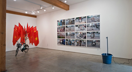 Dinh Q. Lê, Signs and Signals From the Periphery, installation view The sound of rushing water greets visitors as they walk into the Elizabeth Leach Gallery. Not the calming sound of a river, but the insistent, pounding surge of a pump pouring full force into a plastic bucket. It brings just a little bit of the chaos of a street in Ho Chi Minh City to this quiet gallery on a quiet block in Portland, Oregon. (More.) Posted by Megan Driscoll on May 21, 2009 at 10:09 | Comments (1) PermalinkFriday 05.15.09 China at Reed 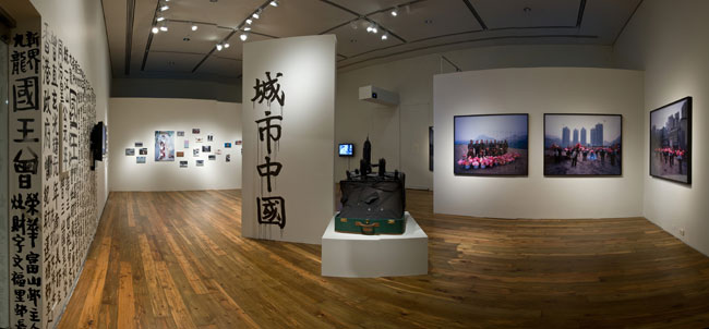 Cooley Gallery Entrance On opening night at the Cooley, standing at the entrance and already China Urban's aesthetic is effectively achieving a tight, busy configuration echoing the hustle and bustle of urban Chinese life. Initially I respond to the show with surprise, primarily due to the flood of people crowding in the gallery space, obstructing my view as person after person... More... Posted by Alex Rauch on May 15, 2009 at 10:20 | Comments (1) PermalinkSaturday 05.09.09 Stephen Slappe's Shelter in Place at NAAU 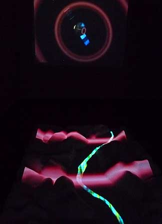
The latest Couture series show at NAAU, Stephen Slappe's Shelter in Place, is the first fully linear visual narrative exhibition in the series thus far, mixing sci fi, young love and indie culture laced with 80's style media induced paranoia. Thus, it makes a huge investment in its own anachronism at a time when a great many other artists are also fetishing the 1980's to the nth degree...(more) Posted by Jeff Jahn on May 09, 2009 at 7:09 | Comments (3) PermalinkFriday 05.01.09 Ellen George's Nose Touches Twig at PDX Contemporary Art 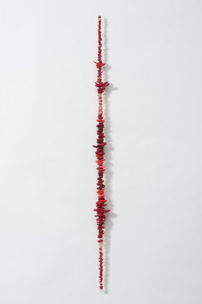 Ellen George, Strawberry Fields Forever, 2009 I think George's vertical wall pieces are better than ever. Pieces like Strawberry Fields Forever and Sunspots demonstrate how a common vertical line can provide a powerful tool for organizing a large number of individual disparate elements. Each work is made of a nearly innumerable number of smaller units of polymer clay each with its own shape, size and color. Each unit is clearly visible and still makes a significant contribution to the whole. Everything is visible to the viewer in a clear and direct way and the work is experienced as both part and whole at the same time. More... Posted by Arcy Douglass on May 01, 2009 at 0:25 | Comments (1) PermalinkTuesday 04.21.09 House of Sound, rest in peace 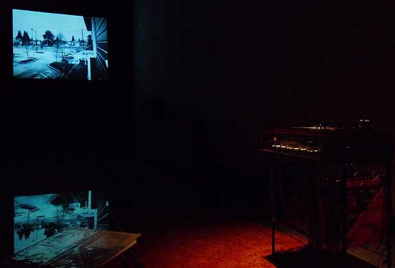 I've come to understand why I always wait till Vanessa Renwick's more recent shows are over …or nearly so to review them. They are essentially memorial services or wakes for those things past and for some reason it seems terribly redundant to review them while they lay in state. Yet, House of Sound Portrait #3, which ended last weekend at NAAU was very different from Renwick's complicated and very polished architectural snuff flick Trojan Portrait #2 in the 2006 Oregon Biennial. In many ways House of Sound is less concerned with being an art or film piece than a private documentary screening or personalized theater experience. Instead, of showing the House of Sound as a kind of iconic demise like Trojan it's an anthropological wake for a music shop as a community taste-making acculturation node. Installation-wise, the 70's style couch... (more) Posted by Jeff Jahn on April 21, 2009 at 12:59 | Comments (0) PermalinkWednesday 04.01.09 Seeing the Numbers @ PAM 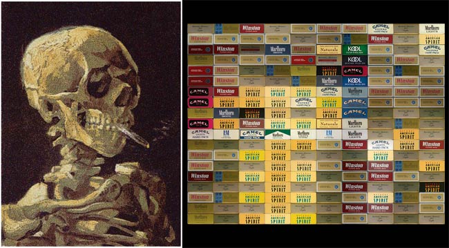 Skull With Cigarette, 2007 [based on a painting by Van Gogh] and Close Up When I wrote this at 9:36:22pm on March 22, 2009 the US population, according to the Census Bureau, was 306,063,901. For the current population, add 1 person for every thirteen seconds since then. This is the mathematical frame for Chris Jordan's installation up now through the 12th of July at the Portland Art Museum's Apex gallery. The selections from his Running the Numbers series attempts to lay out the statistics from recent American consumerism, creating flawless photomontages that literally depict the specific number e.g. 200,000 packs of cigarettes, equal to the number of Americans who die from cigarette smoking every six months. The works are spotless and overwhelming to the point of becoming specter-like in their meaning, teasing an allegorical omnipresent truth of innocuousness in American consumption. Posted by Alex Rauch on April 01, 2009 at 12:53 | Comments (1) PermalinkMonday 03.23.09 Animals and Icons : Cliff Evans at PCC Cascade Gallery 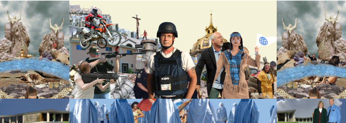 Still from Empyrean 5 Channel Video Projection, Cliff Evans 2007 Empyrean n. 1. The highest heaven; specif., a) among the ancients, the sphere of pure light or fire b) among Christian poets, the abode of God 2. The sky; the celestial vault; firmament . . .(more) Posted by Amy Bernstein on March 23, 2009 at 13:20 | Comments (0) PermalinkMonday 03.16.09 Evertt Beidler at PSU 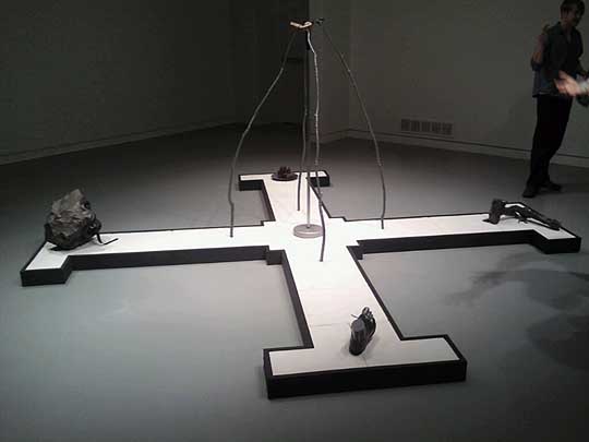 Evertt Beidler at PSU's Autzen Gallery March 2009 gallery shows in Portland were full of new names serving everyone notice that they are some major and newly evolved talents in town. Two that come to mind are Eva Speer at Charles Hartman and PORT's own Ryan Pierce at Elizabeth Leach, both of whom debuted new works that balked the economic doldrums, placing some impressive works for serious figures. Still the biggest surprise debut this month is Evertt Beidler at PSU's Autzen gallery. Beidler has lived in Portland on an off for several years and after finishing his MFA in the Midwest has returned as a real force to watch. I liked his earlier show at Gallery 500 years ago but this is a whole other animal... (more) Posted by Jeff Jahn on March 16, 2009 at 9:40 | Comments (0) PermalinkThursday 03.05.09 Contemporary Modern at Lewis and Clark 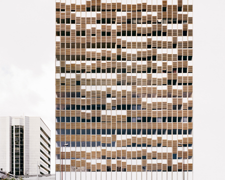 Rémy Lidereau, Puteaux, France, April 2004 reGeneration, a sprawling group exhibition, opens with an ambitious promise: These "photographs of tomorrow" will be known in twenty years. Curators William A. Ewing, Nathalie Herschdorfer, and Jean-Christophe Blaser from the Musée de l'Eysée solicited submissions from the world's top photography schools, selecting work by fifty photographers whose portfolios showed the skill, creativity, and ambition not only to endure, but to become major representatives of their generation. (More.) Posted by Megan Driscoll on March 05, 2009 at 21:15 | Comments (0) PermalinkThursday 02.19.09 Viscous Intellect: Drake Deknatel at Elizabeth Leach Gallery 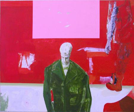 Untitled, (Little Soldier Red) 2005, Drake Deknatel The paintings of Drake Deknatel are a bit like a faint sound in the distance. They are like the attempt at remembering something so familiar yet which somehow remains evasive. They are like descriptors of the mental space that surrounds the second after forgetting a dream. They stand between nightmare and love, between good painting and bad, between the tangible pictoral and the invisible metaphysical. It is an ephemeral experience which lingers. . .(more) Posted by Amy Bernstein on February 19, 2009 at 13:02 | Comments (2) PermalinkFriday 02.13.09 Josh Smith at PNCA 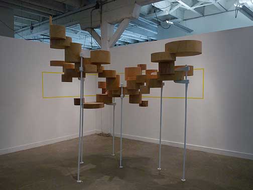 Josh Smith's The Righteous Foundation of Us is yet another exciting installation in the Manuel Izquierdo Gallery at PNCA (the only gallery in Portland cool enough to require a buzzer). In this case the show is a multilayered rumination on the goals of modernism, materials, intellectual positioning and it's relationship to us now, aka a generation that must rebuild things taken for granted like the American Dream. Smith has been a fixture in the Portland art scene for many years now as...(more) Posted by Jeff Jahn on February 13, 2009 at 14:49 | Comments (0) PermalinkFriday 02.06.09 Tacoma Art Museum's 9th Northwest Biennial 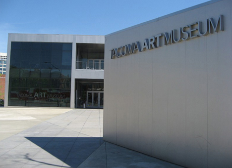 TAM's lovely building by Antoine Predock Last Saturday I was lucky enough to trek on up to Tacoma and take in The 9th Northwest Biennial. This biennial is notable partly because TAM is the only major Northwest institution that still does a broad survey of the region's art, and they have 1st class facilities. Also, this particular Biennial's execution was doubly important since the previous 8th version of the show was such a letdown. Happily this 9th NW Biennial, co-curated by Rock Hushka (Tacoma Art Museum’s Curator of Contemporary and Northwest Art) and Alison de Lima Greene (Curator of Contemporary Art and Special Projects at the Museum of Fine Arts) Houston is a lot better than the previous attempt. ...(more) Posted by Jeff Jahn on February 06, 2009 at 14:28 | Comments (1) PermalinkFriday 01.30.09 Oregon Painting Society at Fontanelle 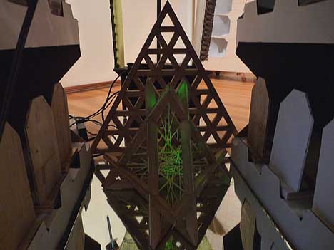 Interior of OPS's "UFO" The history of artist groups is incredibly important considering the way the Impressionists, The Nabis, Die Brucke, de Stijl, The Ten, the YBA's, Superflat, Royal Art Lodge, Forcefield and New Leipzig Schools all have left a lasting imprint. They often bring attention to art in out of the way places signaling a shift in the art world. If there was ever a time the art world needed a shift it is right now as the Miami art fairs or sales driven art ecology finds out Bernie Madoff has absconded with their trust fund money. It's time to get back to creating for art's sake... (more) Posted by Jeff Jahn on January 30, 2009 at 11:06 | Comments (0) PermalinkFriday 01.23.09 Go Make Camp at PCC's Northview Gallery 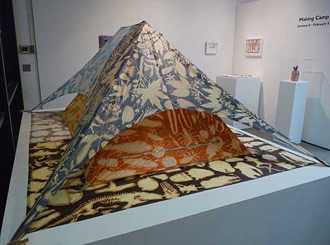 Joseph Palazzo & Mark Smith The Painting as a Tent; the Tent as a Landscape; the Landscape as a Museum, 2002 Making Camp will be running January 8 through February 5 at the PCC Sylvania campus' North View Gallery (CT Building) and it definitely lives up to its name with a strong, coherent theme sustained throughout the show. Interestingly, the show's inspiration and title Making Camp came from the gallery's sylvan view and location, which holds a vague treetop Swiss Family Robinson air about it. The gallery's installation is dominated by the large works of Maria T D Inocencio's Canopy, Paula Rebsom's View of Mt. Hood from the Gallery and Theresa Redinger's The American Dream in Under 100 Pounds. Sadly, this show about camping doesn't take full advantage of the windowed forest aspect of the gallery's giant bay windows, but - for a last-minute show - it is amazing how many pieces are included in the space. ...(more) Posted by Alex Rauch on January 23, 2009 at 12:00 | Comments (0) PermalinkSunday 01.11.09 PORT's staff review of 2008  flying the Portland flag high in 2008 Worth the wait, 2008 was the most varied and adventurous year of art exhibitions since I moved to Portland nearly 10 years ago. You name it, I saw it; pornographic/existential beer signs, arch minimal multireferential ruminations on the corner of a room, Ed Ruscha's latest paintings, TV stations that broadcast a whopping 20 feet, videos with zebra suits, lots of photography, The Natzler's ceramics, a condo for bats, too many good lectures and lots of gallery shuffling... (more from Arcy, Ryan, Amy, Alex, Megan and Jeff) Posted by Jeff Jahn on January 11, 2009 at 14:15 | Comments (7) PermalinkMonday 12.29.08 Woolley's 15 and Smith is Ecumenical The Woolley Gallery has been an integral part of the contemporary Portland art scene since first opening in 1993. While in the Pearl District, Woolley became a pioneer in discovering new talent in town. His eye for new artists has been and continues to be an important factor in the Portland art vocabulary. 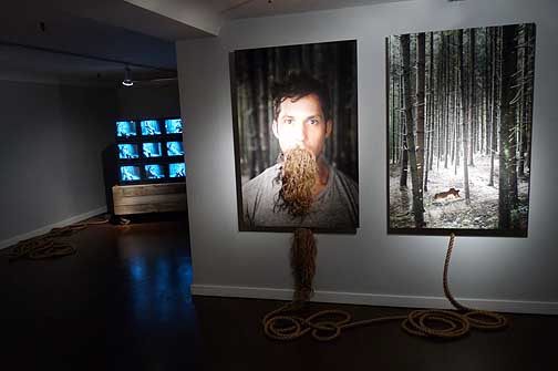 Installation view, Selections from ME9 by Stephen Scott Smith ...(more) Posted by Alex Rauch on December 29, 2008 at 11:24 | Comments (2) PermalinkMonday 12.22.08 Corey Arnold's Fish-Work 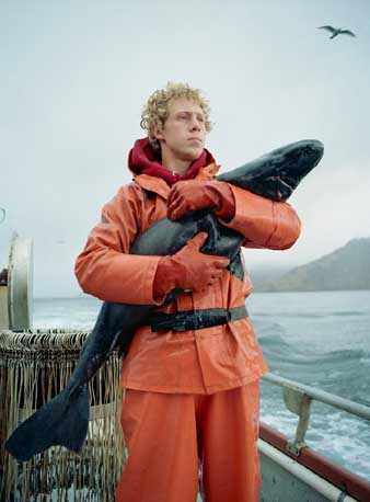 Matthew and the Sleeper Sadly, of one of the best contemporary art exhibitions of 2008, Corey Arnold's wry and accurately titled FISH-WORK at Charles A.Hartman Fine Art ended during the blizzard last weekend. If you missed it PORT will try to make up the difference... sure we have seen Arnold's work in occasional group shows but this collection of images is particularly strong, and sometimes devastingly fresh. (more) Posted by Jeff Jahn on December 22, 2008 at 12:06 | Comments (2) PermalinkFriday 12.05.08 Nostalgic Wonderment 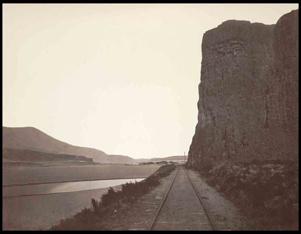
The Portland Art Museum's latest show, Wild Beauty: Photographs of the Columbia River Gorge, 1867-1957, is more than just an exhaustive photographic history of the Columbia River Gorge, it is a bittersweet reminder of the fragile beauty of even the most rugged environments. The show's message comes across as if one were watching an unbiased world news program presented in a straightforward manner, as a chronicle of time passing into memory. Posted by Alex Rauch on December 05, 2008 at 9:25 | Comments (0) PermalinkFriday 11.21.08 The Eye of Science: Brought to Light at SFMOMA by Bean Gilsdorf 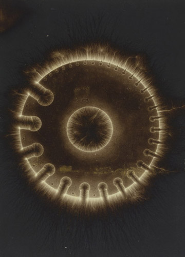
Hermann Schnauss, Electrograph of a brass wire gauge, 1900; Albumen print; 6 x 4 5/16 in. Imagine this: the world is new again. Photographs report the actuality of a novel universe, revealing truths about the environment heretofore unimagined. A formerly skeptical population is now awed, and hungers for images of phenomena previously hidden from sight, because seeing is both knowing and believing. One could ask why a modern art museum would exhibit a group of scientific photographs from the mid- to late 1800s, but Brought to Light answers with an unusual exhibition that highlights the power of curiosity and experimentation... (more) Posted by Guest on November 21, 2008 at 11:47 | Comments (2) PermalinkWednesday 11.12.08 .meta-resolution 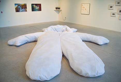 Nayland Blake's The Big One (fg) The current show at Linfield College entitled .meta, is curated by TJ Norris and the finale in an unofficial trilogy of shows including Grey|Area and invisible.other. This very ambitious and diversified show consists of twenty works by eleven artists all completed within the last five years and range from sound sculpture to photography. What's more, .meta is organized in a tersely subtextual manner for the viewer - so much so that the exhibition as a whole has ceased being implicit and has become a curatorial affectation. Luckily, on an individual level some of the artworks are able to speak for themselves...(more) Posted by Alex Rauch on November 12, 2008 at 13:16 | Comments (0) PermalinkSaturday 11.08.08 Even Greener: Beyond Green at Lewis and Clark's Hoffman Gallery 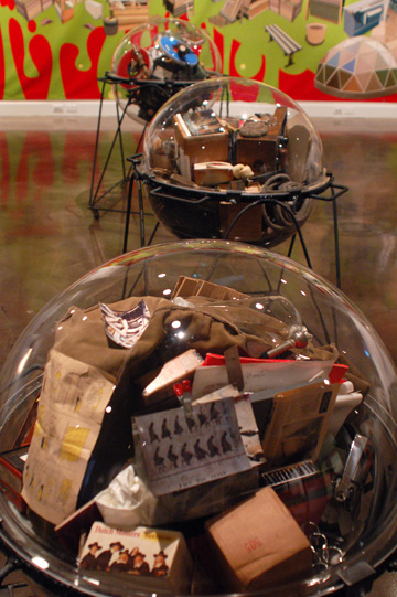 "Excerpts from the Universal Lab (travelpod 1, 2, and 3)" 2005 Dan Peterman Welcome to the now. In a pluralist, industrialized, and deeply technological society we exist in an ecosystem of shift and flux. Our heterogeneous DNA strengthens and challenges us, and in a characteristic, historic note of progress evolution has now transitioned us to the next step of our survival : responsibility. Posted by Amy Bernstein on November 08, 2008 at 8:43 | Comments (1) PermalinkFriday 10.31.08 Exit Wounds 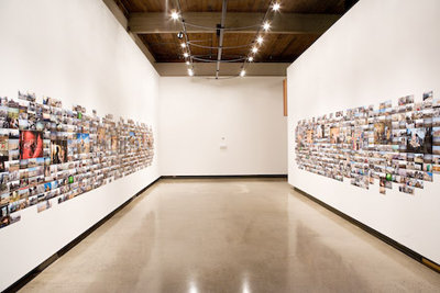 From lommassonpictures.com Jim Lommasson's Exit Wounds is not about art. It's not about politics or journalism either. It's about raw human experience: The suffering, the triumphs, the fear, the pride, the visceral truths that confront every individual touched by the violence of war. (More.) Posted by Megan Driscoll on October 31, 2008 at 10:22 | Comments (0) PermalinkWednesday 10.22.08 Todd Johnson at PNCA 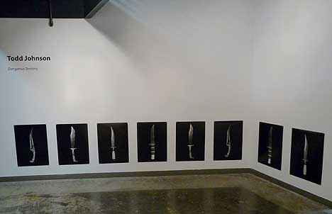 Dangerous Territory at PNCA Collectors tend to be a certain type of hermetic, detail-oriented person and those who collect weapons in a serious way are a very rare breed. For example, those who collect guns and knives are particularly private, even gruffly territorial about their obsessions. They usually don't want the rest of the world know what they have... (more) Posted by Jeff Jahn on October 22, 2008 at 13:55 | Comments (0) PermalinkFriday 09.26.08 End of September Reviews It's the last days for several worthy exhibitions, so here are some quick reviews
to pique your interest:
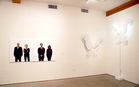 Installation View, Bored Meeting (L), Invincible Air (R) Sean Healy's Life in Black and White at Elizabeth Leach Gallery presents his solidest work to date but it's somewhat undone by a hang that diffuses the themes of power, security and posturing. Taken in small vignettes the show works though. For example, Bored Meeting and Invincible Air both resonate with anyone who knows the business world… it's all about selling some truth between all the posture and ambition... (more) Posted by Jeff Jahn on September 26, 2008 at 17:03 | Comments (0) PermalinkTuesday 09.23.08 Be What?: Ryan Trecartin's "I-Be Area" 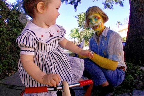 " I-Be Area", Ryan Trecartin 2008, Courtesy Elizabeth Dee Gallery I Be Areaaaaaaaaaaaauhhhhhhh. Who you be. What you be. When you be you, I'll be me. . .but I have to indulge first. Call me by My Space and my color. Say what you mean PLEASE. Because I AM TIRED and so fucking bored. . . . All this non linearity is making me hungry for profundity. Poetry is the buzz word of a generation bloated from its deficiencies in Diet Coke and Sartre. What's my name? What's my Name? WHAT'S MY NAME? Uh. Say my name. say my name. say my name. When no one is around you, say, "Baby, I love you." Did you hear me? I can't believe this is happening! Where is he, Paulo? The muffins are burning! Urgency in all of these emergencies, but I didn't do it for the right reason. I asked him for more. It's just not fair that I'm an artist; my mother made me this way. She just doesn't understand bright yellow ambition. Fuck it. Calvin Klein never wanted any of this. But in Sally's world, he is God, and you know what that means: more sunscreen. So much fun and so little time. So much freedom and so much imovie. The abstract striation of thoughts and impulses to be found and gorged upon in Ryan Trecartin's film "I-Be Area" is an invitation to both freedom and farce. Featured in this year's Time Based Art Festival, "I-Be Area" stood alone in film and genre in the midst of the rest of the festival. . .(more) Posted by Amy Bernstein on September 23, 2008 at 9:00 | Comments (2) PermalinkFriday 09.19.08 Jeff Koons at MCA Chicago 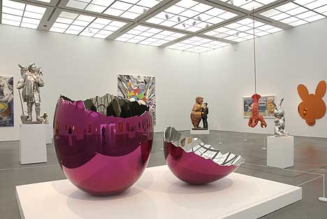 Installation view of Jeff Koons at the Museum of Contemporary Art, Chicago, May 31 - September 21, 2008. Photos © Museum of Contemporary Art, Chicago. Photos by Nathan Keay. How much a person in the art world loves and or hates Jeff Koons mostly depends on how much they appreciate how thoroughly he manages the viewer's experience and expectations. For some it is too patronizingly complete and for others it's an open-ended parody of how patronizing a lot of art is. For the more casual viewer he's one of the few contemporary artists who can be practically guaranteed a response, which is rare and deserves serious attention. To put it mildly, he is a master of the conflicted pop response (like Warhol before him and Hirst after) and it is those other two artists that help bracket and benchmark our understanding of him... (more) Posted by Jeff Jahn on September 19, 2008 at 18:16 | Comments (6) PermalinkSaturday 09.13.08 Gertrude & Otto Natzler at MoCC  Bright Blue Bowl, 1968; Ceramic; 5.25 x 3 inches diameter; Museum of Contemporary Craft Gift of Tom Hardy photo Dan Kivitka This September plays host to some of Portland's most spectacular, erudite and heavy hitting shows in recent memory but the one I keep coming back to is an oasis of quiet mastery, The Ceramics of Gertrude and Otto Natzler at the Museum of Contemporary Craft. It's a return of sorts since the museum organized a retrospective of the Natzlers in 1975 when MoCC was then called the Contemporary Crafts Gallery. Maybe it's the renewed interest in everything mid 20th century or the way it makes difficult things look so easy with its incredibly rare display of virtuosity. Maybe it is the daunting consistency and experimentation of this husband and wife team who fled the Nazis in 1937 but somehow this feels like the show that must not be missed... (more) Posted by Jeff Jahn on September 13, 2008 at 10:01 | Comments (0) PermalinkZidane  Still from Zidane: A 21st Century Portrait by Douglas Gordon and Philippe Parreno I went and saw Zidane: A 21st Century Portrait by Douglas Gordon and Philippe Parreno which is part of PICA's TBA Festival 2008 at the Northwest Film Center's Whitsell Auditorium at the Portland Art Museum on Friday night. I thought that the film was extraordinary. It raises some basic questions about how we choose to engage our environment or experience. I learned that it is our awareness of our own attention which informs whether we are actively or passively engaged in our experience. The structure of the film is pretty straight forward. There are 17 cameras that are focused on a famous soccer player named Zidane. Unlike watching soccer on television, these cameras are always on Zidane whether he has the ball or not. The film is a compilation of images from all of these cameras and are edited to follow the flow of the soccer game that took place in 2005. Unlike some of his fans, I had heard of Zidane but I did not follow his career so I was able to see Zidane as a man playing soccer rather as a hero of European soccer. If you are fan of his, your experience will be different than mine. Like the best films, very subtle changes in perception end up making a big difference. (More...)  Still from Zidane: A 21st Century Portrait by Douglas Gordon and Philippe Parreno Posted by Arcy Douglass on September 13, 2008 at 9:20 | Comments (0) PermalinkSaturday 09.06.08 Barney and the Boundary: Barnett Newman's 18 Cantos at PAM 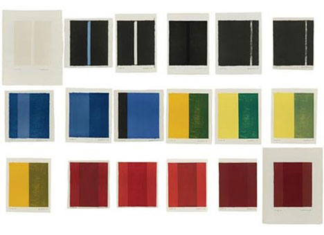 Barnett Newman 18 Cantos, 1963-64 A portfolio of 18 lithograph prints and one cover page Copyright 2008 Barnett Newman Foundation I should say that it was the margins made in printing a lithographic stone that magnetized the challenge for me from the very beginning. No matter what one does, no matter how completely one works the stone (and I have always worked the stone, as soon as it is printed) makes an imprint that is surrounded by inevitable white margins. I would create a totality only to find it change after it was printed-into another totality...There is always the intrusion of the paper frame. To crop the extruding paper or to cover it with a mat or to eliminate all of the margins by "bleeding" is an evasion of this fact. It is like cropping to make a painting. It is success by mutilation...The struggle to overcome this intrusion-to give the imprint its necessary scale so that it could have its fullest expression, so that it would not be crushed by the paper margin and still have a margin- that was the challenge for me. That is why each canto has its own personal margins...These eighteen cantos are then single, individual expressions, each with its unique difference. -Barnett Newman, "Preface to 18 Cantos," 1964 The problem of the boundary, or how a work a work relates beyond the borders of work to engage the periphery, drove some of the most interesting work of the 60s. The boundary is how the viewer is able to separate the inside of a work from the outside or how a work separates or integrates itself with the outside world. It goes by many names: the frame, the pedestal, the border and the edge to list a few. It is how a viewer locates themself as they are exploring a work. Barnett Newman's 18 Cantos are no exception and are especially interesting because they specifically highlight issues of boundary that might be latent and misunderstood in his paintings. For Newman, the printmaking process left an artifact that brought the idea of the boundary to the forefront of his thinking. His articulation of the problems of the boundary also coincided with work by other artists of the 60s including Donald Judd, Dan Flavin and later even Mark Rothko who had done some of the most advanced thinking on the subject. Perhaps no issue is now more critical than the boundary because it is ultimately about how artists integrate their work with the world around us. Newman's 18 Cantos are now on display at the Portland Art Museum. More... 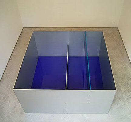 Donald Judd Untitled, 1989 Aluminium and blue plexiglas Copyright 2008 Donald Judd Foundation Posted by Arcy Douglass on September 06, 2008 at 17:34 | Comments (1) PermalinkMonday 08.25.08 Orbis Viridis Obscurus: Ethan Jackson at NAAU 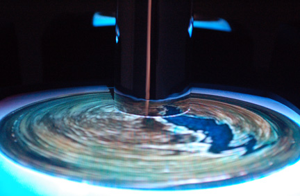 "Orbis Obscurus" (Detail) Ethan Jackson 2008 Ethan Jackson's transformation of the New American Art Union this month is beautiful and baffling. Walking into the first section of the exhibit, Jackson has transformed the front windows of the gallery space into a giant camera obscura entitled 'Polyopticon VII' which depicts the side of the street opposite the gallery. Despite the advanced nature of the technology of optics in this day and time, this ancient discovery of the nature of lenses never fails to awe an audience. . . (more) Posted by Amy Bernstein on August 25, 2008 at 9:31 | Comments (0) PermalinkSaturday 08.23.08 Jeffrey Sarmiento at Bullseye 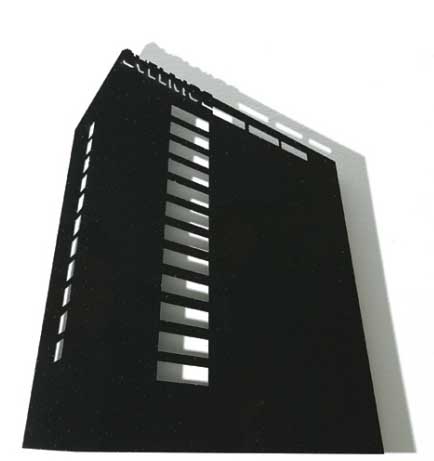
Jeffrey Sarmiento Soviet Hotel II (Siauliai) Jeffrey Sarmiento's Translations at Bullseye is a crisp study in the way certain civic architecture's volumes and memory, when associated to space can exude and question imposed power and aesthetics. Sarmiento (a Fulbright fellow) likes to explore "self imposed mismatches" ... (more) Posted by Jeff Jahn on August 23, 2008 at 19:43 | Comments (1) PermalinkFriday 08.15.08 Eadweard Muybridge and The Matrix  Eadweard Muybridge Animal Locomotion, Plate 700, 1887 Collotype Eadweard Muybridge understood that a single photograph was of little use when you are trying to understand the movement of an subject. Movement is inherently a function of moving through time and space. Muybridge's genius was that the even though a single photograph could only reveal a frozen moment in the movement of an object, a series of photographs are able to reveal a much more accurate description of movement. Even more important was that when the photographs were taken sequentially so the movement of the object can be observed changing frame by frame. I was surprised at the difficulty of thinking about some of the implications of Muybridge's experiments. You can see all of this for yourself if you look at the excellent show of Edward Muybridge collotypes at Charles A. Hartman Fine Art until August 30, 2008. I feel like working through the spatial or temporal aspects of Muybridge's work and photography in general is like trying to understand a Zen Koan. It all sounds so simple on the surface. The shutter speed should be about time and the camera lens should be about recording the space or the field of view in front of the camera. The more I work through Muybridge's work, the more I wonder if the exact opposite is a more accurate description of what is happening. We usually associate time with the hands of a clock, no space just the continuous movement of experience counted off second by second. But couldn't time also be measured by the amount of spatial information that we are able to receive from a photo or a given environment? Ironically, this would imply that the clearer the spatial information is in a photograph, the more time and less space there is. Could the shutter speed be recording more space to be exposed on to the negative the longer the shutter remains open? More...  Still from the move The Matrix, 1999 Posted by Arcy Douglass on August 15, 2008 at 13:14 | Comments (11) PermalinkSaturday 08.09.08 Jacqueline Ehlis at NAAU (Abstraction Today, an anatomy)  After Hours Red (The Red Corner), [view from above] Since it has opened Jacqueline Ehlis' Serenade at NAAU has become one of, if not the most demanding and discussed exhibition I've experienced in my 9.5 years in Portland. Its avowed goal is simply to "operate within the historically loaded perimeter of painting," but it's not the spectacle many expected. Instead, it presents itself without fanfare like a monk in a monastery; it is quiet, task driven, ascetic, up front and unpretentious. It carries itself around with a lot of discipline and deep seated routine that tells the viewer that this isn't just an art exhibition but a kind of anatomical treatise on monochrome geometric abstraction and minimalism's connection to surface and material. Now in its last weekend with positive reviews from every outlet in town and a nonstop sustained level of tongue wagging it's time for a deep look...(more) Posted by Jeff Jahn on August 09, 2008 at 11:29 | Comments (5) PermalinkFriday 08.01.08 Last Chance Reviews Portland doesn't shut down its scene with a bunch of perfunctory Summer group shows like
a lot of cities. This July was no exception with a wonderful pile of more serious
shows, many of which come down this weekend. I'll also have a very long and involved review for one show up later this weekend. Till then here are a few waning
shows that deserve some more attention:
 Donald Morgan's Egyptian One Eighty at Rock's Box Donald Morgan's Hunters and Collectors at Rock's Box continues what has become the strongest altspace exhibition series in Portland since the Haze Gallery of 2004. The show itself is filled with tons of allegorical constructions that reference everything from Egyptian funerary accoutrements to the show's eponymous piece consisting of a zebra hide and mid century sportsmen's hats. It's all about the artist's rather catholic and somewhat syncretic tastes which for me felt like watching the discovery channel for an afternoon (not bad if the weather weren't so nice). Maybe it's not the best show Rock's Box has done recently as it feels a tad slick and referentially impressive for the sake of being academically impressive but still it's well done. Show ends Sunday August 3rd. 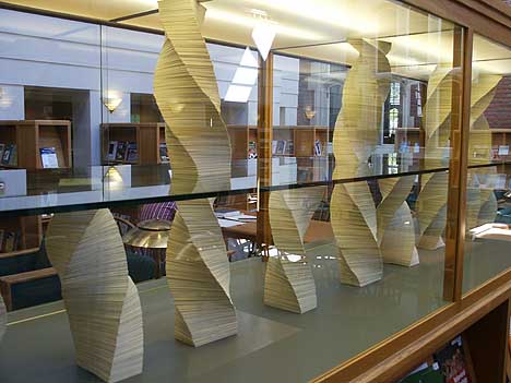 Owen's useless, incorruptible, secret at Reed College Melody Owen's show at Elizabeth Leach was all over the place, probably because the artist had literally been in Iceland, Paris and Quebec. I found her collages and sculptures to be her strongest suit… but it was her Caseworks show at Reed College's Hauser Library titled useless, incorruptible, secret that was the... (more) Posted by Jeff Jahn on August 01, 2008 at 15:16 | Comments (0) PermalinkWednesday 07.16.08 Experience into Art: Robert Rauschenberg's The Lotus Series at Blue Sky Gallery 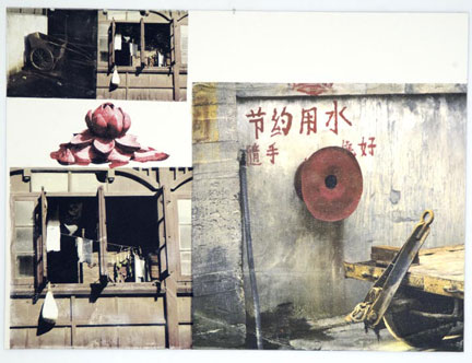 Robert Rauschenberg Lotus V, 2008 Pigmented Ink-jet and hand painted photo-gravure on Somerset velvet 45.75 in. x 60 in. x 1.75 in. Print edition by ULAE Rauschenberg was a great photographer. The first works he sold to the Museum of Modern Art in New York were photographs. The surprising thing is that even though he could capture whatever he wanted in front of a camera, it was never enough. Perhaps it was not real enough because the life and energy that would swirl around him seemed much richer and more complex than a single image from a camera. He needed something more, something different. He found that by collaging images along with the artifacts of a life he was able to create something richer, something as vibrant as the experiences he was trying to translate. Just as the image on the camera will be exposed onto a negative, at least it used to be before digital cameras, Rauschenberg wanted to insert himself into the process, to let all of the energy and experience to be exposed onto himself before being translated to the work. These new prints are extremely complex and bring together a lot of themes that Rauschenberg spent a lifetime developing. All of this comes together in a show of his last prints called The Lotus Series at the Blue Sky Gallery in Portland, Oregon. When we are looking at The Lotus Series, like most of Rauschenberg's work, we never see a photograph in isolation. Even though Rauschenberg was an excellent photographer, at some level he must have felt that a single image would not be real enough. It would not be able to convey all of the life and energy that he saw spinning around him. The single image was too fixed, too stable, too much about one-point perspective. By contrast, he wanted to convey what it felt like to be alive. He was not trying to make art with the prints, but he was trying to show you the art that surrounds us everyday. Almost anything can be art; you just have to look at it in a certain way. Rauschenberg was opening himself to the world around him, trying to be open to the potential for art latent in his every experience. More... 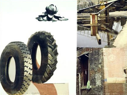 Robert Rauschenberg Lotus II, 2008 Pigmented Ink-jet and hand painted photo-gravure on Somerset velvet 45.75 in. x 60 in. x 1.75 in. Print edition by ULAE Posted by Arcy Douglass on July 16, 2008 at 12:24 | Comments (2) PermalinkTuesday 06.24.08 The New Scene on NW Broadway For the nearly 9 and a half years I've lived here The
Everett Station Lofts have been the best incubators of local talent introducing
Portland to the likes of Jacqueline
Ehlis, Brenden
Clenaghen, Laura Fritz,
Jenene
Nagy, TJ
Norris, Roxanne Jackson, Stephen Slappe and Stephanie Robison etc. Consequently, everytime I hear some all-talk no art background person declare how they are going to change Portland
I kinda chuckle because "the Lofts" currently in resurgence mode with
Igloo, The
Life, Sequential, Tilt,
Pip and now Tractor and the soon
to open On gallery…) so routinely change the up and coming scene that
no one entity could hope to change the ever-changing. True even the best of these
galleries typically last only a year or two but they provide an important blueprint
to others aspiring to create live work spaces for Portland's scene… the lofts
are located in Chinatown so it's all location location location + a little well
placed energy and some post art school knowledge = a formula for success (though there is a glass ceiling).
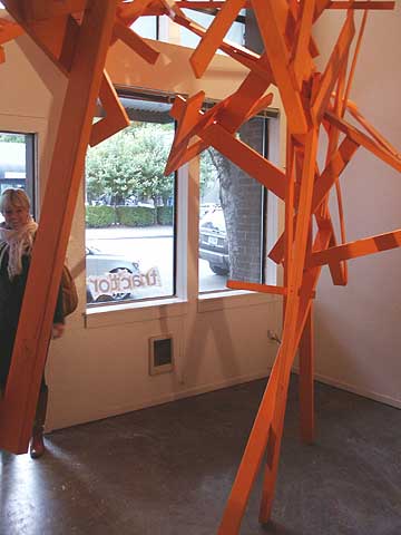 Crushed Orange A19-7 at Tractor Gallery A great example is the inaugural exhibit at Tractor gallery in the Everett Station Lofts by Mackenzie Shubert and Charles Olson. Titled Crushed Orange A19-7 it reminds me of Mark di Suvero and Kurt Schwitters' Merzbau... (more) Posted by Jeff Jahn on June 24, 2008 at 10:59 | Comments (3) PermalinkFriday 06.20.08 Roger Ballen at Quality Pictures 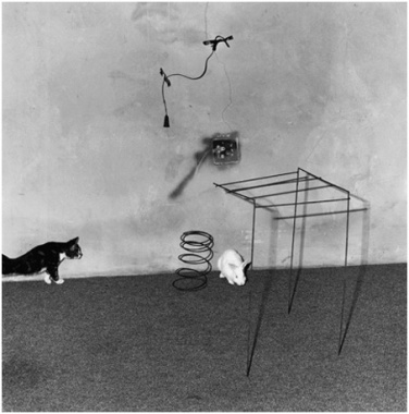 Animal Abstraction, Roger Ballen at Quality Pictures The intrinsic nature of photography is confounding. Picked apart, the latin translates directly, meaning "light drawing". Caught from light particles bouncing off the objects surrounding us, the history of photography's purpose was the capture of those particles on light sensitive emulsions, and the result was the precise emulation of the world around us, so to speak. Due to the nature of this process, most of the world's audience considers the photographic image a small but somewhat accurate piece of reality. In the world of art, of course,. . .(more) Posted by Amy Bernstein on June 20, 2008 at 12:40 | Comments (2) PermalinkTuesday 06.17.08 The Design and Construction of the Japanese Garden: A Lecture by Shiro Nakane  Kinkaku-ji or the Golden Pavillion in the snow Shiro Nakane of Nakane and Associates spoke at PNCA on Tuesday night. In an excellent lecture that was co-sponsored with the Portland Japanese Garden, his talk was called "Honoring the Past and Envisioning the Future" and was the last part of the PNCA + Five: Idea Studios program for this year. It was a privilege to get an introduction to the design of Japanese gardens by the preeminent landscape architect of our time whose family has actually restored some of the most prominent gardens in Japan. It is hard to find a western equivalent for the temples and gardens of Kyoto and Mr. Nakane's role in their restoration. The closest I could think of would be if the cathedrals of Western Europe were somehow all within walking distance to one another in a small town and his family has been responsible for not only the restoration of the older ones but also the construction of new cathedrals as well. 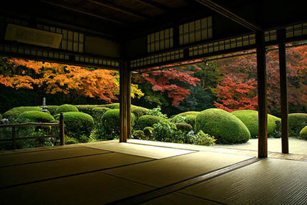 Shisen-do in Kyoto demonstrating the relationship between the interior and exterior spaces Posted by Arcy Douglass on June 17, 2008 at 15:19 | Comments (4) PermalinkFriday 06.13.08 The first Contemporary Northwest Art Awards 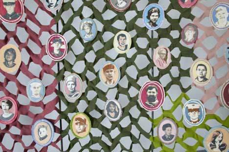 A tiny sample of Marie Watt's installation So is this Contemporary Northwest Art Awards deal at the Portland art Museum worth seeing? People have had their doubts and well... I've seen it and yes (unequivocally) you should too... The CNAA's open tomorrow to Museum members as a gala and the 5 artists will speak on Sunday at 2:00. A huge, free and warmer weather bash is planned for July 25th The Verdict: As a collection of 5 solo shows it starts with two of the best exhibitions we've seen in Portland in the last year before losing its nerve (in a very professional way). I'll save in depth formal reviews for later because it really deserves 5 reviews, but in short here is why it does and doesn't work: Overall it is a serious museum show, not like the somewhat ADHD style biennials, even the stuff that falls short... falls short with well installed authority. You get to explore precisely why and how each artist succeeds or fails. It starts with a bang, Marie Watt really steps up with a Joseph Beuys meets Louise Bourgeois festival of fond remembrance that utilizes the Belluschi designed atrium space to great effect. If you like craft, spatially activated art and do-gooder social coincidence stuff (quite reminiscent of MK Guth's Whitney Biennial piece but more crafty) then this will please you. If you were one of the people annoyed that Watt was the only Portland artist included and asked why her?... then her installation should answer the question (in case you missed her Smithsonian show). Fact is it is unfair for her to represent Portland alone... but she does a good job representing herself and this is an eye opener compared to her consistently good but never quite awe inspiring solo shows at PDX...(more) Posted by Jeff Jahn on June 13, 2008 at 14:23 | Comments (7) PermalinkBrighter Than a Thousand Suns 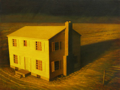 Robert Beckmann Test House - First Light, 2008 Oil on Canvas 36 x 48 inches (c) Robert Beckmann 2008 "I have become death, the destroyer of worlds," J. Robert Oppenheimer spontaneously said upon witnessing the first detonation of a nuclear bomb on July 16, 1945. The statement is a slight mistranslation of a passage from the classic Hindu text the Bhagavad-Gita. It is hard to imagine that Oppenheimer's declaration is even an overstatement. The bomb has one purpose: to destroy. But even something as seemingly straight forward as the atomic bomb never remains clear for very long and soon enough the questions begin to arise: What does it mean? Why do we feel compelled to build them? Is it protection for ourselves or from ourselves? In a direct way, by looking at Ashland artist's Robert Beckmann's new paintings that are part of a group show at Jim Kempner Fine Art in New York, the viewer is able to come to grips with some of these questions in their own way. More... Posted by Arcy Douglass on June 13, 2008 at 10:07 | Comments (0) PermalinkFriday 05.30.08 Keith Boadwee's This is a low. at Rock's Box  Unitled (piss in mouth) Detail Keith Boadwee is a bit of a legend… hmm where to start? Probably the enema paintings of the 90's…. At the time they seemed like a logical abuse of art history and a performance art taunt directed at the fuzzy notions of good and bad taste. Many loved it because it seemed to be a great way to try and kill off "painting" once and for all (nice try), some thought it was talentless drivel, while others saw it as a necessary icon of queer culture. As a series they certainly got everyone talking but... (more) Posted by Jeff Jahn on May 30, 2008 at 17:02 | Comments (0) PermalinkTuesday 05.06.08 Judy Cooke and Amanda Wojick at Elizabeth Leach Gallery 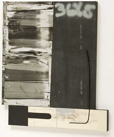 Judy Cooke, Oil, 2007 rubber, aluminum and oil on wood 43 x 38.5 x 2" Black Rubber has many connotations. Some of us might think tires, others its uses as a shock absorber/ dampener and others, well how should I say it, something more entertaining. According to Wikipedia, natural rubber is an elastic hydrocarbon polymer that naturally occurs as milky colloidal suspension, or latex, in the sap of some plants. In other words, rubber is a natural substance that has found lots of uses in industrial applications: tires, tubes, gaskets, etc. We use rubber to make sure our cars stay on the road and to make sure that when we connect to pipes that don't leak. Not to overstate the obvious but rubber is flexible, it adapts... (more) Posted by Arcy Douglass on May 06, 2008 at 9:46 | Comments (1) PermalinkFriday 05.02.08 Paul Sutinen at the Nine Gallery 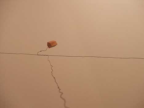 Detail of Paul Sutinen's Sculpture in the Form of a Small Building in the Distance at the Nine Gallery Unless you are camping or a cave dweller, buildings are the main stage for most human activities. We humans are essentially hive dwellers and buildings are our honeycomb. Because of this, Paul Sutinen's Sculpture in the Form of a Small Building in the Distance at the Nine Gallery collective (located inside Blue Sky in the Desoto Building) was a welcome respite from all of the sculpture du jour (self conscious with a light touch) on view for May's First Thursday... (more) Posted by Jeff Jahn on May 02, 2008 at 14:37 | Comments (0) PermalinkFriday 04.18.08 Overstock: Chris Held at Jace Gace  Drene Shampoo Ad Proctor & Gamble 1952 The other night I stopped by the Safeway on my way home from work. I popped in to purchase toilet paper, toilet paper, and only toilet paper when I suddenly found myself in the shampoo and conditioner aisle. My gaze lingered lovingly and languorously over the many options afforded me. . .(more) Posted by Amy Bernstein on April 18, 2008 at 11:07 | Comments (9) PermalinkSunday 04.13.08 Damien Gilley at Portland Building + other Portland space rangers 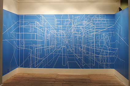 Gilley's Plus Minus at the Portland Building Portland's art scene is host to pretty much every genre imaginable but spatially concerned installation work has become a very prominent element over the past 6 years. It's time to add Damien Gilley to the ever-growing list of first rate to promising practitioners of the genre. This focus on redefining space makes sense as Portland is currently reimagining itself as a city (many would argue that it is a city state built on civics rather than corporate greed). Gilley's Plus Minus at Michael Graves' history making Portland Building makes use of vinyl tape to render and conflate the cityscape and interior space on a wall based web. The effect isn't unlike a city planner's PowerPoint slide manifested in real life by some giant graphic design obsessed spider (it is so very Portland). ...(more) Posted by Jeff Jahn on April 13, 2008 at 22:09 | Comments (3) PermalinkFriday 03.28.08 Last weekend round the corner reviews There are lots of interesting solo shows coming down this weekend and a few of them deserve a little more critical attention. Conveniently all are within 2 blocks of eachother:
 Adam Satushek's Puddles (2005) at Rake Gallery One exciting discovery is Adam Satushek at Rake Gallery. His large format photographs of decay, debris and human activity comprise one of the tighter solo shows in Portland for the month of March. It satisfies my need to see photography do more than just depict the more pleasant aspects of civilization and nature and much of it is unintentional earth art... 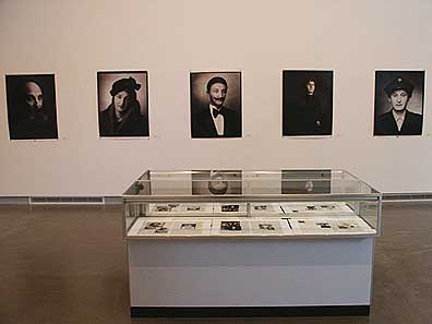 Raphael Goldchain at Bluesky Gallery... (more) Posted by Jeff Jahn on March 28, 2008 at 12:38 | Comments (1) PermalinkSaturday 03.22.08 Elegy to Analog: BYOTV at The New American Art Union  SuperPaint System in 1973 Image Courtesy Computer History Museum Dear (Video) Ladies and Gentlemen, The death of an era is upon us. On February 17, 2009 the FCC will terminate the broadcast transmissions of analog signals in favor of an entirely digital broadcast system. To receive these new signals, one must own either a digitally receptive television or purchase an analog converter, for which the government has issued coupons and for which may be applied through various FCC websites. Such a change will mark. . .(more) Posted by Amy Bernstein on March 22, 2008 at 12:05 | Comments (1) PermalinkFriday 03.14.08 Carson Ellis at PCC Rock Creek  Carson Ellis, original artwork for the The Decemberists' The Long and Short of it Tour (detail) It is no secret that Portland has an impressive music scene nor is a secret that the art scene is equally robust, what isn't talked about much is how often they are entwined in each others affairs. The two have grown up alongside and supported eachother. Take for instance one of my favorite local artists, Carson Ellis and her work for The Decemberists. Way back in the old days 2001/2002 (before Portland actually believed something was going on) Ellis got my attention for her sure hand and novel wit. Later, her ghost ship painting was used for The Decemberists Castaways and Cutouts album and the rest is history. Soon she'll have a show in Chelsea, but till then there is small but wonderful retrospective of her The Decemberists work at PCC Rock Creek up for the month of March.... (more) Posted by Jeff Jahn on March 14, 2008 at 11:27 | Comments (0) PermalinkFriday 02.22.08 Nathaniel Shapiro at PNCA's Izquierdo Gallery 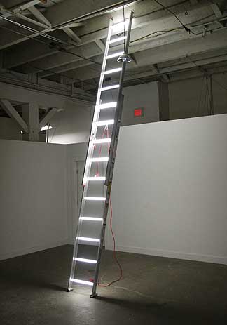
Last year I noted Nathaniel Shapiro as one of the most promising new artists to the Portland art scene. In just under a year he's proven why with a stark and beautifully laid out show in PNCA's Manuel Izquierdo Sculpture Gallery. Titled "The Way of Progress" Shapiro's most convincing show to date consists of only two installations, neither of which utilizes any gallery lighting because they provide their own light sources... (more) Posted by Jeff Jahn on February 22, 2008 at 11:34 | Comments (6) PermalinkThursday 02.14.08 Johann Neumeister at Rock's Box 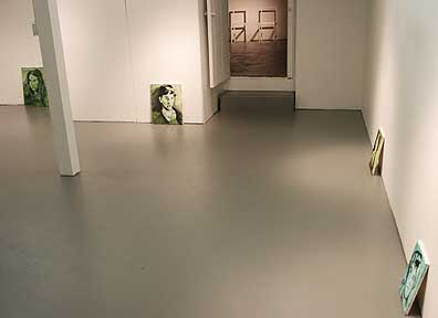 L to R Unica Zurn, Virginia Woolf and Valarie Solanas Portland is currently teeming with more interesting alternative spaces than ever before but Rock's Box has earned some distinction in less than a year with the only thing that really matters; four consistently intelligent, daring and engaging shows. Admittedly, these weren't all necessarily masterpieces but they were challenging and consistently professionally executed (note: proprietor Patrick Rock is himself one hell of an artist [with an MFA from SFAI] and a rare native Portlander). The latest show, "Johann Neumeister - is - Dr. Herbert Dreadful Introducing: Psychopsychoanalysis" is easily the tightest and most impressive show at Rock's Box to date. Upon entering the...(more) Posted by Jeff Jahn on February 14, 2008 at 13:49 | Comments (0) PermalinkTuesday 02.05.08 A "Working History" at Reed 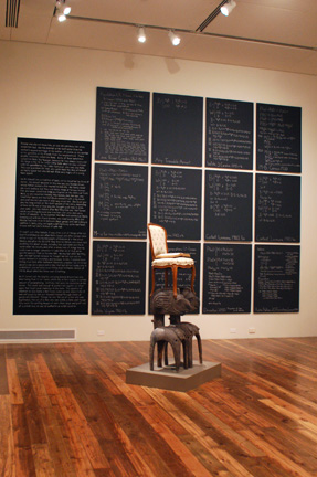 Fred Wilson "Seat of Power" 1991, Kianga Ford "Counting 2000-2008" The group show at Reed this month is in honor of change and the ability to alter popular notions of thought. Entitled 'Working History: African American Objects', this exhibit explores the contemporary African American experience through languages both appropriated and created. An amalgam of artists compiled and arranged by Cooley Gallery curator, Stephanie Snyder, this show is a brilliant, reified miasma of African American identity politics that bleeds. . .(more) Posted by Amy Bernstein on February 05, 2008 at 8:16 | Comments (2) PermalinkFriday 02.01.08 Jessica Jackson Hutchins' Hours and Ours at Small A 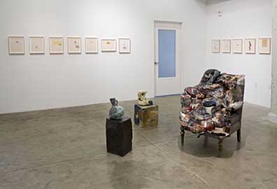 Some artists seek to refine a convincing material experience by removing any irregularities while others invite entropy by creating fissures and cavities, which are places for esthetic skepticism to fester and breed. Jessica Jackson Hutchins is the latter type of artist but with Hours and Ours she seems to be testing a different realm or two with the addition of a Proustian document laced with family life. Back to esthetics (which really matter here), both perfectionist and imperfectionist strategies make enemies and allies of viewers almost too easily. As alternative sides of the same materially indulgent coin both strategies are susceptible to the charge of being merely a fetish or patina. There is a danger of being formulaic but great artists like Robert Rauschenberg and...(more) Posted by Jeff Jahn on February 01, 2008 at 17:36 | Comments (0) PermalinkFriday 01.25.08 Sarah Johnson at Chambers Gallery 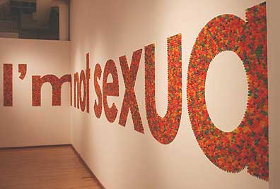
Sarah Johnson's debut at Chambers Gallery is a breath of problematic air. Comprised of the words (poetically broken by the walls), "I'm not sexua | lly satisfied" it is spelled out in dots candies. The break is perfect, implicating the viewer and space. There is also... (more) Posted by Jeff Jahn on January 25, 2008 at 11:34 | Comments (0) PermalinkTuesday 01.22.08 Joe Macca's Slowblivion at PDX Contemporary Art  Joe Macca Untitled, 2007 Acrylic and Oil Medium 45" x 45" Image courtesy of PDX Contemporary Art Copyright Joe Macca 2008 When I look at Joe Macca's paintings, I am always surprised with the subtle division between the forms and the color of his work. One might think of it as the forms are the drawing component of the work, while the color is its realization. One is the vehicle, and the other is the message. I am taking the time to make a distinction between color and form in these paintings because in his case they reveal his process in an extraordinary way. The paintings are a union of opposites: between the square and the circle, between personal and the public, between the abstract and the real. More... Posted by Arcy Douglass on January 22, 2008 at 14:48 | Comments (1) PermalinkMonday 01.14.08 Aaron Siskind at Charles A. Hartman Fine Art  Jerome 20, 1949 Gelatin silver print, 1957 "If you look very intensely and slowly, things will happen that you have never dreamed of before." -Aaron Siskind I was caught a little off guard when I walked into the Charles Hartman Fine Art to see a show of Aaron Siskind's photographs. In most of my favorite photos there is no object in the picture. Just a surface. More often than not, it is decaying as we silently watch it. In his best photos he destroys the object in the same way that the best abstract expressionists destroyed the figure. More accurately, the body is what filters the experience, both of the photographer and the viewer, rather than being the object... (more) Posted by Arcy Douglass on January 14, 2008 at 0:27 | Comments (0) PermalinkThursday 01.10.08 Breathing in the Light: James Turrell at Pomona College  James Turrell Entrance to End Around, 2006 neon light, fluorescent light & space Courtesy GRIFFIN, Santa Monica Photo by Florian Holzerr Copyright James Turrell It is the day after Christmas, and I am walking up a narrow corridor to enter James Turrell's End Around at the Pomona College Museum of Art. There is a soft, blue lavender light that spills into the space of the corridor from an adjacent room. It is hard to describe the effect of the light, but it is a light that has its own identity, its own volume. It is man-made and not natural, so the environment feels slightly alien and unlike anything I have ever seen. I realize quickly that I am about to enter a space that I'm probably not prepared for and for which there is no natural equivalent. As I turn the corner, the blue light floods the space, as floors, walls and ceiling converge at a rectangle in the center of the room. There is nothing for my eye to focus on. This is one of Turrell's ganzfeld pieces. Ganzfeld means "total (or entire) field" in German and comes from the experiments of Wolfgang Metzger in the 1930s. The premise is simple: if we spend all of our time using our eyes to focus on objects, what happens to our eyes (and our minds) when we do not have anything to focus on? So turning the corner and entering End Around, I felt a lot like Alice wondering how deep the rabbit hole goes. More... Posted by Arcy Douglass on January 10, 2008 at 23:02 | Comments (0) PermalinkSaturday 12.22.07 Gordon Barnes & Shelby Davis at Jace Gace  Yes, a tank in a waffle house... Recently Jace Gace (a hybrid waffle house/gallery on Belmont) has become the newest place to see challenging art in Southeast Portland and openings have been packed despite the extensive condo construction next door. This installation art/waffle development would be more surprising if it hadn't been started by a bunch of MFA's from CCA and located in the Portland Art Center's smaller but wonderful old space when they were dedicated to installation art (2005). Jace Gace's current show, titled "The Closest It Gets From A Safe Distance" features a large scale model tank made of cardboard. At nighttime it features an electric lightshow, fog and music by Megadeth... (more) Posted by Jeff Jahn on December 22, 2007 at 14:45 | Comments (4) PermalinkMonday 12.03.07 William Kentridge at Lewis and Clark College 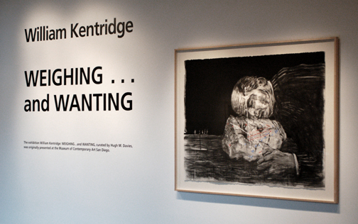 "Weighing and Wanting" Installation Shot Hoffman Gallery Despite the discouragement of the weather and the natural predilection for hibernation during this time of the year, there is soulful reason this month to bundle up and get out. Lewis and Clark's Hoffman Gallery is currently exhibiting "Weighing and Wanting" an animated film and associated drawings by William Kentridge.. . . .(more) Posted by Amy Bernstein on December 03, 2007 at 9:30 | Comments (0) PermalinkWednesday 11.28.07 Your Art: Olafur Eliasson's Take Your Time and Your Tempo at the San Francisco Museum of Modern Art 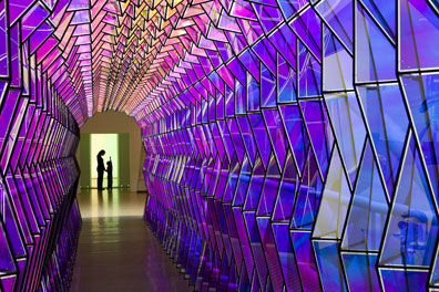 Olafur Eliasson One-Way Colour Tunnel, 2007 Take your time: Olafur Eliasson, installation view at San Francisco Museum of Modern Art; (c) 2007 Olafur Eliasson; photo: Ian Reeves, courtesy SFMOMA The first thing that you notice when you get off of the elevator at Olafur Eliasson's Take Your Time at the San Francisco Museum of Modern Art is that you are entering a room that is saturated with a bright yellow light. The piece is called Room for One Colour and the room is saturated, or soaked if that is possible, with this bright yellow light. The light is so bright that the walls in the elevator lobby seem to dematerialize and the room seems much larger than it really is. It is a good introduction to the show because from now on nothing will be what it seems. Eliasson is the master of inverting your expectations. Anything that you think you know about a space or a material goes out the window. His strength as an artist is his ability to look at materials or phenomenonal effects with a fresh eye. He is able to isolate the raw potential of a material so that it can be used to transform the experience of the viewer. More... Posted by Arcy Douglass on November 28, 2007 at 22:09 | Comments (0) PermalinkTuesday 11.27.07 November in Portland: a glut of good shows  This November Portland was full of interesting shows that probably deserved more attention and if you want to walk off some of those Thanksgiving calories you can check out these shows that aren't by Kentridge, Campbell, Lulic/Kreider, Boberg and Von Rydingsvard…. Yes, those are still my top picks but here are some other vexing shows that collectively show just how varied and unpredictable Portland can be. Recently Jen Graves and Regina Hackett started a conversation in Seattle about the center of their scene... for contrast things are too varigated here in Portland to even consider a center these days. Sure we had a center or two back in 2002-2004 with Haze and the original Savage gallery but now each of the 100 or so factions is pretty much capable of getting 100-500 of their cohorts to show up to a big event… There just isn't a single room big enough to fit everyone and a lot of these groups have international connections that make trying to "be THE place" in Portland a bit of a waste of time. Instead we have lots of alt spaces and old haunts: 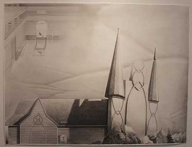 Bryson Gill's Atrium Surrealism in Grey Jace Gace is a great new altspace addition to the Portland art scene started by a couple of recent CCA grads...(more) Posted by Jeff Jahn on November 27, 2007 at 13:21 | Comments (6) PermalinkFriday 11.16.07 a band on every thing: Gary Hill Lectures at Reed 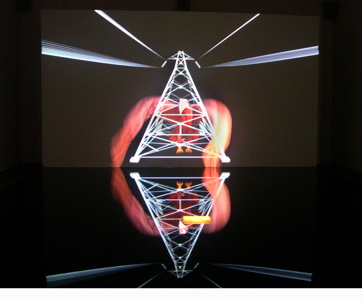 "Frustrum" Gary Hill 2007 If you didn't have the chance to attend video artist Gary Hill's lecture the other night at Reed, you may have missed one of the rarer opportunities to revisit the contemporary phenomena of existence with one of its most ardent investigators. While modern day philosophers. . .(more) Posted by Amy Bernstein on November 16, 2007 at 19:34 | Comments (1) PermalinkSaturday 11.10.07 Beth Campbell at PNCA's Feldman Gallery For every action, there is an equal and opposite reaction - Sir
Isaac Newton's third law of motion
 a portion of Beth Campbell's The Following Room (2007) at PNCA Art can get lost in the paradoxes it courts and sometimes that is a good thing. Yes, some contemporary art is designed to ingratiate itself by reaffirming the tastes of those who see it, whereas other work is designed to confront and challenge those expectations. Beth Campbell's show at PNCA's Feldman gallery is mostly of the challenging journey variety. It has a kind of magic despite the fact it goes pretty much nowhere through its use of a series of faux mirrors. The effect is a bit like the Bermuda Triangle in an Ikea store, or a kind of physical paradox where pop culture meets nameless individual. The important part is how viewer gets a little lost and discombobulated by the experience forcing them to question the way optics and cognition converge. Getting lost has an important and pervasive history that can't be ignored. Great literary characters like Melville's Ishmael or cheesy self help books are both built on the idea that one has to lose themselves in order to find oneself. In Chinese philosophy Mencius focused on the internalization of one's external world to stay true to it. Similarly the western philosopher Wittgenstein focused on the human tendency to solipsisticly see one's self as the center of the universe... (more) Posted by Jeff Jahn on November 10, 2007 at 17:21 | Comments (3) PermalinkSaturday 11.03.07 Beyond the Frame: Robert Irwin's Primaries and Secondaries at the Museum of Contemporary Art in San Diego  Robert Irwin examining Light and Space a few moments after it was turned on Photograph by Jeff Jahn Copyright Robert Irwin/Artists Rights Society, New York Robert Irwin is walking to the left and then to the right, stepping forward and then back, until finally stopping at a spot where the work fills his entire field of vision. He is trying to understand what this new piece is about and he has always said that looking is as much about the body as the eyes. For the first time, his assistants have just turned on Light and Space, a work designed specifically for his retrospective, Primaries and Secondaries at the Museum of Contemporary Art in San Diego. Light and Space, like the eponymous art movement is about a particular environment or set of conditions to experience. In this case it is a large empty room defined on a one long by a field of fluorescent light fixtures. The lights are installed in a non-repeating modified grid pattern that completely fills a giant wall. There is no focus and is non hierarchical, it is just the experience itself. The experience resonates between the field of light that is created by the fixtures and the way that the light redefines the space of the room. The transformation and reorientation of the space makes the new work a classic Irwin piece.  Robert Irwin examining Light and Space Photograph by Jeff Jahn Copyright Robert Irwin/Artists Rights Society, New York At that moment, like the rest of us, Irwin has never seen this particular work before, and we are lucky enough to watch him as experiences it for the first time. It is an event that crystallizes much of Irwin's approach and reveals as much about the man as the art. In the excellent retrospective of Irwin's art currently on view at the Museum of Contemporary Art in San Diego we are treated to almost fifty years of his work, most of which is supplied by the Museum's own collection. The installation of the work is clean and spare and you can feel Irwin's eye not only in the work but also in the way the work becomes inseparable for the space in which it is installed. More... Posted by Arcy Douglass on November 03, 2007 at 9:14 | Comments (1) PermalinkThursday 10.25.07 Drawn of the Dead: Jessie Rose Vala at Motel Gallery 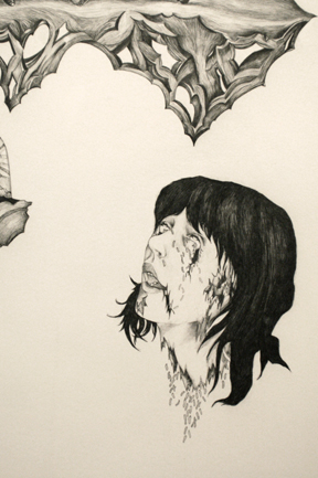 "My Sinews Take No Rest" 2007 Jessie Rose Vala For those of you with a penchant for the undead and the inner workings of their lost souls, head to Motel, and quickly, to see the remnants of Jessie Rose Vala's solo show "The Torturous Veil" which goes down this weekend. These large scale graphite pieces are delicate emanations of flesh and symbol, vivid and rotten, and rich with a contemporary mythology. These large drawings defy our age in a way, ...(more) Posted by Amy Bernstein on October 25, 2007 at 20:49 | Comments (2) PermalinkFriday 10.19.07 Marko Lulic and Peter Kreider at Reed College 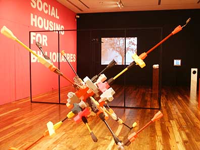 Work by Peter Kreider (fg) & Marko Lulic (bg) Reed's Cooley Gallery has reopened with a new walnut floor and a strong two-person show featuring Marko Lulic and Peter Kreider...(more) Posted by Ryan Pierce on October 19, 2007 at 9:24 | Comments (1) PermalinkWednesday 10.17.07 Camouflage at Portland Art Museum 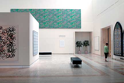 (L to R) works by Philip Taaffe, Andy Warhol, Agnes Martin and Damien Hirst (photo by Dan McLaughlin) The universe is stuck in a rut, be it the motion of the planets, the behavior of subatomic particles, the cycle of life & death or the ebb and flow of freeway traffic… everything tends to follow some predictable patterns. Yet the patterns of life, be it the movements of the sun or the coordinated acrobatics of flocking birds are so pervasive that they often become invisible to us… unless something provokes a pause rendering them visible once again. Art can achieve that perceptive pause. How poetic is it then that this small show at the Portland Art Museum with major works (many on loan from the Broad Art Foundaion) exploring the use of pattern in Post WWII art is called Camouflage? 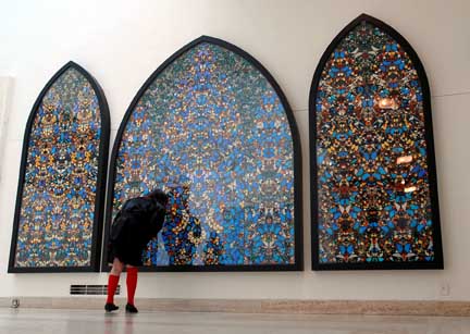 Damien Hirst's The Kingdom of The Father gets Scout Niblett's undivided attention With works by Agnes Martin, Christopher Wool, Philip Taaffe, Damien Hirst and Andy Warhol it is small but heavy hitting sampler of a major trend in postwar art...(more) Posted by Jeff Jahn on October 17, 2007 at 9:30 | Comments (0) PermalinkFriday 09.28.07 Last chance reviews Mcfarland and Cowie 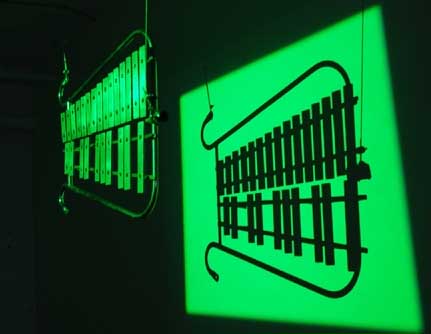 Part of Mcfarland's Preparations @ PAC September was blessed with a glut of interesting shows that didn't get proper reviews because the requisite TBA and the Affair at the Jupiter Hotel overview pieces took up most of the column inches allotted in the Oregonian, Mercury and WWeek. Sure they each had reviews but their obligatory information articles sort of ate into the critical space. To counter that effect here are two quick reviews of shows worth your attention this coming weekend: Posted by Jeff Jahn on September 28, 2007 at 14:29 | Comments (6) PermalinkThursday 09.27.07 Walking the Path: Richard Serra Sculpture at the Museum of Modern Art 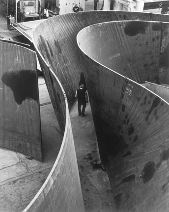 Richard Serra Sequence (Detail), 2006 Weatherproof steel Overall: 12'9" x 40' 8 3/8" x 65' 2 3/16" (3.9 x 12.4 x 19.9 m) Collection the artist (c) 2007 Richard Serra / Artists Rights Society (ARS), New York Photo: Lorenz Kienzle In Richard Serra Sculpture: Forty Years at the Museum of Modern Art in New York, Serra's work provides a guide to the way that materials can be used to transform or define space. No sculptor has put more thought into the problems and pleasures of navigating and defining space. I was surprised to see how rigorous his approach to the experience of space has been over the last forty years even though his own language and budgets have grown considerably during that time. One thing that became immediately clear is that, Serra has thought harder about space than any artist, ever. More... Posted by Arcy Douglass on September 27, 2007 at 9:45 | Comments (1) PermalinkTuesday 09.25.07 Jeffry Mitchell at Pulliam Deffenbaugh 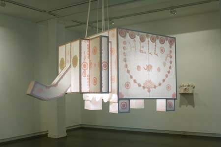 Elephant Lantern 2007 Jeffry Mitchell 2007 Upon entering the the Pulliam Deffenbaugh gallery this month, artist Jeffry Mitchell's work greets you with a giant "Hello!" followed by exclamation points. The first, most impulsive response hearkens to childhood, and the mind answers with an enthused "Hellooooo!" in return. Perhaps it is the handstands of the ceramic elephants on Mitchell's shelves, or the curve of the greetings that adorn the big elephant lantern and drawings, but an intonation resonates from the letters. . . .(more) Posted by Amy Bernstein on September 25, 2007 at 9:34 | Comments (2) PermalinkFriday 09.21.07 Darren Waterston and Tyrus Miller :The Flowering (The Fourfold Sense) at Lewis and Clark 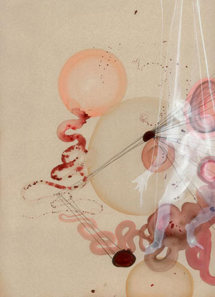 Darren Waterston, Leper's Conversion, Pigment print with letterpress and coloring 2007 Each of us knows what our bodies look like. There are different proportions but more or less it's several limbs, a layer of skin covering a skeleton of bones with various internal organs. That is our body, but is it what we are? Perhaps more than any other, Saint Francis found the divine through the body. He did not find it by looking at the ideal beauty of the ancient Greeks but in the wounds of the lepers and the homeless that surrounded his home in Assisi. He embraced things that we would normally turn away from like the bleeding sores of those who are sick. He resisted the temptation to run away, transcended his natural feelings of self preservation, and cultivated compassion to discover the divine through the path of caring for those around us. More... Posted by Arcy Douglass on September 21, 2007 at 0:00 | Comments (0) PermalinkTuesday 09.11.07 Rock/Paper/Scissors at the Portland Art Museum 
Wolfgang Laib's Reishaus, 1989 (MillerMeigs Collection) Like the opportunistic Camouflage, the Portland Art Museum has yet another new contemporary group show called Rock/Paper/Scissors that went up this past weekend in the Suwyn gallery. It is a small scale exploration of post WWII European art and is especially nice because it is culled mostly from the museum's collection. More scholarly than bombastic and appropriately sober considering Europe's need for extensive Marshall Plan reconstruction after the war...(more) Posted by Jeff Jahn on September 11, 2007 at 13:29 | Comments (0) PermalinkFriday 09.07.07 The Wisdom of Light: The Hiroshi Sugimoto Retrospective at the De Young Museum  Hiroshi Sugimoto, Boden Sea, Uttwil 1993 Photography is by definition about the interaction between time and light. In Hiroshi Sugimoto's photographs we are able to engage in a conversation with light. In a very real way, he opens the light to us. He lets the light speak to us in a way that would be impossible in any other medium. Sometimes the light is fast like in the Seascapes and the dioramas where the exposure time is some small fraction of a second. In other work the light is slow, so slow that one photograph is exposed for the length of an entire movie. In most of his photographs the light is reflected, so that the light seems to be emanated from the subject that he is photographing. More... Posted by Arcy Douglass on September 07, 2007 at 12:15 | Comments (0) PermalinkThursday 09.06.07 Jenene Nagy's False Flat at Linfield Gallery 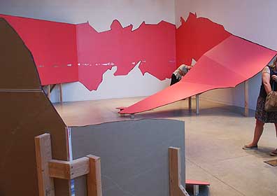 False Flat (detail) Taking over the entire Linfield gallery Jenene Nagy's False Flat is one of the more ambitious solo shows in recent Portland history, with the added promise of a creating a lot more headroom for work her to expand. Until recently I had questioned whether Nagy (PORT's business manager) was going in a fruitful direction but after the controversial The Hook Up group show it was apparent she had made a major breakthrough by simplifying and... (more) Posted by Jeff Jahn on September 06, 2007 at 12:25 | Comments (0) PermalinkSaturday 09.01.07 Angela West: A Survey at Quality Pictures  "Sweet Sixteen #1" 2001 Angela West image courtesy Quality Pictures The attempt to photograph life in the south is not a new idea. Life for southerners and the characters the place makes them creates jerky flavored targets and meals for literature, film, and the saltiest of still images. It is a swarming breeding ground for nostalgia and ghost stories, as a balmy, pink, and protracted humanity thickens the waterlogged atmosphere there. . .(more) Posted by Amy Bernstein on September 01, 2007 at 11:51 | Comments (0) PermalinkFriday 08.24.07 Heart of Darkness: Eden's Edge at the Hammer Museum 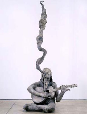 Liz Craft Ballad of the Hippie 2003 Bronze and Peacock feather at Eden's Edge Curated by Gary Garrels, Eden's Edge: Fifteen L.A. Artists, at the Hammer Museum until September 2, is a cross section of the art scene of Los Angeles bringing together work of artists as diverse as Ken Price, Lari Pittman, Matt Greene, Liz Craft, Anna Sew Hoy and the late Jason Rhoades. I felt that when I was walking through Eden's Edge, I was traveling up river on my own trip wandering through the various studios of Los Angeles artists and wondering how deep the river really goes...(more) Posted by Arcy Douglass on August 24, 2007 at 9:00 | Comments (5) PermalinkFriday 08.17.07 "Entropy and Emergence": Kimber Shiroma at Gallery 114 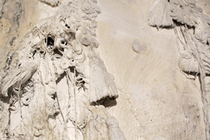 "Attached #3" (Detail) Kimber Shiroma 2007 Kimber Shiroma's latest exhibit, "Entropy and Emergence" is an intriguing show to check out this month at the artist's collective Gallery 114. This new work of Shiroma's is ambitious and experimentally thorough as the artist attempts to mold breath and symbolism into a mishmash of materials that run the gamut of malleability. Posted by Amy Bernstein on August 17, 2007 at 18:00 | Comments (1) PermalinkThursday 08.09.07 Me, you and everyone else we know is a ventriloquist at Small a 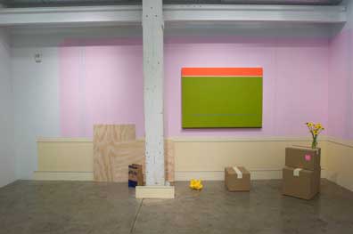 Michael Zahn's Then We Came To The End (2007) WARNING this show at Small a projects is the product of a novel curatorial idea, something which viewers should always be suspicious of. In this case "Me, you,you. a ventriloquy" presents artists that treat their aesthetics and materials somewhat like a ventriloquists' dummy. I take that to mean they are essentially animating the dead skins of art weve already seen before, while giving it a different voice. Weird but cool. Sure it is full of pitfalls but I highly recommend this show of aesthetic sock puppets. (Note the gallery doesn't have regular hours this month but you can call ahead 503 234-7993 and set a time… no doubt gallerist Laurel Gitlen will often be there taking care of details for the Affair @ the Jupiter hotel art fair Sept 14-16). Now for the art...(more) Posted by Jeff Jahn on August 09, 2007 at 10:35 | Comments (5) PermalinkSaturday 07.28.07 David Eckard's Liveries (summer stock) at Mark Woolley Gallery 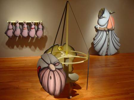 installation view (L to R) Proxy (beer bust), Bon bon bon & Bride (full bloom) This last winter David Eckard, arguably the premier Portland sculptor of his generation, surprised us with an interesting series of paintings at Chambers Gallery. That work resembled geological forms, bound flesh and clothing in an essential flattened space that had everyone asking, what does this mean for the sculpture? The question was further complicated by a recent residency in Rio that took place after the paintings had been created. The sense was the Eckard was restless and had some major changes afoot. More definitive answers came quickly with Eckard's show at the Mark Woolley Gallery, Liveries (summer stock), which delivers an important new shift to his work ...(more) Posted by Jeff Jahn on July 28, 2007 at 8:49 | Comments (1) PermalinkMonday 07.23.07 The Material World- APEX :Wes Mills at the Portland Art Museum and Wes Mills: Drawings at PDX 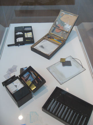 Wes Mills Travel Box 1998-2004 at APEX: Wes Mills at the Portland Art Museum A pencil, some white powdered pigment, a couple of pieces of paper and an open mind. You can't get much simpler than that, but when Wes Mills started drawing again in the early 90's that was as good a starting place as any, because what he was looking for was within. Starting with a limited palette of raw materials, and therefore fewer variables, Wes felt like he could get closer to the experience of art. When I look at his drawings, I am reminded of the Zen archers who find that they are aiming at themselves in the center of the target. In Wes' case, I think he finds himself in his materials...(more) Posted by Arcy Douglass on July 23, 2007 at 15:19 | Comments (0) PermalinkSaturday 07.21.07 The Poet's Nature Lab: Camille Solyagua at Charles A. Hartman Fine Art 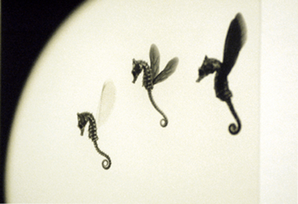 "Three Seahorses" 1998 Camille Solyagua The birth of a new era is upon us within Portland's Pearl. The opening of the Desoto building this Sunday gathers the forces of a number of the Pearl's galleries in a space akin to airline hangers and origamied kites. Light floods this space and lifts it. . .(more) Posted by Amy Bernstein on July 21, 2007 at 9:16 | Comments (0) PermalinkFriday 07.13.07 Michelle Ross at Elizabeth Leach Gallery by Ryan Pierce  Ross' Outpost I Michelle Ross' new paintings, on display through July 28 at Elizabeth Leach Gallery, constitute a subtle and sublime travelogue through Italian landscape and architecture. A recent stint as a visiting artist at the American Academy in Rome has led to a suite of oil paintings and related works on paper that are even more understated and essentialized than we have come to expect from this veteran Portland abstractionist...(more) Posted by Ryan Pierce on July 13, 2007 at 15:23 | Comments (3) PermalinkTuesday 07.10.07 Bryan Schellinger at Quality Pictures 
Schellinger's PDX-#9,07,2007 With 10 identically sized, cool-toned stripe paintings, an ice sculpture of the artist's head and a floor filled with black jaw breakers, Bryan Schellinger's New Works at Quality Pictures was the definite standout of First Thursday shows this month. Finally, a main Portland gallery is willing to challenge a show's homogeneity through related, but initially chaos inducing elements. ...elements that in this case inform one's understanding of the paintings. This show is a good thing for the First Thursday crowd, as previously one had to go outside the main Pearl District venues to experience anything that didn't just politely hang on a wall or sit on a floor. It is also an exciting debut of an artist whose work has grown considerably since leaving Atlanta for Portland over a year ago. ...(more) Posted by Jeff Jahn on July 10, 2007 at 1:24 | Comments (0) PermalinkFriday 06.29.07 Brad Cloepfil's: Drawing / Making - Projects of Allied Works Architecture (1997 - 2007) at PDX Gallery 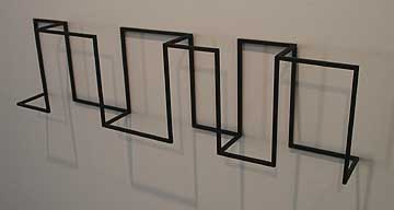 Structural Concept Model for Krause guest house, 2007 Architects take definite stances towards the future be it; irreverent, hopeful, dismissive etc. Some like Rem Koolhaas are aggressive, breaking moulds and ruts first and foremost... making every other issue subordinate to their drive to reinvent. It is almost kitsch. While others like Portland's Brad Cloepfil seem to excel at making the future a bit more dignified. An inherently less reactionary or revolutionary stance but one that still has room for a few twists and turns within that essentially stoic outlook. In other words it is built to last...(more) Posted by Jeff Jahn on June 29, 2007 at 20:19 | Comments (0) PermalinkThursday 06.21.07 Getting You to See What's Right in Front of You: Alison Owen at TILT  Detail of Alison Owen at TILT One of the first things that you notice when you walk into the TILT Gallery and Project Space for New York artist Alice Owen's show is the room is practically empty. The room is very sparse and there are two large blank pieces of paper pinned to the wall. No paintings. No drawings. No sculpture. No Art. Just an empty room. Or is it? More... Posted by Arcy Douglass on June 21, 2007 at 23:09 | Comments (7) PermalinkFriday 06.15.07 Off the Plane and Into Space: THE HOOK UP at the New American Art Union 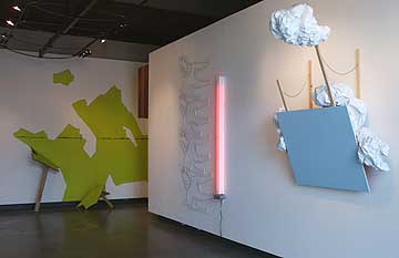 (L to R) Jenene Nagy, Sean Healy & Stephanie Robison By exploring the rich area of cross fertilization between painting and sculpture, the show THE HOOK UP at New American Art Union provides real insight into new ways that art can get off the wall and interact with the viewers in real space. Though these ideas are not new they are becoming increasingly relevant. More... Posted by Arcy Douglass on June 15, 2007 at 9:41 | Comments (1) PermalinkFriday 06.08.07 More Relevant than Rembrandt: Kehinde Wiley at PAM  "St. John the Baptist" Kehinde Wiley 2006 Kehinde Wiley's works at the Portland Art Museum this month are some of the most pivotal paintings to come across this city in quite some time. After venturing through the museum's labyrinthine design, the room that holds Wiley's work seems to hum, existing in its own space, despite the vast variance of the museum's collection. The paintings seem to patiently await your presence, as if they know the breadth of what they hold and. . .(more) Posted by Amy Bernstein on June 08, 2007 at 8:39 | Comments (22) PermalinkThursday 05.31.07 Mississippi May or may not? 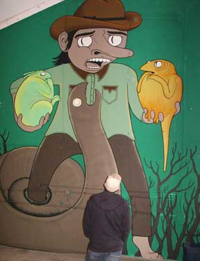
Ryan Shank's mural "Friendly Times With Old Smellyneck" Warehouse shows have a near mythological status in the art world as spaces pregnant with possibilities and as benchmarks of ambitions. Historically, exhibitions like Damien Hirst's Freeze or the goings on at Forcefield's Fort Thunder have introduced new tight knit casts of art world characters and counter movements designed to change very local expectations and redirect the gaze of art viewing audiences. In theory at least, they present a challenge to the status quo and in the case of Hirst or Forcefield, they had lasting effects. Portland has had a ton of warehouse shows... (more) Posted by Jeff Jahn on May 31, 2007 at 15:40 | Comments (0) PermalinkWednesday 05.30.07 The Primacy of the Mark: the Brice Marden Retrospective at SFMoMA 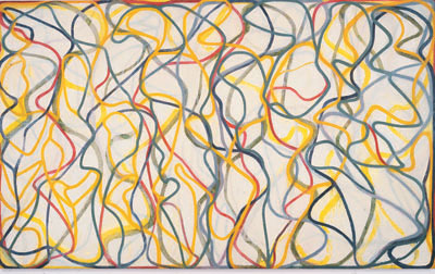 Brice Marden Study for Muses (Hydra Version), 1991-95/1997; Oil on Linen Brice Marden has been trying to bring the experiential quality of making and looking at paintings into the foreground of his studio practice for forty years. If there has been a common subject matter to his paintings, it would be about the long, slow, patient observations that the paintings require and the effect those observations have on the way we see ourselves and the world around us. His career has been an exploration of the ways that different forms and surface could be used to tighten the image to the picture plane. He has, on his own terms, been always trying to cut through to what is the essential nature of painting, and he does it by asking a series of questions: when does one color change to become another, when does one object transform into another, and what effects do the paintings have on the people that look at them? more... Posted by Arcy Douglass on May 30, 2007 at 9:48 | Comments (15) PermalinkFriday 05.25.07 Catch these sparklers, before they are gone 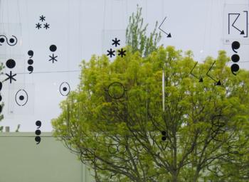 Tetenbaum & Abel's Weather Report at NAAU Here is are some worthy things in Portland that come down shortly: Tracey Emin, Book Art, Tivon Rice & Nathan Shapiro...(more) Posted by Jeff Jahn on May 25, 2007 at 12:08 | Comments (0) PermalinkThursday 05.24.07 Dinh Q. Le at Elizabeth Leach Gallery 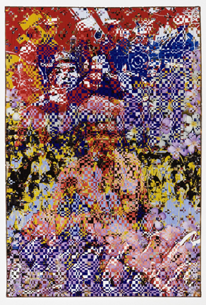 Dinh Q. Le Untitled (Crowd), 2007 Photo Courtesy Elizabeth Leach Gallery When you walk into the Elizabeth Leach gallery this month, a barrage of imagery simultaneously assaults and seduces. The colors of Dinh Q. Le's six works in the outer gallery grab your eye again and again, in an overload of pulsing industry. They are pharmaceutical colors, candied colors.. ..(more) Posted by Amy Bernstein on May 24, 2007 at 7:41 | Comments (0) PermalinkMonday 05.14.07 Habit Forming at PNCA  Kota Ezawa, The Simpson Verdict, 2002 digital animation, 3 minute loop Miller Meigs Collection Cartoon O.J. Simpson's lips twitch into a brief smile as the word "murder" is spoken for the second time..............(more) Posted by Jessica Bromer on May 14, 2007 at 21:03 | Comments (2) PermalinkFriday 05.11.07 Hereto, Where Art Thou? (by TJ Norris)  Maxwell's Demon (USA II) "We're all kind of basically involved in the same thing, putting up a blank of some kind and filling it in." - William Wiley Blank - Exploring Nothing is the latest curatorial conundrum from Atlanta-based aquaspace (aka artist/curator/writer Avantika Bawa) on view through the month of May at Tilt Gallery & Project Space. Essentially, Blank is a small group exhibition of eight artists (including Bawa herself) who are exploring the ambiguous, esoteric space of the intangible, sourcing the impossible scope of nothingness... (more) Posted by Guest on May 11, 2007 at 10:26 | Comments (0) PermalinkTuesday 05.08.07 Beyond Representation: minimalist/postminimalist prints at PAM 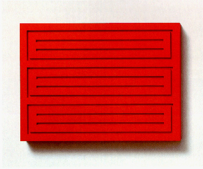
Donald Judd Painted Woodblock 1991 Titled, "minimalism/postminimalism: Selections from the Collections of Jordan Schnitzer and His Family Foundation" this print and multiple show at the Portland Museum of Art is an exploration of the way that some of the best American artists of the '60s up until today explored the process and potential of printmaking. This excellent exhibition includes prints by some of the best American artists including Agnes Martin, Donald Judd, Richard Serra, Brice Marden, Josef Albers, Frank Stella and Sol Lewitt to name just a few...(more) Posted by Arcy Douglass on May 08, 2007 at 10:00 | Comments (1) PermalinkTuesday 05.01.07 Retinal Reverb Revisited 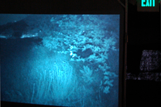 "Coyote Search" Terry Chatkupt Upon entering the opening show for this year's PDX Film Fest, one encountered a shift in perception; linear living was altered somehow, and the viewer suddenly found him/herself immersed completely within a realm of video. The subtle bluish glow of screens and projections created. . .(more) Posted by Amy Bernstein on May 01, 2007 at 7:51 | Comments (2) PermalinkFriday 04.27.07 Quick and dirty reviews April 2006 There is a necessary but dirty art to reviewing shows without giving them the real space they deserve. Here are some shows who are on their last weekend and are worth checking out. Yes, with Photolucida this month there was a ton of Photography in Portland:
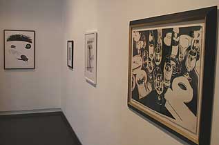 (L to R) Pettibon, Starn brothers, Tillmans & Warhol Still Life: at Pulliam Deffenbaugh It pains me that I don't have enough time to go on and on about this show but let's just say the combination of a Starn Twin's snowflake next to a Raymond Pettibon with a hand grenade made this one of the most inwardly seething still life shows I've ever encountered...(much more) Posted by Jeff Jahn on April 27, 2007 at 13:34 | Comments (0) PermalinkWednesday 04.18.07 Talking With Ghosts: invisible.other at NAAU 
Ted Apel's Potential Difference TJ Norris, a local artist and curator, has put together a subtle but stimulating group show at the New American Art Union. The title of the show is invisible.other, and it seems like the work deals with the transient way that people inhabit spaces. Invisible.other is a fitting title for the show because most of the work details with a residual human presence in the people and things that we encounter and leave behind...(more) Posted by Arcy Douglass on April 18, 2007 at 23:38 | Comments (0) PermalinkFriday 04.13.07 Pooled Pathos: J. Bennett Fitts Quality Pictures 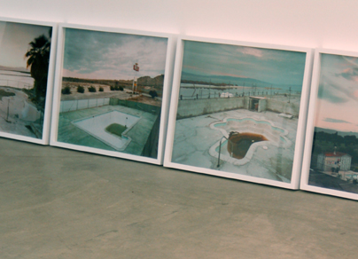 J. Bennett Fitts at Quality Pictures 2007 As a southerner, I grew up spending vast amounts of time in and around swimming pools. I spent entire seasons in swimming pools. In the summertime my bathing suit was a uniform and chlorine my scent of choice. Swimming pools in the southern summer were a place of respite from the merciless dragon Heat that triumphed and reigned in all spaces sans AC. These limpid wells gently rocked with... (more) Posted by Amy Bernstein on April 13, 2007 at 22:15 | Comments (1) PermalinkSaturday 03.31.07 Matt McCormick at Elizabeth Leach Gallery  Still from McCormick's Motor Hotel It's the last day of Matt McCormick's Future So Bright at Elizabeth Leach Gallery and the show has spurred a lot of private discussions I'd like to air here. The videos were initially shot on a 16mm hand cranked Bolex and have this wonderful color saturation, but they picked up some artifacts when scanned into digital. The mélange is a kind of purgatory moment in media, mimicking the temporal structures the images depict. At first the digital artifacts bothered me as it obscured the subtle rustling of the grass in front of an old mining building in the single channel video "Western Edge." In other cases the digital artifacts were impossible to distinguish between heat waves in front of an abandoned building. I both liked and felt cheated by the ambiguity. Does this need a higher resolution scan? Would that ruin it? What if the single channel video "Western Edge" were even bigger and shown by itself?...(more) Posted by Jeff Jahn on March 31, 2007 at 10:28 | Comments (4) PermalinkWednesday 03.28.07 Perplexing Conundrums and the Light in the Midst: Sue Coe at PNCA 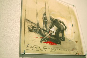 "He Shot My Dog Ziggy" Sue Coe 2006 There is a limp irony in the handshake that pervades deals made and sealed in the art world today; in the midst of so much political unrest, tyranny, and corruption on a global level, there are surprisingly few artists who choose to address these injustices with the honesty and outrage as does artist Sue Coe. Coe intends to illustrate. . .(more) Posted by Amy Bernstein on March 28, 2007 at 19:40 | Comments (0) PermalinkMarie Watt at PDX 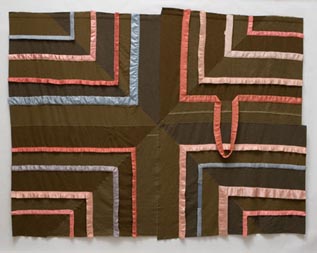 Marie Watt, Ledger: Tread Lightly, 2007 Reclaimed wool blankets, satin binding thread, 92 1/2" x 121" Wool blankets are hung on the walls and piled on the floor of PDX Gallery like well-worn, well-traveled canvases. They've been claimed and reclaimed, frayed , cut, recut, unraveled and resown. Some have been altered out of existence, with wood or cast bronze replacements left in their stead................(more) Posted by Jessica Bromer on March 28, 2007 at 5:28 | Comments (11) PermalinkThursday 03.22.07 RE:Dude's Night Out 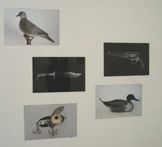 Todd Johnson, clockwise from the top: DD-2 (Dove Decoy),P-1 (Pistol), D-2 (Duck Decoy), FL-1 (Fishing Lure), K-1 (Knife) all 2007 When Cris Moss tapped into a circle of friends at the last minute for the show "Re: dudes night out" at the Linfield Gallery, he unexpectedly dug deeper into one of the more prominent undercurrents of the Portland art scene, translocated or transposed territory. The intention of the show (on an extremely tight time schedule) was to show how a group of artists might relate to one another as a social network rather than though shared ideas about work, process, or some overall theme. Strangely, although the artists work in a wide variety of mediums, most of the artists seemed interested in one way or another in transposing one idea about space or territory into another so that when it is placed in a new location it is transformed into something completely different... (more) Posted by Arcy Douglass on March 22, 2007 at 10:14 | Comments (11) PermalinkThursday 03.15.07 Red Yellow Blue by Arcy Douglass 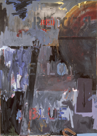 Land's End (1963) These are the three primary colors stenciled by Jasper Johns onto his famous painting Land's End, completed in 1963. It is currently in the collection of San Francisco Museum of Art and now on view at the National Galley of Art for the Jasper Johns' show, An Allegory of Painting, 1955-1965. Starting from the three primary colors, an artist can...(more) Posted by Arcy Douglass on March 15, 2007 at 18:08 | Comments (0) PermalinkWednesday 03.14.07 "Paper Chase" at the Guestroom Gallery 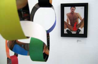
"Thomas Lloyd" 2006 Philip Iosca Photography courtesy Dan Mclaughlin This month the Guestroom Gallery offers up their tasty take of what seems like a called suit in Portland's art scene recently: the medium of collage (see Liz Leach's 25th anniversary show as well as December 2006 for the Chambers Gallery). Call it Dada or jazz or. . .(more) Posted by Amy Bernstein on March 14, 2007 at 8:14 | Comments (3) PermalinkWednesday 03.07.07 Adam Sorensen's The Glows at Elizabeth Leach Gallery 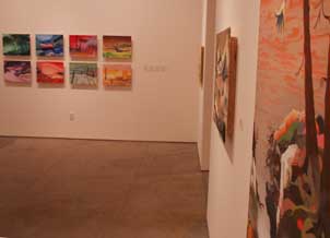 By 2003 Sorensen had been curated into the Oregon Biennial and Core Sample (by yours truly). He was good but not fully developed. His work had a Gary Hume like flatness of field and a precious floral quality that seemed undistinguished if appealing. It felt like an opaque projection only a few steps away from wallpaper but it had a tension that kept it alive. The surfaces were also a little overworked too. Basically, he was a talented painter who hadn't reached his full potential. Now its 2007 and 3.5 years since the last time we've seen more than 2 of his paintings on a wall and Sorensen has his big debut at what is arguably Portland's top contemporary gallery...(more) Posted by Jeff Jahn on March 07, 2007 at 11:10 | Comments (3) PermalinkFriday 02.23.07 Last chance, some quick reviews I always feel guilty writing about worthy shows in a very short form, yet since all of these shows ends this weekend I feel it's worth the brevity:
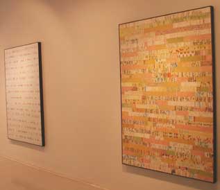 Whitney Nye at Laura Russo Whitney Nye at Laura Russo: Yes, Portland has had way too many collage shows but this is a breakthrough for Whitney Nye and "Counterpane" is just one of the standouts....(more Nye, Weber, Hilliard, Vogland, Eckard, Dan May and Jim Hansen) Posted by Jeff Jahn on February 23, 2007 at 17:27 | Comments (0) PermalinkDeath Staring Back You: Damien Hirst at PAM by Arcy Douglass .
 No Art; No Letters; No Society (Detail), 2006. Glass formica cabinets with medical packaging and human skulls, The Broad Art Foundation, Santa Monica. Hirst has become famous over the last twenty years for art that pushes back at the viewer, and this exhibition is no exception. His most famous works like The Physical Impossibility of Death in the Mind of Someone Living, a large shark floating in a giant tank, forces spectators to confront their own mortality. The four works included in the exhibition from the Broad Collection are a good overview of some of the themes that run through Hirst's work, all presented with the fun and horrors of a haunted house at a traveling carnival. His work is at the crossroads of many contradictory ideas by being both funny and sad, shallow and deep, slapstick and profound...(more) Posted by Arcy Douglass on February 23, 2007 at 10:52 | Comments (0) PermalinkThursday 02.15.07 The Candor of Cali: Chris Johanson at The Portland Art Museum 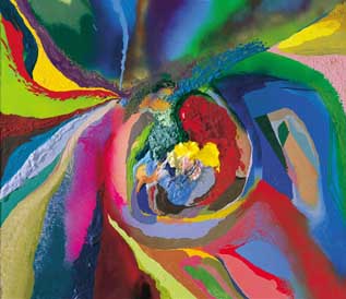 Non-Time Specific Chris Johanson (Detail) Non-Time Specific Molecular Contemporary Landscape, 2007 Latex, acrylic, and spray-paint on reclaimed wood 48 x 45 3/4 inches Courtesy of Jack Hanley Gallery, San Francisco and Los Angels, and the artist Photo: Paul Foster The latest APEX spotlight to hit the Portland Art Museum this month is Portland-based artist Chris Johanson. In the past couple of years, Johanson has received national and international attention as part of a group of artists hailing from San Francisco's Mission District. Occasionally titled "The Mission School" this group of artists (also including Barry McGee, his late wife Margaret Kilgallen, and Alicia McCarthy, among many others) revels in the intersection of public, private and the D.I.Y. philosophy of a generation suffocated by consumer culture. . .(more) Posted by Amy Bernstein on February 15, 2007 at 20:36 | Comments (13) PermalinkMonday 02.05.07 Voodoo Hymn and Primal Anecdote: Zen Parry at Contemporary Crafts Museum & Gallery 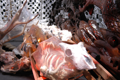  "Engagement: White Light" Zen Parry at Contemporary Crafts Museum & Gallery The Contemporary Crafts Museum & Gallery ups their own pretty ante this month, expounding even further on the definitions and boundaries of the terms "arts" and "crafts" and asking (not so politely) for the rest of Portland to mosey on up to the bar. . .(more) Posted by Amy Bernstein on February 05, 2007 at 17:39 | Comments (1) PermalinkFriday 02.02.07 21st century conciousness and Portland's Aerial Tram  There are several flavors of influential architecture which redefine cities; the phallic tower of power... made popular in during Italian renaissance (Pisa, Eifel Tower, Chrysler Building, Space Needle etc.), the temple or jewel (Parthenon, Frank Lloyd Wright's Guggenheim, Gehry's Bilbao or Rem Koolhaas's Seattle Central Library), power plays (the Great Pyramid, US Capital building, Kremlin) and then there is my favorite, the pragmatic but show stopping philosophical conversation piece like Zaha Hadid's Bergisel Ski Jump (which conveniently directs jumpers towards a very old cemetery), Golden Gate Bridge or the Statue of Liberty (basically a big, poetic welcome mat, ideological advertisement and thank you note all in one). 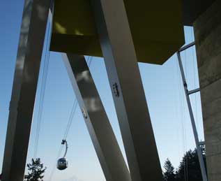 going up Portland's Aerial Tram is just that, a pragmatic but philosophical conversation piece. Pragmatically it was made for transporting people from the tall new glass towers in the South Waterfront neighborhood to Oregon Health and Sciences University at the top of Pill Hill but has courted and accumulated a lot of other meanings. Like the Eifel Tower, Space Needle, Arc de Triomphe and Statue of liberty it will forever be considered alongside the pervasive philosophical challenges and contexts in which it was built. For Portland today though context is questioning man's relationship to the environment (fossil fuels in particular), health care and science as a partner with nature, our use of increasingly scarce real-estate, issues of civic interdependence and the nature and use of the US's power. It is a unique architectural project and time will tell how the conversation it spurs will pan out....(more) Posted by Jeff Jahn on February 02, 2007 at 16:46 | Comments (4) PermalinkThursday 01.25.07 Some small scale shows you may have missed 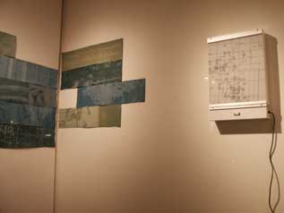
Carrie Iverson's Survey @ the PDX Window Project Man what a great month of shows (from Hirst to Tharp, Riswold and Julie Orser). Even considering the coverage from other publications there was simply no way to review it all and some worthy things got passed over. Here are some interesting small scale art shows that come down this weekend to consider checking out...(more) Posted by Jeff Jahn on January 25, 2007 at 20:35 | Comments (0) PermalinkGlitter and Doom at the Met 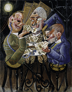 Otto Dix Skat Players, 1920 Neue Nationalgalerie, Staatliche Museen zu Berlin, Preußischer Kulturbesitz Before taking in Glitter and Doom: German Portraits from the 1920s, I visited another of the Metropolitan Museum of Art's current special exhibitions, Americans in Paris............(more) Posted by Jessica Bromer on January 25, 2007 at 7:33 | Comments (1) PermalinkWednesday 01.24.07 A Distinguished Guest: Clyfford Still at PAM 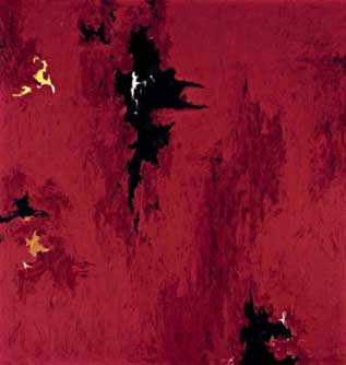 On my most recent stroll through the Portland Art Museum I came across another distinguished painting on loan, Clyfford Still's 1947-R-no.1, which set the auction record for a Still late last year at a mere $21,296,000. Aside from gawking at the price (Im over it), which most certainly would have brought the ire of an artist famous for focusing on philosophical integrity rather than the art market, it's a great chance to see one of the few unrestricted Still's in private hands. He's one of my favorite artists and I absolutely respect his far-sighted convictions and principles. During his lifetime Still only sold 150 unrestricted paintings, which is why this work is so valuable. Still chose to keep the rest of his output in his estate, which will eventually be housed in the Clyfford Still Museum in Denver (Portland's Brad Cloepfil is the architect for the project). Now the important part, the painting...(more) Posted by Jeff Jahn on January 24, 2007 at 11:49 | Comments (3) PermalinkSunday 01.21.07 Mao Chairman Mao: Jim Riswold at Augen Gallery 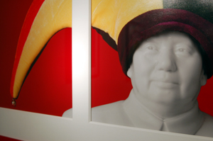 Detail from "Mao Home and Garden" Exhibition, Jim Riswold 2006 What is Power? Where does it come from, and who really has it? What grants it to those that wield it, brandishing the formless, seething orb with the stealth of the keenest guru? The power of Grayskull? Good fashion sense? A dashingly short moustache and celebrity smile? The color red? What is it exactly that places the supposed powerful at the top of the power-hungry food chain, and when are they removed from said salty pedestal only to be replaced by another? It is an invisible battle of quite abstract yet very human ideas, yet Posted by Amy Bernstein on January 21, 2007 at 23:39 | Comments (2) PermalinkWednesday 01.10.07 Virtuoso Vindicated: Storm Tharp at PDX Contemporary 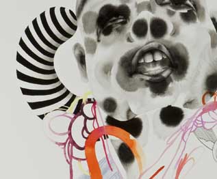 Eu De Toilette (detail) For years Storm Tharp has been haunted by his good reputation; nice guy, smart, worked for ad giant Weiden + Kennedy, ability to draw like the devil himself, etc. The problem was always the way his talent just spilled out in all directions and mediums at once. It was as of his supernatural abilities had come along with a supernatural dose of attention deficit disorder... (more) Posted by Jeff Jahn on January 10, 2007 at 16:30 | Comments (4) PermalinkFriday 12.29.06 See em before 2006 is gone A couple of quick reviews for shows that end this weekend:
 Absolutely do not miss Stephen Slappe's Chain Reaction at Tilt. This multi projector video installation of a menacing 60's style scientist and a couple of hapless humans being observed by him draws the viewer into the theatrical experiment. The music is classic B-movie sci-fi...(more) Posted by Jeff Jahn on December 29, 2006 at 10:42 | Comments (1) PermalinkFriday 12.22.06 Robert Colescott at Laura Russo Gallery 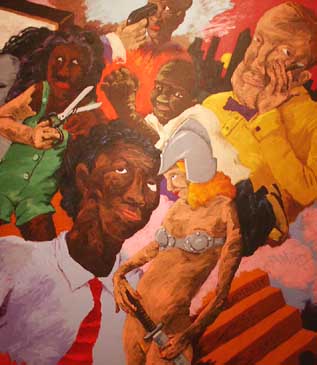 Haircut (detail) 1989 Artworks are judged in many ways but one of them, the ability to remain fresh, emblematic or poignant after standing the test of time seems to trump all of the others. Happily, time has not blunted the sting of Robert Colescott's irreverent and boldly direct work. Robert Colescott, a onetime Portlander, seems to be one of the few contemporary artists capable of achieving that feat, maybe because so many of today's young whippersnappers like Cecily Brown, Inka Essenhigh, Kara Walker, Daniel Richter or even cartoons like The Family Guy seem to be following in his iconoclastic "equal opportunity offender" footsteps. As the 1997 Venice Biennale representative for the US he took shots at everyone, whites, blacks, construction workers, salesmen, Coca Cola, sex, the priesthood etc, sometimes all at once. Colescott creates a kind of pantheon of human failings and there are no "sacred cows" for Colescott...(more) Posted by Jeff Jahn on December 22, 2006 at 11:50 | Comments (0) PermalinkMonday 12.18.06 Pierre Huyghe at Portland Art Museum  Pierre Huyghe, This is not a time for dreaming, 2004, Live puppet play and super 16mm film, transferred to DigiBeta. 24 minutes, color, sound, Photo: Michael Vahrenwald If the story of Modernism is in large part a story about progress, then its contemporary re-telling is necessarily about failure. Pierre Huyghe's This is Not a Time for Dreaming chronicles parallel stories about the creative process, at the same time giving form to the failures implicit in both narratives. Commissioned by Harvard University to create a work commemorating the 40th anniversary of the Carpenter Center for the Arts – the sole building by Le Corbusier in the United States and one of only two in the Americas – Huyghe delved into historical records and archival documents to provide source material. The resulting work took the form of a puppet show set to music, performed with a cast of custom-built marionettes and filmed in a pod-like stage that Huyghe constructed as a temporary appendage to the Center. The 16 mm film documenting the performance has been included in solo shows at the Musée d'Art moderne de la Ville de Paris and Tate Modern, and is currently on view as part of the Miller Meigs contemporary art series at the Portland Art Museum... Posted by Katherine Bovee on December 18, 2006 at 13:19 | Comments (1) PermalinkSaturday 12.16.06 POW! and Chris Verene's "Self Esteem" at Quality Pictures 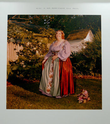 Detail from Chris Verene's "Heidi in Her Renaissance Fair Dress" 2004 Heidi greets you at the door, resplendent in her full regalia of "Ren" Fair attire, beaming in all of her medieval maiden glory. She seems relaxed and proud amidst suburban fauna and flora, the portrait of someone living as closely as possible to a dream. POW! Pictures of Women confronts you immediately upon entering the door. Enter here, stage left, Quality Pictures, Portland's latest addition to the Pearl, and after experiencing the raw caliber of its first show, quite an addition indeed. . .(more) Posted by Amy Bernstein on December 16, 2006 at 10:58 | Comments (0) PermalinkMonday 12.04.06 Go Go: Green Light Green Light at Small A Projects  Detail from Anissa Mack's "Generic Fruit Cocktail" 2004 Small A Projects' current show, Green Light Green Light, is one of this winter's refreshing rarities. It holds fort on an island of wry, dry wit and irony, defending itself in the infinite, reverberating echoes of implication the works channel. For lack of effusive formal elements or the push of a gaudy craft, horror vaccui sufferers beware. The immediate impression. . .(more) Posted by Amy Bernstein on December 04, 2006 at 8:31 | Comments (1) PermalinkMonday 11.27.06 Doing A Lot Of Justice: Thom Mayne's Wayne L. Morse Courthouse in Eugene 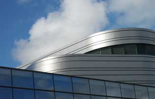
The new Wayne L. Morse Federal Courthouse, designed by Thom Mayne, is without a doubt the hottest new building in Oregon and yes it's in Eugene, not Portland (insert envy here). It opens to the public on December 1st. Still, the mind swims with two curious incongruities: 1) Huh, a hot new courthouse… is that possible?... (much more) Posted by Jeff Jahn on November 27, 2006 at 22:59 | Comments (2) PermalinkWednesday 11.15.06 Archer Gallery's "New Directions"  Detail from Grace Weston's "Identity Crisis" The defining boundaries of photography as expressive medium continue to expand as illustrated in the Archer Gallery's current show, New Directions. The show gives the world's tiniest hors d'oeuvre of where the current art world is taking the medium, and Jeffrey Archer does an excellent job refreshing our tired eyes and awaking the mind with the ambitions of this collection of photographers, weary as they are from the barrage of images the media spits at us on a daily basis. Photography is everywhere these days, yet this collection of artists test and question. . .(more) Posted by Amy Bernstein on November 15, 2006 at 17:22 | Comments (1) PermalinkSaturday 11.11.06 Diana Puntar's An Hour On The Sun at small A 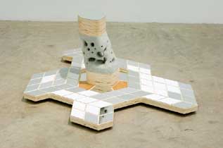
Last Thing I Remember (2006) Americans are famously materialistic so it's no surprise that American art has a long tradition of material fetish as carrier of information, although it certainly popular in other countries as well. Be it John Chamberland's crumpled cars, Warhol's Gold Marilyn, Carl Andre's bricks, Jeff Koon's vacuum cleaners, Damien Hirst's carcasses, Dieter Roth's chocolate, Yves Klein's blue pigment, Matthew Barney's Tapioca, Tara Donovan's stacks of cups the material is the engine that drives or at least directs the message. More recently artists like Roxy Paine, David Altmejd or Curtis Fairman have all presented strong bodies of work exploring paint, mirrors and the world of store-bought plastic as well. Locally we have Chandra Bocci, Jacqueline Ehlis, Jesse Hayward, Brenden Clenaghen etc., the list is never-ending. To this list lets add Diana Puntar at small a projects, it's he last day of her show and her materials are decidedly mid-century sci-fi. Her favorite material is plywood, used in a way mid-century design fanatics will be very comfortable with. From Frank Lloyd Wright to Charles and Ray Eames it is as synonymous with modern furniture as metal tubing and glass. In step with the fetish Puntar often laminates mirrors to the plywood as well. This all relates back to a time when the future wasn't quite as complicated (save for Earth's annihilation by nuclear weapons). The extensive use of mirrored plywood slats also serialize space with facets while evoking sputnik era satellite design. It's slightly Alvar Aalto but no where near as refined and some of the plywood edges wouldn't have made his grade...(more) Posted by Jeff Jahn on November 11, 2006 at 13:26 | Comments (0) PermalinkTuesday 11.07.06 Ty Ennis at NAAU  Ty Ennis, Hooray Picasso, 2006 courtesy of New American Art Union Ty Ennis referenced artists Marcel Dzama and Chris Johanson in his last solo exhibition at NAAU, obliquely promising to move beyond their influence in his next body of work. The invention of a completely new style within a year's time is a daunting task for any artist; it's something that only Picasso seems to have gracefully accomplished. Perhaps this is why the man who "never got called an asshole--not in New York" is saluted, with bitter cheer, in the essentially style-less Hooray Picasso. .........(more) Posted by Jessica Bromer on November 07, 2006 at 12:42 | Comments (10) PermalinkElection day thoughts on drawing in the aughts 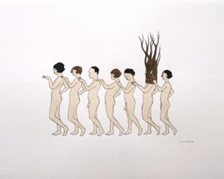 Marcel Dzama, Untitled, 2003 courtesy of David Zwirner One cold and snowy Canadian night, a young artist named Marcel Dzama was setting his wild imaginings to paper at his grandmother's kitchen table with such enthusiasm that he overturned a nearby bottle of root beer base. As the sweet liquid saturated his work, Dzama was struck by his own serendipity. Here was the drawings' key ingredient: something to make his grizzlies' fur a milk chocolate brown and his amputees' crutches an almond tan, to perfectly offset his customary palette of military greens and wan fleshtones. Like the butterfly of chaos theory, whose flapping wings set off a chain reaction that culminates in a tornado, Dzama's clumsy gesture gave birth to the quaint drawing craze. .....................(more) Posted by Jessica Bromer on November 07, 2006 at 12:18 | Comments (4) PermalinkMonday 11.06.06 Don't Blink 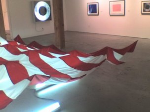 Jesse Durost at Elizabeth Leach Gallery This weekend marked a new trend in art programming in Portland... short run installation art shows featuring work with industrial lighting. Both local boy Jesse Durost and (Croatian) Victor Popovic's shows opened on November 2nd at the Elizabeth Leach Gallery and the Portland Art Center respectively. How does everyone feel about this short run trend? By Sunday November 5th both had concluded their runs.... here is what you missed...(more) Posted by Jeff Jahn on November 06, 2006 at 11:28 | Comments (4) PermalinkMonday 10.30.06 APEX: Roy McMakin 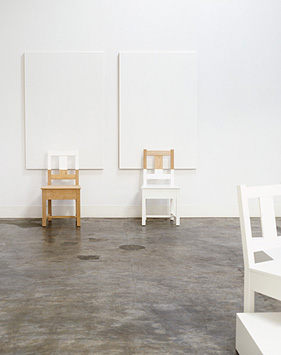 Roy McMakin, "paintings with chairs & sculptures of chairs", 2006, installation view Courtesy Matthew Marks Gallery, New York and James Harris Gallery, Seattle, Photo: Mark Woods Melding furniture design with formal art practice, functional with sculptural, Seattle-based artist Roy McMakin challenges the segregation of art and design, an investigation that has occupied his practice throughout the last twenty-five years. In a small show of paintings with chairs & sculptures of chairs—currently on view at the Portland Art Museum as part of the new APEX series organized by Curator of Northwest Art Jennifer Gately—McMakin continues his inquiry into the intersection between art and design. Using a generic-looking chair of his own design, appropriately deemed the Simple Chair, McMakin here situates his furniture design within a more conceptually rooted art practice through the most minimal alterations... Posted by Katherine Bovee on October 30, 2006 at 1:19 | Comments (2) PermalinkSaturday 10.28.06 Last chance to go solo in October: Guth, McCormick, Pack etc. 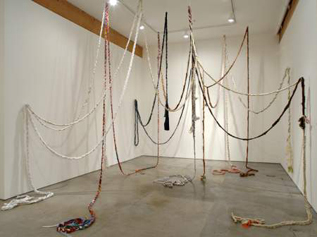 MK Guth's Braid at Elizabeth Leach Gallery Group shows are important as social mixers and as an opportunity to see a lot of different artists but now Portland's ever-maturing art scene's focus has increasingly shifted to solo shows where artists are truly gauged. Even the Oregon Biennial was quickly supplanted attention-wise by numerous solo shows this summer. That said it is the last day for these worthy solo shows: MK Guth's Growing Stories at Elizabeth Leach Gallery marked the return of one of Portland's brightest installation artists after years of collaboration and video work. There was a palpable buzz of excitement at the opening but its best to catch this work in less crowded circumstances during its last day today. Growing Stories focuses on pop culture, expectations and the sort of personalized fairytales that people tell themselves to get through the daily existential grind. The familiar fairytale "Rapunzel" with her famously long hair in a tower is the thread that quite literally ties it all together. The most direct piece in the show is a...(more) Posted by Jeff Jahn on October 28, 2006 at 10:47 | Comments (2) PermalinkWednesday 10.18.06 Sincerely John Head with Foghat and a Ford Ranchero  The collective, Sincerely John Head is obsessed with obsession, hanging out and finding a niche within well worn niches. It goes beyond nostalgia and occupies a sweet spot where irony becomes a worn out celebration, worn out critique and an inside joke with a big old welcome mat. Some might call it catching the hipster wave but there is a little more going on here than building a consensus of awesome irony. Still, it had a certain familiarity of purpose that made writing about this smart but too acessible one day project more complicated than it would have been had it been a wierder event. The now mid-career artist Richard Prince does similar sorts of things with his Camero hoods and Marlborough man photos, it's a wistful kind of corporate innocence that retains some element of critique. Similar to Prince, SJH loves anachronism and lowbrow is the preferred brow. The difference here is audience participation; SJH requires participation in order to get the organs of fandom pumping with new blood and oxygen again....(more) Posted by Jeff Jahn on October 18, 2006 at 19:52 | Comments (8) PermalinkThursday 10.12.06 Artists and Specimens at Lewis and Clark College  Cornelia Hesse-Honegger Lady Bird Beetle from Richland, Washington (1998) Be sure to make the trek up Palatine Hill to see the Artists and Specimens show at the the Hoffman Gallery; it will give historical documentation, classification, and our beloved pioneers new identity. This show is one of savvy mimicry and rich, kaleidoscopical commentary. It is funny and profound and makes you think twice about Audubon and Lewis and Clark and even Ranger Rick. All of a sudden these... (more) Posted by Amy Bernstein on October 12, 2006 at 21:09 | Comments (0) PermalinkWednesday 10.11.06 Brandland at Powell's Books 
Burger Christ Brandland at Powell's Books Basil Hallward Gallery was put together by the ad giant Weiden and Kennedy's W+K 12 school so one has to consider this student work. An entertaining romp, it is good for laughs at things most of us already know about art and advertising. For instance "Burger Christ" runs on cognitive dissonance, it's a one liner repeated over and over again, and not quite as good as seen on the Family Guy or someone like Banksy. Still, it works because like a lot of advertising its broadly targeted inside joke resonates with most everyone of a nonchristian & nonfast-food background, creating a sense of sneering belonging. It doesn't try to be great art, its entertainment and group cohesion, which can only be distinguished from art in that it fades away faster and costs less. The verdict...(more) Posted by Jeff Jahn on October 11, 2006 at 12:35 | Comments (1) PermalinkPaula Rebsom's Debut at Tilt Gallery 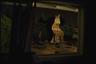
Paula Rebsom's Howling Coyote (2006) Probably the best local show up this month is "When I can't be here, I go there" at Tilt gallery (run by PORT's own Jenene Nagy, I just can't ignore this gem, which comes on the heels of several other decent to good shows). In addition, "WICBTIGT" is the auspicious debut of recent University of Oregon MFA grad Paula Rebsom who seems to have become ten times the artist she was 6 months ago. With just two large format images Rebsom constructs...(more) Posted by Jeff Jahn on October 11, 2006 at 11:48 | Comments (4) PermalinkThursday 09.28.06 Sean Healy: Supernormal at Elizabeth Leach 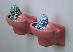 Sean Healy, Gumdrops, 2006, Courtesy Elizabeth Leach Gallery In his solo show at Elizabeth Leach, Sean Healy continues to mine nostalgic content, this time turning his gaze towards the high school hallways, musty gyms and hushed libraries of adolescence. Recalling a prototypical high school ecosystem, the works in Supernormal serve as varied tributes to what seems to be an exclusively male cast of bullies, nerds, smokers and other misfits. Here, Healy describes, memorializes and subverts the workings of the social systems that play out within high school walls. The varied and primarily sculptural work in Supernormal will seem familiar to anyone who saw Healy's last show at Elizabeth Leach's former downtown space. Healy uses everything from seductively colored, semitransparent resin casts of everyday objects to a series of awkwardly cropped photographic portraits. Even when Healy delves into iconography like aluminum cutouts of cartoonish animals or uses unapologetically sentimental vintage '70s wallpaper, he retains a level of detachment and tastefulness through his formal sensibilities.... Posted by Katherine Bovee on September 28, 2006 at 12:19 | Comments (1) PermalinkSaturday 09.23.06 Vanessa Renwick's Portrait #2: Trojan at 2006 Oregon Biennial 
The strongest work of art at the 2006 Oregon Biennial, Vanessa Renwick's short film, Portrait #2: Trojan, deserves some attention. It is special because unlike a lot of the works here it seems whole and fully realized in its self-contained encapsulation of a nuclear power plant's last day. Yes, it is an architectural snuff flick, but its implications go way beyond a 7 second news clip or...(more) Posted by Jeff Jahn on September 23, 2006 at 13:51 | Comments (3) PermalinkFriday 09.22.06 Brenden Clenaghen's Endless Parade at Pulliam Deffenbaugh Gallery 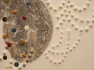 Detail of Clenaghen's "Swing low" Upon entering Brenden Clenaghen's "Endless Parade", still on view for another week at the Pulliam Deffenbaugh gallery, one is met with a glittering menagerie of paradox. Clenaghen's pieces appear to be objects of decadence, and upon first impression, one might dismiss them as such. Exquisitely crafted, the eye hungrily inhales each piece's silky, almost skin like surface, the sex of its fine design. The painted, dripping objects are... (more) Posted by Amy Bernstein on September 22, 2006 at 9:49 | Comments (0) PermalinkWednesday 09.13.06 Alice Wheeler and Jesse Hayward at Chambers 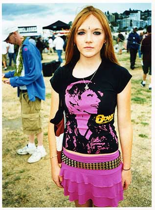 Alice Wheeler's "Girl With Bowie Shirt" (2006) Two conjoined shows ponder the effects of color, complexity and the charm of clarity this month at Chambers Gallery. Although unaware of one another up until this point the two artists couldn't have been better paired. Both are acquaintances of mine to varying degrees and I just couldn't ignore this pairing of decadent aesthetes. Wheeler is a fully developed monster and a great litmus test and foil for the younger Hayward... (more) Posted by Jeff Jahn on September 13, 2006 at 0:00 | Comments (0) PermalinkMonday 09.04.06 Jesse Hayward at the Oregon Biennial 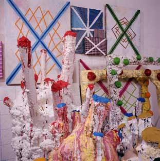 detail of Jesse Hayward's Large Pod Project at the Oregon Biennial Color accretes so much that it takes on a sense of independent vitality. It seems mobile, gooey, infectively burgeoning. Hayward dissimulates art as the product of work or craft. The impetus of the painting/ sculpture/ installation hybrid seems an internal quality of the object itself. Rather than seem a product "completed" by the artist, the objects seem totally self generative, the natural fungal decay of art materials left too long in a dark damp store-room. The objects give the feeling of neglect or abandon, highlighted by the empty stretcher frames stacked together: the by products of unfinished studio labor. The frames accrete color without the presence of the surface: Hayward skips a step, short-circuiting the "correct" studio process and moving immediately from stretcher to paint. The paint provides its own surface, adhering to everything parasitically, like barnacles. The color has its own will, finally freed from the sublimation of the complex goals of painting: communication, illusionism, expression. Instead the color grows according to a biologically programmed will, according to the evolutionary principle: "It doesn't need to be perfect, reasonable or mean anything, it just needs to be able to indefinitely reproduce." Despite the immediate repulsion of this inexorable, non-rational, biological will, the color itself is exuberant, riotous, ecstatic...(more) Posted by Isaac Peterson on September 04, 2006 at 1:19 | Comments (2) PermalinkSaturday 09.02.06 James and Joey Lavadour at PDX 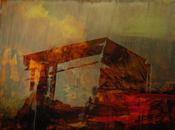 James Lavadour,Usual and Accustomed, 2006, Courtesy PDX Contemporary Art In the current show at PDX Contemporary Art, the bold expressionist strokes of James Lavadour's new series of landscape paintings are sharply contrasted by the precise craftsmanship of Joey Lavadour's hand-woven baskets. While both artists are deeply influenced by their experiences growing up on the Umatilla Indian Reservation in Eastern Oregon, their work stems from different regional traditions. Although James Lavadour is a self-taught painter, his work resides within a lineage of Northwest painters who look to the colors and forms of the region's lush landscape for inspiration. Sun Spots continues James Lavadour's continually evolving tribute to the landscape of Eastern Oregon. This new body of work retains the bold, spontaneous strokes that characterize Lavadour's work, but develops a heightened level of depth. The romanticisms of Lavadour's landscapes are conveyed less through his repeated reference to grand mountainous landscapes than through the ways in which these landscapes are altered. Ghostly architectural forms delineated by smoky washes loom in the foreground of works like Border Camp. In a large grid of nine paintings, panels marked by their unnaturally saturated color interrupt the earthier tones of alternating panels. In Wall, fiery bursts of intense color threaten to consume the entire frame. Lavadour's landscapes are activated through forces of constructing and destroying, mirroring the process of repeated layering and removing of paint that he uses to build the rich surfaces of his work. Joey Lavadour revives centuries-old traditional basket-weaving techniques that nearly died out until a handful of artists began to learn and, more importantly, to teach this tradition within the past two decades. Originally created as bags to store goods and objects, Lavadour replaces traditional materials like reeds and leather with brightly colored yarn, accentuating the rigid geometrical patterns that decorate the surfaces. In both Joey Lavadour's baskets and James Lavadour's paintings, one becomes accutely aware of the surface, as both artists simultaneously ground their work by emphasizing these surfaces while inserting instability--Joey through the illusion of shifting surfaces that come from his bold patterns and colors, James through adept paint handling. 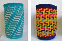 Joey Lavadour, (left) Migration, 2006, Courtesy PDX Contemporary Art Posted by Katherine Bovee on September 02, 2006 at 9:23 | Comments (0) PermalinkTuesday 08.29.06 Heidi Cody makes trouble in Nature Valley 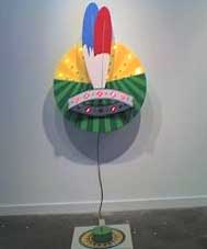
Heidi Cody's Mixed Signals from Nature Valley I've always been a fan of Heidi Cody's work and her latest piece at the Illegal Art show in PNCA's Feldman Gallery is really excellent. The piece, "Mixed Signals from Nature Valley" takes on the vernaculars from all those exploitive roadsigns and turns them on their heads. When you press the button two puffs of smoke (aka smoke signals) rise from behind the feathers. It's exploitation art that had me considering all those car manufacturers who name their vehicles after words from First Nation tribes like, Pontiac, Toyota Tacoma and Jeep Cherokee etc. Clearly the whitewashed cartoon version of the "Indians" (nothing like being defined by a misnomer by some guy who thought he had reached Asia) is supposed to sardonically imply that the message isnt all "happy" from the valley but it also studies the very appealing conventions of classic sign design as well. The appalling appeal that doesn't turn into some shrill dogmatic bombast is the really its strength and the way it implicates the viewer through entertaining interaction makes it particularly successful. In Cody's hands's pop eats itself. The show opened yesterday and if you are in the Pearl district definitely check it out at PNCA. Through October 21st, 1241 NW Johnson Posted by Jeff Jahn on August 29, 2006 at 10:03 | Comments (1) PermalinkFriday 08.18.06 North + South at the Albina Press 
Antarctica Photograph by Michelle Ott Part of what makes Portland such a vibrant art city is the massive # of venues, which isn't hurt by its massive # of cafe's and coffee houses. As public meeting places and zones of bohemian elan they are big part of why Portland is more European and civic minded than other US cities. It also gives artists a way to develop in public in a way that MFA programs cannot. Both have their place but there is something about the harsh indifference and poor viewing circumstances in cafes that is more than just some cliched romantic notion. This month, North+South, a duo show by Gretchen Vaudt and Michelle Ott at the Albina Press...(more) Posted by Jeff Jahn on August 18, 2006 at 11:03 | Comments (0) PermalinkReport from Tacoma: Fresh at Museum of Glass  Hanna Liden (Swedish, born 1976) Black Flag Burner, 2005 Chromogenic color print, Artist Proof (Edition of 3), 30 x 40 x 2 1/2 Courtesy of the artist and Rivington Arms, New York City The exploration of nature through allegory in art may be a centuries-old concept, but it has been approached with renewed interest by artists who have recaptured the romantic impulse in art. References to nature are prevalent in the recent influx of Goth-inspired imagery, decorative work with origins in graphic design trends and work that indulges in Baroque excess. Fresh: Contemporary Takes on Nature & Allegory, the first exhibition of the Context series at Tacoma's Museum of Glass, surveys fifteen artists who address nature and allegory in a thoroughly contemporary manner... Posted by Katherine Bovee on August 18, 2006 at 1:38 | Comments (0) PermalinkMonday 08.14.06 Tillmans in Chicago Tillmans' Deer Hirsch 1995 Wolfgang Tillmans large show at the MCA in Chicago ended yesterday. It travels to UCLA's Hammer Museum next and it wasn't so much of a revelation as an interesting way to revisit the already familiar. What I mean by that is his nonchalant fashion shots for magazines like Interview etc. and often highly staged subculture scenes seem ubiquitous and have been so adopted or used previously by other photographers that all sense of individual style seems to have evaporated from them. Everything photographed by Tillmans seems exhausted, like the viewer just missed something much better...(more) Posted by Jeff Jahn on August 14, 2006 at 13:22 | Comments (0) PermalinkFriday 07.28.06 Your Insider's Guide to the Oregon Biennial  Federico Nessi's Hero #1 The Oregon Biennial opens Saturday night. Here is your insider's guide: (PORT brought you this Oregon Biennial list first) As the curator Jennifer Gately states in her essay, " Those who track the scene here will find relatively few surprises." That probably means you PORT readers...(much more) Posted by Jeff Jahn on July 28, 2006 at 19:45 | Comments (1) PermalinkThursday 07.27.06 Scott Wayne Indiana's Liz Taylor Piece at Grey I Area 
I would like to defend Scott Wayne Indiana's "The Liz Taylor Piece" which appears in the last week of the concise and expertly curated (by TJ Norris) Grey I Area show at the Guestroom Gallery. Almost universally panned, this particular piece of SWI's presents some interesting aesthetic problems which I would like to explore. Isn't there something special about art that is universally despised? Often it seems like despicable art is that which discards accepted tropes of "the authentic" in favor of convoluted recursions of the acknowledged "inauthentic." I see SWI's enigmatic piece as reverse Warhol, an immediate observation of the slickness, reproducibility, and predatory avarice of transacted / leveled / modulated identity (like Warhol's relationship to Coke) attacked through the simple tactile process of tearing, cutting, and sticking. In defense of this work it is perhaps better to think of the object as the artifact of a performance rather than as a sculpture. The performance "The Liz Taylor Piece" represents is the simple act of touching this book...(more) Posted by Isaac Peterson on July 27, 2006 at 0:00 | Comments (7) PermalinkTuesday 07.25.06 Grey|Area reviewed by Avantika Bawa 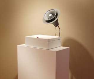 sculpture by j.frede Grey|Area, curated by TJ Norris at the Guestroom Gallery in Portland, Oregon is an aptly titled show, which exhibits the work of thirteen West Coast artists. The works in the show include a range of media that either deliberately or unknowingly resist immediate and easy categorization. Instead they confidently straddle established genres, revealing in the process the scope of overlapping territories. By drawing attention to serendipitous details, a tactile minimalism and the often unseen, this overlapped grey area becomes a huge platform that initiates thought and provokes debate. What is it that makes this overlapped space -- this blur -- a space worthy of exploration? This question resonated as I navigated the show... (more) Posted by Guest on July 25, 2006 at 17:03 | Comments (1) PermalinkSaturday 07.15.06 Adam Bailey at Portland Art Center 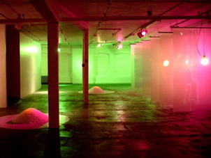 Adam Bailey's Lineage of Harmonic Sensation at The Portland Art Center is the first show to really fullfill the promise of this organization since John Mace's exciting and slightly overcooked rookie show in March 2005. What's more, instead of yet another impossible to categorize group show whose basic premise is to create a turnout, it actually allows one to gauge Bailey as an artist. It's flawed but in the worthwhile ways expected in a big debut. Practically everyone has pretty much demanded more from PAC and it looks like they took it to heart. This is a good start and it made my day to see something I liked at PAC. As I toured the gallery completely alone (just try that at MoMA) I simply enjoyed the visual and aural pulse of the show, despite its shortcomings. This large room sized installation is basically a catalog of experience art media. It includes light as sculpture a la a lesser James Turrell, sculpture that ...(more) Posted by Jeff Jahn on July 15, 2006 at 5:43 | Comments (0) PermalinkWednesday 07.12.06 Isermann is the Man 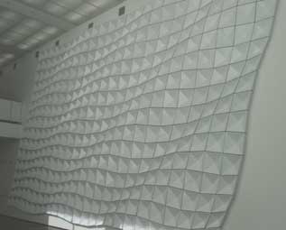 Jim Isermann's Untitled (0205), 2005 When in Chicago a few weeks ago I took in Jim Isermann's Untitled (0205) at the excellent Museum of Contemporary Art (MCA). Situated in the lobby on massive white walls the faceted white panels play with light and space, the two most common aspects of experience art. I've seen a lot of Isermanns and I always enjoy them, but somehow this one struck a slightly different but good chord, it was like a visual iceberg. It is bit colder and as uniform as a Sol Lewitt, but soo different in effect because I kept thinking about Rem Koolhaas' buildings and their use of disorientation to heighten the viewer's level of perceptual engagement. One could just say, "you had to be there," for most of these kinds of installations but I think there is a greater need for this sort of space that presents physical questions. These days museum lobbies seem to host a lot of the most interesting work. For me it's like a little ginger to cleanse the palette before more sushi. The process of getting prepared to look at work is an interesting subject in itself for art and for those that think that minimalist (is it even abstraction, or simply refined forms?) is a rejection of engagement with the world couldn't be more wrong. Posted by Jeff Jahn on July 12, 2006 at 13:39 | Comments (0) PermalinkFriday 06.16.06 Richard Rezac at the Portland Art Museum 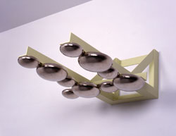
Richard Rezac, Untitled (98-06), 1998, Nickel plated bronze and steel, Collection of Sarah and Andrew Meigs Whenever I move to a new place it is easy for me to take it for how I’ve found it, believing in a permanency that seldom exists. I see it, so it must have been true for all time. As a newcomer, I have had to remind myself that the Jubitz Center for Modern and Contemporary Art in the Mark Building at the Portland Art Museum hasn’t always been there. Knowing that there was a void that has since been filled has left me wondering how I would feel about my new home had there not been a place to study a large collection of contemporary work...(more) Posted by Melia Donovan on June 16, 2006 at 8:30 | Comments (1) PermalinkSunday 06.11.06 The Art Of Richard Tuttle at the Des Moines Art Center  Fountain, 1965; Acrylic on plywood; 1 x 39 1/8 x 38 3/4 in.; Whitney Museum of American Art, New York; 50th Anniversary gift of Richard Brown Baker; © Richard Tuttle; photo: Jerry L. Thompson, courtesy the Whitney Museum of American Art, New York While at the wonderful Des Moines Art Center a few weeks ago I was able to take in their fantastic version of The Art of Richard Tuttle retrospective. It ended today, June 11th. Sure it was an impressive show at both SFMOMA and the Whitney but the DAC offered some exciting new twists, especially a not to be forgotten Tuttle vs. Richard Meier showdown. The show was installed in both the Eliel Saarinen and Meier wings of the DAC and the difference between the two is part of the special magic this version of the show had. All of the other museums presenting this show have only one architect for their space, Botta, Breuer and next up at Chicago's MCA, Joseph Paul Kleihues (these are my favorite museum galleries anywhere). Each version of the retrospective would have to be different as Tuttle is an idiosyncratic and pragmatic artist. He adapts and ...(more) Posted by Jeff Jahn on June 11, 2006 at 23:00 | Comments (1) PermalinkSaturday 06.10.06 Ovitz Part II at Reed's Cooley Gallery 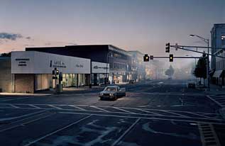 Gregory Crewdson, Untitled (North by Northwest), Summer, 2004, Digital C-print, 64.25 x 94.25 in. Edition 5 of 6. Image courtesy of the artist and the Ovitz Family Collection, Los Angeles Ok, Ill admit I haven't been the biggest fan of Gregory Crewdson and much prefer the works of of his pupil Justine Kurland or the noirish and Lynchian video installations of Sue de Beer to his work. Still, Im not certain they would have had careers if he hadn't blazed a cinematic trail in the late 90's for them. Yes, I found this second installment of Reed's New Trajectories series called "New Trajectories II: Expansions, Recent photography by Gregory Crewdson and Candida Hofer from the Ovitz Family Collection, Los Angeles"... (whew) nearly as compelling as the first installment. The show closes on Sunday June 11th so I recommend you make a point to see it... (more) Posted by Jeff Jahn on June 10, 2006 at 16:55 | Comments (0) PermalinkTuesday 06.06.06 Barry Johnson: Commutatus (and more at the new Portland Art Center) 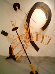
Barry Johnson's Commutatus translates the virtual space of drawing into the actual space of sculpture. His forms are as fluent and lively and as complex as large scale charcoal drawings. He's not overly focused on woodworking skill and I think this is a strength rather than a weakness. The forms, as extensions of drawing, are the most important and Johnson's construction methods primarily facilitate those forms...(more) Posted by Isaac Peterson on June 06, 2006 at 23:46 | Comments (2) PermalinkSaturday 05.27.06 Roxy Paine's PMU 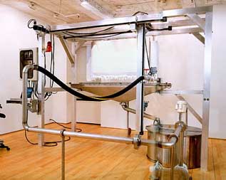
Roxy Paine PMU (Painting Manufacture Unit) 1999-2000. Aluminum, stainless steel, computer, electronics, motors, pump, valves, acrylic, Courtesy of the artist and James Cohan Gallery, New York. Function finds little room in contemporary art, a realm where dysfunction, tension and absurdity operate best. While Roxy Paine's automatic art-making machine—the Painting Manufacture Unit, or PMU on view through Sunday at the Portland Art Museum—could easily fall prey to the cynicism inherent the task of automating the creative process, its functionality saves it from merely becoming an exercise in pure critique... Through Sunday, May 28th Portland Art Museum • 1219 SW Park Avenue • 503.226.2811 Posted by Katherine Bovee on May 27, 2006 at 22:45 | Comments (2) PermalinkWednesday 05.24.06 May Gallery Roundup 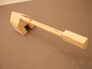 Paul Sutinen's "Mt. Hood Piece" at 9 Gallery There were a # of good shows in Portland this month but Linda Hutchins takes the prize...(more)... Posted by Jeff Jahn on May 24, 2006 at 0:45 | Comments (9) PermalinkMalia Jensen (part 3) Representation/ Simulation/ Decay Jensen finds a bracing and playful sense of liberation in decay. She suggests the possibility that decay is, though entropic, also a dynamic transformative force, one capable of breaking down simulation and revealing a more truthful experience.
But Jensen's decay exists in Nature Studies as a not-yet-resolved descent. We see objects in intermediate states, not settled wholly into scattered, fragmented detritus, but on their way there. And it is the intermediate states of decay which are the most anguished. In these states we see things completely changing form, becoming unrecognizable, leaving the boundaries of our descriptive abilities. 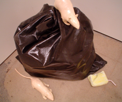
In her trash bag with rats, Jensen adopts the imagery of decay outright. This sculpture operates similarly to the photographs; it exists in a decayed state between simulation and representation. As a representation, it is cleverly made and compelling. It immediately triggers a visual joke. It's funny to see a bag full of trash with rats crawling over it in the gallery...(more) Posted by Isaac Peterson on May 24, 2006 at 0:11 | Comments (3) PermalinkTuesday 05.16.06 The Flow 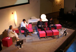 Suitcase Curators Teruo Kurosaki and John Calvelli with moderator Paola Antonelli From the day-long symposium on Tokyo design held during the last week of April to the exhibition of design objects currently on view in the Feldman Gallery, PNCA's exploration of trends in Japanese design and culture has set out to equip Portland's creative types with a new vocabulary and understanding that will provide fodder for their own practice. The association of Japan with cheap industrial fabrication and electronics has been overshadowed in the past few years by a reverence for Japanese culture, which has proliferated in both the United States and Europe in everything from art (Muarakami, Nara, Aoshima) to fashion (BAPE, Murakami for Louis Vuitton), music (Puffy Amiyumi) and style (designer toys). The Tokyo Flow symposium was not so much an attempt to rigidly define these trends as an opportunity to expose Portland audiences to these currents, identifying the ways of thinking and cultural context that inform Japanese design. A great deal of the work being exported from Japan has made an impact not because of its uniqueness or originality, but because it freely aggregates styles and influences—some have made comparisons to sampling in music—in a way that epitomizes modern urban experience. Other work captures the kind of minimal sereneness that derive from a rich aesthetic tradition. Combine that with the religious, cultural and historical forces that are also at play—and which perhaps still hold a certain exoticism for Western audiences—and it comes as no surprise that Japan has had such a pervasive influence on everything from pop culture to design. Taking a cue from the five "suitcase curators" who culled objects for Tokyo Object Flow, what follows is a sampling of what the symposium and the exhibition offered to Portland audiences... Posted by Katherine Bovee on May 16, 2006 at 9:30 | Comments (0) PermalinkSunday 05.14.06 Malia Jensen at Elizabeth Leach Part 2 
Malia Jensen's Haystack series appropriates, dissects and reconstructs Monet's dull paintings. Her photographs trick and antagonize with an agile sense of mischief. The photographs represent a single, immediate act, that of clicking the shutter. No thought is given to formal principles of composition, no attempt is made to make the subject more interesting. It is the immediacy of Jensen's photographs which resonate with the simplistic impressionist credo. Do not think what is before you, simply apprehend it. This is exactly what Jensen is doing in this series. The difficulty here is that with a camera, Monet's credo becomes ludicrous, redundant...(more) Posted by Isaac Peterson on May 14, 2006 at 21:54 | Comments (8) PermalinkThursday 05.11.06 Malia Jensen at Elizabeth Leach (part 1) Malia Jensen's drawings offer the same conundrum as New Yorker cartoons. Are they funny? Am I missing something? Is the humor over my head?
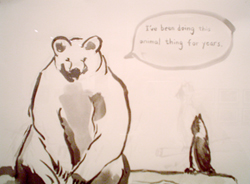
Like New Yorker cartoons, Jensen's drawings offer multiple possibilities for interpretation and leave the viewer floundering in the space between language and image, trying lamely to connect the two, unsure whether to laugh or not. Jensen's cartoons are drawn with a light, casual touch, nonchalantly dismissive of notions of formal mastery in the medium of drawing. They emulate the accessibility of sunday comics or greeting cards. Jensen appropriates commercial forms that democratize high art practice by producing skill-less renderings which deflate the elitism of the medium. Having set up an innocuous, democratic field in which to operate, Jensen proceeds to throw metaphysical fire-bombs. We look to the word balloon for justification...(more) Posted by Isaac Peterson on May 11, 2006 at 19:43 | Comments (0) PermalinkWednesday 04.26.06 Allison Edge at Motel  Little Lost One On paper I should really dislike this show of cute things called "You're the One for Me" but it's so wholeheartedly wrong and thoroughly obsessed with things I marginally understand that it became challenging and therefore worth exploring some. Edge is essentially a crush artist and she loves cute boys and kittens. The subject matter is innocuous enough but Edge's impressive no-nonsense execution and careful color choices are coupled with her studied obsession with cuteness, all made palatable by Takashi Murakmi's importation of kawaii or cute culture into contemporary art. If you are into cute boys and kittens then this is heaven. The kittens in particular make me very uneasy and they have a strong recent history in contemporary art if you consider Fischli and Weiss or Bruce Nauman's cat in the studio. The difference here is instead of being disarming these are images of obsession and designed to provoke a specific fetished reaction rather than an open ended opportunity for confusion,(read more)... Posted by Jeff Jahn on April 26, 2006 at 23:57 PermalinkFriday 04.21.06 2 quick and dirty reviews 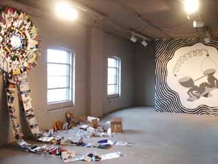 Paige Saez's Art Forum (left), Scott Harrison (right) 2 reviews.... (read on) Posted by Jeff Jahn on April 21, 2006 at 0:10 | Comments (0) PermalinkWednesday 04.19.06 Multiplicity (NCECA Roundup Part III) 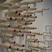 Kay Hwang Kay Hwang
Multiplicity could have easily gotten lost in the predictability of its format—a group show defined by a single word that serves as both title and theme, with an expansive topic that gives the curator the ability to usher in everyone from the artist du jour to heavy hitting art stars. These types of exhibitions often seem hinged on a "curatorial-lite" formula that has proliferated in tandem with the crop of curatorial studies programs that have sprouted up over the past decade. Weakening the relationship between curatorial practice and academia, such exhibitions easily fall into curatorial sloppiness. When done well, however, they can provide a dynamic alternative to strictly historic or academically-grounded exhibitions. Curators Kate Bonansinga and Vincent Burke were able to reign in the exhibition at the Portland Art Center through careful selection and adept installation, turning out one of the best offerings of NCECA's ceramic-oriented exhibitions... Posted by Katherine Bovee on April 19, 2006 at 15:39 | Comments (1) PermalinkFriday 04.14.06 Fresh Let us write our own words! Let us speak with our own voices! Let us have the courage to express and defend our own opinions with something more savory than blurbs and puns.
I say down with the Salon! Down with the Emperor! Down with the voice of Portland art now! Down with pats on the head! Down with "Affirmation, Permission and Dissemblance!" Down with the commercial success of a gallery held as more important than the art it contains! Long Live the Revolution! Long Live an art scene that is actually about art! (read more....) Posted by Isaac Peterson on April 14, 2006 at 1:06 | Comments (9) PermalinkMonday 04.03.06 Eugene on the move 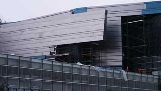 It had been several years since I made the hour and a half trek south to Eugene but this was my chance. With a new museum, a 35 year retrospective and one of the most exciting new buildings in America (by Morphosis) under construction there was plenty to see (read more)... Posted by Jeff Jahn on April 03, 2006 at 23:25 | Comments (2) PermalinkSaturday 04.01.06 NCECA Roundup (Part 2) 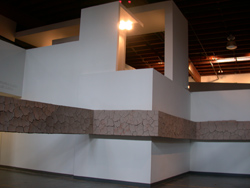
While one would be hard-pressed to definitively extrapolate recent currents in ceramic art from the work included in NCECA, a broad range of work was represented, and many shows found resonance with others around town. Over at Pacific Northwest College of Art, four Alfred University grads—Ian McMahon, Nathan Sherman, Marc DeBernardis and Robert Marzinsky—take media-based concerns to an extreme in an exhibition entitled Composite. Four large-scale works in PNCA's Swigert Commons employ ceramic in its raw form, boldly taking site-specific clay and mixed media sculptures to architectural dimensions. The most successful piece is a horizontal band of raw clay, suspended in mid-air between walls and columns to delineate a new space that interacts with the building's existing architecture. It acts as an unavoidable public sculpture within the commons space. Visitors and students are confronted with a choice to walk around the sculpture, thereby changing their normal trajectory, or enter inside of the sculpture by ducking underneath the band, which was positioned several feet off of the ground. Although it serves as an architectural feature or barrier, its impermanence is apparent, as the raw clay bears deep cracks reminiscent of salt flats, a reminder that the construction could crumble at any moment... Today is the last day to view these exhibitions at PNCA, PDX, Pulliam Deffenbaugh, Elizabeth Leach and Gallery 114. Posted by Katherine Bovee on April 01, 2006 at 9:38 | Comments (2) PermalinkMonday 03.27.06 The Sensualist: New Work by Eliza Fernand 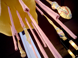
Tube Cloud Tube Cloud hovers menacingly / peacefully in the center of Rake Gallery like a Rococo Man 'O War. Pink tendrils descend from the central mass and burst into fleshy, sequined tubercles. Tube Cloud is above a round cushion. When one understands the interactivity of the ceramics, it is easy to see that the artist intends the viewer to sit on the cushion amongst the pink tendrils and fleshy tubercles. The accidental motion of the sitter animates the tendrils and tubercles. One finds oneself as gently caressed as a clown fish by a sea anemone. One of the fragile tubercles has already broken. The important temporal limitations of sensual experience have naturally led the artist into performance. Fernand's performances have thus far been held in non-gallery spaces (read more)... Posted by Isaac Peterson on March 27, 2006 at 1:18 | Comments (0) PermalinkFriday 03.24.06 NCECA Roundup (Part 1) 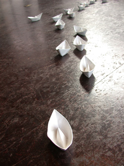 The "paper" boats of Juana Valdes intrepidly navigate the waters of craft The fact that the NCECA Conference brought several thousand people and over 100 ceramic-related art exhibitions to Portland for a period of four days in early March predictably elicited everything from enthusiasm to skepticism and indifference from Portlanders. Although the roots of Portland's craft tradition runs deep, it's not exactly at the forefront of the art scene here. The political and aesthetic radicalism that marked the Art & Craft Movement at the turn of the century has dwindled, and many now associate craft with fine (but not necessarily well-designed) objects... Posted by Katherine Bovee on March 24, 2006 at 10:29 | Comments (2) PermalinkMonday 03.20.06 Love in the Wild, Vicki Lynn Wilson at Blackfish 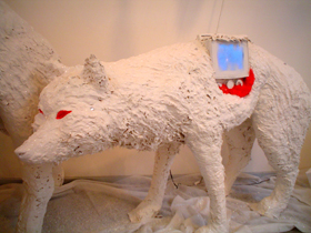 An installation of new work by Vicki Lynn Wilson at the Blackfish Gallery entitled Love in the Wild is fraught with complex tension. The work shifts easily though inexplicably between silly fairy tale narrative and images of predatory violence, while always returning to a single generative nexus: the American living room. Wilson's cold, snowy, sparkly myth-scape is an allegorical environment distantly related to the frozen despair of Narnia under the influence of the White Queen: forever winter without Christmas. As in the White Queen's Narnia, The freezing in Love in the Wild applies to time as well as temperature. Time no longer seems to progress, but eddies and compounds idly. The interaction of prey and predators (which also seem formed from glittering snow) becomes confounded in the absence of a timeline. Animals divide and replicate constructively, the aura of predatory menace becomes detached from a specific event and diffuses into the atmosphere itself. A hunting dog seems to divide through mitosis, becoming a diploid aggregate, the halves seamed together with bright red fabric scar tissue. (read more)... Posted by Isaac Peterson on March 20, 2006 at 23:35 | Comments (0) PermalinkFriday 03.17.06 ArtForum's Slant on Red 76's Ghosttown 
It is swell that the March 2006 issue of ArtForum has a 2 page article on Red 76's Ghosttown project in Portland but it excludes some important facts, while projecting a... Posted by Jeff Jahn on March 17, 2006 at 22:32 | Comments (10) PermalinkFriday 03.10.06 New Trajectories I: Relocations, the Ovitz Family Collection (Part 2) 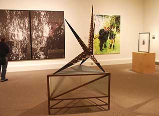 L to R works by: Stephan Thiel, David Thorpe, Eric Schmidt, Richard Prince and Tim Eitel Tommorow is the last day of this show at Reed College, read more for part 2 of my review... Posted by Jeff Jahn on March 10, 2006 at 0:00 | Comments (0) PermalinkMonday 03.06.06 Daniel Barron debuts at Pushdot Studio  Daniel Barron's Milton Daniel Barron's In he Knee of the Curve at Pushdot Studio is one of the more impressive and odd rookie art shows I've seen in a while. This wipes the floor with a lot of the tamer photographic fare I often see in galleries and stumbling across it on First Thursday made the... Posted by Jeff Jahn on March 06, 2006 at 20:56 | Comments (0) PermalinkSaturday 02.25.06 Quick and Dirty Plus 
Today is the last day to get a glimpse of the PDX Window Project by PORT's own Jeff Jahn. As Jahn's statement explains, the project has less to do with "bodice ripping paperback novels and Valentines Day" than devising a visual language through the two "installation/paintings" on view. It is also unafraid to create desire, mostly through a series of pleasing contradictions that play off of one another. In the forefront of the window is a sweetly-scaled drip castle constructed from white sand. The two-tiered structure alludes to monumental architecture, no surprise given Jahn's long history with architecture. The fact that it is created from sand—which has long had a symbolic association in art with the passing of time and brings with it other connotations given the fact that this unstable material is essentially made from the ruins of rocks—undermines the architectural associations. Jahn also plays with formalism here, creating a sculpture that is in essence a result of hundreds of gestural drips, a quality one would normally associate with painting. Leaning against the back wall is a thin, angular panel topped by a Burton-esque spiral. Its red, white and pink hues, horizontal stripes and indulgent impasto make the work pure visual candy, but the ambiguity of its status as painting or sculpture inserts a problematic tension that resonates neatly with Jahn's sandcastle. Posted by Katherine Bovee on February 25, 2006 at 8:41 | Comments (7) PermalinkWednesday 02.22.06 Hanging Judge: quick and dirty reviews This is the last weekend for a few worthy shows that you might want to check out.
Here is a flurry of short reviews to help you decide. read on...
 Shin Tanaka's T-Boy sculptures at Compound Posted by Jeff Jahn on February 22, 2006 at 23:01 | Comments (2) PermalinkMonday 02.20.06 Hans Holbein's Madonna of Mercy at PAM 
The Madonna of Mercy, currently on view at the Portland Art Museum (!) Just as Jacob Meyer found himself clinging to the fading Orthodoxy as the Reformation demanded justice in the real world, Holbein himself was torn between worlds. His painting was an objective practice, an aesthetic orthodoxy, and he followed it out of the real world and away from his responsibilities and connections. Was Hans Holbein an ideologue willing to sacrifice anything in support of More's radical humanism? Did Holbein abandon everything to become a citizen of More's Utopia, the Not-place which could yet become real? Absolutely not. He worked for Henry the VIII in the exact same capacity that he served Thomas More. Holbein's personal Orthodoxy of objectivity never altered, and separated him from the world in the same way that Jacob Meyer was separated from his Madonna of Mercy. Ultimately, Hans Holbein cannot be considered a citizen of More's Utopia. He lived instead in the Outopia, the not-place which can never be made real... Posted by Isaac Peterson on February 20, 2006 at 6:56 | Comments (5) PermalinkFriday 02.17.06 New Trajectories I: Relocations, at Reed College (Part 1) 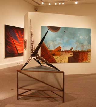 David Thorpe's The Great Conspirator, in front of David Schnell's Tontauben, in front of Mark Handelman's Vision Michael Ovitz is one of the World's top art collectors and known for getting what he wants. Apparently, he's also very generous and has been gracious enough to lend major parts of his collection to Reed College for two concurrent exhibitions. Portland is an art mad city going through nearly violent upheavals in sophistication, so we really appreciate this treat. Yes, writing a review of a personal art collection like the Ovitz Family Collection is a bit like writing a biography, except this isn't his whole collection so it will seem slightly schizophrenic. Still, the sheer quality of the work and the fact that much of the best stuff should find its way to MoMA demands some attention. Besides, despite the theme of "relocations" there is a coherence to this first of two Reed College Cooley Gallery shows. It will be... Posted by Jeff Jahn on February 17, 2006 at 0:11 | Comments (2) PermalinkTuesday 02.07.06 Sophie Calle at PAM 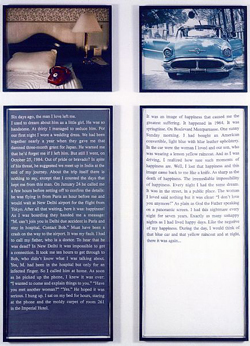 Sophie Calle, Exquisite Pain (Day 6), 2000 Embroidery, photo panels, ed. 2/3 Lent by the artist and courtesy of Paula Cooper Gallery. © Sophie Calle Sophie Calle has been accused by critics (and subjects) of being a voyeur, a spy, an amateur detective, a "world class snoop" and a specialist of intrusion in the private lives of others. Calle's work originates in aspects of performance or experience, oftentimes autobiographical in nature and involving the lives of strangers. Since the 80s, the French artist has embarked on projects that include covertly following an acquaintance that she met once at a party in Paris—where Calle lives and works—to his vacation in Venice; dutifully recording the contents of strangers' hotel rooms while posing as a chambermaid; and documenting stolen paintings through photographs of the empty voids left behind along with transcriptions of interviews with guards and curators who worked in close proximity to these masterpieces. Although Calle's work emerges from ritual and experiential behavior, only the documentation of these actions are presented within the gallery. Calle's work poses a problem for both the critic and the viewer. On the one hand, her dry presentations—marked by an documenter's indifference and often consisting of unremarkable photographs alongside framed texts—exhibit a cool, formal distance that deflect emotional attachment. On the other hand, the subject of Calle's work is often autobiographical and extremely personal, inviting a false sense of intimacy shared between the artist and viewer. It is for this reason that Robert Storr cited the "forensic qualities" of her work and Donald Kuspit accused Calle of being nihilist. It is this point of tension that also inspires many critics (including Kuspit) to use the word "seduction" to discuss her work. It is also for this reason that one of the subjects (or some might say victims) of Calle's intrepid documentary impulses was so angry that he published a nude picture of the artist in a widely circulated French newspaper. Yet a young Parisian fan of Calle's work was so inspired that she presented Calle with her personal diary after meeting her at an opening. Calle's work indeed seduces, with its obsessive documentary urges that lure the voyeur in us all... Through February 12 • Jubitz Center for Modern and Contemporary Art Portland Art Museum • 1219 SW Park Avenue • 503.226.2811 Posted by Katherine Bovee on February 07, 2006 at 9:18 | Comments (1) PermalinkTuesday 01.31.06 Report from France (Part III)  Ann Veronica Janssens , Installation view L E E 121 ! Courtsey Galerie Micheline Szwajcer, Anvers (c) Biennales de Lyon 2005, Photo: Blaise Adilon On the 2005 Lyon Biennial One could argue that the popularity of art fairs, biennials and newly minted MFA grads all has to do with a common desire: an obsession with the new and the now. In the midst of this frenzy for all things emerging, the 2005 Lyon Biennial – entitled Experiencing Duration - rejects a typical biennial's premise of surveying the present, creating a kind of anti-institutional anti-biennial. Curators Jérôme Sans and Nicolas Bourriaud collapsed distinctions between art of the late 60 and 70s and art of the past two years, disarming temporality of its authority in order to clear the way for re-imagining the future of art. When post-modernism descended onto the art world and passed through a generation of art students who would later become teachers in these same institutions, it left the artist without the possibility to fantasize about anything resembling utopian ideals. Sans and Bourriaud are particularly interested in hippie idealism, except they are fully aware in the inability to believe in utopia. Relieving the artist of the quest to re-imagine the world in utopian terms, Sans and Bourriad instead seek to regain the experiential optimism and energy of this era without the delusion of utopia. At the same time, they are interested in no less than to foster a new environment for the younger generation of artists, one that reclaims an idea of sustainability and breaks away from a cycle of simply identifying and "consuming" the new... Report From France: Part I (Nature) Report From France: Part II (Fictional Geographies and Disorientation) Posted by Katherine Bovee on January 31, 2006 at 1:30 | Comments (0) PermalinkFriday 01.27.06 Report from France (Part II)  Jeppe Hein, Simplified Jeppe Hein, Simplified
Fictional Geographies and Disorientation For some, the creation of imaginary terrains involved the more literal creation of fictional geographies, visual counterparts that provided a place for the mind as well as the eye... Report From France: Part I (Nature) Report From France Part III (on the Lyon Biennial and Palais de Tokyo) Posted by Katherine Bovee on January 27, 2006 at 11:27 | Comments (0) PermalinkWednesday 01.25.06 Hildur Bjarnadottir at Pulliam Deffenbaugh  Hildur Bjarnadottir - Gingham - Cadmium Red Icelandic artist Hildur Bjarnadottir doesn't ignore art and intellectual history; she gives it a newer, smarter, better made/time tested and reflexively subversive cloth to wrap it in. She has already received kudos from Art in America and Artnet but her latest show, Overlap at Pulliam Deffenbaugh Gallery shows her as the fully developed, unpatronizing and supremely deft contemporary virtuoso her earlier and more obvious work had always pointed towards. Somewhere between Modernism's impulse to push beyond the mundane and Duchamp's brilliant "so what" mundane ready-mades (later restated in Pop art), traditions became... Posted by Jeff Jahn on January 25, 2006 at 0:07 | Comments (5) PermalinkTuesday 01.24.06 Bethany Wright and Ashley Edwards at Nocturnal Bethany Wright presented an intense, visceral piece assembled from components developed under the auspices of Bard College and PS 122 in New York. Bethany has here collaborated with Poet and Reed Graduate Ashley Edwards. Their piece was performed for a small audience at Nocturnal on Friday, January 20.
Bethany recites two of the poems from her bandolier. The tension seems to be building in the room, but it is hard to place why. People are relaxing as the readings progress, allowing themselves to be more expressive. Bethany is moving around a little quicker. The poetry is slowly submerging the space, rarifying the atmosphere. Finally the tension culminates, at which point Bethany stops what she's doing, drops the mic and runs back over to the table, where she picks up a honey bear and squeezes the honey out into her hand. Then she covers her face, neck and head with honey and rushes out of the room.... Posted by Isaac Peterson on January 24, 2006 at 17:30 | Comments (8) PermalinkMonday 01.23.06 Report from France (Part I)  Graphic design: Cédric Henry Graphic design: Cédric Henry
The illustration for the 2005 Lyon Biennial seems as if it is lifted from a 60s or 70s sci-fi book cover. Against a paint-splattered psychedelic sky, the silhouettes of three men turn to face a gigantic planetary orb rising above the skyline. It's an image that captures a moment of discovery - the discovery of alien planets, foreign terrains and spectacular sights. It illustrates exactly the kinds of reactions one is hard pressed to find within museum or gallery walls these days. In a time when cynicism and re-appropriation reigns, it's rare to find newness or impact. I was in France for the holidays, traveling to see the last week of the biennial and catching several shows in Paris. As expected, I saw very little that was truly new or awe-inspiring [disclaimer: I can't blame France's art scene entirely, since many galleries were between the major exhibitions of last fall and a round of new exhibition opening in mid-January]. But I did see a new kind of crisis bubbling beneath the surface, one that is sure to influence if not define whatever artistic and curatorial impulses the future holds for us. An obsession with imaginary or re-imagined terrains - physical, psychedelic and real - repeatedly appeared in the work that I saw. It's present not only in France (where nearly half of the gallery artists I happened to see were American), but also in recent U.S. shows like MOCA's Ecstacy. Perhaps against a backdrop of "already been done," artists are trying to reclaim their position as the creator of new aesthetic and intellectual terrain. Or perhaps, if I allow myself to have an utterly cynical moment, it's the curators who are taking on the job of inventing new worlds, conveniently relieving the artist of this "burden..." Posted by Katherine Bovee on January 23, 2006 at 1:18 | Comments (0) PermalinkWednesday 01.18.06 Daniel Duford's Sleeping Giant at the Art Gym Daniel Duford's new work at the Art Gym explores the interaction between architecture and American cultural mythology as represented by comic books in Sleeping Giant.
The flyer published by the Art Gym contains a 2-page spread of a Sleeping Giant comic. This brief narrative seems to be a component of a larger story. It relies on a "nature as cataclysm" theme which parallels Alan Moore's famous Swamp Thing, as well as the pre-heroic Sub- Mariner. Sub-Mariner was the main character of the first Marvel Comic ever published, and his original intention was the oceanic destruction of New York City until the appearance of Adolph Hitler during WWII as an eclipsing super villain in the Marvel Universe caused him to reevaluate his moral position. 
Duford's aesthetic is a mixture of the Golem myth and the "big" superhero. "Big" superheroes are incarnations of the id: they have become so physically energized that the power of their aggressive tendencies is nearly uncontrollable, and often supercedes intellect and judgement. These heroes represent an opportunity for writers to grapple with moral and existential dilemmas, and it is often difficult to establish whether or not they are heroes. Of course, it was Alan Moore and Berni Wrightson's Swamp Thing which brought a new level of sophistication to the "Big" hero. In Swamp Thing, the hero's "bigness" became spiritual "vastness." ... Posted by Isaac Peterson on January 18, 2006 at 23:36 | Comments (2) PermalinkWednesday 12.28.05 Anna Fidler - Oblivious Peninsulas Anna
Fidler's new body of work at Pulliam Deffenbaugh is entitled Oblivious Peninsulas. Oblivious Peninsulas represents a point of expansion for the artist as she moves elegantly from cut paper collages into painting, while preserving her personal direction intact through the medium shift.
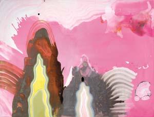
I haven't been in town long enough to have seen her earlier work, but thanks to my trusty research staff I have been able to get some idea of how this show represents significant growth for the artist. It is significant that peninsulas are places to jump from, and this metaphor elucidates not only this particular point in Fidler's career, but also the relationships she creates between washy, flowing, glittery, lurid, fields of paint and the accreted materiality of the "peninsulas" as objects. Fidler is a polymath... Posted by Isaac Peterson on December 28, 2005 at 14:32 | Comments (1) PermalinkThursday 12.22.05 Mona Hatoum at Cooley 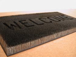
Although comprised of object-based work ranging from large-scale sculpture to delicate waxed paper impressions, Mona Hatoum's work at the Cooley Gallery revolves around a desire to craft encounters - sometimes uncomfortable - between viewer and object. A contemporary of the YBAs, Hatoum shares only marginal similarities to the shock tactics of her pop culture obsessed peers. Hatoum's mode of working deals with personal, political, visceral and violent content through conceptually-driven art that rests on a solid foundation of formal consideration of how her practice manifests itself within the gallery. Her work bears more resemblance to 80s era Rosemarie Trockel or Christian Boltanski than to Damien Hirst's perversions of minimalism or Sarah Lucas' general bawdiness. The ominous profile of La Grande Broyeuse - literally, the big grinder - dominates the gallery. This major piece is an impressive inclusion in the Cooley's modestly scaled gallery and provides a key visual and conceptual foundation that informs the entire exhibition. It is at once threatening and playful. Manifesting itself through high and low, sublime and mundane, La Grande Broyeuse speaks to a lineage of modernism, yet doesn't stray far from the personal and geopolitical themes that emerge repeatedly in Hatoum's work. The French title brings to mind the lingering presence of French influences in Lebanon, where Hatoum was born, but more importantly, references Marcel Duchamp's lingering influence in contemporary art. Both form and title recall Duchamp's iconic la Broyeuse de chocolat. The cavity of Hatoum's grinder is large enough for a human body, and the sculpture at times seems like a threatening insect-like torture device. Yet, it's at root a humorously glorified utensil, based on an archaic grinder from the kitchen cupboards of the artist's mother. A more contemporary counterpoint can be found in its resemblance to the monumental geometries of industrial male sculptors like Mark di Suvero and Anthony Caro. La Grande Broyeuse forms a complex of meanings, but handled within the scope of Hatoum's sharp practice, these meanings avoid becoming convoluted, instead, neatly intersecting through the formal qualities of the sculpture itself... Through December 23 • Cooley Art Gallery Hauser Memorial Library at Reed College • 3203 SE Woodstock Boulevard Posted by Katherine Bovee on December 22, 2005 at 8:05 | Comments (0) PermalinkWednesday 12.21.05 New Found Land - Cynthia Lahti at PDX Cynthia Lahti's new work at PDX Contemporary Art is a body of ephemeral ink drawings and delicate sculpture. Lahti creates work that is consciously fragile. The drawings look less framed and more contained; as one would preserve and display an exotic butterfly.
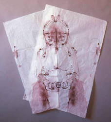
brown bow Lahti's drawings are mostly composed around a butterfly-like symmetry. She draws in ink on tissue paper and folds the paper in half through the drawing. The ink so saturates the paper that it tends to destroy it, in addition to bleeding out in near uncontrollable directions. Lahti chooses subject matter she responds to emotionally from diverse sources. Mostly the images seem to come from magazines and deal with nostalgic representations of idealized childhood. Lahti's drawing method is uncorrectable, she must accept errors as compositional devices or throw the drawing away. Further, Lahti seems to relish the idea of error as an artistic device. The inclusion of error in an artist's program generates unsettled objects. Lahti's drawings (as well as her sculpture) are on the way to completion, but never arrive. The object is in transit; almost, but not quite yet, a drawing. The elegance of the drawing has been overmastered by the brutal, stupid force of her main compositional solution: folding the drawing in half to create a Rorschach test. Symmetry provides the looked for solution; indelibly solidifying the image. 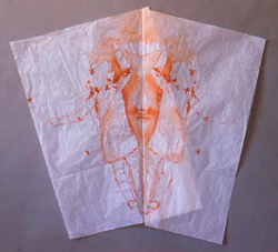
Spin Symmetry stills the motion of the unfinished drawing and introduces layers of meaning unrelated to the subject matter. Images of idyllic childhood fancy are multiplied, corroded, frozen and preserved by the symmetry. Lahti's Rorschach test acknowledges that childhood was an ego-constructed fantasy after all, but nevertheless one worth preserving. Ultimately, Lahti's work speaks to the fragility of the ego itself, as well the often transparently superficial means by which it composes and constructs memories. It is with extreme selectivity that the adult mind sifts through the experiences of childhood, emphasizing... Posted by Isaac Peterson on December 21, 2005 at 8:22 | Comments (0) PermalinkTuesday 12.13.05 Backyard Icing The new show by PNCA artist in residence Jenene Nagy is entitled Backyard Icing and uses unusual materials and subtle gestures to create imagery somewhere between botany, topography, and cake decoration.
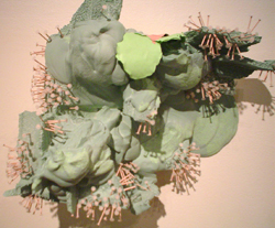
Nagy inverts and complicates the basic vocabulary of art making, and materials and concepts constantly switch places. Nails become a visual end product, rather than an intermediary of construction. Throughout her compositions, Nagy uses nails painted soft pink and green; aggregated in the sculptures as though they were delicate flower petals... Posted by Isaac Peterson on December 13, 2005 at 7:38 | Comments (0) PermalinkWednesday 11.23.05 Danto at PAM Philosophers and critics are notorious for holding onto their intellectual ground at all cost, and Arthur Danto, speaking last Sunday at the Portland Art Museum about the gap between art and life, was no different. Danto described a trajectory in which the differences between art and life were muddled, finally breaking apart completely in the 1960s, leading to our current period in which art is no longer a matter of aesthetics or craftsmanship, but a kind of philosophical game in which a work of art is an embodied meaning. Danto has taught at Columbia's philosophy department since the mid 1960s, and it shows in every aspect of his art criticism. In Danto's version of art history, the 1960s marked a dramatic shift in which modernism gave way entirely to the pluralism of post-modernism, breaking apart an approach to art making very much based in a single media and ushering in the era of "everything is possible." Artist manifestos and grandiose visions of inciting real change through art were gone. Greenburg's quasi-religious devotion to the idea of art as a quest to find the essence of a single medium (in his case, painting) was no longer relevant. From this period forward, the role of artists shifted - now an artist's primary concern is to generate meaning. Surprisingly, Danto doesn't come off as particularly jaded or cynical about the state of art, he just approaches art with cool intellectualism - it's an intellectual game, but an enjoyable one that Danto is happy to engage with. He is thorough and brilliant, but interestingly, the consistency of his ideas can seem counterintuitive to his decades-long interest in pluralism and post-modernism. As a philosopher, his overarching ideas come to an intellectual elegance that resembles reality, but ring false when one thinks too deeply about their implications... Posted by Katherine Bovee on November 23, 2005 at 12:03 | Comments (1) PermalinkSunday 11.20.05 1st Anniversary Discussion of MoMA 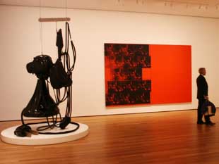 It has been a year since The Museum of Modern Art reopened in Midtown Manhattan and in many ways MoMA has become the contemporary art equivalent of the elephant's graveyard. It is where we grieve and remember the death of giants and look at the bones while poachers scavenge for ivory tusks. It's a parade of masterpieces and names, an epistemology of aesthetics that (according to Saltz and others) the faithful recite like the Lord's Prayer or Pledge of Allegiance. Yet masterpieces like Picasso's Les Demoiselles d'Avignon, Barnett Newman's Vir Heroicus Sublimis and Matisse's The Red Studio are guaranteed to deliver the goods. MoMA has lost what I call its freak factor… lets just say MoMA is infuriating if you like to be infuriated by art occasionally. It just doesn't happen there… instead one gets the inevitable corporate Pixar retrospective on Dec 15th . I can't wait for the video art retrospective on the iPod…? At that point who needs MoMA's walls? The core of greatness in the early & mid twentieth century collections lets MoMA get... Posted by Jeff Jahn on November 20, 2005 at 22:36 | Comments (0) PermalinkThursday 11.17.05 TJ Norris' Nucleo at Chambers Gallery 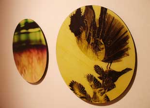 G.LUMIN (L) & BRITE-FLIGHT (R) Limitations can be beautiful and ideally concepts are a type of limitation that focuses or distills a work of art's elements into more than the sum of its parts or intentions. A good example of this is TJ Norris' latest show at Chambers gallery. Although tiny (in the back room) it packs the punch of a Shaolin Monk. It does so precisely because the concepts, space and execution are so tight & disciplined… it all works. Nucleo refers to the very interesting circular shapes of these photographs and the focused centrality each image seems to exude because of this feature. Each image seems to be a focused study of a particular bit of a decaying urban environment. Each image is own world, but it's a recycled, very processed version of decay that seems newly minted by the camera's mechanical eye. It seems to be a parable of how the artists's focused attention (through camera, editing and circular forms) creates a mimetic effect upon the viewer. The works don't seem less gritty because of their slick photographic surface… instead they seem more intimate and approachable in a charmed way that smelly urban grit might not normally exude. The visual focus brings... Posted by Jeff Jahn on November 17, 2005 at 22:44 | Comments (1) PermalinkFriday 11.11.05 Teach Me Your Wildness Elizabeth Leach gallery currently features a show of drawings by sculptors, entitled 2D from 3D. Immediately upon entering the gallery, one encounters a huge Kiki Smith drawing of a wolf. It is a clumsy drawing in ink on a large crumpled sheet of paper which has one corner cut out of it.
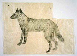
The proportions of the animal make no sense. Its front legs are entangled in a nasty perspective problem, the left fore leg should be closer to the viewer but instead ends up behind the right fore leg. The hindquarters of the animal are properly foreshortened but inexplicably larger than the rest of the body. The wolf has no background but the crumpled, creamy paper on which it is drawn. Above its wedge shaped head is a single, graphic, five-pointed star, which the animal seems to contemplate. The ink hatch marks which render the fur of the animal are regularly spaced and patterned. The piece is brutal, clumsy, awkward, fiercely and naively executed. It is almost as though the artist herself is a wild animal akin to her subject... Posted by Isaac Peterson on November 11, 2005 at 8:50 | Comments (3) PermalinkThursday 11.10.05 Performance Art as Cover This week at the Guggenheim, Marina Abromovic is re-enacting seminal performance pieces from the 1960s and 70s, including Vito Acconci's Seedbed, Valie Export's Action Pants: Genital Panic, Joseph Beuys' How to Explain Pictures to a Dead Hare and one of her own pieces from 1975, Lips of Thomas. As the project description states, "[This] project is premised on the fact that little documentation exists for most performances from this critical early period; one often has to rely upon testimonies from witnesses or photographs that show only portions of any given piece. Seven Easy Pieces examines the possibility of redoing and preserving an art form that is, by nature, ephemeral."
In Portland, we've witnessed two artists in the past 6 months who have employed the idea of performance art as cover. Brad Adkins revived a Francis Alys walking piece in conjunction with PICA's 10 year retrospective and, recently at Marylhurst, covered Michael Bowley's 1979 Walking in a Circle Until a Mark is Made. Last August, Harrell Fletcher gave a performance at the Aalto Lounge of Robert Smithson's slide lecture on the Hotel Palenque... Posted by Katherine Bovee on November 10, 2005 at 10:20 | Comments (4) PermalinkTuesday 11.08.05 Nerve Block Jerry Iverson strips painting raw in the "Nerve Block" series at Pulliam Deffenbaugh. By reducing his palette to only pure white and pure black, Iverson's compositions have a graphic shock quality which he plays against the traditional vocabulary of abstract painting: form, balance, compositional harmony. Iverson's work is like watching a master fencer working with a cattle prod instead of a foil. It seems uncertain whether the elegance of his movements will be readable within the unrelenting, graphic organization of his compositions.
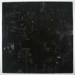
In an all black painting entitled Where We Go, Iverson treads the water of minimalism. One gets the uneasy feeling that Frank Stella is looking over your shoulder, sipping a cup of coffee. The painting seems heavy, full of a gravitas similar to minimalism's assertion of the unavoidable truth of materiality. But the gravitas in Iverson's work is not an assertion of the materiality of the paint itself, it is soulful, full of motion, expressive... Posted by Isaac Peterson on November 08, 2005 at 8:15 | Comments (0) PermalinkFriday 11.04.05 All I Want is Everything at small A 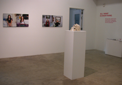
Small A project's inaugural exhibition, All I Want is Everything, gives us a taste of what we should expect more of in the coming months. The exhibition is tastefully spare and features work by a savvy group of young artists based in cities from LA to NYC who are just beginning to find their way onto the pages of ArtForum, Trans> and Modern Painters. At least half of the artists in the show will have larger shows throughout the next year. The premise of the exhibition - artists who explore the potential of transcendent or transformative experience in rock and roll / metal - isn't a particularly new or revolutionary curatorial thesis, but the show is smartly enacted. After the Savage Gallery closed its doors at the end of last summer, its former gallery director Laurel Gitlen took over the location to begin her own gallery. Gitlen made her mark at the Savage Gallery by bringing in artists like Dave McKenzie and co-founded Portland's first art fair in 2004 with former PICA curator Stuart Horodner. Both at Savage and through the Affair, Gitlen has consistently brought in artists from Brooklyn and elsewhere outside of Portland, which has raised the hackles of at least some of the art community here, but is exactly why I'm glad she's continuing with her latest endeavor at small A projects. Themes of transformation and transcendence are potentially weighty, but given a dose of pop culture irreverence, they are rendered facile. It's all intentional of course, a strategy of a contemporary art scene always willing to undercut its own authority. To make an obvious metaphor, it's a bit like your favorite nostalgia-inducing song - its formulaic predictability is also what makes it rock... Posted by Katherine Bovee on November 04, 2005 at 10:47 | Comments (0) PermalinkAFF New York by Brad Carlile  Robert Sagerman's 5,460 @ Margaret Thatcher Projects The AAF Contemporary Art Fair was this past weekend at New York's Pier 92. There was art from 140 galleries including three from Portland:Butters Gallery, PDX Contemporary Art, and Alysia Duckler Gallery. The tag line was "Fine Art under $10,000". Previously they used to advertise "affordable art under $5,000" -- that's inflation I guess. If you must, a few postage-stamp sized works at $100 did exist. I was hoping to see some fresh work, but didn't find much. A problem with an art fair like this is that most galleries seemed to hang slightly-stale decorative works. However, a saving grace for me, the AAF was less loaded with adolescent images on paper than The Affair @ the Jupiter hotel (sorry, but I overload easily on this type of work). At London's Quantum Gallery, Diane Kaufman's impasto portraits were quite gripping (and selling). These thick layered oils start with a Baconesque feel andthen go further. Fleshy cuts of the palette knife descend through multi-color strata to reveal both turmoil and humanity. They also ask why we invest such meaning in a face's configuration. Also in the thick paint category is Robert Sagerman's richly textured work at Margaret Thatcher Projects (New York). Robert Sagerman's brightly-colored work dizzyingly... Posted by Guest on November 04, 2005 at 0:30 | Comments (3) PermalinkMonday 10.31.05 McGinness at PICA  That graphic design has seeped into the realm of contemporary art isn't revelatory news and shouldn't come as a surprise to anybody living in Portland. Portland and its environs can boast top design firms like Wieden + Kennedy and ziba; hordes of shoe designers who work for Nike and Adidas, both of which have major headquarters here; and has its very out outpost for the cause of graphic design as art, Compound Gallery, not to mention galleries like motel where you can find plenty of crossover. It has also has served as home base for design stars like Scott Patt, who recently moved away to head up design at Converse. One of the major graphic designers to storm the contemporary art world is New York-based Ryan McGinness, who treated a packed house in the W+K atrium last Thursday to a barrage of slides detailing his work and practice over the past 6 years. A graduate of Carnegie Mellon, McGinness studied in both the design and art programs, but maintained a separation in his mind between his more practical design work with other studio practice. Working at a design firm out of school, he struggled to establish his art practice, until he realized he could drop his pretensions about art making and just begin to make what he wanted to make. At this time, beginning around 1999, McGinness began to use a vocabulary of simplified symbols that show off his masterful design sensibility and ability to pare down complex ideas to their iconographic essence. Over time, he has built up to a more baroque aesthetic, layering symbols and adapting a new lexicon of signs that takes their cue from crests and arabesque flourishes. His installations at Deitch, PS1 and Galerie du Jour in Paris combine wall paintings or vinyl cuts with paintings, sometimes intermingling commercial products as well. Although he has recently returned to using a more simplified forms, he has retained this strategy of exhibiting his work within complex, multi-layered installations... Posted by Katherine Bovee on October 31, 2005 at 9:08 | Comments (2) PermalinkThursday 10.27.05 Megan Whitmarsh at Motel Gallery 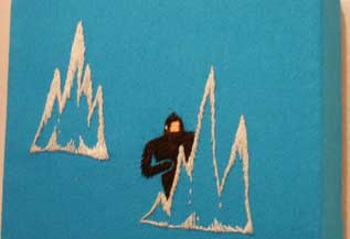 Icy King Kong (detail) Megan Whitmarsh makes tiny, meticulously embroidered scenes populated with Yetis (who socialize), people from the future (who are menaced by modern sculpture), crystals and a generous supply of moon boots and indie rock bands. A sense of innocence as a treasured ideal that cannot exist but in memory pervades, but it's more than nostalgia or a quest for authenticity (only hoplessly fake things claim the authentic). For those who look for 911's effects, this fetish of impossible innocence has become a major defining element of early 21st century art and that event's legacy. Much of this genre merely traffics in these icons of innocence as a joke with little exploration of why they have become so important. It is true, I generally dislike this cute formula but Whitmarsh might be the exemplar worth saving from this popular but completely overdone trend. In embroidery art it has recent roots in the drunken confessional clumbsiness of Tracey Emin (reality art before reality TV). Whitmarsh's work is philosophically confessional but there is nothing clumsy here... Posted by Jeff Jahn on October 27, 2005 at 22:29 | Comments (3) PermalinkTuesday 10.25.05 Mutatis Mutandis: New Work by Pat Boas The name of Pat Boas's new show, Mutatis Mutandis is a repetition of a single latin word in two different tenses. The Latin muto means change or transformation. The suffix atis identifies who witnesses the change, meaning essentially "you all see, or you all are seeing." The single word Mutatis has all the grammatical structure of an entire English sentence: You are all witnessing change.
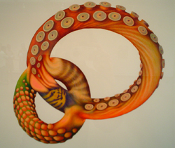
Mutandis is another permutation of the root word muto... Posted by Isaac Peterson on October 25, 2005 at 8:47 | Comments (0) PermalinkMonday 10.24.05 Ellen George at the Archer Gallery 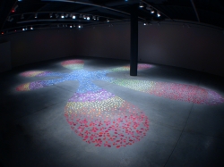
The artists' signature is a contentious thing - it's the mark of authenticity and the mark of ego. It's also the thing that will irk not only your second generation postmodernist teachers at art school, but those of your classmates who know better, when you hand in your first crappy undergrad painting assignment with your own big red signature scrawled across the bottom. The last line of the artist's statement accompanying the exhibition at the Archer Gallery at Clark College in Vancouver reads, "I sign everything with an e*." We've seen Jacqueline Ehlis do a signature piece, a riff off of the slick paintings of customized cars. And at her latest exhibition, entitled *, Ellen George makes a signature piece with a sprawling, room-sized, cartoonish asterisk form, formed by several thousand polymer clay pieces shaped by hand. Teardrops, many-pronged stars and cloud-like blobs were carefully arranged, a gradation of rainbow colors radiating from the cool blue center to the striking red edges. The arrangement threatened to coalesce into a rigid pattern, but George retained vibrance in the piece by creating a loose and slightly irregular mosaic of shapes... Posted by Katherine Bovee on October 24, 2005 at 8:46 | Comments (0) PermalinkWednesday 10.19.05 Mike Rathbun at the Art Gym 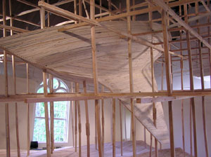 One of the most impressive solo shows in recent memory, Portlander Mike Rathbun's (N45°23.871' W122°38.864') combines the physical intersection of fabrication by hand and the more abstract problem of location. The show consists of a massive 20 foot long boat suspended high above a wave floor in a matrix of hand cut two-by-twos. The boat looms ominously overhead the pleasant waves while listing athletically to one side as if it is being propelled by a phantom wind. Yet, the scaffold of two-by-twos seem to freeze both the waves and boat in a form of stasis, an important thing if one wants to pin down to one's location. Beyond the impressive scale the installation correlates craft with location, two things one is keenly aware of when on a real ship. First, when on the water you realize how your location is constantly in question and second, one hopes the craft has structural integrity lest it shortly become a visit to Davey Jones's locker. In contemporary art the quest for location has become a key issue, especially with biennials and art fairs decentralizing the art world. Other artists like Martin Puryear are less engineering heavy and more poetic and if one has any qualms about this show it is how reliant on theater as a kind of surreal craft stunt it can seem. It is true Puryear can seem like a craft fetishist as well and similarly walks a fine line. But for these eyes the installation differs sharply from Puryear in that it addresses its temporal nature more. Instead of sculpture, this is an event which hearkens to the theme of discovery and vastness that ships and seas always evoke and it reminded me of the first time I read Kon Tiki. It's an apt metaphor for the art experience as a series of difficult to pin down inner and more tangible journeys as well. (Last Weekend) The Art Gym, Marylhurst University, B.P. John Administration Building, Third Floor, 17600 Pacific Highway (Hwy 43) Hours: Tuesday - Sunday, 12 noon to 4 p.m Posted by Jeff Jahn on October 19, 2005 at 21:47 | Comments (0) PermalinkTuesday 10.18.05 Troca Brasil at Feldman Gallery 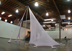
Walking into Troca Brasil, one might expect to uncover a set of cultural cliches - lurid color, sensual forms, exotic content. Each of the five artists in the show is connected in varying degrees to A Gentil Cariocia, a Rio de Janeiro gallery whose name makes reference to the city's inhabitants as well as the traditions that permeate Brazilian culture. Upon entering PNCA's Feldman Gallery, however, one is greeted by a spacious and sparsely installed exhibition that doesn't exactly engulf visitors with sensuality or exoticism. Portland's press have discussed the show primarily in terms of its sensual qualities, but, while there is plenty to be found, Troca Brasil is successful for its resistence to the cultural and artistic cliches of sensuousness. The artists of Troca Brasil balance a regard for sensory experience with formalism and ideas that elicit much more than just a gut-level emotional response. The occupants of Laura Lima's chicken coop are decked out with brightly dyed feathers, typically used for carnaval, ridiculously fastened atop their own plumage. It creates a convivial atmosphere within the gallery (and during lectures in adjacent commons when intermittent cawing is heard in the background), but it's also a continuation of Lima's ongoing work exploring the ways that ritual and costume interact. Earlier work includes a gallery performance recreating a 16th century painting of a formal ball, complete with period costumes, as well as more contemporary costumes that oftentimes restrict the wearer in some way. Her Doped Woman performance at ARCO 2000 consisted of a woman cocooned in a long knit costume that was directly attached to the wall. Pieces from her Man=Flesh/Woman=Flesh series, explores the relationship of two humans constrained by a shared costume. One photographic documentation shows two nude men locked in a fighting embrace, heads completely obscured by a shared and blinding hood (find pictures at Casa Triangular's website). Lima's Gala Chickens is not the first piece she has created exploring the concept of costumes through the animal world. During "A Little Bit of History Repeated," curator Jens Hoffmann's two day survey of noted performance art pieces as translated by younger contemporary artists, Lima's homage to Yoko Ono's Cut Piece replaced the performer with a goat. Ernesto Neto's My Little Castle...Blue (two times for infinity), a womb-like nylon structure grounded by testicular sacs of rice and sand, invite associations with the sensual and sexual terrain of the body. But just as important is the gravity-defying construction of the piece, whose lycra walls stretch nearly two stories high, with only a single, freestanding aluminum rod for support. During Neto's lecture in early September, in which he revealed an effusive charm and knack for storytelling, the artist repeatedly referred to both the role of sensuality and to his ongoing engagement with formalism that has allowed for his work to develop... Posted by Katherine Bovee on October 18, 2005 at 12:37 | Comments (0) PermalinkThursday 10.13.05 Some Post-Affair Thoughts 
Love it or hate it, the Affair 2005 has come and gone. Yes, the small art in cramped rooms. Yes, the people. Yes, even the rain that threatened to spoil (but only tempered) Friday night's parties. I was out sick last week, no doubt a victim of the elements (standing outside for hours in winter temperatures in the courtyard of the Jupiter will do that), which has given me lots of time to mull over exactly what went on at the Affair. As expected, there was far too much art in hot little cramped rooms - which is part of the joy, because, hell, it's an art fair. It's supposed to feel like a bazaar. It's not supposed to be the ultimate aesthetic experience, but a way to see lots of work from lots of places in a condensed context. Plus, it's rooted in commerce (at least theoretically - read DK Row's comments on that in his "After the Affair" wrap-up). Both last year and this year, I heard complaints about the size of the rooms from several people, but I didn't find that the work suffered any more damage than work at large fairs, for example, in row after row of nondescript booths at NYC's armory fair. And, of course, being in close quarters provides the kind of chance encounters and intimacy that attracted the galleries, particularly those from out of town, in the first place. Portland being Portland, the Affair is, naturally, a different kind of art fair and its strength lies in its scale. Since Portland is still developing a strong collector's base, and one that still seems to suffer from an attitude of indifference towards collecting work from outside Portland, the sustainablility of its art fair depends on its differences. Talking informally with gallery owners from outside of Portland, who trekked here from cities including San Francisco, Seattle, Atlanta and Houston, it's apparent that this, along with the Portland's well-deserved reputation as a must-see city, was what brought them here, not the promise of lucrative sales. That said, I hope that these types of events will encourage a more sophisticated collector's base, since it's such a crucial element to bringing Portland through its adolescence as an art city... Posted by Katherine Bovee on October 13, 2005 at 1:12 | Comments (0) PermalinkWednesday 10.12.05 The New Portland Art Museum 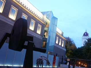 Anyone who was in Portland the first weekend of October knows it was an art endurance test that most of us here are still recovering (or deinstalling) from. Ok it wasn't as ridiculous as Art Basel Miami or the Armory Show/Whitney Biennial Weekends but it was a lot more active and spread out than say a Site Santa Fe opening. What it amounted to was a hell of a lot more than one human being can hope to take in. In fact, I was involved with the three biggest events: the opening of the Portland Art Museum's Mark Building, the Affair @ the Jupiter Hotel art fair and my Fresh Trouble show. Then came all the First Thursday openings a few days later. A very busy time. The main event, the Portland Art Museum's new North Wing includes the new Jubitz Center for Modern and Contemporary Art (28,000 sq feet of new galleries) and we note that the younger members of the Jubitz clan opted to fund it to the point of naming rights. In conversation I've been impressed with their knowledge and this bodes well for the long term vitality of the museum. Now for some generalist first impressions (I will leave the Sophie Calle exhibition for another time)… The Collection: We lack the strong collection of my hometown Milwaukee Wisconsin (or the big guns at the Art Institute in Chicago) but I'm pleased to no end that the Dan Flavin, the Gilbert and George and the Ernst Ludwig Kirchner are all on display for the fist time in memory. We aren't going to have MoMA's... Posted by Jeff Jahn on October 12, 2005 at 1:00 | Comments (1) PermalinkFriday 09.30.05 Maintain Full Speed 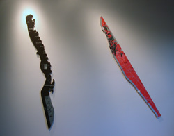 Tudor Mitroi, Staff 5 & Staff 7 The Affair is less than 24 hours away, which means that September has sadly passed and we are launching into yet another overactive month in October. Before we let September slip away entirely, a quick revisit of one of September's standout shows, Inertia 2005 at Gallery 500, an exhibition of 13 artists from across the United States, juried by PORT's very own hyperactive curator, Jeff Jahn. The premises of the exhibition was to dig up new talent from across the nation, and as a result work runs the gamut, from conceptually-oriented work to pieces driven primarily by good design. Thankfully, the pool of over 100 artists who submitted work for the show was narrowed down to a mere 13 artists, avoiding the mistake of other group shows I've seen at Gallery 500, where an exuberance for the maximal tends to result in cramped installations. There is no mystery as to why Tudor Mitroi's staffs, painted panels cut into long, thin shapes, appeal to Jahn, who makes medium sized painted panels cut into irregular lightning bolt shapes. Mitrol's works are large, yet have a sense of delicacy difficult to achieve at such a large scale. His two staffs show painted details of maps that outline different courses, one that seems to be a walking route of some sort, the other a driving route that the artist used daily to travel between home and work. One side of each panel is cut to follow the route. The shapes look awkwardly thin, yet threatening, like jagged weapons. They also serve as documentation of the artist's journeys, adding a performative aspect that recalls work by artists like Richard Long... Posted by Katherine Bovee on September 30, 2005 at 8:27 | Comments (3) PermalinkWednesday 09.21.05 Required Reading Required reading: Jerry Saltz's latest
Babylon article is out.
A few things stood out. 1) He's right New York is kinda bland when it comes to young artists. I've noticed that two rather expensive cities, New York and San Francisco are producing a lot of trying hard to be cheap look'n but crafty art. Like all the trust funder MFA grads (who can afford those places) got the 2002 Whitney Biennial memmo and copped the style as an ironic comment on their situation. I've said it before, Rachel Feinstein did the neo-Victoriana princess thing better back in 1999 and Marcel Dzama draws sullen people mixing with bears, cats and bunnies better than anyone in the United States. Canada won this round back in 2000 folks. This whole unicorn, 80's heavy metal band trend makes me sleepy and Rachel Harrison did amazing clumpy awkward material art better in 2002. Yes Larry Rinder's 2002 Whitney biennial looks to have been incredibly influential but has spawned a hoard of lame wannabe non-chalant-savants who paint a rainbow anytime they cant figure out how to resolve a composition. Greater New York... unimpressive. 2) Matthew Higgs claims he wants to "change New York art world in 24 months."... ummm OK change it by making it less money driven, good luck. Most of us in Portland have met Matthew and he's smart guy but not that radical. He seems to curate people he knows and follows very arid versions of trends that suit him, he has focus. He's very good at that focused curatorial role, but as a revolutionary he seems miscast (he's too organized to allow radical lack of control dictate the outcome)... still I like the balls it takes to say something like this. I bet some smart ass is going to try and change Matthew Higgs in 24 months. The fact remains artists set the agenda not curators and New York is choking on non chalant careerism and a dearth of new ideas. As long as artists buy into the way things are now nothing will change. The last time I spied Higgs it was at Greater New York and he seemed as thoroughly unimpressed as everyone else was. Higgs will be in Portland September 30th for the Affair at the Jupiter Hotel. I suggest everyone ask him what the hell he meant or find out what he's been smoking. It's good he's coming to Portland though, we are different and that means something. Port officially extends a welcome to either the bravest or the drunkest new-ish curator in New York. 3) This version of Babylon restates much of the last one (it was Super Babylon) and that odd sense of fuzzy stasis in the essay says something about the New York art world. Posted by Jeff Jahn on September 21, 2005 at 23:55 | Comments (0) PermalinkSunday 09.18.05 Treasure Hunting at Bay Area Bazaar 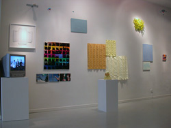
Walking into the salon-style exhibition of Bay area artists at Pulliam Deffenbaugh, I thought perhaps The Affair had landed one month too early, on the wrong side of the river. For their last show on 12th Avenue before unveiling an impressive space on what is developing as the Pearl District's new hotspot, Pulliam Deffenbaugh invited artist Laurie Reid to curate a show of over 50 Bay Area artists. Reid, known for airy, delicate watercolors, selected work based on her own network of friends, colleagues and influences in the Bay Area. Since the show lacks an underlying concept, the work is all over the map, many very likable, some rather unremarkable. While it didn't provide more than a somewhat haphazard survey of San Francisco's art scene, there were plenty of rewards to be found among the overwhelming volume of work on display. Charles Beronio's Color Extraction (after Betsy Ross), an American flag pieced together by all-white fabric, is at once a formal study, a reflection on the political weightiness of this symbol and a jab at appropriation art, citing the seamstress that sewed the first flag and ignoring more expected precedents like Jasper Johns' White Flag. I was dismayed to learn later that Seattle artist Jack Daws had created a nearly identical piece in 2001, since Beronio created a rich contextualization for the piece, bringing much more to the table than just an obvious set of political overtones. There was plenty of proof that the kinds of small, often clumsily executed crafty work that Jerry Saltz once deemed "termite art" is alive and well, including Dustin Fosnot's diminutive landscape created with cliffs of styrofoam graced by a pink cocktail umbrella. Other such work included ariel sculptures that looked like satellites and moved along a thin rope strung across one end of the gallery; a two inch high striped lawn chair; a small felt hill by Emily Sevier that reminded me of Amanda Wojik's fantastical terrains (though much less sophisticated); and a small assemblage held together with bungee cords and embellished with garish pink feathers... Posted by Katherine Bovee on September 18, 2005 at 23:15 | Comments (0) PermalinkThursday 09.15.05 Jen Rybolt on DJ Spooky at Newmark Theatre The tenure of DJ Spooky (aka Paul Miller) as "that subliminal kid" has spanned a time period perhaps best defined by the accelerated way in which we have come to rely on computers and technology to relate to each other and the world around us. In his video-sound collage "ReBirth of a Nation," Spooky asks us to take a critical view of past events and attitudes, to consider history through many lenses, while hoping that in doing so we might escape Santayana's conviction that "those who do not understand the past are doomed to repeat it."
After a hypnotic storm of drum and bass combined with a blink-of-the-eye-quick reel of changing international flags and symbols (interspersed with question marks) on three large screens, the film dipped into the opening cards from DW Griffith's 1915 film The Birth of a Nation. For those unfamiliar with this work, it was the first feature-length silent film, and pioneered the "rules of grammar" film continues to follow today. "The Birth of a Nation" was also used as a Ku Klux Klan recruitment film through the 1960's and takes a Confederate view of events... Posted by Guest on September 15, 2005 at 7:28 | Comments (1) PermalinkTuesday 09.13.05 Stefanie Schneider at Alysia Duckler Gallery 
Berlin based artist Stefanie Schneider enlarges expired Polaroid stock into burned-out C-prints. The lossy images almost completely dissolve into lurid color abstractions. The shiny pink of a sex kitten's glittery body suit becomes an electrified, free-floating color field. The vivid, flame-orange hair of a 70's sexploitation film star vibrates against the dusty gray of the sky above an LA desert. Skin tones and facial details in the figures are completely lost. They are refugees from Faster Pussycat... Posted by Isaac Peterson on September 13, 2005 at 1:56 | Comments (0) PermalinkMonday 09.12.05 Bruce McClure's Crib and Sift at tba:05 In an article published in artforum last summer, artist Anthony McCall recalled a question he was often asked in regards to his work: "Are you making sculpture or are you making films?" Last Saturday, Bruce McClure's performance of his four part series, Crib and Sift, elicited just this question. Using four projectors, modified for each 14 minute section of the performance by using a combination of plates and focal points, McClure layered four identical, simultaneously projected films to create densely textured fields of light and shadow. The imagery itself was not created with a camera, but, as McClure describes, by using "an original ink sneeze printed four times on a technological substrate (16 mm. film) and developed into an importune register of film events." All but one film were accompanied by droning soundtracks created with similar regard for nonlinear composition.
McClure's work had more to do with transcendental installations like LaMonte Young and Marion Zazeela's light and sound environment, Dreamhouse, than with most experimental films I've seen, which tend to rely on heavy editing and obscure imagery to create filmic density. McClure's films, like the Dreamhouse, act more as a meditative environment (perhaps with a nod to the psychedelic) defying the linearity of film. His second film used each projector to create one of four light filled borders, leaving a rectangular black void with softly defined edges, using the two dimensional to imply the infinite, recalling the use of the seemingly infinite voids in Anish Kapoor's sculptures... Posted by Katherine Bovee on September 12, 2005 at 9:07 | Comments (0) PermalinkThursday 09.01.05 Blue Skies Imported from Rio 
In Troca Brasil, PNCA exchanges with a gallery in Rio de Janeiro, known as A Gentil Carioca and are putting the final touches on what promises to be an exciting, festive and sensual show opening Thursday. A Gentil Carioca means the kind ones from Rio, and the mission statement of the gallery is kindness. A Gentil Carioca creates a space for showing work that could not possibly exist anywhere else. Their kindness is towards the experimental and daring artist, and in the last minute hustle of final preparations before tomorrow's opening, you can feel that sensual, playful spirit in the gallery like a warm South American breeze. The work is daring, comic, vibrant, warm, like a vigorous embrace from a long lost friend.... Posted by Isaac Peterson on September 01, 2005 at 1:56 | Comments (0) PermalinkTuesday 08.30.05 Mapping Sitting at the Cooley 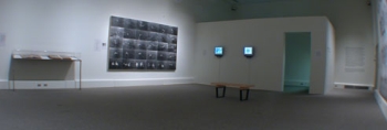
Walid Raad, one of the two artists behind Mapping Sitting, is best known for his ongoing project documenting the history of Lebanon through videos, photographs and original documents. Working under the guise of a fictional non-profit collective, The Atlas Group, Raad freely intermingles historical fact with fiction, introducing fictional figures and experts within his retelling of Lebanese contemporary history. For Raad, who prefers to call The Atlas Group an imaginary foundation rather than a fictional entity, the insertion of these fictions alongside historically accurate documents and accounts is a way to open up multiple routes of access and introduce a multiplicity of discourses previously unheard in mainstream media and established academic versions of history. Although the contents of Mapping Sitting, unlike Raad's work as The Atlas Foundation, are historically correct, the exhibition also deals with the question of the malleability of historical retelling. Raad and collaborator Akram Zaatari, a filmmaker and co-founder of the Fondation Arabe pour l'Image (FAI) in Beirut, drew from the archives of the FAI to create a survey of Arab photographic portraiture from the last century. Posted by Katherine Bovee on August 30, 2005 at 9:47 | Comments (0) PermalinkThursday 08.25.05 Ploeger at Newspace 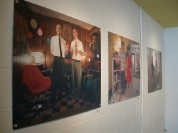
Although Portland does not fall victim to the kind of late summer heat that drives people away from many other cities this time of year, August has been marked by a typical late summer lull, as artists and gallerists gear up before this fall's hyperactive roster of exhibitions and events. That said, there are several shows you may want to catch this weekend before the summer runs out (see Jeff's picks in yesterday's post). One show I recommend is Ann Ploeger's theatrical photographic portraits of the artist's friends in domestic spaces at Newspace. Her portraits are marked by intentionally overworked compositions, highly saturated color, deadpan humor, strategic use of props and harsh lighting. In a review that ran earlier this month, DK Row chided Ploeger for her high theatrics, but these qualities, along with the fact that the photos invite voyeuristic intrigue, are what make these large scale portraits so likable. It's kind of a survey of how the other, hipper half lives. Row aptly positioned Ploeger as an artist exploring a contemporary equivalent of 19th century painted portraiture. Ploeger chose subjects that tend to embrace a thoroughly retro sensibility (probably just a sign of Portland's obsession with the second-hand aesthetic). The straight faces of her subjects and overtly staged compositions employed by Ploeger give the portraits a somewhat anachronistic feel, harking back to early photographic portraiture at a time where technology didn't allow for a great degree of dynamism. In addition, Ploeger exploits light in interesting ways that give her compositions a painterly theatricality. Most of Ploeger's indoor photographs use harsh lighting that creates dark shadows and well-placed glare, strategically using natural light in combination with prominent placement of domestic lamps. In many outdoor photos, she intentionally positions her subjects in a way that create intense black shadows that contrast with overly saturated areas of sunlight. In her artist statement, Ploeger explains that her "body of work attempts to capture the subject's true self," an unsettling statement that rings false in light of her work. Ploeger's portraits are emotionally cool in a way that has much more to do with Wolfagang Tillmans' fashionable photos of close acquaintances that Nan Goldin's revealing portraits of her friends. Looking at Ploeger's work, I find nothing revealing about the subject's "true self." The most revealing thing about these portraits is the way that they emphasize the self-conscious posturing of the subjects in everything from the way they position themselves in front of the camera to the conscientious lifestyle choices evidenced in their domestic realms. Perhaps Ploeger's quest to find a sense of truth or authenticity in her photographs explains some of the inconsistencies in the show, for her best work is where artifice unabashedly reigns. Through August 28 • Newspace Center for Photography 1632 SE 10th Ave • Tel. 503.963.1935 Posted by Katherine Bovee on August 25, 2005 at 10:11 | Comments (0) PermalinkWednesday 08.24.05 Portland gallery "going" in August  Brown, Essenhigh by Zach Kircher I don't expect much from August gallery shows but there were more than a few things for the curious this month. You've still got through Saturday the 27th to catch most of em. Actually, I'm still surprised at how fast Portland is growing up in the Pearl District and some of the newer buildings are finally showing a new boldness in design. I predict a second phase of condos seeking to distinguish themselves from the rather OK designs that have already gone up. As for art my favorite work in August was Zach Kircher's, "Brown, Essenhigh" at Savage Art Resources. (gallery closing thoughts at end of this post, art first folks) Kircher's one hell of a painter. Will we see Cecily Brown in Playboy or Maxim? It's possible (she's been in Vogue enough), but truth be told this painting is more revealing than the cheesecake. I like both painters but Inka Essenhigh is better and less of a pouty-panderer than... Posted by Jeff Jahn on August 24, 2005 at 21:57 | Comments (0) PermalinkThursday 08.18.05 Troy Briggs + Amanda Ryan = 114 Gallery 114 presents a two-person show featuring Amanda Ryan and Troy Briggs. The show is entitled Portland Modern Showcase.
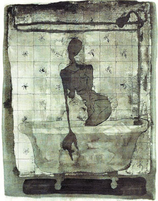
Troy Briggs, in a spare and nervous drawing style, attempts to articulate nameless emotional events. His fluid drawing style is limited and elegant. His subject matter is saturated with domestic melancholy. Distorted female silhouettes emerge from the shower or float suspended before wallpaper patterns. Briggs creates ink drawings and uses neutral watercolors sparely to focus his compositions on the central figure. Most of the drawings are then coated with acrylic gel medium, which interacts with the ink and... Posted by Isaac Peterson on August 18, 2005 at 1:50 | Comments (0) PermalinkMonday 08.15.05 Emily Ginsburg at Nine Gallery 
Social Studies #14 (detail) This month at Nine Gallery, Emily Ginsburg exhibits work from Social Studies, a series of stark black and white silkscreens that continues her ongoing interest in human behavior and psychology. Each panel holds an interconnected tangle of silhouetted signs and symbols rooted in a graphic vocabulary that Ginsburg has culled from modern and vintage electronics, industrial forms and comics. Ginsburg's previous installations and video work make use of the body directly, and in works like Blotto, she employs imagery of body parts and gestures. Within this new series of work, she instead references human behavior in a very cool, distanced, academic way, using a set of abstracted symbols to infer such social forces as communication, networks and human conflict. Works in the show fall into three levels of complexity and the installation emphasizes these differences, resulting in an unfortunate unevenness. One wall contains a set of simplified images, many paring down a simple representation of conflict and tension between abstracted forces. The facing wall contains a series of imagery with more complexity, but the similarity of scale between elements falls flat at times. Ginsburg's large silkscreens are by far the most successful pieces in the show, and the expanded palate of symbols and formal variation give the pieces a visual complexity that the smaller prints lack. Ginsburg's large prints employ fluid composition and have a diffuse energy that recalls work by contemporary painters such as Paul Henry Ramirez, but Ginsburg downplays explicit figurative references, relying on the cerebral and visual rather than the visceral impulse. All of Ginsburg's canvases stay within the edges of their borders and act as self-contained compositions that are the visual equivalent of sampling, albeit in a strictly formalized manner... Posted by Katherine Bovee on August 15, 2005 at 14:50 | Comments (0) PermalinkSunday 08.14.05 Mixtape 
The next time you're sauntering around the Pearl District on first Thursday take some time to wander a little more expansively. Walk through the Baghdad-esque art bazaar that spontaneously occurs near 13th Ave. Explore the proliferation of self start-ups and oblique instant galleries that spring to life once a month in China town. What do you have to lose? Your worst-case scenario is that you hike up more flights of stairs, see a little more decorative living room cubism, and drink a little more wine than usual. But without daring exploration, where would we be today? Without Magellan, would the rest of society ever have guessed the globe was circumnavigable? Without Galileo would we ever have admitted the solar system was heliocentric? Without Lewis and Clark would Oregon ever even have been discovered? Check out one of the best self start-ups in China Town, the Starling gallery, managed by David Stein and Suniti Dernovsek. These two young people make great contributions to the PDX arts community through pure moxie. In addition to creating a unique forum for the visual arts, Suniti is active as a dancer/ choreographer. Upon entering the Starling, You will find an energetic youth driven atmosphere that is as conversant in the high culture of art as it is in the low culture of DIY post-punk democratic community. This is an excellent arena for the artwork of Lisa Beyer. Beyer's new work engages a specific cultural subset that if not for the start-up chutzpah of the Starling, would otherwise be eclipsed in the lunar shadow of wine and cheese cast by the pearl. 
Beyer's show, entitled, It's Ugly, but is it Art? is an interchange between several socio-cultural contexts. The work is rooted in DIY street community and music, but infiltrates... Posted by Isaac Peterson on August 14, 2005 at 17:07 | Comments (0) PermalinkThursday 08.11.05 Bend it like Bocci, Boyle and Durost  Ryan Boyle's The Greenhouse Effect "Bent" as a show title might refer the fabrication process, the artist's intention or to their determination but I'm fairly certain its just there to keep troublesome art critics from inserting their typically unrelated digressions. At least Bent is a red herring chosen by the artists. Actually, Bent is really just an excuse to see three of Portland's best young installation artists, Chandra Bocci, Ryan Boyle and Jesse Durost. In a scene that includes more experienced installation artists like Bruce Conkle, Matthew Picton, Laura Fritz, David Eckard, Amanda Wojick, T.J. Norris, Bill Will, Port's own Katherine Bovee and Aili Schmeltz etc... there is a lot of serious competition in PDX's close knit art scene. The first artist, Ryan Boyle makes effective use of space with The Greenhouse Effect. It's comprised of what appears to be late 19th early 20th century utilitarian buildings. They could be stables, canneries, granaries, prisons or gas chambers...it is difficult to say. Boyle gets points for his choice to bridge the space between the wall and a structural support column too. Inside these purposeless but utilitarian looking buildings are piles of paper circles that are made by paper hole punchers. The effect is a vague miasma similar a twilight zone episode. One has to ask, where are all the people? 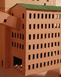
The overall sense is somber and the mostly linear buildings are interconnected... Posted by Jeff Jahn on August 11, 2005 at 22:42 | Comments (0) PermalinkTakashi Kato and Randell Sims Stop into the Pacific Northwest College of Art (PNCA) this month for a small but stunning show of figurative expressionist paintings by alumni Randell Sims and Takashi Kato. These talented young painters work with expressive bravura and detailed construction. Both walk a line between intellectual composition and emotional truth.
PNCA has long been a stronghold of figurative expressionism, in part due to the presence of local expressive powerhouse Lucinda Parker. Read more about her presence in the community here: Lucinda. 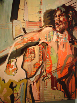
In Vaporous Neuro Discord 1-4, Takashi Kato manipulates dripped paint by tilting the canvas to create an intricate grid. Responding to this grid, Kato searches for figurative imagery within his compositions. The agonized figures appear entangled in their surroundings, unable to extricate themselves from the net which vaporizes their bodies and binds them into their environment... Posted by Isaac Peterson on August 11, 2005 at 10:30 | Comments (0) PermalinkWednesday 08.10.05 Banks Violette the blunted extremist It looks as if the combination of Banks + Violette + Crap is a magical Google
algorithm trifecta driving lots of traffic to PORT. We only mentioned him briefly
but apparently there is a partially sated hunger for the topic and PORT
hears you. Feel free to describe exactly how, why and what Violette sucks in our
comment section...
Unfortunately, we aren't one of those pandering sites and I'm pleased to inform y'all Mr. Violette doesn't quite suck.. He doesn't quite "rock" as hard as Artnet has recently suggested though. Instead, Banks Violette is just another decent showman in the recent spate of decent entertainers with shows originated in New York museums; Matthew Barney, James Lee Bryars and Tim Hawkinson etc. All traffic in fantasy as a diversion and there is nothing wrong with it… but there is nothing life changing about it either. Overall, Barney and Violette's somewhat lesser ubiquity has been greased by an increasing need for digestible fantastical showmanship which drives greater audience attendance at museums. Sure, Violette takes some of the darker parts of heavy metal subculture and creates odd, somewhat evocative memorials to counterculture behavior taken to felonious extremes. It is sincere bad boy art, but any historian 50 years from now is going to find the actual stories of ritualized murder and Norwegian church burning to be the more telling artifacts, not these installations. In many ways Violette is just trading in a short term aura of contemporary obsessions (evil, heavy metal etc…) which in the current Whitney show's case centers around the story of several Norwegian metal bands attempting to out evil one another. Murders and church burnings occurred. Yes, the story provokes a "no way… really that happened?" reaction but it is a red herring. The murderous Norwegian metal bands are really just analogs for the looming specter of those Isamic extremists who similarly take their beliefs way outside the mainstream and become terrorists. Basically, Violette is beating around the bush, making a slightly less threatening version of terrorism in the Whitney. My take is that Violette is a kind of 3rd tier Matthew Barney (a kind of over-popular 2nd tier Salvador Dali type showman himself). Both rely on pageantry. Violette is very indebted to Barney who takes arcane information popular in all sorts of subcultures be it... Posted by Jeff Jahn on August 10, 2005 at 7:54 | Comments (2) PermalinkTuesday 08.09.05 Interstate Out of August's first Thursday crop of exhibitions, Dan Gilsdorf's Interstate emerges along side of Bent as the best of downtown.
Interstate is a show of kinetic sculpture and installation. Described by the artist as "mechanical simulacra as homage to human consciousness." Militaristic machines cycle through futile movements. Two rows of army boots stomp up and down in place, setting a plodding rhythm in the center of the gallery. A motor driven brush scrubs the eyes of a plaster head. Tiny, repetitive motorized sculptures project huge shadows on the wall, creating moving dioramas of banal American landscapes. Gilsdorf draws imagery from his own experience: telephone poles passing through the headlights of a westbound car, oil towers looming over the plains, the adolescent emulation of military heroism. 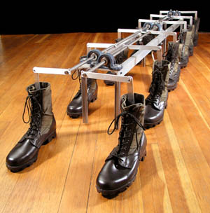
Gilsdorf examines the relationship between culture and the consciousness of the individual. He concentrates on the fictions culture creates which shape the development of the psyche. Gilsdorf's work is highly ambitious, he reaches for universal descriptors for the cultural framework, as well as for the intricate details of personal experience. He examines how individual actions and events, when attached to values seen as universal, enlarge to become history, which by definition contains fictions. In order for the present to become processed into the past, it must be fictionalized. Gilsdorf scrutinizes heroism as exemplified by the military, sifting through fictions in pursuit of the true American mindscape... Posted by Isaac Peterson on August 09, 2005 at 1:32 | Comments (0) PermalinkSunday 08.07.05 Fletcher's Palenque 
Robert Smithson, whose prolific writings and early death in 1973 contributed to his postmortem presence as a figure meriting cult-like adoration among a generation of art students and critics, has again inspired a host of new discussion with the recent retrospective of his work, originating at MOCA last year and currently on view at the Whitney. Appropriately, Harrell Fletcher launched week two of Taking Place last Monday with a "cover" performance of Smithson's slide lecture on the Hotel Palenque. Smithson's well-documented lecture on the architectural highlights of a dilapidated hotel in Mexico was first given in front of a class of architecture students at the University of Utah in 1972 and lives on as both a transcript (published in Parkett several years ago) and an audio recording of the original lecture. Smithson details the decrepit spaces of the hotel, conceiving of the aesthetics of neglect in a mock-academic fashion. Although his offhand comments ludicrously elevate this crumbling hotel to monumental status, Smithson's fascination with entropy, monuments and contemporary ruins lend a certain ambiguity to the lecture, as the Hotel Palenque embodies the notion of a living contemporary ruin. Fletcher has presented Smithson's lecture several times and documentation of Smithson's piece is cited as part of Learning to Love You More, Fletcher's ongoing collaboration with Miranda July. Fletcher's interest in re-presenting this lecture is not surprising, since much of his artwork and collaborative ventures involve excavating art from everyday life. Throughout the lecture, Smithson lingers over such details as the "spiky, irregular, cantilevered effect" of rebar jutting out of a partially demolished wall; an empty chair in a deserted dance hall "suggesting the transitoriness of time and the universe" and also providing "a better view of the scaffolding in the roof"; and "the dried pool with the suspension bridge going across it." What did surprise me was Fletcher's insistence in the post-lecture chat that he was presenting the lecture in a neutral manner in order to allow the audience members to decide for themselves whether or not Smithson gave his slide presentation as a mockery of academia or a sincere tribute to these contemporary ruins. Fletcher read the lecture quickly and without intonation, and many of Smithson's spontaneous and humorous comments were lost because of this. While critics tend to note the tongue-in-cheek nature of the recording of Smithson's lecture, Fletcher, by "neutralizing" the piece, seemingly attempts to imbue the piece with newfound sincerity. It was disappointing that Fletcher so strongly disavowed his power to retranslate this piece either in terms of contemporary practice or within his own set of artistic vocabulary and the performance seemed to be no more than a nod to an art hero, perhaps a tribute better served by his inclusion of the transcript on the Learning to Love You More website. Posted by Katherine Bovee on August 07, 2005 at 15:29 | Comments (2) PermalinkTuesday 08.02.05 The Enchanted Forest: Post-modern Optimism Justin "Scrappers" Morrison at V-Gun
The prolific and eclectic Justin "Scrappers" Morrison has a new show at V-Gun Gallery, located in the Veganopolis restaurant, through September 10th V-Gun. 412 SW Fourth Avenue. Tel. 503.226.3400 The best introduction to Scrappers is his own artist statement: The Enchanted Forest There is a deep far away forest that we can all reach. It is the wilderness inside. It is your wild side. My wild side is home to lumberjacks, savage scouts, happy hobos, vintage beer commercials, protesters, strange trees, unicorn and Bigfoot. They live the way they see fit and I let them be. Maybe someday I'll go join them in the Enchanted Forest, but until then they remind me to stay wild. All the paint used is recycled, salvaged or eco-groovy house paint. All of the wood was salvaged from dumpsters and houses that were being deconstructed. Recycling is cool, reusing is cooler, reducing your resource consumption and subsequent waste is coolest. -Justin "Scrappers" Morrison 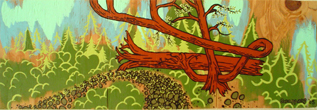 Scrappers' paintings are at once delightful and defiant. Almost every piece will make you laugh. Scrappers' painting materials are decidedly humble, yet his world of imagery is fantastic and hyperbolic. Scrappers sets clear limitations on his materials and process, using only recycled paint and surfaces. These limitations liberate his playful, imaginative approach rather than inhibit it. Scrappers' definition of the borders of his world allows him to truly "run wild" within that world. Scrappers presents us with small windows into a complex, humorous, and seemingly limitless psychological space. Trees elasticize and intertwine. An antique beer can appears in the sky surrounded by a glorious mandorla, drawing bears to worship it as an embodiment of recycling martyrdom. Boy scouts swarm... Posted by Isaac Peterson on August 02, 2005 at 15:30 | Comments (2) PermalinkFriday 07.29.05 Utopia and Obsolescence Legacy: Boxed Version.
Installation by Philippe Blanc and Katherine Bovee. 7-18 to 9-16-05. Northview Gallery, Portland Community College, Sylvania Campus (CT Building) 12000 SW 49th AVE, Portland, OR, 97219 Gallery Hours: M-F, 8am-4 pm or by appt: 503-977-8017 PORT's own Katherine Bovee and husband Philippe Blanc explore ideas of utopia and virtual experience in Legacy: Boxed Version, an installation in PCC Sylvania's Northview Gallery. 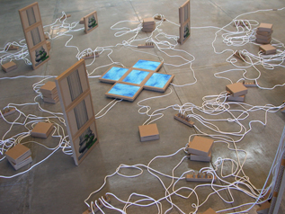
The sculptures are low material replicas of high culture objects: computers, monitors, and power cables facsimiled from cardboard and white clothesline. The pieces are crafted with meticulous precision, the model of choice, the Mac Mini, is instantly recognizable, and there appears to be no variation between individual replicas. There is a high level of detail in the replications, including cardboard switches on power strips and cardboard prongs on plugs. Clothesline cables attach the cardboard computers to towers of flatscreen cardboard monitors. The monitors "display" images of Grecian columns wreathed in vines. At the center of the piece five cardboard monitors flat on the ground form a reflecting pool. Legacy finds a curious intersection between the origins of Western culture in ancient Greece, the virtual space of video game environments, and utopian models... Posted by Isaac Peterson on July 29, 2005 at 19:16 | Comments (0) PermalinkReport from Taking Place 
Last weekend marked the beginning of Taking Place, a series of lectures, screenings, talks and events initiated by Stephanie Snyder, Matthew Stadler and Sam Gould. The premises of this nearly two month long investigation is to pose questions that disrupt the notion of place as a geographical entity, instead proposing that place is as much of an outcome of social and psychological forces than geographic realities. Each one of the three organizers of Taking Place shares a particular interest in this notion, further articulated in the small catalog that accompanies the series. Gould, working through the artist collective Red76, has undertaken many projects that activate spaces in unexpected ways, often employing social gathering as a means to lend new meaning to a particular place. One of the latest Red76 projects, the Laundry Lecture series, appropriates the laundromat as had hoc lecture hall. Stephanie Snyder, curator of Reed College's Cooley Gallery, is deeply interested in diasporic space - one example of the transportability of space - and the collective imagination that sustains these displaced spaces. Matthew Stadler strives to find meaning in contemporary places where designations like "city" and "country" are inadequate to describe the spaces we occupy. Although I didn't catch all of the first weekend's events, I did catch work by artist collective Dynamite Family, who was on hand last Sunday to present posters from their ongoing project, Potential Energy, and Mini Movie Fest. Hailing from Grand Rapids, Michigan, members of Dynamite Family have recently embarked on a series of projects in an attempt to connect with and solicit work from other similar collectives around the U.S. Their most recent projects share a sense of transportability, making their inclusion within the lineup of Taking Place participators a very logical choice... Posted by Katherine Bovee on July 29, 2005 at 1:19 | Comments (0) PermalinkWednesday 07.27.05 Cut and Paste: Paul Fujita and Eunice Parsons at Chambers Gallery Cut and Paste: New Work by Eunice Parsons and Paul Fujita
at the Chambers Gallery (207 SW Pine St. #102)
The very first opening of Eva Lake's newly formed Chambers gallery provided a frisson of excitement from blocks away, simply because of its timing: July 14th, Bastille Day! Despite the strong argument for happenstance, one couldn't help but associate the events. And it was a deep, rich optimism centered on the efficacy of art that permeated my thinking as I walked down 2nd street toward the new gallery. Perhaps this is what artists really are, revolutionaries who tear apart confining structures to release raucous creative potentials general society would prefer to keep hidden. Ah well, let them eat cake! 20 complex, painterly collages by 88-years-young Eunice Parsons are featured in the main gallery while the smaller room displays the work of skater Paul Fujita. A great strength of this show is the curatorial insight that drew a parallel between these two artists. Fujita's painterly assemblages of broken skateboards are an elegant counterpoint to Parsons' modernist compositions. Walking between the two rooms, synonyms begin to emerge in the details. Parsons' use of ticket stubs and forwarded post initiates themes of travel and experience that seem to carry into the other room with Fujita's use of map fragments and consideration of the history of the boards as vehicles. 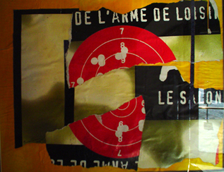
L'arme de Loisier Parsons' collages are composed with intricate consideration, but occasionally she moves with a speed and daring any skater would admire. L'arme de Loisier, the source of the postcard, is striking in its force and simplicity. A billboard poster is torn into three large pieces and rearranged on a painted orange ground. The poster's large red target with white numbers and bullet holes is torn neatly in half. The tension created by the divided circle is the central dynamic in Parsons' composition, and sets the... Posted by Isaac Peterson on July 27, 2005 at 18:32 | Comments (0) PermalinkFriday 07.22.05 Last Days  By now you know that Gus Van Sant's latest film, Last Days, isn't about Kurt Cobain. Go see it anyways, because it's a gorgeous elliptical existential study of a human being, who like the rest of us... is trapped by the inevitability of death. This film is much less about the scraps from Cobain's life than fans will demand and more of a brilliant take on the topic of euthanasia. It is a subject which will soon be debated in the Supreme Court (and a new justice complicates it further). Van Sant lives in Portland and Oregon is the only state that has legalized euthanasia. Americans really don't think much about death but this film does more than its fair share of work on the subject. For those less artistically inclined, Last Days might draw complaints of slowness but for people who look at paintings, this film displays a true mastery of time. The whole film practically stands still, giving everything, including the making of macaroni and cheese a sense of geological scale. Compared to the affected art world slowness of Matthew Barney or even Eve Sussman, this down to earth approach connects better. In many ways it takes the work of video artists like Fischli and Weiss (who put a kitten lapping up milk up on the Times Square jumbo-torn) and turns such mundane beauty into incredibly sustained movement shots where Blake is a train and everything else becomes the rails. The effect is breathtaking for many reasons. For one, the long uncut shots make the viewer notice when a cut is used. It interrupts our consciousness and it isn't surprising it is used for several blackouts. It also emphasizes the inevitability of the story which we all know will end in death. Van Sant uses lots of symbolism for inevitability including numerous references to trains, reoccurring scenes that are slightly different, a hilariously utopian Boys II Men video and a musical performance that makes extensive use of looped sampling (something I doubt Cobain would have done but Thurston Moore was the musical consultant so it still has plenty of indie cred). My favorite scene was the groundskeeper as a quasi grim reaper, which features the greatest use of a long handled tree saw in all of film history. I also found the constant use of reflected trees on windows impressive. Overall, it's one of my favorite Van Sant films, especially because of its truncated square format that makes the film even more claustrophobic and intimate. So get over the Cobain trivia, this is about life and death and although Cobain casts a long shadow his celebrity means nothing next to the universal experience of death. Last Days opens at Cinema 21 Friday July 22nd Posted by Jeff Jahn on July 22, 2005 at 1:00 | Comments (0) PermalinkMonday 07.18.05 Justine Kurland at PICA by Isaac Peterson 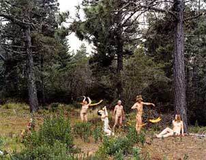 Fire Eaters by Justine Kurland Five large photographs by Justine Kurland occupy a central wall and a corner space in the lobby of the Weiden and Kennedy building near the PICA reception desk. It is unfortunate that this work is displayed in such an easy to walk through area, as the meditative atmosphere Kurland creates would be better suited to a space less bustling. It is easy to see the relationship between Kurland's mythic natural settings and the work of her former Yale teacher, Gregory Crewdson. Kurland walks a tightrope stretched between the mythical and the everyday, and allows her images to be pulled sometimes completely toward myth, while maintaining a slender relationship with the regular practices of "nature as spirituality." At other times, the imagery is pulled too far back to the familiar Oregon outdoor culture, and the larger implications must be sifted out of what is immediately identifiable as a typical camping weekend in Oregon... Posted by Isaac Peterson on July 18, 2005 at 22:41 | Comments (0) PermalinkPDX + Japan + Design 
Last March during a lecture at PNCA, John Jay of Weiden + Kennedy and Japanese design guru Teruo Kurosaki threw out a challenge to Portland's designers, artists and creative community to make Portland the next design mecca, on par with Tokyo and New York. Drawing parallels between the creative lifestyle offered by Portland and that of Tokyo, Jay and Kurosaki suggested that the next step in moving Portland towards being an international presence is to create an interchange between designers in Portland and Tokyo. Compound Gallery has been doing just this sort of thing for the past several years - its mission statement (probably not coincidentally) embodies the type of cross-cultural pollination that Jay and Kurosaki were urging. For those unfamiliar with this Chinatown space, Compound Gallery is a part of the Just Be Complex, a hybrid business that also includes a design studio; a store selling anything to do with urban/street/skater/Japanese culture, from scantily clad Rei figurines fit for any otaku's hovel to t-shirts by Portland-based Scott Patt; and a video rental featuring Asian flicks and an impressively comprehensive selection of anime. It's analogous to Zakka (NYC) and Giant Robot (LA). Compound has always been ambivalent towards Portland's art community and perhaps rightly so. It's Portland's most cosmopolitan gallery (especially ever since PICA dropped its curator and its gallery space) and is the only art space in Portland where one can expect to see contemporary art from outside of the US on a consistent basis. Despite the fact that Portland is populated with transplants, a sizable sector of its art world is enamored with "supporting local artists," in some cases to the extent of being hostile towards outside artists or refusing to recognize the merits of Portland-based artists who show regularly outside of Portland. Liberated from a great deal of Portland's art world politics and economics, Compound Gallery embraces a very specific niche and they do what they do very well. While one can't expect to find anything groundbreaking in terms of the greater contemporary art scene, Compound Gallery does manage to put on consistent shows by some of the most active Japanese and American artists working at the forefront of graphic design and illustration. Work with strong roots in Japanese graphic design is au courant in the art world right now, from west to east (e.g. Chiho Aoshima at Blum & Poe, Marakami's takeover of NYC). While time will tell whether or not this trend is here to stay in the contemporary art world, the type of work being produced by young Japanese artists and designers will certainly have a lasting influence in the design world for years, if not decades, to come. Compound Gallery's latest exhibition, supported in part by (no surprise here) Weiden + Kennedy, presents a group of young talents from digmeout, which describes itself as an "artist excavation project" based in Osaka that seeks out and promotes talented, up-and-coming young artists. During the opening on first Thursday, an exuberant throng of Japanese press took over the gallery, documenting every action of the many exhibiting artists who were visiting for the opening. The show was a reprise of last summer's digmeout exhibition, featuring many of the same artists alongside several artists new to the digmeout fold. Highlights include Ryuji Otaui's stark prints, decadently kitschy and glam; nostalgic, narrative collages that take a cue from 50's era illustrations by artist collective Re:VERSE; ZanPon's drawings of doe-eyed girls emerging from a chaotic tangle of scribbles; dreamlike, psychological paintings by Heisuke Kitazawa (aka pcp); and a charming video involving humans with cat ears, bunnies and flying buses by Mimi Murai. Whether or not Portland will indeed step up to John Jay's challenge remains an unanswered question, but Compound Gallery is certainly doing its part to make sure Portlanders are seeing the best of Japanese design while helping to ensure that Portland is on the radar of young designers worldwide. Posted by Katherine Bovee on July 18, 2005 at 1:44 | Comments (0) PermalinkSaturday 07.16.05 Nick Blosser at PDX 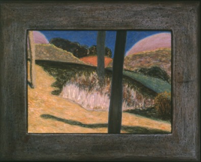
Hilly Landscape 2004 Egg tempera on wood There is something about egg tempera paint. It's in the colors, certainly, but in the texture, too. Though it has a flat, matte finish, unlike oil, which has a subtle glisten, tempera glows. Its rich luminosity heightens the surfaces it covers like candlelight in a darkened room. Then, there's the history of it. When peered at closely, even a modern work in tempera takes on a medieval quality. Nick Blosser, in his current show at PDX Contemporary Art Gallery, has used this quality to fine advantage. The small landscapes succeed in natural or artificial light because of the inherent calm fluorescence of the paint. Blosser adds the paint in thin layers, or builds it up for greater depth. The leaves on his trees, consisting of small brush strokes, possess a mass and volume that is unexpected, considering the lack of impasto. Blosser says that he works "toward retaining strong abstract relationships within each painting [while keeping] in place something authentic about the places [he] paints." The result for the viewer is familiarity with observed locations, but more clearly delineated forms and colors than are seen in nature. Most of his scenes are of cultivated or reclaimed landscape. Fruit trees in blossom, long shadows across a field. In Hayrolls Under a Tree, one gets an impression of domesticity and hard farm labor. Many of his locales seem like great spots to picnic. It's the edge of abstraction that makes them innovative, rather than postcard pretty. One of the paintings, Trees on a Hill, is as near abstract as Serusier's The Talisman. His delicate use of color ends the similarity. Kudos to Blosser for making his own frames, an ability and inclination I would like to see more artists aspire to. Blosser's frames, of carved, painted wood, so perfectly match his paintings in mood and visual appeal, one cannot imagine the paintings presented in any other fashion. The effort is appreciated. Posted by Andie DeLuca on July 16, 2005 at 11:48 | Comments (2) PermalinkSunday 07.10.05 Art from the WPA at PNCA 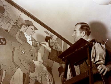
On the East Coast one might see a mural of Washington crossing the Delaware; in the Midwest, paintings of wheat fields and farm life; in the West, bronze statues of gold miners, wagon trains, and first meetings with Native Americans. We are all familiar with them. They are found in grade schools, high schools and post offices, state and federal office buildings, public parks and national preserves. They're the murals and statues depicting historic events and community projects, growth of industry, and small happenings in daily life. They are the art works of the Works Progress Administration, or WPA. Started in 1935 to create work for the massively unemployed, several programs were set up under the WPA to assist artists. These included the Public Works Art Project, the Section of Fine Arts, and the Treasury Relief Art Project. These programs had strict professional requirements for participation, allowing artists to make about $50.00 a month, a nearly living wage for the era. There were sharply drawn guidelines regarding subject matter and style. The artists were restricted to portraying historical events or scenes from everyday life in a realistic, or only slightly stylized, fashion. Only one program, the Federal Art Project, allowed more stylistic freedom, and a wider choice of subject matter. The current exhibition, Art from the WPA, at PNCA's Feldman Gallery is an eclectic selection of works by people in the era of, and under the auspices of, the WPA. While not all of the works were created specifically for the federal program, many of them were. And all of them reflect the purpose of the projects in one way or another. The artists represented also had ties to the then Museum Art School, which became PNCA. Most rewarding to the local viewer are the associations with local sites such as Timberline Lodge and familiar scenes of forest and farm land. Decoration - Floral Still Life by Margery Hoffman Smith greets the viewer on entering the gallery. An impressionistic blue and white ceramic bowl is depicted, filled with red, orange, yellow and blue flowers. Hoffman Smith apparently created such paintings for Timberline Lodge, and this is reflected in the hand carved, though incongruously gold painted, frame. Also incongruous, is The Dying Fisherman by John Ballator, dated 1933. This painting has a distinctly religious aspect. Two men and a woman pull a figure from the waves. All are dressed in flowing, brightly colored draperies, rather than modern dress. The composition is that of a Renaissance deposition from the cross. There is no clue given about where this painting was intended to hang, but it seems more appropriate for a church than for a government building. Ballator is known to have painted, with Louis Bunce and Eric Lamade, murals for the St. Johns Post Office. Forest, by Littleton Dryden, is far more stereotypically Oregonian. Painted for the Soil Conservation Service, it is part of a series meant to illustrate the consequences of deforestation. This must be the "before" picture, showing an idyllic scene of virgin timber, deer, fresh running stream, and filtered sunlight. One of the most impressive characteristics of some of the paintings, is how the artists comprehensively included in their compositions so many varied aspects of life. History was a predominant theme. In Rockwell Carey's Early Mail Carriers of the West, 1937, one sees a panoramic landscape that includes a pony express rider, a steam boat, the building of the rail road, and an already functioning steam locomotive. And it's a convincing layout. In Panels for Mural Competition Arthur and Albert Runquist use a geometric style to show fruit packers and fishing activities. These homey, domestic businesses are shown to be the forerunners of big industry by including in their respective backgrounds oil fields and tanker ships. On a smaller scale, Martine Gangle, in 1934, painted Woman Feeding Chickens, a salute to domesticity. Bue Kee's ceramics of fruit, a beaver, and a larger terra cotta goose, also created for Timberline Lodge, seem to reference home and farm, as well, and are charmingly characteristic of the Northwest. A few works show a more adventurous, modern style. Clown, by Clifford Gleason, is post-impressionistic, and the subject matter is outside the preponderance of works presented here. It is a dynamic study, not quite Soutine-intense, but thought provoking. Similarly, Darrel Austin's Woodchoppers are Max Beckmann-like figures, appearing wounded and worn out. I have yet to understand what Orrie Greaves' Fisher Folk has to do with Tongue Point Naval Air Station, for which it was created in 1941. Showing a possibly Hispanic community of fishing people with two American sailors looking on, it has been used to promote this exhibition, but is one of the weakest pieces here. The figures are cartoonish, with little muscle definition. The composition is lopsided, and the colors pallid. In its favor, and the question arises if this was a policy of the WPA, the MAS, or the current PNCA, there is a higher percentage of women artists represented in this show than is usually the case. Lucia Wiley's serigraphs depict their subjects in swirling, intimate style, and Charlotte Mish's Ship Launching challenges the stereotype that women artists are only interested in feminine subjects. The WPA was disbanded in 1941, as the federal government turned its attention to the wars in Europe and the Pacific. Unemployment ceased to be the problem it had been. In its wake, the programs left several hundred thousand murals, easel paintings, sculptures and prints. The PNCA has presented a small but representative sampling of those of most interest to the people of the Northwest. Posted by Andie DeLuca on July 10, 2005 at 15:36 | Comments (0) PermalinkSaturday 07.09.05 David Velasco on Danzine at CUNY 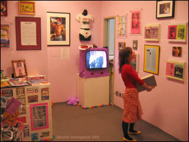 A brief disclosure. On those toxically quixotic summer days spent botanizing the pavement of downtown Portland, I would sometimes spy Danzine editrix Teresa Dulce strolling down Stark Street or Broadway wearing her assertive "Hooker" baby-tee, and I would stop and whisper to myself: "I love you." I wasn't the only one who cultivated a distant admiration of Dulce; she sparked quite a fan club in PDX and beyond. As the principal face of Danzine (1995-2005), an organization that taught us all that sex workers aren't faceless, she and the rest of her crew channeled an unbridled sense of strength, care and hospitality. Recently, I was fortunate enough to catch some of this energy at an installation and Danzine retrospective Dulce and cohort Marne Lucas put together for the group show At the Mercy of Others: The Politics of Care at New York's CUNY Graduate Center (curated by Sasha Archibald, Sarah Lookofsky, Cira Pascual Marquina and Elena Sorokina for The Whitney Independent Study Program - ended June 25, 2005). Mobilizing some of the elite attack squad of contemporary artists from the 60s through the new millennium, the show worked to demonstrate the impossibility of a true and noble act of caring, while nevertheless underlining the necessity of the work of care. A triple-play of Mary Kelly's Primapera, Mike Kelley's More Love Hours Than Can Ever Be Repaid and film footage of Yoko Ono's Cut Piece showed some curatorial ingenuity, successfully weaving together themes of caring, cutting, and dependency without... Posted by Guest on July 09, 2005 at 19:08 | Comments (0) PermalinkFriday 07.08.05 Macca at NAAU 
Despite its self-depricating title, Joe Macca's new body of work, Flotsam, is a successful, if sometimes uneven, venture into a more spontaneous body of work by this Portland artist known for his laboriously crafted color field paintings seen regularly at PDX. As he explains in the exhibition statement, this body of work came about during the day-to-day tedium of his studio practice, which involves many hours of waiting for thin layers of oil paint to dry. The work presented at New American Art Union is pieced together from more experimental work created during this time. These small drawings, notes, collages, video experiments and a collection of mail art all engage with, and sometimes pose a challenge to, the mechanisms of the art world. The underlying cynicism that seems to run throughout Flotsam is somewhat mysterious, given the lack of intellectualism and the air of serenity that Macca's masterful abstractions tend to exude (I'm not the only one to have noticed a bipolarity in Macca's work). In many of the works at NAAU, it's not clear if Macca is jaded, if he still wants to believe in some sort of art utopia or if he is simply avoiding a strong point of view altogether, celebrating in the comfort of knowing that in making art after modernity, anything (and nothing) is possible. In his artist statement, Macca explains that he "invokes the participatory nature of artistic production" in this exhibition, but I can't completely buy into this overwhelming optimism given the nature of many of the works in the show... Posted by Katherine Bovee on July 08, 2005 at 11:56 | Comments (1) PermalinkTuesday 07.05.05 Snapshot Chronicles at Cooley Gallery, Reed College 
This week is your last chance to see Snapshot Chronicles: Inventing the American Photo Album, a narrowly focused historical survey of photo albums at the turn of the century curated by Reed College's Stephanie Snyder and Bay Area collector Barbara Levine. Although Reed College's Cooley Gallery is modest in size, outstanding installation techniques, liberal use of dark blue paint and rich accompanying texts lend the exhibition the heavy, authoritative presence of a museum. On display are 70 American photo albums created between 1898 and 1935, many assembled by anonymous creators. Although it is tempting to get caught up in nostalgia and the voyeuristic attraction of milling through the personal artifacts of strangers, curators Snyder and Levine go to great lengths to present these albums within a more thorough context, citing not only socio-economic factors and historical events that are revealed through these albums, but also cultural, aesthetic and technological influences. The exhibition may be historically motivated, but it remains quite relevant to contemporary trends in self-documentation. While Kodak's Brownie camera and other portable cameras gave ordinary Americans a cheap and accessible way to document their own lives at the turn of the 20th century, digital cameras have revolutionized the way in which we document ourselves at the turn of the 21st century. While early album makers relied on a few crude image altering techniques as well as inventive ways to clip and collage their photos, image editing software has given the home user an entirely new set of tools to alter images according to their own aesthetic tastes. Blogs, virtual photo albums and other web-based technologies have renewed an interest in documenting the minutiae of daily life. Additionally, the scrapbooking industry, which rose exponentially in the late 1990s (I've seen it cited as being several billion dollar industry), attests to a concurrent growth in the creation of traditional albums, albeit under the guise of a well-marketed hobby. Snapshot Chronicles provides a look back at the origins of this marriage between technological, commercial and aesthetic forces in shaping the ways we document ourselves. Snapshot Chronicles runs through July 11 at the Cooley Art Gallery, Reed College. The show will travel nationally throughout 2006-2008. Posted by Katherine Bovee on July 05, 2005 at 9:44 | Comments (0) PermalinkThursday 06.30.05 Ken Kelly Rocks 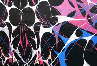
Skull (detail) I've always liked aspects of Ken Kelly's work, probably because of its non-western use of arabesques and attention to surface. Yet, his earlier works seemed to be too intentionally oriental and antiqued in ways that I found equally troublesome. No longer. Kelly's latest show at Pulliam Deffenbaugh dubbed, Babble, is just as meticulous as before but now sports a Spinal Tap like twist that is more nostalgic, humorous and ambitious. The work is inspired by 80's metal, proving once again that abstraction, like some great imulsifier can appropriate pop culture and give it new freedom. In fact, none of this newfound rock and roll undermines the work's seriousness and artists like Philip Taaffe, Jackson Pollock and Frank Stella all have some relationship to Kelly in that intense patterns threaten to extend beyond the painting's surface. Such intense pattern is simply too much to fully take in and makes the painting behave like things seen out of the corner of one's eye, even when we are looking right at it. 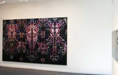 Skull (left), I.D. #1 (right) A good example is the twelve foot wide painting, "Skull." The work in many ways is dressed in shiny black like Rob Halford of the band Judas Priest. "Skull" is larger than life, suitably decked out in... Posted by Jeff Jahn on June 30, 2005 at 22:49 | Comments (0) PermalinkWednesday 06.29.05 Two Short Reviews  Blue Sky Gallery is currently showing a display of photographs by Douglas Lavere and Berenice Abbott. Side-by-side scenes of New York City are visuals of what the city looked like 60-plus years ago and in the much more recent past. Lavere made a project of repeating the point of view photos that Abbott took in the 1930s, replicating time of year, time of day, photographic equipment, and film type to show the changes that the city has undergone in the past six decades.  It doesn't hurt that Abbott's original shots were compellingly composed and developed images of city life, both intimate and grand. The before and after scenes of a bakery storefront show how a small business can stay in the same hands over the years, serving the same kinds of bread, the staple of life, while at the same time the superstructure of the city changes dramatically. When we see the location of the World Trade Center, minus the twin towers, next to the same vista with the iconic citadels, we can't help but envision them missing again in the imagined photo taken in the future. New York Changing remains on display through July 2. And now for something completely different: 
Heriz At Utrecht's Wall Gallery, between 11th and 12th on N.W. Everett, Tamara English shows a series of oil paintings, Ishk , which are representations of details of oriental carpets. English sees these as "interpretations of interpretations of what is found in the natural world," reflecting her interest in flora and fauna used in the man-(or often woman-)made. The paintings, with titles such as Kashmir and Mahavalla, are of varied sizes and dimensions. English uses a heavy impasto, and incorporates expressionistic drips, splashes and slashes to add a personal, painterly note. Whether she was creative with her palette or directly reproduced the colors of her models, the colors range from intense jewel-tones to pastels and are coordinated beautifully. This exhibit ends tomorrow, June 30. Posted by Andie DeLuca on June 29, 2005 at 13:44 | Comments (0) PermalinkMonday 06.20.05 Portland gallery hopping 
Jacqueline Ehlis at Savage To the un-initiated the art scene activity in Portland is a bit daunting and (without a guide like PORT) sometimes tough to locate outside of the Pearl District, which typically shows less experimental work (but even that isnt always true). Every month there are new galleries, artist groups, itinerant warehouse shows and at least three major art walks to confront. The bankers havn't driven the artists out… some of these artists even own homes before age 35, although housing is a very tight market. Grads from Columbia, CCA, UNLV, NYU, Rutgers, Brown, Alfred, RISD and Art Center litter the scene but refreshingly talent is the only real currency. Trust funders although plentiful, don't dominate the pecking order either. Basically, if you've got it… it gets noticed here fast. So to help here is a bit of a travelogue or diary review starting with cocktails the night of May 31st. Then we go right into the First Thursday and First Friday openings. Also, for every show I mention 5 others are skipped. For our local readers this means you have a week and a half (at the time of this post) to catch anything you missed. On Tuesday night (may 31st), before the Wednesday previews part of the scene was ensconced at Le Happy, a crepe place and bar in "The Bucket" neighborhood tucked under I-5. It is near the Pearl District and NW 21st . Artist John Brodie (and manager of the band Pink Martini) owns the place. Much of the scene was there; Joe Thurston, Bob Wilcox, Brad Adkins, Marne Lucas, Leah Emkin, Laura Fritz, James Boulton and Bruce Conkle. PORT's own Jennifer Armbrust is at another large table and I give her a nod and eye contact. Big gestures in crowded rooms aren't my thing, private bookish art-nerd that I am. She was gruntled I didn't wave but hey if I waved at her 20 people would logically think I was waving at them too… or drowning. Wednesday June 1st previews: This was PORT's launch day and many thanks to Tyler Green who is the MAN when it comes to art blogging. Also, big thanks to longtime blogger Carolyn Zick of Dangerous Chunky too. The best show by far was by UNLV Dave Hickey alum Jacqueline Ehlis, who seems to have combined the Marfa aesthetic with Willy Wonka, Jo Baer, Tuttle and a little Alfred Stieglitz to pull off 5 distinct but related bodies of work in one strong show. Hanging out with Robert Storr and Hickey never hurts but she is very independent minded. Now she seems to have moved beyond grad school predictability into something that even those who hate Hickey are grooving on. Sales are great, major non-local contemporary museums are in aquisition mode and there is a general sense she's done something special here. The show has kept me off balance and Im still processing the loud minimal weirdness. Read Katherine's PORT review here. 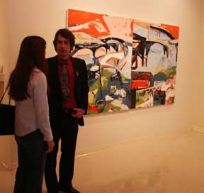
Tim Dalbow at Laura Russo Gallery First Thursday June 2nd: It was a bit chilly and overcast but Tim Dalbow (a young painter who is always impeccably dressed) had his opening at The Laura Russo Gallery. But clothes don't make the art. His show here is a surprise because this... Posted by Jeff Jahn on June 20, 2005 at 0:48 | Comments (0) PermalinkThursday 06.16.05 Jack Pierson's Teenstar 
One of my favorite art objects in Portland is Jack Pierson's "Teenstar", which is nestled away in depths of the Portland Art Museum. (on loan from a private collection) There is something ornery about a good object which confounds and exceeds its original context, like a great idea with baggage. Or is "Teenstar" a contemporary totem of things that never seem to change? "Teenstar" can be found downstairs outside the PGE auditorium and across from the large Frank Stella protractor work. I usually dislike word art and much of Jack Pierson's production seems too contrived... yet "Teenstar" stands out because of its pervasive, practically insidious subject matter. Constructed of found signage, the materials coerced into a word work together to emphasize both the ubiquity of youth and the corruption of the aging process. Teen stars never seem to go out of style and the phenomena probably started with Mary Pickford. Then came Annette Funicello, Sally Field (the pregnant flying nun, wow), Danny Bonaduce, the Backstreet Boys and Lindsay Lohan. For many good reasons (like being too inexperienced to be jaded) the power of precocious youths won't go away and neither will this Jack Pierson. "Teenstar" is a combination of roadside Americana and celebrity teenage road kill that has found its way to a museum, for now. This is Pierson at his best. Posted by Jeff Jahn on June 16, 2005 at 21:20 | Comments (0) PermalinkWednesday 06.15.05 Currently at IFCC Through June 23, Interstate Firehouse Cultural Center is presenting the paintings of Katherine Pappas-Parks, and the sculptures and drawings of Junko Iijima.
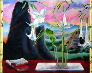
Enchantment with the Observable World, Meteora III, 2005 Pappas-Parks is an accomplished artist who is shown and collected nationally and internationally. Her Greek heritage informs this series of six paintings called At the Edge of the Sky. These are landscapes with various organic elements, ephemera and cultural icons in the foreground. One includes the waist-up nude figure of a lovely young woman. Enchantment with the Observable World, Meteora I-IV is a series of four paintings of variations of the same landscape: otherworldly Devil's Tower-like mounds in a flat vista. In the foreground of each is a red shelf or ledge containing a glass or vase, plants such as lilies, and a book or other culturally significant object. Aphrodite's Gift From Paris, which has the nude figure, gives us two green pears rather than one golden apple. All of the paintings have edges of gold leaf which reference Greek Orthodox or Byzantine religious artifacts. Pappas-Parks calls her work "Painterly Realistic" and lists as influences Surrealism and Magic Realism. She was also influenced by the 20th Century writer Nikos Kazantzakis, who wrote of "beauty in an object as simple as a rock." Though indeed painterly, her technique results in a softness that, were it not for its intensity, might remind one of watercolor or airbrush. Her colors emphasize the painterly effect. 
Hybridization, Object Study, 2005 Junko Iijima's installation, Hybridization, uses its small space dramatically, with 24 black and white drawings in black lacquer frames, and 12 red pedestals on which sit small dark bronze sculptures. The carpet in the room is grey, and the walls off-white. The simplicity of the effect is distinctively oriental. Iijima, who grew up in Japan and currently lives in the U.S., has achieved a melding of cultures with these works. The bronze sculptures are small, heavy, nonfunctional interpretations of Nanbu Ironware. The forms are influenced by "contemporary American pop culture, creating hybrids of new and old, East and West." Some of the sculptures have a shape reminiscent of teakettles, while others, and most of the drawings, have an organic, diatomaceous look. This is where the modern influence is most keenly observed. Iijima includes with her statement on this exhibit and biography a "brief history of Japan and America" that emphsizes the trade of physical goods, leading to a cultural blending. Her explorations lead her to examine her heritage in the light of her current environment. The result is a formal elegance imbued with an anime kick. Posted by Andie DeLuca on June 15, 2005 at 15:21 | Comments (0) PermalinkMonday 06.13.05 New Work From Brad Adkins 
At PDX's Summer Group Show, Brad Adkins sets out to prove why he's just gained gallery representation by this Pearl District standby with a convincing new body of work. Adkins, who has done much of his most noted work in collaboration with Chris Buckingham as Charm Bracelet, moves away from social art interventions and instead offers the viewer a more intimate aesthetic experience. Among works in the main gallery space are a group of Adkins' altered plastic water bottles, a target-like form fashioned out of colored painters' tape and a stack of 25 one dollar bills, faces blacked with a Sharpie. I learned from Adkins that this group of work both signifies the closing of one project and the beginning of a foray into a new kind of art practice. The series of dollar bills began as a way for Adkins to make gifts for friends. Adorning each bill with a rectangle of solid black, Adkins obliterates all of the official markings that provide proof of value, but because of his viability as an artist, imbues them with greater market value. Adkins informed me that this was the last of these types of pieces he would create. This final large stack of bills is intended to be given away by its purchaser, which would of course put Adkins' currency back in the market, a sort of mini-experiment about value in the art market. The other works on display mark a focus on object making that uses common materials as its source. One of the first thoughts I had upon seeing these pieces was that Adkins must be a fan of Tom Friedman. As it turns out, not really. He doesn't have much interest in the sort of rarified experience of bringing an object into the studio the way Friedman does, nor does he hold the same interest in positioning the artist and the artists' process within each work. Adkins is more interested in the outcome of the completed work and in giving the viewer simple aesthetic gratification... Posted by Katherine Bovee on June 13, 2005 at 9:25 | Comments (0) PermalinkSunday 06.12.05 Landmark at PICA 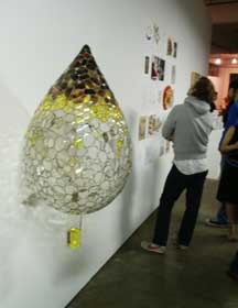
Richard Klein's Cocktail Last Night's landmark event for PICA's 10th birthday is certainly the best of the many warehouse shows up in Portland right now. With a gala event on Friday night and a general opening Saturday night it does say one thing about PICA. They have been important for the last 10 years despite the rootlessness they have experienced since January 2004 when visual arts programming lost its curator and programming seemed to be run by the staff. Now they make a bid to continue that tradition despite some recent and very serious image tarnishing that cannot be swept under the TBA rug. There remains a huge question looming over their real commitment to visual art exhibitions, which is the one thing Portland absolutely needs. Instead of stepping up to bat they chose a performance festival over art exhibitions and closed their space. Nobody will let them forget it. The money excuse doesn't work since the Portland Art Museum raised nearly $40,000,000 at the same time. It says something about development priorities and a local PR problem that no amount of sass from PICA staff has counteracted. They simply were not where the action was (there is money not affiliated with PICA or the museum that is just waiting for something serious and Kunsthalle). Basically when Portland zigged one way; PICA zagged to what they were most comfortable with, performance. The itinerant warehouse of Landmark is a symbol of that black eye but they wore that shiner well last night! Obligatory gripes aside, let's raise a toast! We should also thank Stuart Horodner whose vision was not entirely appreciated at the time but now in retrospect seems to have given this landmark show most of its sizzle. The sizzle of the increasingly crazed local scene has at times overpowered PICA's auslander (but noble) focus. Landmark is an art party as a 10 year PICA programming recap, featuring work by Dana Schutz, William Pope.L, Din Q. Le , Alain Bublex, Tony Tasset and Xu Bing. I saw all of these but the Le show in the last 6 years and it was a trip down memory lane. In fact, I had a hilarious conversation about Foghat, Tom Petty, a cooly loach named Spazz, Emil Nolde and fried string cheese with Schutz as she was making the monoprint on display here. She's very important, not because of Saatchi or... Posted by Jeff Jahn on June 12, 2005 at 15:58 | Comments (2) PermalinkThursday 06.09.05 "First Person" A Juried Exhibition of Self-Portraits at Froelick Gallery 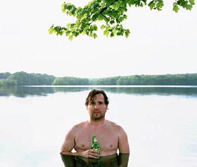 Smithfield Lake by Jesse Burke
From the traditional to the surreal, from the abstract to the literal, from the humorous to the sublime; it can all be found this month at Froelick Gallery's "First Person." This juried show of self-portraits includes 50-plus images of artists, mostly from the local area, and mostly recent. One notable exception is a 1975 Cindy Sherman as Lucille Ball. (Since Sherman's oeuvre consists of images of herself as other personalities, I wonder what a portrait of Sherman as Sherman would really look like.) Some artists are represented by more than one image. Almost all imaginable mediums are used. This is an eclectic mix, indeed. Fine technical skill and draftsmanship drew me immediately to Julia Ann Smith's "Restraining Influence." With her Caravaggesque sideways glance Smith invites the viewer to speculate on what would happen if the entwining vines released her. Jesse Burke's "Smithfield Lake" has an air of uncomplicated honesty about it. Yet there is more to this than just wondering who's minding the barbecue. Look in his eyes. Shawn Ferris goes surreal, using somewhat obvious (and very humorous) metaphors in her "Getting Ready for the Big Dance." More than one artist uses the completely, and mystifyingly, abstract. Tudor Mitroi's "Wandering Staff 2" and "Wandering Staff 7" are maps imposed on imaginatively shaped wood bases. Does the self-portrait really show us the soul of the artist? Is it a glimpse into the psyche or merely a snapshot of a moment? These images answer those questions and many more, depending on the viewer's knowledge of the artist and perception of his or her self. Posted by Andie DeLuca on June 09, 2005 at 15:51 | Comments (0) PermalinkTuesday 06.07.05 Jacqueline Ehlis at Savage 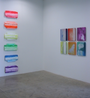
An arc of glossy semi-spheres are loosely configured around the entrance of Savage Art Resources. These seductively colored orbs appear to push out from the wall, violating the boundary that separates gallery from the outside world. It's a fitting introduction to Jacqueline Ehlis' show, at once giving the viewer a playful wink while slyly indulging in formal exploration of the relationship between painting, surface and the white box. In her current show, entitled Vigor, Ehlis delves further into some of the explorations seen in her previous solo show at Savage's former Pearl District space in 2002. In the excellent DVD that was produced in conjunction with this exhibition, Ehlis poses the question of whether or not paint is a sophisticated enough medium in the 21st century. She eloquently answers this question by embracing a studio practice that is as rigorous conceptually as aesthetically. Ehlis, who is one of the most articulate artists I've encountered in Portland, is masterful at combining the depth of her intensive studio practice with more cerebral content in a way that never fails to deliver immediate visual pleasure. A former student of Dave Hickey at UNLV, Ehlis avoids dwelling on the more conceptual aspects of her work, although I find the depth of her formal investigations to be even more rewarding than her very likeable visual sensibility... Posted by Katherine Bovee on June 07, 2005 at 17:12 | Comments (0) PermalinkFriday 06.03.05 "Paint" at Elizabeth Leach The title of this exhibit says it all. Almost every texture, color and emotional impact that paint can have in abstract works is covered here. In addition, a theme that is pervasive, and could possibly serve as a lesson to all aspiring artists, is the drip, and how it can be used to convey different feelings to different types of work.
The show, which continues through June, includes works by Willy Heeks, Pat Steir, Judy Cooke, Louise Fishman, Tom Lieber and the iconic Joan Mitchell. It could be described as an overview of the Abstract Expressionist movement, and its various incarnations. Lieber is the only artist who doesn't include any drips in his painting "Amber Ring," a horizontally oriented abstract resembling a landscape. More Color-Field than expressive, it's almost like a neutrally toned Frankenthaler. It is calm, and seems more determined than other paintings here. Everyone else uses the drip more or less intentionally. Pat Steir's "Black and White Double Waterfall" is so well planned, one can imagine the artist saying, "Now let's see...if I do a wash like Morris Louis, then carefully spray drops across it..." The result, though planned, is dynamic. The other extreme of intentionality is Louise Fishman's "Green in the Body." Fishman carefully constructs layers of color in an abstract, brushed design. If a drip of paint happens unintentionally, it stays. The drip does, however, add a note of passion to her work, complementing the underlayers of orange in the overall green design. Willy Heeks is a delight with his explosive colors, eclectic materials, and energetic textures. How could he not include some drips? They are as inherent as whiskers on a cat. The same can be said of Joan Mitchell's "Quand J.J. Partit Pour New York," a characteristically monumental Expressionistic eyeful. I was disappointed to see only one Mitchell in the show, as she is always fascinating in her textures and color combinations. Also disappointing is that Dianne Kornberg's naturalistic prints of seaweed was replaced by Kurt Pershke's "RedBall Portland." Kornberg's works show depth, realism, and an innovative process. I wasn't able to see Pershke's project in situ, and hesitate to comment on it from photos. Posted by Andie DeLuca on June 03, 2005 at 9:30 | Comments (1) Permalink |
| s p o n s o r s |
 |
 |
 |
 |
 |
 |
 |
 |
 |
 |
 |
 |
 |
 |
 |
 |
 |
 |

|
Site Design: Jennifer Armbrust | • | Site Development: Philippe Blanc & Katherine Bovee | |

