
|
||
|
Portland art blog + news + exhibition reviews + galleries + contemporary northwest art
|
||
|
Wednesday 07.18.18 Patricia Reser Center For The Arts unveiled in Beaverton 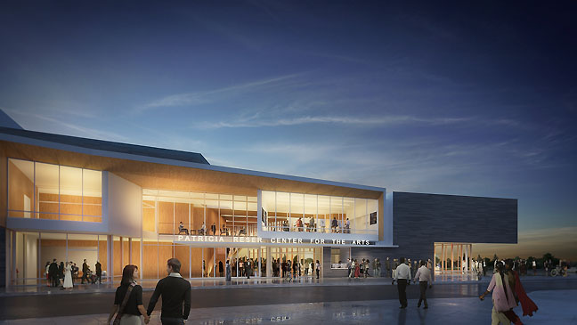 Patricia Reser Arts Center at night (art gallery is at the far right and main lobby at left) Yesterday the Beaverton Arts Foundation unveiled the 46 million dollar Patricia Reser Center For The Arts or PRCFTA. With a lead gift of 13 million dollars by Reser it features facilities for dance, speakers, music, theater, art classes and of prime interest to us an art gallery. It is a place making opportunity for Beaverton (a major Portland suburb of 96,000 people, which up to now has suffered what Gertude Stein once said of America, "There is no There There." Well, there is now... or will be soon! I'll give special attention to visual arts, which have been in a lot of turmoil lately and have needed good news like this. The 46 million dollar center is now 80% funded, with commitments of 21 million from the city of Beaverton and 1 million from The Harold & Arlene Schnitzer CARE Foundation. 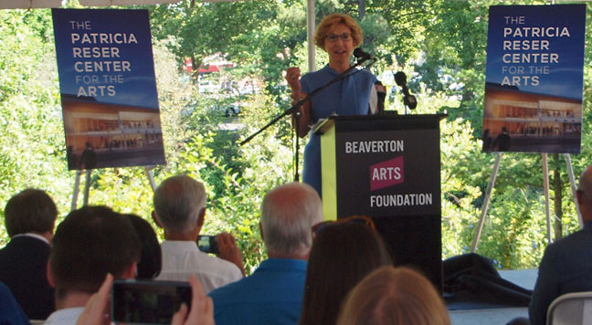 Lead gift patron Patricia Reser discussing the eponymous arts center 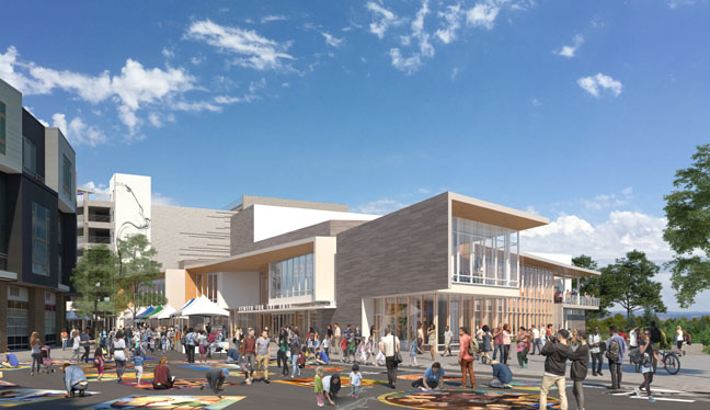 you can see from this view how prominently the art gallery (front right tip of building) is positioned, essentially greeting those who turn onto the road and will be visible from cars as they go by. ... (more) Posted by Jeff Jahn on July 18, 2018 at 12:03 | Comments (0) PermalinkWednesday 04.18.18 JSMOA's Crimson Cube at WSU 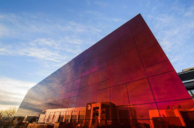 the new "Crimson Cube" at WSU (photo Bob Hubner) A little over a week ago I was fortunate to catch the opening of the new Jordan Schnitzer Museum of Art at Washington State University in Pullman. Nicknamed the "Crimson Cube" for the structure's exterior it gives students and other visitors a landmark to navigate by. It is a nice touch since so many other University art spaces are hard to find and seem tied only to art departments, which often have little pull on campus politically and makes the susceptible to cuts. No problem with that here because the cube is intentionally at the heart of things at WSU. 20 years ago this sort of reflective glass structure would have read as corporate but the cantilever that is subtly off other building's grid axis and the red color are distinctly more curious than an office tower's comportment. The overall effect is, "what is that?" and the JSMOA's comparative minimalism recalls David Chipperfield's excellent library in Des Moines. That curiosity prompt is a good place to start for any art museum and has its roots in Robert Smithson's mirrored displacement works without the specificity that Art has. That is left for inside. 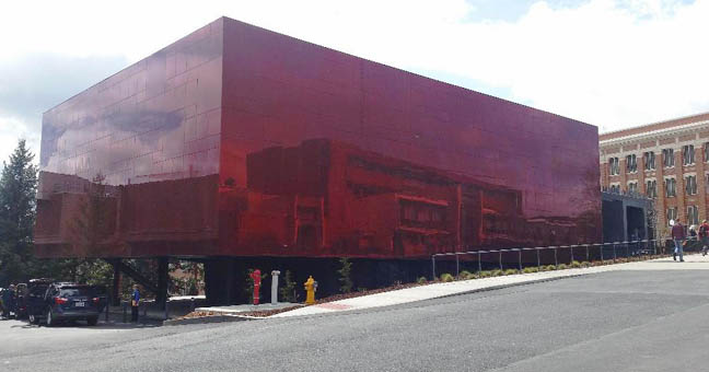 The skies over the JSMOA influence how extroverted the building behaves and its branding is low key, prompting questions... 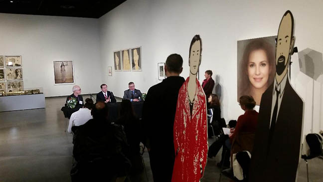
Press briefing in the Person(a) exhibition in the Harmon/Wright Gallery ...(more) Posted by Jeff Jahn on April 18, 2018 at 9:00 | Comments (0) PermalinkSaturday 04.01.17 Japanese Garden's Cultural Crosssing sets the bar 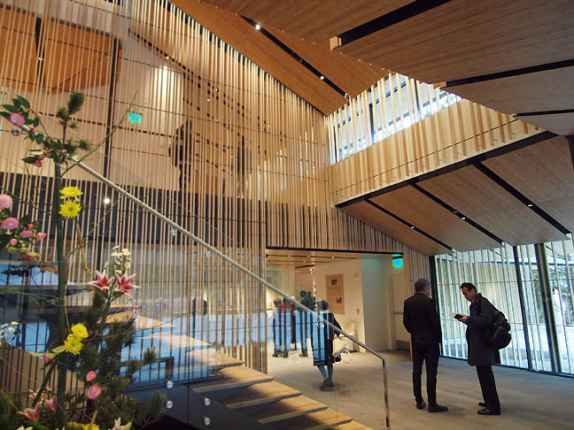 Kengo Kuma's Japanese Garden expansion transcends architecture (all photos Jeff Jahn) Architecture is the applied art of buildings that create and reshuffle the dictates of site and civilization. True architecture elevates the discussion/experience, going beyond mere shelter. When done right it becomes a meditation upon both human activity and the persistence of the site. True, most public architecture is just a thinly veiled ploy for attention, a way to organize cultural energy and perhaps focus funds upon itself but it need not be narcissistic. That said the Portland Japanese Garden's "Cultural Crossing" expansion certainly isn't vain or even stunt-like so much as an innovation driven by necessity. With over 400,000 visitors last year alone (despite being closed part of that time) the tiny and fragile garden was on the precipice of losing what made it special, being a contemplative atmosphere devoted to the Japanese way of executing exquisite excellent experiences. When done right public architecture ennobles and inspires the community it serves and as an excellent first US project by one of the world's greatest architects it certainly should perform that function. The Portland Japanese Garden's solution was to hire architect Kengo Kuma who detailed how he would create a satoyama or mountain village with PORT in an interview years ago. It was a stunning inversion, create a tiny village that would expand the cosmopolitan exploration of two cultures already engaged in a vigorous conversation. 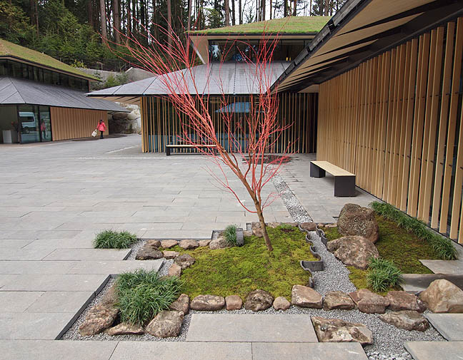 the new village courtyard Portland and the Japanese have had a mutual infatuation with each other that goes back over a century... all the way back to the 1905 World's Fair in Portland. Today, Japanese tourists flood Portland's streets... and replicate our food scene at home. Likewise, Portland's artists and cognoscenti travel to and study in Japan frequently and you can see the influence in their work. The cultural exchange in art, food, music and geek-craft is intense. Notably, Portland also boasts of having the finest Japanese Garden outside its native lands so it makes sense that this amplified cultural exchange would find its way to that site. Yet, what they have done is so much more, its the story of a small institution using a 33 million dollar project to grow into a new role... a kind of embassy of understanding and exchange. The fact that it does so by creating a cutting edge version of a medieval village, one which re-imagines feudal castle walls (typically barriers) into an invitation gives us an idea of just how innovative this project is. The buildings with their new shoji screen system echos the vertical army of Douglas Fir trees on site is poetry in the guise of place making. I've never experienced buildings so at home within a massive stand of trees. Appropriately the construction projects are not 100% complete (mostly roofs, which are living gardens themselves). It could have gone wrong so easily, but instead... (more) Posted by Jeff Jahn on April 01, 2017 at 6:01 | Comments (0) PermalinkSaturday 09.12.15 Primer on Portland's newest bridge 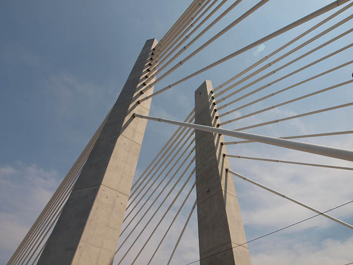 Portland's newest bridge now open (photo Jeff Jahn) Portland's newest bridge opens today (Trimet rides are fee) but I'm going to hold off on my full review until we've seen it used some. Frankly, it is because I need to see it in use once open to give an comprehensive assessment. We've critiqued the bridge process (3 different architects etc) in a little more detail than other media outlets but I think I'll just fold it into our big 2015 review because it really does say a lot about what Portland has accomplished and still faces in the future. Till then have a look back at the process: own unofficial design submission contest to drum up more ideas. Some of our reader's ideas like the belvederes and light show are now featured in the final design. (A good idea is a good idea.) ...(more) Posted by Jeff Jahn on September 12, 2015 at 10:02 | Comments (0) PermalinkTuesday 07.14.15 Kengo Kuma's designs for the Japanese Garden Well, I've enjoyed my little vacation (a working one and my 1st in 10 years) from PORT but it is time to hit the beat again.
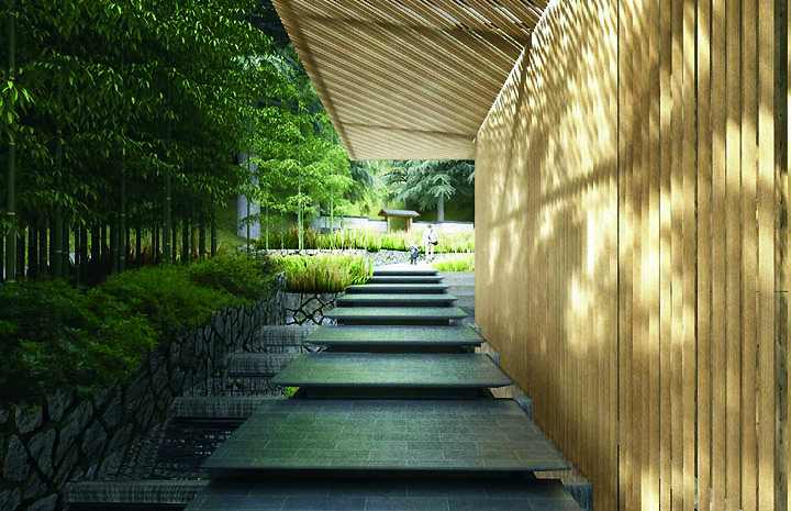
Cascading ponds and ticketing pavilion at the new entrance for the Japanese Garden. The Portland Japanese Garden just released more developed designs for its expansion by Kengo Kuma. For an important reference in 2013 PORT spoke extensively with Kuma San and he discussed how a new type of Shoji screen as well as an ambitious plan to make the Portland's Garden a new model development in the tradition of the Japanese Garden balancing the traditional garden with enhanced visitor engagement in the living tradition of the Japanese Garden. Something that requires new buildings outside of the garden area. ...(more) Posted by Jeff Jahn on July 14, 2015 at 10:30 | Comments (0) PermalinkFriday 03.20.15 PNCA's New 511 Home Part 2 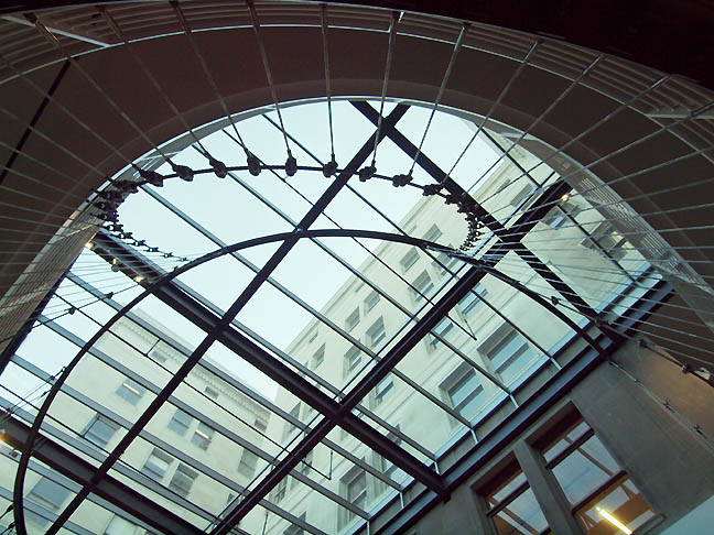 PNCA's massive new skylight and helix-like cable system (all photos Jeff Jahn) So how will PNCA's new Arlene and Harold Schnitzer Center for Art and Design change the school and Portland? That's what I want to focus on for this second part of my review. Part 1 can be found here. First and foremost it definitely will have an effect because it solidifies PNCA's relationships, both to the Pearl District galleries as the cultural anchor of the city as well as formalizing it's own structures into a new cognitive map that is more vertical, historical and at the center of the district rather than the fringe. ... (more) Posted by Jeff Jahn on March 20, 2015 at 12:44 | Comments (0) PermalinkThursday 03.05.15 Part I PNCA's New 511 Home 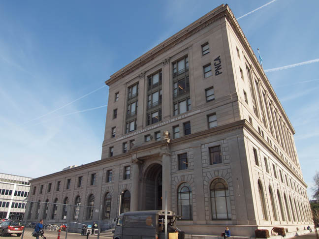 PNCA's new home the Arlene and Harold Schnitzer Center for Art and Design (photos Jeff Jahn) It has taken a long time for PNCA to finally move into the 511 building, officially called the Arlene and Harold Schnitzer Center for Art and Design but Portland's "flagship" art and design school has finally settled in enough after moving in January to invite the public for First Thursday. For quite some time PNCA has been the anchor institution for Portland's renaissance from sleepy lumber and industrial town to an art and design player on the international stage. Over 7 years ago PORT was the first media outlet to grasp just what the 511 building could mean to PNCA and Portland. Time for a critical review and tour. 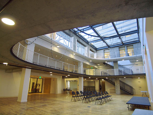 ample light in the amphitheater space ...(more) Posted by Jeff Jahn on March 05, 2015 at 13:46 | Comments (0) PermalinkWednesday 02.05.14 MoMA swamped? 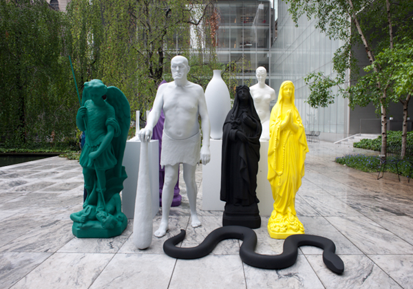 Katherina Fritsch at MoMA's sculpture court The New York Times had another article on the rightly and much maligned MoMA expansion today. It is a complicated issue, how to make the museum more a citizen of the street it lives on while protecting the art experience? This issue is crucial because MoMA sets the tone for all other museums and the overcrowding of the sculpture garden would end the last great refuge for contemplation in an already overcrowded museum experience. Thus, MoMA's preoccupation with traffic flow sacrifices the art experience in all corners of the museum already, instead of creating eddies and pools of contemplation. Basically, if MoMA were a wetlands this ever more quickening stream would sacrifice the beaches and nesting grounds we more devoted art goers are most interested in! Sometimes good fences make good neighbors... and having very intentional and varied boundaries can succeed where monogenic strategies cannot. Let's look at perhaps the most successful modern and contemporary museum in the country, the Menil. 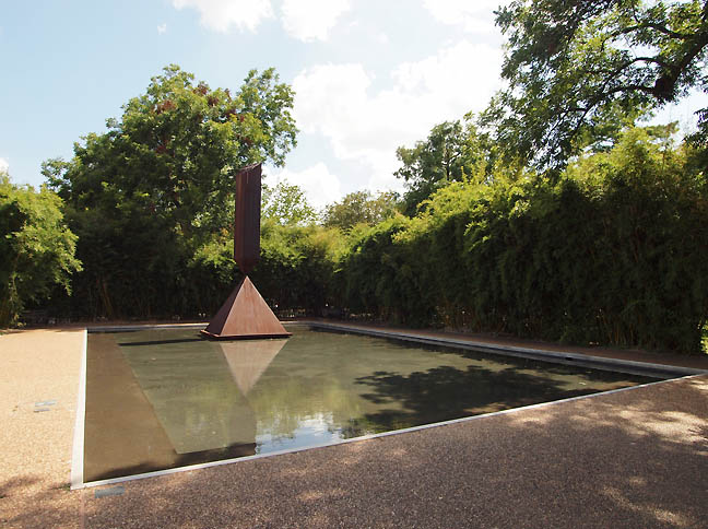 Barnett Newman's Broken Obelisk at the Menil The Menil was designed to create similar vistas and private nooks of contemplation one found at... (more) Posted by Jeff Jahn on February 05, 2014 at 12:06 | Comments (0) PermalinkMonday 12.30.13 Architecture in Portland: Best and Worst Developments of 2013 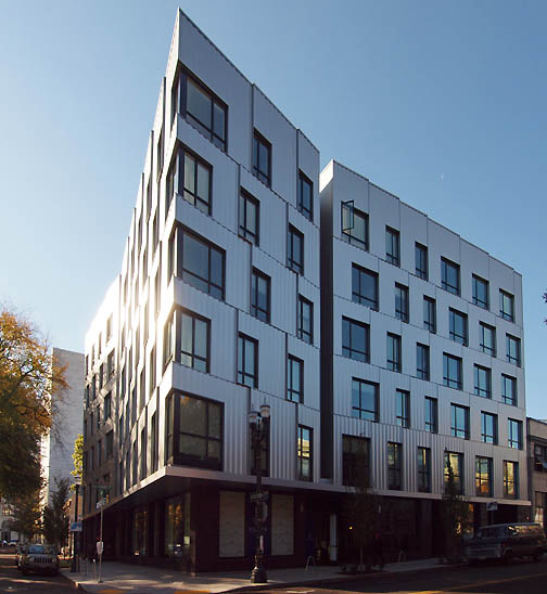 Art House's gleaming metal and glass on the North Park Blocks (all photos Jeff Jahn) There has been a subtle but important shift in Portland's architecture scene this year that hearkens to a shift in Portland's overall seriousness. I call it the year the faux brick died. To these eyes faux brick was the "humble brag" of Portland's design lexicon... simultaneously disingenuous and passive aggressive because metal and wood were too lux or direct. I'm glad that architecture in Portland is moving beyond trying to make new 10-12 story metal frame buildings look like brick. Nobody is going to do a 12 story wood clad building either. Still, three of the most interesting projects; Kengo Kuma's Japanese Garden (check out our interview), PNCA's Cloepfil designed 511 building and the new Willamette transit bridge (which we should name after Mark Rothko because he grew up on its west banks, while experiencing all racism Jewish immigrants endured) wont be completed for some time so we have a lot to look forward to in years to come... especially if the Portland Art Museum can solidify key elements for their next expansion ideas. 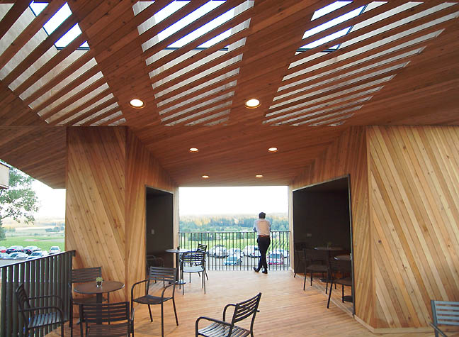 Terrace area of the Sokol Blosser's new Tasting Room facilities designed by Allied Works The clear winner of 2013 was Sokol Blosser's new tasting room by Brad Cloepfil and his team at Allied Works. Start to finish this project is probably one of the best things from Brad since his W+K headquarters... (more) Posted by Jeff Jahn on December 30, 2013 at 17:36 | Comments (0) PermalinkTuesday 07.23.13 Brad Cloepfil/AWA's Sokol Blosser Tasting Room 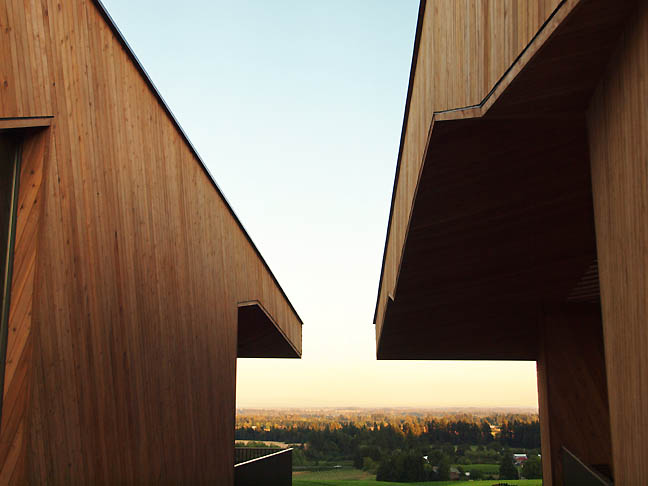
The view from Sokol Blosser's new Cloepfil/AWA designed tasting room (all photos Jeff Jahn) There are a handful of contemporary wineries that have made a major impression upon the architecture world. There is HDM's understated but large earthy pile in Napa, and Calatrava's far more balletic project in Spain, as well as Mario Botta's project in Tuscany. Last week, at an event inaugurating Sokol Blosser's new tasting room building designed by Brad Cloepfil/AWA I was struck by the fact that Oregon and not just Portland was finally growing up in terms of design. Basically, Cloepfil has taken to punctuating the thesis statement sentences of Oregon's development whenever a new chapter begins to be written (the Pearl District and now wine country). That is a hell of a thing for a single building to accomplish, much less a winery. Typically, wineries fetish a kind of anachro-tecture by trying to emulate European Gothic or Spanish Mission designs. Since all are derived from agrarian fortresses they seem better suited to shoot arrows or bullets from than drink wine. I suppose it just depends what you are into but the people who frquent here are called wine lovers not wine warriors for a reason... visigoths make horrible guests! Sokol Blosser's situation is far more refined than that scenario and with their new tasting room it is clear that Cloepfil, who is now perhaps beginning to mature into a potentially great architect knew what was great about wineries... wine, companionship and the bucolic sublime. 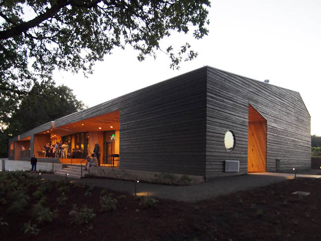 Sokol Blosser's new tasting room by Allied Works ....(more) Posted by Jeff Jahn on July 23, 2013 at 15:37 | Comments (0) PermalinkMonday 07.01.13 Ding Dong the Bridge is Dead 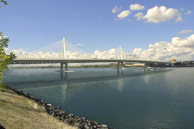
Cable stay CRC design, which not chosen The big news this weekend (broken by the Tribune) was that the much hated Columbia River Crossing is dead. PORT has been on top of this from a design perspective and when they chose the cheapest and tunnel of ugly version instead of the more seismically safe and more elegant cable stay design I predicted the project would be killed. If a project can't even get those like me who see a need for a well designed and seismically pro-active bridge on board they will have to wait for the Big One or say a 7.6 to damage the existing bridges enough to make a replacement happen. That's sad because people will likely die. Here are some take-aways: 1)Next time get a major archictect and engineering firm on board, the project is just too complicated for a meat and potatoes design that nobody can buy into. The architect can juggle the massive tangle of interests and find a way to bring that feedback into the design. That would create buy-in. Design isn't about being "fancy", it is about finding elegant solutions to difficult problems and the CRC idea requires top level problem solving... not run of the mill overpass style solutions. 2)This requires a bigger carrot. IE the Federal Government will have to fund at least half to 65% of the project... to bring both states back to the table. 25% simply did not cut it and this is I-5 afterall, the most Important road on the West Coast. 3)The project should show off the incredible stetting and instill pride. It should also be the most seismically robust and environmentally sound solution available today. Right now that is a cable stay design with its greater sway and fewer piers. The clearances should also be high enough so as not to impact upsteam businesses to nearly a billion dollars in mitigation payouts. This should be a job builder not payola. 4)Some of the 170 million that has already been spent is not wasted but the next time the process is undertaken it will require a front door not the back room political dealing approach attempted this failed time. Posted by Jeff Jahn on July 01, 2013 at 9:41 | Comments (2) PermalinkFriday 04.13.12 PICA's new headquarters 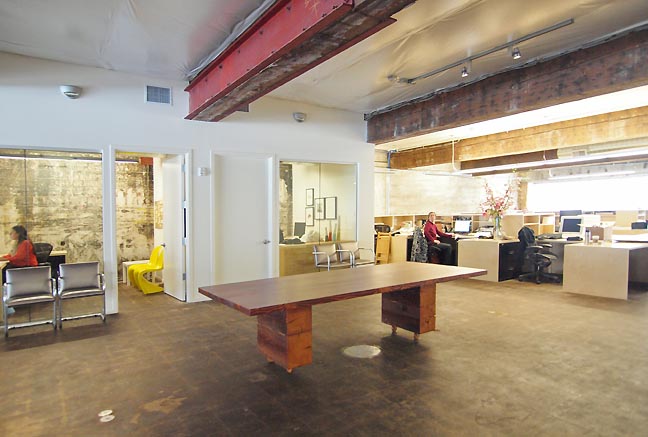 PICA's new headquarters I'm burying the hatchet because this space gives me reason to believe in PICA again but first a little history. In 2004 PICA shuttered its once excellent visual art program, which under curator Stuart Horodner presented the likes of Janine Antoni, William Pope L. Dana Shutz, Melanie Manchot, Jim Hodges, Tony Tasset and Rudolf Stingel... and if that sounds like the most interesting nonprofit exhibition space north of San Francisco it is because it was. What's more the space was large but not unwieldy space designed by Brad Cloepfil, long before... (more) Posted by Jeff Jahn on April 13, 2012 at 13:54 | Comments (2) PermalinkTuesday 01.31.12 Aerial Tram at 5 a Renaissance Revisited 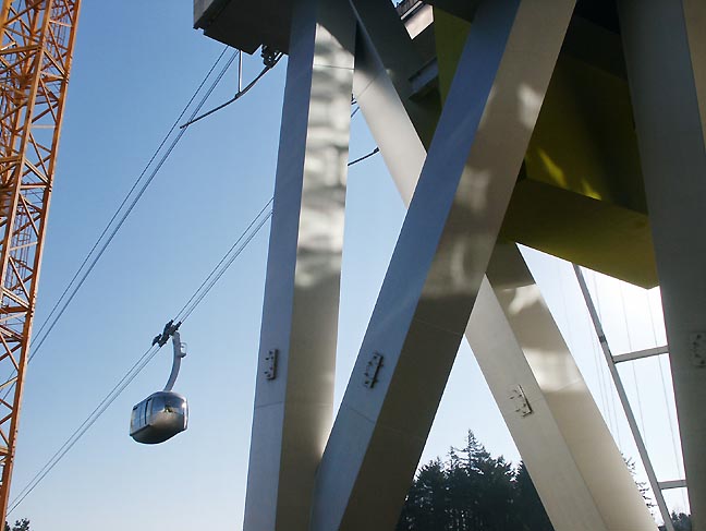
Aerial Tram on its first day of public operation (photo Jeff Jahn) Brian Libby has an important look back at the Aerial Tram which is now 5 years old. Here is my original review of this watershed architectural moment for Portland. How does it hold up today? It still feels contemporary and very very European (OMA, MVRDV-esque). Still, it remains a controversial benchmark... some architects call it a glorified parking garage. So what? Of course it is! (BTW, interesting parking garages are the rage now) The point is it remains an elegant solution to OHSU's campus expansion problems on Lair Hill keeping Portland's largest employer in the city core. It is also an extroverted piece of architecture... (more) Posted by Jeff Jahn on January 31, 2012 at 13:44 | Comments (0) PermalinkFriday 09.16.11 PAM reinvents itself with Ziba Here is a taste of the new identity:
 The new identity keeps the authoritative red but it is a softened shade, the more traditional text below covers all the bases Analysis: The Portland Art Museum's new identity and branding was conceived in close collaboration with Ziba design. In short, it is a bold clean appropriation of the P of Portland and definitively states that indeed this is an Art city. No, it isn't as bold as something like the Tate's chimerical identity but by being similarly polymorphous mark (it can act as a window on images or art) it is a gutsier than the Art Institute of Chicago's rather staid new logo.... (much more) Posted by Jeff Jahn on September 16, 2011 at 14:30 | Comments (0) PermalinkThursday 06.02.11 Bud Clark Commons: design to save lives 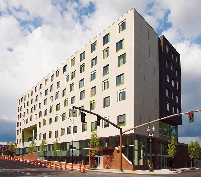
Resource Access Center (Bud Clark Commons) If you've recently spent any time at all in Portland's tony Pearl District you've no doubt seen the dramatic rise the new Resource Access Center or Bud Clark Commons just across from the Post Office and PNCA's soon to be 511 building. Much has been written about its sociological underpinnings (like Housing First, which has been proven to lessen the burden on social services) so I'll focus mostly on design here. 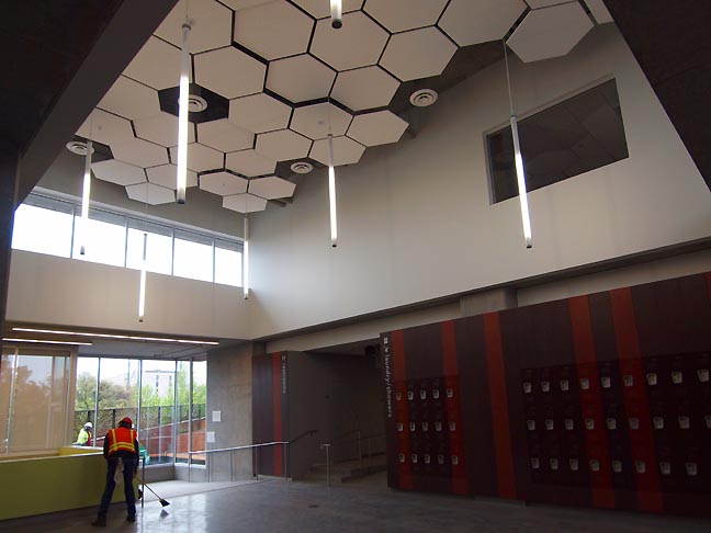 The Commons with lockers right around the corner from showers etc. in the Day Use area. The RAC designed by Holst Architects is perhaps the boldest exterior architectural statement for a building in the city core since Graves' disastrous Portland Building put the city's downtown into a passive aggressive design coma for over nearly two decades...(more) Posted by Jeff Jahn on June 02, 2011 at 16:35 | Comments (1) PermalinkMonday 04.25.11 CRC design decision, do or die? it looks like die Governors Gregiore and Kitzhaber are about
to announce the type of bridge they hope to build for the Columbia River Crossing.
If it isn't a cable stay design, I predict it will be stopped. If it is a cable
stay it will still face intense pressure.
 Cable Stay Design, which was not chosen. Update: And in a dark day for Oregon and Washington they have chosen the composite deck truss design, for cheapness and alleged expediency sake (never a good idea on a 3+ billion dollar project). Expect Oregonians to rally against this (the cable stay design was superior in terms of seismic survivability and with less piers had a smaller environmental profile in the water). Also, the cable stay didn't look gawd awful with zero appeal for pedestrians and bicyclists. Instead,... (more) Posted by Jeff Jahn on April 25, 2011 at 10:10 | Comments (0) PermalinkWednesday 02.09.11 Columbia River Crossing: Still Planning Blind 
Cable Stay CRC design (not in favor because of Pearson airfield interference) Since we have tracked the unspeakably difficult to track Columbia River Crossing bridge replacement project since the beginning we are due for an update. Last week Governors Christine Gregoire and John Kitzhaber (the two people with the most say in this project) rejected the ridiculously bad open box girder design and are considering three other alternatives. As of yet there is no serious designer attached to the project, simply a set of engineering options. This has been the greatest weakness of the project (which I've detailed in depth many times before). Simply put the project is extremely complicated and the CRC leadership is still looking at this as a series of standard solutions to a nonstandard project... (more) Posted by Jeff Jahn on February 09, 2011 at 16:10 | Comments (0) PermalinkTuesday 11.02.10 YU contemporary art center goes public 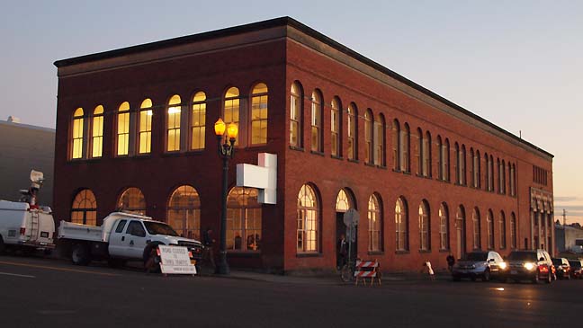
The Old Yale Union (YU) Laundry building in a bid to be the serious contemporary art center Portland has been wanting. The unveiling of the YU contemporary art center on November 2 in Portland felt both energizing and overly familiar. On the positive side an LLC holding company (under control of founders Curtis Knapp and Aaron Flint Jamison) already owns the building and seeks to transfer ownership of the former Yale Union Laundry building to YU (acronym for Yale Union) a 501(c)3 non profit arts institution. Located in the inner SE industrial district YU is in an ideal location. The team has already donated and carried out a feasibility study by BOORA, which requires 5-7,000,000 for build out and seismic upgrades (though 10-$20,000,000 seems much more prudent for endowing the programs). Yu already has some finished renovations like the impressive kitchen for major events. 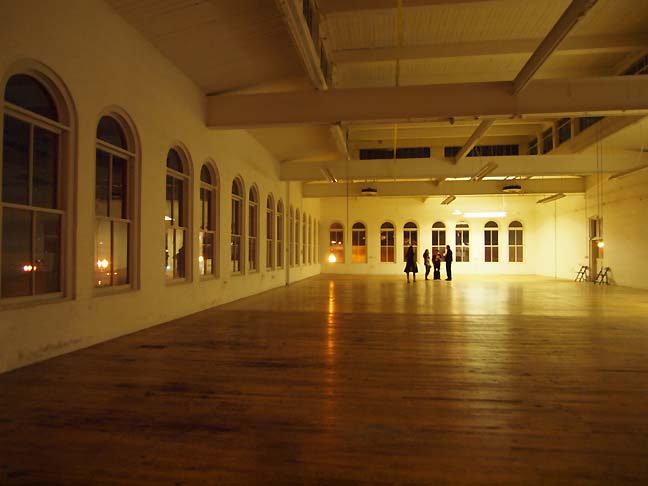 a mere 1/3rd of the main gallery space. The plan is multidisciplinary, with 14,000 sq feet of contemporary exhibition space, 4 artist residency spaces, a 100 seat auditorium/flex space... (much more) Posted by Jeff Jahn on November 02, 2010 at 21:19 | Comments (1) PermalinkFriday 10.01.10 OCAC reinvents itself with two new buildings 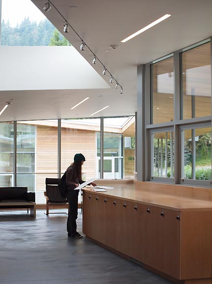 OCAC student using the Jean Vollum Drawing, Painting and Photography Building's custom locker/counter top built-ins (all photos Jeff Jahn) For starters, the 100+ year old Oregon College of Art and Craft has done something startling for such a small quiet school. Along with soaring enrollment that all art schools in Portland have experienced lately, they have raised 14.6 million dollars and hired international architects Charles Rose (of Boston) and COLAB (of Portland) to create the organs of change that will begin to fill out their ambitious 15 year campus building campaign. This signals the end of Portland's self imposed exile from commissioning outside design firms (a gun shyness resulting from the horrible ergonomics of Michael Grave's Portland Building) and this critic couldn't be happier... (more) Posted by Jeff Jahn on October 01, 2010 at 16:00 | Comments (0) PermalinkFriday 08.13.10 Clyfford Still Museum final design video 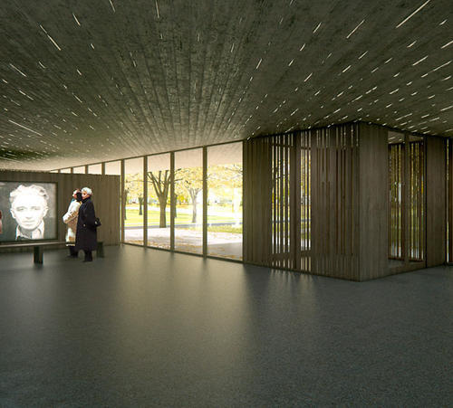 lobby view still (from video) of the Clyfford Still Museum In late July they finalized the design and now Denver's Clyfford Still Museum has released an excellent virtual tour of the building by Portland's own Brad Cloepfil. It's looking like it could be Brad's best design since the W+K headquarters and it doesn't hurt that Still is one of my favorite painters. Overall, Cloepfil seems to have balanced both light and heavy massings of concrete texture to produce a serious building designed to... (more) Posted by Jeff Jahn on August 13, 2010 at 11:03 | Comments (0) PermalinkFriday 06.04.10 Sneak peek at OCAC's significant architectural coup 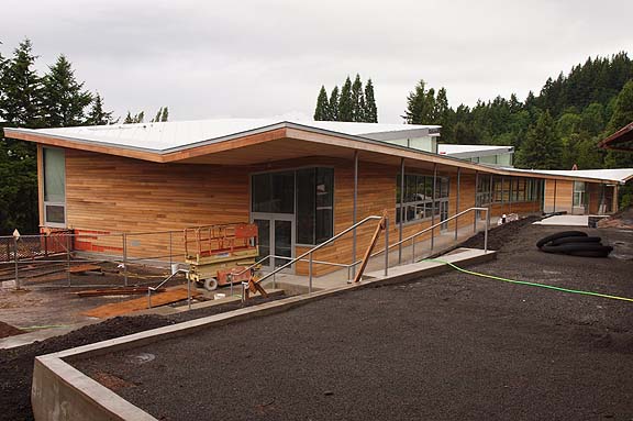 OCAC's new painting, drawing and photography building Though it's over a hundred years old the Oregon College of Arts and Craft has been one of Portland's best kept secrets. So in a bid to reinvent the college they have boldly undertaken a 15 year, 3 part master plan by BOORA, and kicked it off with what looks like a fantastic new building designed by Massachusetts based architect Charles Rose + local/international firm Colab with landscaping by Murase Associates. It's a new center for painting, drawing photography... with studios. Also, much more than simply a cool building; it asks the school and Portland in general to live up to even higher ideals of art, design and ecology. Great architecture and design challenges us and Portland as an innovative, high quality human scaled city deserves to be challenged.... (more) Posted by Jeff Jahn on June 04, 2010 at 14:00 | Comments (0) PermalinkWednesday 11.11.09 Transit Bridge Developments Nov, 2009 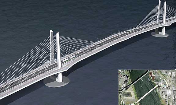 November 10, 2009 version of Willamette Transit Bridge Yesterday's WRBAC meeting was interesting and more fiery, at least compared to previous meetings. It's detail time and the design of the new Transit/Ped/Bike bridge iis coming along. I like its triangular towers and belvederes designed to minimize the airfoil vacuums that flat towers create (dangerous to cyclists and pedestrians). 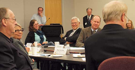 WBRAC Committee (foreground) Donald Macdonald and Anna Valentina-Murch (center and right background) I also liked that...(more) Posted by Jeff Jahn on November 11, 2009 at 18:59 | Comments (0) PermalinkFriday 09.25.09 New Designs on Portland 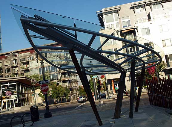 The design for the new leaf-shaped Rainwater Pavilion for the Tanner Springs urban wetland park in the Pearl District is pretty impressive. The pavilion designed by Herbert Dreiseitl (like the rest of the park) conjures "Space Elves" in my mind, something that would be hokey...(more) Posted by Jeff Jahn on September 25, 2009 at 11:30 | Comments (15) PermalinkMonday 07.06.09 Willamette transit bridge design developments 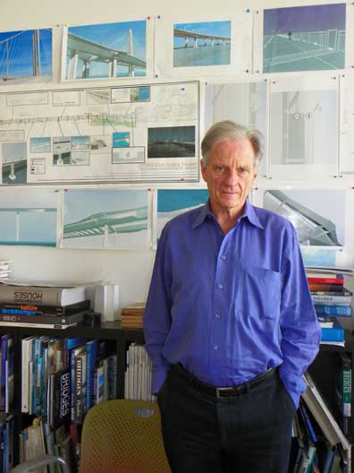 Donald MacDonald, the architect Trimet hired at the end of May to design the new multi-use transit bridge over the Willamette At the July 2nd design meeting we were introduced to a new architect with a serious reputation and a preliminary but exciting new inwardly canted tower design with decks that protrude for better pedestrian/cycle lanes, a rather extraneous proposal for a waterfall, the misguided idea that Portlanders identify with salmon as a color as much as the actual fish, potentially tacky attempts to soften the inherently angular cable stay design, talk of observation decks, more tower designs and numerous innovative strategies to improve the bicycle and pedestrian lanes.  a sketch for V style towers, which now seems out of favor.... (more) Posted by Jeff Jahn on July 06, 2009 at 9:30 | Comments (0) PermalinkMonday 06.22.09 Bridging some gaps in the discussion  Architect Donald MacDondald's "Refined" Cable Stay design, up for review today Once again, discussion of the Willamette river transit bridge has heated up in anticipation of today's meeting for the final choice of bridge type. In my opinion it isn't bridge type that matters... it is the detailing of whatever design chosen that will determine how usable, environmentally sensitive, pride inducing, and ultimately successful the design will be. To bring everyone up to speed... PORT pretty much started the civic discussion over this bridge with our totally unofficial design competition, later we broke the images of the rather nice hybrid design that now seems out of favor with the committees. Frankly, I like pure cable stayed designs, they have generally cleaner lines and can span longer distances which can make for a smaller environmentally footprint... but the details have to be good and the discussion around them needs to be relevant to produce sensitive designs. The stakes for this project are huge. In many ways Trimet and Portland's alt-city reputation as a green, civically progressive oasis in America is on the line. It's understandable but should Trimet really try to come in way under budget on what will likely be their most visible project ever?... (more) Posted by Jeff Jahn on June 22, 2009 at 11:00 | Comments (0) PermalinkThursday 03.12.09 Bridging design issues  New cable stay/suspension combo bridge proposal I've been wrestling with this new cable stay suspension bridge hybrid across the Willamette River for several weeks now and the designs went public last week. Im not exactly excited about this design but it's an intriguing alternative to the two pure cable stayed designs, both of which seem generic. Still, the effectiveness of the design varies depending on the view. 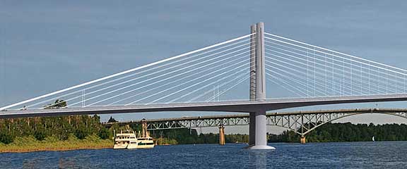 detail of hybrid bridge In profile from the middle of the riverr it looks very european and elegant, except that's not how most would experience the bridge....(more) Posted by Jeff Jahn on March 12, 2009 at 9:23 | Comments (0) PermalinkSaturday 10.11.08 Willamette Bridge Design Reactions 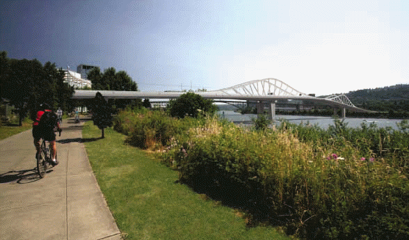
a prelimenary wave frame bridge design for the Willamette I'm certain PORT readers remember how we were dissatisfied with ZGF's preliminary design for the Willamette River pedestrian and light rail bridge and created our own design contest...(more) Posted by Jeff Jahn on October 11, 2008 at 22:35 | Comments (2) PermalinkFriday 03.21.08 Thinking about The Living Room at MoCC 
Ornamental Modern at MoCC January 2008 This weekend marks the last for the Museum of Contemporary Craft's The Living Room, which ends March 23rd. With a novel cutaway layout, the show has had 3 different iterations, Mid-Century Modern, Ornamental Modern and the current Eco-Modern. My favorite is the current Eco-Modern, which sports a great 1970's weaving by Mike Walsh and an excellent Peter Voulkos or 2. Lately with Dwell, Ikea, Design Within Reach and the mass appeal of Target's ad campaigns, modern design has enjoyed a pretty amazing resurgence. One of my favorite baristas refers to Dwell as yuppie porn but I think curator Namita Wiggers is going beyond the "simplify your hectic life" dream that seems to be fueling the interest. Instead, she looks at the links between craft and modernist furnishings and how the modernist aesthetic was mostly a "truth in materials and production" movement. She also mixes the new with vintage. Here are two of my favorite living rooms: ...(more) Posted by Jeff Jahn on March 21, 2008 at 11:15 | Comments (0) PermalinkTuesday 02.12.08 PORT's Bridge Design Contest: Awards 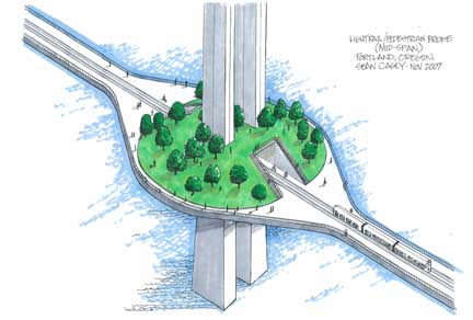 Sean Casey's elegant design Sure the cost for a new light rail and pedestrian bridge is high, this should be expected as transit projects are never cheap but if Portland gets a new bridge over the Willamette it should embody the green and design ideals that Portland holds so dear...(more) Posted by Jeff Jahn on February 12, 2008 at 12:07 | Comments (0) PermalinkWednesday 12.26.07 2 New condos for the Pearl District: it's design review time 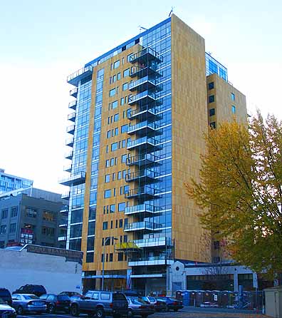 The Casey Ive been waiting for a slow week to discuss these two new condos in the Pearl District. Neither is a product of of the design deficient, "let's put brick on a 10+ story building to warm it up," school of thought. First is The Casey, which is the first residential condo to sport a LEED platinum rating so it's very green conscious... (more) Posted by Jeff Jahn on December 26, 2007 at 15:09 | Comments (4) Permalink |
| s p o n s o r s |
 |
 |
 |
 |
 |
 |
 |
 |
 |
 |
 |
 |
 |
 |
 |
 |

|
Site Design: Jennifer Armbrust | • | Site Development: Philippe Blanc & Katherine Bovee | |

