
|
||
|
Portland art blog + news + exhibition reviews + galleries + contemporary northwest art
|
||
JSMOA's Crimson Cube at WSU 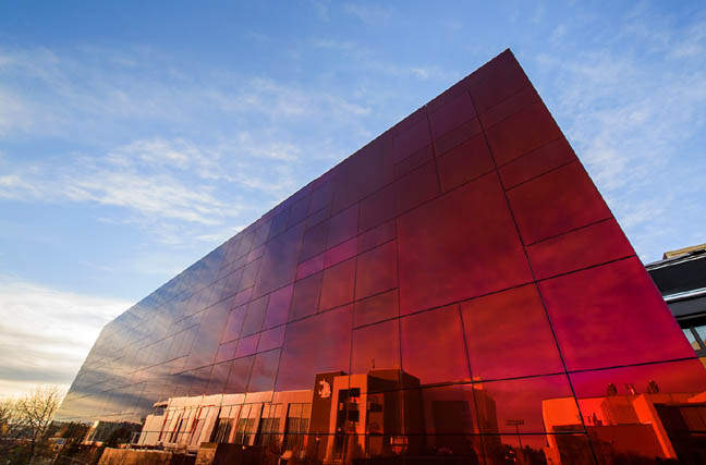 the new "Crimson Cube" at WSU (photo Bob Hubner) A little over a week ago I was fortunate to catch the opening of the new Jordan Schnitzer Museum of Art at Washington State University in Pullman. Nicknamed the "Crimson Cube" for the structure's exterior it gives students and other visitors a landmark to navigate by. It is a nice touch since so many other University art spaces are hard to find and seem tied only to art departments, which often have little pull on campus politically and makes the susceptible to cuts. No problem with that here because the cube is intentionally at the heart of things at WSU. 20 years ago this sort of reflective glass structure would have read as corporate but the cantilever that is subtly off other building's grid axis and the red color are distinctly more curious than an office tower's comportment. The overall effect is, "what is that?" and the JSMOA's comparative minimalism recalls David Chipperfield's excellent library in Des Moines. That curiosity prompt is a good place to start for any art museum and has its roots in Robert Smithson's mirrored displacement works without the specificity that Art has. That is left for inside. 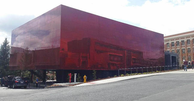 The skies over the JSMOA influence how extroverted the building behaves and its branding is low key, prompting questions. What's more this cube is the only art museum for a large area, making the facility crucial, not just to the college but for younger students. Think of it as a lighthouse for those looking for a different perspectives. At a time when so many Universities are shortsightedly phasing out art exhibition spaces this is another of many university museums (eponymous or otherwise) that Schnitzer has made a focus of opening or expanding. Disclosure, the Jordan Schnitzer Family Foundation is a PORT sponsor but all should know he puts no pressure on us... if anything we both seem to have a distinct ken for museums far from major art cities and the role they play in society. What is special at WSU is the way the structure and staff have activated its spaces, in stark contrast to the way a lot of new art spaces are trying to out "humblebrag" each other with "engagement nodes" that always feel like institutional footnotes and token gestures at things that happen better elsewhere. Here the museum is one big unmistakable edifice of engagement with its red reflective surface (a nod to Anish Kapoor?) and still operational garage door bays that say come on in. The cube area contains the controlled and pristine exhibition spaces that aren't undercut with engagement gimmicks... it promises, "Im a museum experience" with all the heightened sensibilities that entails and it delivers inside. Outside, its just a big mystery that asks to be unwrapped. Technically, it isnt even a true cube... in the tradition of college nicknames it's more of a fond familiarizing gesture and not official. 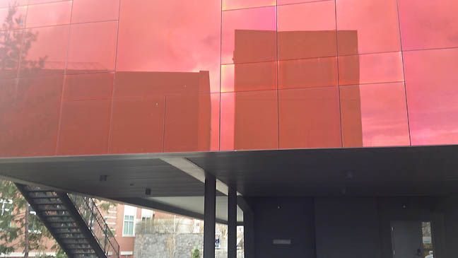 The Anish Kapoor-like red reflective surface breaks up the visual monotony of brick and concrete on WSU's campus. The cube itself is off axis from the campus grid ensuring that passers by will notice the optical effect. Simple and effective it doesnt try to be Art. I like it when architecture knows its place but operates boldly without hubris. This cube isnt trying to be the fanciest museum either and doesnt write any checks outside that it cant cash inside. Of course crimson is one of Washington State University's colors, so the heraldry is appropriate. 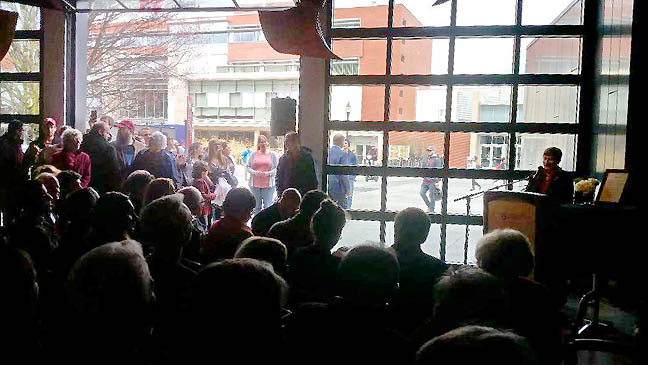 JSMOA Interim Director Anna-Maria Shannon at the dedication utilizing the pavilion space. It is a former campus safety garage that still sports a roll up garage door. I like how this choice to retain a garage removes barriers and is open for various programming. This lack of pretension was just right for a campus museum and I expect that many attending had just strolled in during Mom's Weekend. 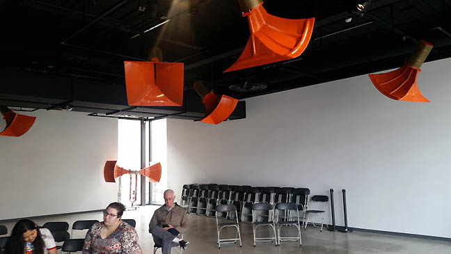 Another view of the garage pavilion which has a permanent Trimpin interactive sound sculpture. I am not much of a Trimpin fan but this one called Ambiente432 works well. When the space isnt in use by a speaker it subtly fills the room with curious oscillations while its bright orange baffles seem to pronounces the opportunities that open, flexible space proposes. What's more I love this very open site specific use of art in a museum. The horn flanges themselves seem to prime viewers for the other galleries, listen and look is a fine way to welcome students and the community. Rarely does semi-public art work this well. 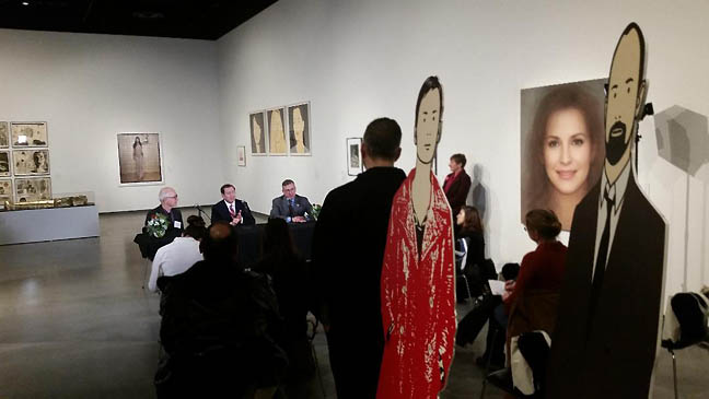
Press briefing in the Person(a) exhibition in the Harmon/Wright Gallery I like how Schnitzer and WSU brass sort of integrated themselves into the installation for the press. Schnitzer was quick to point out that though his name is on the institution and his collection is featured for Person(a) he's hands off on programming. Person(a) itself is a great introductory show... featuring portraiture from everyone like Warhol, Beuys, Julian Opie and Richard Prince. The exhibition is a nice encyclopedic show and very well installed. Frankly, this University Museum did a much better job hanging its inaugural exhibitions than most major museums. That added extra effort to play strength against strength as far as pieces go made works and the various shows speak to each other. Curatorial students were involved in picking works for the show too. The question is can they keep it up? Speaking with the director and staff they seem to know the strains and are keeping shows up for 6 months. Its a good move as high turnover usually just leaves exhibition spaces succumbing to the demands of changeover grind rather than the thoughtful presentation of work. 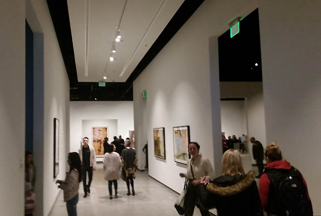 The Great Hall features prints by Jim Dine who gave the University over 200 works in anticipation of this museum. Years earlier his Technicolor Heart sculpture was installed prominently on campus (the Walla Walla Foundry is just over 100 miles away). This way the heart sculpture is no longer some orphan art outpost on campus and in many ways helps visitors find their way to the museum. Art works though persistence, it plays a long game and follow-though is crucial. I've always liked Jim Dine, though not so much his hearts but this has me rethinking things. Similarly, the way the "Grand Hallway" upon entering the formal museum galleries is actually treated as an important exhibition space with several Dine prints. The hall has a slightly dropped ceiling which upon exiting becomes taller. Its an old temple trick that Frank Lloyd Wright often employed and JSMOA architect Jim Olson admitted as much. Simple and effective the hall makes one's visit feel like a pilgrimage. So many museums are trying so hard to be relatable that they just feel like an inside joke the visitor is not in on. Here at WSU the visitor feels as if they have been expected and are being received... and cued that important things are to come. The large Harmon/Wright Gallery at the end beckons with a borrowed view of a walking Joseph Beuys print, which seems to say, artists are with you and of you. Nice install touch from curator Ryan Hardesty and its even more impressive since it had a lot of student curatorial input including; Mikah Chan, Alyssa Zili Chang, Taylor Hill, Lindsey Hineman, Aaron Hulburt, Jennifer Ladwig, Sidney Murphy, Sanaya Nordine, Julia Preston, Megan Rowe, Alex J. Scott and Isak Sullivan. 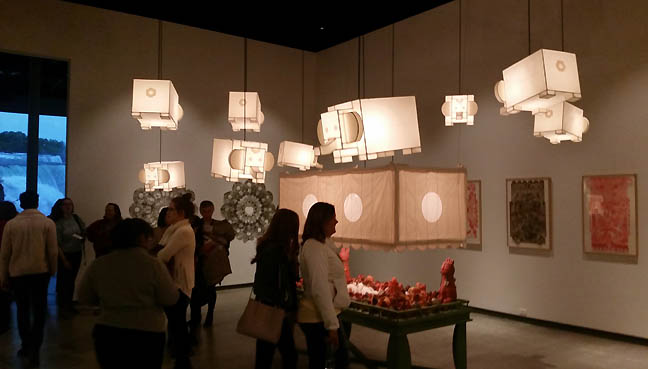
In the two smallest galleries were selections from the True's video art collection and a solo show from Jeffry Mitchell titled The Death of Buddha. Mitchell is one of the Northwest's most talented and prolific artists and that sometimes works against him as he gets spread thin. Not here, DoB is one of his finest outings in recent memory. Particularly, it is the juxtaposition of heavy clay and light lanterns that dance above the viewer's heads that makes it work so. Even the contrast of light and dark makes it special, more like a festival than an art show. As the Buddha might say, "Be a light to thyself," indeed. 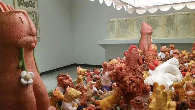
According to lore the Buddha dies achieving a state beyond nirvana and enlightenment and here Jeffry Mitchell turns an otherwise solemn death into a celebration. It isnt easy to make such a touching exit out of cartoonish bunnies, bears and chickens but Mitchell manages to give it the right blend of gravitas amid an overwhelming sense of celebration. The great artist Paul Klee taught at the Bauhaus that to master composition one first had to master gravity. In Death of Buddha, Mitchell's floating elephants illustrate how effective this advice can be. 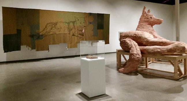 Similarly, Marie Watt employs animals to bring up touching sentiments. Her Companion Species (Underbelly) series exhibition in the large Creighton Gallery is ambitious and convincing. I would argue it is her strongest show to date and her most realized body of work overall. Her use of the Capitoline Wolf hearkens to the origin stories of Rome but other works are more personal. Like Mitchell's show, animals are relatable mythical proxies for more human tales. The hanging blankets make the central sculptures feel more activated, compressed but not smothered. 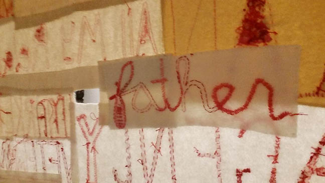
The back side of one of Watt's large blanket hangings recalls filial origins. Overall, a great way to approach students who are just finding their way in the world. I often see Watt and Mitchell in Northwest museums, but this was just a better more fully formed effort from both of them. 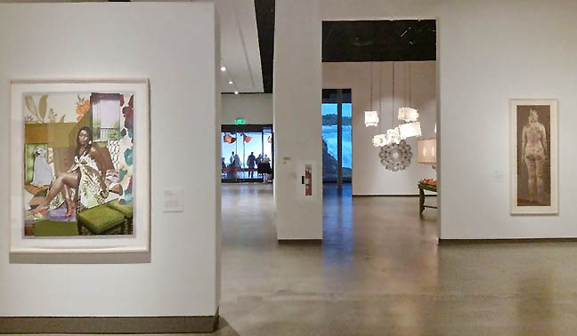
Overall it is the way all of the exhibitions speak to each other and glimpses of Mickalene Thomas with Jeffry Michell and Jim Dine in the background make it invigorating even for a seasoned viewer like myself. For a student viewing an art exhibition on their own for the first time I can't think of a better university museum hang. Question is can they sustain this? Art is a long game. That said this new museum opens up WSU's old main exhibition space for other types of shows, currently a student curated look at the University's permanent collection. Let's hope that the new Schnitzer Museum at Portland State University can follow in the same direction... PSU's Littman gallery is student run and seems to be constantly threatened with being ended, despite being consistently one of the best exhibition spaces in Portland for decades. 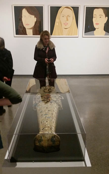 Let's conclude with a witty corner of the Person(a) show where the curators (some are students) point out the heiroglyphic cross talk between Jane Hammond's Spells and Incantations and Alex Katz behind) among other contemporary works. Walk like an Egyptian indeed. Everything here makes for an auspicious debut and there is something about student curators who are more refreshing than most major museum curators in coordination with WSU's professional curatorial staff that makes this crimson cube an exciting addition to the campus and sets new standards for art museums in the Pacific Northwest. There's none of the counterproductive airs of the infamous "Seattle Chill" here or the the equally inconsequential humblebragathon or "Portland Polite" on display here at WSU (despite featuring solos exhibitions from artists hailing both of those cities). Instead, there is a genial and elevated sense of discovery at the JSMOA at WSU. Salutes to the Palouse and everyone involved with this project, every art institution on the planet should pay attention to how this was executed. Take a bow WSU's Crimson Cube, now continue at this level of execution and openess... Posted by Jeff Jahn on April 18, 2018 at 9:00 | Comments (0) Comments Post a comment Thanks for signing in, . Now you can comment. (sign out)
(If you haven't left a comment here before, you may need to be approved by
the site owner before your comment will appear. Until then, it won't appear
on the entry. Thanks for waiting.)
|
| s p o n s o r s |
 |
 |
 |
 |
 |
 |
 |
 |
 |
 |
 |
 |
 |
 |

|
Site Design: Jennifer Armbrust | • | Site Development: Philippe Blanc & Katherine Bovee | |

