Portland art blog + news + exhibition reviews + galleries + contemporary northwest art

recent entries

Enrique Chagoya Interview
January Review Roundup
2019 1st links
2018 Summary
End of 2018 Links
PNCA + OCAC Merger Off
Loss of Material Evidence at Hoffman Gallery
Hoffman Gallery Changes at Lewis and Clark?
1st Weekend Picks
Meow Wolf The Movie
Giving Thanks Readings
Meet RACC's new leader Madison Cario

recent comments

categories


Book Review
Calls for Artists
Design Review
Essays
Interviews
News
Openings & Events
Photoblogs
Reviews
Video
Links
About PORT

regular contributors


Tori Abernathy
Amy Bernstein
Katherine Bovee
Emily Cappa
Patrick Collier
Arcy Douglass
Megan Driscoll
Jesse Hayward
Sarah Henderson
Jeff Jahn
Kelly Kutchko
Drew Lenihan
Victor Maldonado
Christopher Moon
Jascha Owens
Alex Rauch
Gary Wiseman

archives


Guest Contributors
Past Contributors
January 2019
December 2018
November 2018
October 2018
September 2018
August 2018
July 2018
June 2018
May 2018
April 2018
March 2018
February 2018
January 2018
December 2017
November 2017
October 2017
September 2017
August 2017
July 2017
June 2017
May 2017
April 2017
March 2017
February 2017
January 2017
December 2016
November 2016
October 2016
September 2016
August 2016
July 2016
June 2016
May 2016
April 2016
March 2016
February 2016
January 2016
December 2015
November 2015
October 2015
September 2015
August 2015
July 2015
June 2015
May 2015
April 2015
March 2015
February 2015
January 2015
December 2014
November 2014
October 2014
September 2014
August 2014
July 2014
June 2014
May 2014
April 2014
March 2014
February 2014
January 2014
December 2013
November 2013
October 2013
September 2013
August 2013
July 2013
June 2013
May 2013
April 2013
March 2013
February 2013
January 2013
December 2012
November 2012
October 2012
September 2012
August 2012
July 2012
June 2012
May 2012
April 2012
March 2012
February 2012
January 2012
December 2011
November 2011
October 2011
September 2011
August 2011
July 2011
June 2011
May 2011
April 2011
March 2011
February 2011
January 2011
December 2010
November 2010
October 2010
September 2010
August 2010
July 2010
June 2010
May 2010
April 2010
March 2010
February 2010
January 2010
December 2009
November 2009
October 2009
September 2009
August 2009
July 2009
June 2009
May 2009
April 2009
March 2009
February 2009
January 2009
December 2008
November 2008
October 2008
September 2008
August 2008
July 2008
June 2008
May 2008
April 2008
March 2008
February 2008
January 2008
December 2007
November 2007
October 2007
September 2007
August 2007
July 2007
June 2007
May 2007
April 2007
March 2007
February 2007
January 2007
December 2006
November 2006
October 2006
September 2006
August 2006
July 2006
June 2006
May 2006
April 2006
March 2006
February 2006
January 2006
December 2005
November 2005
October 2005
September 2005
August 2005
July 2005
June 2005

contact us


Contact us

search


syndicate


Atom
RSS

powered by


Movable Type 3.16

This site is licensed under a


Creative Commons License

Wednesday 02.28.18

« Pertinent links | Main | First Thursday Picks March 2018 »

Travelogue look back at 2017

To describe 2017 as the most intense of years does not begin to do it justice. It was a year of upheavals... and the death and births of many things (my father and many others included). 2017 was also the year I logged the largest # of travel miles (all without leaving the USA or even visiting the East Coast from my West Coast base in Portland Oregon). Every time I turned around I was either unpacking or preparing for another sojourn. But now as 2018 is now solidly under way I'd like to revisit many of the most memorable things I saw and why... what is travel after all if you can't think back and take stock?

A few caveats: I've left out the art fairs (seen one you've seen em all), tours of some of the best private collections in the country (privacy, even when collectors are showing off? ...sure) and studio visits (because those are private). Instead, I'm focusing on formal exhibitions because somehow those formalities felt like the true face of things. That was 2017 and it felt very formal like a courtroom, funeral or wedding... setting the tone for a 2018 where the stakes are suddenly clearer than any time I can remember.

SerraNasher_sm.jpg
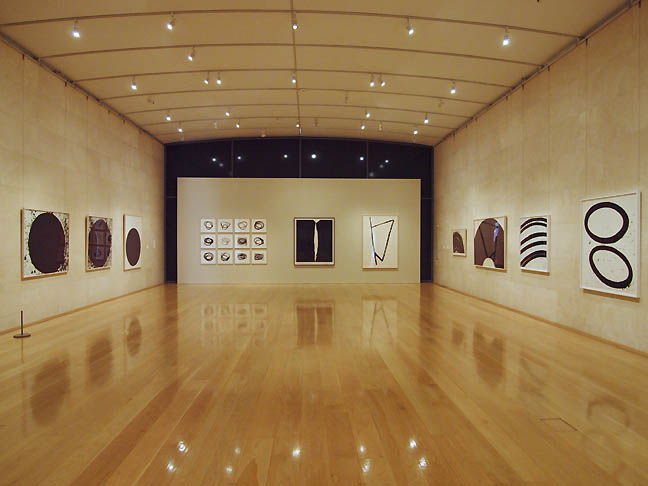
Richard Serra Prints at Nasher Sculpture Center, Dallas Texas (all photos Jeff Jahn)

One of the very best things I saw was also one of the first. A Richard Serra print show at the Nasher Sculpture Center in Dallas. This was the first time 2D work has been displayed in this gallery designed specifically for sculpture. The image above shows just how powerful and ideal it was. Imagine an ivory colored cathedral festooned with black forms that acted almost like music notation on the page. The hang turned the room into an instrument. The prints have such presence and the travertine marble walls designed by Renzo Piano gave an intense papyrus-like contrast without losing spatial cues such as mass/gravity like those ubiquitous white walls do. I realized here why I hate drywall, it disguises its mass. Instead, it felt more like a romanesque cathedral than yet another nameless white box exhibition hall. When not full of visitors the prints felt like black robed friars or priests. The works all came from Jordan Schnitzer's collection (yes yes a PORT sponsor, but I single this show out this because it was truly inspired and in the perfect setting).

Overall, the exhibition felt extremely visceral, almost sacred... which is where a lot of prints are handicapped in comparison to other forms like sculpture and installation art. Those other forms inherently claim territory, whereas painting and printmaking require a certain reliance on the wall. Later in the year I was able to tour Gemini G.E.L.'s facilities in Los Angeles with Serra's primary printmaking collaborator and I'll be publishing that interview in the coming month or so. I'm still catching up from 2017's schedule and events and this post is just the outside of Portland portion.


serra_det_sm.jpg
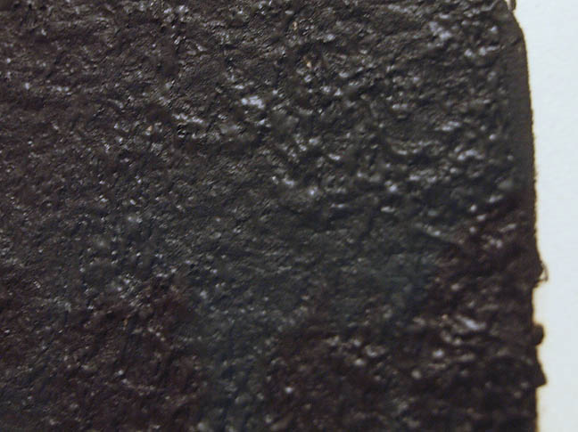
Serra print (detail)

What I learned in Dallas was how Serra's prints feel almost geological in their mass and texture as a group, like continents in an ocean (normally I'd just see one or two of them at a time). It makes sense as the planet's foremost living sculptor seems to harness things we all take for granted like gravitational pull, mass and the way materials absorb light so why not tectonic plates? The show had a magnetism to it that was stronger than even some of Serra's sculptural works Ive seen at Zwirner... I kid you not... looking at these I am reminded how it is the iron in human blood that makes it red. In these prints the highly worked surfaces act like visual magnets that make me aware of my heart pumping liquid ferrous material through arteries and veins. The surfaces of Serra's sculptures are less emphasized and in many ways these prints hearken back to the sculptors early days of throwing lead.


Weber2_sm.jpg
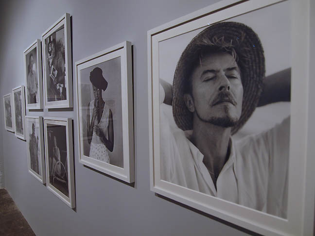
Bruce Weber at CCA Dallas

Another one of the most memorable exhibitions I saw was Bruce Weber's photography at the CCA Dallas. The largest museum exhibition of Weber's work ever mounted he is more known for his work in fashion magazines. Here Weber's often travel tinged photographs absolutely hold up to sustained exhibition viewing without any annoying fragrances from a magazine. What I like about these photos is they don't seem to sell anything except elan vitale and an unhurried mood. It's true, to have time is the greatest of luxuries, just talk to any elderly person. Sure there are lots of famous people and the obligatory models cavorting but there is something powerful here. A world of genuinely magical moments encountered in travel. A dream like relief from the daily drudge that is a powerful. These aren't some Elysian Fields though... often there is a sense of intimate moments here... a reverie that comes from breaking routine.


Weber_dallas_sm.jpg
CCA Bruce Weber (install view), David Bowie and Iman photos

In particular the photo of David Bowie and Iman meeting Nelson Mandela alone is amazing (see here, and scroll down). Bowie seems massively honoured and giddy... Iman has infinite poise and Mandela comes off like the coolest person who has ever lived, giving Bowie some tips on being cool knowing full well how funny that is. Its a study in self-awareness and just reveling in the moment... it would be great even if the subjects were not who they were.


Labomba_sm.jpg
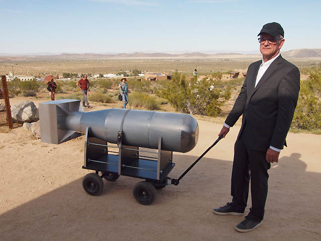
Stephen Whisler, Walking the Bomb at the 2017 Treenial, Joshua Tree California

Later I visited Joshua Tree California for their Treenial weekend art festival. They have only staged the event twice and it feels approachable and relaxed event, not some overheated art market throwdown (all the heat is provided by the very real desert). I found it easy to strike up a conversation and I was particularly impressed with Stephen Whisler's Walking the Bomb piece. As paripatetic performance sculpture the desert environment only enhanced the implied threat... and the artist, dressed as if hes going to either a funeral or refereeing an event presented a perfect set of mixed messages. One criticism, much of the other work seemed like it lacked scale or concentration though... more like an gypsy camp that went to art school (there is a charm to that). There was also an ad hoc aspect to much of the work, which lacked a sense of durability, though I can say the same for most contemporary art today. Overall, the sense is that the Treenial could distinguish itself further and I suspect it will. It felt homey, like a family reunion cookout and that is something rare in contemporary art these days.

Treenial_black_SM.jpg
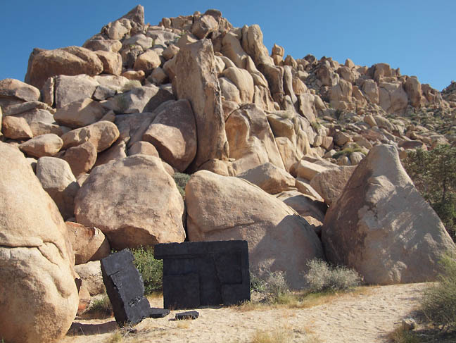
Red Shift, Sonja Schenk for the 2017 Treenial

One piece that definitely didnt feel ad hoc or lacking in scale was Sonja Schenk's Red Shift. A bit like a burnt out fortification next to a hill of Joshua Tree boulders one had the sense that this could be a weapons test site or a drug lab that that was melted in some horrible accident then put in a car crusher. The black object is actually infrared painted, opening up further viewing options at night time as the rock absorbs heat energy during the day, releasing it at night. It also felt like a 3rd cousin to Richard Serra's work, with an enhanced air of mystery. Art in the desert really shouldnt feel familiar and this definitely felt like a visitor from another planet, the remnants of a secret lab and perhaps some dark magic cursed site. I'd call that a success. Overall, the Treenial isnt as big a production as things you find in Santa Fe or Marfa but it feels like a beginning.


KJM_Moca_sm.jpg
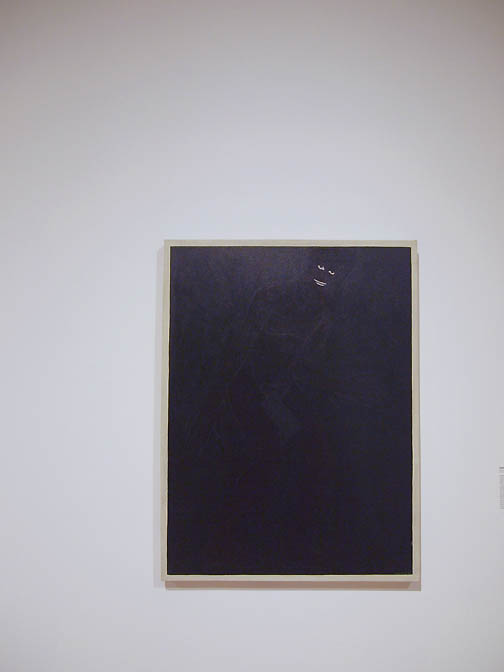
Kerry James Marshall. Invisible Man, 1986 at MoCA, Los Angeles

The Kerry James Marshall Mastry exhibition at MoCA was extremely memorable. In particular, I found some of the earlier work to be a peak experience... especially the painting Invisble Man. It is simply more subversive and edgier than the later works... which were good but felt like more like postcards illustrating liberal ethics or at least scenes they would applaud. That isnt Marshall's fault, as those early works would be difficult to just pump out now that he's successful. I like those later "postcards" but I live in Portland, where everyone is trying to collect those kinds of ethical values merit badges and display them, whereas Invisible Man implicates the viewer... gives us some hell. It is simply more challenging and powerful. I applaud Marshall's overall success with this show but there is something about the stark invisible man that says... you arent ever going to see me, dont think you can. That's a strong work, best painting relating to race of the 20th century... so good it took till the 21st century to get its due.


Sterling_ruby2_sm.jpg
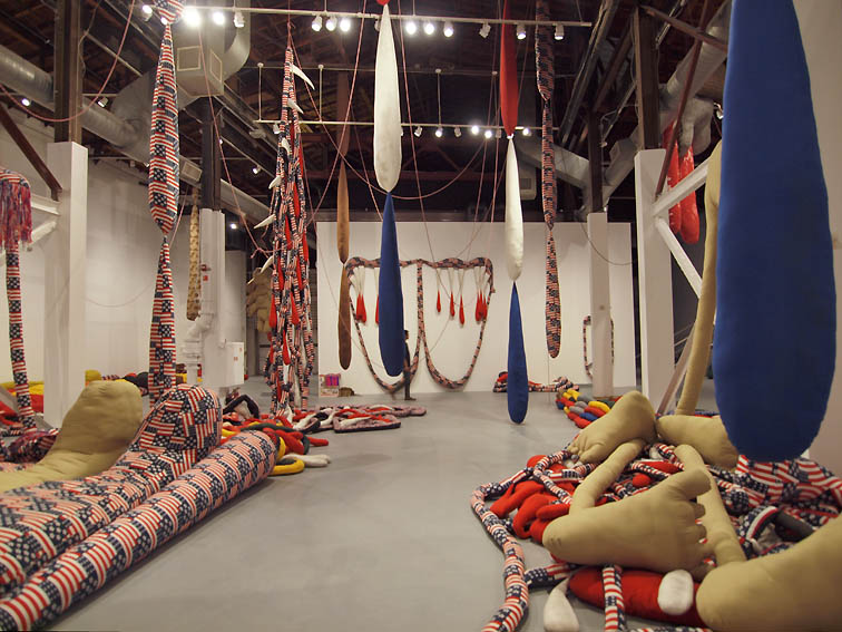
Sterling Ruby at Geffen Contemporary. MoCA

Another strong thing was Sterling Ruby at the Geffen Contemporary... I liked this much better than the grotty ceramics that the art market loves. Instead, this was a warehouse playground of seemingly misplaced patriotism... it felt akin to the times. Big toys, not grown up... a playground for some giant patriotic vampire baby in diapers. I preferred it to the Carl Andre show. I love minimalism but somehow Andre is better in smaller doses... it ceases to be minimal when there is that much of it. I prefer Judd, Flavin and Irwin... Andre is more controlling than those other artists but the Zinc plate works still held up, the blocks and bricks felt more like a spent force when seen with other similar works. Overall, there was something about Ruby's use of the Geffen's warehouse that felt spot on that a slicker museum space would not have... there was a sense of storage and the passage of time... a more underground presentness that a warehouse affords. In a slicker more finished museum like MoCA just blocks away it would have simply felt like a rich person's toy collection. Not so here so MoCA gets kudos for siting the work properly... less so for the Andre show.


huntington_install_1_sm.jpg
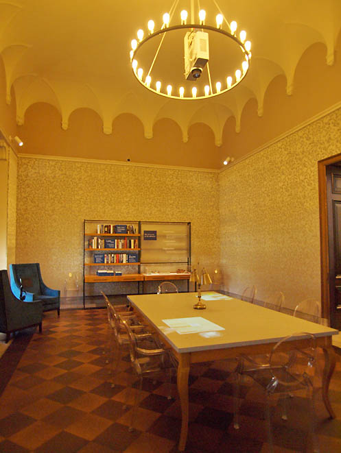
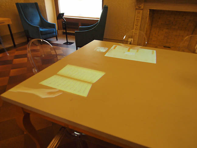
Across the valley in Pasadena at the Huntington I rather liked this site specific installation called Hand/Study by Kate Lain. At first it was hard to see it as anything but a side reading and receiving room.


Huntington_Installation_SM.jpg
Kate Lain installation at Huntington Library, Pasadena (detail)

This was yet another non white box piece the work replicates the typical goings on at the Huntington Library's archives through studying the hands of archivists. It felt practical and spectral at the same time in the richly appointed room with its golden light and upholstery. 2017 furthered my dislike of a standard white box gallery space for sure. It requires more intention from the artist and more work from the curator but just stumbling across this and having to ask if it is art or not gave the piece a head start in the race to artistic relevancy.

HC_Frankenthaler_sm.jpg
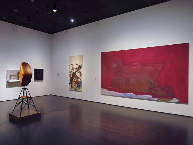
Over at Lacma I was disappointed with the installation of works from the permanent collection... this corner seemed to be filled with artists that curators have trouble with in the art historical cannon like Frankenthaler, Cornell, Louise Nevelson and H.C. Westermann. All artist I like but it made this felt like the odd corner of a yard sale consisting of artists who did things their own way (Frankenthaler never gave up landscape despite inventing post painterly abstraction). The cluster felt like a curatorial shrug? Ok maybe there is a thread of formalized surrealism here but that's a stretch... its a bad hang that says, we want a new building... we are gonna flail at this till we raise funds to do this better. If they wanted to be bold a Polly Apfelbaum a couple of rooms away would have tied it all together in a meaningful way but I just dont think most institutional curators are good at designing permanent collection exhibitions today... they are following the collectors not the work. It used to be that the permanent collection's hang was crucial.

Maholy_nagy2_sm.jpg

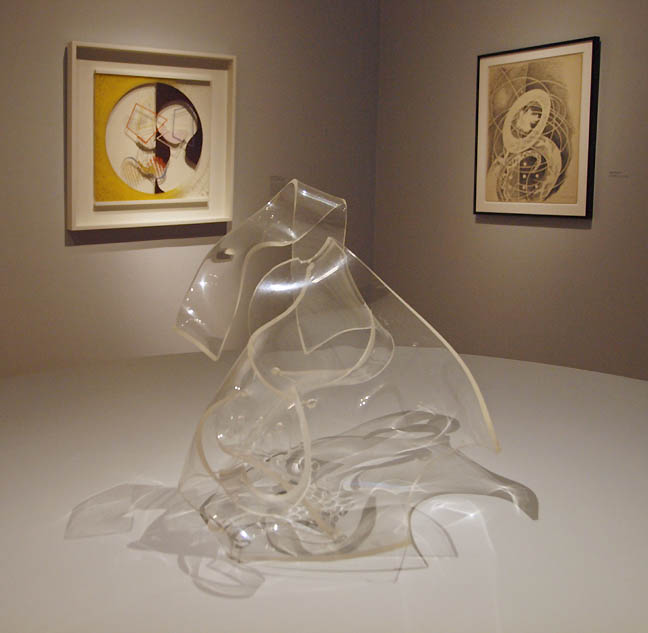
The special exhibition Maholy-Nagy Future Present at Lacma was much more rewarding than the permanent collection. An artist who didnt distinguish between Design and Art (that's possibly the true meaning of Modernism), who liked to work in most mediums felt energetic and inventive. His non painting works stole the show, while the paintings looked like studies for the sculpture and installations. It was an interesting reversal because the art market gives more value to the wall based works.


lacma_expresionist_Studies_sm.jpg
Wandering around in some of the Lacma buildings one does see the level of disrepair... perhaps the museum doesnt think to much of its expressionist studies program either? I do see the need for an overhaul and perhaps this proposed non-linear permanent collection hang will work?... but Lacma need to work a lot harder at it than what I saw.


Rhoades_sm.jpg
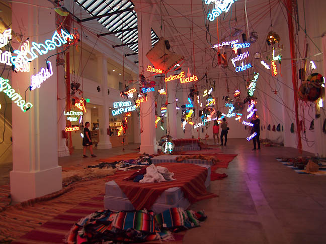
The Jason Rhoades show at Zwirner was like an old friend. Sadly, I was working on a show in Portland with Rhoades when he died in LA. What I liked was the way it made Zwirner's gallery seem like a gonzo Mexican restaurant. That's the thing about the stronger artists... they dont just take over and fill out a room... they re-focus space and make it strange and new. In this era where cultural appropriation has become a firestorm this work insolently sets brush fires... the fact is all cultures borrow and steal from each other and if the artists can't then nobody can. In some ways doing it like Rhoades is better than being earnest. It is a form of respect that some recent artists havent been as good at... an artist can appropriate, but they have to lay out all the cards, no half bets... and if there are institutional curators involved they better be prepared to present it as a minefield. Rhoades made minefields.

Blum_Poe_suga1.jpg
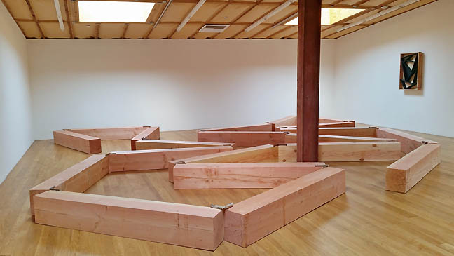
The Kishio Suga show at Blum and Poe was right up my alley and had not of the suffocating over controlled feeling of the Carl Andre retrospective at the Geffen Contemporary. This upstairs space felt more like an art treehouse than a gallery.

Suga1_sm.jpg
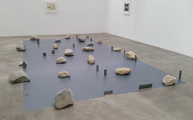
In the more formal galleries downstairs Suga's work still sparkled. The metal and rock works in particular had a jaunty sense of play and unfussy rhythmic invention. Like a floorplan for a rock garden or a very discreet ruin.

J_stoneware_LYW_sm.jpg
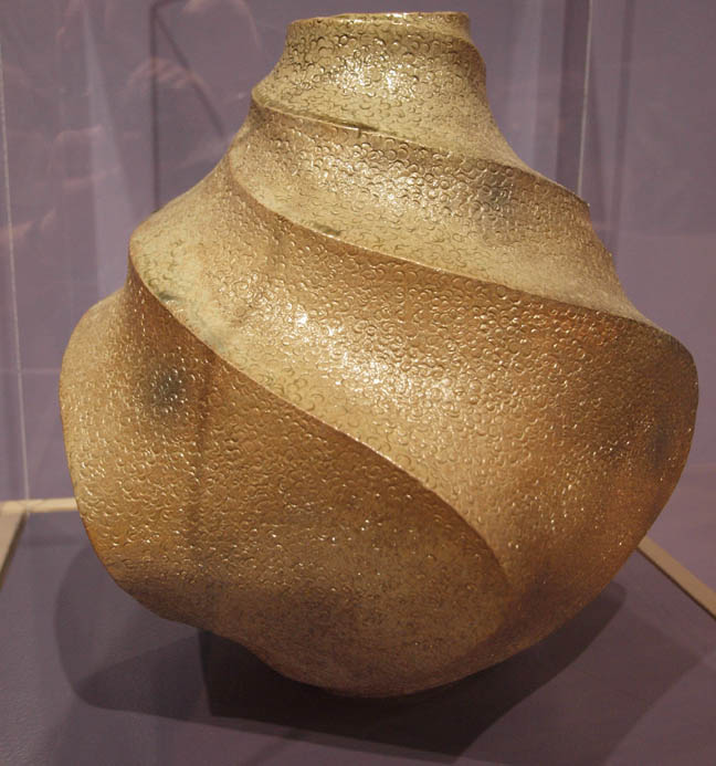
Later, when in the Midwest again I took in this interesting Japanese Pottery exhibition at the Leigh Yawkey Woodson Art Museum in Wausau Wisconin. As a child I lived just a few blocks away. The LYWAM is in an old lumber baron's mansion but they have expanded it a great deal. It is the only large scale art museum for hundreds of miles in Northern Wisconsin. The Japanese ceramic show was much like some of what i have seen at Portland's excellent Japanese garden but in this case all of the ceramics were contemporary... what I really love about the Portland shows is the way they are generational. Still, some of the contemporary ceramics were among the most unusual things I had seen in 2017.


Casa_Rinconada_chaco.jpg
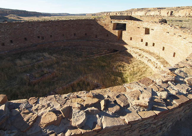
A few months after my Father's death I took a Southwest road trip with my Mother, for perspective. We visited the remote Chaco Canyon culture site in New Mexico and above you can see Casa Rinconada kiva ruin.


site_new_santa_fe_sm.jpg
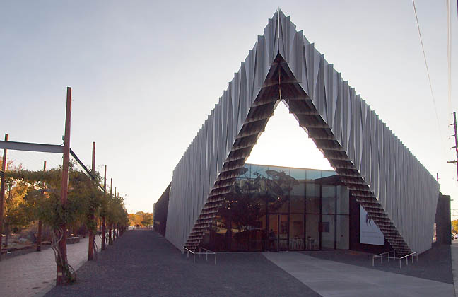
We also took in the newly reopened Site Santa Fe designed by SHoP architects. Basically it no longer has the warehouse feel of the old Dave Hickey Beau Monde Biennial and has replaced it with a slicker experience. Its likely more functional but it also ends an era when Site felt like it was the bleeding edge of things where things became a big deal. The renovation says, we are the establishment but still retain a certain edge... all through this kind of abrasive yet inviting new entrance. The new Site isnt utopian architecture from the outside, though on the inside its typical museum white walls.

Site_surveillance_sm.jpg
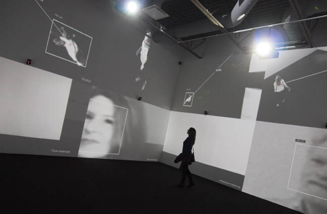
Zoom Room at Site Santa Fe

The opening exhibition Future Shock seemed to extend the architectural messaging with a long list of established somewhat apocalyptic artists like Tom Sachs, Andreas Gursky, Doug Aitken and Alexis Rockman but its the inclusion of Rafael Lozano-Hemmer's Zoom Room that really makes the show convincing. Zoom Room is an active artificial intelligence driven surveillance gallery. In it the visitor is observed even more than the work itself can be, an excellent and instructive inversion. Any time one hits the streets in places like New York or London we expect this same level of tracking but seldom do we get to see AI surveillance as it works.

Site_install_sm.jpg
Alexis Rockman's work fit perfectly into the dystopian/survivalist theme and Andrea Zittel's work was fitting as well. Still, I like it better when Zittel presents an environment rather than this sort of fashion/design display at Site. Here the museum room wasnt challenged and it felt like a missed opportunity to treat the white gallery box as another kind of desert to colonize and bring meaning to... they felt like trophies not settlements. Zittel has this pioneer on the futuristic present frontier aspect to her work and the presentation here missed its chance to push back at institutional role in presenting art. A curatorial misstep, at least Sach's work felt like a subversion of the white box gallery as it seems like packing materials become the art.

Monkey_kitty_sm.jpg
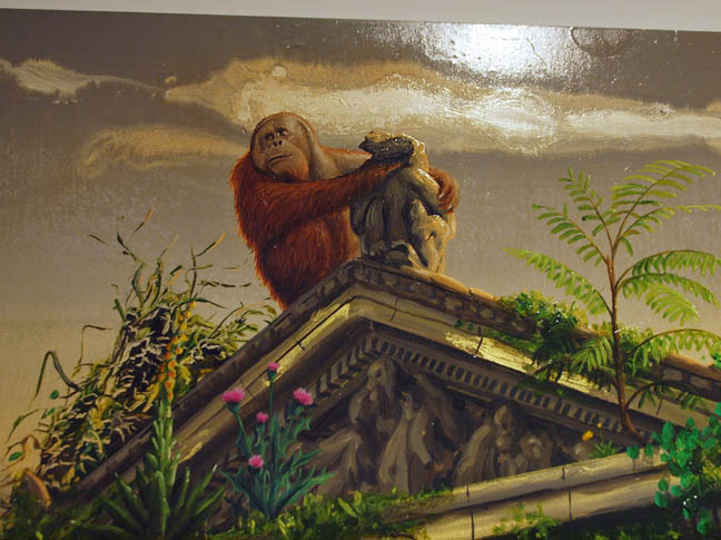
Alexis Rockman's large paintings didnt need to challenge the museumy feel (history paintings need museum walls) and I liked this portion of his version of the Bronx Zoo after the animals had taken over. The orangutan here is Rockman and he's holding a stone sculpture that is an homage to a beloved cat. Nice little easter egg there.

Ersnt1_sm.jpg
Max Ernst Tapestries at Peters Projects, Santa Fe

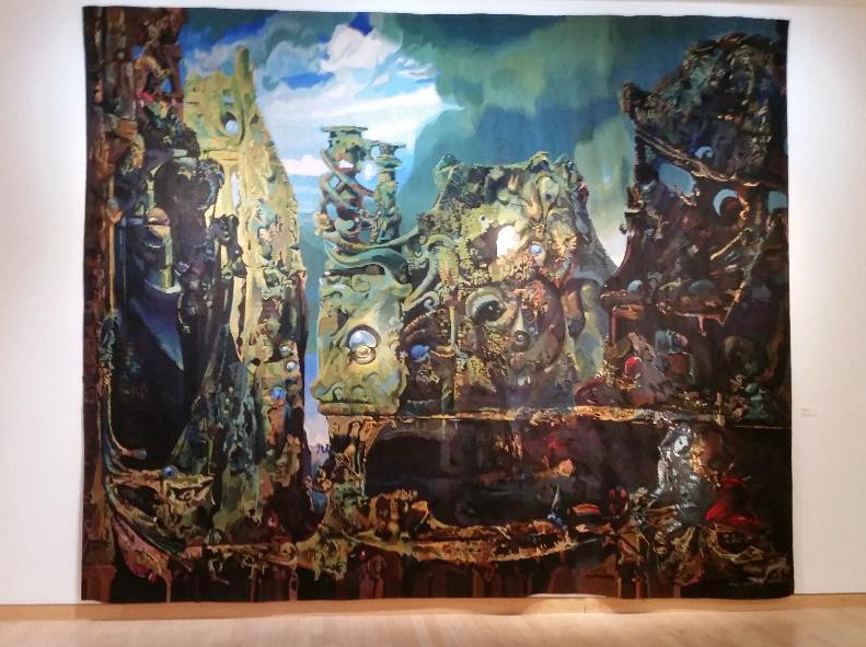
One of the best exhibitions I saw in 2017 was a Max Ernst tapestry show at Peters Projects in Santa Fe. Basically, a collaboration between Ernst and master weaver Yvette Cauquile-Prince I liked how multiples were produced of many of Ernst's early iconic paintings. In many ways they become stronger, stranger and obviously larger by translating them into another medium and it was an analougous to the way digital mediums translate visual sources into pixels. In this case the original source works felt like precious hidden secrets and rather occult but as large tapestries they are iterative and multiple... more open source, which is another nod to automatism and unconscious bubbling up rather than the will of the artist. Can one really own the unconscious? What is gained here is the way they become an entire engrossing world and far more tactile.

Ernst2.jpg
Max Ernst,The Eye of Silence at Peters Projects

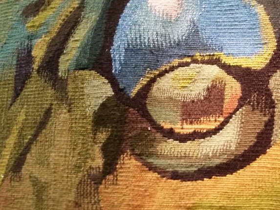
Viewable as a huge presence from a distance these tapestries are better than murals and the texture actually invites closer viewing that the comparatively smaller original paintings cannot. For example the original The Eye of Silence from 1943-44 at the Kemper is just over 56 inches wide, this version is over 12 feet wide and the weaving process acts as another surface intervention over the original decalcomania technique (also a way of achieving some automatism). What's more the tapestry's drape and furls of the fabric also have a more personal presence... instead of the slight of hand magic trick that one gets from surrealist painting techniques you get the methodical hand of the master weaver which makes the strange imagery even stranger. Like Jazz involving a weaver makes this iterative... Ernst becomes like a band leader like Count Basie and shows the power of the image itself.

Ernst_eye.jpg
The Eye of Silence (Detail)

Really this is no different than the way Marcel Duchamp commissioned copies of his most famous works, turning the art making process into an iterative one... similar to the way a musician can have a studio version of their music then perhaps a live version. These tapestries feel like the live version.


Meow_wolf_creature.jpg
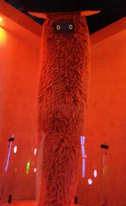
Another highlight was the Meow Wolf warehouse in Santa Fe. Bypassing the entire art world system of galleries an museums the artists took control of their work to fill an entire warehouse... which has become the #1 tourist attraction in Santa Fe.


Meow_wolf_couple.jpg
What's more two of my favorite Portland artists the married duo of Chelsea Linehan and Nathanael Moss both contributed to this collective confab. None of the artists are credited (keeps things focused on the collective and not market values or careers) but if you know their work you can suss out where they contributed. Overall, Meow Wolf is fun house surrealism but by bypassing galleries an museums they have essentially wrested distribution from notoriously political entities and given the artist's their agency back. Sure a lot of Meow Wolf is entertaining but ultimately their success could change the way museums and galleries tend to dominate art production. Putting power back in the hands of artists IS necessary.


abex_sm.jpg
I spent the last few days of 2017 in Chicago. I al still saddened at the loss of the Art Institute of Chicago's Abstract expressionism room where Excavation, greyed rainbow and Clifford Still's "Monster" painting all held court and a conversation together. Somehow these white walls and works no longer facing each other drains them all of the collective magic that was present in the old hang. True the two de Koonings do speak to each other now but that less interesting than Jackson Pollock, Still and de Kooning having it out. It is the difference between the Cedar Tavern and a tomb. There should be more constructive crosstalk between work at museums and for some reason its becoming a dieing art at a lot of the museums I saw in 2017.


AIC_Situation_sm.jpg
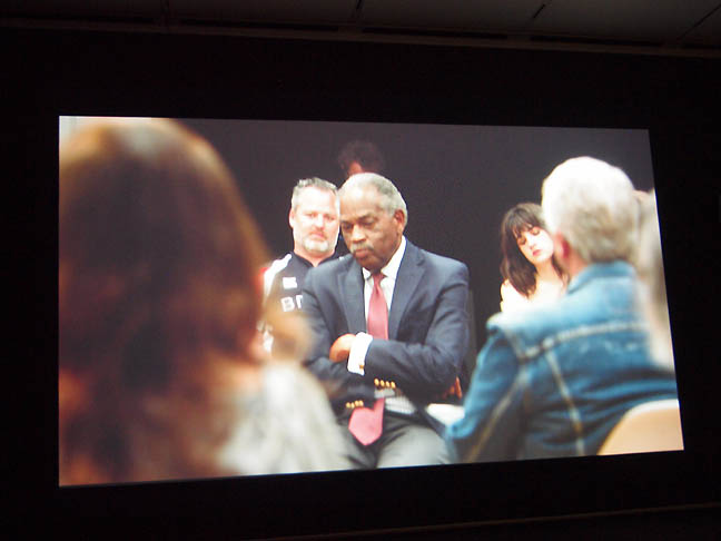
What was exceptionally strong at the Art Institute of Chicago though was Leigh Ledare's The Plot. A film of a conference put on by the artist in Chicago various individuals who explore their own worldviews. This lays bare the miscues and challenges of different types trying to communicate. The body language alone in each shot tells the tale... some were abrasive and dismissive, others measured and cautious... the wise and experienced held back while the reckless, curious and simply young got into the fray early. The way all of the people in the film jostled in unpredictable ways, while each "predicting" one another's stance was revealing. Take away, too much art and life is messed up by relying on assumptions. The best art keeps assumptions off balance and Leigh Ledare did a masterful job of capturing and editing this collision of worlds (without giving much indication of what they were discussing). This is the sort of probing artwork we never see in Portland... where it is going to be inherently contentious but in the interest of gaining real understanding. Instead, there is this "Portland nice" that usually leads to miscues that never get disabused. Overall, an impressive work on the difficult subject of race and class understanding. I complain a lot about institutional curators, including this museum but this was an exceptional decision. Bravo AIC, this was one of the last artworks I saw in 2017.


Posted by Jeff Jahn on February 28, 2018 at 9:36 | Comments (0)


Comments

Post a comment

Thanks for signing in, . Now you can comment. (sign out)

(If you haven't left a comment here before, you may need to be approved by the site owner before your comment will appear. Until then, it won't appear on the entry. Thanks for waiting.)


Remember me?


s p o n s o r s
Site Design: Jennifer Armbrust   •   Site Development: Philippe Blanc & Katherine Bovee