|
||
|
Portland art blog + news + exhibition reviews + galleries + contemporary northwest art
|
||
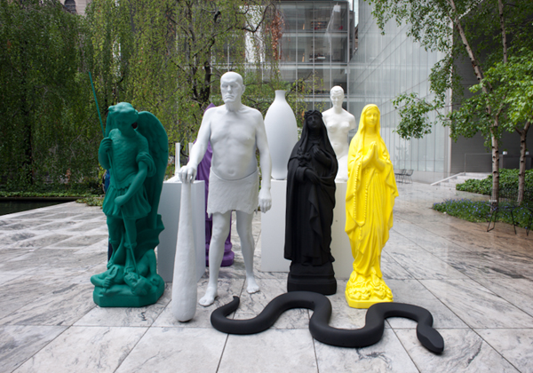
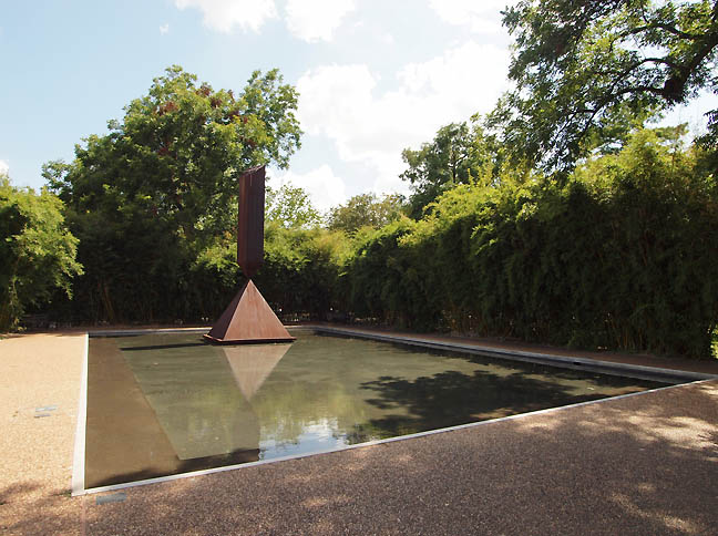
MoMA swamped?  Katherina Fritsch at MoMA's sculpture court The New York Times had another article on the rightly and much maligned MoMA expansion today. It is a complicated issue, how to make the museum more a citizen of the street it lives on while protecting the art experience? This issue is crucial because MoMA sets the tone for all other museums and the overcrowding of the sculpture garden would end the last great refuge for contemplation in an already overcrowded museum experience. Thus, MoMA's preoccupation with traffic flow sacrifices the art experience in all corners of the museum already, instead of creating eddies and pools of contemplation. Basically, if MoMA were a wetlands this ever more quickening stream would sacrifice the beaches and nesting grounds we more devoted art goers are most interested in! Sometimes good fences make good neighbors... and having very intentional and varied boundaries can succeed where monogenic strategies cannot. Let's look at perhaps the most successful modern and contemporary museum in the country, the Menil.  Barnett Newman's Broken Obelisk at the Menil The Menil was designed to create similar vistas and private nooks of contemplation one found at the Menil's own private home, with the addition of higher traffic corridors to accommodate the public nature of a museum. The results were astonishingly good and it has made Renzo Piano perhaps the world's most in demand and over-used museum architect (newer projects after the Beyler Foundation haven't had the same sucess but are still good). There are worse things than being good at what you do. What we need to ask is, "What is MoMA good at?" For me the answer is, the world's best modernist collection and attracting visitors. Sadly, since the exodus of Robert Storr (when MoMA Curators ran the museum instead of the director) and the ascent of Director Glenn Lowry their scholarship and appreciation of major artists has taken a back seat to their past glories and current crushes (attendance). Though MoMA can never be the Menil, which is a focused private collection, there is a sense that museums are losing their identity as they become ever more focused on the business aspect of their existence. This created huge problems a few years ago when MOCA in LA put undo stress on the attendance figures rather than the curatorial excellence of their program. At MoMA they now have a chance to step back and devise a new plan, one where the museum can have more porous "art bays" that invite the street while keeping the sculpture garden an oasis. Renovated and expanded indoor galleries could also take a cue from this purposeful creation of eddies and pools in the larger stream. They could even create a maze like matrix where people could simply get lost in the collection, while at the same time create higher flow areas where big works can stand up to the torrent of visitors who crash against them like a class 5 rapids in a river. Question is, are DS+R the firm that can best achieve this? Do they have the skill? Who might be a better fit? Steven Holl, Toyo Ito, Herzog & De Meuron, Brad Cloepfil, Snohetta and Sir Norman Foster all seem to have a greater understanding of contemplative space and high traffic. The trick is to have a nuanced and granular approach to space that provides variety like the Menil does. Ideally, the next expansion should be concerned with such contemplative ideals and marry them to the practicalities (like traffic and porousness) that MoMA must engage. This is the decision that will define Glenn Lowry's place in history as either the man that saved MoMA from its success or the one who facilitated its decline in quality by cashing the checks that popularity writes. Posted by Jeff Jahn on February 05, 2014 at 12:06 | Comments (0) Comments Post a comment Thanks for signing in, . Now you can comment. (sign out)
(If you haven't left a comment here before, you may need to be approved by
the site owner before your comment will appear. Until then, it won't appear
on the entry. Thanks for waiting.)
|
| s p o n s o r s |
 |
 |
 |
 |
 |
 |
 |
 |
 |
 |
 |
 |
 |
 |
 |
 |

|
Site Design: Jennifer Armbrust | • | Site Development: Philippe Blanc & Katherine Bovee | |

