
|
||
|
Portland art blog + news + exhibition reviews + galleries + contemporary northwest art
|
||
Ben Buswell at Upfor 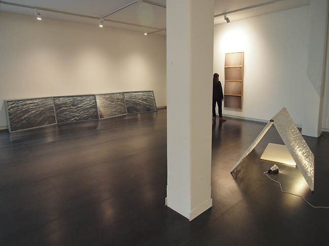 Ben Buswell's We Live Only Through Ourselves (all photos jeff jahn) Since Picasso and Braque's introduction of analytical cubism, followed later by Robert Smithson and today Doug Aitken, Josiah McElheny etc. , faceted images and the subsequent defraction or dislocation of experience have established themselves as important threads in contemporary art. To that pedigreed history add Ben Buswell's first solo show at Upfor gallery, which mixes the artist's personal history with design and landscape as Smithsonesque crystalline objects. To varying degrees these forms mitigate the present so as to allow the vastness of time into the cracks of experience. In other words the works often conjure the romantic sensibility of the sublime, though it is hardly uninterrupted. Instead, that vastness or otherness is cracked and suffused with a melancholy, some of which is obviously so personal that the only way for the viewer to participate is to project their own personal history as an act of simultaneous forgetting and remembering. It is very similar to religious sacrament... or votive candle burning, which is popular during these Western Civilization holiday times. 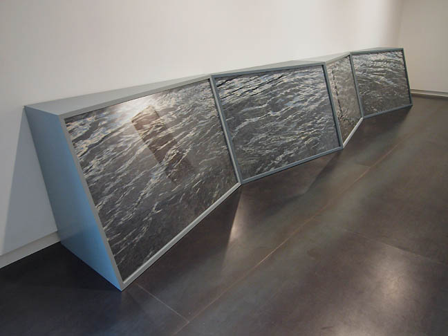 Passenger Perhaps the most striking work in the show is Passenger, a floor bound quadriptych of embellished photographs that sits in the room more like furniture than wall based photography. This decoupling of the floor and wall in the work recalls Donald Judd but it lineage comes more directly from Robert Smithson who would often use mirrors to dislocate the viewer. 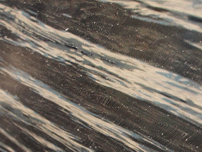 Passenger (detail) In Buswell's case he embellishes the photographs with a subtle texture beneath the glazing and the four facets of seascape constantly shift the viewer's attention. It operates in much the same way waves upon a body of water create a moire like field. These fractal moire effects have a calming zen-like quality that come from a mindful dissipation of self into a visual field of vastness. It works here though the actual wooden constructed part could become more nuanced... right now it lacks the proportional finesse of Judd and Smithson. 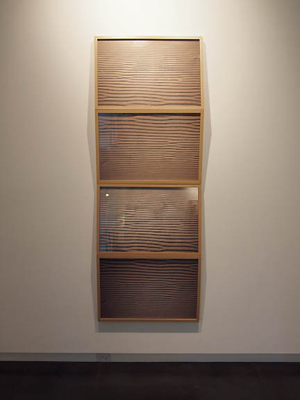 First there is a mountain Other photographic works like First there is a mountain and Then there is no mountain use sand dunes to a similar effect, though the annoying musical reference to Donovan is superfluous except perhaps as a marketing ploy to aging boomer hippies contemplating their own mortality? It undercuts the seriousness of the work to make it cognitively accessible. Other than that I very much enjoy these works and I feel like they are his most accomplished to date. In all three faceted photographic works I like how Buswell leverages the way objects encourage subjective readings, whereas photography poses a false promise with the wink of sharable experience. Of course photographs are subjective objects as well. Still, in all three the panes of glass represent the defraction of the personal and any sense of a shared absolute (a Smithsonesque purgatory-landscape?). Overall, I find Passenger the most compelling because it is the oddest... though it is a tad clunkier than the wall based works from a design standpoint. 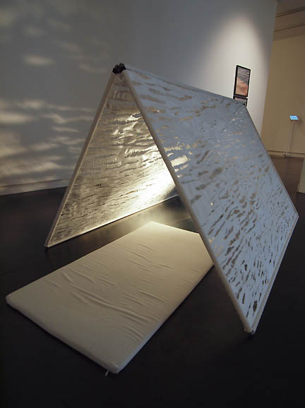
When the Cathedrals Were White (FG), Your Quality is My Value (BG) The piece with the highest design language quotient, When the Cathedrals Were White is a tent-like scrim with a white mat. Is it another votive lantern? A prayer mat? An indoor fort to a long passed innocence? It definitely reads like a large somewhat ineffectual protective case for some Apple product. It also seems to interrogate the all too easy use of monochrome white, often a hack art/design crutch. Even Apple has moved away from what it called it's iconic "Snow White" design schema. A two part photographic work Your Quality is My Value leverages mimetic marketing speak as a design shorthand and formally might allude to Stieglitz’s important Equivalencies series of photographs. It's seductive textures are more fleshy than the white or grey works in the show but make the Donovan titled works read as flesh as well. It seems odd when the show is so Generation X in tone. 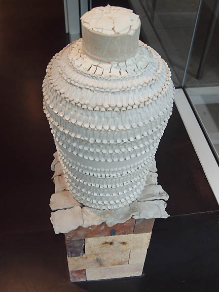 A Sooner Urn The most quixotic piece on view, A Sooner Urn is of such a different language than the rest of the show that it reads as either a stray or posits itself as a key to the otherwise ciphered exhibition. It is white and textured in waves of ceramic and apparently a family heirloom was immolated within it when fired. Ok, all families have secrets and perhaps this whole exhibition is a ritualistic shrine for the person who bequeathed this now destroyed object to the artist? Perhaps it brings closure (though I doubt such a thing exists) or at least its offering somehow contains the paradoxes that relationship once held for the artist. Still, it somewhat puts off the viewer... unless they care about settlers in Oklahoma or their state football team. Basically, this is work for the artist alone, which is a valid approach. Viewers shouldn't be the nexus of all art production. Perhaps, that is the point of a solipsistic exhibition titled We Live Only Through Ourselves... but the thing is the best art eventually moves far beyond that point. Buswell has a great deal of talent and sensitivity but that can be a burden that many artists have trouble overcoming. In their vanity (we all have it), they present the personal as an imponderable when it is merely mundane arcana. Buswell's show isn't that kind of dead end, it is a transition show as he is now discovering his true subject matter and it is exciting to behold (I've waited at least 5 years for this show). What I can say for certain is that Buswell's next body of work will likely be the most crucial in his career. This show is completely worthy of attention and speculation but though We Only Live Through Ourselves, one could counter with Art Only Lives Through Others. Buswell, like a lot of artists using design vernacular (in Portland there is a large group I've pointed out many times) is beginning to reconfigure his work not as a series of objects but as a series of experiences that are active and loaded negotiations with the viewer. The difference is akin to industrial design.... young designers pin a lot of hopes to their work but over time the truly talented ones enter an ongoing vernacular that fluidly communicates back and forth between the user and designer. Posted by Jeff Jahn on December 17, 2013 at 10:47 | Comments (0) Comments Post a comment Thanks for signing in, . Now you can comment. (sign out)
(If you haven't left a comment here before, you may need to be approved by
the site owner before your comment will appear. Until then, it won't appear
on the entry. Thanks for waiting.)
|
| s p o n s o r s |
 |
 |
 |
 |
 |
 |
 |
 |
 |
 |
 |
 |
 |
 |
 |
 |

|
Site Design: Jennifer Armbrust | • | Site Development: Philippe Blanc & Katherine Bovee | |

