
|
||
|
Portland art blog + news + exhibition reviews + galleries + contemporary northwest art
|
||
Architecture in Portland: Best and Worst Developments of 2013 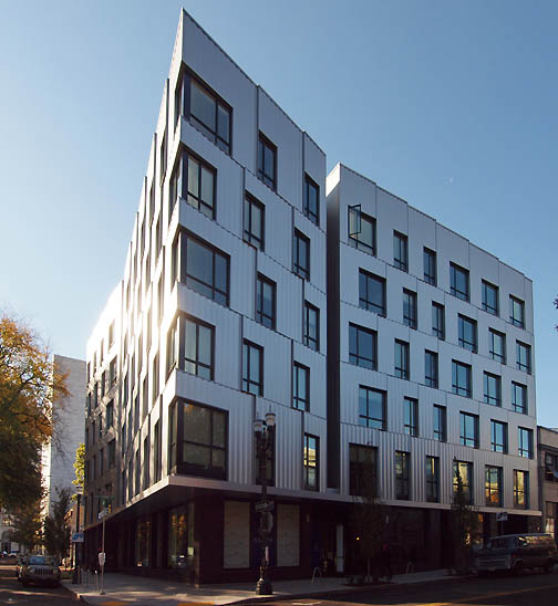 Art House's gleaming metal and glass on the North Park Blocks (all photos Jeff Jahn) There has been a subtle but important shift in Portland's architecture scene this year that hearkens to a shift in Portland's overall seriousness. I call it the year the faux brick died. To these eyes faux brick was the "humble brag" of Portland's design lexicon... simultaneously disingenuous and passive aggressive because metal and wood were too lux or direct. I'm glad that architecture in Portland is moving beyond trying to make new 10-12 story metal frame buildings look like brick. Nobody is going to do a 12 story wood clad building either. Still, three of the most interesting projects; Kengo Kuma's Japanese Garden (check out our interview), PNCA's Cloepfil designed 511 building and the new Willamette transit bridge (which we should name after Mark Rothko because he grew up on its west banks, while experiencing all racism Jewish immigrants endured) wont be completed for some time so we have a lot to look forward to in years to come... especially if the Portland Art Museum can solidify key elements for their next expansion ideas. 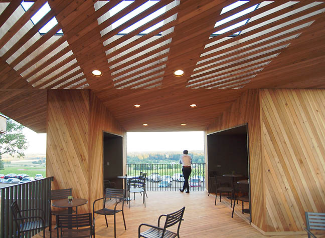 Terrace area of the Sokol Blosser's new Tasting Room facilities designed by Allied Works The clear winner of 2013 was Sokol Blosser's new tasting room by Brad Cloepfil and his team at Allied Works. Start to finish this project is probably one of the best things from Brad since his W+K headquarters and the opening party was the shindig of the year (I generally hate parties and would rather geek out on space, ideas or objects but that is exactly what most of the attendees wanted to talk about ...so it was great). Overall, Sokol Blosser set such a high bar in 2013 that 2014 will have difficulty matching the excellence. The fact that it is wine country throws down a gauntlet for the rest of the wineries and the city of Portland itself. 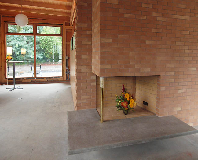 Marylhurst University's Belluschi Pavillion restoration project The single worst architectural snafu was an odd deviation of proportions in Marylhurst Univerity's Belluschi Pavillion project. By altering the fireplace ledge design to be much wider (you can see the original here) this otherwise very worthy project is getting off on a correctable wrong foot. The too shiny brass bar simply looks tacky, but it is the far more cantilevered ledge which corrupts Belluschi's design language (proportions matter here and its worth fighting any code disputes). This is an important preservation project and they have admirably kept in the kitchen area period. Overall, this doesn't need to be a museum to modernist design (with all original furniture etc.) but the hearth is the heart of this building. We often say this is NW style architecture but it is really just another iteration of Prairie Style Architecture ala Frank Lloyd Wright (Belluschi sought Wright's input on the Portland Art Museum), where the hearth is crucial. Since the restoration is not complete there is still time to correct this. 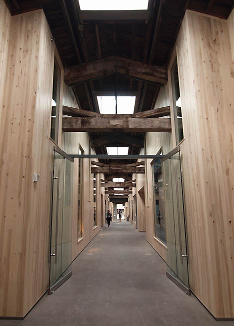 Union Way Perhaps the most exciting retail project in Portland for 2013 was Union Way, which cut a high end shopping alleyway between the Ace Hotel and Powell's books. The architects at Lever, whose Principal, Thomas Robinson has a previous history with Herzog & de Meuron and Allied Works would be my pick for firm most poised for superstar status to rival his former gigs. What I love about this is the way the wood an light present themselves in such an simple unpretentious ways while oozing that "natural wood = lux" aesthetic that has become all the rage for the past half decade. Thankfully they chose to avoid using overly knotty wood or anything resembling logs. In fact the subtle knots seem more prominent high above head height, which transitions to the darker old growth beams from the original structure. So instead of the somewhat tired log cabin thing, this feels like a slick northern European ski chalet situation. Rarely does a hallway become the main design element in any project, but here it is... retail that actually pays attention to the site and seeks to amplify it. 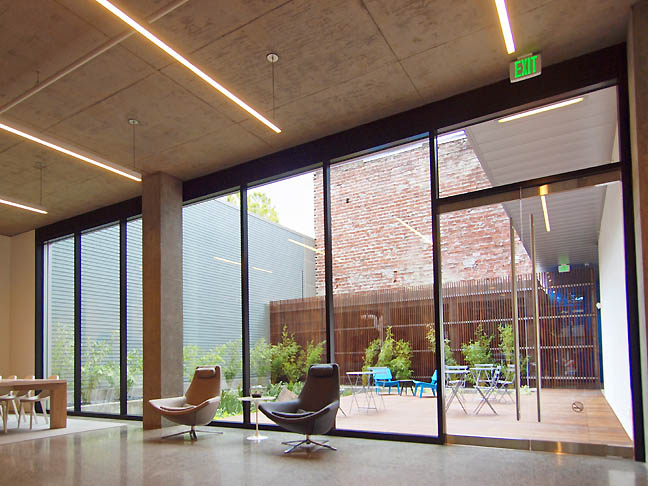 Art House lobby Another Lever designed project, Art House (developed by the Powell family for PNCA) wins points for not using wood or brick for cladding. Instead, the faceted metal opens a lot of interesting hallways that terminal in large windows that look out upon the canopy of the North Park Blocks. The comparative lack of brick seems honest compared to all of the odd 10+ story faux brick "humble braggers" that have defined most residential projects in the Pearl.It might not be the best building in the Pearl but from the outside it is both the boldest and most nuanced... perhaps paving the way for a whole new class of buildings in the Pearl District. 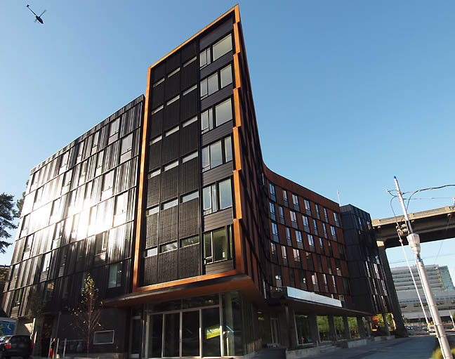 The Emery The Emery (by ZGF) wins my vote for the best new residential building Portland for 2013... and it needs to be since it is in the south waterfront area which remains an island within Portland's urban fabric. With curves and facets making every unit unique this place is right out of Denmark. By addressing the Ross Island Bridge it also has a better texture than the grey south waterfront spires to the south, which feel very generic by comparison. Overall, the varigation of floor plans and materials makes this the best high density residential project in Portland for 2013. One has to go back many years to Randy Rapaport's projects to find anything superior and those were much more deluxe pre-crash projects. Next up, Portland's art scene 2013 in review Posted by Jeff Jahn on December 30, 2013 at 17:36 | Comments (0) Comments Post a comment Thanks for signing in, . Now you can comment. (sign out)
(If you haven't left a comment here before, you may need to be approved by
the site owner before your comment will appear. Until then, it won't appear
on the entry. Thanks for waiting.)
|
| s p o n s o r s |
 |
 |
 |
 |
 |
 |
 |
 |
 |
 |
 |
 |
 |
 |
 |
 |

|
Site Design: Jennifer Armbrust | • | Site Development: Philippe Blanc & Katherine Bovee | |

