
|
||
|
Portland art blog + news + exhibition reviews + galleries + contemporary northwest art
|
||
Talking shop with Marc Treib  Marc Treib On the occasion of the Portland Japanese Garden's Noguchi exhibition this past May I had the honor of speaking with Marc Treib one of the world's foremost historian/critics on Noguchi, land art and the design of public spaces. He is the author of numerous books including, Noguchi in Paris: The UNESCO Garden (2003), Settings and Stray Paths: Writings on Landscapes and Gardens (2005) and Space Calculated in Seconds (1996). He is Professor of Architecture Emeritus, University of California, Berkeley. This is the final weekend for the Noguchi show (PORT also interviewed its curator) at the Portland Japanese Garden. 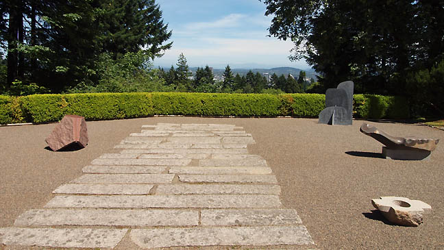
Noguchi at the Portland Japanese Garden (photo Jeff Jahn) JJ: You are in Portland because of your relationship with Noguchi's work and the Japanese Garden's 50th anniversary show. In particular you focus on "the sites", be it a public space or former studio. I've been to the Houston sculpture garden, The Long Island Studio and the California Scenario. I haven't been to the UNESCO or the studio in Japan, which looks amazing. There is something about the Japanese garden format that laid the groundwork for his work which wasn't just object oriented sculpture but an environment for experience that speaks most to me. MT: The California Scenario is the best one. 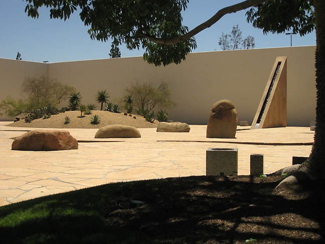 California Scenario (photo Loren Madsen) JJ: It is definitely the most satisfying to me. It is incredibly playful and even has a playful sense of humor referencing fault lines, lima beans and water supplies. I lived in LA from from the mid 70's till the early 80's and as a kid experiencing the space for the first time it was one of the first true art environments I encountered. I felt like he understood the fragility of the human occupation in So Cal and knew it as a tenacious strength. MT: I don't think it was humor, I think Noguchi was dead serious. You know he was born in Los Angeles but he had never really gotten to do anything in California. When he was presented this opportunity by Henry Segerstrom was a big developer down there. Apparently, the shopping mall across the street is called South Coast Plaza someone told me is the most successful shopping mall per square foot in the entire US. And it is gigantic and former farm land. So Segerstrom kind of proposed to him something that would kinda deal with the agriculture and the origins of the land , which the family was developing. Which is why one of the pieces is called The Spirit of the Lima Bean, because that is what they used to grow on the site. It does sound funny, in particular lima beans of all things but I don't think there was humor involved. So basically it is an exegesis of the ecosystem of California, the mountain, the meadow, the sources of water in the Sierras and there is something about land use. The one thing I've never seen operating is that first mound is supposed to have mists covering it. 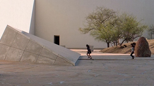 Noguchi's California Scenario with children (photo Steve Aldana) JJ: Mists really? Perhaps, when I was a kid all art looked funny... especially when you just wander into a space and read about lima beans on a plaque. The experience was one of my first wonderful moments of vexation regarding art. MT: Either it didn't work or they never did it, but I've never seen pictures showing the mists working. But Segerstrom was really committed to the project. He said that his wife knew about Noguchi's work and he did not. She had some issue of Art in America with his work in it so they had decided to commission the piece. They had already done this big Serra down there in that complex, one of the tower pieces and a number of other artworks that they had sponsored over the years so when they were building these two towers and the parking garage they thought they would get Noguchi to do the plaza. It was a pretty interesting ploy. I asked him how much it cost and he (Segerstrom) said, “I don't know.” They were half partners with Prudential and he knew that that company would have never paid what it cost to do the project so the costs were never allowed to line item. It was just labor, materials and whatever that he estimated were about 1.2 million. And it is beautifully done. A lot of the reasons it is beautifully done is because this landscape architect Ken Kammeyer really pulled it through. Because Noguchi would do a model at 1 to 100 scale and oversee construction stuff but basically the projects varied with whoever carried out the detailing stuff. A lot of it was Noguchi's partner Shoji Sadao who was also Buckminster Fuller's partner. JJ: It was like they shared him... 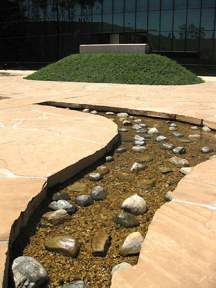
Water feature at California Scenario (photo Loren Madsen) MT: He was the enforcer. He made things happen and worked out all of the technical things and got drawings done. And a lot of the detailing like in Houston, a really good architect or landscape architect would have detailed it better. California Scenario really works because they had a really good landscape architect. For example, they had no visible drains. They are all hidden underneath things. So getting everything to work and the selection of plants was actually Kammeyer's work. At UNESCO for example, today with the tree cover overgrown it is much more pleasant as a space to be in but it is much less sculptural because the vegetation doesnt reinforce the sculptural idea in any way. He really didn't have a good sense of using plants. JJ: From photos the UNESCO project almost looks like a diagram of plate tectonics rather than a green space garden. 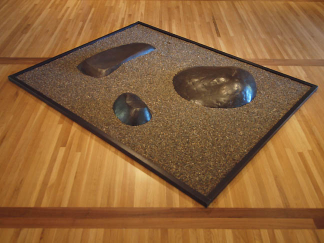 Garden Elements (1962) at Portland Japanese Garden (photo Jeff Jahn) MT: Well it is more like his reliefs from the 30's and 40's so it is a sculptured ground plane and the early photos looks much more interesting sculpturally. I don't know if you know a piece called Opus 40 by Harvey Fite in Saugerties New York, just north of Storm King? It was a blue stone quarry and Fite was teaching across the river at Bard and he took this quarry and started reshaping it as a place to display his sculptures and then x years into it he realized, no THIS is the sculpture. It was called Opus 40 because he was going to work on it for 40 years. He had a little tractor mower and used to mow all around the edge of it but one time he got too close and fell down into it so it should be called Opus 37 because he only worked on it for 37 years before he died. But it is very similar to Noguchi's UNESCO as a kind of sculptured ground plane. It is a kind of relief and not that spatial like California Scenario, but UNESCO is hemmed in by buildings and far more constricted. JJ: It seems more topographic. MT: UNESCO was an important and earlier work, but it is not my favorite. 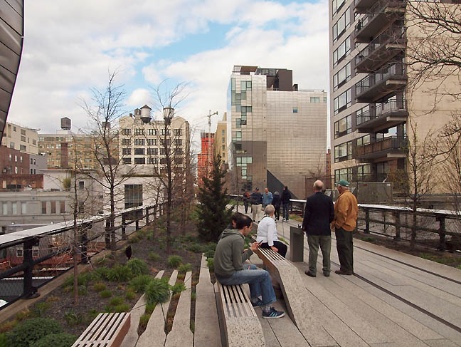 The Highline, New York City (photo Jeff Jahn) JJ: I know you are here to talk about Noguchi but ever since I heard you were coming I wanted to ask you about the Highline in New York City? When I was there a few weeks ago I was surprised at how busy it was... so many were asking me to snap pics for them with their smart phones (probably because I had a more serious camera). I remember when it was brand new it was hardly used and before that it was like one of Smithson's Passaic post industrial ruins. Also, everyone brings up Gordon Matta-Clark as well but to me it is too Disneyland like Matta-Clark had so much edge. The fact that Im from Portland means that such green spaces are common... not just something that had to added into a wealthy neighborhood. What is your take on it? MT: At some point I am definitely going to write something about it but as an amenity The Highline is undeniable but if you are talking design I'll take Smithson over or Matta-Clark over Piet Oudolf the planting designer. It is now more of a tourist site almost as if Times Square has been shifted into Chelsea. I'm not certain how many locals actually use it. At least it isn't like many designs which pretend to be art works and therefore become resistant to changes and become incredibly precious, which is something that bothers me. JJ: Well there is this frisson of repurposed renewal between the rusty metal of the old and new the fancy plantings... I think tourists come to New York thinking anything is possible but Times Square is so congested and gaudy that it no longer functions as a symbol of hope but as an albatross of corporate hegemony. Perhaps the preferences of Americans are shifting from corporate icons to pastoral renewal or a more Portland-like fetishing of green space as a symbol of freedom? I've always found that the most compelling places have distinct strata of use, like Venice's sinking palazzos or Soho's onetime galleries in cast iron buildings. These imbedded layers create conflicting viewpoints, which I also like for panel discussions or verbal critiques. MT: I've always interested in pairing up Okwui Enwezor with Dave Hickey! JJ: Because they both speak completely different languages? MT: Of course that is the whole idea... that is why you arrange people in discussion. JJ: I do think it is really important to curate against form. It seems like there has been a tendency of late to create tensionless exhibitions and talks, which is boring because everyone has a predictable thing that they do, like eggs fitting into cartons. Yet, once you've been in the cultural milieu you realize that everybody is speaking a different language and that fractious moment of translation is where the truly interesting stuff happens... otherwise it is just running according to script. What I like about Hickey is that he creates fractures and gets people to reveal their positions up front, Okwui is more of a diplomat. Both are very cosmopolitan as both have such specific presentation and intense vocabulary that you are pushed to either love it or hate it. That skeptical moment between acceptance or rejection for the reader or audience member is a good thing that isn't personal... simply a faceting of worldviews. You don't have to be convinced by something to gain understanding. Both Hickey and Enwezor are so intelligent that it is fascinating to hear them talk about their backgrounds but even better when they are improvising off of something else. MT: Well you know everyone has got the shtick now. The artists have their shtick, and the curators have their shtick and the critics have their shtick. And it used to be that you had an artist and you had a critic who was a critic... and now you have an artist and a critic who is a proponent. Today you don't make it in the world unless you have a critic who, "writes about you." There is an artist I know who is now showing in New York and was in the San Paulo biennial last year, which has like 8,000 artists in the show and he was singled out by a critic in Art in America as one of the 6 and he said there were sales the next day. JJ: But it is different in a smaller place like Portland which is both big and small at the same time... a place where they don't always pay very close attention to reviews, both national and local and it gets tied to much pettier things like do they teach at the same school, do they have the same social clique and they want to be friends in a kind of consensus of community that doesn't always appreciate being critiqued from outside. I do it anyway and think of it as an asymmetrical skeptic's approach and try to focus on the work as if it were being shown in London or New York. People in smaller places want affirmations but that really isn't enough to simply promote people and work they like. A real critic points out multiple horizon lines that may or may not be relevant, but they have to present the possibility that they are crucial and shatter monogistic thinking. I think that is why reviews really matter in New York and London. They know the critics there are under tremendous pressure. Here, people want to be friends and run with a gang... and I just don't do it. The thing is plenty of Portland artists and designers are making waves internationally by sidestepping the cliquish aspects local scene while reaping the benefits of having such a conducive atmosphere of supportive peers. In that way the international market has been very healthy for Portland... you can be left alone and show in world class venues elsewhere. MT: You know as an outsider looking in on the art market... I mean the prices the things and how things are in Frieze New York and then Hong Kong the next week and then to Basel... it just becomes a whole other entity. JJ: The commerce of it? MT: And the preciousness, because it is done by an artist. If the same thing is done by a designer it get changed. There is no problem. But things like Tilted Arc, Im a great Serra fan but that was a bad piece... although Martha Schwartz's thing has been removed too I hear. They will never be happy those people. JJ: They tried to have a Mark di Suvero removed from in front of the Milwaukee Art Museum in Wisconsin. Calatrava had actually oriented his museum design with it as an axis point. And those that sought to remove it were just picking it as a target. It wasn't like Tilted Arc, it wasn't obstructing anyone. MT: Well di Suvero's can normally resist removal! (laughs) JJ: It wasn't that serious a threat but it's like a remnant of the culture wars. MT: Another thing, the Marfa people have a news letter each year, an annual report JJ: Chinati? MT: Yes Chinati, they did a conference on the restoration of unpainted plywood and the latest thing is the concrete boxes outdoors in the parade grounds. If it were architecture we would just say, let's cast new ones because they were made incorrectly. So people are chipping away small corners and replacing it with new concrete. JJ: Part of the Judd conference we did here in Portland in 2010 was in response to this. Judd was absolutely against the preciousness of the object with things like pedestals. Judd's attitude was not about value being attached to original components of a piece or even the object itself... merely the way it operated visually, thus his infamous dislike of distracting damage. Instead, his attitude was similar to design or architecture... simply refabricate it again. It's like a Stradivarius, the instrument is no good unless it can be played so they repair damaged parts so they can become playable again. Judds are played by the eyes, not relics and it is why he is still a radical artist because there is tension between his philosophy and the market pressures that fetish things like original surfaces despite being marred and considered damaged by the artist. Sorry, it is a topic close to my heart. 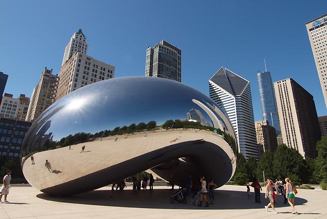
Anish Kapoor's Cloud Gate at Chicago's Millennium Park (photo Jeff Jahn) I also wanted to bring up Millennium Park in Chicago. It is a rare large scale plaza, sculpture park, garden and stage that actually worked well... mostly because of Anish Kapoor's Cloud Gate sculpture ties it together by being so popular. MT: I was disappointed when I finally saw it because it is not integrated. It is like a carnival. You've got the Kapoor and you've got the Gehry and the Gustafson but they don't feed into one another. Well the work that SOM (Skidmore Owings and Merrill) did kind of divided everything up. Gehry is always over the top but I thought the bridge works. Then there is the Kapoor, it is called Cloud Gate but it really isn't a gateway into anything, it is kind of lateral and when you go underneath it you don't know where you are going. JJ: It is kind of like the Bermuda Triangle but that is why it works. People bring out the cameras and take photos for social media sites. It is very Me Generation. Then they see themselves reflected in a distorted landscape. It is intensely solipsistic but tourists love that. MT: I love the piece, it is pretty much the best of the work I've seen of his. JJ: I think it is the most successful piece of public art I've seen by any artist in the last century or more. MT: It is probably true. Then he has a show at the royal academy where he shoots red wax out of a cannon against a wall. He's got too much money now. JJ: Well that monstrosity for the London Olympics was a stinker as if they wanted their response the the HDM/Ai Weiwei designed birds nest stadium MT: That I don't understand. I may not like a lot of Kapoor's work... I saw his discs in London but that tower was just ugly and Cecil Balmond is a really great designer... what happened there? Of course there is a film about making it and Balmond was born in Sri Lanka and Kapoor is from India abnd they were joking that this was their revenge on Britain. (laughs) JJ: (laughing) could be... that explains a lot MT: And the tower is just this (mimics a straight line with is hand). The rest is just window dressing, its not an alternate path and there is no roller coaster that goes up to it and like a Carsten Holler you can't slide down. It doesn't even stabilize the tower, it is basically a water tower with an elevator. All of the other stuff is decoration. JJ: It shows just how good his cloud gate it because without it Millennium Park would not have worked at all. It shows what art can do, it can overcome even uninspired design. But when the art itself sucks no design can save it. MT: Well what was there before, just rail yards... so anything is really an amenity and people will go there, that's not in question. Ultimately though it is long on trees and all of the talk and the hyperbole is kinda silly, a bit like Villet. JJ: Which reminds me that I wanted to ask you what you thought about Walter De Maria's Lightning field in comparison to a reviled project like la Villette. Both impose a grid but with different expectations. De Maria's almost unI'versally lauded piece isn't a park like la Villette. The is more of a destination than an amenity though design is clearly at work as the entire experience of being brought out to an isolated somewhat rustic cabin has a great deal of intention behind it. MT: Villette? Well I compare it more to things like Roden Crater but The Lightning Field is just an incredible experience. Of all of my earthwork visits to me it is the most impressive because of its minimal means. You know I'm a modernist. I've been to Roden Crater twice while it is under construction, I'd love to get back there too. Actually, I'd love to do a book or an exhibition called Building Light which is Alvar Aalto, Tadao Ando, Flavin, Irwin and Turrell. I've got a folder I've been collecting things in for years and anytime I get near a Turrell or Flavin I put it in the folder. JJ: Ando does a great job of marrying earth and sky. It is odd but I think most light art isn't very related to Earth Art, it is usually one or the other. And then you have Judd who kind of straddles the two with the 100 mil aluminum pieces but avoided earth art because he felt he couldn't improve upon the landscape. Whereas Noguchi is very rooted to the earth. 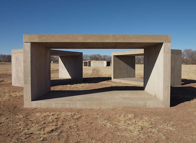 Concrete Judds at Chinati Foundation, Marfa Texas (photo Jeff Jahn) MT: Maybe the land art stuff isn't specific enough objects, because you can't fabricate the landscape setting? There isn't enough control? Though Judd did have this tilted circle of concrete at Philip Johnson's The Glass House and a couple of things that border on it. LA County has a sister piece to those open ended boxes at Chinati, which were the closest Judd ever got to land art. I once asked Michael Heizer at a conference once about the landscape and he indicated he didn't care about it at all, just that, “he used dirt as a medium and there was a lot of it out there.” Though, I think he perhaps protests too much. I visited Double Negative in its now crumbling state and it is perfectly sited. JJ: I have such a crush on Heizer's work and respect how little he wants to talk about the work in public, letting the work speak for itself. His father was an archeologist and the work is like an archeological site... it is mostly about man's activity. The piece for Philip Johnson was Judd's first concrete piece and St Louis also has a concrete box. Which brings me back to Noguchi for how much at ease is work engages the landscape. Other artists couldn't help but make a mark on the landscape... there is an interventionist element but Noguchi's work almost looks like it was always there, even if it is an obvious intervention. To use your Millennium Park terminology Noguchi's work is “integrated” as a kind of place making that isn't as interventionistic... even the works on display in Portland which are stand alone pieces that Noguchi never intended specifically to show in Portland. For me Noguchi's work seems to step out of time rather than engage the language of overpass construction or Cor-Ten. The connection to Japanese gardens is huge. There is a lineage, where the other later artists have a kind of signature “Art making” to them. Some Noguchi's look as if they might have been from an ancient temple. 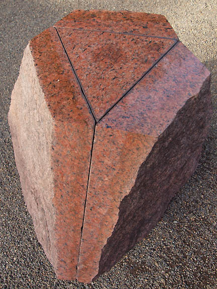 Noguchi on views at The Portland Japanese Garden (photo Jeff Jahn) MT: I agree that they are closer to landscape architecture than they are to earthworks because they are not really derived from the site. They are imposed on the site. I was just on the Master's committee of someone at Columbia whose thesis was on the preservation of Noguchi's American Landscape projects. And I asked him what's your thesis, “should a landscape have different preservation criteria if it was conceived as landscape architecture rather than an art piece?” In many ways Noguchi was kind of Naive in that early part of his career and was more concerned with esoteric spiritual concerns instead of how a piece would actually accommodate the human body. But there is a place for that as well... not everything needs to be comfortable. The California Scenario is not a very comfortable place. At California Scenario there is hardly a place to sit, it is incredibly hot. What has gI'ven it a new life ironically is non smoking and buildings. You cant smoke within 20 feet of the door so you have to go deeper into the space. I'd like to do a new study on the use of public space as based on no smoking laws. JJ: Maybe Damien Hirst will do an outdoor smoking piece? MT: Well he did do that cigarette piece. JJ: It is a logical progression for him! (laughs) MT: They have these spaces in Tokyo because in all of the central courtyard areas you are not allowed to smoke. So cigarette companies like Kool rent out space for smoking lounges. They sell Kools there too presumably. JJ: So it all gets down to the use of the space and rules of behavior. Is it being used as a sculpture park or is it landscape architecture that is being used by the public with a wider latitude of program? The last time I was in Houston I hung out in Noguchi's sculpture garden despite the fact that it was 114 degrees in the shade. I was drinking hot coffee too and feeling so tough because nobody else was in sight. Perhaps they had more common sense but I like coffee and wanted some for my sculpture stroll. I liked some of the work but the sculpture garden itself was so dead and wasn't inviting... to be fair 114 degree weather doesn't help. MT: (laughs) Well, Houston's Noguchi sculpture park also has an unfortunate relationship to the building at least compared to the Turrell tunnel, which has a direct connection to the two Museum wings. At one point they had proposed that the street might come out. It could have been a very different situation if they had depressed the street so that you had a platform that continued from the museum. Instead, people just think it is part of the parking lot more than as the sculpture gardens. JJ: It just highlights how intention in public spaces is so important. In Portland we have the Halprin Fountains like the Ira Keller Forecourt, which is incredible. I see a lot of that design in Brad Cloepfil's Clifford Still Museum in Denver, which is also set back as a terrace of rectangles and light pools instead of the Halprin's setback of rectangles creating a waterfall with pools of water. Also, instead of just textured concrete both look a lot like terraces made of basalt crystal columns. MT: Sounds like a Clyfford Still painting JJ: It was a tremendous pairing of the right architect for a notoriously difficult to please artist. Which parallels the Japanese Garden here and its plans to expand with Kengo Kuma designing the buildings. Since ours is considered so authentic it is a tricky proposition to expand upon. Kuma is pretty much the only architect I'd trust to do something that actually enhances the Portland Japanese Garden, which is considered to be the best one outside of Japan. I hear you are advising the Garden as well? MT: Yes, and though I haven’t seen the Anderson gardens near Chicago, which everyone says are also very good as they say “Japanese Style” gardens, which is also a somewhat difficult proposition... I do believe the ones in Portland are the finest that I've seen and the best kept. The one jarring note to me is you have that one dry garden floating in the middle of a forest. Still, it isn't actually in Japan and the garden is in a Douglas Fir forest and a Japanese Garden isn't just about the land it sits on, there are views. Portland is Kuma's first public project in the US and hopefully he will do it justice. Certainly having Noguchi for their 50th anniversary certainly made great sense for the garden. Isamu Noguchi: We Are the Landscape of All We Know is on view at the Portland Japanese Garden through Sunday July 21st 2013 Posted by Jeff Jahn on July 19, 2013 at 10:41 | Comments (0) Comments Post a comment Thanks for signing in, . Now you can comment. (sign out)
(If you haven't left a comment here before, you may need to be approved by
the site owner before your comment will appear. Until then, it won't appear
on the entry. Thanks for waiting.)
|
| s p o n s o r s |
 |
 |
 |
 |
 |
 |
 |
 |
 |
 |
 |
 |
 |
 |
 |
 |

|
Site Design: Jennifer Armbrust | • | Site Development: Philippe Blanc & Katherine Bovee | |

