
|
||
|
Portland art blog + news + exhibition reviews + galleries + contemporary northwest art
|
||
Brad Cloepfil/AWA's Sokol Blosser Tasting Room 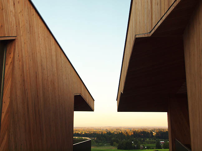
The view from Sokol Blosser's new Cloepfil/AWA designed tasting room (all photos Jeff Jahn) There are a handful of contemporary wineries that have made a major impression upon the architecture world. There is HDM's understated but large earthy pile in Napa, and Calatrava's far more balletic project in Spain, as well as Mario Botta's project in Tuscany. Last week, at an event inaugurating Sokol Blosser's new tasting room building designed by Brad Cloepfil/AWA I was struck by the fact that Oregon and not just Portland was finally growing up in terms of design. Basically, Cloepfil has taken to punctuating the thesis statement sentences of Oregon's development whenever a new chapter begins to be written (the Pearl District and now wine country). That is a hell of a thing for a single building to accomplish, much less a winery. Typically, wineries fetish a kind of anachro-tecture by trying to emulate European Gothic or Spanish Mission designs. Since all are derived from agrarian fortresses they seem better suited to shoot arrows or bullets from than drink wine. I suppose it just depends what you are into but the people who frquent here are called wine lovers not wine warriors for a reason... visigoths make horrible guests! Sokol Blosser's situation is far more refined than that scenario and with their new tasting room it is clear that Cloepfil, who is now perhaps beginning to mature into a potentially great architect knew what was great about wineries... wine, companionship and the bucolic sublime. 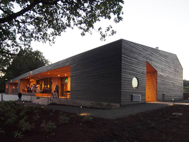 Sokol Blosser's new tasting room by Allied Works Completed over a decade ago, Cloepfil's Weiden + Kennedy headquarters in Portland was both his first and frankly best work to date but with the recent Clifford Still Museum and now the Sokol Blosser Tasting Room he is producing more mature work that hits the high notes more consistently than even than just a few years ago (like Seattle Art Museum, UMMA, 2 Columbus Circle). All of which is just a protracted way to say that the warm and convivial Sokol Blosser project might just be his best building of the decade so far. As one approaches from the long private road amongst the grapes, the new tasting room hardly announces itself. Dark in color and set back into the hillside subtly, its roof line doesn't interrupt the trees, which punctuate the rolling hillside. In the later afternoon the shade of the hill even obscures the primary parking lot. 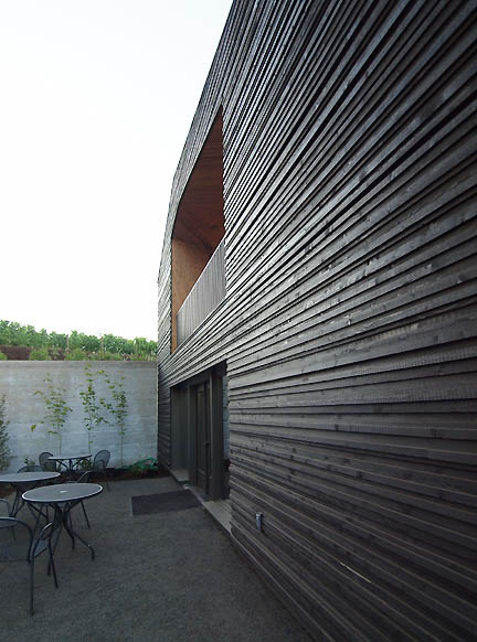 Zumthor-like exterior textures Once on foot it seems like a simple shed, though fans of design will notice the obvious nod to Peter Zumthor's superlative exteriors. The few asymmetrical cutaways reveal rich wooden interiors and make the entrance obvious for the thousands of visitors this space must accommodate. It is still very understated at this point, at least until you enter the asymmetrical entrance 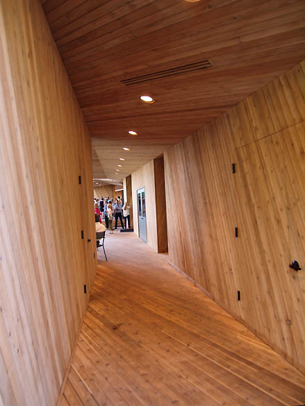 Entrance Upon entry, the space explodes into a kind of Kubrickian cedar symphony with leading lines (probably learned when Cloepfil worked for Mario Botta) from the diagonally laid slat boards, which are in use everywhere. One is essentially cast into a gently rolling sea of cedar where the walls floors and ceiling are all treated very similarly like the rifling of a gun barrel. The difference of course is that instead of one destination like a bullet, one can end up in the large vaulted main room, front porch or cozy library for those frequently rainy days. 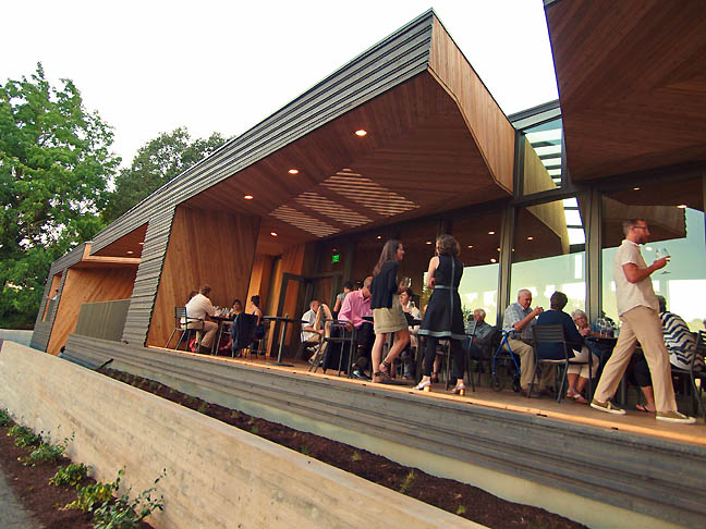
The Porch 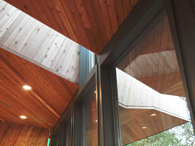 Light fissure in Main Room 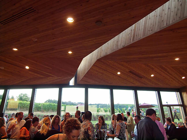 Main Room under heavy use In the main room, a large dark tasting bar with James Lavadour paintings stops the eye as an audacious fault line of glass reminds the visitor that the landscape is the real story here. On the porch one finds views of the surrounding hills striated with grape vines and in the library a massive table and shelving ensemble still leave plenty of window opportunities for one to gaze onto the hillside. 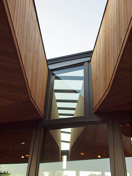 ample glazing 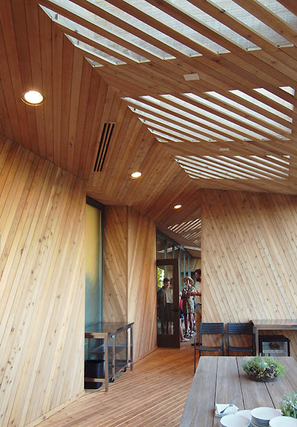 just outside the kitchen 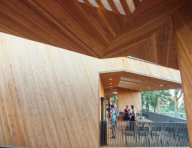
It is these fissures of glass that cut through the building that most closely resemble a smaller more cedar version of Cloepfil's recent proposal for a Quebec's National Art Museum, which is has a lineage derived from a metal and glass guest house in Duchess County. Overall, the strategy actually works better on a smaller scale with wood here as it is almost like a puzzle box that was assembled or woven from timber on the site... rather than being imposed upon it. The provisional wonders of wood and glass are far different that the de facto quarry that all stone buildings end up being. As one explores deeper the program of the building becomes more specific and epicurean; a Kitchen, Farm Table, Terrace (for club members) and a Private Cellar room with a nearly secret door. 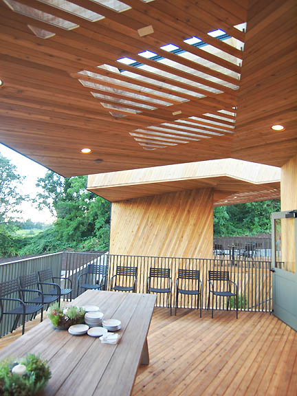
Farm Table 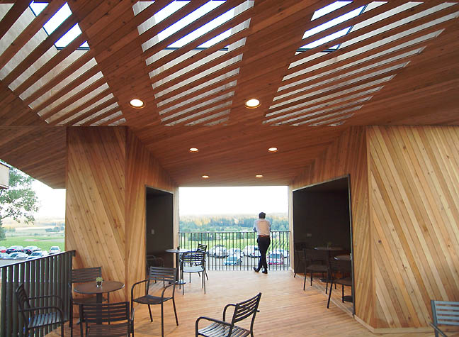 Terrace As I explored the spaces I was struck by how the Farm Table and Terrace areas attracted the biggest design geeks looking for a quieter place to take in the details and views, while politicians and cultural patrons seemed to intuitively find the secret cellar space. Even the cellar isn't a dungeon with its semi private outdoor courtyard. 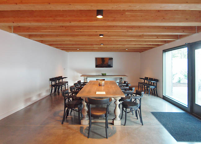 Private Cellar Sustainability wise, it meets the Living Building Challenge and is energy net zero, which is the most stringent sustainability rating out there today. Built into the design is the possibility to add a living roof in the future, which reminds us that these wineries are essentially small family businesses so it is a prudent to leave some future projects in the design. The winery's original tasting room by John Storrs was the first LEED Certified tasting room in the country so this is another watershed for Sokol Blosser. 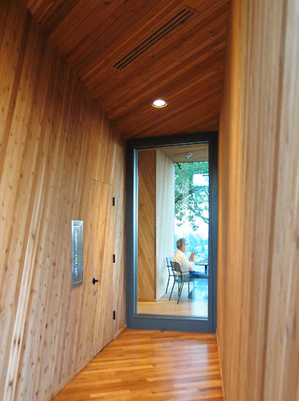
Looking hard for flaws, I found the bathrooms to be somewhat hidden, in fact they are so arcane it had to be an intentional. Fair enough, one might want the guests to steel their powers of concentration before using the facilities. This is a winery after all. Also, the plantings and crushed gravel path around the structure simply don't have the same level of intention and execution as the building itself. It looks like a project that can be tackled at another time, one truth about wineries is that they are farms and therefore always works in progress. 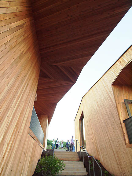
Still, the greatest experiences came from the deep fissures and chasms that Cloepfil and his team have developed to create separate yet communal gestalts within this building, which is destined to be a must see stop on any tour of Western Oregon. From the outside it looks like a single building but in practice it feels like a small village retreat where the wine and landscape receive most of the spotlight. One could say the building, like a good guide simply ushers you to best spots, where a glass with a view undoubtedly awaits. 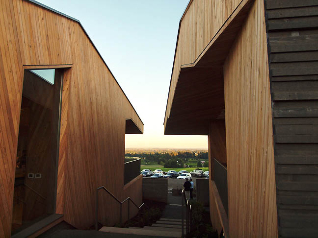
Posted by Jeff Jahn on July 23, 2013 at 15:37 | Comments (0) Comments Post a comment Thanks for signing in, . Now you can comment. (sign out)
(If you haven't left a comment here before, you may need to be approved by
the site owner before your comment will appear. Until then, it won't appear
on the entry. Thanks for waiting.)
|
| s p o n s o r s |
 |
 |
 |
 |
 |
 |
 |
 |
 |
 |
 |
 |
 |
 |
 |
 |

|
Site Design: Jennifer Armbrust | • | Site Development: Philippe Blanc & Katherine Bovee | |

