
|
||
|
Portland art blog + news + exhibition reviews + galleries + contemporary northwest art
|
||
PAM reinvents itself with Ziba Here is a taste of the new identity:
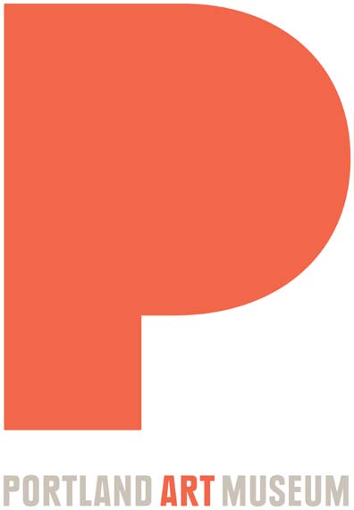 The new identity keeps the authoritative red but it is a softened shade, the more traditional text below covers all the bases 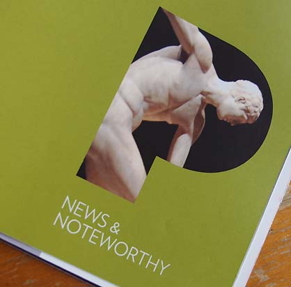
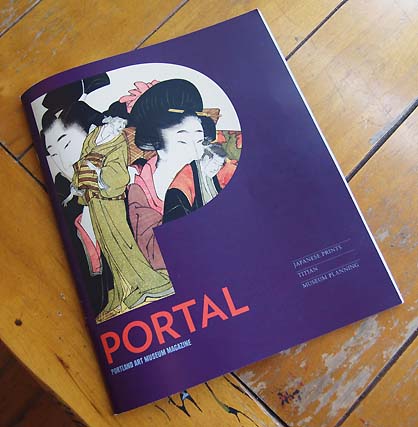 The new members magazine Portal, which has more in depth and crucial arts writing in addition to basic info and patron acknowledgement. Analysis: The Portland Art Museum's new identity and branding was conceived in close collaboration with Ziba design. In short, it is a bold clean appropriation of the P of Portland and definitively states that indeed this is an Art city. No, it isn't as bold as something like the Tate's chimerical identity but by being similarly polymorphous mark (it can act as a window on images or art) it is a gutsier than the Art Institute of Chicago's rather staid new logo. 
 One of Portland's biggest problems during the recent cultural renaissance driven by creatives and internationally active artists flocking to the city has been the dodgy indecisiveness, patchwork programs and murky messages of it's larger arts institutions but with this reinvention, PAM threatens to join OCAC, PNCA and the Japanese Garden as leaders in the reversal and as the biggest arts institution in the state it is about time. Having put a decade + of work into Portland as perhaps the most pervasive voice and curator of this shift the move does my heart a lot of good. There will be a new website as well. Ziba as a self described, "design and innovation consultancy," doesn't so much alter a client's image as undergo an anthropological investigation to create a comprehensive design that tells the story of where the client has been and eventually wants to go. In other words, this is crucial and strategic shift aimed at rectifying past weaknesses... not just repackaging the tip of a never changing iceberg. Instead, this is an ice shelf breaking off and putting everyone (even trustees) on notice that PAM has changed. I'm certain this took a lot of work and vision because it isn't your standard marble edifice mark like their earlier identities (below).  PAM's logo back in 2002 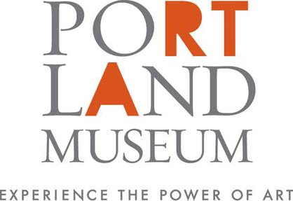 PAM's much worse logo from 2006 The new identity also sets the tone for any potential new building/programmatic efforts (hiring Ziba means they would likely hire an architect of similar stature... perhaps Steven Holl etc. when the economy stabilizes a bit more). Members will be receiving the new Portal magazine featuring the new look, feel and direction in the next few days. 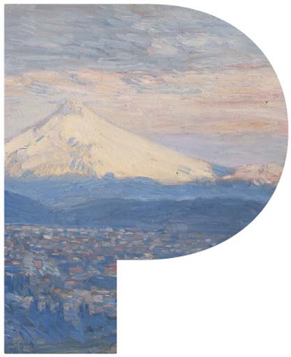 These image logos are for staff business cards and provide another window into what is at PAM (they heard a lot of "I dodn't know they had that" during the research phase). There are guidelines to keep from abusing the art though. 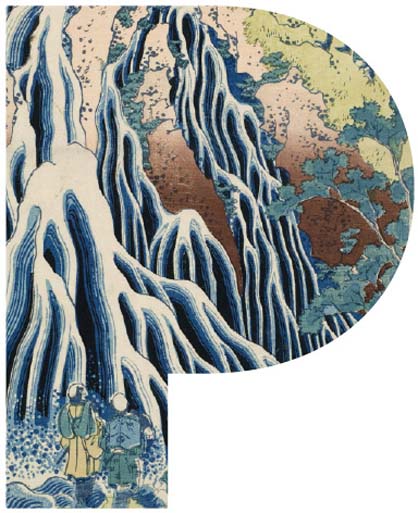 . .
Not many people realized it but when the Portland Art Museum hired Brian Ferisso and installed him as director back in 2007 it signaled a huge shift. It signaled a deepening of programmatic commitments and a long, perhaps arduous top to bottom assessment of it's practices on a professional level. Under his predecessor, PAM was a club but today with a robust educational outreach and shows like the currently on display Ed Ruscha, John Beech and Adam Sorensen shows they are clearly a completely different and more serious institution than they were in 1999 when I first moved here. Sure, from the vantage of this past Summer the 2011 Contemporary Northwest Art Awards failed to incite anything but antipathy and a lot of whittling, but at least the art selected was installed seriously (addressing a historic problem, while creating one of relevancy). Concurrently, the Allure of the Automobile held little interest for the art hungry community but it was clearly successful at reaching out across the aisles to the less arty crowd. In October with Chris Burden and Martin Kippenberger shows both opening I think we can forgive them (at least until the next CNAA's, which is just another opportunity to improve that they can seize or squander). Which is to all point out a problem with PAM, consistency of presentation, which has lead to a perception problem amongst what they identify as "Connectors" and "Creatives". When Brian took the helm we met and I found out he was a design buff (who worked with Calatrava on the Milwaukee Art Museum... my old home turf). He also noted the current logo's mixed messages and need for a serious replacement. But instead of just doing something flashy they spent years working with Ziba to understand the institution's strengths and faults. Only then did they undertake a comprehensive identity and rebranding. 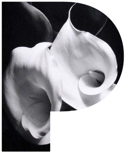 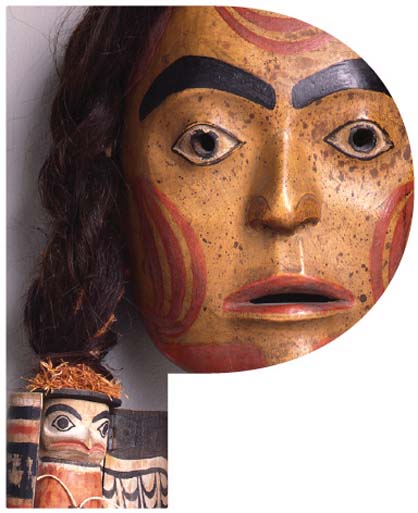
I like the flexibility of making the art the focus, letting people know what the museum has in it and yet implying that they are capable of being flexible and nuanced to various situations though safeguards are in place to keep from abusing the art with the logo. This certainly puts pressure on PAM to be relevant programmatically as the new identity doesn't let them hide behind marble columns to project authority... they have to show they are relevant... and consistently so. What's more with this new onus on presentation, shows or galleries (like the Jubitz Center for Modern and Contemporary Art) that are overhung need to be examined if they are truly going to win over the design savvy new blood of Portland. Posted by Jeff Jahn on September 16, 2011 at 14:30 | Comments (0) Comments Post a comment Thanks for signing in, . Now you can comment. (sign out)
(If you haven't left a comment here before, you may need to be approved by
the site owner before your comment will appear. Until then, it won't appear
on the entry. Thanks for waiting.)
|
| s p o n s o r s |
 |
 |
 |
 |
 |
 |
 |
 |
 |
 |
 |
 |
 |
 |
 |
 |

|
Site Design: Jennifer Armbrust | • | Site Development: Philippe Blanc & Katherine Bovee | |
