
|
||
|
Portland art blog + news + exhibition reviews + galleries + contemporary northwest art
|
||
Bud Clark Commons: design to save lives 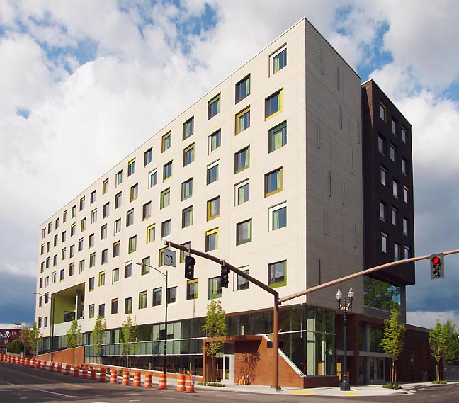
Resource Access Center (Bud Clark Commons) all photos Jeff Jahn If you've recently spent any time at all in Portland's tony Pearl District you've no doubt seen the dramatic rise the new Resource Access Center or Bud Clark Commons just across from the Post Office and PNCA's soon to be 511 building. Much has been written about its sociological underpinnings (like Housing First, which has been proven to lessen the burden on social services) so I'll focus mostly on design here. 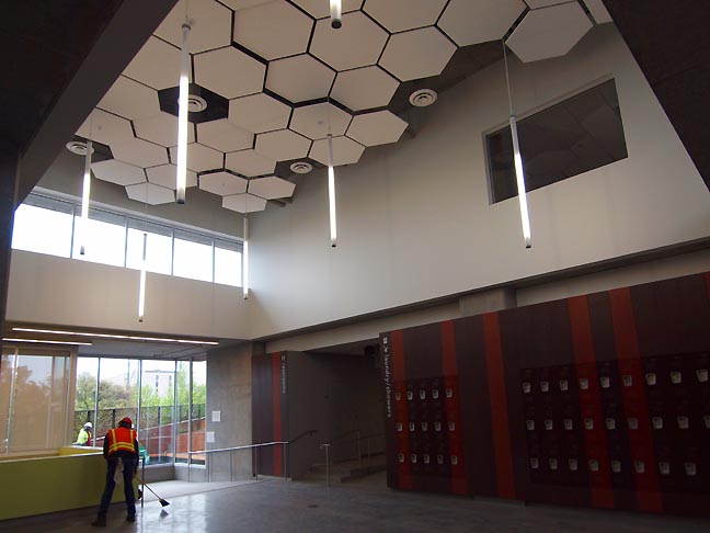 The Commons with lockers right around the corner from showers, laundry etc. in the Day Use area. The RAC designed by Holst Architects is perhaps the boldest exterior architectural statement for a building in the city core since Graves' disastrous Portland Building put the city's downtown into a passive aggressive design coma for over nearly two decades. Yes metaphorically, the Aerial Tram's kiss broke Portland's sleeping beauty style slumber in 2007, but due to the recession the actual downtown hasn't done anything nearly as bold till now. Depending on what part you are looking at it can be stark and utilitarian or some of the most stunning design work in the city core... without being grand. The way it alternates between the two is its strength, mixing humble moments with beauty and hope to keep things both fresh... and grounded. Honestly, 6-9 months ago I felt the design seemed like window dressing. I dislike the creme or "Dockers Khaki" colored brick but as details recently fell into place (ex: the vertical lighting system and excellent concrete form work), along with a tour of the inside the design won me over. 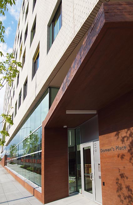
The RAC is a 28.75 million dollar (hard costs) state of the art building designed to address Portland's homeless population and its very functional and pragmatic interior lives up to its fancy but still understated wrapper. Though 4 million was cut from the budget due to the recession, Holst Architect's project manager David Otte felt it actually made the project "better" by forcing the team to rethink the design, ultimately turning a shorter full block suburban style building into an 8 story half block structure leaving another half block open for another complimentary project. The project is expected to be LEED Platinum certified and will had its ribbon cutting today (June 2nd 2011). Unlike most homeless shelters this one is designed to be welcoming to the community. The idea behind the Holst Architect's design for the varied windows is to make each unit seem more individual, which is somewhat successful though it still looks regimented and institutional (as do the 937 condos a few blocks away). It's more of an intentional reiteration of the firm's now familiar design language than a true attempt at infinite complexity, but to be realistic this is being made with public money... at least there is parity between the haves and have nots here. Regardless, it's the functionality of the building that will be it's claim to fame. The RAC may not not become a world famous building like W+K's HQ but perhaps it is a much more important and practical step up for building design in Portland (PAM and PNCA take heed) and homeless centers in the United States. The building is special because it combines several newer (but tested) ways of caring for the homeless all under one roof. It even receivedattention from the New York Times last year. (Disclosure, much of my solo exhibition Vection in July 2010 was made from scrap wood from this project). Here are a few of my favorite design moments: 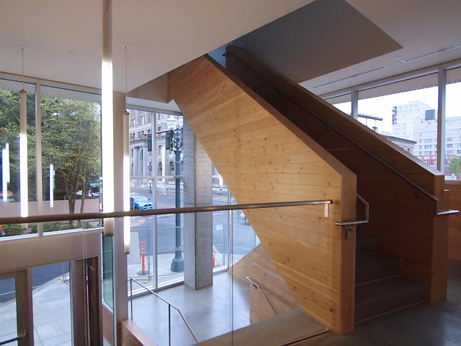 The main staircase is the best staircase in the city since W+K's Headquarters nearly a decade ago. 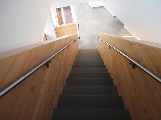 With glimpses of the outside and novel angles this staircase to the Transition Projects offices make the trip to counseling more enjoyable. 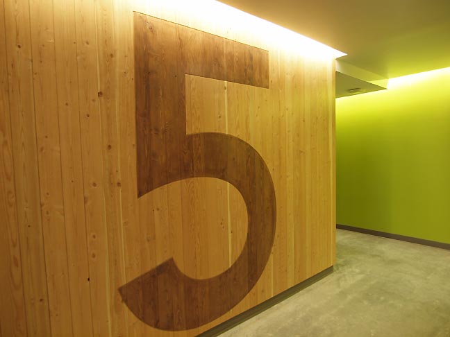 Elevator #'s denoting the floor level for the 130 housing units have a great deal of visual punch. 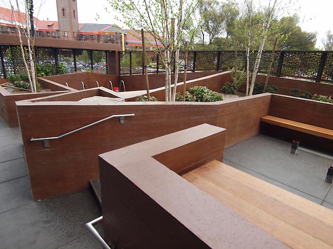 Outside the Day Center a kind of warm concrete landscape has numerous areas for bikes, shopping carts, Kennels and chess boards. It will be open to the community and is perhaps the most striking design detail of the project. 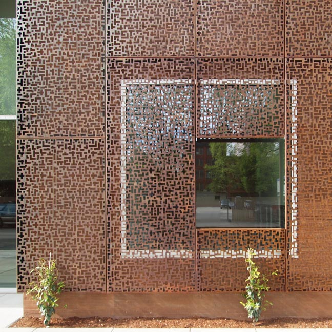
The metal screenwork gives the center security without making it prison-like, emphasizing porosity 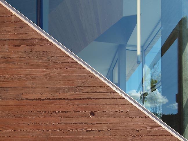 the concrete formwork for the project is exceptional and deserves awards 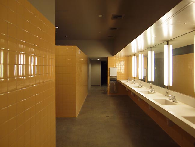 The mens bathrooms in the Shelter section are simple, easy to clean and sturdy but look good too. 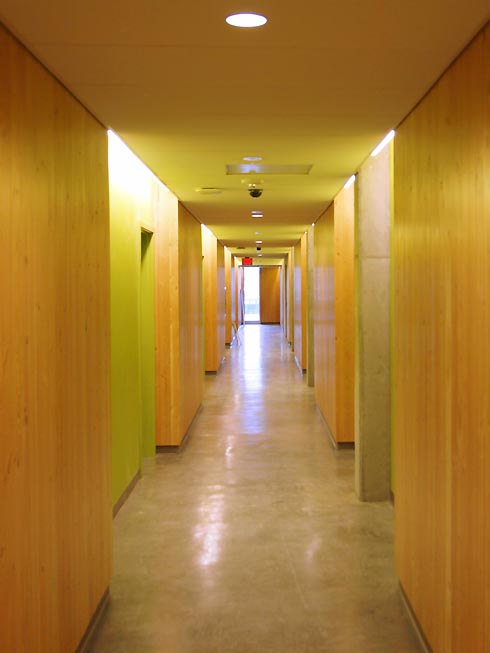 A simple but nice hallway in the Housing section Overall, this project is neither paradise nor an asylum but it has some aspects of both to juggle. Design isn't about being fancy, spending more money or even being clever. Instead, it is about coming up with solutions to existing problems using the best ideas. In this case there are three parts: 1)Housing: 130 units (clean and sober, housing first, 30% of income even if that is $0) 2)Day center: a welcoming design (includes sanitation center for showers, lockers and Kennels etc.) open to the community with an artist's studio in residence to promote interaction and community rooms as well as Transition Projects offices for counseling 3)Shelter: Room for 90 (45 veterans) with kitchen and sanitary facilities. 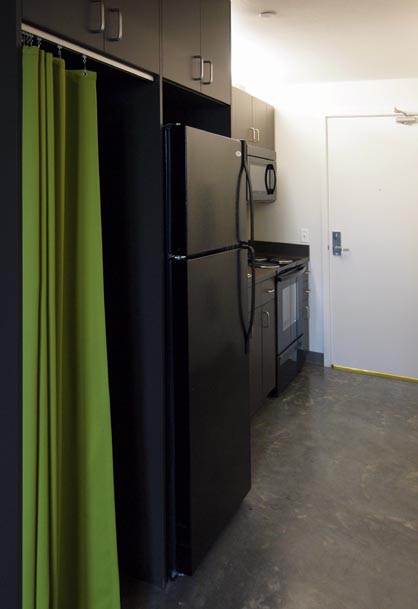 Individual kitchen in the Housing section 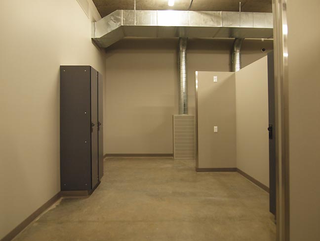
It doesnt look like much but this shelter area is innovative for the way it brings in fresh air 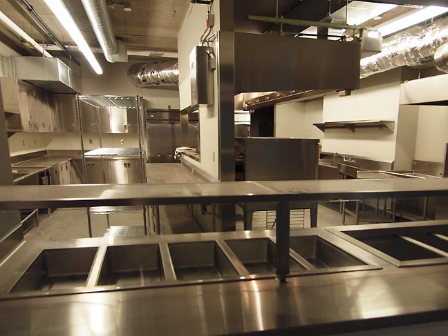 Main kitchen for the Shelter section (workers and managers responsible for the construction have cooked meals for future tenants here already) 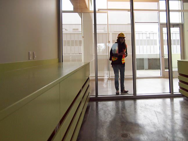
The artist in residence studio. It should be nice having PNCA across the street. 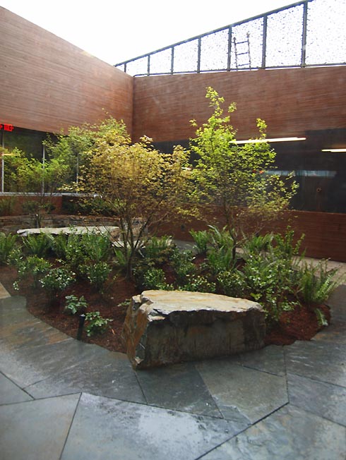 The Shelter has a separate courtyard, nice touch 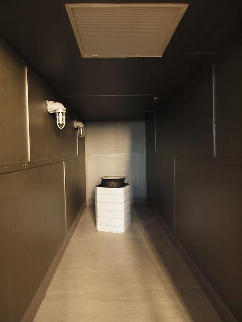
It isn't pretty but the bedbug removal station will be extremely useful. 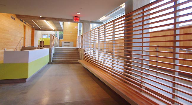 Shelter area desk (note the ample sunlight on the right) It's such a Portland thing to put more progressive design ideas into homeless shelter than its condo's for the rich living just a few blocks away. So how did this happen? Partly it is because Old Town/Chinatown's businesses and residents complained that the city keeps putting all of the homeless facilities in their neighborhood... though that is understandable since that is the nexus of homelessness in the city. The Housing Authority of Portland's solution was uncharacteristically bold for Portland. Instead of going cheap and predefined they turned to the designers who sought out progressive but effective solutions tried elsewhere, so rather than urban blight the RAC could be a center of forethought rather than the typical afterthought. It definitely compliments the train station, Max train stop and ups the ante for whatever might replace or upgrade the current greyhound bus terminal and Post office. This building is an important design moment for the city and perhaps rather than merely cheap we can continue to do things better in ways that will cost us less in the long run in both humanistic and monetary terms. That type of forethought is an area where Portland leads the nation and The Bud Clark Commons will be a mandatory visit for any architectural or urban planning tour of the city. It isn't perfect but the Bud Clark Commons is a milestone in design for Portland and homeless services throughout the United States. 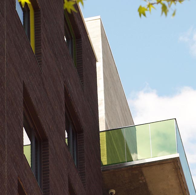 Green Judd-like balconies on the east side of the building. Posted by Jeff Jahn on June 02, 2011 at 16:35 | Comments (1) Comments I agree completely, this is a remarkable building and, more, a remarkable statement about the uses of and right to good design. At last, a building that is intelligent, curious, restless, without having to parade its smarts or quirkiness. A great piece of work from Holst; and that this is the city's center for services to the homeless and dispossessed I have never been prouder to live in Portland. Posted by: Matthew Stadler Post a comment Thanks for signing in, . Now you can comment. (sign out)
(If you haven't left a comment here before, you may need to be approved by
the site owner before your comment will appear. Until then, it won't appear
on the entry. Thanks for waiting.)
|
| s p o n s o r s |
 |
 |
 |
 |
 |
 |
 |
 |
 |
 |
 |
 |
 |
 |
 |
 |

|
Site Design: Jennifer Armbrust | • | Site Development: Philippe Blanc & Katherine Bovee | |


![[TypeKey Profile Page]](http://www.portlandart.net/nav-commenters.gif)