The secret lives of art residing in private collections are generally just as private as the collectors
that have acquired them, but when Sarah Meigs asked
Storm
Tharp to curate her collection to better explore a work of his “The Decorator”,
they both turned that dynamic inside out. It's complicated to discuss but Sarah still remains relatively low
key (I'd describe her as a patient observer and mom who cares about Portland and
art with an emphasis on things with an integral thread of thought as discovery)...
yet suddenly her collection and the laboratory she built for it are very
accessible. Many wanted this venue to be more like the True's Western Bridge in
Seattle but that is a short term project and though less public, the Lumber Room feels
like an ongoing experiment and a more personal one at that. The resulting show
is called, Reader on a Black Background, referring to the
famous painting by Matisse.

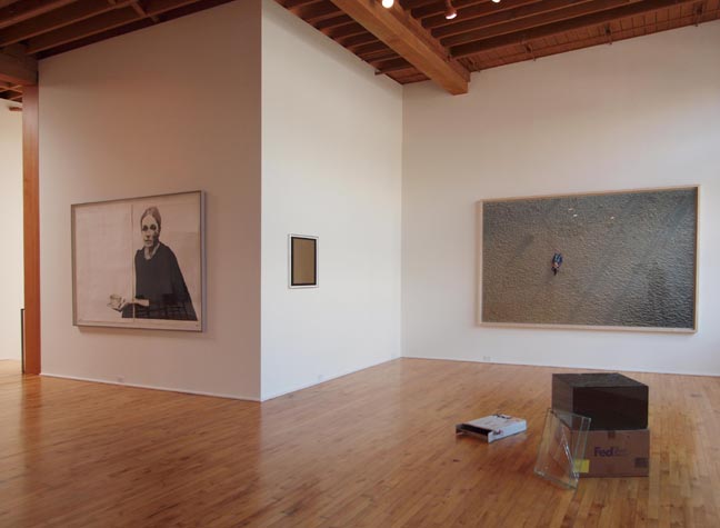
(L to R) Tharp's The Decorator, Matt Sheridan Smith, Walead Beshty and Richard Misrach
What is amazing about the project is the respectful way these objects are arranged...
since most artists are the mortal enemy of any art that is not theirs (even
across disciplines writers often butcher visual art). Historically very few
major artists have been good stewards of the work of others; Alfred Steiglitz,
Donald Judd, Takashi Murakami and Damien Hirst being the exceptions that prove
the rule. Add Storm Tharp to that short list of successful "involved curation" instances where an artist is also curator. It is especially refreshing, since there isn't a hint of passive
aggressiveness that I often seen in most artist/curators (local or otherwise). Overall, I think it is
important that artists not abdicate their right to curate and therefore contextualize
themselves and it is a great opportunity.
The positive outcome makes sense knowing Tharp, who once worked for Interview Magazine (a publication that collects interesting people). In fact, I think of him a little bit like a casting
director, since he sets up a sort of landscape of characters and props in all
of his shows. To give you an idea what I mean
here
is my perhaps defining review of his seminal show in January 2007.
Tharp's last 3 solo shows in Portland have all fit that same mold, as he collects
and arranges characters without setting up much of a narrative thread between
the pieces beyond a general theme. In this case his “The Decorator”
piece came from his 2010
show (Hercules) which he described as related to, “the idea of perfection,”
in the Judd
Related talk I put together last year. He also revealed that a lot of it
came as a response to the intense reaction he had while visiting Marfa and Hercules
is a kind of perfect Deus ex Machina when he appears in Greek myths...
mr perfect who fixes things.

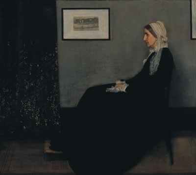
Whistler's, Arrangement in Grey and Black:
Portrait of the Painter's Mother (1871)
More specifically, The Decorator (a kind of Hercules) is an adaptation on the
famous Whistler's Mother painting, which Whistler boldly described as, an “arrangement”
of colors, thereby eating the lunch of those critics like Ruskin who tried to
label him a mere decorator. In this case, Tharp plays another funny twist by
making the woman turn towards the viewers and the room... giving her and himself
a kind of curatorial authorship and presence both in and of the room. Notably, Tharp curated the two Judd chairs in the entrance hallway and not the main gallery
(called The Yard), the way Judd put his chairs in various Chinati Foundation
exhibition spaces.

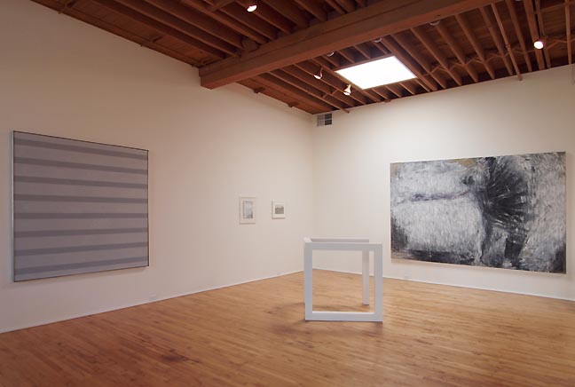
(L to R) Agnes Martin, Adam Fuss, Lee Friedlander, Sol LeWitt, Susan Rothenberg (photo Jeff Jahn)
Having Judd upstairs would have been too much (especially with the Whistler
reference) and instead the arrangement looks really good with few heavy handed
moves. Instead, all of the pieces look really good alternating the
figurative with the abstract ala the Matisse painting Reader on a Black Background,
which Tharp chose as the title for the show. It is explained in the essay, which is
a little tentative and a bit like a thoughtfully digressive travelogue than
a curatorial statement. All of which tells us a lot about this show (adding to the difficulty in writing about it)... that like a lot
of artists, Tharp isn't curating this as a multifaceted exposition on an idea (as a professional curator would)... instead, he's choosing specific elements embodied
in individual works to string together a series of useful ideas to himself as
the artist. Honestly, I don't want to unpack all of those nuggets for PORT's
readers and would rather visitors discovered and developed such interpretations
themselves.
I will however discuss the way the show is installed because many of the most
important pieces have been on display at The Portland Art Museum intermittently
and I have to say... they look so much better here. For example, Sol Lewitt's
open cube (Sarah has 2 of these) has never looked this good in any museum because
it is lit with only one floodlight and a square skylight above. The white cube
itself is turned to intercept the corner, acting as a very physical intermediary
between a grey Agnes Martin stripe painting and a gestural grey Susan Rothenberg.
This makes the white cube a kind of referee between gesture and regimentalism...
a funny curatorial pun on the role of white cubes as art spaces as well. All
of the works are; white, grey, silver or black in this corner which also reads
as a funny decorator's moment. The thing is, it works. The Rothenberg, Martin
and LeWitt never looked this good at PAM (giving me yet another opportunity
to harp about the Jubitz Center being overhung, an idea which is an extension
Judd's critique of generalist museums).
Other works by Corin Hewitt and Jessica Jackson Hutchins expand on the idea
of vistas and domestic accoutrements in a lived in space as a kind of decorator's
situation to negotiate. Likewise, Katherine Yass' video Descent is conveniently in black and white as well. It also reminds me of that
final scene in The Fountainhead where Gary Cooper is riding an elevator to the
top of his skyscraper (another epic decorator moment).
I appreciate the inclusion of Walead Beshty's broken glass and cardboard shipping
boxes, which embrace the idea as damage as part of the piece (which is a direct
reversal of Judd in some ways and a reaffirmation of his core ideas in others).
I had considered showing works like these in a companion show to last year's
Donald Judd called Judd Related... instead, I put together a talk in which Storm
participated, so this all feels like a fine full circle. The Richard Misrach
beach scene has a lot of color compared to most of the upstairs portion of the
show but for me it feels like the restful repose in Matisse's Nice era paintings
and signifies the rest after accomplishment and an antipode to the forever critical
gaze of The Decorator... which is a kind of Tharp's alter super ego, the one
which is never quite sure anything is done or quite good enough.
The show will only be open for 3 more days May 19-21 11AM-6PM @ 419 NW 9th (ring the intercom)

