
|
||
|
Portland art blog + news + exhibition reviews + galleries + contemporary northwest art
|
||
Re/activate, Basalt and Soft Edge as Art-chitecture 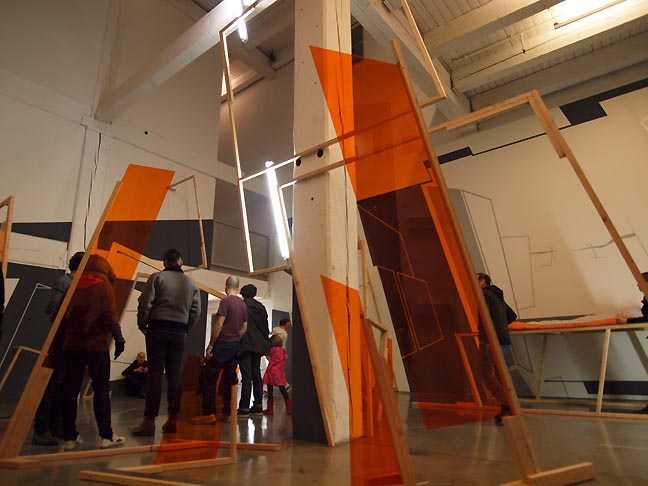
Re/activate during March 1st Thursday's opening I can't recall a time a young emerging artist has hit Portland as hard and often as Damien Gilley has... and in March 2011 he just doubled down with 2 major shows at W+K and Linfield Gallery. He's one of several artists with provisional architecture shows up this month that I wish to discuss. In fact, an extensive list of frequently design oriented art-chitects like Josh Smith, Jordan Tull, Jenene Nagy, Salvatore Reda, Laura Hughes, James Harrison, Arcy Douglass, Jesse Hayward, Midori Hirose, Karl Burkheimer, Oregon Painting Society, The Appendix group (Ben Young, Maggie Casey, Zach Davis and Josh Pavalacky), Evertt Beidler, David Corbett, Avantika Bawa, Laura Fritz, Nathaniel Shapiro and yes I suppose myself (plus many more) are all involved in the examination of the built and buildable environment. So with shows of provisional or potential environments by Damien Gilley, Jordan Tull, Josh Smith and Eric Franklin, March 2011 is a kind of design-a-megeddon of provisional architecture which bears a little more looking at. First, let's define provisional architecture as test form, illusionary or unfinished environment/structures and or materials in space presented in a way that doesn’t distinguish itself as a finished object that can exist without the space that contains it. Provisional architecture doesn’t just modify space it re-schematizes it, turning finished space into an expanded unfinished (or unfinishable) potential space. It opens space and possibilities rather than dwell in it. This type of provisional architecture is always impossible to fully apprehend by the viewers, because it is inherently schematic and unfinished. Kurt Schwitters Merzbau is the protean precedent for this genre which Portland's scene has started to develop into a new Portland-style facet of installation art. 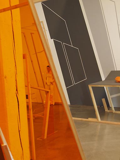 Re/activate at W+K HQ The most successful project in this month of successful “Portland art-chitecture” is Re/activate a collaboration between Damien Gilley and Jordan Tull incorporating sound and dance at Weiden + Kennedy's gallery space. Perhaps more successful than most of the numerous and recent solo projects by Tull or Gilley, the language of cantilevered angles is constantly reiterated in Tull's wooden slanted frames and Gilley's slanted forced perspective lines and murals. The effect tends to open each other's efforts by creating greater spatial idiosyncrasies and view corridors both real and illusory. For example, the way Tull's translucent orange plastic tints the views of Gilley's gallery expanding linescapes and the dancer Rachel Tess (who is making Martha Graham-esque angular movemesnts) reframe eachother. It is a major development for both artists. 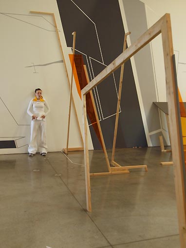
Tess in Re/activate The quality of Tess' dancing/choreography is sufficient but would benefit from more intense extensions and compressions like the ones Graham was known for. The sound-scape is useful for crowd noise control during performances but is otherwise not much of a player here. The real star is the way these two artists can use somewhat similar linear devices with divergent materials and a near 15 degree angle to set up so many interesting vantage points in this very architecturally significant space renovated by Brad Cloepfil. I enjoy the way this set treatment co-opts the viewers, dancers and individual design elements into a Zahha-Hadidian graphic tableau that also references photographic lens distortions that also resemble the angles everything is leaning in. Is it a stage, a lobby a 3d mural? Yes. Do the viewers start to see the world at a 15 degree angle slant... yes. This works because the leaning creates a kinesthetic distortion that produces an odd existential self awareness in space. In these destabilized times Reactivate just feels true to the moment. 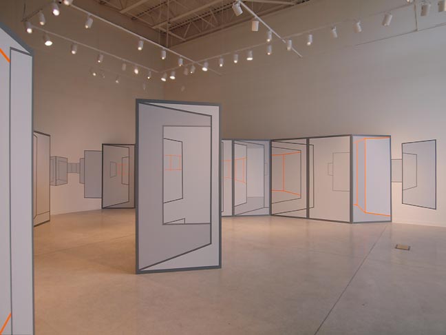
Masterplexed at Linfield College Perhaps the reason Re/activate is stronger than Gilley's solo show Masterplexed at Linfield is the way its layers complicate and reward viewers to explore the piece and architecture simultaneously as we try to undo the knots that Tull and Gilley have tied between room and art. Conversely, Masterplexed feels like a more simple game maze brought to life but it lacks idiosyncratic element that we see in Gilley's best pieces like his Absorpbtion Field show or his Little Big Burger hallway from last year. Little Big Burger's hallway works especially well because the floor and ceiling are incorporated to create a more immersive experience, whereas Masterplexed was contained within a room that remained more or less recognizable as a gallery. There is a fantasy at play in Gilley's work and the more convincing the better. Gilley's best work constitutes an element of wish fulfillment... a wish for more interesting spatial options and adventures. 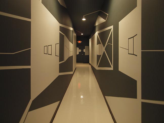
Gilley's installation at Big Little Burger In other words if there is something missing it is that Masterplexed wasn't immersive enough and lacks its own design language. Also, the gallery itself being a big white box doesn't add much context to play off. Instead, Masterplexed is a generic language of slightly shifted perspective boxes like the rasterized graphics in Star Wars that blew everyone's mind in 1977 (before Gilley was born). It also reminds me of the photos of Katsura Villa recently shown at Portland's Japanese garden... the problem being Gilley isn't creating masterpieces of design at Linfield's gallery. It's fine but it's more of a reserved stepping stone to something more impressive (Perhaps his show in 2112 at PCC's Northview gallery provides a more inspiring “Brutalist” architectural space with a huge window box to play in). With Masterplexed Gilley just doesn’t quite do enough to the space, whereas sometimes Gilley does too much such as his Zero Sum project last year. Yet there is a breakthrough in March for Tull and Gilly with Re/activate. They seem to have pushed each other with the collaboration (most architects collaborate), and this installation lives up to its name. Reactivate is the best thing either artist has done in the last year. Though less generic than Masterplexed, Reactivate still has a somewhat simple design language at work here... resembling the angle language that Zaha Hadid uses. That is a problem Gilley and Tull and other artists like Nagy run into frequently... how to make art-chitecture different and or stand up to the work by architects? In particular Gilly, Tull and Nagy all have produced works that resemble Zaha Hadid's schematics. I should note that with Nagy's work at Washington State University called Out/look she seems to have found an object based answer exploring a huge drooping sheet of material, which is more a material exploration mediating architecture rather than the alternative architecture that Gilley, Tull and Nagy (at other times) uses. All of which isn’t to say Gilley's Masterplexed at Linfield doesn't work, it does. It just isn’t the breakthrough statement that a lot of people are waiting for, instead it is a refinement. Perhaps it is because Masterplexed lacks idiosyncratic architectural details to play off that we see everywhere in Reanimate? Masterplexed evokes a Tron, 1st person shooter video games like Doom and Kubrickian linear perspective devices. It comes off as austere and reserved by comparison to Gilley's best solo project to date, a mural at Big Little Burger which transforms a claustrophobic hallway to the loo into an exciting graphic exploration of potential space which it invites the mind to explore. Perhaps the issue is that Gilley needs idiosyncratic constraints to rail against like his highly successful Absorption Field show at Gallery Homeland? Im very anxious to see Gilley and Tull's next solo outings. 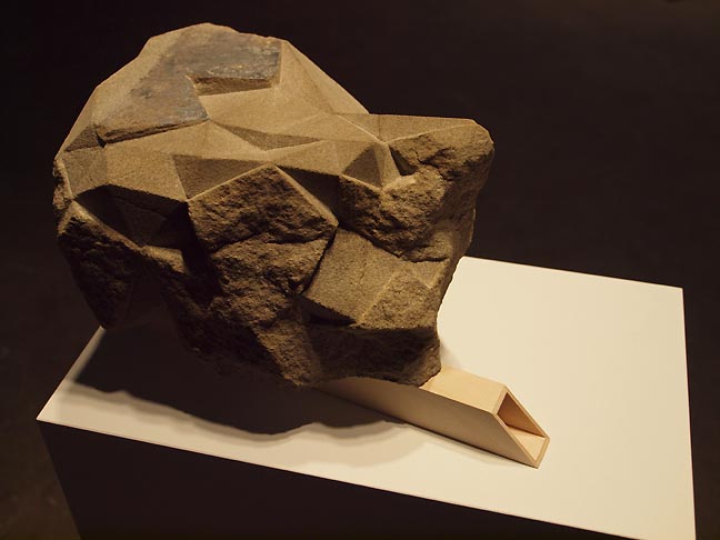 Josh Smith's Soft Edge Another artist I follow closely is Josh Smith and his Soft Edge show at the Manuel Izquierdo Gallery (a key space for launching art-chitects in order of show appearance over the years; Laura Fritz (2000), Jenene Nagy (2005), Nathaniel Shapiro (2006 and 2007), myself (2008), Smith (2009), Oregon Painting Society (2010), Gilley (2010) and now Smith again in 2011). Smith is one of the brightest of the bunch and Im glad PNCA has upgraded some of the gallery's floor plan and lighting. The first piece Soft Edge is a sculpture on a pedestal that appears to be maquette for a structure. It sports a long wooden entryway into an eccentric geodesic dome like rock. Wood is Smith's specialty as a craftsmen but his much newer use of rock short circuits some of the self-consciousness of his craft background. Reminiscent of Buckminster Fuller and Michael Heizer (both incredibly influential to architects like Rem Koolhaas and Tadao Ando) this rock igloo structure implies a certain ageless attraction to very durable survivalist structures in an uncertain age..... For Fuller and Heizer it was the omnipresent cold war threat of nuclear annihilation... for Smith his maquette implies a hardened target for everything from post 9-11 terrorism to a general sense of intense climate change. There is a self sufficient rugged individualism at work here. 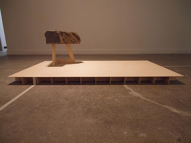
Soft Edge (parallax) The other successful work Soft Edge (parallax) features a floor based installation with a raised platform two coordinating lines on the floor and nearby wall and a wooden structure holding up another Rock... L shaped this time. The whole configuration resembles the kind of brutalist and sculptural architecture you see in sci fi such as Logan's Run, Battlestar Gallactica (Edward Olmos and Lorne Green's versions). The lines on the floor and wall might suggest being on the grid (electricity, communications, etc), whereas the cantilevered support of the “L” shaped rock reminds me of Rem Koolhass' CCTV tower and Michael Heizer's sculptures. It is both authoritarian and somewhat precarious... is this a metaphor for autocratic regimes trying to stay in power? The third installation is a rasterized construct of a mountain titled Holy Mountain. I like how it addresses the white wall but somehow the wooden construction lack the primeval punch of the rock pieces, it feels like his older work. Now I'm convinced Smith is ready to put on a large scale single installation now that he's discovered how to poetically convey the power and fragility that land and architecture exemplify. 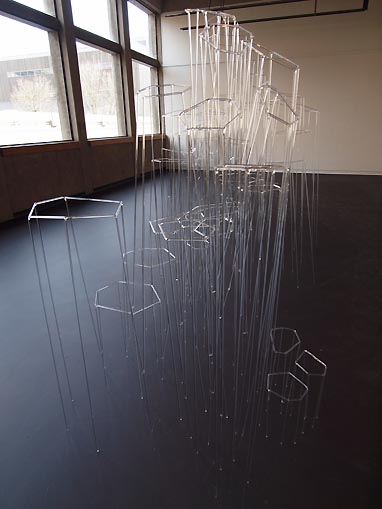 Eric Franklin's Basalt Last but not least is Eric Franklin's Basalt at PSU's Autzen Gallery (itself a room with a view to a great deal of brutalist architecture with very interesting skywalks). In this impressive outing Franklin's glass, Lucite or acrylic(?) structures merely sketch out the volumes of large basalt crystals such as the ones famously depicted on the cover of Led Zeppelin’s The Houses of the Holy. In many way's it is a 3d version of what Gilley does, except in a highly autonomous way that is sculpture and much less related to painting. 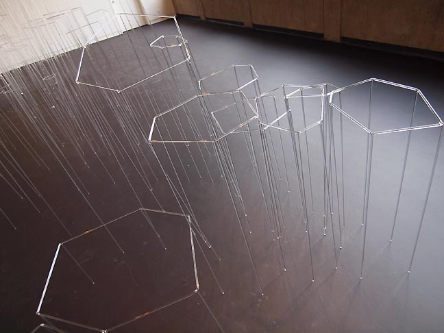
Each crystalline structure catches light at interesting angles and at the terminus of each leg the material fluoresces with extra intensity, which is further enhanced by having the gallery floor painted black. It was a great decision and really makes the piece “pop” in the space. So what does it mean? Well, for a variety of adaptive reasons humans pay special attention to highly organized phenomena and structures. These are often rationally describable in mathematical terms and the shape of such structures literally determines their properties as described by physics. Often such crystals represent a kind of ideal... Superman's fortress of solitude or famous architecture such as IM Pei's pyramid at the Louvre, Philip Johnson's Crystal Palace or the soon to be finished Shard by Renzo Piano in London. The frequently hexagonal sides also bring to mind the honeycomb of bee's, perhaps humanity's favorite geometric metaphor for organized activity. Is this a hive? Nothing besides the form suggests that interpretation so I sense that Franklin is simply evoking the beauty of organization itself, but because there is a lot of variety in these crystals he seems to celebrate a slightly divergent diversity. In these troubled times these forms are comforting as well as suggestive of potentially dangerous technology. So why are so many artists in Portland so obsessed with exploring form and provisional architectural structures? I believe it is because Portland is the one major US city that is not in the grips of massive corporate interests. Instead, it is a city of small business shopkeepers and a general civic sense that everyone is enfranchised. If it sounds utopian, it isn't but it gives Portland artist's an obvious window on a somewhat different world, one worth anticipating or planning for, all while researching the recent goals and missteps of modernism and so called corporate architecture in order to present something different. Reanimate runs through March 31st, performances March 17, 30 & 31st at 7:30pm @ W+K Soft Edge runs through March 31st at PNCA Basalt runs through March 31st at PSU's Autzen Gallery Masterplexed at Linfield college has ended Posted by Jeff Jahn on March 17, 2011 at 8:05 | Comments (1) Comments Basalt by Eric Franklin is made entirely of glass and was fabricated on site. The piece started as individual rods, and is now one connected structure. Posted by: Namita Wiggers Post a comment Thanks for signing in, . Now you can comment. (sign out)
(If you haven't left a comment here before, you may need to be approved by
the site owner before your comment will appear. Until then, it won't appear
on the entry. Thanks for waiting.)
|
| s p o n s o r s |
 |
 |
 |
 |
 |
 |
 |
 |
 |
 |
 |
 |
 |
 |
 |
 |

|
Site Design: Jennifer Armbrust | • | Site Development: Philippe Blanc & Katherine Bovee | |


![[TypeKey Profile Page]](http://www.portlandart.net/nav-commenters.gif)