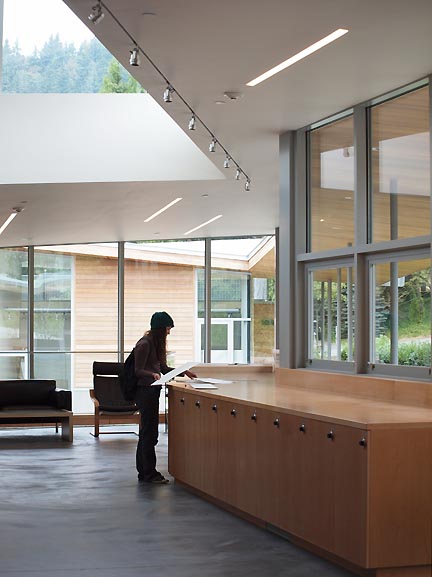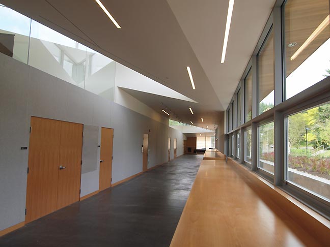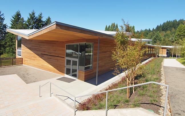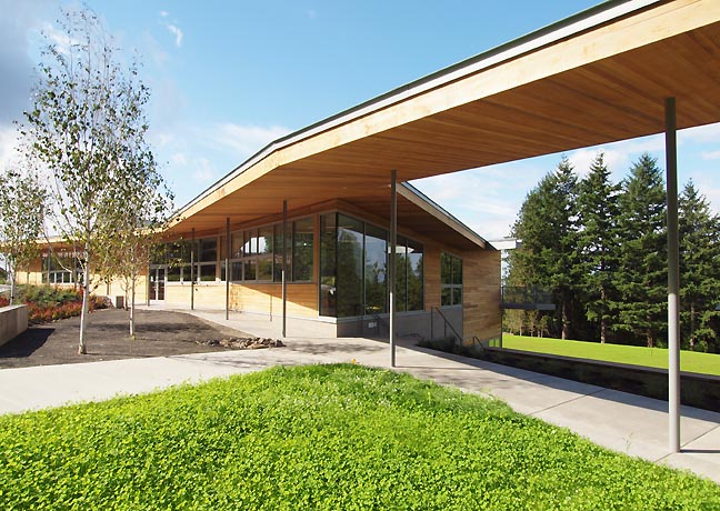
OCAC student using the Jean Vollum Drawing, Painting and Photography Building's custom locker/counter top built-ins (all photos Jeff Jahn)
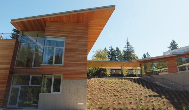
For starters, the 100+ year old Oregon College of Art and Craft has done something startling for such a small quiet school. Along with soaring enrollment that all art schools in Portland have experienced lately, they have raised 14.6 million dollars and hired international architects Charles Rose (of Boston) and COLAB (of Portland) to create the organs of change that will begin to fill out their ambitious 15 year campus building campaign. This signals the end of Portland's self imposed exile from commissioning outside design firms (a gun shyness resulting from the horrible ergonomics of Michael Grave's Portland Building) and this critic couldn't be happier. In fact, this building fits right in with the existing architecture by John Storrs and looks right at home on the exceptional wooded site with spectacular vistas, while addressing environmental concerns such as rainwater managing bioswales.

A long hallway of built in lockers designed specifically for student needs. What's more architect Charles Rose designed the counter tops to handle artists camping out or even sleeping on them. Rose's other projects are mostly homes for creative types and arts related schools so he understands the demands of the project driven lives of artists. In person Rose came off as a keen listener who would energetically engage in whatever key concerns (light, disability access, tough materials, rain) were brought up. His buildings at OCAC resemble that personality and most artists I know would probably consider him a lot of fun to hang out with. Time will tell if his buildings have inherited that quality.
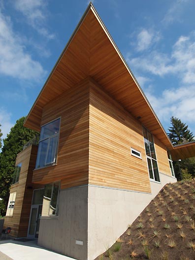
I find it likely. The projects numerous compound angles and shard-like triangle forms resemble Libeskind's Jewish Museum, but with a decidedly warmer feel that remind me of Northwest modernist designer John Yeon who made great use of covered walkways and poles.

Jean Vollum Drawing, Painting and Photography Building

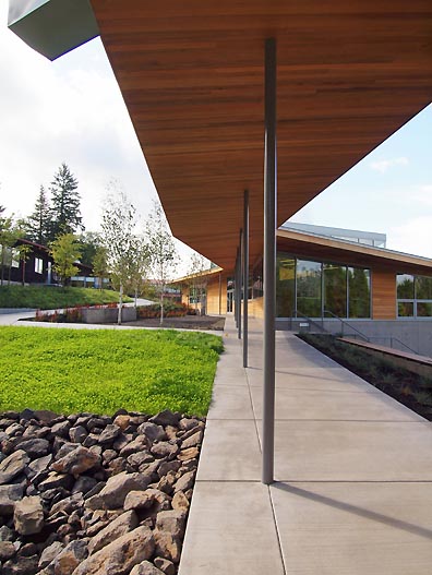
A canopy between the buildings is a nice addition in a wet climate like Portland's.
If anything this project resembles a Norwegian or Swiss ski resort with its ample glass, hallways and utility surfaces framed with cedar. Ergonomically there isn't that much difference between the awkward stuff art students schlep and snowboards. So instead of cozy fireplaces, there is just more glass with retractable shades and projection screens. The shard forms themselves resemble the volcanic tree-covered slopes around the campus. Let's just say any triangular form on a pole ultimately references a pine tree. The sequential forms resemble a man made mimetic forest. This is a school with a fair number of woodworkers after all.

Malcolmson Thesis Studio Building
Ambitious architecture has a way of pushing everyone involved and ultimate evolves the city of Portland's somewhat underdeveloped philanthropic expectations and executions. Perhaps many institutions needed to think a little bigger or at least be more demanding. OCAC has and with a long term 15 year plan it has the added benefit of follow through. The campus will remain small and tight knit with a focus on the fundamentals and personal attention.
Ultimately the project's finished details bear out the promise of the unfinished sneak peek PORT provided this Spring.

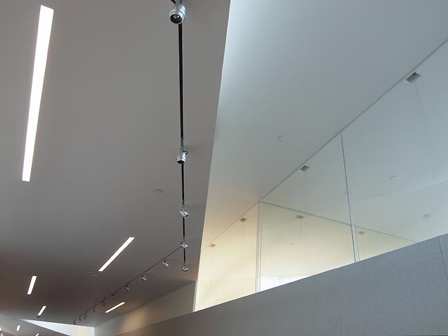
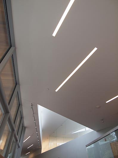
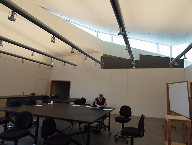
Compound angles make for an exciting ceiling and a dynamic space.
The physical change is very palpable on campus, this is some serious architecture that in use has been just as functional a it is inspiring. In fact, I was a presenter at a 3 hour CAA symposium at the building last weekend and can attest to the functions of the facilities both for formal class-like situations and informal conversations.

After being in Chicago recently (home to the best collection of recent architecture on the planet) it's frankly inspiring to see something that holds up. Admittedly, though this effort does not redefine what an art school can be... they easily redefine expectations for anyone who visits them and with their sylvan location ups the ante for all architecture outside Portland's dense urban core.

OCAC's two new buildings are hugely important beyond their vital role for this small, specialized and ambitious arts and crafts college. In fact, they also constitute a new contemporary benchmark for successful high-use non-profit institutional space in the state of Oregon. In fact, you have to go back to Pietro Belluschi's design for the Portland Art Museum (with input from Frank Lloyd Wright)to find it's precedent. The Mt. Angel Library by Alvar Aalto, remains the state's best building but it doesn't get used anywhere near as hard as an art school will. One art student can do more damage in a year than 30 years of monks will so there is a spartan pragmatism about this concentrated arrangement of triangular forms, ample northern light and its celebration of honest materials like concrete glass and cedar. In fact a majority of the wall surfaces are not drywall at all but a replaceable damage tolerant wood fiber board.

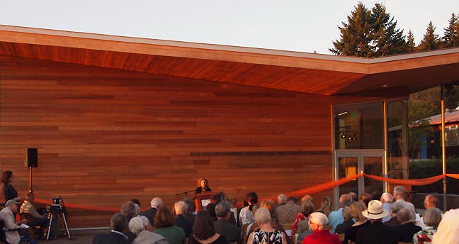
New OCAC President Denise Mullen and donors at the dedication ceremony on September 30th. She will also need to make certain the school continues to evolve its small tight knit faculty and program to keep up with the new expectations of this building program. Maybe not a qualitative change (which is high) but in terms of innovation and international discourse.

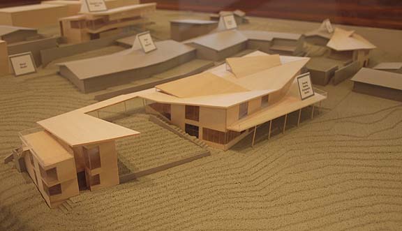
Model of the new master 15 year master campus plan by BOORA architects, with new buildings in light wood color, gray = existing structures. The new metals building to the right will be next. At the top there is a library. As for the existing buildings there will only be one minor modification, the tiny old photography department will become a covered walkway to facilitate a walkway. The path between the new drawing building and the eventual library will form "the spine" of the revised campus.

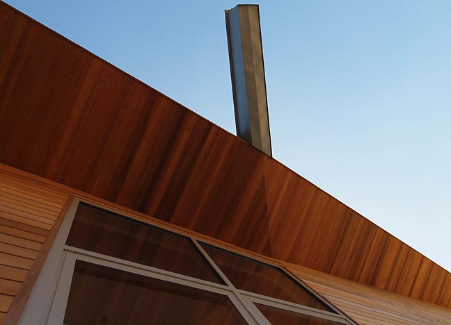
One important feature of the buildings is the way they funnel rainwater into 3 spouts which dramatically drain into bioswales, removing pressure from sewer systems by returning water to the water table through natural filtration. It's a green move Charles Rose uses in many of his projects and in this case the buildings are LEED Silver rated... not attention getting but many times its cost saving to make the building greener by not chasing LEED's particular parameters.

Though I like the water spouts I found that the ones here are a little more blocky and chunkier than Rose's other projects. The effect is ironically, less crafty but I like it. In Portland drawing fussier attention to rain is a bit too much of a stunt.


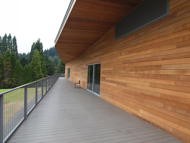
The classrooms all have access to a large deck with fantastic western vistas.

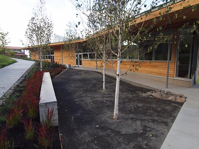
The grounds have numerous outside meeting areas for small classes to congregate.

The computer lab isn't fancy in terms of architecture but this art and craft school has made an important leap into digital technology with this new building.

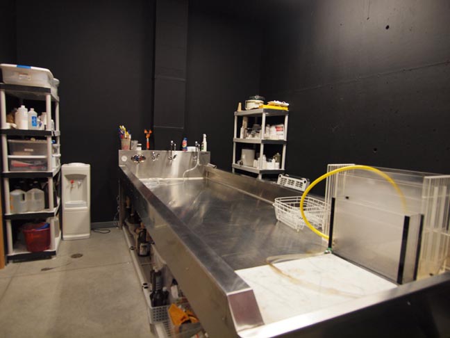
True to their motto, OCAC also has extensive darkroom facilities for traditional film photography as well.

Eventually the slope between the two buildings may become an amphitheater.

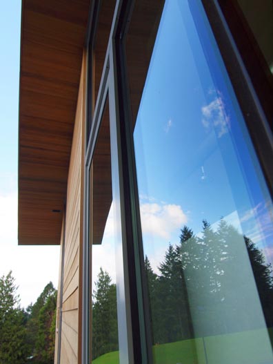
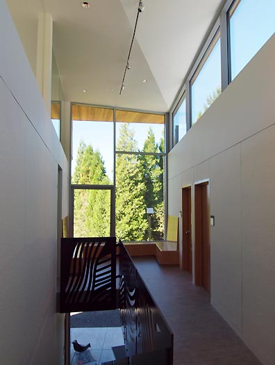
Windows are key to any successful building in the Northwest and this large studio window keeps activity from feeling too hermetic.

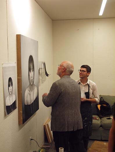
OCAC student in his studio

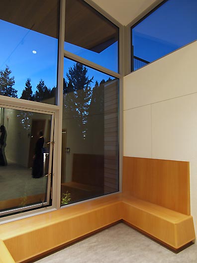
Some very well thought out benches in the studio building take the place of the ubiquitous and crappy folding chairs at many art school studio spaces.

An art piece by Linda Hutchins doubles as a railing in the studio building.
Overall, a highly ambitious, well designed and promising start to an exciting 15 years.
OCAC will open the buildings for a public celebration October 2nd, 11-4 PM


