
|
||
|
Portland art blog + news + exhibition reviews + galleries + contemporary northwest art
|
||
Eva Speer's Landscaping at Charles A. Hartman Fine Art 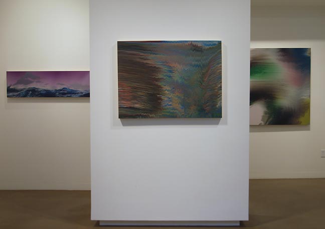 From Eva Speer's Landscaping (L to R) Collection, Slipways #1 & #2 It's the Pacific Northwest, so of course there is a fascination with landscape. Just as the Hudson River School of painting, Ansel Adams, and the f64 photographers and artists who live in the Northwest have no choice but to be in awe of the nature that surrounds them. Those who agree with the previous statement may be unaware that such an assertion is political at best or, at worse, exclusionary. However, it is hardly more so than the opinion that within a progressive art history, landscape painting has been dead for over 150 years. Some may wonder why everything must be deemed political while others maintain that to ignore the political gives short shrift to an ethical awareness in artistic choices. However, for some reason the argument persists less vociferously when the percentage of greenery overwhelms the total yardage of asphalt. Call it the "Kumbaya Effect" of our region. Still, there are some artists who find that the dichotomy of these two extremes is where one can find the richest subject matter. Contemporaneously, the majesty of fir trees and volcanoes is tempered in a suitable parlance, and in that a language is necessary, the landscape as an idealist abstraction has to be realized as an active personal space. In Eva Speer's case, she makes it a gerund. It can be safely assumed that Speer knows all of this theoretical rigmarole, has taken it into consideration in her recent work, and even has some fun working in a milieu that maintains a strong influence in the region. 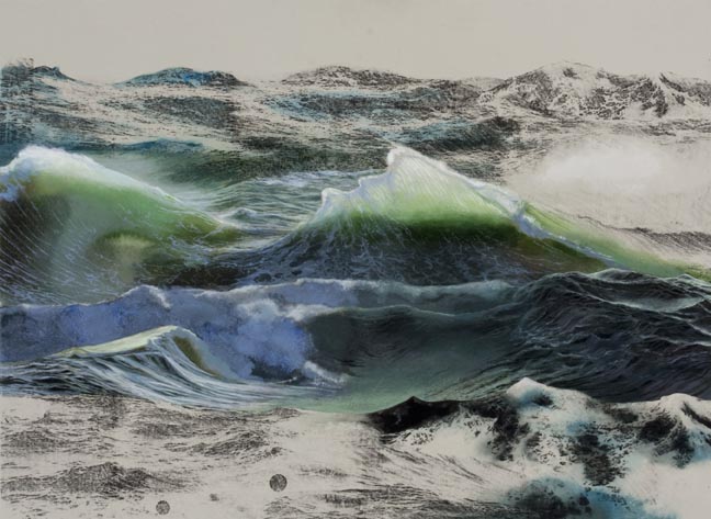
We Could Have Stayed Home Speer experiments with the genre, but also gives viewers traditional "scapes." Even though they are seascapes, they set the tone for the contrariness in her paintings. The artist as subject matter is never far from the context of the paintings. We Could Have Stayed Home depicts a turbulent body of water that reflects the moody assertion of the title. (Regret and remorse are equally common themes in art as is the ubiquitous seascape.) The materials of the painting, gouache on paper with a Xerox transfer, implies that there is no need for inspiration derived from actually being at the depicted scene in order to paint it. The Xerox frames the scene, any scene, really, of such a body of water, wave after dashing wave, as different in formations as snowflakes, but on a grander scale, just another stormy sea or snow-covered field. The second seascape, Collection, reinforces this notion of the mundane. While well executed (Speer is more than proficient as a painter), we ultimately are left with yet another seascape. 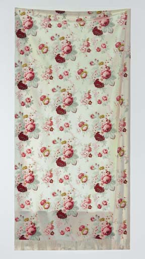 Loved Ones #2 Another aspect of the aforementioned schism is the idyllic nature of the most traditional landscape art. It is given to a nostalgia, a more perfect frozen moment and therefore more like a memory than an event. It is how one remembers a scene. The two large gouache on paper pieces, Loved Ones (#1 & #2), have that effect without being traditional landscapes. Again, Speer is evoking themes around landscape as a genre. The reproduced prints are reminiscent of cotton curtains our grandmothers might have preferred just prior to the introduction of fiberglass as a fabric and the angularity of modern interior design. Not so much landscapes as mindscapes inspired just as much by the dearly-departed’s love of gardening, these trompe loeils of hanging fabric generate feelings of melancholy and fondness just as much as they perfectly replicate a luscious old design. 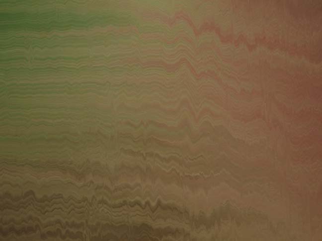 Slipways #1 (detail) It is a simple notion, actually: Landscaping is creating a landscape. To paint a landscape has a similar agency. And both are constructed around geology, namely the most fundamental aspect of land. With no recognition of either a human presence or preference of a specific depiction, the landscape/geology becomes more of an abstraction. In her Slipways series, Speer comes closest to the abstract and reminds us of the tectonic dynamism that lies underground in the Pacific Northwest. The paintings look like colorful seismographic charts, and that might be enough of a reading for these meticulously rendered oils. Yet, they offer more. Their sheen is not unlike that of a photographic print of a landscape, except the camera has been jostled, the emulsion emulsified (Spillways?), all during a magnitude 8 earthquake. The palette is largely that used in landscape painting, including tree bark, water, reflections and sunsets. Since we are so accustomed to seeing the landscape painting in its unadulterated, non-deconstructed form, with her use of these color combinations, we readily give Speers the benefit of the doubt. (One can almost see the scene, but it is best not to gaze for long periods of time and instead look for that millisecond between tremors to see the landscape represented.) Landscaping is typically what one does to one's yard, to a golf course or park. It is plants, land contours, irrigation and whatever else suits one’s fancy, combined in such a way to be visually appealing and designed in a manner to allow easy yet controlled navigation of a given area. It is a manipulation of a natural order, pragmatism as much if not more than an aesthetic. (Just ask a farmer, for whom it is more about landscaping than the landscape, a desire for more efficient production than the aesthetic. Looking good is an added bonus.) Comparatively, a traditional landscape, whether painted, photographed, or filmed, reverses priorities; were it not for the skill of the artist, agency is not given a second thought. Yet, when the artist’s representational decisions, derived more from thought than flora and fauna, are brought more fully into the equation, it is then we can recognize that the entire genre should indeed be seen as "landscaping." Posted by Patrick Collier on September 16, 2010 at 8:32 | Comments (3) Comments Landscape painting has been dead for 150 years? Really? I can't help but feel cynical about a blanket statement like this. Posted by: Brian Libby To further address the genre of landscape painting, one might say that a traditional landscape painting locates the viewer at a distance, where his experience is ideal, abstract. To emphasize the contingent verb form instead of the timeless noun is to manipulate the position of the viewer in relation to the "view". Repetitions and illusions perform the tricks, provide the screen, deflect the gaze from interior to the work to exterior the work. The subject becomes not the symbolized or abstracted (and not even pictorial landscape) but the physical action of a present moment--the relocation of gaze--which is spatial (scape) and temporal, a series of shifts between antecedent and present. Thanks again for posting. Posted by: Eva Speer Brian, just so we're clear: I was representing an extreme position to continue developing the parallelism in that paragraph. Posted by: Patrick Collier Post a comment Thanks for signing in, . Now you can comment. (sign out)
(If you haven't left a comment here before, you may need to be approved by
the site owner before your comment will appear. Until then, it won't appear
on the entry. Thanks for waiting.)
|
| s p o n s o r s |
 |
 |
 |
 |
 |
 |
 |
 |
 |
 |
 |
 |
 |
 |
 |
 |

|
Site Design: Jennifer Armbrust | • | Site Development: Philippe Blanc & Katherine Bovee | |


![[TypeKey Profile Page]](http://www.portlandart.net/nav-commenters.gif)