|
||
|
Portland art blog + news + exhibition reviews + galleries + contemporary northwest art
|
||
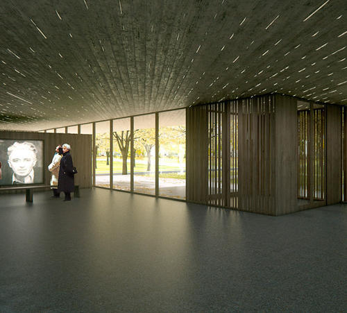
Clyfford Still Museum final design video  lobby view still (from video) of the Clyfford Still Museum In late July they finalized the design and now Denver's Clyfford Still Museum has released an excellent virtual tour of the building by Portland's own Brad Cloepfil. It's looking like it could be Brad's best design since the W+K headquarters and it doesn't hurt that Still is one of my favorite painters. Overall, Cloepfil seems to have balanced both light and heavy massings of concrete texture to produce a serious building designed to prep viewers for the linear textures (frequently vertical) that one finds in Still's work. I don't buy the corduroy motif but I think it is cool none the less. Hopefully, the finished product will only look better than this. It references modernism but it's light filled heavyness seems more in the service of the viewer than structural aggrandizement so it works. Imagine what Cloepfil (or any top architect) could do with the so far pathetic design of the Columbia River Crossing bridge? Posted by Jeff Jahn on August 13, 2010 at 11:03 | Comments (0) Comments Post a comment Thanks for signing in, . Now you can comment. (sign out)
(If you haven't left a comment here before, you may need to be approved by
the site owner before your comment will appear. Until then, it won't appear
on the entry. Thanks for waiting.)
|
| s p o n s o r s |
 |
 |
 |
 |
 |
 |
 |
 |
 |
 |
 |
 |
 |
 |
 |
 |

|
Site Design: Jennifer Armbrust | • | Site Development: Philippe Blanc & Katherine Bovee | |

