
|
||
|
Portland art blog + news + exhibition reviews + galleries + contemporary northwest art
|
||
May 2010 reviews May has been an exceedingly good month for shows in Portland and even though
Cy
Twombly, Disquieted
and Donald
Judd have ended there's still time to catch Scarecrow
and other extra worthy shows. Honestly, I can't a remember a month in Portland
when we've had so many high quality or at least provocative shows both local and
international in scope? In fact, both the Everett Station Lofts and Last Thursday
delivered strong surprises (which somehow weren't sniffed out by the recent attempted/impossible
survey of the scene).
Here are a few quick reviews that give one a taste of what else was going on in the Portland art scene for May: 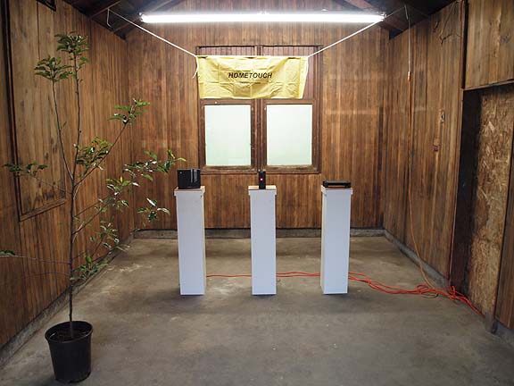 Hometouch at Littlefield At Littlefield Zach Rose's Hometouch, the artist presented a hilarious mock trade show/infomercial sales situation. The three sleek blinking black boxes on pedestals promise some sort of technology and the cheesy pot ash tree gives the whole affair an air of corporate ennui emphasized by the sign which is expertly presented as anything but home-y. The installation raises lots of questions with no answers. Might one of the black boxes be a game console that can help you exercise or play tennis without leaving the home or is it a wireless controller that will organize the activities of every electronic device in the room? No answers here, just crickets and I enjoyed the near perfect deadpan presentation. It wouldn't be as effective in a traditional white box gallery either. Overall, technology can be considered an endless incursion into one's personal and or home life and Rose's mock celebration/exposition makes the utopian deus ex machina of technology into a kind of asymptotic rebus of wish fulfillment. In this installation we can project any expectations upon these slick black boxes with their blinking LED lights and eventually someone will manufacture something to satisfy that desire. The whole thing feels like a Becket play with Dave Hickey as director… call it waiting for Godot.com? 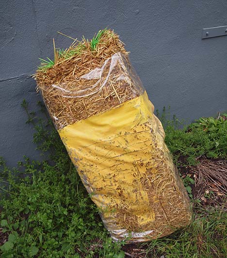
Travis Fitzgerald at Appendix At Appendix Travis Fitzgerald's latest installation of uneasy combines showed great promise as an Arte Povera tinged conflagration of painting and cheap materials all Isa Genzken. I particularly liked a cellophane wrapped bag of pine needles and green paint… it was poetic and reminiscent of Richard Tuttle but a similarly wrapped hay bail stole the show. Propped up in an alleyway it was Art Informel indeed… a kind of Anne Truitt meets Robert Rauschenberg moment outside the white box. I hope Fitzgerald ditches the gallery construct all together taking it beyond the whole Unmonumental fetish of cheap materials in the white gallery... a conceit popular for the past 8 years or so. The show is wildly uneven but he's one to watch. 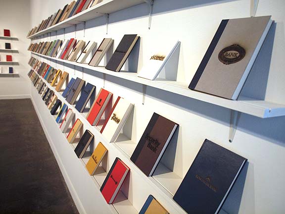
Michael Mandiberg at PNCA At PNCA's Feldman Gallery Michael Mandiberg's The Great Recession is a well presented but not particularly deep exploration of the aura surrounding today's financial lending institutions, both international megabanks and more local savings and loans. Since all are symbolically represented by similar sized books there is a sense of inscrutable equanimity here, begging the question of culpability between Wall Street and Main Street via this obfuscation. Yes, we would all love to "close the book" on this chapter of economic history but of course it's impossible and the "bank logos are burned into the covers" of our consciousness. I enjoy this show but the readily accessible puns reveal its limitations as a too academic exercise in logo slinging. The video, etc. doesn't really expand the discussion either though someone burying his money in the woods is equally topical. Ultimately it's the book and pop logo fetish that makes this show palatable as an exercise in design as a form of mild institutional critique. Go see it now because after this recession ends it won't age well. Luckily for Mandiberg it probably has another year or two of relevance. 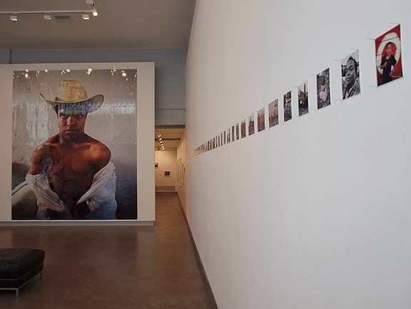
Liva Corona at Bluesky Bluesky's Enanitos Toreros show is a smart exploration of humanity and scale (one of photography's best attributes……..). In Liva Corona's show her photography presents a series of encounters with dwarf bullfighters from Mexico. I particularly appreciated the way both the small format and giant format prints all presented their subjects as figures to be encountered by the viewer, not merely as subjects of the lens… i.e. passive images merely presented for voyeuristic apprehension. Here the figures meet your gaze. Also, the kinesthetic shift of scale effectively makes scale a moot issue and refocuses our attention on the humanity present. It's just like fighting fire with fire or a black comic using the N word. What's more I've noticed a steady increase in the strength and presentation of shows at Bluesky since their move to the Desoto building and subsequent phases of increased professionalization. It's putting them on course for becoming Portland's third major museum space (PAM and MoCC being the other two). In the past people confused them with being a co-op but with deft shows like this by international artists (with subsequent international expenses) it seems like Bluesky is more of a kunsthalle for photography in this vibrant art city. 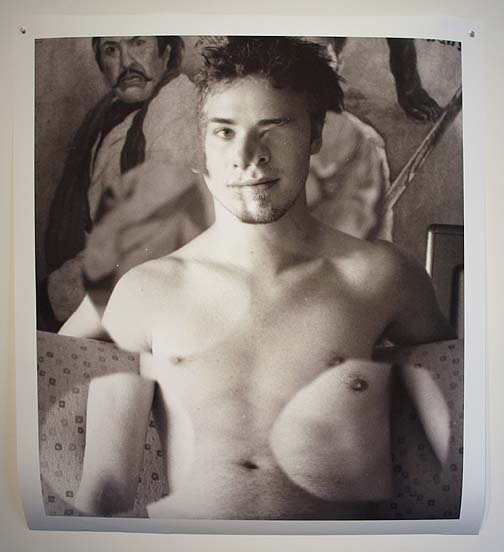 Gus Van Sant at PDX Contemporary Art Gus Van Sant's Cut Ups show at PDX Contemporary Art is surprisingly good... just because he's a good sometimes great director doesn't mean his still photos will necessarily translate, but here they do. His screen-test photos digitally mashed up recall the fragmented drama of Francis Bacon and fiction of Storm Tharp as well as Picasso. Still, the big difference between those artists and Van Sant is the characters he constructs are ultimately pieced together in a way that makes the figure seem more vulnerable and evocative of sympathy rather than the sadism of Picasso or fiction in Tharp or Bacon. Think about the narcoleptic character played by River Phoenix in My Own Private Idaho or the death scene in Last Days where the main character leaves his body and climbs away. Those scenes should give a reference for these Frankenstein like accretions of personalities. 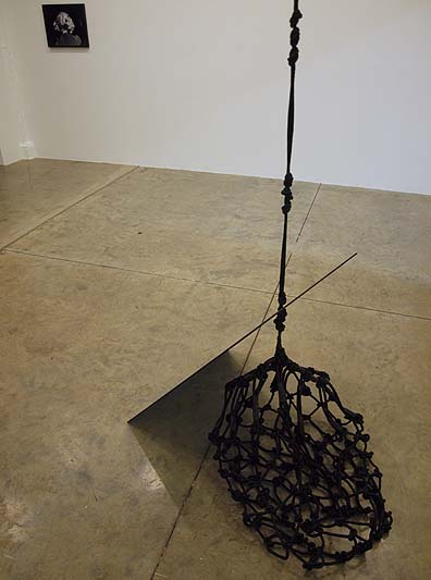 Snellman's Face Facade Natasha Snellman's latest show at Fourteen30 is a little too predictable for its own good but the back room is more successful than the front. The front room is full of works that combine 3 popular contemporary memes; the voyeuristic vampirism of Hollywood, mild S&M and art heavily indebted to Rachel Harrison and other artists in the Unmonumental show. It just looks like the sort of art you are certain to see when gallery hopping in LA, making it a tad anonymous. The back room continues the themes of the first but houses only two works, which happen to be the strongest in the show. The back of Shirley Temple's head is apparently a famous icon (I recognized it immediately) and her tender, fragile situation is highlighted by the colored bruise of fame Snellman has placed in the part of her hair… is this child star damage? Temple had a non alcoholic drink named after her and eventually became a US ambassador, for her Hollywood was a place to be a child and politics a place to be an adult… it's usually the other way around. The hanging piece, Baby Take a Bow (suspended) successfully fuses a fetish for black netting, and tinted window glass… it's a kind of rumination on the delicate balance between privacy and sexual fetish. Nicely done (unlike some of the easier stuff in front) but I still have to wonder, what's the point? This show isn't sexy or vulnerable enough to compete with the Hollywood we see regularly in film. Hell, it's still not as cool as a Robert Palmer video (which Snellman and I both like a little too much). She's talented but needs to push the envelope a lot more if she's going down this well worn path. WWRPD? 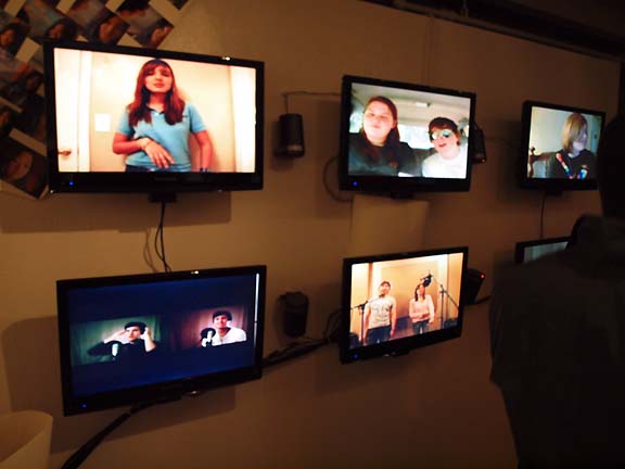 Exploring Glee and it's fans at Tribute Exploring Glee and it's fans at Tribute
Tribute Gallery's Marginal Strands show is the second of Dustin Zemel's Stare Hard Series… this time taking on the phenomenon of Glee. Honestly, I liked this exhibition more than the actual show since I'm more interested in the cultural phenomena than yet another high school drama on TV. My impression is one of obsession and intense identification and it reminds me a little bit of Candice Breitz's Soliloquy Series, just not as convincing, clear or mesmerizing. Then again Glee doesn't have Nicholson or Eastwood acting in it, yet. 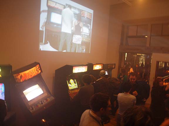 Artura Silva at Half/Dozen Half Dozen's Artur Silva exhibition of arcade machines, video and mayhem titled Flipperama Rhapsody was one of the most ambitious shows I've seen at the Everett Station lofts in recent memory. Consisting of numerous classic arcade games, one tipped and spewing smoke, and a video collage of snarky arcade play action the show has that typical Brooklyn-style attitude and subculture mining one doesn't see frequently from local art school graduates. That's either a good thing or bad but it is welcome variety this time. This is another enjoyable show that isn't terribly deep I but it does signal that Half/Dozen is now the gallery to watch in the Everett Station Lofts. 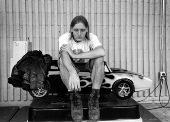 Mark Steinmetz at Charles Hartman Fine Art Mark Steinmetz's show at Charles Hartman Fine Art is a wonderfully nuanced study in the compressed horizon of opportunities one finds in small towns. Generally as a kind of formal metaphor for fate there is an intense horizontality to the compositions and even when a ribbon and pole bisects a picture there is a sense that yes, one can possibly transcend this place but not today. His photo of a young man sitting in a too small hotrod kiddie ride might be very staged looking but it also feels true to my own experience with small rural towns. Steinmetz's highly geometric compositions serve to enhance the sense of fate hanging in these photographs, he's a kind kind of photographic Thomas Hardy. Posted by Jeff Jahn on May 28, 2010 at 12:54 | Comments (0) Comments Post a comment Thanks for signing in, . Now you can comment. (sign out)
(If you haven't left a comment here before, you may need to be approved by
the site owner before your comment will appear. Until then, it won't appear
on the entry. Thanks for waiting.)
|
| s p o n s o r s |
 |
 |
 |
 |
 |
 |
 |
 |
 |
 |
 |
 |
 |
 |
 |
 |

|
Site Design: Jennifer Armbrust | • | Site Development: Philippe Blanc & Katherine Bovee | |

