
|
||
|
Portland art blog + news + exhibition reviews + galleries + contemporary northwest art
|
||
Transit Bridge Developments Nov, 2009 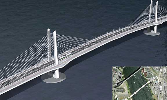 November 10, 2009 version of Willamette Transit Bridge Yesterday's WRBAC meeting was interesting and more fiery, at least compared to previous meetings. It's detail time and the design of the new Transit/Ped/Bike bridge iis coming along. I like its triangular towers and belvederes designed to minimize the airfoil vacuums that flat towers create (dangerous to cyclists and pedestrians). 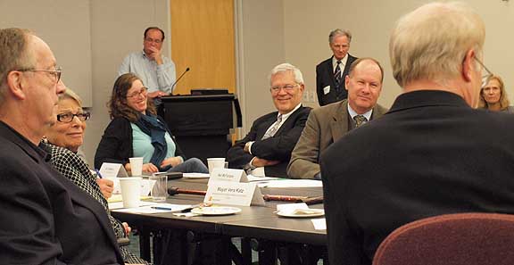 WRBAC Committee (foreground) Donald Macdonald and Anna Valentina-Murch (center and right background) I also liked that architect Donald Macdonald reiterated my aesthetic comment (from August's meeting) about how the triangular forms relate to Mt Hood and the tops of pine trees in Portland's natural skyline. Overall, it has a Frank Lloyd Wright feel that is both futuristic and classic. I'm actually glad its not yet another Calatrava. With Macdonald's bay bridge extension and this Portland project he's becoming a big name bridge architect who isn't some euro-clone. 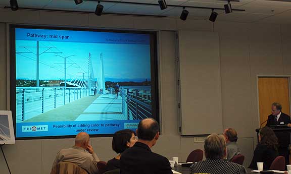
Debate over railings and central lighting posts Still, The bridge is only 25% designed and a lot of important details remain unresolved. For example some committee members felt the handrails were rather "vulgar" and reminded one of a "stockyard". I wouldn't go that far but they certainly require a lot of refinement. Macdonald stated his preference for more horizontality as well. Still, the committee was on the architect's case about this and I'm glad because these designs aren't there yet. Below are some elegant bridge handrails. 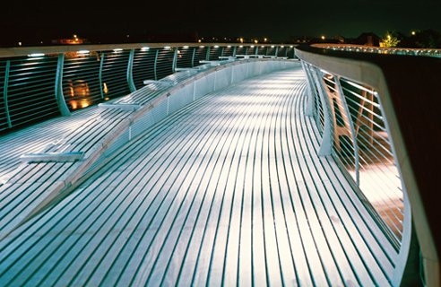 this bridge in Castleford England has excellent hand railings I also feel the streetlights in the center of the bridge don't fit well and feel crude compared to the rest of the bridge. Those lamp posts introduce a horizontal design element on top that really messes things up. The project also has 2 artists Anna Valentina-Murch and Douglas Hollis from San Francisco (chosen by RACC) who are exploring ideas such as a a bike path with goes that play a tune to sound wells and a subtle breathing bridge light show that ebbs and flows subtly over time. Their efforts are in the very preliminary stages but are being included in the process because it allows greater artistic freedom if the work as the design is taking form. Both artists seem to be of the subtle Robert Irwin/Olafur Elliason school of public art. 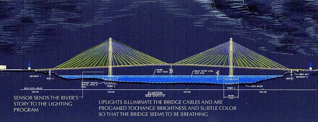 Aesthetic lighting proposal Everyone mentioned that subtlety for the lighting as key... this is after all the city that Mark Rothko grew up in with characteristic diffused sunlight colors and I and many others believe the bridge should be dedicated to Portland's most famous son (who has been shamefully gone unacknowledged). 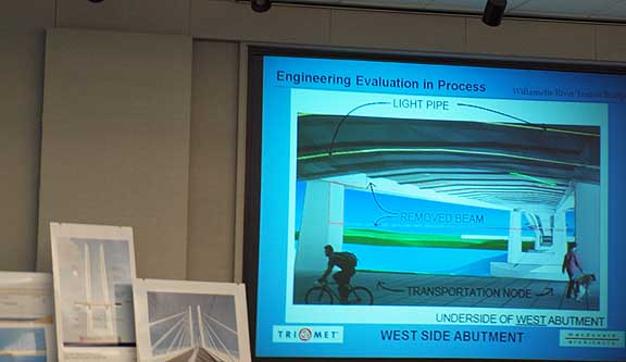 under side of bridge without support beam There was also some healthy tension between the architect and engineer in regards to reinforcement beam beneath the bridge. Having the concrete bar reduces the experience of the bridge's underside exponentially so hopefully the engineer can make the structure both structurally sound and aesthetically worthy. Committee Chair Vera Katz was pretty direct with the engineer who felt there was about a 50/50 chance of finding a resolution. Katz didn't seem to be taking any of that and pressed that it was crucial to find an aesthetically suitable solution because the committee wants the underside of the bridge to be wonderful, not "prison like." 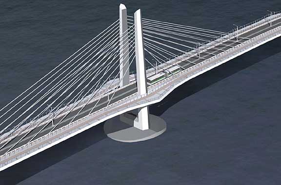
Overall, I felt the process was on track and Portland seems to be getting a unique bridge that fulfills a unique role as the first major transit, pedestrian and cycling bridge in the USA. The bridge has a lot of potential as a Portland icon that along with the tram says that Portland is ready to lead... actually weve been doing it for decades but now Portland seems poised to be less shy about it. Posted by Jeff Jahn on November 11, 2009 at 18:59 | Comments (0) Comments Post a comment Thanks for signing in, . Now you can comment. (sign out)
(If you haven't left a comment here before, you may need to be approved by
the site owner before your comment will appear. Until then, it won't appear
on the entry. Thanks for waiting.)
|
| s p o n s o r s |
 |
 |
 |
 |
 |
 |
 |
 |
 |
 |
 |
 |
 |
 |
 |
 |

|
Site Design: Jennifer Armbrust | • | Site Development: Philippe Blanc & Katherine Bovee | |

