
|
||
|
Portland art blog + news + exhibition reviews + galleries + contemporary northwest art
|
||
New Designs on Portland  The design for the new leaf-shaped Rainwater Pavilion for the Tanner Springs urban wetland park in the Pearl District is pretty impressive. The pavilion designed by Herbert Dreiseitl (like the rest of the park) conjures "Space Elves" in my mind, something that would be hokey if it weren't so well done. The shelter even recycles rainwater into the wetlands below. Nice job. Up on Alberta for Last Thursday, the intriguing crop of new garage galleries is starting to hit its stride after several ok-good shows they are starting to come into their own, making the most of their idiomatic spaces. 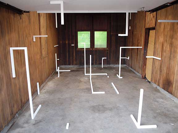
For it's second show the Littlefield gallery's Frame show by Jordan Tull is a very exciting attack on the white cube. Tull's latest work calls Sol LeWitt and Joel Shapiro to mind (though not figurative like Shapiro). Overall it is an interesting use of implied rasterized space as schematic related to Jenene Nagy and Damien Gilley's recent work. 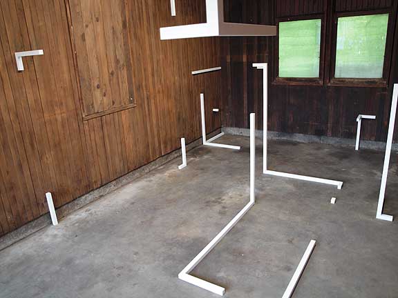 Last August Tull wowed us at Tractor Gallery and collectively this followup and August's show really make the Lower East Side galleries attempts at minimalism seem tame, stale and noncommittal. The space even has a history once playing host to one of Criss Moss' Donut Shops and home of the Decemberists.  The Appendix gallery which is a little less refined than Littlefield also came into it's own with work by Gary Wiseman and Meredeth Andrews' Inside Outside Upside Down. 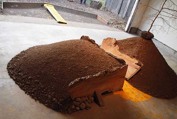 Sporting walkways covered with tumeric and mustard powder there is a shamanistic Beuys related thing going on here though it isn't fully realized yet. Still the excavation and plankwalk in fromt of the garage successfully creates an air of anticipation that the wooden dams and earth don't fully deliver upon. 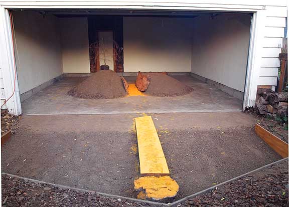
That said the tiny and dead Charlie Brown Christmas tree does provide some interesting indoor/outdoor contemplation. Overall, Gary and Meredeth need a large scale situation and some major earth moving equipment to really make this work. That said this holds promise and the group of artists that seem to be cycling through Tractor, Littlefield and Appendix seem like a legitimate movement of 10+ young artists with similar concerns (space, environment, indoors/outdoors) in dialog with one another. Posted by Jeff Jahn on September 25, 2009 at 11:30 | Comments (15) Comments I did not know people were still attempting minimalism. I thought that was played out like SEGA. Posted by: derek franklin I just built a cube. Painted it all black and glossy. Then titled it "SEGA." Now, rather than making art, I am playing NHL 98 on sweet new home entertainment system. Wanna come over Derek? I call Detroit Red Wings though. Glad to see some attention is being directed towards Appendix and Little Field. Posted by: Calvin Ross Carl Thanks, I would love to take you up on the invite, and I call Penguins. It is also great to see these galleries getting exposure, and I do not intend to take away from that with my comment. I think appendix has done an amazing job with programing. My point is that the discourse is dated and not symbolic of contemporary artistic practice. A subscription to the Kantian myth is no longer viable. Minimalism through the eyes of Foucalt's structures of power and simulationism is even dated. So, how is this discourse of the futility of minimalist attempts relative to anything but obsolencences, or perhaps Benjamin's notion of the the true collector, Jordan Tull's show was interesting, but more as a side note on the exclusivity of regional garage band music or as a stored muscle car left over from the cold war than any attempt at minimalism. If it is an attempt at minimalism I would be truly disappointed. Posted by: derek franklin Derek and I talked for a length about such issues, and I think they're pertinent/need to be discussed. As a co-conspirator in both spaces, I'm interested, Jeff, why you think the piece attacks the white cube. The space in its totality... yes...LF is delightfully non-traditional...but couldn't one make the argument that the install is actually acting to bring the white cube back into the space, neutralizing its character by positioning itself as a series of implied cubits, white and static? I would argue that the piece is successful as per the artist's goal, and that it is a gorgeous intervention, but I'd hesitate to say that it manifests as an attack. If there is violence to be read here, I take the position that it is actually the white cube attacking the space and not the other way around. Particularly in the shots you posted, the white angles feel ominous, viral. They are small blips and flashes of the white cube and its allies. They co-opt and prop the space upon themselves, suggesting an infinite and unstoppable field/membrane of confinement/demarcation. Posted by: joshua pavlacky Currently we live in a truly pluralistic age... so any argument that a particular strategy no longer holds water is in itself specious (on a similar note insisting that "painting is dead" is equally specious). Thankfully, we are now done with the era "planned obsolescence" in art with mutually exclusive theories for art movements... in other words, all tactics and strategies (no matter how obscure) are quite viable and all theoretical ideas are non-exclusive (even if they were intended to be so originally). In particular, there just so happens to be a lot of interest in so called "minimalism" because they are perceived as the last great era, ie one where many of the chief proponents actually made each other better rather than merely persuing product differntiation. That and minimalism, post minimalism etc. engages real estate... a loaded subject if there ever was one. "Property" is a subject that isn't going away any time soon. Also, one can be sure a strategy is even more valid when it's pantomimed in art schools. It's a form of flattery. Second, I'm positive the so called "minimalists" themselves were not attempting minimalism... its a misnomer and a kind of marketing distinction foisted upon Judd, Martin, LeWitt, Morris, DeMaria, Reinhardt, Marden, Smithson etc. for convenience. Besides, Malevich, Mondrian, Klee, and late Kandinsky all have work that could just as easilly be misapplied to that set. I really like artists like Eva Hesse who have been lumped into the min/post-min tag but don't seem to fit that well. Third, fact is any strategy is available to artists today, who can then re-apply it to whatever program or context they so choose. It will be different now, but that's the challenge. Josh, on your specifics... maybe attack isnt the only word that applies but by providing an alternative it is a challenge. Overall I enjoyed how Frame replaced the normalizing non-heirachical effect of white walls with the work itself, recapturing art's sanction within the piece and not the institution. Overall, there is something more autonamous to work like Tull's which acts as a schematic... like a blueprint in space for different space. I think of it as a loaded template imposed on the site... like gun sights in a scope or those rasterized tron-like graphics in early video games. As a superimposed template with material information (Nagy, Gilley etc. do this too) it becomes a way to create priviledged art spaces outside of the white box, even when it is still in a gallery... It would be interesting to see Frame extend into the open space in front of the gallery and load/blur the indoor/outdoor distinctions more. It could be done in a lot of unexpected locations too. I also Like Minus Space's use of the term "reductive art"... and in many ways a template or schematic is a type of reduction. Posted by: Double J I never intended my comment to insinuate that painting or a reductive aesthetic is dead. I believe that we see that in the works of artist like Sterling Ruby, Stephen Prina, and Gedi Sibony, and the history is loaded and reworked infinitely. This is positive for the viability of the aesthetic condition of reductive art, and proves that it like all aesthetics fit into our puralistic age. This is not exactly the issue I was getting at . I myself have a deep love for minimalist works, but find many works like Tull's to be uninformed and pay little respect to the all the artists and theorists engaged in the subject. It is a strong aesthetic that can be down right dangerous when used in the wrong ways both politically and socially.(Le Corbusier St. Louis for example) Also, a movement will never be born out of these types of works in Portland unless someone steps up and builds a new context for them theoretically. We cannot just sit around naively making pieces and expect them to hold any weight. Artists must give do diligence not only to making,and aesthetics, but also to fully conceptualizing works. This is the artists' duty today. Without doing that we will never get past the stereotypes of artists and be respected as intellectuals and educated makers instead of untethered madmen oracles of the future. Simply linking our works to history will never do anything for us or the art. Posted by: derek franklin The thing is Tull's work isn't a re-working of LeWitt at all or some kind of tribute to minimalism. Instead, it comes from his background in very high level design which makes what he and others are doing in Portland very different and thus has great potential for something new. Where artists like Judd were driven by philosphy (in particular empiricism) I think this wave in Portland is being driven more the influence of Rem Koolhaas and other architects on design (a certain absurdist rationalization of form and function with specific ends). Where Tull Gilley, Pavlacky, Arcy Douglass and Jenene Nagy etc. are interesting is how they are rehabilitating those ideas for an art context, something which ultimately seperates it from the ideas of Koolhaas and OMA which are tied to their cleint's needs. There is no client here except for the artist creating work for one another. Though we havn't seen a lot of original writing from some of these artists I suspect it's coming... and quite frankly, if pushed Im quite capable of producing something that should satisfy the need for words. Another one of the Portland artist's working in this genre is PORT's own Arcy Douglass. He has an impressive command of art history, writes like a demon and is actually a former architect (worked with AGPS on their Topanga Canyon project). His essays on PORT show his command over the subject matter and he shares similar concerns that you have.. Overall, I think they each have a good intellectual base but It is best to remember that the purpose of these project spaces is a way for the work to develop, drive and inform discourse before it goes all out and makes grand statements for itself. After speaking with Pavalacky recently Im convinced he and those in his circle have the drive and brainpower for such a daunting task. So... patience, these artists are woodshedding this somewhat new, and quite different thing. What makes Portland very interesting is how artists are allowed to develop over time... in the real world in a post MFA context. That said... there's nothing wrong with charging them to produce more and diverse discourse Derek. I think these artists definitely feel the same need for refined discussion that you do. Let's remember that the discourse by even the most accomplished artists today is in general is pretty feeble in comparison to what was taking place 40 or 50 years ago though... so it isn't really just a Portland problem. That said I think we are on it. Posted by: Double J I have been thinking about Derek's comments a lot and they are worth repeating because I think that they are right:
"So it was a move that we both wanted to make at the same time. We have both been developing the land sculpture simultaneously since that time, five years ago, just about until today. We're really starting the sixth year. I mean, you know, we did it. It's something that two people could do that one couldn't, really, create a movement, because if one person does it, it is almost an eccentricity, but if two people are doing it and then they influence two others or three. It takes no more than three or four or five people to make a movement and then those people of course can have a hundred or two hundred or five hundred or a thousand following them. But the key idea is to develop two or three people. But it's not necessary, sometimes three or four or five people could be working simultaneously."
http://www.aaa.si.edu/collections/oralhistories/transcripts/demari72.htm
Minimalism was process and was not form driven. I think that is one of the biggest misconceptions. Most comments about minimalism tend to make it sound like it is driven by the "image of the perfect form". Judd's work is the result of the proccess and the problems that he had set up for himself in his work. Judd did not care about perfection and tried to avoid it in his work. He did want work without "distractions" but that is very different. If Judd could have solved those problems in painting, he would have done it. Their work was solutions to problems that they had set for themselves that could not be solved any other way. It is not about form or image which people who talk about Minimalism tend to focus on. The only artist that was interested in Minimalist forms per se was Robert Morris and you know where his process led him. In the interview De Maria talks about striving for the perfect form so we would have to include him in there as well. But nonetheless, their approach is in the minority. Somebody should write an article called "Everything we were taught about Minimalism is wrong". Posted by: Arcy I feel I must further explain some of my comments posted. It appears I have unloaded a bunch of ideas, but not unpacked them properly. This has caused them to be looked at under a lens of harshness and misconception. What I meant by the "Kantian Myth" was the idea that an art object was a thing within itself. Meaning a thing, a being, this could be Transendental, Alien, I did not mean this Kantian comment as a diss on minimalism, but as a statement that we are now familiar with these images and objects. This familiarity does not allow us to look at this art without more diametrical eyes linking multiply histories and movements to this. This is where many people came from with art is dead and painting is dead conversation, but that is not my stance. I feel this opened the flood gates to what Jeff called, "A Truly Pluralistic Age". This to me means that the minimalists reductive aesthetic will continue forever but in new contexts. The problem with this, is that the artist today must be aware of all the histories of these aesthetics and build new ones, which is extremely hard. When it is not attended to by the artist it sends these images and objects into the abyss of indifference. That is why I have been aggressively commenting on this particular post, and made the comments about artistic and critical practice. My comments about the obsolescence factor in Tull's show was not aimed against minimalism. Benjamin believed that at obsolescence only a true collector could see the new aura of the object. This True Collector could break the object free from the constraints of banal functionality and give the object a new aura, which Benjamin deemed the objects utopian aura. This is not a slash on Jordan Tull, but a different way to looking at his piece. Being in a garage gallery sets this stage for me this is a place where many people store cherished collectibles and nostalgic heirlooms to be preserved for a new life outside the original context. The situation for me that comes to mind is when my neighbor as a child would pull his 58 Cadillac out of the garage once a year in the summertime. It was perfect and like nothing I had ever seen, but it was thirty years old. If he had drove this car every day this aura would be lost. Krauss used this notion as a theoretical underpinning for Marcel Broodthaers work, which I find to well argued. In the case of Tull's show if Jeff is right about the artist's intentions Tull has perhaps saved minimalism in a opposite way bringing it to a context of functionality through the lens of architecture and high design. I believe Jeff has a point in this situation, but I continue to believe there is almost no intention in this particular piece. Plus, Tull told me at the opening he researched Kant for this piece. This is why I commented in the that context. I would like to see Arcy and Jeff write an essay about contextualizing these aesthetics today. Everyone who works in this aesthetic is probably waiting for it. Perhaps I should just do it myself. Finally, they teach minimalism is school for about 6 hours, and neither Arcy or Jeff know me from a can of paint. Posted by: derek franklin No worries Derek, this is not a review of your understanding... it's just a review of some developing, somewhat design based art in Portland. Then again you did position your understanding in relation to other artists in town and it's commendable you have the will to do so... still I won't turn this into your mfa critique. Your own work just doesnt figure but I can see how your position is invested here. That said, Krauss can be discounted pretty easilly, she's reversed her own position on Judd so much she's more of a catalogue of how Judd's experiential work troubles theorists than a definitive take. All that said I'm confident Arcy and I are well versed in the subject having spent lot of time recently with what remains of many of those artist's inner circles in an attempt to get at the the real and much richer history here. We do know your work and that is what matters. I second Arcy's opinion that what is being taught in schools is a kind of paper tiger version of what Newman, Judd, Martin, Smithson, Irwin, De Maria, Heizer Flavin, LeWitt and Hesse were really about. Most of the art I see coming out of art schools relating to them seems like pantomime, which is fine in a school setting but those artists though quite educated were rather anti-academic. Attempts to academicize that work will always fail. I much prefer the woodshed approach I'm seeing from Pavlacky, Tull and Arcy, Gilley and Nagy etc. Ive had an essay in the works but I also think it's important for Josh and his crew to articulate their positions themselves at this point. This review was just a little goading and it's nice to see a hint of the more private discussions here in the comments. That said I've had numerous private discussions that convince me that there is real discourse and new effect at play here rather than some mere surface exploration of a bygone era. With this sort of art it is the experience, not the CV that ultimately matters. It's intellectual response to worldly experience rather than academic situation, a subtle but very important distinction. Flinging a paintpot, empty can or not... art history is predominantly made by autodidacts and apostate academicians for a reason. It isn't merely enough to read Kant... Judd certainly rejected him and counter-intuitively applied a more mainline empiricism into something very radical as a visual experience (the visual being the important driver, not the philosophical camp). In short It was the man not his reading and Id like to see how this evolving chapter in Portland plays itself out. It is also interesting because unlike New York, LA and San Francisco... Portland's scene isn't dominated by its art schools at all. People move here from other places after their schooling and they tend to be most ambitious/effective movers and shakers as they develop outside the academy. In other places the most promising MFA's are placed directly in galleries after the graduate. Here there is a development process and it's exactly what I am seeing at Tractor, Littlefield and Appendix (among others). Posted by: Double J My background is merely a BFA in printmaking, 8 years as a union steel fabricator, and 2 years working with artists. So, I am not trying to turn this into an MFA critique. Posted by: derek franklin I also would not and do not want to be positioned with this group of artists. Posted by: derek franklin Hi Derek, Thanks for your analysis of the "Kantian Myth", it is very helpful and raises some interesting and difficult questions. I think that the first question it raises is can art be just about the object, the "thing in itself". The second question which is also implied is art just about aesthetics? First let's put this into perspective. In the 1950's Abstract Expressionists are in their heyday and paintings are often described as somehow representing or communicating the internal state of mind of the artist. Pollock: " Every good artist paints what they are." So on the one hand there is a very nebulous, personal motivation for these paintings but on the other hand there is a very proto-Kantian "truth to materials." Pollock drips paint, Newman paints with flat colors, etc.
By the 1960's the industrial systems set up in this country during the Second World War are in full swing. They are all kinds of beautiful materials that really do not have place in "art", at least how it was understood in the 1950's. These materials might be sheets of copper and steel, zinc, magnesium, rubber, plywood, flourescent lights and plexiglas just to name a few. Anyway you get the idea. You bet when the artists stared using these materials that they used them in the same way that the painters of the 1950's used, mainly very concerned with aesthetics and "beauty", but somehow it was going against the natures of the materials. Look at the early work of Andre or Judd and you can see them trying to process these or the contradictory demands of beauty and aesthetics while at the same time demonstrating a truth to materials. The early work by these artists did not "work". There might have been too many ideas or it was too fussy or maybe they just felt that they were not connecting with the potential of the material. The work was not eliciting in them the reaction they felt when they were looking at the Abstract Expressionists. Anyway, something had to be let go, this was there moment of truth. On the one hand, they had what they understood at the time to be "beauty", the aesthetic and personal interest of the artist and on the other hand was would you will call a Kantian will to the "truth" of materials. If they chose beauty they risked, turning back on themselves and becoming second rate Abstract Expressionists. If they chose the will of the materials, then they went to down a path that was very different than the art that went before it but whose success was far from assured. I would probably say it even stronger that it must have seemed nearly impossible to create a compelling art that removed the personal aesthetic of the artist and concentrated solely on the properties of the material. The first step in the work that we call Minimalist would be a rejection of beauty. It is not without some irony that 40 years later we would often find their work would be compelling enough to be considered "beautiful". Stella was not sitting in his studio saying let's make some beautiful black paintings, Judd was not interested making beautiful boxes, and Andre was not saying that these metal tiles will look really beautiful together. I am also not convinced that any artistic practice based soley on beauty, ie the personal aesthetic of the artist at one time would be sustainable. Their work came out of a deeper place. The drive to create a solution out of the problems that they had set for themselves based on their understanding of what the Abstract Expressionists were doing in the 1950's. It is my understanding that when Stella was using black paint or when Judd was beginning to make his boxes, they were working within the "natural" properties of the materials. Black paint looks and feels different than the canvas that it is painted on. Plexiglas, plywood and Zinc all come in sheets so automatically you are either go to use it as a flat piece on a wall or you going to connect the pieces to create a volume, ie a box. In both cases, it was not aesthetics but the properties of the materials that was driving the process. I am not convinced that reduction for reduction's purposes is ever enough. In the same way that beauty was not driving these works, reduction implies that there is a perspective outside of the process of the materials in which it would be a good thing to "reduce". These artists were never interested in reduction. They were interested in exploring the limits of materials without distraction or personal aesthetics. They were spectators as much as they were creators. Now to come full circle and deal with Kant again, I think that a Kantian reading of the work implies an appreciation of these works solely on their optical and aesthetic properties which in turn leads to a whole series of value judgements: Good, Bad, Beautiful, Ugly... This approach is foreign to not only they way that works were created but also to the intention of the artists. Their work was beyond aesthetics and personal preference in a very profound way which seems completely at odds with a Kantian reading of their work. On the hand, Kant led to a new regard for materials which was a good thing. In other words, Kant in regard to materials is helpful, Kant in regards to aesthetics is less helpful.
Sorry for the long post, once you start you do not know where it will end. Arcy Posted by: Arcy Arcy- Posted by: derek franklin Derek I think you are protesting just a bit too much, besides you were the one who positioned/inserted yourself in the discussion. What's done is done. I don't think reduction is the goal either (Minus Space definitely shows art that isn't reduction for reduction's sake) but I appreciate the use of another term... Overall, simply avoiding the unnecessary is a good strategy for all but the most roccoco art. Even an additive artist like Jason Rhoades didn't accrete anything unnecessary. Also, there is a Occam's razor that can be applied to a lot of interesting art and design... a place where the two can and sometimes do meet, creating a form of ambiguity between the two. Tull comes from that tradition operates more like Martin Puryear or Toyo Ito than LeWitt. Its more syncretic like the way Tull coopted idiomatic aspects of the Littlefield space It's an important observation but Nagy, Gilley, Tull, Macca, Pavalacky etc. arent coming at this in a remotely similar way to Judd etc. and that's good. Even though Arcy arguably is the one coming the closest to earlier artists, even he is coming with a much different set of syncretic constructs that inform his work... i.e.lots of design influences and they have their roots in a lot of recent European architecture. Overall, Tull's got way more than Kant going on anyways... besides his industrial design background he is a legitimate master craftsman and right angles are his most natural form. It's his natural vocabulary and like most languages it's useless if only one person speaks it. Tull's Frame absolutely represents a sophisticated vocabulary that is probably going to get even more sophisticated. Its like Latin... the more people call it a dead language the more specialized uses it will find. Making it anything but dead. Of course, there are more than aesthetics at work here (there is a kinesthetic response to the environmental conditions) but I get the distinct sense that's a hairpin trigger for a lot of people who love those minimalist artists (who were hardly of a monogenic program but are treated as such). What Id like to see is a further refining of this discussion in further exhibitions and maybe an essay or 2. Certainly more pointed artist statements will be expected because of this effusion. Posted by: Double J Post a comment Thanks for signing in, . Now you can comment. (sign out)
(If you haven't left a comment here before, you may need to be approved by
the site owner before your comment will appear. Until then, it won't appear
on the entry. Thanks for waiting.)
|
| s p o n s o r s |
 |
 |
 |
 |
 |
 |
 |
 |
 |
 |
 |
 |
 |
 |
 |
 |

|
Site Design: Jennifer Armbrust | • | Site Development: Philippe Blanc & Katherine Bovee | |


![[TypeKey Profile Page]](http://www.portlandart.net/nav-commenters.gif)