
|
||
|
Portland art blog + news + exhibition reviews + galleries + contemporary northwest art
|
||
Willamette transit bridge design developments 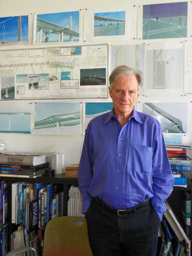 Donald MacDonald, the architect Trimet hired at the end of May to design the new multi-use transit bridge over the Willamette Trimet's bridge design process has been tough to follow but at the July 2nd advisory committee meeting I think I saw the light at the end of the tunnel. Thankfully, the meeting was heavily weighted towards design issues (in stark contrast to the horrendous Columbia River Crossing design, which is lacking to the point of being offensive... we still need a design competition for that other project). At July 2nd's meeting our new architect, Donald MacDonald, felt once the tower design is settled on by late August all of the other elements will fall into place by their December deadline. So at least the Willamette's new span seems to be on track. 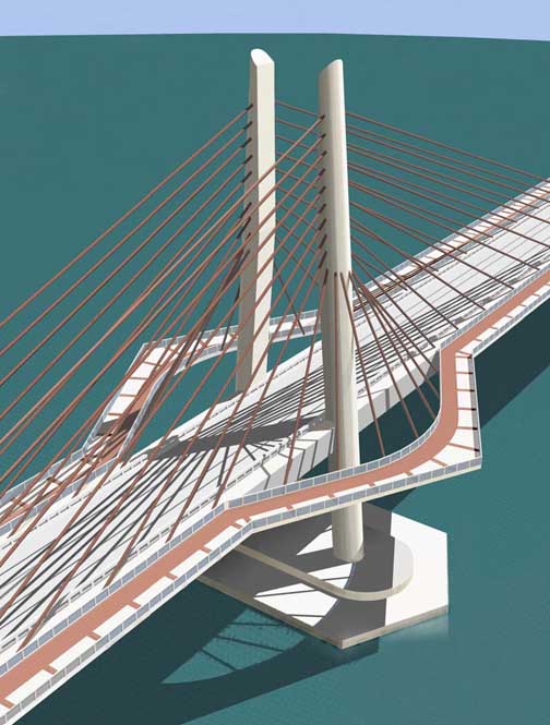
July 2nd's meeting debuted an exciting preliminary "A" design with inwardly canted towers, cantilevered bike/pedestrian paths that creates four great observation points and wider paths around the towers. The salmon color is a bad idea, very little besides salmon is salmon colored in Portland (and for good reason). 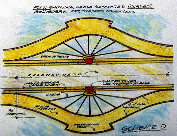 Curved belvedere designs Of course everything you see here is very preliminary but what we do know for sure is that this new multi-use bridge (transit, pedestrian, cycling) will be a refinement of the modern cable stay design. Also, with bike and pedestrian lanes on both the north and south sides it has a shot at being the best (and only) bike, pedestrian and mass transit span in US. MacDonald, seemed positive that it could be the world's top ped/cycling bridge. Hopefully this article will provide PORT's design savvy readers enough information so they can come prepared with some serious input for Trimet and the architectural/engineering team.. they are looking for more and the next opportunity July 24th at AiA Portland office (details and RSVP info here). So is this going to be some horrendous out-scaled project as some have wondered? I seriously doubt it... and if anything Donald MacDonald's bridge resume and architectural star power is a step up from Rosales, with an impressive series of projects, all which seem quite sensitive to their sites: 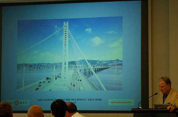 Macdonald discussing his high profile Bay Bridge SAS segment 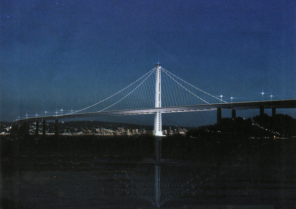
New Bay Bridge SAS extension for Caltrans  *Note this Bay Bridge East Span or SAS extension has cycling and pedestrian lanes above deck (** sadly unlike the CRC, which has tunnels). 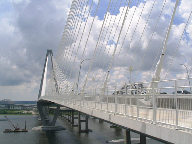
MacDonald's Arthur Ravenel Jr bridge, which I've brought up repeatedly in discussion over the CRC bridge project 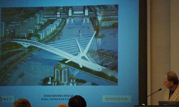
MacDonald's marina bridge in Dubai 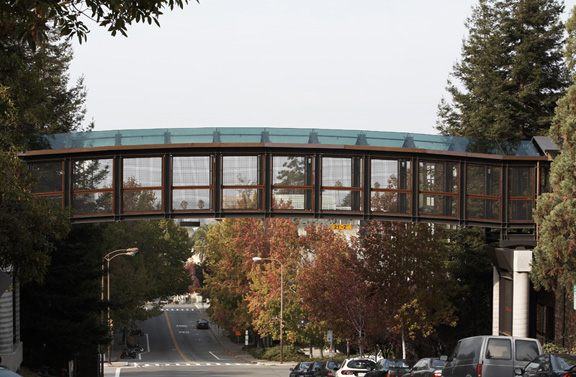
MacDonald's nicely detailed and scaled skywalk at UC Berkeley 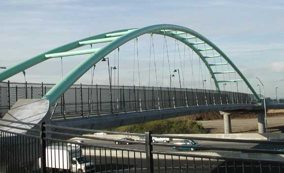
A cycling/pedestrian bridge in Berkeley over I-80(any biker/pedestrians familiar with this bridge care to comment on it?) What happened at the meeting? Well we were introduced to a new architect with a serious reputation and a preliminary but exciting new inwardly canted tower design with decks that protrude for better pedestrian/cycle lanes, a rather extraneous proposal for a waterfall, the misguided idea that Portlanders identify with salmon as a color as much as the actual fish, potentially tacky attempts to soften the inherently angular cable stay design, talk of observation decks, more tower designs and numerous innovative strategies to improve the bicycle and pedestrian lanes.  V style towers, which now seems out of favor Frankly it's a lot to take in and most of it was very preliminary but encouraging, it's a refinement of a modern cable stayed bridge design that isn't using an older system to appeal to some Portlanders sometimes misplaced fetish of humility. Call it a new bridge for the new Portland. 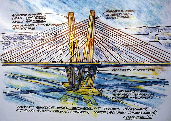 Option C is a V design with space within the towers (interesting lighting options), but it increases the tower's area One option, the "V" tower designs (options B C D) seemed out of favor at this meeting but are still being developed (to these eyes they needlessly loom over the pedestrian and cycling areas). Also, option E with its steel towers = extra cost, budgetary riskiness and anachronistic design seems just as doomed as the Wave Frame design from last year. 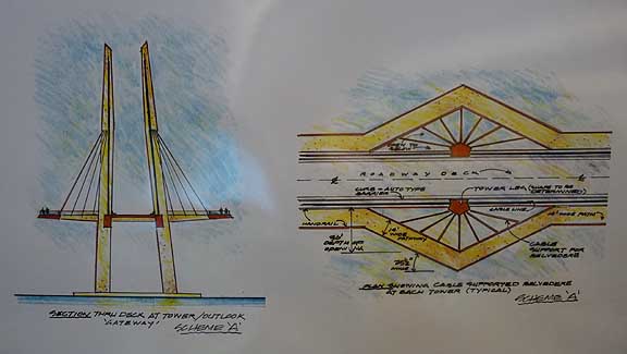 A preliminary sketch of "inwardly canted" option A Whereas, option A with the inward canted towers (a clear favorite with nearly everyone in the room) was given the go ahead for much more design development which we will probably see in a few weeks. I particularly liked how option A's footings remind me of the Ira Keller Fountain. But the salmon color is a bad idea, we like to save and eat salmon here but very little exterior architecture uses the color in Portland… pine tree greens make more sense. Quite frankly, I'm not certain the bridge needs color beyond white, except that green lighting at night is apparently better for birds and bats. 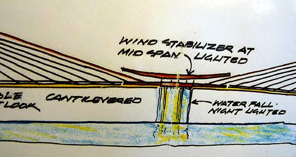 the central shelter is an unconvincing idea, it was brought about as a way to soften the bridge profile Ignoring the waterfalls and huts in the center of the bridge, I like that these designs are generally more assertive than we've seen earlier in this process… which is appropriate because this bridge is a major statement about Portland's commitment to mass transit, pedestrians and cyclists and is the first major iconic challenge to the dominance of car culture in America. It is time for Portland to step up and lead in an iconically responsible way, deferring to fine but old car-oriented bridges doesn't make sense. On a detail level the ped/cycle innovations are gutsier than previous designs but the cheesy ideas like a waterfall worry me, though it is a time to discuss. 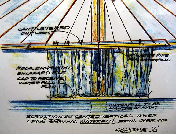 preliminary waterfall feature sketch... a rather un-Portland suggestion I feel it is redundant and wasteful to put a waterfall over a river when we have so many real ones nearby. Besides artist Olafur Elliason already did some temporary art pieces in New York. Frankly it's wasteful gimmick so unless it's a gray water reclamation unit I think MacDonald should focus on good design first before suggesting smaller features. Portland is a design city. Similarly one cannot be true to a cable stay design and ignore it's angular but potentially gossamer qualities so some attempts to soften the design might misplaced. Celebrate the inherent qualities of the design, don't sabotage them with half-hearted acessories. Posted by Jeff Jahn on July 06, 2009 at 9:30 | Comments (0) Comments Post a comment Thanks for signing in, . Now you can comment. (sign out)
(If you haven't left a comment here before, you may need to be approved by
the site owner before your comment will appear. Until then, it won't appear
on the entry. Thanks for waiting.)
|
| s p o n s o r s |
 |
 |
 |
 |
 |
 |
 |
 |
 |
 |
 |
 |
 |
 |
 |
 |

|
Site Design: Jennifer Armbrust | • | Site Development: Philippe Blanc & Katherine Bovee | |

