|
||
|
Portland art blog + news + exhibition reviews + galleries + contemporary northwest art
|
||
Stephen Slappe's Shelter in Place at NAAU 
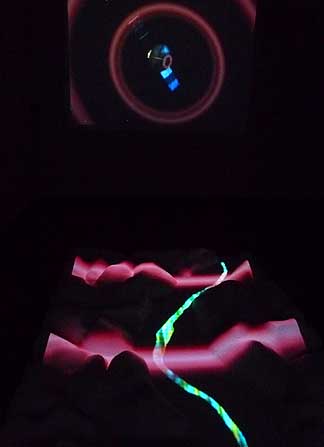
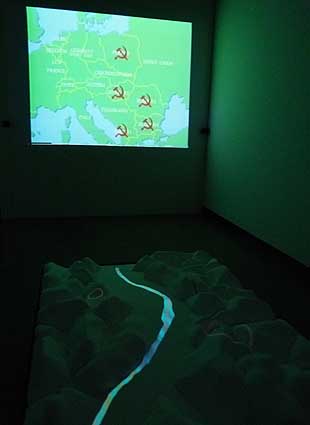
The latest Couture series show at NAAU, Stephen Slappe's Shelter in Place, is the first fully linear visual narrative exhibition in the series thus far, mixing sci fi, young love and indie culture laced with 80's style media induced paranoia. Thus, it makes a huge investment in its own anachronism at a time when a great many other artists are also fetishing the 1980's to the nth degree. Frankly, I'm not convinced that part is successful but it provides some guilty pleasures. It also points out how the 8 years of constant alert under G.W. Bush wasn't all that unique compared to the Regan era (or Kennedy with the Cuban missile crisis for that matter). Do we really need to revisit the Bush or Regan era though? …and if so what insight is gained? More promisingly, Slappe's piece may suggest the issue of constant civic hysteria might be just as much the media's fault as the leader's.  Inside the gallery viewers will find an 80's style boom box by itself then a 3 channel video room outfitted with surround sound. The room contains two walls that serve as screens and a floor based topographical model of a West Virginia river valley, which also serves as a screen of sorts. That topographical model acts as both a real and metaphorical barrier between the two screens and the effect is a touch like Tony Oursler, especially when the two main characters faces float on it at the end of the piece. Still, it is considerably more passive than Oursler's engaging characters. Instead, most of the time it acts as a schematic or bridge between the wall-based video content. Yet, it was my favorite part making me feel a little bit like I was walking through a video arcade. Despite that it still it felt underused as if no-one were playing those games and was waiting for someone to put a quarter in it. For context, the piece differs significantly from Slappe's previous works like Crossroads (currently on view at the Art Gym) in that the work isn't a focused study on spatial relations in a genre like car flicks, sci fi or vampire movies as he has done quite successfully in the past. Instead, it presents a loosely coherent story with some character development and a string of events. In short this is like a short film, except it is presented a bit like home-theater in the round. 
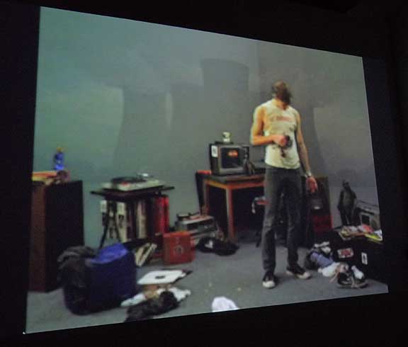
Here's a summary: If one begins the viewing in the "proper" sequence we are greeted by a shimmering view of the topographical floor element. Water like waves (or are they broadcast transmissions?) flow over the hills and valley. On the two facing vertical walls we are bombarded by images and sounds from the old Soviet Union, Ronald Regan and eventually images of the Bhopal India chemical leak. Alarms sound and a satellite which crosses from one vertical wall to the next beams red waves across the topographical valley spawning two red spiral zones…which continue to radiate throwing circular waves (similar to the satellite's). Eventually two rooms appear on the vertical walls; one a boy's …another a girl's. Soon the two characters appear, watch a little doomsday style 80's news television then they begin to listen to some punk records and read comics in existential reverie. Then they pick up their old land line style phones and somehow share these sub cultural interests with one another mimicking today's smart phone media features. Eventually their heads become disembodied (signifying their growing consciousness of a different media and therefore world) and float onto the topographical floor space where the projected river separating them disappears and the eventually lay naked (having gotten their bodies back) next to one another in way that reminds me a little of Bill Viola. Problem is I often find Bill Viola's imagery and storytelling to be overly saccharine, too melodramatic and forced. Slappe here has distinctly more indie aesthetic and except for the alarms at the beginning, the piece is hardly melodramatic. The problem is, unlike his earlier pieces like Crossroads, which all relied heavily on the incidental but important spatial cues and details the story becomes the key. Sadly it just isn't that great of a story, it isn't bad either… and it reminds me of comic books, even the OK ones are usually page turners. 
Here is where this becomes a movie review: First off, all of the 80's references like Ronald Reagan and the Soviet Union feel underdeveloped. Instead of really serving the plot they simply establish a time period when they could have done much more. Instead the footage is trafficking purely in received meaning rather than engage the viewer to develop it as a parallel world. Even the movie version of The Watchmen kept references to politicians and pundits slightly twisted (like Nixon as president in the 80's). Second, there isn't any real character development; the boy and girl end up together because they are the only characters in the story. I just don't feel any connection to them even though I've played some of these same records to friends over the phone lines. Lastly, I felt like this was a technical junket for video art. And technical elements like the satellite and phones were simply there to tie the various screens together. Actually, I liked the satellite part quite a bit, but by the time we get to the archaic version of media messaging between the phones… the trick felt forced. Overall, it's a decent show with impressive technical complexity that needed a better screenplay to really take off . Still this is a new direction and adds complexity to Slappe's oeuvre beyond his shorter studies of video genre bon mots and if he can couple the two this will have been a very important show for him... and though I'm critical here it's still a pleasure to watch him progress making the show enjoyable in its ambitions. Sure, Shelter in Place may lack Slappe's usual snap but as a first foray into long format narrative work it's a good first step that may see him develop into an indie aesthetic Pierre Huyghe...but right now it relies too heavily on borrowed yet underdeveloped inference. Technically and storytelling-wise there is a lot to master here and Shelter in Place lacks the razor sharp acuity of his shorter work, which is less burdened with borrowed detail and is ultimately less narrative work. Those chimerical storytelling skills usually take more than one piece to fully develop and Slappe deserves a credit for setting out on that path for NAAU, even if the piece over-reaches by half. Posted by Jeff Jahn on May 09, 2009 at 7:09 | Comments (3) Comments this show is the best of the year half way through it, and I can call Slappe the most contemporary video artist in the Pacific Northwest. Posted by: Modou hmm...finally saw this today and I really don't agree with your criticisms at all. I think attacking "the plot" is a bit of a straw man argument with this piece; although it does resemble a short film I think it has very different intentions than a narrative short. It seemed more about playing with the audience's focus and attention in a unique and fun way than it did about working with character and story. Plus it was simply beautiful to look at and listen to, and completely engaging for its entire duration. Posted by: rebeccasylvester Great, it's always best to think for yourself (criticism just lays out benchmarks and talking points) and I'm glad you enjoyed the show... I certainly did, but even upon my final viewing last Saturday the piece seemed to fall apart somewhat at the point where the "characters" were introduced. It isn't really the plot either... it's the way it is treated as a 3 channel video piece and the way it all does and doesn't come together. A veteran of narrative work like Renwick or Guth would have handled more succinctly. Also, technically I didn't attack, I critiqued... which requires me to compare it to best of class video art from related artists like Pierre Huyghe, Tony Oursler or Bill Viola and though it's OK... it's just not on that level because it is still clearly dealing with technical elements (including story development). It's not that the characters fail outright... it's that they aren't completely successful and the pacing of the piece starts to fall a bit flat once the characters are revealed (then underdeveloped). Thus, the critique of narrative isn't a straw man argument at all. Rather, it is obvious that narrative is a major part of the piece...otherwise it could be presented non-sequentially (but tellingly it isn't). Yes, you can enjoy the piece by ignoring that comparatively weaker narrative element, but I don't have that luxury... it's the job of criticism to consider all of the major elements in the evaluation of the piece. Lastly, if we are thinking about this in terms of international art production "ok" or "partly successful" should not be the final goal. To date, Crossroads is the most fully realized piece from Stephen (it is excellent, if a bit less complicated) and I hope you got to see it. Posted by: Double J Post a comment Thanks for signing in, . Now you can comment. (sign out)
(If you haven't left a comment here before, you may need to be approved by
the site owner before your comment will appear. Until then, it won't appear
on the entry. Thanks for waiting.)
|
| s p o n s o r s |
 |
 |
 |
 |
 |
 |
 |
 |
 |
 |
 |
 |
 |
 |
 |
 |

|
Site Design: Jennifer Armbrust | • | Site Development: Philippe Blanc & Katherine Bovee | |


![[TypeKey Profile Page]](http://www.portlandart.net/nav-commenters.gif)