|
||
|
Portland art blog + news + exhibition reviews + galleries + contemporary northwest art
|
||
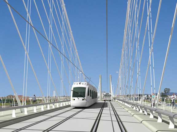
Willamette bridge follow up  Pedestrian view from proposed "Hybrid" bridge, courtesy Rosales + Partners/Schlaich Bergermann and Partner LP Brian Libby at Portland Architecture has a great follow up on the hybrid bridge unveiling. I couldn't make it but this more detailed design is much better and Rosales is correct in that this hybrid cablestay/suspension design is more transparent experience for users (see above) than the wave design. My overall concern centers around how this future Portland icon is getting less aesthetic attention things like former Mayor Potter's beard or Randy Leonard's bass-akwards fixation on a neon sign. Aesthetics matter and it seems like design is trying to be snuck in through the back door of the discussion. This is the same problem with the I-5 bridge, which needs a top tier architect to pull off with any kind of hope for success. Barry Johnson over at the Oregonian, is also discussing Willamette bridge appropriateness with some good thoughts. Still, his focus on height is a bit of a red herring, it's about a design that stands up to context rather than pandering to it. A more tailored cable stay design could be even more elegant and appropriate than the wave or hybrid design and declare that pedestrians/bikes and mass transit are the most celebrated modes of locomotion in the city. In my mind this bridge was considered an engineering and budget driven project above all else. The aesthetics are being added at the end... a kind of hail mary attempt by the architect to save the process from itself . That strategy is appropriate for the architect but frankly it's bad for a "city planning"... ironically what the bridge will come to symbolize. All things considered this "hybrid" design should be Trimet's first choice (let's see). All that that said this Willamette span issue clears the path for stronger discussion of the I-5 bridge, which is currently a blind man's elephant in dire need of an architectural competition to gain clarity. Touchstone's I-5 design ideas a-la-Vancouver are frankly A JOKE that Portland can't take seriously, it looks like a damn casino, not a bridge. Also, the Oregonian still requires a real architecture critic to take the lead in this discussion, healthy civics require major and experienced critical framing. Art criticism is more of an insiders game and PORT is just offering an aesthetic assessment on a larger issue... our focus makes us more limited in major civic discussions. Important yes, but we are just voices from the vis art community. Posted by Jeff Jahn on April 09, 2009 at 9:30 | Comments (0) Comments Post a comment Thanks for signing in, . Now you can comment. (sign out)
(If you haven't left a comment here before, you may need to be approved by
the site owner before your comment will appear. Until then, it won't appear
on the entry. Thanks for waiting.)
|
| s p o n s o r s |
 |
 |
 |
 |
 |
 |
 |
 |
 |
 |
 |
 |
 |
 |
 |
 |

|
Site Design: Jennifer Armbrust | • | Site Development: Philippe Blanc & Katherine Bovee | |

