The Black Square

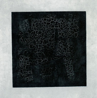
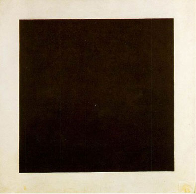
Kasimir Malevich, Black Square, 1913 [1914-15]
The painted area of the Black Square is reinforced by the square canvas itself. The painted internal space of the square is removed and, at the same time, the painting takes on a three dimensional form by assuming the physical properties of the canvas that exists in the space of the room. The result is that painting exists not as a window to somewhere else but as physical, tangible presence of the space of the viewer. Malevich created a new type of pictorial space that spoke as much to the space outside the boundaries of the painting as the space contained within it.
"Nonobjective feeling has, in fact, always been the only possible source of art, so that in this respect Suprematism is contributing nothing new but nevertheless the art of the past, because of its use of objective subject matter, harbored unintentionally a whole series of feelings which were alien to it...Suprematism has opened up new possibilities to creative art, since by virtue of the abandonment of so called "practical consideration," a plastic feeling rendered on canvas can be carried over into space. The artist (the painter) is no longer bound to the canvas (the picture plane) and can transfer his compositions from canvas to space."
-Kasimir Malevich, The Non-Objective World
"A non-objective art, phenomenal art is about seeing-about seeing, "feeling," and determining its aesthetically. Yet it seems every time we get a glimpse of this power of our seeing, we quickly give it away by attributing to it someone or something outside ourselves. We act as if we've seen a mirage or had a visitation; we make a mystique or a religion of it, instead of accepting the responsibility for what it is-that we perceive. It doesn't just happen to us- we make it happen, we participate directly in the forming of that envelope of the world and our being in it, and we do so at every moment of our lives. There is nothing more real, more interesting, more powerful, more informative, more important, or more beautiful."
-Robert Irwin, Being and Circumstance: Notes Toward a Conditional Art, 1985
"The art work is not put in a place, it is that place." -Michael Heizer
After I wrote in Art and Nature, I realized that there was something else there that placed the idea of process into context. It is the link that connects the artist to the viewer's experience and I think it is intention. What does intention mean? How could that change your experience of art?
A year and half ago I had to opportunity to attend a press preview for a Robert Irwin exhibition Primaries and Secondaries at the MCASD. I had the opportunity to speak to him and ask him a question or two. The previous summer I was slowly working through the great Irwin book "Seeing is forgetting, the name of what one sees" by Lawrence Weschler. I was trying to come to terms with the some of the issues that surround Irwin's work and I asked: Where is the art? Is it the artist? Is it in the object? Is it in the viewer?
Irwin thought about for a milli-second and said that art is in the viewer. Art has to be in the viewer. It can't exist anywhere else. I think I some ways I am still trying to understand the implications that of what he told me. If you really believe that art is in the viewer, it changes the way you look at art. Some of the things that I once thought were the primary aspects of art are now not as important to me as they once were. In turn, things that I once thought were not very important are now extremely important, if not everything about the experience. Irwin is one of the most articulate artists but sometimes the subjects he discusses are simultaneously very simple and extremely complex. So in a way, this essay is a way to begin to explore the implications of the new world that Irwin suggested. It is a world that in a way is defined by intention both on the part of the artist and the viewer. We will begin to look at it through the lens of Kasimir Malevich's Black Square. Trying to work through what Irwin had said, I was led on a path that brought me back to Malevich who was probably the first artist to articulate concerns that are very similar to Irwin's. I think that Malevich would have agreed with what Irwin said, maybe he would have even said something similar if he was given the opportunity. I am not sure I understand what Robert Irwin told me. I am not sure that I will ever understand it but these are things that I wonder about.

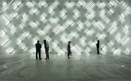
Robert Irwin, Light and Space, 2007
Installed at his show Primaries and Secondaries at the MCASD
Irwin's site conditioned response to one of the MCASD's galleries. The lights are arranged across the wall in an even an undifferentiated way. There is no focal point and it is the totality of the entire space that matters in the experience of the work.
Everybody reading this post has probably drawn a square at one time or another. Most of the time a square is a square but it is not art. For most of us, a square is a geometrical shape with four equal sides. It is without scale or size. It was empty of art which is precisely why Malevich found it so useful. How could something that was empty of art be used to make art? Why was Malevich's square so different? The difference is intention.
When Malevich paints a square, it is deliberate. It is something that he knows we are all familiar with. A square is not exotic shape or some type of special geometry. It is something that we encounter everyday but rarely if ever in an art context. His painting is not a discourse on the geometrical properties of the square and I do not think that Malevich was interested in geometry per se; he was interested in how he could use it. Malevich is using the square as a tool to make a connection. For him, the square communicates and embodies a very unique and specific experience. He is using a shape that we are all familiar with to establish a direct connection to the viewer beyond the edges of the painting. It is the vehicle and not the subject. It might not be clear at first glance, but Irwin was right, the subject is the viewer. This is why Malevich changed what was considered to the potential of painting. The painting exists as much in the space of the room as it does in the boundary of the canvas. Malevich's intention to make art was to establish a direct connection to the viewer's experience of their own awareness. The viewer is the subject of the Black Square.
You. Right Now. At this moment. Exactly where you are standing in this room. Everything.
No preparation. No history. No dialog. No intermediary between you and the work. The work is equal to your experience of it.

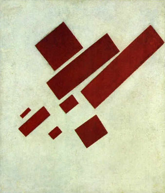
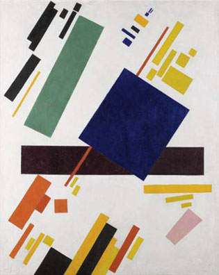
Kasimir Malevich, Suprematism with Eight Rectangles, 1915
One of my favorite Suprematist paintings. The way that the rectangles do not align to the picture plane creates an indeterminate depth. Painted the same year as the Black Square, Eight Rectangles is more traditional because it is still about an interesting arrangement of forms within the bounded space of the canvas. Although beautiful, the space in the painting has a lot more in common with Cubism than the break that was achieved with the Black Square.
The square is a geometric form that is available to everyone but the square on any canvas would not be enough. Like the letting of air out of a balloon, the square has to be flattened and it cannot have any internal space or any sense of perspective. The painted square can't create space, it has to be space. It has to align perfectly with the edges of the canvas. If the canvas is rectangular or if the square is rotated, it would be like most Suprematist paintings and create a complex space that while interesting and potentially beautiful, it still exists within the boundary of the painting. However, if the geometry of the square is echoed in the geometry of a square canvas, something remarkable happens. The painting jumps off the wall in a way and becomes a physical presence in the viewer's space. It is a new way of looking at art. It is the correlation between the geometry of the painting and the shape of the canvas itself that unlocks this experience. As a Malevich said they become of vehicles in the desert of pure feeling. The Black Square is not a window into a faraway place or a picture of a time either long past or far in the future. The experience of Malevich's square is about you. There is nothing beyond the experience of the events and objects in which you have direct firsthand knowledge. Everything is visible. It might lead to an experience of a direct awareness of yourself, the painting, the room that you are standing in, the temperature of the room, the room outside etc. The painting is about your direct firsthand experience. The painting is about making an experience with art leading to a direct awareness of yourself. Like the tree falling in the woods when there is nobody around, the experience of the painting does not exist without your awareness of it.

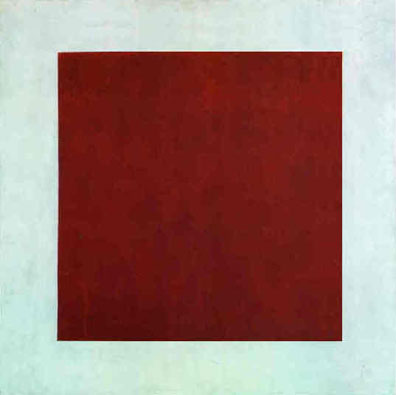
Kasimir Malevich, Red Square, 1915
Red Square is a variation on the form of the Black Square in a different color. It is a good reminder that these paintings are full of feeling and not exercises in form. Each color generating a new and unique experience. They are an the exploration of the most efficient and direct experience of painting that might be possible.
As Irwin has said so eloquently, when you are taught to look at most paintings, you are taught that edges of a painting don't count. You are supposed to willfully ignore them and only concentrate on the picture in the middle. But for Malevich, and I think also for Irwin, the edge of a painting becomes the most remarkable event because it is a threshold between the space of the room and the space of the canvas. In the Black Square, Malevich made the edges count. It is no surprise that a Renaissance painter realized that when a painting with a proper perspective is placed at an analogous point in a physical room, the space of the room is extended into the painting. Malevich works in the opposite way, when the painted square has a direct physical equivalent in the square boundaries of the canvas, the result is that the painted square begins to have a physical and tangible presence in the room. It assumes a three-dimensional form. It is something that you can feel. The painting is as real as you are in this shared space of the room. There is nothing else. It is interesting that while Malevich was not the first artist to use the boundary of the painting to determine form within the painting, he was certainly not the last. It was a device used by a wide variety of artists including Barnett Newman, Mark Rothko, Donald Judd, Richard Serra and in a surprising way, even in Irwin's own work. The way that the threshold of the boundary of the work informs its content has a lot to do with the ways that the artists articulate their intentions. In 1974, when Judd was talking about Malevich's Black Square, he said: "Before 1915, neither form, nor color, nor surfaces, nor anything else existed per se." Before Malevich, those things could not be seen because there was no way for a language to articulate it. It was invisible. It was beyond the pale of art.

Kasimir Malevich, Suprematist Composition, 1916
Another beautiful Suprematist painting, but even more than Eight Rectangles, the more interesting and dynamic the interior space of the painting, the less likely it is to make the viewer aware of the space outside of the painting. It is a little counter-intuitive but the Black Square is comparatively boring because of the simplicity of the geometry of the square but it is precisely that boredom with the internal space of the painting that allows an entirely different type of experience to emerge for the viewer.
In the Black Square, there isn't an art history. It is a break with art history. It is something new. The picture is not a window into something or someplace else. The painting brings your attention back to yourself. That is what is so different about it. That is what makes it extraordinary. The painting is used by the artist to establish a direct connection with the viewer. But it is not through technique or a beautiful painting skill or anything else that we are taught about what painting should be. It is successful because it uses forms and a technique that you are already familiar with but by using them he is able to establish a deeper connection. This is why the painting was such a threat and why it was often misunderstood. It has been described in terms of formalism, cubism and even minimalism. Describing the painting in terms of other art movements doesn't help and the analogies soon break down. Malevich's was transcending the boundaries of painting with the Black Square because it was a tool to reach into the space of the room.
It was only with the use of the familiar objects and by choosing to use a straight forward form could Malevich move beyond everything that was limited the other paintings: technique, representation, composition, aesthetics and skill. Everything else beside the straight forward representation of the square was extraneous. To make a painting he had to destroy it, everything that we thought was important about it. He could not use another painting language to say what he wanted to say. The Black Square solved a very specific problem for him, it was the vehicle for him to establish a direct connection of shared experience between viewer and the artist. Anything beyond that connection was unnecessary. The artist creates and defines the experience with the work but it is left to the viewers to experience it for themselves.

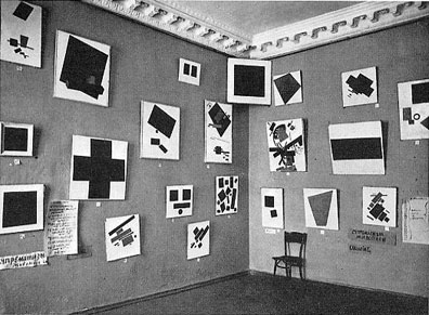
The Last Futurist Exhibition at 0,10 Petrograd, 1915
Black Square is placed across the corner near the top of the walls. It placed like this because since the painting was relatively inert, it could be displayed in a dynamic way to begin to activate the corner of the room as a kind of 1915 version of Ellsworth Kelly.
Even in the context of Malevich's other work, the Black Square is special. In the Last Futurist exhibition in 1915 the work is hung across the corner of the room and high up the wall. It is the best example of the potential of Suprematism. The other Suprematist paintings are very beautiful but they are too much like pictures. They are like an anti-gravity cubism but the Black Square was different and Malevich knew it. It created a feeling that was completely different than any of his other paintings and any painting he had seen before. Out of all of his paintings, it was the Black Square that hung above his bed when he was lying in state. It became a surrogate for him as it was used as a signature on occasion and eventually inspired his tombstone. The Black Square changed what was possible in art and opened the door to a world of new experiences and feelings. By using the simplest of shapes and geometry to establish a direct connection to the viewer, Malevich was just the beginning.

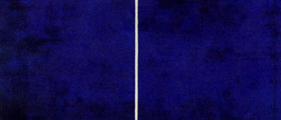
Barnett Newman, Cathedra, 1951
In Cathedra, the zips echoes the boundaries of the edges of the edges of the canvas. He did not introduce a geometry that was not already present in the way that the painting presents itself to the room, namely the edges of the stretcher bars. The zips define and in turn are defined by large areas of ultramarine blue. It is the tension between the definite and indefinite that makes Newman's paintings so compelling. It was later slashed by a man with a knife at the Stedelijk Museum in Amsterdam in 1997 and since "restored."
In the 1950s, the New York painter Barnett Newman found that the best way to make his paintings was by using a zip that ran parallel to edges of the canvas. I am not sure what Newman thought of Malevich, but Newman, like his zips, was interested in declaring his own territory. There are remarkable similarities between the approaches of the two painters. Like the Black Square, the interior zips, although they created a new sense of space, echoed the geometry of the boundaries of the painting itself, which in turn mediates the space inside the painting with the space outside the painting. This was not a coincidence. The clearest way for a painting to establish a connection to the outside of the space of the canvas is by responding to the edge. It prevents the space within the painting from collapsing inward to create a false sense of perspective or having the whole painting being read as some form of window. Like Malevich's square, Newman's zips are most successful when they are emptied of space. By echoing the boundaries of the canvas, everything is kept on the surface, flat, in the real space of the room. Newman does not let you go. Of course, like all good painters it is really not that simple but it as good a place to start as anywhere else.
Although the edge of the zip eloquently and simply reinforces the geometry of the canvas, the fields of colors in Newman's paintings are, for lack of a better description, infinite or at least boundless. There is a tension between the color and the measure of the geometry of the zips that generates much of the experience in Newman's paintings. The large flat areas of color are without a scale reference. In front of these fields, we exist in an entirely undifferentiated space, everywhere and nowhere at the same time. The fields of color are immeasurable and are a powerful contrast to the fixed measure of the zips themselves. Newman's paintings become about the tension between the finite and the infinite and it is his ability to bring that tension into the space of the room that makes his paintings so extraordinary. When you look at his paintings, you are in that infinite space. You are free.
This is still a very different experience than looking at Newman's paintings as pictures. There isn't a picture in the traditional painting sense. The figure/ground relationships are ambiguous if not contradictory, and there are no beautiful classic nudes, no pictures of patrons on their estates, no cute animals, nothing that takes you away from the raw experience of the painting. Newman, like Malevich, is asking the viewer to make a big jump and there is a high level of trust involved. If you are not familiar with his paintings, you are not sure if there is any sort of pay off waiting for you on the other side. In the process of making the jump, he asks you to put aside everything that you thought you understood about painting. The technique, the geometry and the color are all in the service of making the direct connection between the viewer and the work. Everything is right there, right in front of you and you can be a part of it.

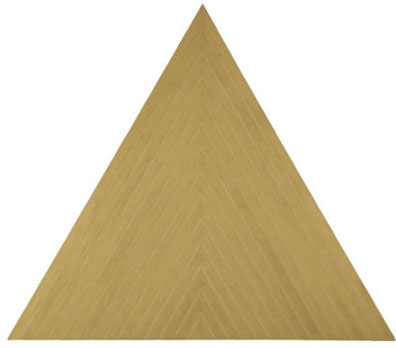
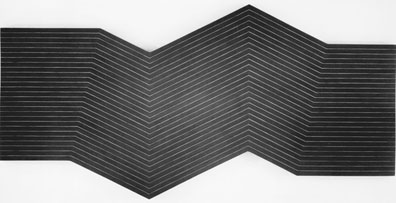
Frank Stella, Valparaiso Green (Sketch), 1963
The shape of the canvas is reinforced by the painted lines. The repetition of the lines squeezes the space out of the painting and the result is that everything is on the surface. Any illusion of perspective or depth is flattened and destroyed. The space the painting generates is in the room rather than within the painting itself. Although, Stella's stripe paintings are generally thought to have evolved out of Jasper Johns' Flag paintings, he could have arrived at a similar solution by looking at Malevich, especially the Black Square.
Like the Malevich's Black Painting, Newman's paintings direct everything back to the experience of the viewer. Everything in the painting is done to establish and reinforce the direct connection between the painting and the viewer. If you do not look at the paintings with the right eyes you do not see anything at all. It might all seem like a big joke: simple composition, often primary colors and overwhelming scale. Although they are definitely paintings, they have nothing in common with 99 percent of what you see in art school and art history class. It is the division that makes modern art different and is very different than the standard line that the goes from Cezanne to Picasso to Pollock to whomever. Newman's, like the best of Malevich's paintings, are different. They both bring the space of the painting to you, although I would still say that they take you somewhere else, or at least you understand where you are better. In a way they both realized that they were not smarter than the painting. Nothing that they could put on that canvas was more important than making that connection to the viewer: no diagonals that might create the illusion of space, no closed shapes like circles, no gorgeous color combinations that remind you how talented the painter is, no technique that seduces you with the artist's hand and especially none of their ideas about what their paintings should be. The experience is about what these paintings are.

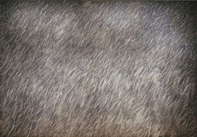
Cy Twombly, Untitled, 1970
The overlapping layers of ephemeral chalk lines create an undifferentiated field that make us keenly aware of the edges of the canvas. We experience the painting as a totality. Twombly achieves the result of a unified field that is undeniably successful and is completely different and would have been impossible for someone like Newman or Malevich, and to be honest, anyone except for Twombly himself.
The limits of Newman and Malevich were not necessarily the limits of their peers or the artists who came after them. Cy Twombly's black board paintings with the layers of diagonal writing are spectacular and go a long way toward creating a new way of articulating an undifferentiated space. Both Ad Reinhardt and Agnes Martin were able to use the closed geometry of squares and rectangles to create beautiful paintings that use the properties of geometry as a powerful tool in making the language of their paintings. Both Reinhardt and Martin were keenly aware of the way that the content of their paintings reinforced and reacted to the edges of the canvas. Both Josef Albers and Mark Rothko had very visceral approaches to color that would have been unnecessary for either Newman or Malevich, although they also independently discovered that a simplified geometry was necessary for their work. Sometimes the lessons are even translated across mediums, it is no coincidence that Donald Judd uses the indeterminate space created by colored Plexiglas to contrast with the very finite space defined by a rectangular volume created by using industrial metals. It sounds very similar to the description of the relationship between the zips and the fields in Newman's paintings. Every artist is different and what does not work for one painter might be exactly what another painter is looking for.

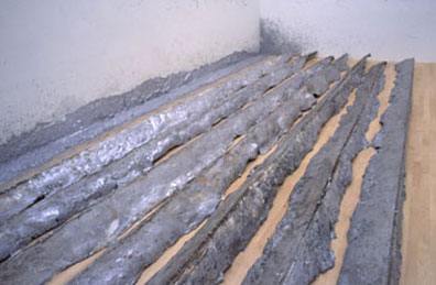
Richard Serra, Gutter Corner Splash: Night Shift, 1969/1995
The walls of the room where the work is displayed are used as a form for the molten lead. As it cools and they are moved throughout the space, the lead castings transfer the intersection between the walls and the floors into the space of the room. The geometry of the pieces are not independent of the gallery where they are shown.
At some level, most artists of the sixties found that it was difficult to establish a direct connection between the work, the viewer and the room through painting alone, and they were driven to move their work out into the space of the room. In some cases, the room was actually used to make the work itself. When Richard Serra was commissioned to pour hot lead against the wall of Jasper Johns' studio and then later at SFMoMA, he was making a work that was literally formed by the room that it was going to be placed in. The work would not have made sense in another location. The space of the room became integral to the space of the piece. This is a very different idea of sculpture compared to the experience that a viewer might have when looking at a Rodin, but it has a lot in common with the approach that Malevich used in his Black Square painting. The square is created, or is at least an echo of the boundaries of the canvas, they are linked and it allows the space of the painting to become part of the space of the room. In Serra's case, the work existed as only a container full of hot lead before it was splashed up against the wall. When it was hot, it was a material without form, like paint in a paint tube and not closer to being art than anything else. It was only when the lead was splashed against the wall and allowed to cool that it took the form of the room. This suggested a very different kind of experience and awareness of the properties of the room.
The boundary of the work clearly becomes the boundary of the room, they are inseparable. Serra's Gutter Corner Splash had practically nothing in common with what was understood to be sculpture up to that point, maybe Brancusi aside. Splashed hot lead against the wall of the studio does not have very much in common with a large bronze sculpture of some historical figure. A Rodin exists in his own space; Serra exists in your space. The two are so different that they are practically two different world views. If you looked at the Serra with the same eyes with which you appreciate a Rodin, you might be very frustrated. They are very different ways of looking at material, space and what is valued in art. To start with, there is no figure and bronze has very different connotations than lead, although the idea that they are both castings might be a good place to start except one is a sand mold and the other is in space that we inhabit.

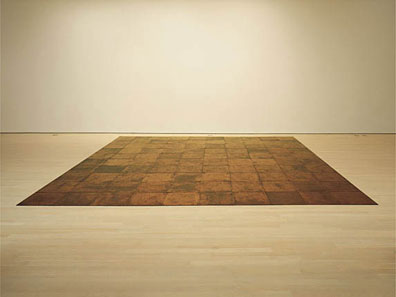
Carl Andre, 10 x 10 Alstatd Copper Square,1967
The form of the work is generated by the tiles each time the work is installed. Before installation, the tiles exist as a raw material, without form. The work becomes coherent only as the tiles establish a relationship to one another and to the room in which they are placed. None of those relationships exist in isolation, but are mutually dependent so the work is experienced as a totality.
Carl Andre took a very different approach; he found the material for his sculptures on construction sites and junk yards. Square metal plates that were often discarded and full of scratches, dents and rust from their previous life were laid in large grids. Each plate was interchangeable, but nonetheless unique, and the entire work was probably subtly different every time it was installed depending on the order in which the plates are stacked. Andre wanted to you feel the difference of walking on the metal rather than on the floor of a museum or a gallery. If you were paying attention, the material difference of standing and walking on the plates was something that could be experienced. It was something that could become the vehicle of an art experience. Each part was subordinate to the whole in the same way that Serra wanted you to be aware of all of the splashed lead along the wall rather than calling your attention to a specific part. This is one of the important differences of art since Malevich. He wanted to call you attention to the entire square, to the entire field. It was meant to be experienced as an undifferentiated totality, whereas the art before wanted you to understand how the parts related to one another. The parts might have been about a narrative, characters or the space of perspective, but it was still about deciphering and coordinating the parts. Malevich was different, he wanted viewers to experience the whole thing and maybe become a little more aware of themselves in the process.

Frank Stella, Nunca Pasa Nada, 1964
One of my all time favorite titles (Spanish translation: Nothing ever happens). A clear application of the ideas that Malevich first articulated with Black Square. The lines on the canvas echo and reinforce the geometry of the canvas itself.
The art before Malevich was about parts, and the best art since has been about a totality of experience. In Andre's work, each tile acts as a part that is able to establish a section of the field. They are unique and specific with individual material properties, but at the same time their shapes reinforce one another so that they produce a coherent field that can create experience. Andre understands this on a very deep level because to understand the work you have to understand the room that you are standing in, they begin to overlap and define one another. Andre's work is not about a beautiful square in the center of the installation that would be the language of parts; he wants you to understand all of them together. As Andre lays out the tiles, if he ever came across a tile that was particularly beautiful, it would always be placed down so that it would not distract from the entire field. The experience is about the totality of all of the tiles rather any single tile in particular. Everything is subordinate to the whole.

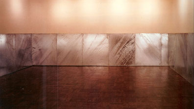
Donald Judd, Untitled, 1970
Installed in the entry of the Leo Castelli Gallery. The work does not exist until installed in the space and cannot be experienced unless it is read in relation to the space. Without the wall, the work would exist as a pile of flat metal plates, again as raw material. Once installed, the work becomes a flat plane that is read relative to the wall behind. One plane in front of another that reinforces and challenges the way that we perceive the walls shaping the space of the gallery.
Donald Judd found a different way to relate his work to the wall. In 1970, in the entry foyer of the Leo Castelli Gallery, Judd installed a series of hot dipped galvanized iron panels along the perimeter of the wall. Just as Malevich's square and Newman's zips echo the edges of the painting, Judd's work is determined by the dimensions and the specific characteristics of the space in which it is installed. Each panel is equal until the corners where they are trimmed to fit the space and are approximately five feet tall. The panels are essentially creating an analog of the room. The height of the panels creates an experience of the space that is very different than when they are not installed. Each panel is parallel to the surface of the wall and creates a tension between the clearly defined space created by the panels and the space on the wall above that is more indeterminate. The panels articulate the way the walls close in and define on the space of the entry. It is a way of acknowledging how the plane of the walls defines the space of the room. The work reinforces this relationship by putting one plane in front of another. The work exists as how we perceive the space rather than being necessarily intrinsic to the panels themselves. When the work is separated from the space, the piece might exist as a pile of panels much in the same way that Andre's work would exists as a pile of plates. In both cases, they would be without form and a coherent experience. It is only when they are installed in the space do they become art. Our experience of the panels becomes a way of translating and measuring the space. A deeper understanding of the work leads to a broader awareness of how we inhabit the gallery space.

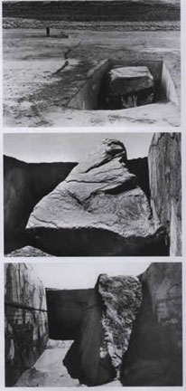
Michael Heizer, Displaced/Replaced Mass, 1969
The work is three excavations of different sizes (30.5, 43.7 and 73.2 tons) in the same dry lake bed. Each excavation displaces a certain volume of dirt that is associated with a large stone whose weight equals the displaced dirt. The work is the conversion of equivalent weights between dirt and stone that changes how we see mass and volume of the entire lake bed.
If Malevich making a painting relate to the physical space of a room by having the form echo the boundaries of the canvas seems pretty straight forward, other artists found more direct ways of connecting the work to the space. In the late sixties, when Michael Heizer started making his work in deserts of California and Nevada, almost every issue that that might apply to work in gallery did not have any relevance to work placed in the middle of the dry lake bed. He needed to start over and forge a new language addressing the spaces that he was choosing to make his work. For these works, nothing really applied anymore, except one, mass. Everything has weight, and the floor of a dry lake bed is much easier to dig through than the floor of a gallery. Heizer created a perfectly simple equation: Every time that you make a cut it has mass and that mass can be replaced by anything. He explored these ideas in his Displaced/ Replaced Mass that was constructed in Silver Springs, Nevada in 1969. Replacing it with the dirt that you just removed would be too simple, but if you were replace it with something that it is different, but not too different, say a very large stone, you might be able to establish a dialog between the different ways that mass can be accounted for: as density, as volume, and as size. To make sure that the message was clear, Heizer did three excavations in different sizes 30.5, 43.7 and 73.2 tons. Each excavation is matched with a large stone of corresponding weight.

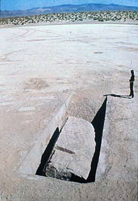
Michael Heizer, Displaced/Replaced Mass, 1969
The excavations and stones provide a direct connection between the viewer and the dry lake bed. It is a new way of experiencing space based on the properties of Heizer's materials rather than their visual characteristics.
There is a visual connection between the shape of Malevich's square and his canvas, one clearly relates to the other. Heizer was doing something very similar thing with mass of an excavated hole rather than visual interconnectedness between shapes on canvas and the boundary of the canvas itself. He was equating the mass of the displaced dirt with the mass of the stone that replaces it. This allows him to link two very different ideas about not only mass but also space as well. The experience of an excavation or the negative space in a dry lake bed is fundamentally different than what one experiences when you see a large stone that probably had to be relocated to the site. Heizer is showing us that visual cues could be deceiving and the two approaches to mass can be linked on a deeper level. Because the dirt that he was removing from the lake bed automatically had a volume as well as mass, the direct connection between the viewer and the space is even stronger. Space is displaced along with mass every time Heizer makes an excavation. In fact, the work is about the way that the stone does not displace the same amount of space for a given weight. The stones being denser, take up less space that the dirt that was originally removed. It is simple, objects that are not the same density do not take up the same amount of space even though they weigh the same. Even better that the geometry of the more or less sloping rectangular excavations look very different than the complex, eroded surface of the stones. The difference in density is reinforced in a clear and easy to understand way. Although one could say that the entire wall becomes part of the Malevich painting, the entire dry lake bed, even if it is very large, is brought into the space of the work by Heizer. It generated a whole new language of exploring the natural attributes of a space: mass, size, volume, space and dimension to name a few.
The excavation was a specific site chosen by Heizer, but he reminds us that equivalent masses and excavations could be located anywhere on the lake bed in the sense that he shows how much the entire lake bed might weigh. This is pretty interesting because even though we are familiar with looking at various types of mountains in landscape paintings, there has never been a work that would give an indication about how much a space like that might weigh. It is literally beyond our comprehension, we do not have any reference about how much a mountain might weigh let alone a space like a dry lake bed. His work opens the door to explore natural phenomena in a way that depends more on what a feature in the landscape is and what it does rather than what it looks like. The boundary of the canvas is still a separation of the work from the space, but Heizer's excavations only reveal an existing volume that already existed on the dry lake bed before the work. The excavation of one relatively small part of the lake bed brings the entire space of the lake bed into the work. There is no separation from the work and the space, they are seamless, although a good case could be made that the boundary exists not at the lines of the excavations but at the boundary of the surface of the stone especially because it was brought from another site. The viewer is left with the awareness of their direct connection of the space, exactly the relationship that Malevich achieved in the Black Square. It is as far from the language of painting that you can get, but it reinforces the understanding that Malevich's discovery was about a specific art experience that could transcend painting and be applied in new and unexpected ways. Like all great artists, Heizer's work came out of his own questions and experiences so he was not looking for an application of Malevich's ideas, but at some level it shows that they had a common goal or were at least interested in articulating the same types of experience.

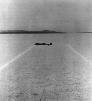
Walter De Maria, Mile Long Drawing, 1968
The Mile Long Drawing acts a reference not for the experience of the line itself but for the entire lake bed.
If you understand what Heizer was doing, it makes you wonder if the relationships could be turned inside out or if there were other direct ways of connecting to other properties of a space rather than just dealing with what it looks like. In 1968, Heizer was not working in the desert alone, he was working with another artist from New York named Walter De Maria who wanted to do just that. De Maria knew that strange things happen on the dry lake beds. Due to the blurring of the distinction of foreground and background, distances are very hard to recognize. When the lake beds are large enough and the air clear it is nearly impossible to determine if a mountain is five miles away or thirty. There is just no way to orientate yourself. I feel like De Maria had a very New York response to a vast open space, if you need to know how big something is, draw a line. Being that this is a very large dry lake bed so it could not be just any line and with the help of Heizer, the two proceeded to layout two parallels each a mile long and separated by twelve feet. The lines were drawn with powdered chalk. The longer the line the more likely that it would be able to establish a direct connection to the entire space of the lake bed. A line that is five hundred feet long holds and connects to the space in a way that is very different than one that is 5,280 feet (one mile). It is significant that each of the lines were a mile long. A mile is probably the largest measurement that a person could still feel that they have a good intuitive grasp of the distance. In other words, a mile is an easy distance to relate to ourselves, and it is not without significance that the famous pictures of the Mile Long Drawing show De Maria lying on the ground of the lake bed between the two lines. It is to remind us that these are size measurements, this is an installation about how we relate to space in a more complex version of the way that Malevich's square relates to the edges of the canvas.

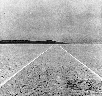
Walter De Maria, Mile Long Drawing, 1968
Like the Black Square, De Maria's line makes us more aware of what exists outside of the boundaries of the work rather than focusing on what is happening in the work.
One could say that De Maria's Mile Long Drawing was not really a drawing at all in the traditional sense but it was a fixed measure, a reference line. The entire drawing is more like a ruler placed over the space of the lake bed. It was something that was measurable that could be used to approximate the immeasurable, the seemingly infinite amount space of the dry lake bed. As they made the chalk line, De Maria was creating a tool to connect to the space in the same way that Heizer understood that every shovel full of dirt has mass. De Maria understood that everything has dimension, something that could be measured. If you can tap into that you can tap into the space of the entire lake bed. Heizer provides a direct connection to the space through mass, De Maria through measure. It is interesting to note that Heizer's Displaced/Replaced Mass is a one-to-one proportion. A given weight of dirt is replaced with an equal weight of stone. De Maria's work is a more ambiguous because although the line is clearly marking one mile of space, the final proportion to the larger space of the lake bed is left undefined and the proportion could approach something like one-to-infinity. The Mile Long Drawing provides a way to measure and connect to what it exists beyond the ruler as well.
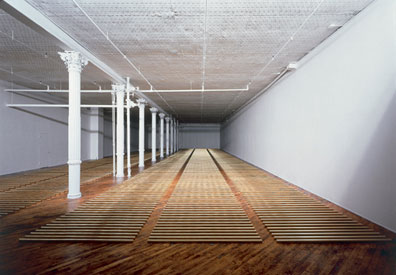
The line was useful only so long as it was in service to the idea as a tool. The clearer and more legible the line, the stronger the connection to the space. The line wasn't the object of the installation, the immeasurable space of the entire lake bed was. I think that this is where photographs of the work are a little misleading. Photographs are very good at capturing objects but not very good at communicating relationships. The photographs turn the chalk lines into objects or at least a traditional form of drawing on a much larger scale, which I think is misleading at best. The lines are shown as graphic images. I think that if you were standing next to the piece, the lines would have appeared quite small, thin and converged at some point toward the horizon. The lines would have been another form of order and space overlaid on the existing space of the lake bed. The intersection between the order of the lines and natural ordering of the space itself, allows the dimensions of the space to be perceived. In a way, the lines are not the work that De Maria was making, his work about making the immeasurable space of the entire lake space legible. Bringing it down to human scale is too much, but the lines would give our bodies something to relate to. The lines are a tool toward providing an experience that allows for direct comprehension of the vastness of the lake bed itself. The experience of making large distances legible is a common focal point of De Maria's work. In 1979 with the help of the Dia Art Foundation, he made Broken Kilometer in which a length of one kilometer is made legible by separating it into five hundred, two-meter-long solid brass rods. Part of the experience of the work is a deeper understanding of the way that a very long length that is hard to visualize is understood to be finite and given to be the visual equivalent of the total length of the rods in the space.

Walter De Maria, Broken Kilometer, 1979
This installation allows the viewer to experience kilometer, not as a distance, but as a length of five hundred equal modules. It allows the kilometer to be experienced as a totality and simultaneously. The abstract notion of distance is transcended and given a tangible, physical presence.
The chalk that De Maria was using for the installation was extremely transient. On a dry and most likely windy lake bed, it was properly being literally scattered to the wind as soon as it was placed on the ground. It meant that the relationship of the lines connecting to the larger space of the lake bed was deliberately ephemeral. The entire work was transitory and probably lasted no more than a few days if the winds were not too strong and it did not rain. This means that every time that the relationship was going to be established the lines would have to be redrawn. The work exists in the relationship between the lines and the space, but not in the physical quality of the lines themselves. In a wonderful way, the temporary nature of the work speeds up a process that is inherent in all art work, mainly what happens when the work changes and the materials become something other than what they were. As the lines deteriorate so does the relationship to the larger lake bed. They become like traces, and in a strange way more objectified because if they cannot create the larger connection, one is left with the physical qualities of the chalk itself, which is a very different experience.

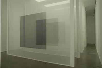
Robert Irwin, Varese Scrim, 1973
One of Irwin's early scrim pieces was installed in a dedicated room in Panza's villa in Varese. Like many of the works that we have been discussing, the experience of the work is not the experience of the scrim, it is the relationship between the scrim and the space. They work together and are inseparable. Like the zips in Newman's paintings, the scrim defines the room and the room defines the scrim. The scrim is the material but the art is the experience of the entire space.
Some artists like Robert Irwin began to focus on the processes of our perception and explored a series of new ways in which it could became one of the primary experiences of art. In the Varese Scrim from 1973, Irwin was working with a series of ideas that would be further developed for an installation Soft Wall at the Pace Gallery in 1974. In both cases, the only change to the space was that a scrim was put in front of one of the walls. The scrim echoes the geometry and proportions of the space in way that is similar to the paintings of Malevich and Newman except that it is in three dimensions rather than two. The scrim is rectangular and parallel to the walls of the space and Irwin worked hard to make the scrim as much like a wall as possible. In fact, his motivation was almost completely the opposite of most installations, he knew, like the paintings of Ad Reinhardt, that the installation would probably be invisible to anyone that was not paying attention. There is also a subtle tactile and visual difference between the scrim wall and the actual walls of the space because the scrims are translucent. The scrims use the language of the way we perceive the space because in a subtle way, the installation questions the solidity of the remaining three walls of the space. The perception of space is turned around. Everything that was solid is now potentially soft. Irwin at once reinforces and challenges the visual cues of the space. It is almost as if Irwin is using our assumptions about walls and the way in which they are used, against us. It is important to realize that Irwin is not adding a new geometry or object to the space, the scrim wall is merely an offset of the existing walls and the scrim forces us to look at the existing walls in a new way. In other words, the installation is about the way a single scrim wall can change our direct perception of the space. The entire space becomes the work rather than just the single scrim wall.

Robert Irwin, Black^3, 2008
Part of an installation at White Cube. The painted squares on the scrims align with black lacquered paintings on aircraft aluminum that hang on the wall. The scrims are naturally translucent although they naturally become darker as you look through more layers, while the paintings are glossy, opaque and full of reflections. One set of perceptions challenges and reinforces another set of contradictory perceptions.
I am always fascinated by the idea that before the scrim was installed, it was just raw material. It was a translucent material that probably arrived on a roll but there was nothing inherently "art" about it. Even stranger is that the same roll could have been used in a lot of different ways, and while some of them might have been very beautiful, it would not have been quite the experience that Irwin is able to create in his work. There is nothing specific about the material. The art is not in the material. This applies to other artists as well. Is the art of Heizer's work in the dirt he chose to use, or in the chalk that makes De Maria's drawing? Probably not. This immediately raises the question that if the art does not exist in the material, then where is it? The only conclusion is that the art does not exist in the material, but in the viewer's coherent experience of an artist's space. Art can only exist in your own experience. In a very real way, you make the art. As the material is unrolled for one of Irwin's installations, in some way a transformation must occur so that the scrim changes from a material into something that allows for the potential for art. Another way of saying it is that the scrim changes your perception in such a way that it creates a potential of a new experience and that experience might be art. If the art was in the material, it would have to be in the material from beginning to the end, but we already know that the art was not in the material in the beginning so it can't be there at either the middle or the end. When the scrim is installed, our perception of the space is changed in an environment that was created by the artist, and we have an experience that might be potentially be art. I asked Irwin where the scrim goes after the show and he said usually in the dumpster. The scrim is revealed as just a material again. The material is useful only so far as it allows for a specific experience, but the experience is in you and not in the material. It raises the question: does art ever exist in the material?

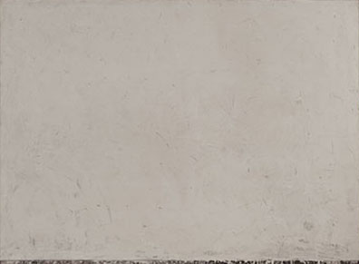
Brice Marden, Return I, 1964-65
Marden's early wax paintings were often very subtly textured surfaces with a slight reveal at the bottom showing the last few layers of paint. There is nothing there. Everything falls away. We are saturated with color in a very indeterminate space, which in an amazing way leads to a very open ended and rich interaction. Looking at these paintings was one of my best experiences in art in my life. They come closer than most contemporary paintings to Malevich's declaration of opening ourselves to "deserts of pure feeling."
Irwin is shaping our perceptions in the most direct way possible for any given installation. He is using the materials that might be installed for a few months or a few years but the installations have a relatively short life span. If the installation is to be moved to another city, everything has to be bought new and the whole installation process begins over again from scratch. As Irwin said, he probably starts with new scrim because it would be impossible to keep the previous stretched scrim clean and wrinkle free for the new installation. The material does not make the transition from one installation to another, only the artist's intentions and our perceptions translate. The material is the intermediary and is renewable but the effect of the installation is potentially the same. Is Irwin's use of the material a special case? Or is it part of the way that we perceive art? Art cannot exist if there is no one to experience and perceive it.

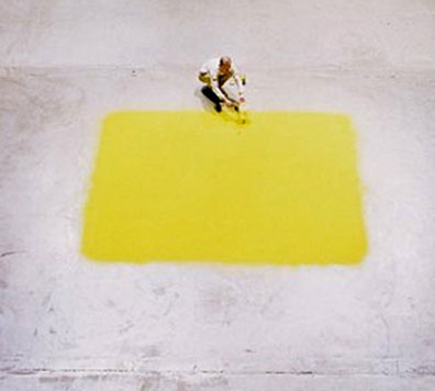
Wolfgang Laib, Yellow Square
Laib's squares of hazelnut pollen are absolutely stunning. The saturation of color seems impossible in anything but a natural material. It is a color that engulfs and you can feel when you breath it in you. By experiencing the work, it literally becomes a part of you. When the installation is finished, the pollen can be collected and stored until the next time. Ideas about an "original" or "copy" seem extraneous. The work just is. It is always the same piece, even when it changes and even when it is not.
If we are to take a broader view of this understanding the material, you realize that in the paintings that we often see in museums and galleries the materials are fixed for a longer, but not infinite, period of time. The materials, the paints in this case, are arranged in such a way to communicate an intention from the artist. The materials will slowly and naturally change over time unless the paintings are intentionally damaged or destroyed, as has been the case of Newman's or Reinhardt's paintings. In Irwin's work, there is the possibility of creating a new installation, but with the paintings it seems like things become more complex because they are meant to last for a much longer period of time. We are trained to appreciate the artist's touch as part of our experience of the paintings. If the paintings are damaged beyond repair in such a way to interfere with what we understand to be the intention of the artist then they are placed in storage, forever. The experience that those paintings had the potential of communicating is gone forever. The paintings will never be remade because nobody could ever make those decisions except for the artist, and since they have passed away, the paintings must remain as they are no matter how damaged. This is a difficult question because each artist has a set of skills that has been developed over a lifetime and the creation of a work involves a whole array of small decisions in which that experience comes to bear. Who can make those decisions except the artist? Perhaps then that is why leaving the damaged paintings in storage is the only solution. Sol Lewitt and the assistants who have been making his wall drawings seem like it would have the potential to be an interesting counter example. It is unavoidable that an artist's work changes when the artists are no longer around to make decisions about it. At some level, I think that Malevich understood all of these issues because he must have been acutely aware of the fragility of his own work.

Kasimir Malevich, Black Square, 1913 [1929]
Black Square changed as Malevich needed it to. It was flexible and somehow it was larger than any single physical manifestation. It existed when it had to, was hidden when it was dangerous, and revealed when the time was right. Older copies might be put away as they aged, became damaged or even if it was simply possible to ship them. New versions might be the same size or they might not be. It would depend on the need. Black Square was in a state of constant becoming and was never fixed in time. It was beyond any single physical manifestation of the work.
Malevich did not paint just one Black Square, but several. The original, maybe I should say the first, Black Square painting was painted 1913 and possibly again in 1914-15. It is approximately 79.5 cm x 79.5 cm and is currently in the collection of the Tretyakov Gallery in Moscow. In 1923, Malevich painted another version of the Black Square that was a little bit larger 106 cm x 106 cm, which is currently in St. Petersburg at the State Russian Museum. In 1929, Malevich repainted the Black Square again for an exhibition going back to the dimension of the first painting, 79.5 cm x 79.5 cm. This painting may also now be in St. Petersburg at the State Russian Museum. There might have been even more black square paintings that no longer exist or are in storage somewhere. The various incarnations of the Black Painting mean that Malevich was willing to make new versions of the painting to suit the circumstances. In this case it might have been because an earlier painting might be cracking because of adhesion problems between the upper and lower levels of the paint or even if the earlier paintings were simply unavailable. In other words the painting existed as a long as the strict tolerances between the black field and the white background remained legible and were the primary part of the experience. When an earlier painting was not available, if it was damaged or if there were other issues that interfered with the experience of the painting, especially if the paints that he was using changed over time, then the artist could decide that the painting could be remade. This sounds very simple, but it is in fact a radical idea about art. The art exists in the relationship between the black square and the square canvas, everything else is extraneous. One version of the Black Square does not preclude another painting of the exact same dimensions as long as the painting works in the same way. If the painting works it works, if it doesn't then it is something else.

Roni Horn, Opposite of White, v. 2 (Large) (B), 2006
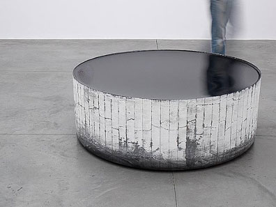
Horn's large glass pieces have the remarkable ability to collapse the space of the room into the work. The rooms spin around the work as if it is in the center of a giant whirlpool. Although they are very technically difficult to fabricate, their forms are very simple, maybe even a little plain. But something remarkable happens when you are standing by one them, you literally cannot take your eyes off them. It is like staring into a pool of very deep water. It consumes you. Like in Malevich's paintings, the experience of the work is somehow beyond its formal properties.
Malevich was also a great writer. His most famous work is The Non-Objective World that was published in 1927 as part of his trip to the Bauhaus in Dessau. Even today, if one were to hear that Malevich was going to publish 10,000 copies of The Non-Objective World, most people would agree that it would probably be a good thing. If a publisher decided to publish an additional 40,000 copies of the book, the value of the original 10,000 copies would not be diminished, in fact the usefulness might be increased because the book might be potentially more influential because of the larger audience. On the other hand, if I said hypothetically that he made one hundred copies or more of the Black Square paintings, most people familiar with art (and museums) would cringe. Apart from the unpleasant practical implications of imagining Malevich making the same painting over and over again for years, why would we be okay with a very large number, potentially infinite because it can always be re-published, copies of The Non-Objective World in circulation and at the same time be comforted that there is only a small, finite number of paintings that exist in the world? Why the double standard?

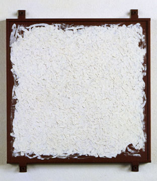
Robert Ryman, Archive, 1980
Ryman has always been very interested in the way his paintings attach to the wall. It is a way of destroying the idea of the painting as a picture. It is a real thing, in front of you, a direct experience. By emphasizing the fasteners, he wants to say that the work exists in your world, not as a window to somewhere else. The surface of white brush strokes is indeterminate but nonetheless establishes a very clear, if non-linear, relationship to the perimeter of the painting. It brings the painting out into the space of the room.
Undoubtedly, part of the answer lies with the artist's intention. Malevich intended to have his writings circulate as widely as possible, while at the same time he wanted to make more than one painting. The result is that there is a finite number of any specific type of paintings because the artist moved on to other things. It still does not answer the question of why we value a painting that is unique more than one that is just one of many copies. As I said earlier, if painting works it should work and if doesn't then it is something else. The number of equivalent paintings should not be relevant because Malevich was not interested in the economics of scarcity. When we over value rarity and uniqueness at the expense of the experience of what the work communicates, the work inevitably changes into something else. It becomes more about ourselves and the society that we live in than rather than anything that artist was about or the way he or she thought about the work. This would also be the case when we work is shown in ways that are not favorable to the work's intention. I am not advocating for an increase in the number of Black Square paintings, that could only be decided by the artist, but I am calling attention to the way that we over value rarity and uniqueness in our appreciation of art out of some misguided belief that it is the object that brings us closer to the artist. Sometimes it does, but often it doesn't. Malevich is not the only artist that this happens with. The writings of Newman, Reinhardt, Martin, Rothko and Judd are all more accessible in terms of availability than their art work. Their writings might be available at a book store around the corner or even on the internet, while the art work is limited to a relatively small number of museums and private collections.
Click here for conclusion


