
|
||
|
Portland art blog + news + exhibition reviews + galleries + contemporary northwest art
|
||
Bridging design issues  New cable stay/suspension combo bridge proposal I've been wrestling with this new cable stay suspension bridge hybrid across the Willamette River for several weeks now and the designs went public last week. Im not exactly excited about this design but it's an intriguing alternative to the two pure cable stayed designs, both of which seem generic. Still, the effectiveness of the design varies depending on the view. 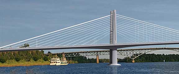 detail of hybrid bridge In profile from the middle of the riverr it looks very european and elegant, except that's not how most would experience the bridge. 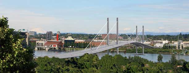
From atop the bridge as a pedestrian or rider, the design starts to really fall apart. The sense of verticality seems truncated or stubby, more like a pier on the esplanade than a bridge. Some cross members or a more triangular set of towers would help create a greater aspirational sense of verticality. It also doesnt have enough mass to fill out the scale and harmonize the proportions. It simply looks underbuilt. 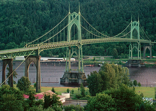
This hybrid design is supposedly designed to conjure Portland's excellent St Johns Bridge (above) but it lacks the gothic cathedral-like emphasis on the vertical. The St Johns Bridge is the second best bridge design on the west coast, beaten out only by the Golden Gate, the most recognizable bridge on the planet. 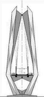
The bridge architect Miguel Rosales seems willing to entertain different tower designs like the one above (it's a little too busy but I like the diamond form and the two prongs). Frankly, trying to further ape the St Johns bridge design doesn't make sense to me; it needs more of its own personality. In fact I feel a straight clean cable stay design, without the suspension might be a lot less cluttered, and in my mind CS4 is still the best overall design visually. It competes with the horrible Marquam Bridge and makes a very decisive break with other Willamette bridges. Portland Architecture did a good job discussing this bridge design as well and this hybrid doesn't seem to tickle the architectural community yet. How do PORT's art and design readers feel? The height of CS4 or CS2 option isn't such a big deal, being taller than the Marquam Bridge but lower than the downtown skyscrapers is a fine statement to make for the first major US city to build a devoted light rail pedestrian bridge. Would it be very unique no, but CS4 type bridges are exciting when lit at night. Since CS4 is less expensive than the others what if more money were spent on the pedestrian and cycling details? 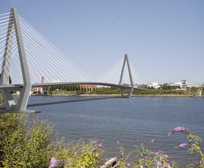 Example of some hastilly altered "less pointy" CS2 towers Also, can we see some better tower designs for CS2 and CS4? For example, towers of CS2 design would be improved if were not so pointy, which competes with Mt. Hood's pyramidal profile and looks hokey in a cut rate Jetsons way. 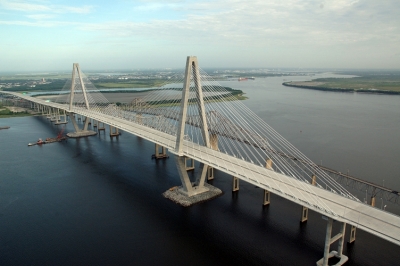
Arthur Ravenel Jr. Bridge... not great but way better than CS2 Another example, the Arthur Ravenel Jr. Bridge in South Carolina creates a better sense of heighened accomplishment. Bridges, especially Portland bridges are closely linked to civic pride. 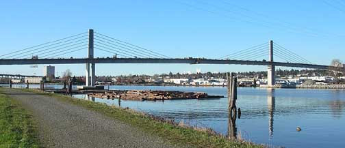 North Arm bridge in Canada Still these designs for Portland are all much better than the new North Arm pedestrian / rail bridge over the Frasier River in Canada, which seems way too stubby with a chunky deck (this is a heavy rail bridge, not light rail like ours). 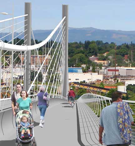 Hybrid bridge's pedestrian details I also feel the pedestrian and bike access areas are dull and uninspired on all three options. Though, having the cable stays between the light rail and the pedestrian/bike lanes as on the new hybrid or the wave frame design is superior to CS4's design where there is less separation. Lastly, the deep grey color is hardly exciting when considering Portland's frequently grey skies. 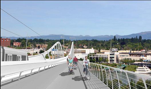 Wave frame design, no longer under consideration The previous wave frame design has been eliminated due to cost of steel overrun concerns. Though it was my favorite of the 4 designs we've seen I really didn't think it was extraordinary enough a design to justify the risks. Still CS4 is the cleanest design of the bunch (probably because similar designs have been refined over an over again). It is the cheapest of the three options but its four piers impact the Willamette River's environment the most. Also, to echo what others have said design quality is a "practical" decision... as the Marquam has already taught us. The US goes through binges and purges of infrastructure spending... so we need to build the best possible projects during this coming infrastructure binge. The St Johns Bridge was massively overbuilt but it is a masterpiece worth having. The Freemont is pretty good too. I'd like to think this new span can at least rival the Freemont. So far it doesn't, and its aspirational correlations to the St. Johns Bridge... especially at the pedestrian experience level aren't even close to being realized, yet. My sense is Rosales is looking for support to get the details right. Right now they aren't. Lastly this Willamette span is kind of a dress rehearsal for the Columbia River crossing. My sense is that process has gotten caught up in red herring issues like the number of lanes ...as if the # of lanes is the decisive factor in how green that bridge can be. I think that project needs an architect at this point and Sam Adams can paradoxically take a more assertive role by delegating it to the people who professionally field all of the competing needs and desires such bridges present... architects. A design competition inviting major architects like, Zaha Hadid, Santiago Calatrava, MVRDV and UN Studio (who lost the Aerial Tram design competition), Foreign Office Architects etc. would be good as it would give the public concrete examples and begin to really look at what a 21st century bridge could be. Or maybe Portland's own Brad Cloepfil needs his first major bridge? In PORT's 2-part interview with him we found out his CAM St. Louis project was actually based on a bridge idea. If this Willamette span project has taught us anything it's that the level of architect has a major impact on the finished product. Rosales is good but not first tier and the designs bear that out. A starchitect is all about pushing people to demand more. If Portland wants to seriously back up Sam Adams claims of, "A better bridge," he's going to have to get a pretty damn good architect and it will likely define his political future. With a 4+ billion dollar budget the Columbia River Crossing has room in the budget for innovatI've design (I've discussed this all before). What I'm seeing from the Willamette Bridge options are incremental refinements or nice bridges, not terribly innovative ones. Posted by Jeff Jahn on March 12, 2009 at 9:23 | Comments (0) Comments Post a comment Thanks for signing in, . Now you can comment. (sign out)
(If you haven't left a comment here before, you may need to be approved by
the site owner before your comment will appear. Until then, it won't appear
on the entry. Thanks for waiting.)
|
| s p o n s o r s |
 |
 |
 |
 |
 |
 |
 |
 |
 |
 |
 |
 |
 |
 |
 |
 |

|
Site Design: Jennifer Armbrust | • | Site Development: Philippe Blanc & Katherine Bovee | |

