
|
||
|
Portland art blog + news + exhibition reviews + galleries + contemporary northwest art
|
||
Tacoma Art Museum's 9th Northwest Biennial 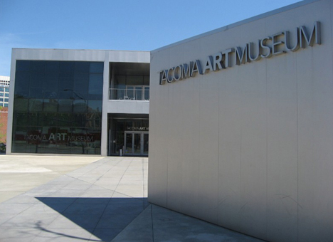 TAM's lovely building by Antoine Predock Last Saturday I was lucky enough to trek on up to Tacoma and take in The 9th Northwest Biennial. This biennial is notable partly because TAM is the only major Northwest institution that still does a broad survey of the region's art, and they have 1st class facilities. Also, this particular Biennial's execution was doubly important since the previous 8th version of the show was such a letdown. Happily this 9th NW Biennial, co-curated by Rock Hushka (Tacoma Art Museum’s Curator of Contemporary and Northwest Art) and Alison de Lima Greene (Curator of Contemporary Art and Special Projects at the Museum of Fine Arts) Houston is a lot better than the previous attempt. Still, it doesn't have the very serious museum feel that the CNAA's at PAM and the Betty Bowen Award at SAM have. Here is the short take: TAM's 9th Northwest Biennial doesn't break any new ground or make any strong arguments, instead it seems to prefer works that that are framed, put in vitrines, have very defined borders or otherwise make nice orderly rectangular forms. Because of those shortcomings the show wouldn't get much positive attention if it happened in Portland, a city full of good installation artists (many with national reputations and not represented here). For comparison, TAM's 7th Biennial had twice the space and since it was curated by the Kabakovs had a lot of very successful installations. In this current instance the installation pieces by Stephanie Robison, W. Scott Trimble, Tannaz Farsi, Linda Hutchins, Jack Daws etc.. are all presented in an orderly and very contained way. 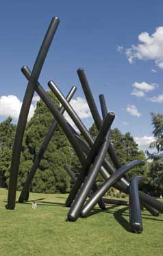
Susan Robb, video documentation of Warmth, Giant Black Toobs, no. 4, 2007. Temporal outdoor installation of polypropylene, air, sun, height: 80 feet; other dimensions variable. Courtesy of the artist and Lawrimore Project, Seattle. Even Susan Robb's video work is just a documentation of an installation (it's the only video in the show... and an unfair choice to represent an entire genre). Thus, despite the most successful works being by Jack Daws, Linda Hutchins and Michael Brophy it is the often fussy presentation of photography that seems to dominate the mood this outing. That isn't a bad thing in the case of Michael Kenna, Susan Seubert and Isaac Layman but it feels more like an argument of exhibition design convenience. It isnt news that art in the Northwest is frequently intensely spatial, but this key element felt stunted here. Thus, this show is hardly definitive and a bit tame. That said there is some good stuff on view. Here's my opening night guide: 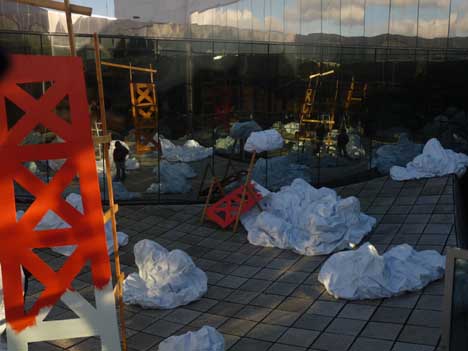
Portlander Stephanie Robison's Wrecking Ball Cloud in the courtyard was not very visible during the opening (due to the glass tinting) but wonderfully present during the day. It wasn't a bad piece but she is more successful when the result isn't so literal. The danger with her work is to avoid seeming like an illustration of a narrative. Still, I love how the mountains and clouds are reflected off the atrium's otherwise problematic reflective glass, showing Robison's sensitive installation touch. 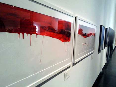
Eugene artist Chang-Ae Song addresses her Korean heritage and is part of a long line of rectangular works on the longest wall in the room. 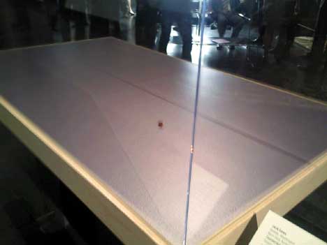
Seattle's Jack Daw's solid 18K gold and copper plated Counterfeit Penny was one of the most successful works in the show. Using the largest vitrine available was a very successful way to cut the Gordian Knot of the "borderitus" in the show. It was also a hilarous twist on viewer expectations of form and value at a museum. 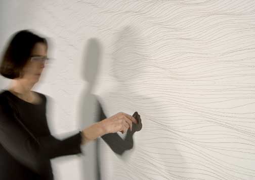 Linda Hutchins, Lineal Silver (in progress), 2007. Drawing with silver spoon directly on gallery wall, 2 walls, 8 x 25 feet each. Courtesy of the artist and Pulliam Deffenbaugh Gallery, Portland. Photo: Cheri Smith. 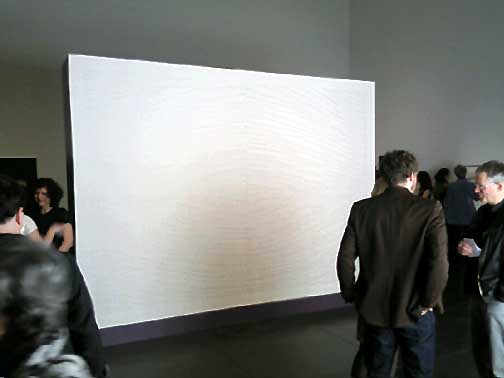
Linda Hutchins' Lineal Silver installation, was also very successful and deserved to win the juror's prize. 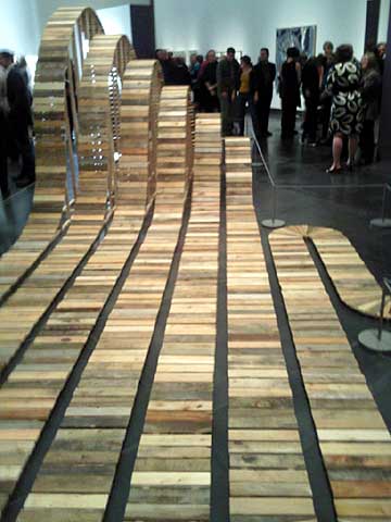
W. Scott Trimble's Untitled #4 made an interesting attempt to use the space but ultimately felt underdeveloped. Related artists like, Puryear, Mary Miss and Alice Aycock nearly always make their constructions more than constructions. Even Maya Lin's 2x4 landscape seen at The Henry in 2006 made better and more elegant use of its massing. 
Michael Brophy's Firewall and Kitchen paintings were great but so heartbreaking I have trouble evaluating them. Years ago Brophy and I bonded in the deep unspoken way akin to how 2 veterans from a war can... basically we had chased and yelled at a drunk driver who had hit a motorcyclist and was dragging him under his car while he motored down NW 21st in Porland's Alphabet District. The poor guy was being rolled over and over between the front and rear wheels. When the driver eventually noticed something was wrong (due to yelling and chasing from onlookers, but not hitting the motorcycle)... he stopped and then ran over the poor guy a second time with his rear wheels. The motorcycalist lived but it didn't look good (not only did we get his license # the plate fell off and we handed it to the cops). I'll never forget how Michael was the first person I saw after I was simultaneously speaking to the 911 operator and made certain some other people gave the right first aid (Michael had been part of the crowd yelling at the driver). Similarly, Michael's studio (attached to his home) caught fire a year and a half ago and the community rallied around him and his equally traumatized renter. Horrible things happen to people that don't deserve it and there's the rub, tragedy strikes and you can really only rely on your fellow man to have your back. Overall, I think these tiny gouaches are wonderful because they detail the night of the fire and the things you do to recover your life afterwards. For an artist like Brophy, life is work. Posted by Jeff Jahn on February 06, 2009 at 14:28 | Comments (1) Comments I saw a sweet article on Martin Puryear with audio and lots of good photos at http://www.flypmedia.com/issues/22/#4/1 Posted by: Jon B. Post a comment Thanks for signing in, . Now you can comment. (sign out)
(If you haven't left a comment here before, you may need to be approved by
the site owner before your comment will appear. Until then, it won't appear
on the entry. Thanks for waiting.)
|
| s p o n s o r s |
 |
 |
 |
 |
 |
 |
 |
 |
 |
 |
 |
 |
 |
 |
 |
 |

|
Site Design: Jennifer Armbrust | • | Site Development: Philippe Blanc & Katherine Bovee | |


![[TypeKey Profile Page]](http://www.portlandart.net/nav-commenters.gif)