
|
||
|
Portland art blog + news + exhibition reviews + galleries + contemporary northwest art
|
||
Willamette Bridge Design Reactions 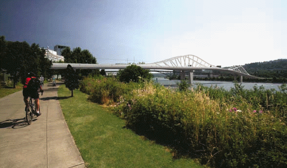
a prelimenary wave frame bridge design for the Willamette I'm certain PORT readers remember how we were dissatisfied with ZGF's preliminary design for the Willamette River pedestrian and light rail bridge and created our own design contest. I'm also certain most of you saw last Wednesday's O with preliminary images of the possible Willamette River pedestrian and light rail bridge. They even had a survey for readers to pick their favorite design. All of which is fine and good but because they don't have a full time architecture critic the piece is about as hard hitting as an article in Dynamite magazine. Can we have cookies and milk while we look at cool bridges too? Seriously, it is good they are sort of paying attention but criticism has an important place in this sort of process. Criticism raises expectation, clarifies goals and gives us better buildings and bridges through comparative analysis and some sort of public display of expertise providing a baseline reaction. The problem is the article and release did nothing to clarify the design goals which should drive the basic structural decisions. Needless to say if Portland wants to be taken seriously as a serious design center we require an architecture/design critic with a strong background (not just an art guy with architecture in his blood, like me). What's more, Portland is just starting to engage the river that defines it so much with the esplanade and big pipe. That makes the first contemporary bridge design in Portland since the 70's even more important. It is also important to note these are just early designs used to determine the two best structural options and could ultimately be designed by another firm. Thankfully Trimet has posted the whole presentation in all of its detail. My take on all three prelimenary options (though it's putting the cart before the horse): 
The wave form design is probably the most intriguing, it has good scale and echoes the Ross Island Bridge's superstructure but it's still a bit generic. 
This is a preliminary image but the wave frame also seems to provide the best interaction/connection with the water... a key concern for pedestrians and cycling in Portland. If a rationale for the design could be established it would be nice... right now it's a bit like a dragonfly's 2 sets of paired wings. *Update: according to the architect Miguel Rosales, "the wave frame bridge is a variation a girder bridge similar to the Glenn L. Jackson Bridge over the Columbia River but instead of using concrete we proposed steel and instead of having the girder in compression below the deck we have it in tension and that is why is above the deck. The shape is also derived from the moment diagram which more or less follows the curvature of the wave." 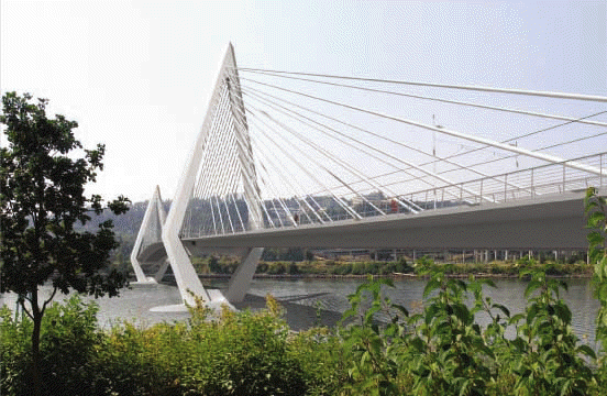
The cable stayed design above has a lot of design potential to be gossamer-like, but this triangular design is disappointingly clunky. Still the more triangular option shown here allows the cable stays to be placed between the pedestrians and the light rail allowing better connection to the water, there was another option with better towers and bad cable placement. What's more the cable stayed design allows the most span clearance for river navigation. Rosales & Partners (who did all of these designs) do make some pretty great cable stayed designs like the one below. 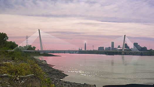 rendering of St Louis Cable stayed design Lastly, the though arch design is derivative of the excellent Freemont Bridge (and origin of PORT's logo) and should be rejected. For further consideration are these designs considering the pedestrian and bycicle experience enough? What about a green bridge with plant life? *Update: For comparison here are some designs that set the bar a bit higher: 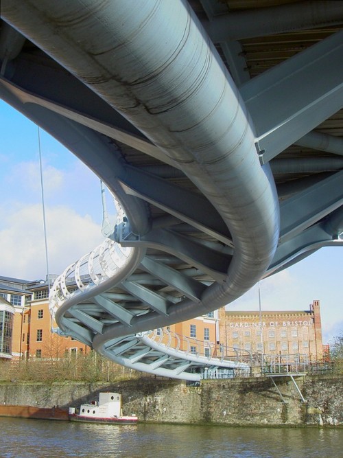
This bridge in Bristol makes maximum use of its underside, an area where visitors can most commune with the river. 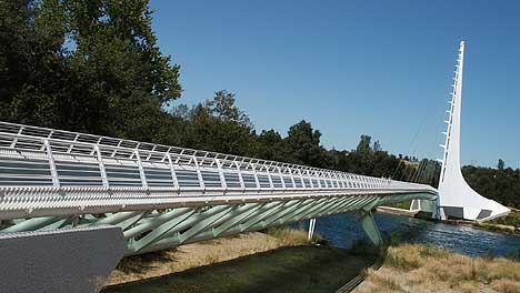
The obligatory Santaigo Calatrava (cable stayed) reference here. This bridge is in Redding California, and was good enough to get me to stop in Redding. Posted by Jeff Jahn on October 11, 2008 at 22:35 | Comments (2) Comments The "wave" design seems to be the obvious winner, but I don't feel overly confident about any of the proposals. None seem like they are making the statement that Portland architecture should be making at this point in our city's history. Posted by: Calvin Ross Carl CRC Ive updated the post and yes I agree... everything seems a bit generic still. We need some strong thinking about how we use and cross the river and this bridge is our best opportunity to convey Portland's position as a 21st century city with more heuristic concerns. Posted by: Double J Post a comment Thanks for signing in, . Now you can comment. (sign out)
(If you haven't left a comment here before, you may need to be approved by
the site owner before your comment will appear. Until then, it won't appear
on the entry. Thanks for waiting.)
|
| s p o n s o r s |
 |
 |
 |
 |
 |
 |
 |
 |
 |
 |
 |
 |
 |
 |
 |
 |

|
Site Design: Jennifer Armbrust | • | Site Development: Philippe Blanc & Katherine Bovee | |


![[TypeKey Profile Page]](http://www.portlandart.net/nav-commenters.gif)