
|
||
|
Portland art blog + news + exhibition reviews + galleries + contemporary northwest art
|
||
Use and Space. An Interview with Brad Cloepfil, Part II Part II of PORT's conversation with architect Brad Cloepfil focuses on the spaces
he creates for use by art and people. Part
I dealt with Cloepfil's many artist influences. Part II picks up right where
it left off, continuing our single marathon discussion of aesthetics, intent and buildings with Portland's most noted architect.
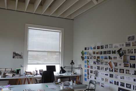 Brad Cloepfil's Portland Office Arcy: Now that your generation is in charge, you can see where ideas and institutions can lead you astray or have deep value… having grown up during Vietnam you can see both sides of the equation. What are the implications of the solace of organization and the danger of thinking as a culture rather than as an individual? Brad: Well I wonder if seeing those images of bamboo being mowed down by machine guns night after night didn't produce a quest for more connection. I mean there was a period of art and a period of architecture when they kind of serialized culture; where the LA school of architects turned everything into collage, where the attitude was, "the world is chaos, so we will make architecture chaos." It's a kind of caricature almost, or can you create a counter voice and create something that is still? I definitely think I'm in the counterforce camp. 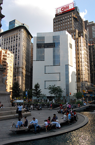 Museum of Arts and Design, NYNY (photo Michael Oman Reagan) Jeff: So you learned something about that stillness from the artists? Brad: The lessons were so present. That's the luxury of art, where it can be purely about one or two ideas. Whereas buildings are complicated by all sorts of things and difficult to understand when you are young… dealing with functions, stairs, structure and conventions of the use. By comparison, the aims of art were clearer so you could determine how successful it was. Later, I had the luxury of doing museums and started to understand the intersection of the two and what they offer each other. 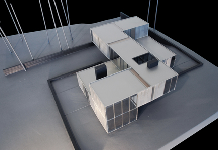 Dutchess County Residence, courtesy Allied Works Architure There are two things on that... The first is a conversation that began in St. Louis - but I had mentioned earlier with the Doug Aitken piece (at the Dutchess County Residence), which was a real breakthrough - where the art extends the conversation of the building. With a museum, in an ideal situation, you start a conversation of ideas with the building and how the curators interpret it and how the art is installed or how site-specific art is made. All of which extend that conversation in specific ways that you cannot control, which is one of the most exciting of all things to me… I mean they (curators and artists) just get to come in and fuck with the space. Which is really exciting because you learn about the space you have made by how they engage and react to it… and curatorially it doesn't even have to be site-specific installations, if you see work beautifully installed it makes the building an entirely different place. 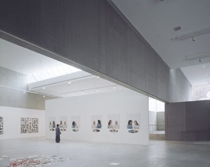 CAM St. Louis gallery view (photo Helene Binet) The next step, getting to work with some artists was exciting. In St. Louis (CAMSTL), first I walked the site with Richard Serra. Arcy: What was that like? He seems like a tough guy to walk the site with. Brad: He's not though, because I'm no threat to him. I'm some young punk of an architect. But then I showed him Wieden + Kennedy, photos of it, because I wanted him to understand what I do. ….and I'll never forget this, he said, "That's a gutsy building." A high compliment now that I know his reputation a little better. At the time, I was like, "What the hell does that mean? I think that's good?" Once he saw that (W+K HQ), he and I just walked the site and he sketched his thoughts and I took those ideas along with what I was doing. And then as the building developed, we started talking about where (Serra's sculpture) "Joe" was situated between the two buildings (CAMSTL and Ando's Pulitzer Building) and Serra really wanting the piece to have its domain but also contribute to the intersection of those two spaces… it was just fun as hell. I watched the World Series with him and got drunk. Jeff: That's a great transition into the second part of our discussion, the making of spaces for artists and the ideas around how to make use of a museum. The St. Louis museum always strikes me in that a lot of people made such a big deal of its kunsthalle format, i.e. a very open-ended program without a collection, so the artists are in some way asked to bring it to life. Did you speak to many artists about their criteria? 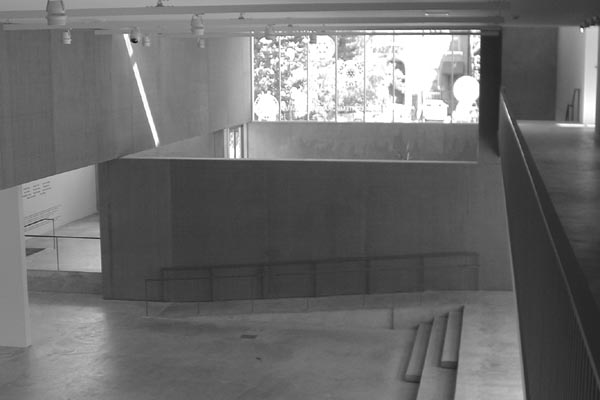 CAM St Louis Brad: I spoke a lot with the director about the range of work and I'd seen enough work. All I thought the architecture in St. Louis could do is sort of mediate between the city and the devastation of the somewhat boundless, scale-less urban context. The idea was to mediate that in a way so that the work could happen, it was like a bridge. The building was really a bridge because I didn't know what could happen. The largeness of the volumes was part of that. Some of it was, "so how small can you go?" But yeah, the architecture was a mediation with the city so the work could be held. Not too held, not bound… but held in a way that the work could find its space. Not only within the building but in St. Louis in some way. Jeff: It's a really pragmatic use of interstitial space… and a very elegant solution. Which reminds me, Elegance is a loaded term you reference a lot when you speak. Obviously, every project is different but earlier today you also spoke about the artists as keepers of a certain pure, elegant ideas… it seems to me you are imparting the same sort of thing upon the buildings you create. Brad: That is such a tricky word and I do say it a lot… (everyone laughs) Brad: - and now it's coming back to get me. What is elegance? That's a long conversation because it is not about something being precious, it is not about a particular aesthetic. (long pause) Well, I do believe in proportions - one thing relative to the other thing. Whether it's the window relative to the wall or the window relative to the ceiling, there are proportions that are resonant and I'm not analytical enough to use the 'golden section' or anything like that. But I do believe we respond to proportion whether it is an activity that is relative to your body or the maximum and minimum space an activity requires. I think that relative proportion provides a link to history, that when you walk into a beautiful room, you go, "wow." Educated, informed or otherwise there is a truth to that response and it has to do with the consideration of proportion and also the considerations of how things meet, how they are made and their relationship to each other. So the attention to detail creates that sense of elegance only because it is a sense of consideration. And again how often in our culture do you get to feel things that were considered? (laughs… which gradually fade to muttered grumbles) Jeff: Robert Irwin talks about consideration all the time… Brad: Is that so? Jeff: that an "aesthetician" needs to be consulted for projects that we expect humans to live in or experience with elevated expectations. Brad: Maybe it's just executing a series of considered relationships, whether they are spatial relationships, formal relationships, and physical interactions. That consideration imparts elegance, but if it is too considered it becomes precious. That's something that really interests me right now, because I have been able to do these houses that are so over the top as far as construction goes that they are almost precious. But I think if the space and the interpretations of it are open-ended enough then it doesn't become all about the object and craftsmanship and the consideration. I think a lot of design is too precious. The design can be quite precious even when the buildings are pieces of crap because they weren't built very well. But that there can be so much consideration, and so much "hand of the architect" - just so that you know each idea builds on an idea, builds on another idea - you feel like you can barely go to the bathroom in that type of building unless you read the thesis and obeyed the laws. Arcy: We were looking at the model of the Clyfford Still Museum and you can see there is a real coarseness to it on the outside. Was that intentional? 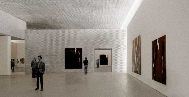 Clyfford Still Museum galleries Brad: It is on the interior as well. Arcy: so maybe that is working against that idea of preciousness? Jeff: Well it's Clyfford Still you are talking about, an artist who cut against the grain and seemed to personify a kind of rigorous abrasiveness in the singularity of his art making as a body of work. Brad: That texture is a specific response to a specific context. 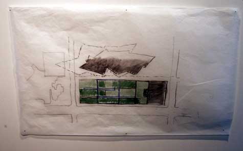 Early context sketch showing the Still Museum (bottom) and Libeskind's DAM (top) Arcy: Like the Libeskind museum? Brad: That and Denver, with everything else there, I just thought to make it feel like a visceral body, something of the earth. Everywhere else there are buildings and things that are springing from the earth, calling attention to themselves and doing whatever they need to do to stake out their turf. I just felt this thing should be in the earth and let the light and people come to it - that you'd enter into that experience. That's why inside and out it's rough. Inside and out, it's one surface and almost one construct and one body - you enter that one body that holds Clyfford Still's works and drawings. And it has natural light throughout all of it, conservation needs aside, it is natural light on most of those paintings. 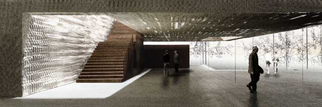 Clyfford Still Museum lobby and staircase rendering Jeff: The Still Museum is a bit like what you did with the Maryhill Overlook folding upon itself and interpreting the earth. Arcy: That's great because Still always saw himself as a man of the earth living in North Dakota and "you are not really ready until you get your hands dirty" and all of that. But of course he hated architects, how do you deal with that? Brad: I'm sure he would hate me. (laughs) Jeff: Here's a great statement from Still that I'm certain you've encountered but it's something a lot of art historians are wondering… how did you respond to this fire breathing gem of a letter written by Still to the director of SFMoMA?: Here was no flamboyant edifice smugly advertising local artistic conceits, nor sterile Bauhaus tomb of authoritarian space and form daring a director to spot its walls and spaces with works of human dimension it could not dominate. Or the usual glorified comfort-station that invited tourist or local patron to relax a moment before innocuous novelties while recuperating from the fatigue of a walk through the park. Bypassing past traditions or present pressures in the direction of architectural aggrandizement or popular fashions the director and his colleagues have chosen to emphasize the primary significance of the work…. - Clyfford Still In that letter it almost sounds like Still is describing your buildings and when I saw that you were one of the architects shortlisted for his museum I thought, yeah he's got a real shot at this. But Still is a very challenging artist, he challenges his viewing environment and the context the works are shown in… with such imposed seriousness. In fact, he's almost beyond serious... trying to provide a life and death level of contemplation. It's almost too much, but he kinda painted to existentially test the very air and any viewer that happens to come into range with one of his paintings… so is that partially behind the texture as a kind of preparation for heightened experience vs. the assumed neutrality of a conventional white drywall box? Mere drywall just doesn't seem up to "the Still challenge" so I'm glad you went this route with the quartz textured walls. Besides, Still seemed to hate any convention he could identify... including museums. Brad: Another reason we are doing the texture is so the body of the building reflects and diffuses natural light throughout, in addition to a visceral, earthlike quality… almost compression. We talk about this in the office but I hope that building will feel like you are constantly moving in. Just in and in and in and in. In contrast to this constantly extroverted environment, it's going deeper and deeper both into the building and into the work. Jeff: That sounds like Still who would do multiple versions of the same painting. It makes sense, he was a philosophy professor. Philosophers like to revisit themes people take for granted, things like the walls and lighting of work. Brad: A lot of what he talks about too is a sense of the infinite - if he doesn't make religious references, I don't know who does. He sort of thought he was the hand of God with his paintings so we're creating a context for that intimate, very singular, you and the painter and the painting in that place experience. The specificity of it is paramount to me as well. A building that would only be there, only for that work. Arcy: Is that interesting because you know exactly what goes in the space you are designing? You probably already know the arrangement of where the paintings will be. Brad: Very fun and yeah, we do, because we work with the director who is also a curator. We know the sequence and the scale of the spaces, the ceilings go from twelve feet to twenty three feet, and how that space gets compressed and the kind of intimacy the scale produces. Some of the galleries are like fourteen by sixteen feet. In contrast to St. Louis where you really are making this open vessel… and to Seattle where you are housing a collection that is certainly changing… this is a single artist's voice. You get right down to it and it is just one man, so the excruciatingly specific quality of that is really fun. Jeff: The unfolding of space and variety of volumes is so important to the experience of your spaces and it's one of your strengths. When I first was scouting Portland out in 1998 one of the first galleries I set foot in was Jane Beebe's original PDX Gallery on NW 12th. It was a little jewel box exhibition space that was less than 500 square feet. Yet it seemed infinite because of the way natural light seemingly dematerialized the walls. It had these large windows opening to the street compared to such a small interior space. It also felt more infinite because it was clear all of the walls could be folded out and configured in various ways. Even though it was small, it had very indefinite boundaries. 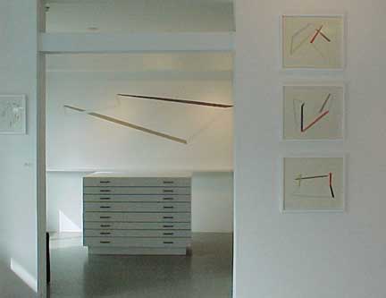 Original PDX Contemporary Art space (now destroyed) Brad: I love that, any time you want to talk about my work go ahead. You know where that came from, by the way, is an early Mary Miss piece…. (thinking) it wasn't Alice Aycock, it was Mary Miss…some kind of wall piece she did, it's up here somewhere (gestures at the bookcase). It was a series of doors within doors. There was also Soane's house (Sir John Soane, in London). Combine that with the Mary Miss piece and you've got the gallery. And there was the pragmatics of having all of those doors to move and being able to hang work on both sides. You put those three things together and you have that space. Also, it was a private gallery… initially, at least… so whenever you went there you'd always see Jane or one of her staff would be there to guide you through it for a one-on-one experience. What a great client. She was my first art client, my first art space. (it no longer exists, when the gallery moved to bigger digs in 2004 the next owner did not keep it… though Allied Works designed the new space for PDX Contemporary Art as well) Jeff: Curating as much as I do, I've noticed there is something very mannered about the spaces that people use for presenting art. You have your standard white box and on the other side of the spectrum the raw industrial warehouse space. And it almost seems like you brought the air and light back into the gallery space. I remember the old PICA space with the light purposefully leaking in from the corners of the wall... it gave it some of the warehouse diffusion. Brad: "The cracks," um hmm. 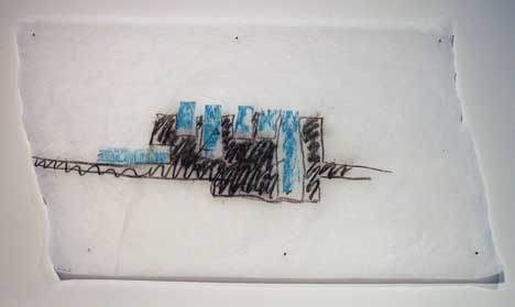 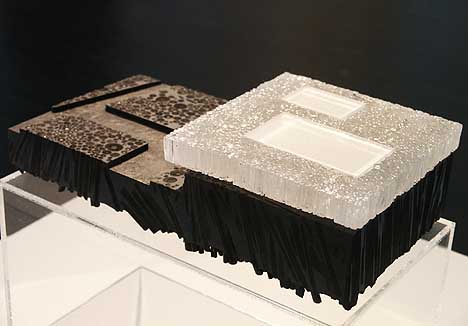 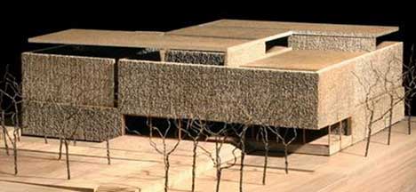
Early Still Museum sketch (top) and model (middle), final model (bottom) Jeff: It reminds me of the semi transparent material, vellum that you are often draw on. Could you speak on that a little because it seems like an aesthetic mood you impart on the finished product via production materials. Brad: When I draw I'm just being an architect trying to understand the buildings. The fun thing about architecture, okay one of several things, is that you get to use so many different types of media to understand the building before it's built… because you are usually working for four years on a public building to try and discover the ideas, represent them so you can communicate them to other people… both to the client and the people who have to build it because it's not a singular act. Then you keep those ideas alive. I start out with charcoal or pastel and then people make cardboard models and you go back and forth. Then there are computer renderings and diagrams. Then you do analytical things we call M.R.I.'s. We try to make it spatial when it's not spatial… there are however many ways to do this stuff and you use all of this different media. That's what is really fun about architecture, I guess. You spend so much time representing and exploring it and then building it with 200 people over 2 years. The drawings are iterative… everything we have talked about is iterative. The iterative thing is key; you flip pieces over and do another drawing and then flip pieces over and do another drawing. At one of those presentations you saw all of the models of the Clyfford Still Museum, just changing one thing, then another. Arcy: Sometimes that's the only way to let the project grow and evolve, especially as the language gets more complex. Also, after seeing your presentations I noticed that sometimes what you take away is more important than what you add. For example the Wieden + Kennedy atrium and the same could be said for the Maryhill Overlook. It's a subtle idea but extremely important. How did you come across that? Brad: Partially by serendipity. With Maryhill, we had complex ideas but didn't have any money and couldn't really do any of them, and I wasn't really understanding the ideas anyway, so we just dialed it all back and said "let's see what happens." So in that early project the insight in it was just the process. 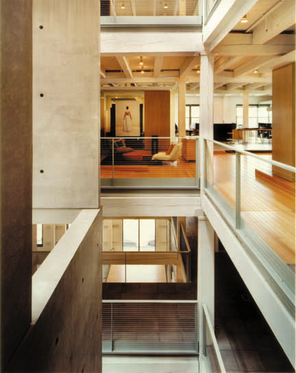
Wieden + Kennedy HQ Portland OR (photo Sally Schoolmaster) Wieden + Kennedy was interesting, it was so additive. Cut a hole, build a five story concrete sheer box and then tie the building back together again - you can still see the hole but have all these diverse experiences throughout different parts of the building. It ended up being at one level very reduced and simple, as well as very complex. I didn't really understand what I had there until it was done. And then it began a whole investigation into two or three things we have explored. For example, Sandy Isenstadt said in the book that, "it seems like everything you have done is an addition to something else." Whether it is an addition to the earth or an existing building or something else…and you can think of Wieden + Kennedy as an excavation. Arcy: Like a Michael Heizer's Double Negative in the middle of a warehouse? Jeff: Or a Gordon Matta Clark cut? Brad: Because what did we have? We had a big clay box. A big dark piece of clay that you carve out and then you have to structurally reinforce it and build an egg within an egg, so there are all these layers in there and multiple readings because of the layers. But it's really all just a consequence of that big black box - you open it up and fill it in again, there is nothing more elemental than that. Arcy: So many architects are more additive. They make their points with some sort of extraordinary geometry, shapes or materials... Jeff: making the building more performative? 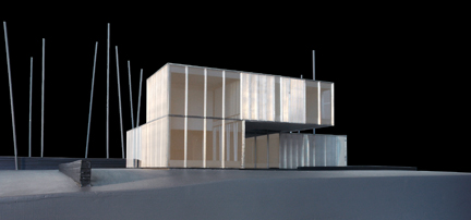 Model of Dutchess County Residence courtesy Allied Works Architecture Brad: It's the same thing as in the Dutchess County main house; we started with how to mark the earth with three corners. We knew it was just a house in this vast landscape and if you cut the earth you begin to locate it in a way where it becomes a bridge between the earth and the landscape itself. Sure it's Michael Heizer and the cutting of the earth; he's sort of the original excavator, though you can look at troglodyte dwellings in China and other things as well. As an architect that's what you do: the first act is excavation. Whether it is the earth, the core of a building or the ribbon of light at 2 Columbus Circle (Museum of Arts & Design). 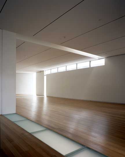 Museum of Arts and Design gallery (photo Helene Binet) In that way 2 Columbus Circle is a lot like Wieden + Kennedy. It's a body - a big solid concrete block - and the floor plans were so small that all we could do is take things away. But now it's so exciting, the idea that you could totally change the structure and the space with a two foot cut. It's so mind boggling to me. Arcy: It's like an excavation of light then? 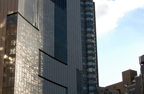 Museum of Arts and Design (left) photo Michael Oman Reagan Brad: That's exactly what it is and you need to see it at different times of day with the interaction of the sun and the clouds and the park. The one thing we are discovering here, and it is becoming apparent in the work, is that the multiplicity in the reading of the space and the juxtaposition of scales is pretty unique to architecture. The lessons learned from these more singular acts of art are then multiplied, but not multiplied by 29 different gestures like a lot of architecture… instead it is multiplied just by the resonance and by the scale that architecture works at. So it becomes new only because we are gathering these ideas and applying them in a way and at scale which allows other things to happen that we can't even really control. Jeff: It's this 21st century expectation; nothing is expected to act in a discreet vacuum, everything has to have a heuristic outlook and architecture is a kind of citizen of a city, not just a big trophy. It is important how a building addresses its role as a citizen not just a roadside attraction sign. Brad: If I have a position on that, it's that certainly the teachers that I had in the generation just before me thought, "well there's all of this different media", so now we are going to make architecture of that medium. So Frank Gehry says he works like a sculptor and other people talk about literary theory and other people talk about film. Well, I talk about buildings. In a way my work participates in all of those ideas but in the medium of architecture. I think that is why the European architects are so much more interesting and you two called them "material" earlier. The Japanese architects too. They are architects gathering those ideas into what they do, not trying to make their buildings into narratives or other oblique references to other fields. The Europeans and Japanese are amazing and I've learned a ton from them on how to make a building. What was really exciting was the breakthrough in working with Doug Aitken. If you take St. Louis (CAMSTL), which we just talked about, it's preparing the ground for contemporary art and bridging with the city and offering the city these galleries and space. With Doug Aitken (at the Dutchess County Residence), I was trying to do something for dwelling and all this stuff happened to mediate that landscape so people could live there, basically, so the clients could occupy that space in some residential way. Then Doug comes in and completely consumes the outside of building with videos that reestablish the landscape before the building was there. So the violation of this idea of architecture as the container of art… where now the art completely owns the building is… thrilling. Jeff: you could call the art a translator of the landscape and the building becomes its support as well as a functional dwelling. Brad: I was almost in tears when I saw that proposal. I was so happy because it took all of the ideas I was talking about and amplified them in a way only an artist can, that singularity of the act. It was so great that the building became the ground for someone else's work. Cities are often the ground for my work and there is something about the inversion of this thing… Jeff: It's interesting how artists translate through inverting relationships… why not reestablish the forest through technology? Brad: But he also had this conversation with the house. Aitken really wanted to take the things the house was in conversation with - the land, the site - and he wanted to engage that discussion. Amazing. Arcy: It's also a great compliment to your work because if it were something like a Victorian mansion, it wouldn't have worked or it would have been a different idea. Brad: Or it would have asserted itself in such a narrative way that it wouldn't have worked. Jeff: for example the English manor house is all about imposing itself on the landscape and you get something like the setting and relationship to nature you find in the Hound of the Baskervilles, a kind of "prowling miasma." I'm not certain that works for anything but a theme park ride now. The Victorians were very performative and histrionic, especially their lobby spaces. You seem to prefer the staircase over the lobby, your new Portland office, Weiden + Kennedy and the CSM certainly make the most of their initial staircase spaces.... 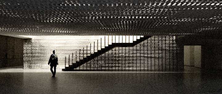 Clyfford Still Museum lobby and staircase It's like Frank Lloyd Wright's Unity Temple, you don't just walk in... it unfolds after climbing some stairs. Unity Temple and Wieden + Kennedy feel very related... not bad. Arcy: Do you think that the intense experience with Doug Aitken will filter back into your practice? Brad: I think once I see it, it will. I can't wait, but I've got to see it first. He's even doing a piece in this townhouse we are doing. It's great because there are these interstitial spaces, thick walls you would walk through, so we were just making these worlds in the thick walls and looking at all of these artists and talking with the owner about all of this other stuff. Then they commissioned Doug (Aitken) and he proposed a project that looks down onto the second floor and down onto the first floor and back at the city in the heart of this building. The project is three floors and he's doing a kind of fractal mirror thing that goes through two floors. So as you walk through this wall, it's three or four feet deep, you look up and the city is reflected back through this prismatic thing he made. Jeff: so he's moving more and more into installation? Brad: Which is exactly what we were trying to do with bringing light back into the space. Again, he finds all these little amplifiers of what the ideas are. Arcy: It's funny because his way is a much more literal and what you are doing is much more subtle. Brad: But again that is the power, or at least as I understand it, of how these artists work; the concentration of a clear idea. I mean that Wolfgang Laib thing that I show in my lectures with the pollen… that still blows my mind. Arcy: I wanted to ask you about Louis Kahn. He was great at taking modern projects and connecting them to the ancient past. Brad: I just thought of something I'd never thought of before. I mean there is the obvious stuff because my former professors, many of them worked with him. Obviously there is the interest in structure and material that all comes from his legacy. I also think the clarity of his work is what he was known for. But there was also this synthetic business that we are involved in. Kahn was such a synthesizer of history. Maybe I'm looking at a different set of ideas… but very much related ideas by all of these people that we are talking about. It isn't the same but there is a kind of analytical process. It's iterative though and Kahn was a big topologist of history… iteratively reducing it down into elements and reworking them. Arcy: and giving it a concrete expression 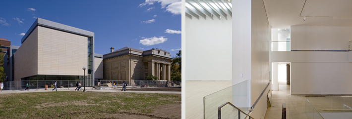 University of Michigan Museum of Art, Allied Works Architecture Brad: Kahn's work was so reliant on structure--his teachers were all Beaux Arts teachers who were very plan based, with very extruded plans…. So one of the first breakthroughs for me was being so tectonically driven in the Wieden + Kennedy Project and yet the space was more than the sum of its parts. And then in St. Louis one can't read the building from plan. That is where it really broke through - juxtaposing those two ribbons, the push and pull of those two things pull you around. And now with all of the projects, even Michigan, you can investigate structure without it being completely about how it hits the earth… that you can make that kind of labyrinthine space or whatever you call it? Arcy: And the Maryhill Overlook was like that. The structure becomes a folded plane and then a section and then another folded plane. Brad: I don't think I was fully aware of that at the time. It was just the act of taking that 8 inch slab and trying to get as much out of it as I could. Because it was all I had. In retrospect I can say, "yeah." (Laughs) Maryhill was made was with much humbler aspirations but St. Louis was about taking these things we learned during Wieden + Kennedy, making them layered and composite and saying "now let's just do it with just 2 things." With Wieden + Kennedy, all of the floor plates vary, it's almost a collage of elements. (all of us are reeling from the long discussion) Jeff: I think you've given us quite a coherent collage of an interview and it's been 2 on 1 this whole time Arcy: Was there anything else you wanted to add? Brad: Jesus Christ, my brain is about to explode. Jeff: this is like one of our road trips where Arcy and I discuss buildings and art all the way from Portland to Los Angeles and then back again, non stop. Brad: Oh man, unbelievable. (The three of us take some pictures and get a little tour of the office. Then, because Brad is a machine who only needs 2 seconds to recuperate, we continue talking for yet another 25 minutes.) Posted by Jeff Jahn on October 07, 2008 at 0:22 | Comments (0) Comments Post a comment Thanks for signing in, . Now you can comment. (sign out)
(If you haven't left a comment here before, you may need to be approved by
the site owner before your comment will appear. Until then, it won't appear
on the entry. Thanks for waiting.)
|
| s p o n s o r s |
 |
 |
 |
 |
 |
 |
 |
 |
 |
 |
 |
 |
 |
 |
 |
 |

|
Site Design: Jennifer Armbrust | • | Site Development: Philippe Blanc & Katherine Bovee | |

