
|
||
|
Portland art blog + news + exhibition reviews + galleries + contemporary northwest art
|
||
Jeffrey Sarmiento at Bullseye 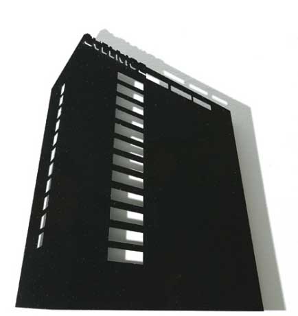
Jeffrey Sarmiento Soviet Hotel II (Siauliai) Jeffrey Sarmiento's Translations at Bullseye is a crisp study in the way certain civic architecture's volumes and memory, when associated to space can exude and question imposed power and aesthetics. Sarmiento (a Fulbright fellow) likes to explore "self imposed mismatches" and as a Filipino American exploring Soviet-era architecture... this is certainly idiosyncratic subject matter. I'm glad he's gone and done something so improbable. His Soviet Hotel II (Siauliai) is an imposing water cut glass black monolith. Executed by Sarmiento in coal black this Hotel in Lithuania was built during the cold war. Instead of actually casting a long shadow, Sarmiento's translation of the structure seems to be the darkness itself, while its actual shadow on the wall is soft and grey. A shadow more inviting than a hotel? 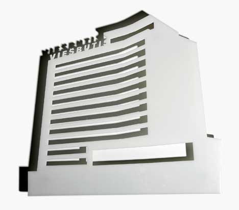 Soviet Hotel I (Panevezys) Soviet Hotel I (Panevezys), though bone white it is no less imposing as a beautiful yet severe ribcage of a structure. Using glass only makes it seem more clinical and deadly, like something in an operating room. This reminds me that glass was the key material in international style architecture and yet it was its transparent properties that Mies Van der Rohe, Le Corbusier and Walter Gropius prized. Sarmiento inverts this material as idea... into idea "as practiced." Notoriously closed during the cold war, countries in the Soviet block places like Poland, Lithuania and the Czechoslovakia were littered with this official architecture. 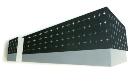 Occupation My favorite piece in the show is Occupation. Here Sarmiento has taken a building that is probably made of cast concrete with tiny (think arrow slit) windows and rendered it in poetically opaque black glass. It is beautiful, severe and immensely autocratic looking. The arrow slit window crosses could be read as graveyard crosses and it stands as an aesthetic ethical reminder of the dangers imposed from inflexible intellectual and social practices. The promises of glass become chilling execution. I doubt the actual building has as much visual power, which is a great achievement for Sarmiento. 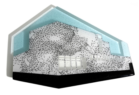 Museum Turbulence Other works like Hotel Turbulence and Museum Turbulence show how adept he is at layering meaning into fixed volumes but they lack the punch of all the architectural brutality in the soviet stuff. Anyone who thinks design is just a pastime for the comfortable and those in need of amusement needs to see this show. Design matters. With Russia invading Georgia and making threats at Poland this exhibition couldn't have been timelier. Through September 27th at Bullseye Gallery Posted by Jeff Jahn on August 23, 2008 at 19:43 | Comments (1) Comments I found the silk-screened layered works, especially Bombay Encyclopaedia, equally compelling. The messier, more intimate personal histories told in the timelines in those pieces provides an interesting contrast to the historical Soviet chill caught in the works you describe above. You can see an artist whose work began in a more autobiographical manner moving successfully into intertwining individual experience with the world around him. Posted by: Megan Post a comment Thanks for signing in, . Now you can comment. (sign out)
(If you haven't left a comment here before, you may need to be approved by
the site owner before your comment will appear. Until then, it won't appear
on the entry. Thanks for waiting.)
|
| s p o n s o r s |
 |
 |
 |
 |
 |
 |
 |
 |
 |
 |
 |
 |
 |
 |
 |
 |

|
Site Design: Jennifer Armbrust | • | Site Development: Philippe Blanc & Katherine Bovee | |


![[TypeKey Profile Page]](http://www.portlandart.net/nav-commenters.gif)