
|
||
|
Portland art blog + news + exhibition reviews + galleries + contemporary northwest art
|
||
Eadweard Muybridge and The Matrix
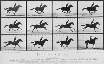
I feel like working through the spatial or temporal aspects of Muybridge's work and photography in general is like trying to understand a Zen Koan. It all sounds so simple on the surface. The shutter speed should be about time and the camera lens should be about recording the space or the field of view in front of the camera. The more I work through Muybridge's work, the more I wonder if the exact opposite is a more accurate description of what is happening. We usually associate time with the hands of a clock, no space just the continuous movement of experience counted off second by second. But couldn't time also be measured by the amount of spatial information that we are able to receive from a photo or a given environment? Ironically, this would imply that the clearer the spatial information is in a photograph, the more time and less space there is. Could the shutter speed be recording more space to be exposed on to the negative the longer the shutter remains open? If I could be permitted to go slightly off topic for a minute, it might be helpful to a quick discussion about time and space in art and what it means for photography in general and Muybridge in particular.
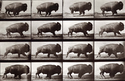
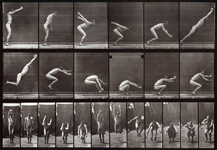
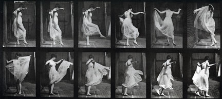
Muybridge was an English native but he spent more than thirty years off and on in San Francisco. It was in San Francisco in 1877, that Muybridge was asked to resolve a bet between two men, one of which was the Governor of California, Leland Stanford. The bet was whether or not all of the hooves of a horse leave the ground when a horse is running. One hundred years before the birth Silicon Valley, it was the technology of Muybridge that proved that the horse's hooves do leave the ground all at once. The sequential movement of Muybridge's camera was made possible by an electrical trigger that was invented by John D. Isaacs, the Chief Engineer of the Southern Pacific Railroad. The electrical triggers allow a passing object to activate the shutters that are arranged along the path of an object. Although each camera only produces one image, the images of all the cameras are able to be assembled to record the path of an object and to recreate the illusion of space in which time is slowed down.
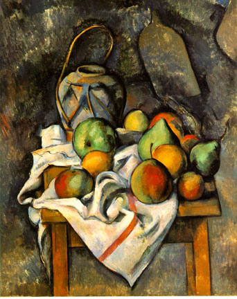
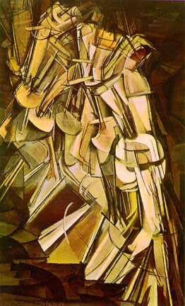
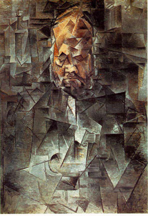
This is one of the disturbing implications of looking at Muybridge's work for me. I had always thought that Cubism was about space but now I wonder if it is actually be more about time because the more time slows down the more space we see. When you look at Duchamp's Nude descending a stair case or Picasso portrait of Ambroise Vollard, you realize that both painters are attempting to slow down time more and more time rather than adding more space into the painting. In other words, Cubism is essentially about the reduction of time through the addition of space. The more and more spatial information that is included in a picture the more a coherent sequence of time is undermined and the more it comes closer to approximating our own experience. As always, by adding more space into the paintings the result is a loss of precise spatial detail, a painting version of motion blur, and we are left with a wire frame view of object in Duchamp's painting. In Cezanne's painting, we are able to understand the differences between the objects based on the way imprecise way that we see the world. Picasso and Duchamp are more about flattening time so that the space could unfold around the movement of many angles of an object rather that is closer to an absolute space than our traditional time based experience.
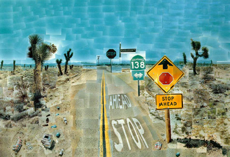
It was not until the end of the 20th century where artists and filmmakers could separate and work with the aspects of space and time individually in a picture. In the early 80s after having the assimilated the language and potential of Cubism, David Hockney was working on a series of photo collages of various subject including Zen gardens and parks in Paris. Hockney was fascinated that each picture not only recorded the object that was in front of the camera but also the position of the camera itself. He was attempting to pack the collages with as much space and time as possible. If Muybridge's photographs were high speed experiments with film, Hockney's work is literally closer to being a walk in the park. Hockney took the photos with his camera and had the rolls developed at a local one hour photo store. It is worth noting that he never trimmed his photos to create a true, synthetic space that we often experience in collages or in the spatial arrangement that we might see in Cezanne. I think that had he chosen to trim each photo, he would have eliminated the spatial component from each picture. As it was, each photo was allowed to exist as its own time and space. His photo collages are about emphasizing the multiple viewpoints that are required to create a space or a scene. Each viewpoint, each print is a microcosm and a module. The macrocosm is the actual physical space in which the pictures are arranged together on a picture plane. Like the way the Muybridge had to assemble his pictures outside the space of the camera, the pictorial space that Hockney creates did not exist in the object that he was photographing; he had to create it in each collage. In a sense, as we move through his masterpiece of his exploration, Pearblossom Highway, we move through the space by following in the tracks of the camera. The result is that we are as aware of where we are as what we see. In Muybridge it is the subject that moves, in Hockney's work we are the ones moving through the space of the picture.
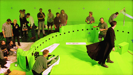
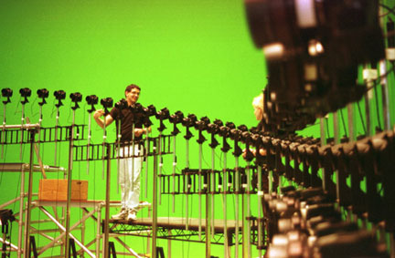
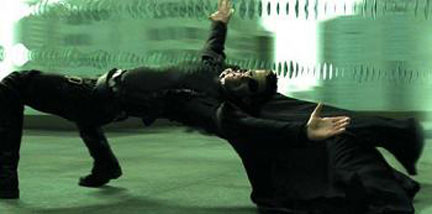
There is an essential quality of space and time in Muybridge's work that is proto-cinematic. We could easily imagine looking quickly at the images one right after the other to see a short animation. The evolution of this line of thought took a significant jump when John Gaeta invented a technique called Bullet Time for the movie The Matrix. The breakthrough in The Matrix was that time could not only be suspended but that you could also create an infinite sense of space because you could potentially look at anything anywhere from any angle all at the same moment. Muybridge's cameras were arranged in line, regularly spaced and triggered sequentially by the movement of the subject. Gaeta's breakthrough was that since a movie is made of still images anyway, what would happen if you put a bunch of still cameras in a circle and triggered the cameras at the same moment. He understood that the result would be a space in which time would be suspended and that you would be able to gather more spatial information from a subject that our normal experience of time and space would allow. If there is no time, space is effectively infinite and overlapping. Muybridge's work is a clear precursor to Bullet Time but Gaeta's insight and application of these ideas is pretty startling nonetheless.
Posted by Arcy Douglass on August 15, 2008 at 13:14 | Comments (11) Comments re: "I had always thought that Cubism was about space but now I wonder if it is actually be more about time" --- I've always thought Cubism was about deconstructing an object (perhaps temporally) and very little about "space". A fun example of this in sculpture is the Picasso Head of a Woman in the Portland Art Museum collection where he attempts to make a planar interpretation in clay before he finds sheet metal and cardboard to be better planar materials. But in paintings, analytical cubist paintings just get kind of fuzzy as the "space" moves from the object(s) to the edges of the canvas. I first noticed this when Frank Stella talked about how the Abstract Expressionists "always seemed to get into trouble at the corners" (see deKooning for a good example of this). The Cubists get into trouble there, too. Not that there's anything wrong with that. Posted by: Paul Sutinen Hi Paul, thanks for leaving a comment. I think that you are right about Cubism being about the "deconstruction" of an object. For both Picasso and Duchamp, Cubism was based on an idea about what painting is or at least what it could do. Cezanne on the other hand, painted the way he saw the world or at least the way that his painting would look right to him. He was solving a problem. I don't think it was an intellectual decision like it was with the Cubists. That is why Cezanne painted that way for his most of his life because it was the only way that made sense to him. I would say that Picasso and Duchamp were both smarter than Cezanne, maybe too smart for their own good. Duchamp certainly did not trust painting as much as Cezanne did. Picasso seems to have wanted painting to follow his thoughts. I do not think that either of them would be patient enough to work through the problems that painting presented to them. They were smart enough that they would move on to something else.. I also think that Muybridge was definitely working through a series of problems in his photographic experiments. Muybridge is probably a frustrated film maker except that movies and movie cameras had not been invented when he was doing his work. That is what makes his work interesting, he is trying to make films with a still camera. Again, although Muybridge was very bright I do not think it came down to an intellectual decision. I think that , like Cezanne, it was simply the only way that he could do what he wanted to. The irony about Cubism was even though it was based on series of intellectual deductions from Cezanne, it still came actually closer to way that we see the world than a one point persective.It revealed the limits of photography I think that is basicly because Cezanne was still at the root of it. Unfortunately, because it was based on an idea it also quickly evolved into a style and styles are never sustainable. This also might be the reason that Cubism as a movement did not last as long as Cezanne's career. It was based on a set of ideas about the potential painting rather than a more accurate description of the real world as it was for Cezanne. I especially liked your comment about the corners. When we see the world, our eyes to do not have the built frame like we would see around a painting. There are no built in corners for us.Our eyes are spherical. It also interesting that a painting tends to be much more spatial in the center, where the paint can work against paint, rather than at the corners, where the paint has to compete with the physical boundary of the frame. The physical boundary is usaully such a dominant element in our perception of a painting that it tends to do "flatten" out anything that is placed there. That is why there is a gradation from the center to the edge in both Cubist and DeKooning's paintings. Judd was very articulate about these problems in painting. Posted by: Arcy Yes Cubism was about deconstructing an image as well as its subsequent reconstruction... that's why anlytical cubism gave way to assemblage. It's also why Ive never bought the idea that Modernism was merely just about the march of progress. It's also why that old 80's version on postmodernism that laid claim to deconstruction rang a little hollow. Also I should note both Braque and Picasso abhorred any discussion of the 4th dimension (time) in their work, and Kahnweiler used their distinction to separate Braque and Picasso from what he saw as false cubists like Gleizes and Metzinger (who loved to discuss time). I think the Futurists like Balla and Boccioni were more fully immersed in the depiction of serialized time in a static image or sculpture... I think Balla would have been very excited about The Matrix. Posted by: Double J I agree with Jeff on this one, it is likely instructive to look at talk about Muybridge in relation to the Futurists, both Muybridge and Futurists were interested in the portrayal or understanding of movement. The Cubists work actually ended up showing a more complete view of 3D objects in a 2D medium (no time). Of course the Cubists were hugely inspirational to to Futurists. In some sense the futurists and Muybridge were also taking taking 3D (2D of space + 1D of time) and portraying it in 2D images. One could argue 4D into 2D, but at least Muybridge didn't have a strong spatial 3D unless you count the sequences from two perspectives. I created instructive table showing how Futurists, Cubist, Muybridge and others may fit together from a perspective, subject, and representation standpoint, but I don't think I can put tables html in a comment, so I created this on my blog: "Muybridge, Futurists, Cubists, and more", http://www.bradcarlile.com/blog/first-thursday/muybridge-futurists-cubists-and-more/ . Oh, but let's not only be academic and only talk about who Muybridge fits into the larger historical framework... Let's get to the scandalous and juicy stuff: The fact that Muybridge murdered his wife's lover and was acquitted. Wow, now that's an artist :) OK, sorry about my dive into yellow journalism. I think futurists don't get the airtime they should in terms of being an inspirational point for many artists. Likely the ugliness of their support of Fascism probably explains their subjucation to the backwaters of art history. From here on out, I think artists pay attention to the surprising number artists make nods to changing their art after seeing Futurist works. Posted by: bradc Thanks for leaving comments Brad and Jeff. Your posts raise an interesting question: Does the effect of Bullet Time seem to have a more accurate precursor in Cubism and Futurism? For me, I thought that because Keanu Reeves was more or less stationary, I made the Cubist connection but you might be right as well. Duchamp's Nude Descending a Staircase is closer to Futurist aesthetic than Picasso, at least as I understand it. On the hand Muybridge is key because both the viewpoint (multiple cameras) and the subject moves. In that way, his ideas would parallel both Cubism and Futurisn even if he was really trying to be a film maker when he wasn't on trial. I think that the time issue, or non- time that I was trying to describe, is implicit in Picasso and Braque's painting whether they wanted to address it or not. The more that they were able to prevent time from freezing the space of any one object, the more viewpoints they could include in their paintings. But like I said in the earlier comment, I think that Picasso's paintings are an intellectual idea about painting, not necessarily about how we really see those objects in real life like Cezanne. That also raises an interesting distinction Duchamp's paintings is about the passing of time because it takes time for her to walk down the stair case. Picasso is able to undermine time because we are able to see things from many points of view in the same instant. I really like the chart. That is a good way of being able to lay the ground work between the different ways that artists use time and space. You might find this interesting. Twombly has spent most of his adult life in Italy, home of the Italian Futurists. A lot of people see the influence of Futurist in Twombly's work especially his blackboard paintings. Posted by: Arcy I see "Bullet Time" as more of a Cubist work, I'ved updated the table in my blog to help explain this. Gaeta's "Bullet Time" mostly explores a single moment in time and allows us to see relations of the subjects (Neo & the bullet) at one point in time as we pan around. This is of course contrasted with the normal movie slowing down right before it. While Muybridge use multiple cameras, I think that was just due to technical limitations. A faster frame changing & camera sync'ed with subject achieves the same effect. No I don't know if John Gaeta was inspired by Muybridge (that would be cool). But, I don't see the multiple cameras as being more central than the issues of time, space, perspective, and subject. By the way, I've always considered Duchamp's "Nude Descending a Staircase" as In Dec 2007, I saw a nice film on Picasso & Braque's Cubism at the the Picasso Museum in Paris. It was pretty clear that they were not interested in "time" at that point. Time still baffles the world's thinkers, it is amazing how central time is to physics but how little we understand it. A favorite quote of mine about time is from string theorist Brian Greene (2004), "I do believe in time,"I just think our intuition about it is wrong." This tells me that we need to move far beyond "movement means blurring" in art and art photography. Here is one more thought on time to confuse/inspire the mind. "All objects in the universe always travel through spacetime at one fixed speed, the speed of light. An object that is not moving is traveling through the time dimension at the speed of light." (paraphrase) Albert Einstein. Arcy you mentioned that a disturbing part of Muybridge's work is the lack of synthesis of the multiple images. What I do is step back and see all of the images at the same time as a collective whole. Posted by: bradc Brad, I liked your quote from Einstein and I agree with you about what Brian Greene said about Physics not understanding time and space. I would probably add that if we think that we understand time and space in art we are not trying hard enough. For me, the use of multiple cameras is the key to Muybridge's work simply because they would each have their own perspective. Even if he had a faster camera and all of the photos were taken from the same location, the images would be too similar for having the same perspective. If it is one camera from one location, the images are only separated in time, like a futurist painting. Multiple cameras implies a pictorial space with multiple viewpoints that could not have been generated by a single camera alone. This why when you look at Hockney's collage Pearblossom Highway he is moving the camera through the space that he was photographing. We literally move through the collage when when we look at it. That is what makes it great. In his case, it is one camera in a couple of hundred different locations. In my understanding, you can not talk about space without talking about time as well. They are interconnected. It is even more difficult to talk about space with out time. For example, if you were walking up a guitar, classic Cubist example, do you paint what the guitar looks like now or when you are two feet closer a second later. Do you paint the guitar from the inside, outside or both? Why should one view be priviledged over another if they are both part of the "space" of the object. All of these decisions have implications for the time of the painting. It follows then that if you are talking about space in a Cubist painting, time has to be accounted for in some way, even if that might not have been driving idea for Picasso or Braque. That also would not stop us from trying to understand the implications of that time as move through to reconnect the different spaces that the painting generates. One of things that bothers me after the wrting the Muybridge review is that all of the art that I thought was spatial is actually temporal, or at least very small part of it is actually spatial. That is what is so difficult about the review. We see painting in time, never in spatial isolation, even if we wish we could. Cubism is no different, it exists in time whether Picasso wanted it to or not. The example of a work that exists in space because it never changes in time would be the Ganzfeld's that have recently been explored by James Turrell. Ganzfeld-"total field." Everything all at once and past, present and future never changes it. Time is held at bay and that for me is the closest I could think of to an absolute space. Everything else, to a greater or lesser extent, exists in time. Here is an even bigger problem. Muybridge's photos, like Hockney's, have to be collaged together outside of the space of any one photograph. You could say that in order to do this, they have to exist as flat pieces of paper that exist in the real world, so that they can be arranged or assembled together. In other words, to make sense of the relationships you have to leave the pictorial space of the camera and enter the real world. The implication is that when we are looking at Cubist painting, if we are honest, we can not limit ourselves to the experience that we see when we are looking at the painting. Everything has to be included in the experience, the people standing next to you, the frame, the wall color and the guard that you had to walk past when you entered the room. Those things, like the movement of our eyes, exist in time in real space. I think that on some level Cezanne understood this and made his painting accordingly. That is why you get a portrait of Madam Cezanne and she is practically on the diagonal because he is trying to influence things outside the space of the painting. He did not do it by denying time. He did by being honest about what he saw. The extension of this line of thought is Ellsworth Kelly, where there is a little space inside the painting but the painting itself can change the space of the room. Posted by: Arcy Understanding the true nature of "time" is probably the toughest problem we humans have ever had. It is a key part of every physics equation, I think it is being a bit capricious to say we "aren't trying hard enough." Sure it is easy to think intuitively about "time", but I believe that leads us astray. "Motion is a blur" that's it, boring and probably wrong. The key distinction between Hockney and Muybridge isn't number of cameras but the representation. Hockney shows one resultant image composed of many subimages, Muybridge shows many resultant images each of the same scene. Either work could have been shot with one or multiple cameras (Muybridge: modern camera on a dolly moving with the subject, Hockney: actually we are trusting him that these were shot with one camera). A more recent exploration of Hockney-esque images is Thomas Kellner we are sure Kellner's vibratory images are shot with one camera because they are printed as contact sheets. Hockney, Cubists, Kellner all explore a subject or landscape by moving around space and add different perspective (there is no indication of time-changing in any of the sub images) of a scene. Cezanne plays with normal perspective lines (the straight liens of a tables change their angles behind fruit, etc.) and shows one subject. I walk away with wow I've never experience and seen that subject (Madam Cezanne, still life, landscape, etc.). Sure they all were created over time, but I don't see the effects of time in any of their work. Muybridge & Futurists are more closely aligned because they explore a subject "moving", they show how it changes in time. They represent change in two different ways. I walk away with thinking about change and time. In these work I see the effect of time - it changes and influences the image that is created. And they both intended to show change & "time". Just because it takes "time" for us in our limited experience to explore the insides and outsides of an unchanging object, to twiddle an unchanging object around in our fingers to see it from all sides, does not mean that we are really the concept of "time". I think that time and space are connected, but as artist we can choose to focus on highlighting certain aspects. It is a bit of a reach if we start including too many things in to interpretation. Saying Picasso and Braque were making big statements about time I think is a bit of a stretch. But if their exploration of space inspires you to think about time differently, wonderful. In the mean time, I'll stick by my thoughts in this table. Posted by: bradc Regarding the question as to whether cubism, or any other genre of art, is more about space or time, since about 1918 it has not been possible to talk about them as an either/or duality as they are intrinsically linked - as are matter and energy - in one single dimension of space-time. Posted by: Amsterdammer Space&time are intrinsically linked, but they are 4 different dimensions that are one space-time manifold. It is always possible to study an particular dimension by minimizing the changes of the other orthogonal dimensions. I still go back to my table, where cubists mostly explored changes in perspective. Futurists mostly stated their intention to showed "dynamism" as a study in subject motion and change. Muybridge showed subject movement where the perspective is held basically constant between the observer and the subject, seems like a study of motion and therefore more closely allied to Futurism than Cubism. As a reminder, Picasso & Braque in their lives said the were not commenting on time and they used expressions like simultaneous views. ok.. Sure, there is no such thing as simultaneity, except as an error of our perception. Posted by: bradc Thank you to everyone that has posted or read these comments. I am sure that this discussion is not for everybody but there is the potential that some of these ideas might spin off into some very interesting applications. One thing that I have been thinking a lot about over the last few days is a analogy. Let's say that you are in a room and that you see three sides of an object. You think that it might be a cube. In order to see, the rest of the object, time has to move so that the rest of it could come into view. The space did not change and the spatial information of the cube did not change. Time changed. We exist more in time than in space. The only way to learn about space is in time. This for me is a very weird idea. Everything that we see around us is time revealling little bits of space to us very slowly. Time is what makes space legible. Time is what separates front from back, left and right, up and down. This is why I think that trying to imagine time without space is interesting. If all of the spatial information is already present, would all of it exist simultaneously if time was not present? Is time basically a straw that is slowly revealling the spatial information to us? This is the idea I was trying to get it in the post. I do not think that we will agree about this but I will say it anyway. Everyone understands the three spatial dimentions and the fourth being time. I realize that everyone is using that as an assumption. But I can't help wondering, if that is a misleading model of what we actually experience. The model implies that space would be able to exist without time by just dropping a variable. I do not think that we understand space without somehow bringing time into it. Most of what we experience is in time, very little of it is in space, even if we perceive it that way. Also if the Cubists are talking about simultaneous views, simultaneous is a qualifier about time. Posted by: Arcy Post a comment Thanks for signing in, . Now you can comment. (sign out)
(If you haven't left a comment here before, you may need to be approved by
the site owner before your comment will appear. Until then, it won't appear
on the entry. Thanks for waiting.)
|
| s p o n s o r s |
 |
 |
 |
 |
 |
 |
 |
 |
 |
 |
 |
 |
 |
 |
 |
 |

|
Site Design: Jennifer Armbrust | • | Site Development: Philippe Blanc & Katherine Bovee | |


![[TypeKey Profile Page]](http://www.portlandart.net/nav-commenters.gif)