
|
||
|
Portland art blog + news + exhibition reviews + galleries + contemporary northwest art
|
||
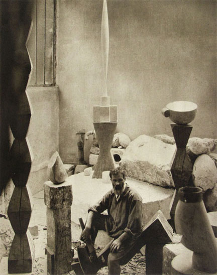
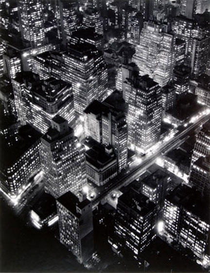
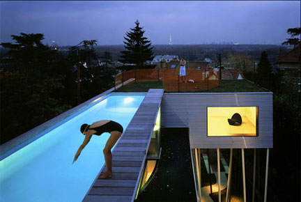
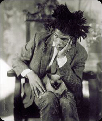
The Power of Place This post is a bit of an experiment but I have been thinking a lot about the way a photo can tell a story a about specific time and place. The photograph becomes an embodiement of an idea that is sometimes separate from the work itself. This essay is a study about the way that certain photos become more than just about the visual records of experience that exist in the worlds of art and architecture. At the same time, I would like to add that the photograph undermines any emphasis on any geographical location outside of the field of view of the camera. Images are one of the few things that available to everyone because all you need to have is a camera and access to the internet. The reason that I chose these images in the post is that they all convey a story. They seem to be closer to conveying an idea about a person or work rather than simply documenting an experience. The ideas in these photographs seem to me to be essentially about place. A camera is extremely specific, it can only record what is in its field of view. If it is outside the field of view of the lens, it wouldn't be recorded. For me, that means that a camera is essentially about a specific place at a specific moment. The great thing is that that place can be anywhere now and availible to anyone. Everybody has the opportunity to participate. In a world that is becoming increasingly universal, there is still something compelling about the specific. The camera also separates the viewer from the event. The image can be used to convey a specific idea which might be different than the experience of the actual event. This post is probably closer to a slide lecture that happens to be on the internet rather than a normal post. There are plenty of artists with a few architects and architecture thrown in. It is worth noting that a piece of architecture is not easily relocated. Unless people make the effort to visit it, it will only exist for most people as an image. For me that is important lesson for artists. Within the confines of a camera you can create your own world that may or may not have anything to do with where you live on the planet. The camera is a great equalizer. As I was doing research for this post I was surprised that artists and architects have been using images this way since the very beginning.
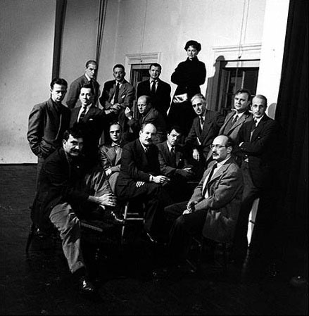
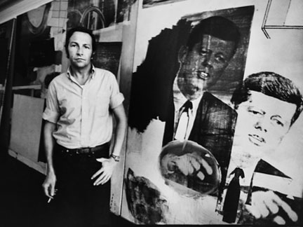
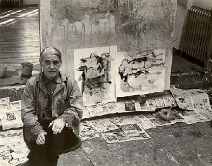
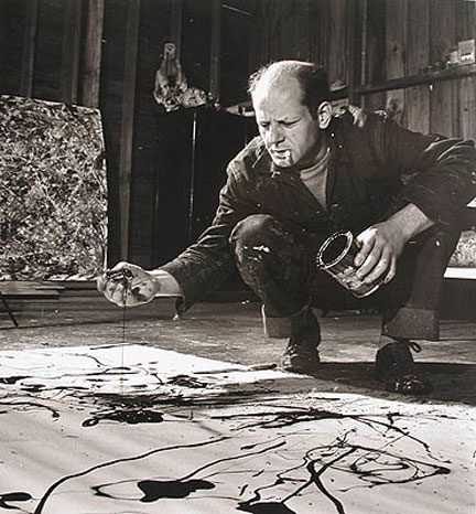
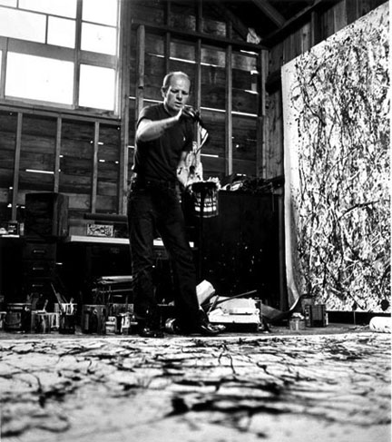
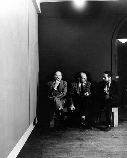
The photograph was comissioned by LIFE magazine a group of artists that were protesting a show at the Metropolitan Museum of Art. It is hard to come to a different conclusion than the institutions at the time got it wrong. The Met at the time failed to recognize some of the most brillant American artists that ever lived.
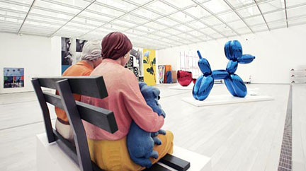
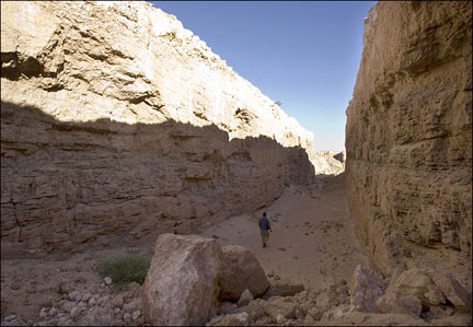
The Broad Collection is a beautiful museum and Renzo Piano is a great architect but in terms of the experience of a place it does not a hold a candle to Michael Heizer's Double Negative. The Broad Collection is beautiful, expensive and ultimately interchangeable. Even worse, like most museums it is very hard to see any of the work in isolation. I think that museums feel that general public would be bored if the experience of the museum is too singular so that put something in there for everybody. While musuems tend to see themselves as generalists, art on the hand has always been extremely specific. If you are going to Double Negative from Las Vegas it is close to two hour drive. During the two hours you might be a little anxious but you are also soaking up the landscape from the car. As you to take make the turn you slowly begin to climb up to the top of the mesa. You can't see anything because it is a flat mesa and there aren't any signs so you are never sure if you are going in the right direction. After driving 30-45 minutes you come to these large holes in the ground. No signs, no admissions, no bookstore, just your experience. Make of your time there what you will. Afterwards though, you realize the whole trip was your experience and not just the time that you spent in and around Double Negative itself.
In the second photo, he is a reading a newspaper witht death staring over his shoulder. It is like it is perfectly normal to be reading he morning newspaper with death staring over your shoulder.
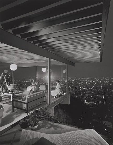
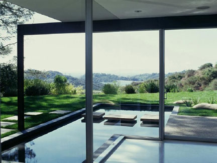
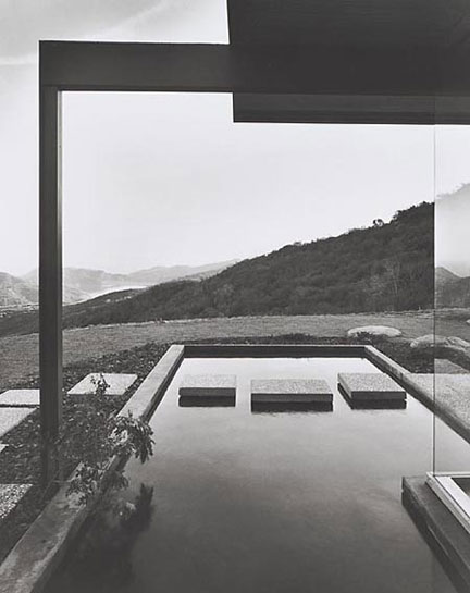
The second photo by Julius Schulman changes the whole character of the house. The roof beam and column that spans over the small pond look like a Japanese Torii gate that had been relocated to Los Angeles. The three steps become like a small Zen garden. Two photographs of the same house from nearly the same angle and they are literally worlds apart.
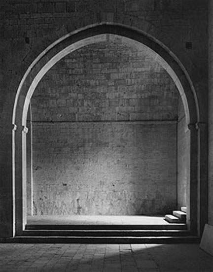
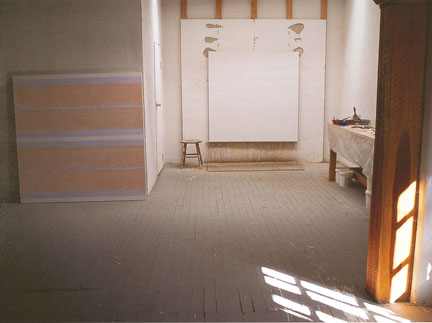
The bottom photo is Agnes Martin's studio in Taos, New Mexico.
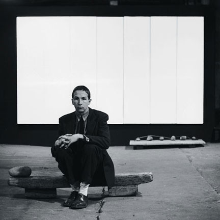
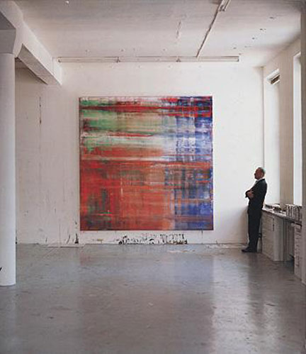
The Richter photo is great because it always reminds me of Vermeer painting. Although, most of the time in Vermeer's work the light comes from the left rather than the right as it does in the photo. I think that the photo is extraordinary because the whole experience is about the natural light and the painting. The white walls and the gray walls dissovle away, the physical properties of the space are secondary to the experience of the work. Even Richter is a little extraneous to the photo. If he was not in the photo, it would not change the experience of the space, although his dark clothes do provide a nice hard line to frame the painting. The photo to me is about the integration of art and space which seems so hard for most museums, the Dia Center being the exception.
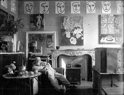
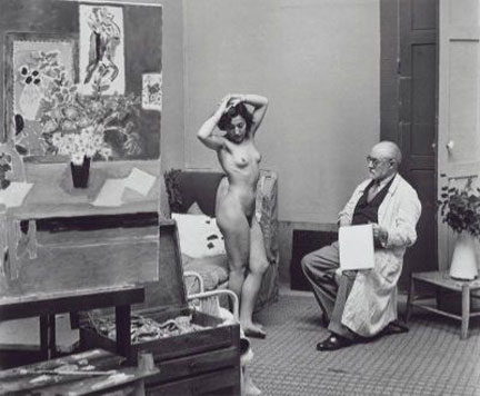
The bottom photo is from Matisse in his studio from a few years before. It is interesting that he is not only not looking at what he is drawing, but also that he seems to be looking through the model rather than looking at her. He is trying to connect the eye and the hand without letting it be filtered by the mind. I always think that he is looking for the most complete expression of the moment.
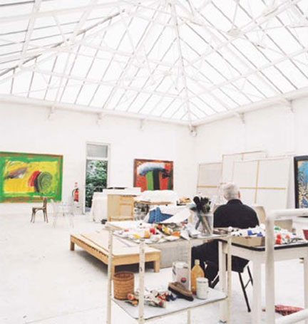
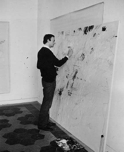
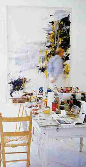
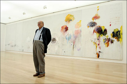
Twombly's studio in, I believe, Gaeta in early nineties. He is working on one of the panels of the Four Seasons. Twombly is in the photo but he is blurred, so somehow his form echoes the forms in the paintings. Again white walls and white floors. The paints are on a curving antique table that is painted all white that is next to a very simple wood chair. Just out of the frame of the camera, is a door or window that looks out over the bay below. One of my favorite photos. The last photo is a little bit of a contrast with the other two. Twombly is in the Twombly Gallery at the Menil Collection in Houston. It is the face that the public sees and he is standing in front of his painting like a proud father. Still, the face the public sees is different than the raw, concentrated experience of his studio.
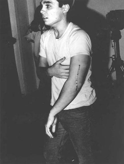
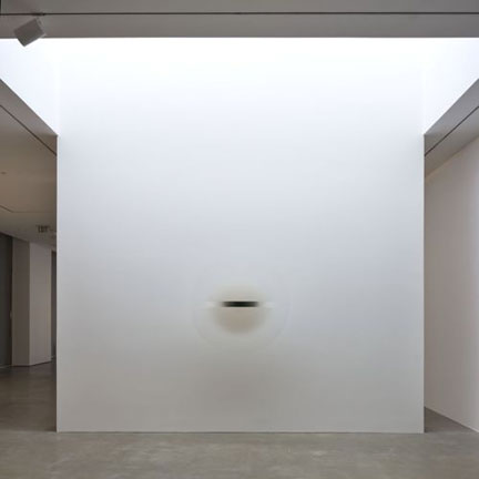
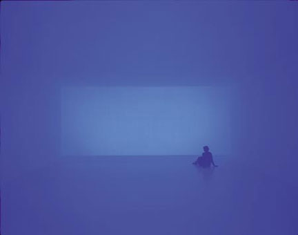
You could not remove one of Walter De Maria's poles from the Lightning Field and still have it be considered art because the art exists only in relation between the grid and the landscape. If you saw one of Irwin's discs lying up against the wall or if you walked into one of Turrell's works with the work lights turned on, both would somehow no longer be art any more. They would have the potential to develop into an art experience but without the the connection to the space they would exist outside of an art experience. The lesson that I got from all of these photographs is that we can all exist everywhere and nowhere now. We are interconnected. The only important is the present moment, where ever you are. For me, each of the photographs have come to represent the power of an idea. It is an idea that is expressed in a certain fraction of a second within a very specific field of view. In other words, it is the power of place. It is a place of ideas, or being in the right place at the right time when history changes. It is a place that is powerful regardless of physical location. Posted by Arcy Douglass on July 23, 2008 at 12:10 | Comments (8) Comments Thanks Arcy, I love your reflections and the photos you have put together. I find it so enriching to have artists and critics show and talk about art that moves you and why. Your piece here allows me to go deeper into my own experience of photos and art and why I may be moved by particular ones. I also appreciate you including architectural photos, the juxtaposition of the two Singleton house photos demonstrates for me, with simple eloquence, the contrast between good and great composition. I look forward to the pieces you write here and the depth and sense of exploration you bring to PORT. Thanks again. Charles Posted by: Charles Thanks for these great photos. I'm surprised to see Twombly working on that canvas leaning against the wall - I wonder if that's a posed shot for something or just how he worked early on - like you said, my belief was that he always worked with the canvas tacked to the wall. He was a huge influence on me in my very early 20s - I dreamed of traveling back in time and going to Black Mountain. I'm glad you included him. Martin's studio is beautiful - I hadn't seen that photo before - but it's inspiring. I recently saw the rooms of her work in Beacon and it was wonderful - old and new work next to each other - it was the first time I've been in a room entirely filled with her work since she passed away - it was very sad and wonderful all at once. Posted by: MOR Nice set of photos... but it does strike me that there are none of a female artist/architect (the women in the photos seem to be only in the role of subject). If you wanted a bit more gender balance, I'd nominate adding this one to the collection (though perhaps it doesn't have enough sense of "place"): Posted by: SimEnzo I agree with SimEnzo. So much of it comes off as male posturing after awhile - it is a reasonable observation to just bring it up. The image of Matisse is especially repulsive - his relationship with his "models" and his treatement of women is well documented. Posted by: lsd Taken as an essay, what I get from this more than anything is a demonstration of our tendency to see in photos a confirmation of what we already believe. I don't know how else to account for your seeming confidence in your interpretations of them. "The expression in the (Chris Burden) photo is...a mixture of 'I can't believe that I have been shot' and 'I just made history.' " How do you know that his expression isn't, for example, a transitional one not relective of any concurrent thought? Or something else? You reject or do not consider this possibility because it doesn't fit your pre-conceived ideas about the event. Granted, the photo does not appear to contradict you, but to what possible expression could you not have applied your interpretation? "In these (Warhol) photos you can see exactly what Warhol is about. Dark spaces, a reflective ceiling and no natural light." In your interpretation, "dark spaces, a reflective ceiling and no natural light" is a metaphor, but you did not "see" this; metaphors do not exist in nature; we create them to express what we already believe. Perhaps you are saying that the metaphor is the photographer's, but are you sure that it isn't yours? "Still, you wonder if the humility of the (Nicholas Serota) photo is genuine or just a good publicity shot." I think you should have brought this skepticism to all of the posed portraits. Posted by: rosenak Two things... First, The Iracibles photo is by a woman, Nina Leen... and in it she deftly put Hedda Sterne at the top of the heap. Second, Arcy and I were present one day while the photgrapher was feverishly working to try and capture that Robert Irwin disc... I cant think of any subject more difficult or worth documenting. For those who did not get to see that show... this is an important photo. Posted by: Double J Thank you to everyone for taking the time to make comments. First, as for the selection of the photos, these were photos that were interesting to me. I make no claims beyond that. Someone else could choose a different set of photos that would be equally valid to that person. For me, the images that I chose are able to convey a large amount of information that can be encoded at the time and place of the photograph that really has no relationship to its geographical location. It is the place that exists in front of the camera and that place sends a message or as an idea. Chris Burden is the perfect example. As I understood it, Chris Burden had planned to be shot in front of a wall and the resulting blood and the bullet would be his contribution to a group show. I think that on some level the resulting blood splatter would be a commentary on his interpretation of what it means to be an artists as well as secondary reference to Pollock's paintings. Fine, easy to follow as an idea and right in line with the type of work that Burden was doing at the time. For me, the photograph is revealing because it shows there is a big difference between planning to be shot and actually being shot. The look his face says it all. His arm hurt, he is probably hoping (or glad) that the bullet did not break a bone, but at the same time a little relieved that he achieved what he set out to do. It is all right there. For me, he looks relatively calm and collected for just having been shot. The deeper question is who took the photo? Was it a spectator or was it a photographer arranged by Burden ahead of time? Although, the public performance aspect of the event was crucial to the piece Burden understood that without a record, the effort might have been wasted or at least only witnessed by a few people. Recording the event was the way that the piece could live on long after the show was over. Does the participation of a photographer change the work? I think that it does. He did not do it alone in his studio one night by himself. He saw the work as part of something larger. But you are right, in the sense we do not know what happened the split second before and after the photograph was taken. That is one of the limits of a camera. That is why everything that it produces is on some level artificial or at least only a one moment and one angle of actual event. But just because something is artificial does not mean it is not useful and can't be used to convey a powerful message. I think a few people have misunderstood what I was trying to get at in the essay. First, it is the idea that images, even though they are artificial and substantially different from the actual experience of work, are incredibly powerful. Second, these are examples of photos that I found interesting but everyone is free to choose their own. More importantly everyone has the opportunity to make their own images and to convey whatever message they want to send. Third, is the idea that the strength of the image is not determined by where one lives. The images made in New York are not inherently better than those produced in Los Angeles or Portland. What is better is that those artists understood exactly the type of message that they wanted to send. Warhol's studio is dark, artificially lit, and had reflective ceilings not because I am interpreting that but because that is the message he wanted to send. He wanted to his studio to look that way and it adds something to see the work in that context. Natural light fluctuates, artificial light does not until a bulb burns out or you turn off a switch. His studio arrangement was deliberate and an important influence on the way he worked. I would also go one step further and say that the look of the studio was also an important way for Warhol to present the work as well. Studio shots reinforce the connection. The important thing is that there is an agenda behind every single one of these images. That was the point of the essay. If you see it, it is something that you could use for yourself. Posted by: Arcy 'Thank you to everyone for taking the time to make comments." My pleasure, to the detriment of my creditors. Thank you for responding thoughtfully. "For me, the photograph is revealing because it shows there is a big difference between planning to be shot and actually being shot. The look his face says it all. His arm hurt, he is probably hoping (or glad) that the bullet did not break a bone, but at the same time a little relieved that he achieved what he set out to do. It is all right there. For me, he looks relatively calm and collected for just having been shot." This seems more reasonable and is more interesting than your original description. "Probably" and "for me" help a lot. "The deeper question is who took the photo? Was it a spectator or was it a photographer arranged by Burden ahead of time?" It was arranged that Barbara T Smith, who had been a fellow MFA student at Irvine, would take photos at the event. I don't know if she was the only photographer there, so I'm not sure if this one was hers....or was Smith only a spectator? I'm not sure anymore -- I was told about this over 30 years ago. In any case, I think it's safe to say that Burden did make sure that the event was documented. As I recall, it was not so public; it was (reasonably!) considered a bad idea to throw a public shooting. "But just because something is artificial does not mean it is not useful and can't be used to convey a powerful message." Agreed. I was only advising the viewer to exercise some caution. "I think a few people have misunderstood what I was trying to get at in the essay." I couldn't quite put your thesis together and should have said so when I commented earlier. "Warhol's studio is dark, artificially lit, and had reflective ceilings not because I am interpreting that but because that is the message he wanted to send." Fair enough. "The important thing is that there is an agenda behind every single one of these images." I'm trying in vain to think of a photograph for which that is not true. Posted by: rosenak Post a comment Thanks for signing in, . Now you can comment. (sign out)
(If you haven't left a comment here before, you may need to be approved by
the site owner before your comment will appear. Until then, it won't appear
on the entry. Thanks for waiting.)
|
| s p o n s o r s |
 |
 |
 |
 |
 |
 |
 |
 |
 |
 |
 |
 |
 |
 |
 |
 |

|
Site Design: Jennifer Armbrust | • | Site Development: Philippe Blanc & Katherine Bovee | |











![[TypeKey Profile Page]](http://www.portlandart.net/nav-commenters.gif)