
|
||
|
Portland art blog + news + exhibition reviews + galleries + contemporary northwest art
|
||
Carson Ellis at PCC Rock Creek 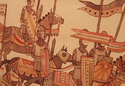 Carson Ellis, original artwork for the The Decemberists' The Long and Short of it Tour (detail) It is no secret that Portland has an impressive music scene nor is a secret that the art scene is equally robust, what isn't talked about much is how often they are entwined in each others affairs. The two have grown up alongside and supported eachother. Take for instance one of my favorite local artists, Carson Ellis and her work for The Decemberists. Way back in the old days 2001/2002 (before Portland actually believed something was going on) Ellis got my attention for her sure hand and novel wit. Later, her ghost ship painting was used for The Decemberists Castaways and Cutouts album and the rest is history. Soon she'll have a show in Chelsea, but till then there is small but wonderful retrospective of her The Decemberists work at PCC Rock Creek up for the month of March. Since those early-aughts she has been the major visual design force behind the band… a mix of anachronism, sepia & coffee stained tones, wit and haunted maritime/Russian fairytale edge (ala Baba Yaga). I continue to be a bigger fan of her than the band, which is exceptional too though it's rarer for them to be on my MP3 player than to think of Ellis' work. 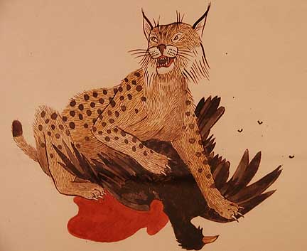 Original artwork for Decemberists.com The reasons were simple, Ellis was the first artist to so convincingly blend the Royal Art Lodge style Canadian laugh-from-dread, Audubon, Japanese Kawaii or "cute" culture, scrimshaw, maritime tattoos and Russian folk into something that referenced those styles without being derivative. 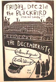 Poster for the Blackbird 2001 As this show illustrates Ellis' graphic language developed pretty quickly. Her poster for the Blackbird back in 2001 evokes monumental prison with a Russian style onion tower and a few people with a car waiting outside. Is it a jailbreak or a concert? It is interesting and a decent poster but not very distinctive. One has to remember this was right after September 11 and the country was taking a dangerous turn towards being a police state. In fact George W. Bush had incredibly high approval ratings, but Portland is not like the rest of the US… we had marches around Pioneer Square decrying these practices. We also had lots of concert posters that tapped into the zeitgeist. Carson was definitely channeling that defiance with a dread yearning for change that was in the air here back then (and even more so now). Later Ellis' focus on escape would come into full bloom as a more completely engrossing world. 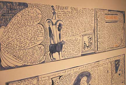 Original artwork for 5 Songs The artwork for the 5 Songs EP is a step into a more fully consuming aesthetic. Executed in mostly blue ink an acrobat who looks a lot like one of Degas' sculptures stands on top of two folksy figures obviously inspired by the famous folk artist Bill Traylor's silhouettes (perfectly acceptable to borrow as graphic art) but it's the scrimshaw-style penmanship of words that swirl into a whirlpool that become consuming. Like a letter home written during a long voyage there is a resignation and a romance here. 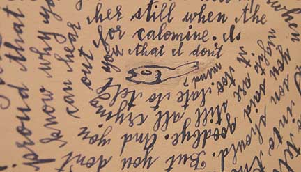 detail from original artwork for 5 Songs This scrollwork "full of longing" motif culminates in the seminal piece of the show, the original drawings for the CD foldout for Her Majesty (2003). 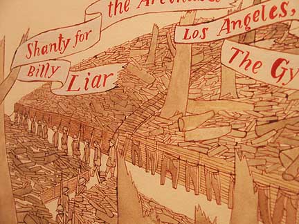 Original artwork for Her Majesty (detail) 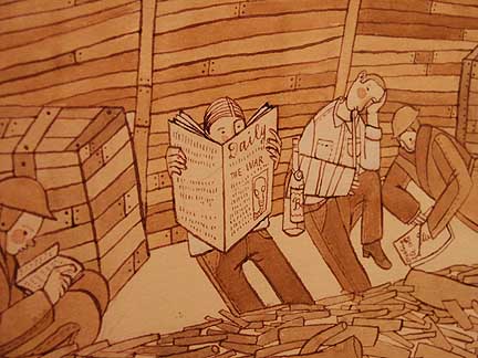 Original artwork for Her Majesty (detail) 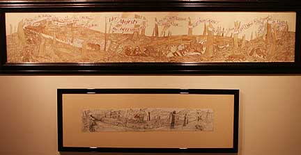 Original artwork for Her Majesty and sketch Consisting of a long series of grim WWI style trenches with banners proclaiming the song titles, the characters are depicted as huddled down, reading, drinking and worrying. It is a scene of historical quagmire and progress at an impasse, perfectly channeling our own times. Ellis manages a Paul Klee like cartoony feel soaked with dread anachronistic cheer. It conveys an overarching historical awareness that the human race has made this mistake before and will again (the Iraq war). The sheer detail puts the viewer in the trenches and corresponding mood. 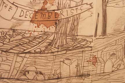 Study for Her Majesty (detail) I consider this a very influential image for 2003 and by 2004 other artists like Allison Smith seemed to traffic in the same militarism without the expansive poetry. I also found the preparatory sketch illuminating, with what looks like a coffee stain as a mortar shell exploding above the quagmired combatants… its probably watercolor but could there be a more Portland pigment? 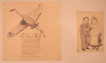 Original artwork for The Crane Wife Later artwork like that for the Crane Wife is more ornate and polished. The two dwarves have pleasant, antique Russian looking bruskness to them and the actual Crane has foreshortened wings showing Ellis' interest in early photography, Japanese scrolls and John James Audubon. Things seem to have gotten more serious, even studied and clinical than the more cartoony work for Her Majesty. That isn't bad but it does hint at the message the band was trying to send and the mood is more personal. 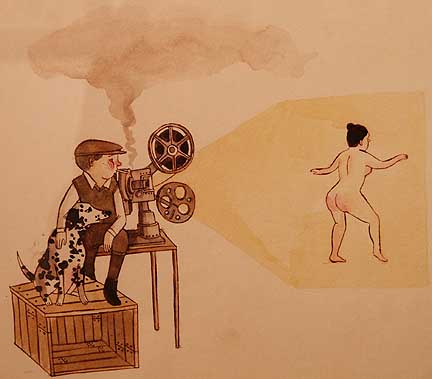 Artwork for Decemberists.com Still, the work for the website, T-shirts etc. have a more whimsical tack with walking elephants, old time nudie films and bearded shirts. The mood is pure PT Barnum. Ellis is a very serious artist and though this show mostly amounts to illustration… she's shown herself to be one of the most adept in that field working today. What I'd love to see is a bigger show of her haunting/funny drawings and paintings. Till then this small retrospective definitely whets the appetite as few artists seem to channel the anachronism and desire for a smarter way to live that Ive seen in Portland (but now present everywhere in some form) over the past 9 years. The gallery is open Monday- Friday 10:00 am-4:00 pm. It is located in Building 3 of the Rock Creek Campus of Portland Community College at 17705 NW Springville Road, Portland. For more information contact Prudence Roberts at 503-244-6111 x3434 Posted by Jeff Jahn on March 14, 2008 at 11:27 | Comments (0) Comments Post a comment Thanks for signing in, . Now you can comment. (sign out)
(If you haven't left a comment here before, you may need to be approved by
the site owner before your comment will appear. Until then, it won't appear
on the entry. Thanks for waiting.)
|
| s p o n s o r s |
 |
 |
 |
 |
 |
 |
 |
 |
 |
 |
 |
 |
 |
 |
 |
 |

|
Site Design: Jennifer Armbrust | • | Site Development: Philippe Blanc & Katherine Bovee | |

