
|
||
|
Portland art blog + news + exhibition reviews + galleries + contemporary northwest art
|
||
Nathaniel Shapiro at PNCA's Izquierdo Gallery 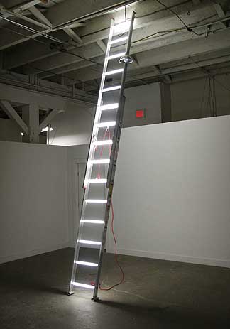
Last year I noted Nathaniel Shapiro as one of the most promising new artists to the Portland art scene. In just under a year he's proven why with a stark and beautifully laid out show in PNCA's Manuel Izquierdo Sculpture Gallery. The gallery hours are M-F 9-5 and Sat-Sun 10-3 but PNCA's III-D building is often locked so you'll have to press the red buzzer at the inside door to get let in. Have patience, someone will eventually come. Needless to say PNCA needs a student gallery attendant here, they used to have one when I first started visiting this space. It's worth all the trouble and yes Shapiro has another separate piece in the Swigert Commons that I'll avoid here just because it's mostly an excellently executed exercise in wit and rather unrelated. 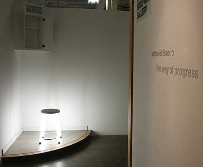 Titled "The Way of Progress" Shapiro's most convincing show to date consists of only two installations, neither of which utilizes any gallery lighting because they provide their own light sources. The first piece is a corner installation consisting of a stool and a white cabinet filled with unused full spectrum lights stored too high for anyone who isn't over 6 feet tall. The full spectrum lights have a nice light blue color that gives them a more charged visual presence. Below them is a typical shop stool outfitted with active fluorescent light tubes for legs. It's a pretty clear metaphor for opportunities or ideas (light bulbs) that can only be conceptualized when they are placed within sight, even if it is still technically out of reach at the moment. The stool would be the metaphorical remedy that makes the light bulb opportunities available, but the legs being "light" makes them seem only theoretical (ie. look dont climb). The second and much more visually arresting piece incorporates a single extension ladder in the main gallery space. Like the stool its structural rungs have been replaced with fluorescent tubes. The piece is perfectly executed and is the only light source in the room. At the top of the ladder is a dangling light fixture with one of the blue bulbs, and like the ones in storage is not active. It's a very poetic and complete show that still looks like it is being installed, nice touch. Is this a jungle gym for the mind? Myself, I read it as an art piece designed to conceptualize the experience of industrial (flavin-esque) light as a stand in for potential human activities. This works particularly well as an art piece installed in an art school… it's a highly effective a form of institutional critique and celebration and as a mental test pattern. Its an invitation for the eyes and mind. As an institution PNCA has come a long way… 7 years ago they were struggling, now they have bursting enrollment #'s, a bid for the potentially Portland paradigm changing 511 building, the 15 million dollar Hallie Ford endowment, great international caliber shows/residencies like Beth Campbell and lectures by James Turrell and the upcoming Jacques Rancrier. Still the school requires a home (they don't own any property, hence the importance of the 511 building bid with the GSA). The solution is simple, they need an aggressive fundraising campaign so they can expand the facilities and endow teaching positions (to pay better salaries which are also needed). Currently, their renter status is hurting their financial makeup and keeping budgets slimmer than if they were building equity rather than hemmoraging it. 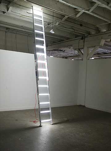 Such a capital/endowment campaign (which is clearly underway) would give PNCA back some of the institutional patina they lost when they split from the museum and allow them to fill out their somewhat vestigial institutional organs… They are kinda like a well fed caterpillar that has made a big cocoon and is preparing to emerge. The fact that they have so many connections to old west hills money and new design oriented businesses in Portland means they are just as capable as PAM was to grow up. It's their time… and everyone including their professors like Shapiro feel it. Shapiro, has channeled the zeitgeist at the college (and Portland's art scene in general) better than anyone in recent memory as his work is first rate execution, while seemingly waiting for the main event. Its pensive work that will probably will grow just as exponentially as it did in the last year. It is fascinating to watch and PNCA has become the most exciting hub of artistic activity in the city. Shapiro is a great asset to the school. (Show ends March 3rd) Posted by Jeff Jahn on February 22, 2008 at 11:34 | Comments (6) Comments A couple years ago, when I was running the PNCA Student Council, we had a lighting salesmen come in to propose some new lighting solutions for the school. The salesmen proceeded to get very excited about a specific fluorescent tube, and sincerely stated it was "the wave of the future." This was a running joke for quite some time at PNCA, about how everything was "the wave of the future." I couldn't help but think that Nate's show was a formalization of that quote. I don't believe he ever heard it, but his show art certainly helping PNCA become "the wave of the future." He also has an installation in PNCA's main building as well, which I believe is titled "Unlimited Minutes, Text and Picture Messaging." It's interactive, so go play with it. Posted by: Calvin Ross Carl Hello, We would like to inform you the art web gallery " J-COLLABO.COM" which With sincere thanks. J-COLLABO Posted by: J-COLLABO Although I don't entirely disagree with Jeff Jahns' estimation of Nathaniel Shapiros' potential as an artist I do have a more critical response to this particular installation. Posted by: beardfallacy and the word "dumbness" isnt overused? I suppose I can compromise and use the phrase "exponential dumbness" somewhere but that seems forced. I agree, Shapiro pulls this one off mostly through the poetry of his installation which invites the viewer (not novelty of concept). Still, I appreciate the fact that he is essentially testing a very simple metaphorical conceit with an incredibly stark installation, he isnt pulling any punches and the fact that it looks like an install in progress just makes it all the better. When confronted with works like this I often think about Greek sculpture and thay ambivalence they seem to exude. This is one really wonderful .show, because I normally can't stand this kind of didacticism. Ambivalence and didacticism are strange bedfellows. Posted by: Double J I just gotta quibble with your quibbling. The alleged overuse of the word "dumbness" is not comparable to the overuse of the word "exponential". The word "exponential" when not used rhetorically, as it is above, is a formula for a geometric kind of growth and does not always denote fast growth. Being relational it can be used to describe slow growth over long periods of time. Rhetorically it is a hyperbolic expression of fast growth. The problem with the overuse of hyperbolic figures of speech is that they lose their power of exaggeration and become ineffectual cliches. Just consider the word "masterpiece". Posted by: beardfallacy Just so that every post I make isn't an incitement to argue, I appreciated your reference to Greek sculpture.- it helps restore my faith in viewers when they make intuitive analogical leaps, especially when the association is based on presence and atmosphere or any of the other qualities that can't be tamed by rationality. Yours felt just right and it wouldn't have occurred to me (not the fact that you could be right). I am also always happy to here another person express disdain for the didactic as a dominant element in a work of art - I'm paraphrasing so I hope I'm not putting words in your mouth or a foot in mine. Being nice makes me sleepy so I'll stop and go get mad at something else. Posted by: beardfallacy Post a comment Thanks for signing in, . Now you can comment. (sign out)
(If you haven't left a comment here before, you may need to be approved by
the site owner before your comment will appear. Until then, it won't appear
on the entry. Thanks for waiting.)
|
| s p o n s o r s |
 |
 |
 |
 |
 |
 |
 |
 |
 |
 |
 |
 |
 |
 |
 |
 |

|
Site Design: Jennifer Armbrust | • | Site Development: Philippe Blanc & Katherine Bovee | |


![[TypeKey Profile Page]](http://www.portlandart.net/nav-commenters.gif)