
|
||
|
Portland art blog + news + exhibition reviews + galleries + contemporary northwest art
|
||
Jessica Jackson Hutchins' Hours and Ours at Small A 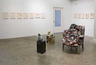 Some artists seek to refine a convincing material experience by removing any irregularities while others invite entropy by creating fissures and cavities, which are places for esthetic skepticism to fester and breed. Jessica Jackson Hutchins is the latter type of artist but with Hours and Ours she seems to be testing a different realm with the addition of a Proustian document laced with family life. Back to esthetics (which really matter here), both perfectionist and imperfectionist strategies make enemies and allies of viewers almost too easily. As alternative sides of the same materially indulgent coin both strategies are susceptible to the charge of being merely a fetish or patina. There is a danger of being formulaic but great artists like Robert Rauschenberg and Donald Judd have pulled it off and justified the divergent strategies. For example, more recent perfectionists like Damien Hirst, Ken Price and Anish Kapoor can be charged with preciousness while pragmatic or imperfectionistic collage artists like Iza Genzken, Rachel Harrison, Jason Rhoades and Jessica Stockholder are often criticized as borrowing too much. It isn't valid criticism because each has developed a strong cause and effect that results in their own language. This emphasis on collage and entropy has become more widespread since Rachel Harrison burst on the scene in the 2002 Whitney Biennial and there has been an extensive new crop of neo Arte Povera practitioners (using simple materials). It's a major international trend as The New Museum's Unmonumental show pointed out (years after everyone knew it). Prior to that Jerry Saltz called it a clusterfuck esthetic and Tyler Green called it Scattertrash. I call it an update of Rauschenberg, Kienholz and Kurt Schwitters and that is a good thing, I think we are past trying to shoehorn it into a movement as it actually never goes away. If Picasso and Louise Nevelson used simple materials for their sculptures so can Rachel Harrison (though I'm bored with Thomas Hirshhorn). 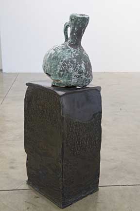 Iranian World 12th Century Ewer - Into the Present, 2007 On the West Coast most notably there has been Matthew Monahan, Anna Sew Hoy and Portland's Jessica Jackson Hutchins. Interestingly, all have a similar color palette related to 70's California funk. I lived in Brea from 1976-1980 and the nostalgia of it all takes me back to bikes with banana seats, a new thing called a skateboard, My Sharona and lots of funky/clunky pottery/macrame combinations. All three of these artists have an interest in archeology; Monahan with ruins from his own studio, Hoy with 70's art both high and low but Hutchins has made some interesting leaps into; her very present family life and ancient history. It gives her work a more genuine lived in quality than her compatriots while giving it more context. It's a wild gambit because there is a deeper romanticism to the work not found in Monahan and Hoy. For example Hutchins Iranian World 12th Century Ewer - Into the Present takes the current tension with Iran and gives it the patina of the archeological record. It's the most brilliant thing Ive ever seen her do as she not only creates a faux antique that wears its flaws like a carnie wears their tattoos... but one also has to think if this looted?,…well of course not but its the association that counts. She even created a similarly flawed ceramic pedestal for it. This pedestal acts as an institutional critique but it is not your run of the mill art institutional critique. Instead, it feels like a political and historical critique, as if our western understanding has ignored the reasons why the ewer has become a loaded object in the first place? Like Giacometti and Brancusi this attention to the plinth is a key to the work's existential presence. In the past Hutchins just seemed to make flawed objects that practically begged for sympathy and they generally overplayed their hand. Whereas this ewer is something more, namely the flawed force of history as artifice. 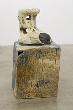 Into The Present, 2007 So is Into The Present the other large ceramic in the show. It's probably a crustier reimagining of a Henry Moore's style of modernist sculpture and intentionally clumbsy. It isn't as obviously quotidian like the work of Hoy and it seems to collect assumptions on its potmarked surface. It's Peter Voulkos meets David Smith after several pitchers of beer in Silverlake 1971, without too much irony. 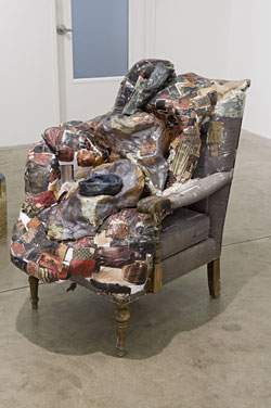 Still Life: Chair, Bowl and Vase The largest object in the room is Still Life: Chair, Bowl and Vase. It's a lot less successful than the ceramics Hutchins is most known for if only because it looks a lot like something Ed Kienholz could have done better. That said, this is different, a domestic object that looks homey and motherly (not Kienholz's strong suit). It's plaster blanket covered with catalogue images bespeaks of not getting out too much. Maybe this needed an entire livingroom ensemble to bring it to life but it does set the stage for the home movies in the next gallery. It needs more follow through to become more than the affectation it is. Kienholz's Useful Art #5, the Western Motel at PAM really outclasses it. 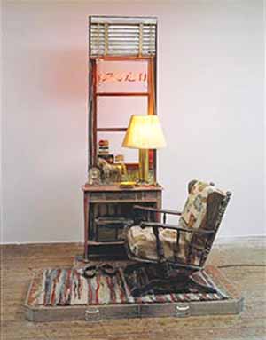
Kienholz's Useful Art #5, The Western Motel Ringing this gallery are a series of works on paper from 1999 whose title's create a poem in the gallery's guide to the exhibition (many are taken from songs). As a whole its an interesting exercise though most seem like studio fodder than finished works… some stand out though like Life is Earnest with its blacked out vertical list and Flesh List who bridges the gap between Agnes Martin and Paul Klee as a witty formal study. Hutchins has grown a lot since 1999. 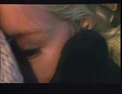 Video Still Sun Valley road Trip 2006-2007 Nothing makes that clearer than the video Sun Valley road trip 2006-2007. Winning points for truth in advertising the work documents a long family road trip. Hutchin's husband, arch-indie rocker Steven Malkmus (who will never be as cool as Black Francis ...another Portlander) is driving and a fair amount of Jackson Browne is playing over the radio (creating a real time soundtrack). The mood is claustrophobic in the comfortable way only family outings can pull off. The scene is disarmingly candid and the entire pace of the action is set by the video's very focused star, the artist's daughter... as she puts stickers in her sticker book. It's very simple and effective. This is very typical of a family unit passing the time, except that mommy is videoing her daughter as she grows up very slowly. I always hear parents remark how they wish they could slow their children down because they grow up so fast. I see the charm here and occasionally the camera drifts up front, catching a glimpse of the road but most of the time that is Dad's job and the videographer has to trust they are doing their job. Contemporary art doesn't address family very often and this home movie might just stand out if nothing for the fact that we seldom see this sort of thing in a gallery. Without any sense of pretence, exploitation or effected amateurism this is arch normal, middle brow Americana. In Portland we realize quality of life is truly important and I wonder how this will go down with her New York Galley? Art doesn't always imitate life, sometimes the two are inseparable and this road trip proves why. I sense Portlanders have never been treated to one of Jessica Jackson Hutchins' best shows but this one is probably the most personal and transformative one, so take it in. Tomorrow, February 2nd is the last day of the show Posted by Jeff Jahn on February 01, 2008 at 17:36 | Comments (0) Comments Post a comment Thanks for signing in, . Now you can comment. (sign out)
(If you haven't left a comment here before, you may need to be approved by
the site owner before your comment will appear. Until then, it won't appear
on the entry. Thanks for waiting.)
|
| s p o n s o r s |
 |
 |
 |
 |
 |
 |
 |
 |
 |
 |
 |
 |
 |
 |
 |
 |

|
Site Design: Jennifer Armbrust | • | Site Development: Philippe Blanc & Katherine Bovee | |

