James Turrell
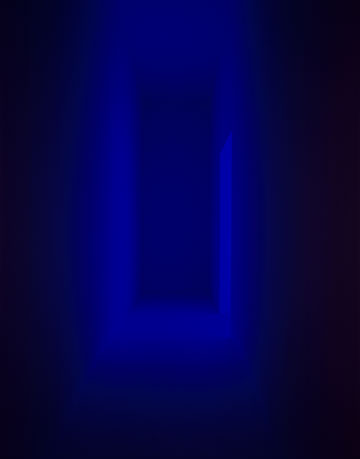
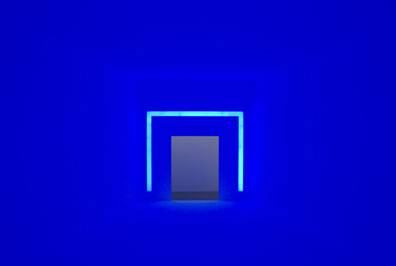
Entrance to End Around, 2006
neon light, fluorescent light & space
Courtesy GRIFFIN, Santa Monica
Photo by Florian Holzerr
Copyright James Turrell
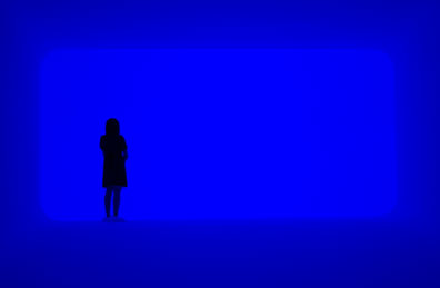
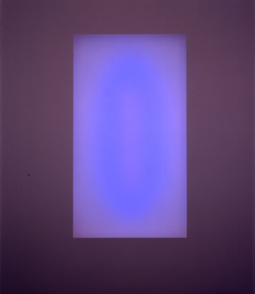
It is the day after Christmas, and I am walking up a narrow corridor to enter James Turrell's End Around at the Pomona College Museum of Art. There is a soft, blue lavender light that spills into the space of the corridor from an adjacent room. It is hard to describe the effect of the light, but it is a light that has its own identity, its own volume. It is man-made and not natural, so the environment feels slightly alien and unlike anything I have ever seen. I realize quickly that I am about to enter a space that I'm probably not prepared for and for which there is no natural equivalent. As I turn the corner, the blue light floods the space, as floors, walls and ceiling converge at a rectangle in the center of the room. There is nothing for my eye to focus on. This is one of Turrell's ganzfeld pieces. Ganzfeld means "total (or entire) field" in German and comes from the experiments of Wolfgang Metzger in the 1930s. The premise is simple: if we spend all of our time using our eyes to focus on objects, what happens to our eyes (and our minds) when we do not have anything to focus on? So turning the corner and entering End Around, I felt a lot like Alice wondering how deep the rabbit hole goes.

James Turrell
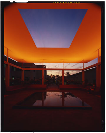
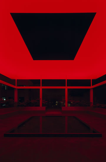
Dividing the Light, 2007
LED light, metal, plaster, & granite
Installed on the campus of Pomona College
Photo by Florian Holzerr
Copyright James Turrell
James Turrell graduated from Pomona College in 1967 and returned a few years later to get his MFA from nearby Claremont Graduate School in 1973. The exhibition at the museum here is in conjunction with a new skyspace that opened in October on the campus of Pomona College called Dividing the Light. The exhibition includes a couple of his new light installations, Silent Leading and Gathered Light, the large Ganzfeld piece, End Around, and a series of plaster models of different built environments in which to experience light. Sometimes the light in these models would be natural, sometimes man-made and sometimes a mixture of both. The models all had one thing in common. In each space, Turrell wants you to concentrate on the experience that is right in front of you.

James Turrell
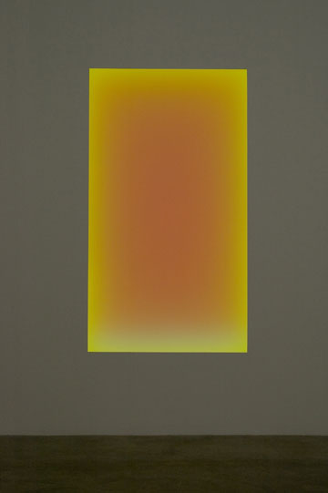
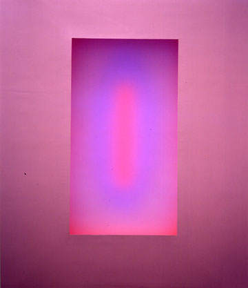
Silent Leading, 2006
LED light, etched glass & shallow space
Courtesy Private Collection
Photo by Florian Holzerr
Copyright James Turrell
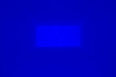
In End Around, you find that you are standing in a large funnel. The floors, walls and ceiling all slope towards a rectangular opening about twenty feet into the space. The opening is also about three or four feet above the doorway. All of the corners in this funnel have been rounded so that there is no way for your eye to focus or find a line to distinguish the floor from the walls or the ceiling. As a result, the space feels like a giant foggy, funnel. All of the surfaces gently curve into one another. Beyond the opening is another volume of space that is the ganzfeld itself, and you can only stand on the platform and look into it. It extends beyond the funnel in every direction for an indeterminate distance. It’s indeterminate to your eye because there's nothing to visually indicate the ganzfeld space's height and depth. All there is to look at is color – a lavender-blue generated by hidden, fluorescent tubes that reflect their light off the curved, white walls of the space.

James Turrell
End Around, 2006
neon light, fluorescent light & space
Courtesy GRIFFIN, Santa Monica
Photo by Florian Holzerr
Copyright James Turrell
The effect of the light in the space is like standing in an evenly lighted cloud or a fog bank. When I first walked into the piece, I found that I was holding my breath for a second because the air in the room looked so different than the corridor. I was so aware of the air in End Around that I wondered if the air was still breathable. It was a strange sensory experience, and it took me a few seconds to be able to relax and discover, to my relief, that I could still breathe. The air looked so different, and it had a tangible presence. I took me a few minutes to wrap my head around the difference between the light in the corridor and the light in this room – it was all in the way Turrell installed the lights. The difference was incredible. It was hard to believe that there was not a fog machine installed somewhere in the space. It made me wonder where the art was: In the light fixtures? In the carefully prepared surfaces of the space? In the air of the room that I was now breathing into my lungs? The answer is that it probably exists somewhere in between all three, but most importantly, the art happens in the volume and not the surface of the space.

James Turrell
Milarepa's Helmut, 1989
cast hydrocal plaster, wood & polystyrene
Courtesy James Turrell
Photo by Florian Holzerr
Copyright James Turrell
I am not sure if there has been an equivalent to this experience in art. When we are looking at art we often inhabit the surfaces, even if they are in three dimensions, rather than the volume of the work. In Turrell's work, it is light that is made visible, resonating within the volume of the space. Therefore, space of the room is shaped like a container to make the light more visible. A lot of time and effort is put in to walls, ceiling and floor to make sure that they disappear or at least so you do not focus on them instead of the light. The irony is that physical walls of the space are often made invisible in the process compared to the experience of the light. They contain the work like a vessel, but they are not the work itself.

James Turrell
Dividing the Light, 2007
LED light, metal, plaster, & granite
Installed on the campus of Pomona College
Photo by Florian Holzerr
Copyright James Turrell
In order for the volume of the space to become legible, there are some things that Turrell has done to allow the experience of the light to be more effective. End Around is actually made of two spaces in addition to the entry corridor. The first is the funnel, which was described earlier, and the second is the volume of the ganzfeld space that exists beyond the rectangular opening. The funnel changes in dimension and proportion to suit the needs of the museum space – the requirement being to create a "viewing" platform that can float within the larger volume of the gallery. The volume of space beyond the opening is undifferentiated to the eye. It does not have a scale or a perceptual dimension; it exists only as a vessel for the light. But one cannot exist without the other.

James Turrell
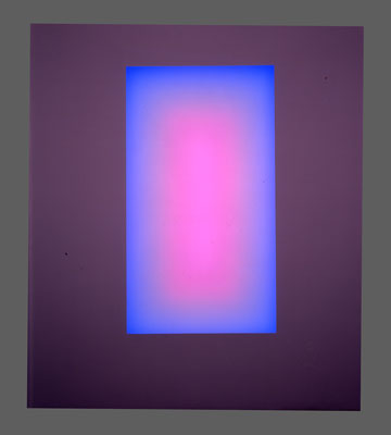
Gathered Light, 2006
LED light, etched glass & shallow space
Courtesy Private Collection
Photo by Florian Holzerr
Copyright James Turrell
There's an important precedent for End Around in Turrell’s body of work. Even the best Pollock and De Kooning paintings rarely bring you to your knees, but that is exactly what Turrell did with the City of Anhirit in 1976. Originally installed at the Stedelijk Museum in Amsterdam and then later at the Whitney Museum in New York, City of Anhirit consisted of four rooms in which the afterimage of the preceding room influences the perception of the color in the next room. Visitors found the rooms so disorienting that eventually the museums installed a path so people would have something to focus on as they moved from room to room. Without any visual cues in the space, people had a hard time standing up, let alone walking from one room to the next. Since then, Turrell has made spaces like End Around that you look into rather than walk through. In Pomona, this translates into the funnel that you inhabit and the ganzfeld space beyond that you only look into. It means that there is a level of Turrell's art that is beyond the way the human body understands and perceives space that is inaccessible in his works displayed to the general public. An equivalent would be if Pollock had to tone down his paintings so that they could be displayed in the general public, not because of taste, but because the human body would not be able to handle it. What's extraordinary here is that we simply cannot handle the upper limits of Turrell's art. It is literally beyond us.

James Turrell
End Around, 2006
neon light, fluorescent light & space
Courtesy GRIFFIN, Santa Monica
Photo by Florian Holzerr
Copyright James Turrell
There's even one more layer of complexity in End Around. There are actually two light sources. The first source is fluorescent light fixtures are placed out of sight beyond the edge of the funnel creating the luminous color in the ganzfeld space. The second source is a strip of blue neon behind glass that is placed around the doorway, like a squared-off arch. The light in the funnel is a mixing chamber for these two colors and these two types of man-made light. The fluorescent fixtures are more lavender, and the neon is more blue. The effect of the colors is that they build on to one another, subtly shifting the lavender into a purple as your eyes adjust. The two types of lights do strange things to your eyes, especially when there is no object to focus on. When you stand next to the door, it appears as if you have a white halo around you, which was pretty strange. It only happens near the entrance with the shadowy corridor in the background. The two light fixtures are not the same value, so perhaps the difference in color appears as a white halo around people – the only "objects" in the funnel.

James Turrell
End Around (Empty), 2006
neon light, fluorescent light & space
Courtesy GRIFFIN, Santa Monica
Photo by Florian Holzerr
Copyright James Turrell
Standing at the edge of the funnel in End Around and staring into the ganzfeld space is an extraordinary experience. Since there is nothing for your eyes to focus on, your eyes eventually relax, and you settle into a soft focus, in which you are looking at everything and nothing at the same time. It is also slightly uncomfortable because it feels like you are breathing in the light that is in front of you and you are becoming one with this undifferentiated field. As you relax, you feel like you are meditating with your eyes open, and you begin to lose track of time. You are not sure if ten minutes had passed or a half hour, but since it never changes, time does not seem that important. The more you look into the ganzfeld, the more you have to look into it, and it is hard to take your eyes away from it. You feel yourself slowing down, and you begin to become aware of the slightest changes in your perception. It is amazing that something you can understand as soon as you walk into the front door can hold your attention so completely for such a long period of time. Unfortunately we were only able to stay for a few hours one morning, but I wonder what the cumulative effect of that experience would be if you were to spend time in End Around for fifteen minutes or half an hour everyday for a week or longer.

James Turrell
Silent Leading, 2006
LED light, etched glass & shallow space
Courtesy Private Collection
Photo by Florian Holzerr
Copyright James Turrell
It is interesting that our bodies will turn away from the ganzfeld even if there is a little crack or scuff on the floor that would give our eyes something to focus on. It is like your eyes are desperate to focus on something. Even though we were wearing booties so that our shoes do not leave scuff marks on the floor, I was told that they still go through a gallon and a half of white paint a week painting out marks and cracks that inevitably show as so many people move through the space. It is a difficult choice to make, on the one hand you would like as many people as possible to see and experience the space. On the other hand, each one of those people leaves an imprint on the space, even if they are not using the space at the same time. The cumulative effect of those imprints is that it slightly takes away from what the space was designed to do in the first place and requires constant maintenance to restore it to its original state.

James Turrell
Stupa Cupid, 1989
cast hydrocal plaster, wood & polystyrene
Courtesy James Turrell
Photo by Florian Holzerr
Copyright James Turrell
We were fortunate that we had the piece to ourselves for as long as wanted to experience it. It was quiet, and we were left to our own thoughts and experiences. If there were even two or three more people in the space, at some level you would always be aware of them, and it would be a distraction. If there were twenty people in the space, it would be practically unusable because the ganzfeld would seem like a big light show, and in strange way you would not be able to stop concentrating on everything that is going on around you, which would prevent you from seeing the work. Art is a very private act of surrender whose experience is always one to one.

James Turrell
Gathered Light, 2006
LED light, etched glass & shallow space
Courtesy Private Collection
Photo by Florian Holzerr
Copyright James Turrell
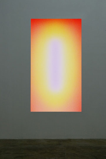
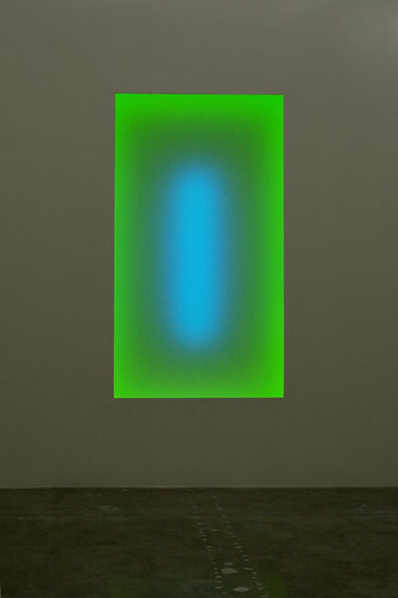
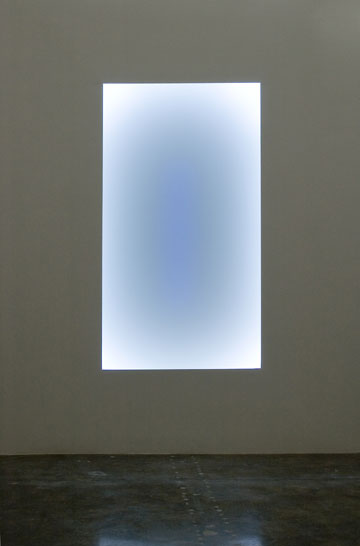
If End Around is like a high-performance air plane that is fragile and requires constant maintenance but is capable of incredible speed and maneuverability, then Silent Leading and Gathered Light are able to find a middle ground between performance and accessibility. These two new pieces, which were exhibited at Pace Wildenstein earlier this year, are made of a series of computer-controlled LED lights installed vertically behind etched glass. Each light has its own cycle of colors that repeat every couple of hours. I was told that there might be an occasional random mix placed between the more choreographed sections. That is interesting because it would imply that no two cycles would be the same. The colors transition from one to another every few minutes, which means that you can relax in front of the lighted panels and watch the colors change.

James Turrell
Gathered Light, 2006
LED light, etched glass & shallow space
Courtesy Private Collection
Photo by Florian Holzerr
Copyright James Turrell
The effects quickly become very complex because you are not only dealing with the image that is being produced by the LED lights, but also being affected by the afterimage created in your eyes. After sitting there for a few minutes looking at a bright, apple-green light that was slowly being dimmed, the surrounding white wall suddenly appeared bright red. There were no fixtures pointing red light at the wall. The red was a complementary image created in my eyes as they tried to compensate for the intense green light. The colors of the lights begin to mix in your eyes so you are creating the work as well. It would be interesting to know that when they were programming the lights, how much of the cycle was based on the relationship of the colors and how much was based on the cumulative effect of those colors on your eyes.

James Turrell
Silent Leading, 2006
LED light, etched glass & shallow space
Courtesy Private Collection
Photo by Florian Holzerr
Copyright James Turrell
The etched glass panels of both Silent Leading and Gather Light sit flush to the plane of the wall. Turrell is very aware of the way that the architecture of the space frames and contributes to the overall perception of the work. Here, the sharp corners of etched glass flatten the space and hold the color right on the surface. This may seem counterintuitive because you might think that someone who is working with light might want their work to be a spatial as possible. The trick is to make the color, not the frame, generate the viewer’s perception of space. A good analogy might be found in a monochrome painting.

James Turrell
Dividing the Light, 2007
LED light, metal, plaster, & granite
Installed on the campus of Pomona College
Photo by Florian Holzerr
Copyright James Turrell
A monochrome painting is both flat and infinitely deep at the same time. The 90-degree corners of most paintings flatten the space and provide visual cues so that the space is read as if seen through a window. Most of the time, space in painting, as in looking out the window, is read as depth that we all experience when we use perspective. In a monochrome, since by definition there is little or no variation in the color as it moves across a surface, the depth is created by the perception of color. The sharp corners flatten the space along the edges, but in the middle where there are no reference points, and the space seems infinitely deep. It is one of the contradictions of working with monochrome panels. Turrell uses a similar technique in his work any time to volumes of space interact with one another to flatten out the surfaces and to achieve the maximum effect of light. He is very conscious of the depth of the material that is used to define the space around the work, and rather than exposing the edge,or the material thickness of a door or a wall, it is always tapered down to a thin line. This is an effect he uses in all of the skyspaces to flatten out the space of the sky, and it is also employed in the doorway to End Around. In both cases, it was important to have the surface of the wall/ceiling to appear taut so that the volume of the light flattens out as well. As you step through the door in End Around, it is like entering the picture plane. This distinction is subtle but important.

James Turrell
Silent Leading, 2006
LED light, etched glass & shallow space
Courtesy Private Collection
Photo by Florian Holzerr
Copyright James Turrell
If the LED pieces were fixtures in a housing that projected from the wall, then they might read as objects themselves or worse, like a box that has colored lights in it. Turrell wanted to do away with all of that. It works for Dan Flavin, but Turrell is interested in the quality of the light rather than the fixtures themselves. This is also why he hides the light fixtures whenever it is possible. In this case, the etched glass softens and blurs the LED-generated light. By holding the etched glass to the plane of the wall, the light becomes a part of the plane of the wall.

James Turrell
Gathered Light, 2006
LED light, etched glass & shallow space
Courtesy Private Collection
Photo by Florian Holzerr
Copyright James Turrell
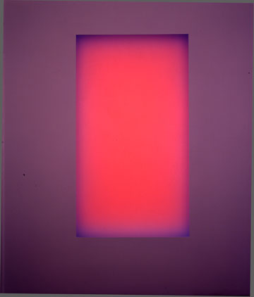
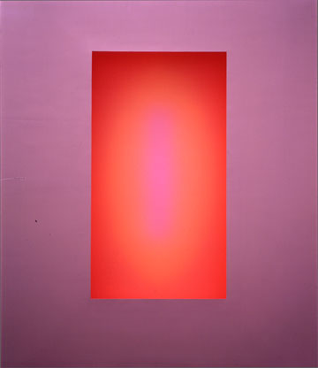
It was great to be able to sit in front of these new LED pieces. The colors changed in beautiful and often unexpected ways. In Silent Leading, even though the etched glass panel is flush with the wall, as the cycle moved into a series of reds and as the intensity of the reds increased, the red light seemed to project 18 to 24 inches in front of the wall! The light seemed to have its own volume and was perceived to be clearly in front of the panel.

James Turrell
Silent Leading, 2006
LED light, etched glass & shallow space
Courtesy Private Collection
Photo by Florian Holzerr
Copyright James Turrell
You find that your attention slowly begins to sync with the time cycles of the changes in color, and again we lost track of the time. I found that occasionally I was waiting for the next color combination. I was aware of my need for patience. That would be in contrast to End Around, in which you were able to see everything at once, not waiting or looking for something else to happen. The LED pieces have three distinct areas of the color. There would be the perimeter, a middle area and then the center. The fourth could be the light on the walls that shows how your eyes are responding/adjusting to the other three areas and tends to be the complementary color of the intense colors as they are fading away. The colors in each of these three areas could either reinforce or contrast with the colors in the other areas.

James Turrell
Jump Start, 1990
cast hydrocal plaster, wood & polystyrene
Courtesy James Turrell
Photo by Florian Holzerr
Copyright James Turrell
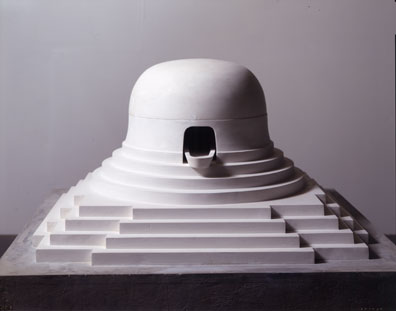
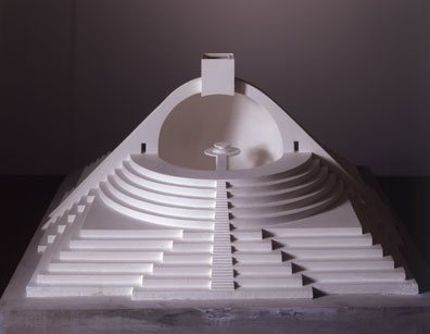
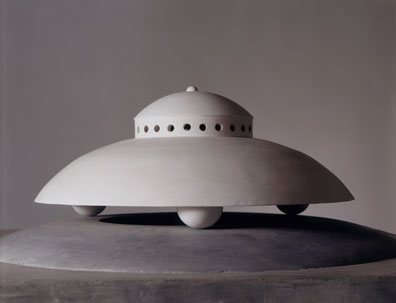
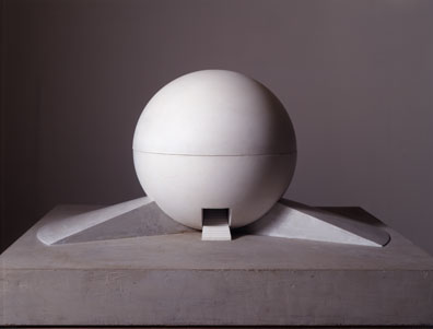
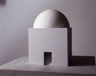
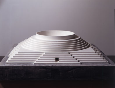
The models that line the ramp down to the galleries are extrapolations of Turrell’s ideas about how space can be used to shape and hold light. I was happy to learn that most of the models have either been built or are currently under construction. In each case, the model seemed to create or highlight a singular experience with light. Just as Dividing the Light, a new skyspace on the campus Pomona College, is designed to slow down people long enough to look at the sky, these models might create ganzfelds, skyspaces or capture distant starlight. The models and the spaces are just containers for the light. The art is in the experience of the viewer.

James Turrell
Spread, 1989
cast hydrocal plaster, wood & polystyrene
Courtesy James Turrell
Photo by Florian Holzerr
Copyright James Turrell
By looking at the models, you can begin to get an idea of the interior spaces by the shapes of roofs and walls. Those with domes are ganzfelds; those with openings at the top (square or otherwise) tend to be skyspaces. Almost all of them have steps that either raise or lower you to as Turrell likes to say "greet the light." The stairs give the spaces more of a feeling of a ritual, as if climbing the steps we are separating ourselves from our everyday world and that we are participating in a unique experience. Each of the different spaces would bring us into contact with different cycles of our environment. One cycle might be the path of the sun as it crosses the sky at the end of the day, another might be the seasons during the year, and still another might be astronomical cycles of the planets as they move through the solar system and the galaxy. These cycles exist whether we are aware of them or not, and Turrell is just making them more visible for us, maybe even allowing us to participate in them.

James Turrell
Thrid Day, 1989
cast hydrocal plaster, wood & polystyrene
Courtesy James Turrell
Photo by Florian Holzerr
Copyright James Turrell
The models are like pieces of idealized architecture in which the only thing that matters is the way the space modifies or accentuates light. Sometimes the models look like an Islamic mosque, sometimes like Boullee’s vision for Newton's Cenotaph and sometimes, with a sly smile, like a flying saucer. They each serve their purpose. It is amazing how different these experiences are from experiences that we would normally associate with art in galleries and museums. It is one space for one work for your experience. That's it.

James Turrell
Dividing the Light, 2007
LED light, metal, plaster, & granite
Installed on the campus of Pomona College
Photo by Florian Holzerr
Copyright James Turrell
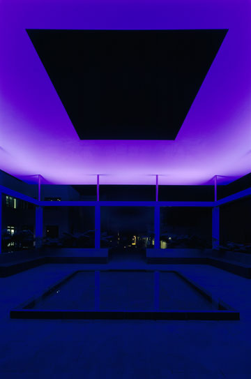
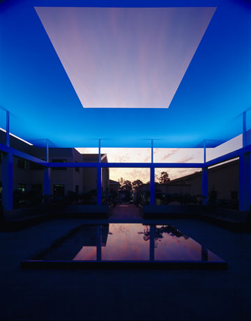
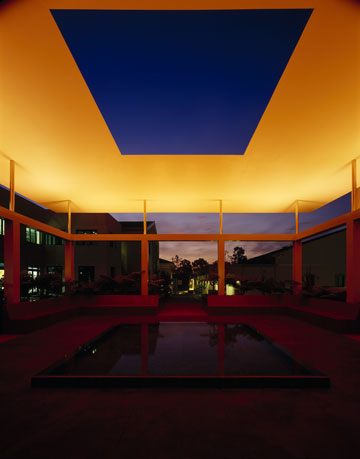
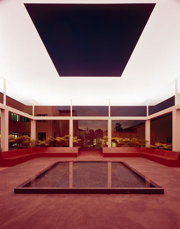
Dividing the Light, the new skyspace that opened in October around the corner of the gallery, is the first of its kind to be totally open to the public. The skyspace itself sits in between two new technology buildings and is completely open on four sides. The courtyard is like a grotto full of ferns with an infinity fountain in the middle. Unlike most skyspaces, this is open to the air so that you can compare the colors of the sky in the opening to the color of the sky seen through the sides. Most skyspaces have been completely enclosed with a square or circular opening at the top. The walls along the sides allow a place for Turrell to project light that would work with the changing natural light of the sky. In Dividing the Light, since there are no walls, the light is projected on to a large, flat roof plane that seems to float above the fountain.

James Turrell
Dividing the Light, 2007
LED light, metal, plaster, & granite
Installed on the campus of Pomona College
Photo by Florian Holzerr
Copyright James Turrell
The lights that project on to the floating roof plane are concealed in a narrow band that runs around the perimeter of the space. Usually the light show begins about an hour before sunset and continues until it is dark. There is also a sunrise program. At a time when a lot of art feels very self referential, here is an artist willing to engage nature on its own terms by using the light of the sky as the centerpiece of the work. Turrell is working hand-in-hand with nature. Some of the lights in the skyspaces that I have been in have seemed relatively subtle, for example at the Three Jewels skyspace at the De Young Museum in San Francisco. For Dividing the Light, the colors seem to be a more intense, perhaps because it is on a college campus, and bright colors would be a good way to capture the attention of college students.

James Turrell
Dividing the Light, 2007
LED light, metal, plaster, & granite
Installed on the campus of Pomona College
Photo by Florian Holzerr
Copyright James Turrell
To paraphrase Robert Irwin, if you are dealing with things that deal with the language of art, you go to a museum. But if you are dealing with raw experience and the cycles of nature, then you go outside and build the work where you can. That is why I think that most of Turrell's work is such an uneasy fit in museums and galleries right now, let alone in at an auction house. They are usually too big and do not easily accommodate more than a few visitors at a time. That is why the show in Pomona has been such a special occasion because you get to see the models, a ganzfeld, and a full-size skyspace all within a few blocks of each other.

James Turrell
Jai Singh's Sky, 1990
cast hydrocal plaster, wood & polystyrene
Courtesy James Turrell
Photo by Florian Holzerr
Copyright James Turrell
Anytime you discuss Turrell’s work, Roden Crater is the elephant in the room that is hard to ignore. Roden Crater is a volcano in Northern Arizona that Turrell has been shaping and building spaces within for the last thirty years. It is hard,maybe impossible, to discuss the other work without talking about the crater because they are all linked together. Ten years ago on an Indian summer day, I parked and walked the long hike in to Roden Crater, guided by my brother, who was a college student in Flagstaff at the time. The sides of the crater are a lot steeper and longer they the look. Once in the crater, we laid down to look up at the sky. We were lucky because it was a clear blue sky that day. After a few minutes, the sky seemed to flatten out because of the shaping that Turrell had already done along the rim (no heavy construction had begun at that time).
Although the effect is called celestial vaulting. For me it seemed like the sky had flattened out around the top of the rim. After a half hour or so, my brother stood up and I grabbed him because I thought he was going to hit his head on the sky, which by then appeared a tangible and solid thing above us. So when I think of Turrell’s work, I think of steep climbs, being totally out of breath, slightly cold but having an exhilarating experience. II was amazed that somebody could completely change my perception of the sky. It was a pretty good day of art for me and was probably one of the experiences that have defined my life since then.
The crater is different now, at least from what I have seen from pictures published in the media. The spaces have become more defined and choreographed to heighten the perceptual feeling of looking into the sky, and parts of it look like a large construction site, so it's probably not yet safe to walk around. I also think that there is the issue of respect. The crater is Turrell's life's work as well as being a studio of sorts. Just as you would not walk into someone's studio unannounced to look at work, it is better to give Turrell the time and space that he needs to complete it. It is unfortunate that Turrell has had such a hard time getting funding to finish the crater. It is the most advanced work that is being produced today. It is on a scale that is hard to comprehend and even harder to find ways to fund. It is amazing that the idea of Roden Crater resonates with so many people that are not even usually interested in art. If Patrick Lannan says that it will take $125 million to fund and create an endowment for Roden Crater, then so be it. It is still cheaper than a good Pollock if the rumors are true and cost losts than one of the Air Force's F-22 Raptors.
Turrell's work is some of the most advanced work out that is being produced today. It is work that is totally unique to our time and place. Most of it is based on technology that did not exist fifty years ago. His work on Roden Crater – large-scale earthworks incorporating specialized skyspaces in the Northern Arizona desert – will probably be the defining work of our generation. In two or three hundred years, when people look back at the work that is being produced now, they will always have to start with Roden Crater, just as most people looking at ancient Egypt start with the pyramids. It is on a scale that is so large that it hard to get our head around, but then the best work always is.
Special thanks to the Assistant Director Steve Comba for letting us in to see the exhibition during his vacation.
James Turrell at Pomona College will be on view until May 17, 2008

