|
||
|
Portland art blog + news + exhibition reviews + galleries + contemporary northwest art
|
||
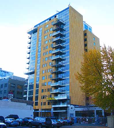
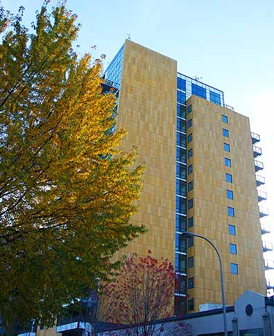
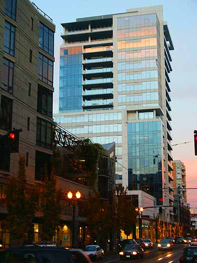
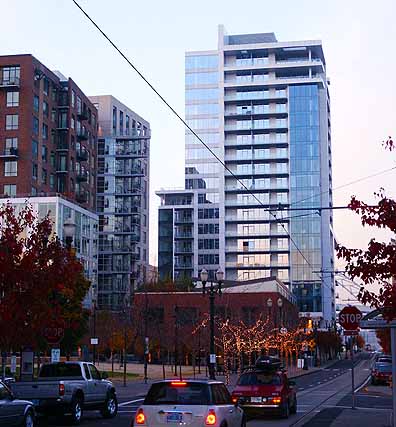
2 New condos for the Pearl District: it's design review time  The Casey Ive been waiting for a slow week to discuss these two new condos in the Pearl District. Neither is a product of of the design deficient, "let's put brick on a 10+ story building to warm it up," school of thought.  The Casey shows off its unique cladding First is The Casey, which is the first residential condo to sport a LEED platinum rating so it's very green conscious. The design though has made some people crazy but I wanted to wait until it was more complete before weighing in. Verdict it's a C+ in my book, basically it's a box with a novel form of cladding. Ive grown accustomed to its unique look and those that dont like it are missing its best asset. The cladding does does make it look very Swiss but the proportions are clunky. Still I have to give it points for taking some chances by not using brick. It sticks out. A C+ isn't bad coming from me, I'm not certain any very recent large building project in Portland would qualify above a B+ except the Tram and people don't live in that. For scale I'd give The Gregory a B- and the totally unimaginative Elizabeth a C- (which is nowhere near as low as I go). Let's hope The Casey's penchant for sticking out will lead to more of that kind of thinking. It's a step in the right direction and the platinum rating doesn't hurt either. What do you think?  The Metropolitan The Metropolitan wouldn't stand out in Miami but it does in Portland's brick clad Pearl District. It has a a LEED silver rating so it isn't amazingly green like The Casey, but it is a solid looking effort, next to an urban wetland park.  The Metropolitan and its neighbors Comprised of blue and white rectangles with lots of glass it's a solid choice and get's a B-. For comparison the nearby Pinnacle just gets a C in my book and The Wyatt is a D+. Let us know what you think? In my mind high-rise condos by virtue of their increased visibility must be held to higher standards and no design below a C- should be given a pass by the design commission... then again the landmarks commision are the people who blocked an Apple store, preferring the type of design a Potterybarn spews so I ain't holding my breath. Designs to look forward to are Park Avenue West and Skylab's tower. Yes, change can be scary but if the design is up to snuff like on the tram it will be worth it. The artists in Portland have reinvigorated the idea of what Portland can be but to a certain degree its the developers and architects who must run with that momentum. Only then will the donor and collector bases in Portland grow enough to do the visual arts activity here the justice it deserves. Posted by Jeff Jahn on December 26, 2007 at 15:09 | Comments (4) Comments I am very interested in the older buildings of portland. It is amazing to me the texture, window patterns and molding architects but into older warehouses left on the east side industrial area. I have been drawn to paint them over the last few years and I think the details are prized by other people. It is idealistic that architectures would that now. It is too expensive... Posted by: elle4 It's almost sad that these buildings are even worth writing about, but in an architecturally deprived city like Portland, I suppose it is news-worthy when a building consists of a material besides bricks or steels. Everyone knows Portland is progressive, unique, blah blah blah, but I'll be damned if we aren't missing that progressive and unique architecture. End cynicism here. I do really enjoy The Casey building. It looks beautiful in the Pearl skyline, and really separates itself from all the drab grey and brick red. The Metropolitan is also interesting, despite the Eddie Bauer that is ruining the front of the building. :) Posted by: Calvin Ross Carl Before reading your comments I said to myself - "Ugly building except for the brick". I don't totally disagree with your C+ grade here. I would give the building a grade of C because millions of dollars, degrees, computers, years of study and time for architects to drive their Crossfires and Boxsters along the water should have generated more than this. Still, the shade of the stonework is critical to the building's salvation, and they did get that right. Let's remember that this will probably be gracing this portion of town for well into the 2100's. Quality matters. Posted by: Arnie I consider the LEED platinum certification in my grading... that's why it gets a C+ The fact that the first Platinum rated residential condo in the USA only manages a C+ is kinda dissapointing, so I'm with you on that. Posted by: Double J Post a comment Thanks for signing in, . Now you can comment. (sign out)
(If you haven't left a comment here before, you may need to be approved by
the site owner before your comment will appear. Until then, it won't appear
on the entry. Thanks for waiting.)
|
| s p o n s o r s |
 |
 |
 |
 |
 |
 |
 |
 |
 |
 |
 |
 |
 |
 |

|
Site Design: Jennifer Armbrust | • | Site Development: Philippe Blanc & Katherine Bovee | |


![[TypeKey Profile Page]](http://www.portlandart.net/nav-commenters.gif)