|
||
|
Portland art blog + news + exhibition reviews + galleries + contemporary northwest art
|
||
Your Art: Olafur Eliasson's Take Your Time and Your Tempo at the San Francisco Museum of Modern Art
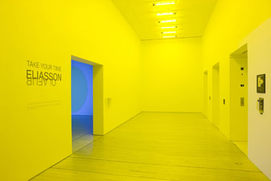
The first thing that you notice when you get off of the elevator at Olafur Eliasson's Take Your Time at the San Francisco Museum of Modern Art is that you are entering a room that is saturated with a bright yellow light. The piece is called Room for One Colour and the room is saturated, or soaked if that is possible, with this bright yellow light. The light is so bright that the walls in the elevator lobby seem to dematerialize and the room seems much larger than it really is. It is a good introduction to the show because from now on nothing will be what it seems. Eliasson is the master of inverting your expectations. Anything that you think you know about a space or a material goes out the window. His strength as an artist is his ability to look at materials or phenomenonal effects with a fresh eye. He is able to isolate the raw potential of a material so that it can be used to transform the experience of the viewer.
There are actually two shows of Eliasson's work at the San Francisco Museum of Modern Art. The first is a small installation of his work from the last fifteen years called Take Your Time and was curated by Madeleine Grynsztejn. The second is the exhibition of Eliasson's car for BMW called Your Tempo. It is no coincidence that most of Eliasson's exhibitions include the word "Your" in the title. He wants to emphasize that the experience is yours and not his. He sets up the environment and makes the work but after that you are on your own. Your participation and your awareness are a critical components to the completion of the work.
One of things that I found surprising when walking through Eliasson's installationsare how much more dynamic they are when compared to the work of Robert Irwin or James Turrell. Irwin's work is much more static so that the viewer has time to catch up with the space of the room and the environment in which it is installed. When you are looking at Irwin's work everything slows down and you find yourself in this stasis that is created between you and the work. In Turrell's work, the light installations are static but they might cycle through different color like they do at the passage at the Museum of Fine Arts in Houston, it is much longer cycle of several minutes between colors. Eliasson's installation on the whole tend to be much more dynamic either moving by themselves or requiring the movement of the visitor to get the sense of the piece. A more revealing comparison would the quasi-natural history museum installations of Damien Hirst.
In a natural history museum, an animal might be on display not because of its specific, individual characteristics that are unique to that animal but because it is representative of a certain genus or type. Any animal on display is stripped of any value as an individual so that you might understand the characteristics of the entire species. The natural history and science museums go from the specific, a single animal, to the general, principles that would define all the species. In Hirst's work, especially in any of work that uses animals or butterfly, we are caught up in the experience of sharing space with these animals. They never lose their individuality. In fact the individuality is key to the whole experience. Each one is unique just as every moment that we stand in front of art is unique. The key distinction in Hirst and Eliasson's work is that they take us from the general to the specific. It is the experience at a particular moment when you are interacting with a specific object in a certain environment, configuration or within a set of constraints that creates the work. When you are walking through a science museum, the experience is about learning about the science between basic scientific phenomena. This is achieved by demonstrating basic scientific principles with simple models. The experience is about the principle behind the model. The model is the means for communicating the idea. Eliasson is able to take the raw experience of a visit to a science museum so that the experience of the models is enough. The experience does not have to be in the service of some concept or scientific principle. Science works from the specific to the general. Most art works in the opposite way; it works from general the specific. The distinction highlights the polarity between art and science. Both Hirst and Elliason take from the general, whether it is an animal, insect or scientific principle, and distills it down until that is something very specific. In certain circumstances and when seen with the right frame of mind, the specific can even become art.
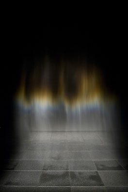
A good example of this would Eliasson's sublime Beauty from 1993. When you experience this work you walk into a space with black walls, floors, and ceiling. There is only one light fixture which points at a very gently falling mist that is produced from some overhead sprinklers. Other than the light and the mist the room is empty. You do not have anything to look at except for the falling mist. The light produces iridescent and rainbow like effects as the light is diffracted on the tiny droplets of water as it descends. The effect is not that different from looking at the mist from Multnomah Falls in the Gorge. But because the effect is isolated, the water transforms as it descends. The water becomes almost hair like and sometimes, for a split second, the mist becomes sculptural like it was made out of metal or stone. In Beauty, not only is the set up great, but it is the transformation that makes the work successful. Water is allowed to do what it does naturally, but in the process becomes something much more rich and complex than you might have expected. It is always water but it becomes more than water. A parallel might be the way the Jackson Pollock dripped paint. The paint is controlled not only by the movement of Pollock's body but it is also based on a series of natural characteristics as well: gravity, the viscosity of the paint, and the height of Pollock's brush/stick above the canvas to name a few. Each of the characteristics is variable that leave their fingerprint on the work. In Eliasson's case he uses fewer variables but they are exploited to great effect. He uses water with its unique optical properties, a misting system, and a light fixtures that would highlight the diffraction of the water. His achievement is that the final work transcends the materials that are used to make it.
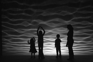
A work that installed in adjacent to Beauty is Notion Motion from 2005. After walking down a long hallway you are greeted with a large screen in which some sort of ripples float upward. In a few seconds you eyes adjust and you realize that a few of the wood planks of the floor are higher than the others. As you step down on the planks you realize that the board flattens down to the floor and that it might have some relationship to what you are looking at on the screen but it is hard to make the connection. It does seem though that after stepping on the planks, the waves on the screen do seem to be more active but there is a definite time delay. The system is practically non-linear because you are never sure how by pressing the raised planks will affect the existing waves in the system. After another short hallway and around the corner, you enter another room where you get to see behind the screen. The floor boards in the previous rooms control a set of paddles in a shallow pool. Light is reflected off of the surface of the water which is displayed on the screen. It is interesting that in this room, although you get to see you how the mechanism works, you are completely passive. It creates an interesting duality between artist and observer, because the first room, when you pressed the floor boards, you were creating the work but in the second room when you finally have some sort of understanding you can only act as an observer. Eliasson only sets up the conditions to allow you to have that experience but you have to create the art yourself. It raises interesting questions about where is the art? In the artist or the observer? The piece becomes a microcosm of Eliasson's process.
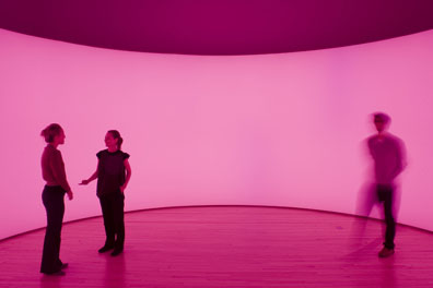
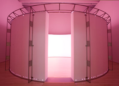
One of my favorite spaces of the show was 360 Room for all colours from 2002. I thought it was surprising and a little funny that the first thing that you notice when you walk into the space is that everybody in the room had their nose to screen. The space itself is a semi-circular room about 9' tall and the colors, which are projected from behind the screen, slowly move through through the spectrum so that the space is slowly saturated with these differnt colors. The colors slowly pulse across the screen every few minutes so no matter where you are standing, you eventually get to see everything. When I was standing in the center of the room looking at these other people with their nose to the screen I had a very strange experience. I am not sure that I believe in auras or anything like that but after a few minutes of standing in the center of the room I could clearly see a line of colors that surrounded each person with their nose to the screen. I am not sure if it was simply a reaction in my eyes as a complimentary color to what was being projected or if somehow there is an optical illusion where the color on the screen is was somehow bleeding over and around these people. I had never seen anything like it and I would be curious to know if anyone could explain what I was seeing.
After a few minutes, I joined everybody else and put my nose to the screen to see what it would be like. The screen is one giant ganzfeld and when you stand with your nose to the screen there is nothing for your eyes to focus on so your eyes rest in a soft gaze and you become a passive observer. When I was standing in the middle of the room, I noticed that as the room cycled through the colors there was a lot of white between the colors but when you stand up close to the screen you are getting not only the image of the field of color but also the afterimage as well. The result is a constantly, shifting pulsating color that I am sure is literally burning itself into your eyes. When you experience the colors up close, there is no longer a pause between colors as you are never sure if what you are looking at is the field of color that is being projected of if it is the after image of its complimentary color. It creates a deep and complex relationship between the viewer and the work. The color of the projection is what Eliasson has programmed but the after image is entirely created in your own body as a response, or a compensation for what it has just seen. You are as a much a part of the exhibit as Eliasson.
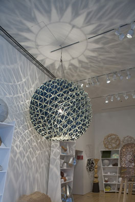
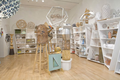
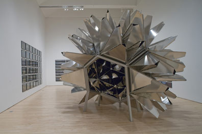
While most of Eliasson's work has to do with the optical properties of different materials the Model room is about an exploration of geometry and mathematics. The models are a way of making the geometry real. The mathematics are allowed to reveal their own inherent beauty. While the geometry itself is naturally compelling and beautiful the room lacks the specificity of other installations in the exhibition. You are never sure if the geometrical models are ends in and of themselves, or stepping stones in larger projects. Eliasson might enjoy that ambiguity. The model room is an interesting addition to the exhibit because the experience is completely different than the work in the rest of the show. You feel like you might be walking into Buckminster Fuller's studio to view various works and geodesics in progress. You are reminded of a certain innocence about Eliasson's work. It is a kind of wild eyed wonder at the mystery and potential of the world. It might be a kind of wonder about the properties of certain materials like water but it also might be about a simple beauty of certain shapes. The Model room is made of probably a hundred geodesic models mostly made of configurations of small triangles. It is a strange contrast to the rest of the exhibition. Most of the exhibition is very experiential but this room is about a collection of shapes and geometries that suggest new configurations of the shapes and surface that form a recurring theme in Eliasson's work.
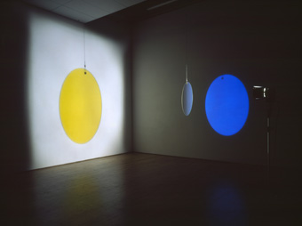
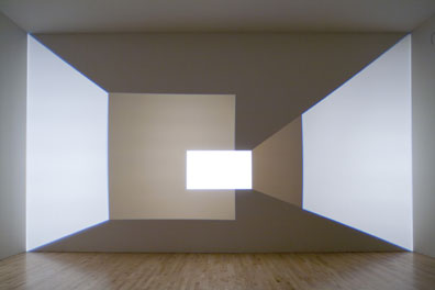
After the Model Room, you encounter Reimagine from 2002. In Reimagine, a series of light fixtures along the back wall project a series of trapezoidal shapes on to the front wall. The twist is that the each of the light fixtures turn on and off in sequence so you get the illusion of movement on the front wall. It is ironic that the movement which could have easily is generated by a computer animation is actually generated by a series light fixtures that turn on and off in sequence to create the illusion of space. The effect is not that different than an animation on the corner of a page of a notebook where a series of still images appear to be in motion if the pages pass by fast enough, although Reimagine is much slower because it is made from only seven light fixtures. Each light fixture is shaping space in its own unique way. Each light fixture has its own set of baffles that creates a trapezoidal or rectangular shape. The effect is both very retro and very modern. The trapezoidal shapes create the illusion of perspective while the rectangle create the illusion of a flat plane. Like most of Eliasson's work, it is extremely simple set up that creates a complex effect. He shows you how everything is done, nothing is hidden. There is no mystery and all that is left is the art.
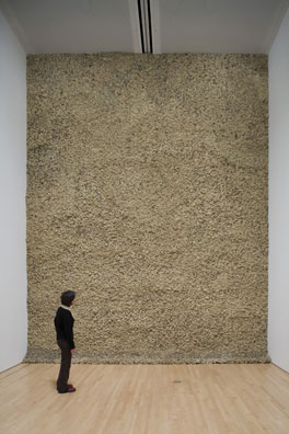
One of the surprising pieces in the show is one of his earlier pieces Moss from 1994. Like the title might indicated, Moss is a large single wall covered with living moss. It is in this piece which is about the relocation of the natural world into the environment of the museum that Eliasson comes closest to Hirst. In both cases, elements from the natural world are exhibited as they exist in nature. A subtle difference between the two artists is that Hirst is more interested in a certain theatricality in presentation and a narrative overlay to animals and insects that are used in his work. Eliasson is more straight forward and that form the relocation of the moss from the outside to the inside of the museum is enough. Eliasson also seems to prefer to keep the natural world alive in his work. You sense that he is always trying to get you to appreciate what is right in front of you, and if it has to be placed in a museum to get you to look at it, then so be it. It might be moss, the optical properties of materials, geometrical models, or it might even be the pictures of waterfalls in the landscape.
The idea become crystal clear when you look at some of his photographic work. Eliasson found a way to take himself out of the picture. Looking at forty photographs of a similar type of subject matter, for example waterfalls, is very different than looking at one photograph of a single waterfall. In a single photograph, we would appreciate all of the things that that make the photograph unique. It might be the hand of the photographer, the light, the form of the waterfall or the overall environment. If you are looking at forty photographs, those things begin to drop away and you find that you are looking at how waterfalls are similar or different from one another. It allows the artist to disappear so the subject matter can become dominant experience. The same thing happens when you look at a Warhol painting in which the same image is printed over and over again. Each image becomes less important than the overall structure.
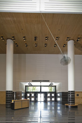
Some of the work was probably not installed in the right location. Ventilator in the lobby of the museum is a fan that is attached to a rope that is hung from the ceiling. The fan blades act as a propeller as it moves the fan around the room. The fan moves on its own accord and in relation to gravity and propulsion created by the speed of the fan blades. Unfortunately, the fan is hung a little too high and it is a little too small to hold the space of the lobby. If it had been installed a room that would have allowed more proximity to the fan, the effect would have been alternately fascinating and probably a little scary as well. I wonder if they considered doing a larger version of the work to specifically fit the space of the lobby. Ventilator does illustrate that in Eliasson's world a fan can be become a propeller, as it does it in a jet engine, but by allowing it to move under its own logic, the idea is transformed so that it becomes about the experience of sharing the space of the fan that strangely seems to have a mind of its own rather than being demonstration of a set of scientific principles.
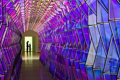
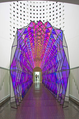
In One-way Colour Tunnel, Eliasson builds a cathedral like form on the bridge that crosses the atrium. Made of a series of triangles and polarized glass, the structure appears to be reflective and semi-translucent when viewed from one direction, and spectacularly colorful when viewed from the opposite direction. The piece is a continuation of the a lot of similar ideas in Yellow versus purple, except that this time the glass is stationery and the viewer moves. The faceting of the structure places each piece of glass at a different angle so that the diffractive properties of the glass differ from one piece to the next. The space is activated by your movement across the bridge and once again emphasizes how dynamic Eliasson's work is in relation to the viewer.
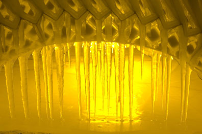
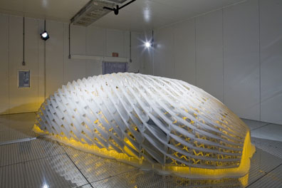
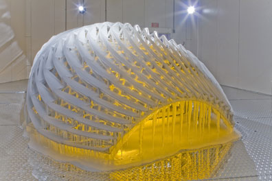
After walking through the exhibition on the upper floor, I wasn't sure what to expect as I stood in line to see Your Tempo, Eliasson's contribution to BMW's art car program. The car is called Your Mobile Expectations: BMW H2R Project and is kept in a room is at about 16 degrees Fahrenheit so the audience is wrapped in wool blankets as they are invited into a large refrigerator to see the car itself. The car is a more advanced version of some of the ideas put forth in Ice Pavillion, where the structure of the ice covers a metal armature that is left outside in freezing weather. The transformation is that something that is normally fluid and soft becomes something hard and sheltering. Eliasson's intention was to call attention to the greenhouse gases caused by the burning fossil fuels in standard combustion car engines.
But he is not just calling attention to the problem of Global Warming but also making the problem worse. If the car was simply placed outside in Iceland during the winter that would be one thing, but to create a large freezer in already climate controlled building in downtown San Francisco is something else. What about all of the energy costs to keep the car cold enough to keep the ice on the car? What about the additional energy required to compensate for the door opening and closing every minute or two to either let people in or out of the space? Besides the installation of Your Tempo,I was impressed in Eliasson's work that there is a certain humility when it comes to nature. He understood that nature always does it better. It was clear that when you walk through the exhibition his work that he tries to get himself out out of the work to let the experience of nature and the viewer to take place. That is why all of the components of his installations are always revealed, nothing is hidden. It is a way of taking himself and his preferences out of the equation. He creates a situation in which there is nothing outside of your personal experience of the work. It was surprising to see that an artist of his caliber was willing to surrender himself and his work in that way to nature. Eliasson is always making himself disappear from the show. He will show you beautiful effects of polarized lens or the beauty inherent to geodesic geometry but then you feel like he will then step away so that you can have your own experience. You can interpret the installations in a any way you like because his work is already finished. He lets the natural properties speak so that he does not have to. It is strange that after you walk through the show, you might feel like you have a pretty good handle on his aesthetics and the principles behind his work but you are really not any closer to understanding him as a person. I am sure that is just the way he likes it. On view at the San Francisco Museum of Modern Art until February 24, 2007.
Posted by Arcy Douglass on November 28, 2007 at 22:09 | Comments (0) Comments Post a comment Thanks for signing in, . Now you can comment. (sign out)
(If you haven't left a comment here before, you may need to be approved by
the site owner before your comment will appear. Until then, it won't appear
on the entry. Thanks for waiting.)
|
| s p o n s o r s |
 |
 |
 |
 |
 |
 |
 |
 |
 |
 |
 |
 |
 |
 |

|
Site Design: Jennifer Armbrust | • | Site Development: Philippe Blanc & Katherine Bovee | |


