
|
||
|
Portland art blog + news + exhibition reviews + galleries + contemporary northwest art
|
||
Marko Lulic and Peter Kreider at Reed College 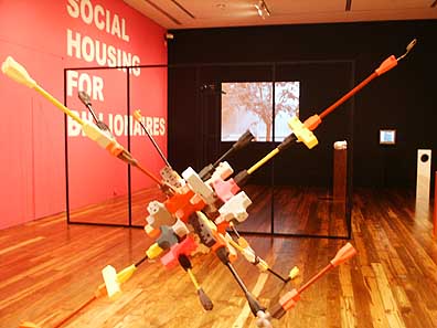 Work by Peter Kreider (fg) & Marko Lulic (bg) Reed's Cooley Gallery has reopened with a new walnut floor and a strong two-person show featuring Marko Lulic and Peter Kreider. PICA's Kristen Kennedy teamed up with Cooley curator Stephanie Snyder to arrange this transcontinental pairing (Lulic is Austrian and Kreider is American). The result is a tidy offering of salient works that stand up on their own merits, but offer considerable interplay upon further reflection. 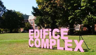 Lulic makes a reflexive comment? Lulic is a young artist rapidly gaining international prominence for his retakes on modernist architecture and monuments. He draws on his Serbo-Croatian heritage to dissect and deconstruct Tito-era Yugoslav modernism with a sincerity that oscillates between admiration and chagrin. His work is visible from the street across Reed's carefully tended grounds: giant hot pink steel letters spell out "Edifice Complex." Amidst the stately bricks and clipped greenery of the coiffed campus, the text acts as some kind of open-ended propaganda. It's part pun, part confession, maybe part accusation as well. > 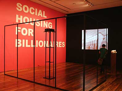 Lulic install, Frey's House #1 (fg) Once inside the Cooley Gallery, the far wall sports the same hot pink and is emblazoned with enormous text reading "Social Housing for Billionaires." Again, in the context of Reed and its requisite associations to trust fund money and liberal guilt, this phrase accommodates a variety of meanings. Lulic's other contributions require a little more probing, and perhaps the accompanying pamphlet for viewers not already familiar with his interests. The gallery is divided roughly in half by "Corner (black)," an L-shaped segment referencing Lulic' remake of Albert Frey's "house no. 1" of 1940 (according to the pamphlet). Although one can literally step through the empty frame, I lacked the knowledge for a mental entry point, and it served as a clunky visual corral between the artists, cramping the already intimate space. A nearby digital photograph, noticeably altered, depicts Lulic at the "2008" Venice Biennale, standing in front of the Croatian, Austrian, and Serbian pavilions, which are magically conjoined behind him. 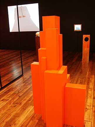 Lulic's The Moderns (Vienna) [bg left] & ZentralKomittee [bg right] with model buildings [fg] Lulic presented two videos: "Zentralkomitee" and "The Moderns (Vienna)." The first is a minute-long pan down the side of a Belgrade skyscraper, a former communist headquarters bombed by NATO during the offensive in 1999. Lulic, under the auspices of a newsman, muses that the building will be removed to make way for a shopping mall. Another video selectively tours Vienna, presenting only the modernist monstrosities and not the stately traditional architecture for which the city is known. In these works and two altered pedestal sculptures, Lulic stakes out distinct territory by posing questions about the troubled legacies of modernist art and attitudes. Lulic seems to miss the idealism and grandeur associated with the age of clunky, overblown monuments, but his sentiment is less nostalgic than gently critical. How can we laugh at the eyesores of previous decades when we are replacing them with the anonymous uniform of Western-style capitalism? 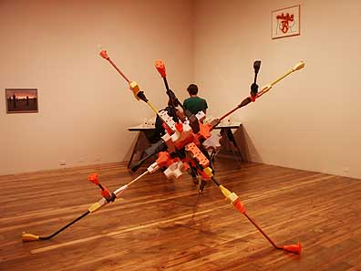 Kreider's Restless Attractor (fg) Peter Kreider's work, occupying the far side of the black corner, is more whimsical, and disparate than that of his cohort. The centerpiece is "Restless Attractor," a plastic sculpture of oversized multicolored electrical plugs and wires, connected end-to-end in an impossible circuit. The piece is both technically impressive and thrilling in a way that makes me think of child mad scientists, making Lego empires in their rooms all day. It's in the realm of Charles Ray and Tim Hawkinson, without so much of the "How'd he do it?" element. 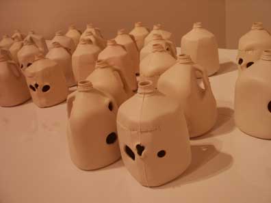 Another strong work is a table of cast and altered porcelain milk jugs, cut to resemble abstract human skulls. The assembled crowd of staring heads rests upon a slab of white Formica, which is in turn placed on crude wooden sawhorses. The mismatched materials stopped me up for a moment-just long enough for the kitschy vessels to shift from ironic to iconic and bring a chill to the work - transforming it into a cartoonish Khmer Rouge-style war crime. Kreider's other works in the show function as short, one-liner jokes-a fork in an outlet, a photo of a beer-whereas the two larger sculptures read as complex visual riddles without losing their light sense of humor. Both artists share a fluidity with material and scale that serves their conceptual interests. Kreider is more formally playful while Lulic's subject, the often-embarrassing spectacle of human monument, is slyly self-deprecating. The matchmaking of two artists occurs so often (and so often with such dismal results) in commercial spaces, that it was refreshing to see a well-considered pairing within a smaller non-profit space like the Cooley. This show bodes well for the future of the Cooley: world-class exhibitions in sleepy Southeast Portland. Through December 9th 2007 Posted by Ryan Pierce on October 19, 2007 at 9:24 | Comments (1) Comments I had the privilege of having Peter Kreider attend one of my class critiques at PNCA, and he was just as fantastic at dishing out the criticism as he is at creating artwork. What was most exciting for me about this show was the way both artists' work really had a dialogue with each other. For every sharp cube of Lulic's, there was a responding playful milk jug by Krieder. It was a rather well curated show. Maybe a little too tight spacing wise in some areas, but otherwise great. Posted by: Calvin Ross Carl Post a comment Thanks for signing in, . Now you can comment. (sign out)
(If you haven't left a comment here before, you may need to be approved by
the site owner before your comment will appear. Until then, it won't appear
on the entry. Thanks for waiting.)
|
| s p o n s o r s |
 |
 |
 |
 |
 |
 |
 |
 |
 |
 |
 |
 |
 |
 |

|
Site Design: Jennifer Armbrust | • | Site Development: Philippe Blanc & Katherine Bovee | |


![[TypeKey Profile Page]](http://www.portlandart.net/nav-commenters.gif)