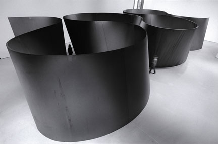
Richard Serra
Band, 2006
Weatherproof steel
Overall: 12' 9" x 36' 5" x 71' 9 1/2" (3.9 x 11.1 x 21.9 m), plate: 2" (5.1 cm) thick
Los Angeles County Museum of Art. Gift of Eli and Edythe Broad
(c) 2007 Richard Serra / Artists Rights Society (ARS), New York
Photo: Lorenz Kienzle
In Richard Serra Sculpture: Forty Years at the Museum of Modern Art in New York, Serra's work provides a guide to the way that materials can be used to transform or define space. No sculptor has put more thought into the problems and pleasures of navigating and defining space. I was surprised to see how rigorous his approach to the language of materials and the experience of space has been over the last forty years even though his own language and budgets have grown considerably during that time. One thing that became immediately clear is that Serra has thought harder about space than any artist, ever. Most of the sculptures relate to the way that we navigate or move within a space. His work is famous for transforming the reference points that we use for orientating ourselves within a space to unlock the potential of a given environment. The best sculptures are the ones that are open ended and are meant to be completed by the experience of the viewer. In the show we get a little bit of everything from the Belts and Prop Pieces of the mid sixties, through Delineator and then Circuit II into the Torqued Ellipses and the larger sculptures of his current work. Serra's best sculptures are not objects but are an interconnected set of relationships that are not complete until we interact and navigate in and around them. Although Serra's work in steel is definitely the focus of the show, it is used to highlight the fact that the sculptures are the means, rather than the ends, of the way experience space.
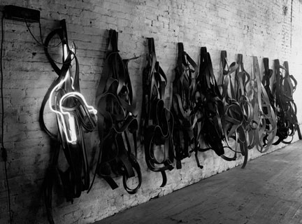
Richard Serra
Belts. 1966-67
Vulcanized rubber and neon tubing
6' x 25' x 20" (182.9 cm x 7.6 m x 50.8 cm)
Solomon R. Guggenheim Museum, New York. Panza Collection
(c) 2007 Richard Serra
Photo: Peter Moore
The exhibition was the first time that I got to experience sculptures like Delineator and Circuit II which I have known only from photographs but form an essential part of Serra's work. He even said it best himself : "I wanted to get away from the imagistic value of an object in an empty space and instead put the focus on the experience of the entirety of the context." In the show we see the work but, outside of the catalog, we are not exposed to the process or even the ideas that creates the work. Also outside of the catalog, no reference is made to the outstanding site specific work that he has created outdoors. I am not sure if this was a decision made by the curators, or even Serra himself, but the result is that work is presented in isolation. It is even stranger that for an artist whose mantra is "Work comes out of work", we are given no indications about his process or his working method. Each sculpture is presented as vessel or a series relationships, singular and complete. Unlike most contemporary art, Serra's work is activated by our bodies when we walk in his spaces. Maybe the thinking is that the models become extraneous and not relevant to the experience of the larger, full size spaces. Still, I couldn't shake the feeling that his ideas are deeper and more subtle than its presentation within the exhibition might indicate.
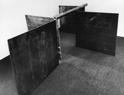
Richard Serra
1-1-1-1. 1968
Lead antimony
(c) 2007 Richard Serra
Photo: Jenny Okun
As you guess from the title, the show was not supposed to be a retrospective of Serra's work because it did include any of this drawings, models, prints, or even writings. No artist since Pollock thinks as much with his hands as Serra. He even talks about using the riggers that install the work as extensions of his own hands. How is that any less of an artistic decision than the creation of the vessels in the first place? At some level, I wonder if Serra or the curators, felt that the drawings and models would have distracted from the experience of the sculptures but the best exhibition would have been like his sculptures, raw and unfiltered. It would have also been great to see his paint stick drawings, where the paint stick is applied an inch thick or any of the very large prints that he has spent a considerable time working on over the years. MoMA would not have a retrospective of Jasper Johns without talking about the prints and drawings, why should it be otherwise for Serra. This touches on the key issue with Serra for me. Serra at his best, is a way of thinking, an approach to materials and an examination of the latent potential in any given environment. I think that this best expressed in his site specific landscape sculptures. Again, nothing in the show about it but there is Lynn Cooke's excellent essay in the catalog. By looking at the inherent qualities of his materials as well as examining the latent potential in an environment, his thinking has lead him to sometimes produce stand alone steel sculptures, while at other times it might be appropriate for an open ended installation in the landscape or in an interior space it might be right to re-orient the space of a room with a drawing. The point is that all of these are approaches are valid for dealing with space and it would have provided a more complete view of the thinking and process behind Serra's work.
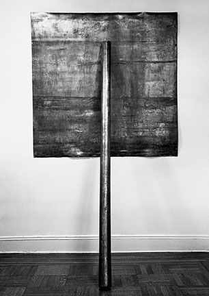
Richard Serra
Prop. 1968
Lead antimony
Plate: 60 x 60 x 1/8 (152.4 x 152.4 cm), pole: 8' (2.4 m) long
Whitney Museum of American Art, New York.
Gift of the Howard and Jean Lipman Foundation, Inc.
(c) 2007 Richard Serra
Photo: Harry Shunk
The work is presented, or at least experienced, in reverse chronological order so we start at the bottom and work our way up. Even when you walk into the exhibition space on the sixth floor, you experience his work in reverse chronological order. The effect is like looking at a body and the working backwards to find the DNA. In the mid to late sixties, Serra was making sculptures through drawing. It might be the way that rubber strips might be hung on the wall in Belts, or it could be the way that a saw cut might reveal the characteristics of a material. During this time he was also rolling sheets of lead into a cylinder so that when you looked at the end of the roll you were rewarded with a beautiful drawing as the material bends around itself to make the tube. Like most of Serra's work, a simple roll tells you a lot about the material, the process of fabrication, and his intentions as an artist. Some sculptures take gravity and the plane of the wall as physical constraints that are essential components of the piece.
In the Prop pieces, he uses a roll of lead to "prop" a sheet of lead on to the wall. These are all very straight forward explorations of the properties that he was using. How does a certain material roll? What are they like to be cut? How do they react to gravity? Can the wall be an active rather than passive factor in the sculptures? They are great sculptures and his later work shows just how much potential this rigorous thinking about materials had. Serra wanted his sculptures to grow from the properties of his materials. He is looking for an expression in his materials in the same way that Pollock used a can of paint. Both were working to expand the inherent qualites of their chosen medium. During this period of Serra's career he felt that the art is already in there, and it is the job of the artist to get it out.
Richard Serra
One Ton Prop (House of Cards). 1969
Lead
Four plates, each: 48 x 48 x 1" (121.9 x 121.9 x 2.5 cm)
The Museum of Modern Art, New York. Gift of the Grinstein Family
(c) 2007 Richard Serra
Photo: Peter Moore
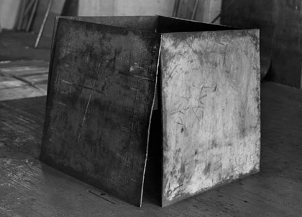
In 1969, Serra made a sculpture of four lead sheets, each about 3' x 3', that all lean in on one another to make a self supporting, freestanding sculpture. The sculpture One Ton Prop (House of Cards) must have changed his life. The lead sheets are held together by gravity and since they can not collapse in on one another, they sculpture stands. Is it gravity or the material properties of the lead that make the piece? The answer is probably both because you can not have one without the other. He is extending his language beyond the formal qualities of an object. I heard that when the piece was installed in Japan a little later, the air conditioner broke, the temperature of the lead raised enough so that it became malleable under pressure, and the whole piece came crashing down. This is a sculpture that is based on entirely on the innate properties of the handling of the materials and the environment, a sculptural equivalent of pulling yourself up by your boot straps.
Donald Judd
Floor Box, 1969
Clear Anodized Aluminium and Plexiglas
83 3/4" x 172 3/4" x 122"
Thomas and Cristina Bechtler, Switzerland
(c) Donald Judd 2007
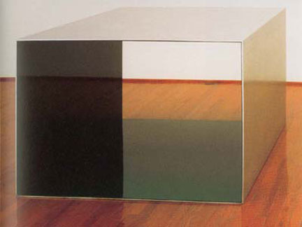
Although the handling of materials and gravity is different, in a House of Cards (One Ton Prop) is is where Serra comes closest to the language of Donald Judd. Judd's work is about how a sculpture occupies a volume of space that in turn relates the volume of the room so that when you experience the piece you are tracking from the piece, to yourself, to the room and back again. Judd's sculpture would also be defined by a series of internal relationships that might be augmented with changes in material, painted or Plexiglas colors. When you experience Judd's work you experience the room as well as the sculpture. In the late sixties, Judd was probably the more mature artist in that he already developed a vocabulary that he would refine for the rest of his life. Serra was still finding his voice and trying to figure out a way to convert his innate knowledge of materials into art. In both One Ton Prop and in Judd's floor sculpture we are confronted with an object that occupies a certain volume of space in a room. Serra's work is characterized taking advantage of forces within the environment and his use of materials, Judd's by its colors and internal relationships, but in both cases the viewer is outside of the space of the sculpture. In a contrast to Serra's later work, your body is passive in the experience of these sculptures.
Richard Serra
Strike (For Roberta and Rudy), 1969-70
Hot Rolled-Steel
96" x 288" x 1 1/2"
Solomon R. Guggenheim Museum, New York. Panza Collection
(c) 2007 Richard Serra
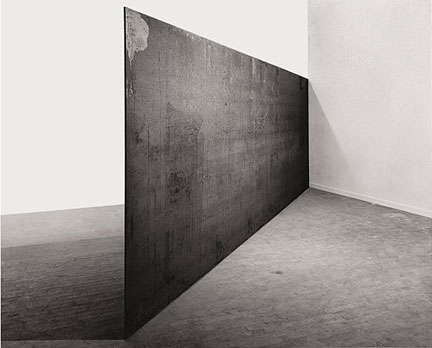
In 1970, Serra had the opportunity to install a work, Strike (for Roberta and Rudy) which is a single piece of steel in a corner of an otherwise empty room. Unfortunately, Strike was not included in the exhibition at MoMA although they did install Circuit II. Circuit II has four plates in four corners and is a bit taller and wider while Strike is only one plate in one corner. We will come to Circuit II in a second. Strike is the first time that Serra transcends the object so that the space is experienced with your body. For me, it is the key piece in understanding Serra's development as an artist. In Strike, the steel is held up in the corner by the walls and so it can't tip over, and it extends into the middle of the room. One can imagine that Strike might have just been an extension of the language he developed from the material properties of a plate of steel as he had in the Prop pieces and in House of Cards, just on a larger scale. He must have been amazed when it was installed, because the steel was defining space as it was declaring it. It was a space that you had to relate to with your body and not just with your mind. You could inhabit the space of the sculpture and it was much more than another sculptural object on the floor. Serra had found a way to take the object out of sculpture, so that you can experience the space in a room that is defined by the parameters of the sculpture. In a surprising way, Strike relates to the space of the room in the same way that the zips function in the paintings of Barnett Newman. Serra is adamant that the langauge of sculpture should come out of sculpture and not painting, but by looking at Newman's Vir Heroicus Sublimis we can understand the way Strike creates a unique type of sculptural presence.
Barnett Newman
Vir Heroicus Sublimis, 1950-51
Oil on canvas
7' 11 3/8" x 17' 9 1/4" (242.2 x 541.7 cm)
Gift of Mr. and Mrs. Ben Heller
The Museum of Modern Art, New York
(c) 2007 Barnett Newman Foundation / Artists Rights Society (ARS), New York
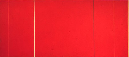
Perhaps it is no coincidence that in order to get to Serra's sculptures on the second floor you have to walk by Barnett Newman's Broken Obelisk. Newman is a great painter and he has probably done more to redefine the parameters of experiencing paintings than any artist of the 20th century. In Vir Heroicus Sublimis, we are confronted with a large red field that is defined by a series of vertical lines, that Newman called zips. The zips do not define the experience of the painting as much as gently guide the eye back into the field so that the viewer could, on some level at least, be confronted with their own experience. The zips, like the edges of Strike, are signifiers that define the parameters of the experience but they are not the experience itself. In the late sixties, when Newman began to make sculptures of his own, the zips were frontal, monumental and unfortunately, objects. By placing an steel plate in the corner of a room Serra transcended the sculptural object with Strike because it was not the plate that held your attention, it was the way the space was redefined. You experienced the space as a totality with your body. Judd not able to achieve the same transcendence of the object until years later when he installed his work in the artillery sheds in Marfa. Strike is fascinating because it is lacks all specificity, it is unspecific like Newman's zips. One could imagine that any steel plate of the given dimensions, assuming that were no marks or disfiguring coloring that would be a distraction, could be used for the installation. It is clear case where the steel sculpture is not used as an object but as a vehicle for Serra's thinking about the experience of space.
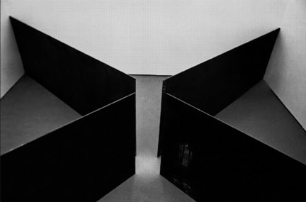
Richard Serra
Circuit II, 1972-86
Hot Rolled-Steel. Four Plates
Each: 10' x 20' x 1"
The Museum of Modern Art, New York
Enid Haupt and S.I. Newhouse, Jr. Funds
(c) 2007 Richard Serra
Back to the retrospective, after the prop pieces and the House of Cards and the Prop Pieces, you come to a room with Circuit II. The space is defined by the four enormous, flat steel plates, each 10' x 20' x 1", that segment the room in to four equal triangular spaces. The piece is taller and longer than Strike so it demarcates the space all the more effectively. The spaces feel a little tight because you can not get away from the presence of the steel, everything in the room is a function of the sculpture. When you stand in the room, an interesting thing happens. There is not much for your mind to grasp on to, so you begin to relate to the space with your body, mainly your inner ear and your stomach. You begin to feel the presence of the sculpture without actually touching it. Sculpture no longer belongs to the eyes and the mind alone. The weight and the density of the plates begin to effect your sense of balance. Is the sculpture the steel plates or the space that radiates from the plates? It is a question that can keep you up at night but the answer is again probably both but you can see the Serra had made a quantum leap since House of Cards.
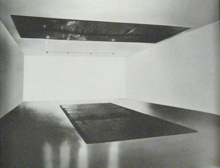
Richard Serra
Delineator, 1974-75
Hot Rolled Steel. Two Plates
Each: 1" x 10' x 26'
Collection of the Artist
Photograph: Gordon Matta-Clark
(c) 2007 Richard Serra
In a nearby room, is one the favorite pieces in the exhibition, Delineator. Delineator is simply two 10' by 25' steel plates set a ninety degrees to one another. One rests on the floor and the other, remarkably rests on the ceiling. It is like one of the Prop pieces without the prop. When Delineator was originally installed at the Ace Gallery in Los Angeles in the mid seventies the height of the room was about 15', so that you could really feel the pressure and the volume between the two plates. Unfortunately, at MoMA they decided not to drop the ceiling of the more or less 20' high room, maybe for good reasons like lights and fire sprinklers, but the effect is a bit like being in a cathedral where all of the space dissipates at the top. Even stranger is that the top plate emphasizes the height of the ceiling. The top plate is so high, you do not see it when you walk in the room unless you look up and it looks like it is magically levitating. The plates have the strange effect of rather than being pulled together under the force of gravity, they seem to be pushed apart like magnets of the same polarity. It reads as though the plates are pushing the floor and ceiling apart creating the space of the room. At Ace, you were confronted with both plates simultaneously, and you understood the intention immediately.
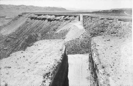
Michael Heizer
Double Negative, 1969
240,000-ton displacement of rhyolite and sandstone
1500 x 50 x 30 ft.
The Museum of Contemporary Art, Los Angeles Gift of Virginia Dwan
85.105
Location: Mormon Mesa, Overton, Nevada
Now to the good stuff. Delineator has always reminded me of Michael Heizer's Double Negative. Double Negative is two slots cut into a mesa in Nevada. Even though the slots are on opposites sides of the mesa, they seem like they are connected because of the matching alignment of the volumes. The space between slots is somehow taken into the field of the sculpture even though Heizer doesn't touch it. It is the same thing with Delineator. In Delineator, we automatically connect the space between the two plates even though they are set at ninety degrees to one another. The top and bottom plate create a twisted volume of space, an early precursor to the Torqued Ellipses, that you can inhabit as you walk along the bottom plate. Serra talks about Delineator in terms of delineating the space of the room, but when I saw the room around the plates becomes practically inconsequential although you do need four walls to contain the space. The great thing the about the sculpture is that even though Serra sets up the parameters, you make the connection across the void. The plates, like Newman's zips, become signifiers to the experience but not the experience itself. Your body is an active, and not passive, ingredient to the experience of the sculptures.
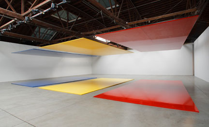
Robert Irwin
Whose Afraid of Red, Yellow, and Blue (3), 2007
Linear Polyurethane Paint on Six Honeycomb Aluminium Aircraft Rectangles
Courtesy Pace Wildenstein
(c) 2007 Robert Irwin
It is worth noting that Robert Irwin's Whose afraid of Red, Yellow and Blue(3) which was installed earlier this year in Pace Wildenstein's space in Chelsea is a variation on the ideas of expressed in Delineator. Rather than creating a new volume of space between the two rotated plates as in Delineator, Irwin uses the matching colors of the opposing plates to jump the gap and create a new volume of space saturated and defined by the intensity of the color, based coincidentally on a series of paintings by Barnett Newman.
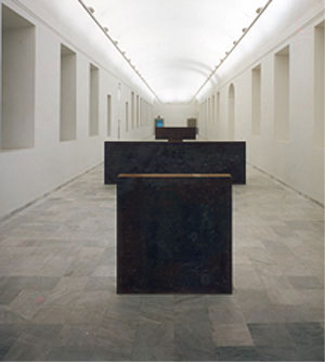
Richard Serra
Equal Parallel: Guernica-Bengasi, 1986
Hot Rolled Steel. Four Slabs
Two: 4'-10 1/2" x 4'-10 1/2" x 9 1/2"
Two: 4'-10 1/2" x 16'-4 1/8" x 9 1/2"
Collection: Museo Nacional Centro de Reina Sofia, Madrid, Spain
(c) 2007 Richard Serra
In Equal-Parallel: Guernica-Bengasi from 1986, Serra explores a similar set of ideas but within a horizontal rather than vertical field. Equal-Parallel is made of two sets of steel slab. In each set, one of slabs are square 58 1/ 2" x 58 1/ 2" and it is paired with a longer slab 58 1/ 2" x 16'4 1/8". All of the slabs are of an equal thickness of 9 1/ 2". The slabs are installed so that they are both facing the same direction and as you walk into the field by standing in front of one the pairs, you are looking at the backing of the other set. Effectively, the experience is slightly cubist because you see the front and the back of the sculpture at the same time. In Equal-Parallel, the two pairs of slabs establishes two references points to allow you to measure and position yourself within the volume of the space. It is as if the immeasurable vertical volume of space in Delineator, becomes measurable as it shifts to the ground plane. As you walk through the room, the center is wherever you are standing because it is always in relationship to the location of the steel slabs.
Richard Serra
Intersection II, 1992-93
Weatherproof steel, four identical conical sections
Two sections 13' 1 1/2" (400 cm) high x 51' 9" (1570 cm) along the chord x 2 1/8" (5.4 cm) thick; two sections 13' 1 1/2" (400 cm) high x 50' 9" (1550 cm) along the chord x 2 1/8" (5.4 cm) thick;
The Museum of Modern Art, New York. Gift of Jo Carole and Ronald S. Lauder, 1998
(c) 2007 Richard Serra / Artists Rights Society (ARS), New York
Photo: Lorenz Kienzle
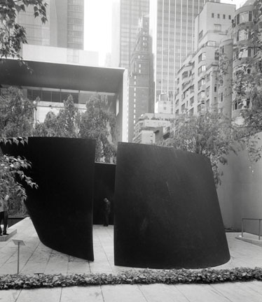
In the sculpture garden are two of my favorite Serra sculptures. The first is Intersection II from 1992-93 and the other Torqued Ellipse IV is from 1998. Intersection II is still based on the continuation of ideas that Serra was working on with One Ton Prop. The sculpture is self supporting by introducing a shallow conical curve to each of the plates that allows them to support their own weight. The introduction of the curved surface allows one side of the steel plate to be concave while the other convex so the complexity of the pieces grow exponentially. Intersection II is the intersection of two sets of conical steel plates, two conical sections pointing down, two are pointing up. The intersection is between the conical sections. The outer plates are parallel to one another and each plate is 13' 1 1/ 2" high x 51' 9" long. The inner plates are also parallel to another and is 13' 1 1/ 2" x 50' 9" long. The effect is that one side of the sculpture the plates are closest to one another on the ground and the on the other side they are closest to one another at the top of the plate. One side opens up and the other down so that the experience of the piece is a relating these two experiences of these inverted volumes. In this way it is precursor to one of his more recent sculptures, Torqued Torus Inversion. It was reassuring to walk through the piece and know that curve of the plate will remain constant. It allows you to concentrate on the experience of the piece rather the watching where you are walking.
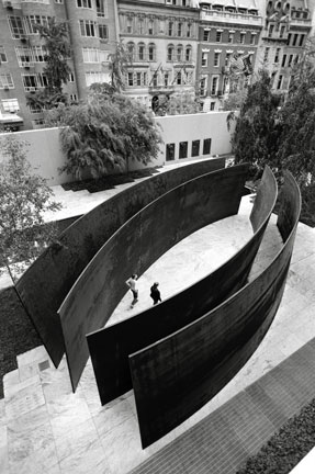
Richard Serra
Intersection II, 1992-93
Weatherproof steel, four identical conical sections
Two sections 13' 1 1/2" (400 cm) high x 51' 9" (1570 cm) along the chord x 2 1/8" (5.4 cm) thick; two sections 13' 1 1/2" (400 cm) high x 50' 9" (1550 cm) along the chord x 2 1/8" (5.4 cm) thick;
The Museum of Modern Art, New York. Gift of Jo Carole and Ronald S. Lauder, 1998
(c) 2007 Richard Serra / Artists Rights Society (ARS), New York
Photo: Lorenz Kienzle
Some people have compared the experience of Intersection II to being near one of the huge ships that Serra had seen being launched into the sea when he was child. There is a strange elegance and for lack of a better word, grandeur in the long, curving lines of this sculpture that make you want to keep walking back and forth along the sculpture to experience the spaces again and again.
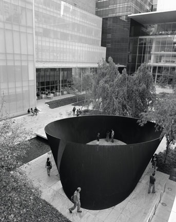
Richard Serra
Torqued Ellipse IV, 1998
Weatherproof steel
12' 3" x 26' 6" x 32' 6" (373.4 x 807.7 x 990.6 cm)
The Museum of Modern Art, New York. Fractional and promised gift of Leon and Debra Black,
1999. (c) 2007 Richard Serra / Artists Rights Society (ARS), New York
Photo: Lorenz Kienzle
Next to Intersection II is Torqued Ellipse IV. I had first seen Torqued Ellipse IV when it was a deep maroon color when it was installed in the Geffen Contemporary in Los Angeles. I have seen it a couple of times since then, but it looked a little uncomfortable in the sculpture garden. It was hard to get around and there were too many chairs around so you did not really want to spend very much time thinking of the space. Over the last ten years, the bright maroon color has turned to a dark gray as it has been exposed to the elements. I think that is why Serra does not like people to talk about his sculptures in terms of the some beautiful effects and colors of rust on the surface of the sculpture. The effects are only temporary and won't be there anyway in ten years while the space will still exist.
Richard Serra
Torqued Ellipse IV, 1998
Weatherproof steel
12' 3" x 26' 6" x 32' 6" (373.4 x 807.7 x 990.6 cm)
The Museum of Modern Art, New York. Fractional and promised gift of Leon and Debra Black,
1999. (c) 2007 Richard Serra / Artists Rights Society (ARS), New York
Photo: Lorenz Kienzle
It is hard to believe that Torqued Ellipse IV came only five years after Intersection II. Intersection II looks back to his experiments with materials and gravity, while Torqued Ellipse IV looks forward to all of his spaces that have taken his language in new and unexpected directions. Serra says that the language of the Torqued Ellipse came after a profound experience in the elliptical space of Borromini's Church of San Carlo in Rome. After experiencing the pull of the ellipse, he wondered if a similar experience could be generated within the context of his work by shaping the steel to connect two ellipses that have been separated in elevation and rotated relative to one another. But as we have seen, at least part of this language has been part of his work since Delineator. The big difference, and I think that this is crucial, is that in Delineator the connection between the two plates was implied. It is a connection created by the perceptions and the movement of the active body of the viewer. In the Torqued Ellipses, Serra builds the connections between the two ellipses and while the ellipses themselves are left as voids. The curvature of the steel plates are unbelievably complex and undeniably beautiful. A steel plate weighing thirty tons is changing from being concave to convex in the space of a few feet.
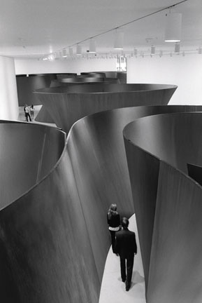
Installation view of Richard Serra Sculpture: Forty Years in the second-floor Contemporary
Galleries at The Museum of Modern Art. Shown: Sequence. 2006. Weatherproof steel. Collection the artist. Torqued Torus Inversion. 2006. Weatherproof steel. Collection the artist. Band. 2006.
Weatherproof steel. Los Angeles County Museum of Art. Gift of Eli and Edythe Broad. (c) 2007 Richard Serra / Artists Rights Society (ARS), New York Photo: Lorenz Kienzle.
The spaces that spring from the Torqued Ellipses are unique and there are no physical equivalents for the experiences of these spaces. Maybe the closest I can think of is if you were hiking through slot canyons in Arizona or the Narrows at Zion in Utah but the scale would be wrong and the space is to regular for it to be a good analogy. It is even more amazing that spaces are not carved out. The same steel plate define the curvature on the inside and the outside of the ellipse. This gives the work a rigor that you do not find in potentially comparable architectural spaces.
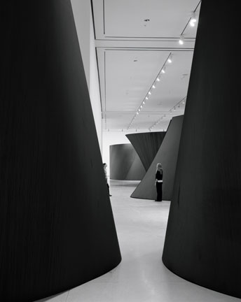
Installation view of Richard Serra Sculpture: Forty Years in the second-floor Contemporary
Galleries at The Museum of Modern Art. Shown: Sequence. 2006. Weatherproof steel. Collection the artist. Torqued Torus Inversion. 2006. Weatherproof steel. Collection the artist. Band. 2006.
Weatherproof steel. Los Angeles County Museum of Art. Gift of Eli and Edythe Broad. (c) 2007 Richard Serra / Artists Rights Society (ARS), New York Photo: Lorenz Kienzle.
The trade off with the Torqued Ellipses is that Serra literally connects the dots for us in a way that was left opened ended in Delineator. We navigate these spaces with our bodies as much as our eyes but the result is that the we are more passive as walk around the spaces. We walk around to learn and experience something that Serra has already figured out along time ago. It also takes along time for our minds to turn off, so that we can experience it with our bodies, because the pieces is so beautiful look at. We don't define the experience for ourselves in the way that we do with some of the best pieces that he has done in the landscape like Shift. I think that this comes back to the idea of specificity. The more unique a piece of steel is, the longer it takes for the mind to stop reading it is as visual object. In Circuit II where the steel is not specific beyond its most general characteristics, we are able to get to an experience of Serra's spaces a lot faster.
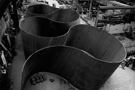
Richard Serra
Band, 2006
Weatherproof steel
Overall: 12' 9" x 36' 5" x 71' 9 1/2" (3.9 x 11.1 x 21.9 m), plate: 2" (5.1 cm) thick
Los Angeles County Museum of Art. Gift of Eli and Edythe Broad
(c) 2007 Richard Serra / Artists Rights Society (ARS), New York
Photo: Lorenz Kienzle
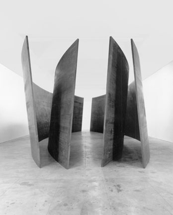
The exhibition actually begins or ends, it is hard to tell, right across the hall from Newman's Broken Obelisk with three of his most recent sculptures. In a large room on the second floor are Band, Sequence and Torqued Torus Inversion all from 2006. Band is a ribbon of steel that bends to accommodate the spaces of four Torqued Ellipses, but it does not seem to have a beginning or end. It could continue forever. It is Serra's biggest sculpture to date, it is 12' 9 high x 36' 5" wide x 71' 9 1/ 2" long. The bends of Band become an irregular unit of measure in understanding the volume of the gallery. It was a surprising check over his shoulder at some of the modular stacks of Judd and Brancusi's Endless Column. All three provide strategies for understanding the volume of a given space by providing a module that is repeated to define the parameters of a room. Both Judd's and Brancusi's intervals are like a metronome, modular and regular. Serra measures the space in a much more irregular and organic way but it still provides a way of understanding the volume of the whole gallery. When you walk along the outside of the Band there is no way to imagine what the reciprocal space on the plate is like.
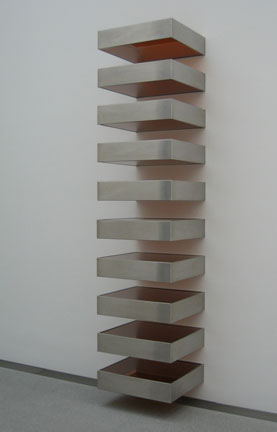
Donald Judd
Untitled (Stack,
1967. Plexiglas and galvanized iron, Twelve
units, each 9 x 40 x 31" (22.8 x 101.6 x 78.7 cm), installed vertically with 9" (22.8 cm) intervals
Musuem of Modern Art, New York
(c) Donald Judd 2007
Although there is a clear material correlation between the inside and outside of these spaces, the way these are experienced by our bodies is almost unpredictable. So each of the spaces are quite similar even though each one varies in its shape an proportion. I was hoping for more variety of the spaces within Band. Even though each one of the spaces and the geometry is unique, perhaps some of them could have been dramatically larger and others dramatically smaller. We would have been treated to the full range of his spatial vocabulary. As it was installed Band is beautiful and the geometry is absolutely astounding but it does not compel you to explore in the way that you feel with Serra's other work.
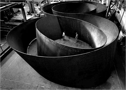
Richard Serra
Sequence, 2006
Weatherproof steel
Overall: 12'9" x 40' 8 3/8" x 65' 2 3/16" (3.9 x 12.4 x 19.9 m)
Collection the artist
(c) 2007 Richard Serra / Artists Rights Society (ARS), New York
Photo: Lorenz Kienzle
In Sequence, the sculpture is like two Double Torqued Ellipses that are connected by a spiral. Sequence is a very large sculpture, it is 12' 9" x 40' 8" x 65' 2". It is not as big as Band but a lot bigger than anything else in the museum. The top is a beautiful drawing of spiraling curves. The new sculptures are almost always photographed from the top, in the same way that Serra's earlier roll pieces were photographed from the side. Only now we can inhabit the Torqued Spirals in a way that we never could with the rolls. The beauty and specificity of each plate with its unique curvature, leads to a reading the sculpture as a large object. The MoMA installation did not do him any favors in this regard because they read as giant terracotta curved shapes in a pristine white space. It is hard to read them as anything but objects because it takes along time to turn the mind off so that you could experience the spaces with your body. As you walk between the plates, the geometry moves in and out, almost like the whole sculpture was breathing as you walked through. Some of the spaces are tight and compressed, others are expansive and open to the ceiling, so you are never sure what kind of experience will be waiting for you right around the corner.
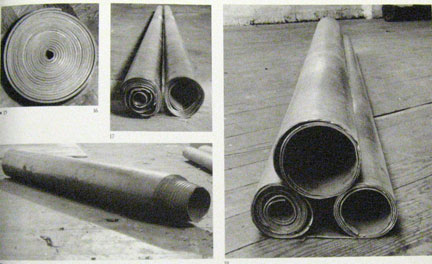
Richard Serra
Lead Rolls including: Untitled: 21" Diameter x 2" Collection Sydney and Frances Lewis; Double Roll: 6" x 6" x 8' Collection Stedelijik Musuem Amsterdam; Bullet 6" diameter x 36", Collection William J. Hokin; Slow Roll For Philip Glass 10" x 10" x 6, Collection Akira Akeda Gallery, Tokyo
All from 1968
(c) Richard Serra
I think in the same way, the more beautiful a sculpture is the harder it is to engage with your body. If you look at Delineator, Circuit II, or Equal-Parallel: Guernica-Bengasi, there is very little there for you mind to work on so it sort of turns off and it makes room for you to experience the sculpture with your body. It is the same thing that happens at Heizer's Double Negative, Walter De Maria's Lightning Field, or with one of Turrell's light installations. In a second you are able to grasp the idea of the work so your mind turns off and you can then really open to the experience. The best qualities of these artists are the experiences that can't be resolved with the mind but only experienced by the body. The same thing would apply the to the great painters like Pollock, Newman, Reinhardt, and Rothko. You can't think your way to an experience of their paintings just as you can't think your way to experience of Serra's sculptures.
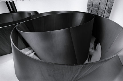
Richard Serra
Sequence, 2006
Weatherproof steel
Overall: 12'9" x 40' 8 3/8" x 65' 2 3/16" (3.9 x 12.4 x 19.9 m)
Collection the artist
(c) 2007 Richard Serra / Artists Rights Society (ARS), New York
Photo: Lorenz Kienzle
Serra understands this better than anybody. In fact, he probably one of the artists that made us aware of this in the first place. It is also probably the reason that his models and anything related to his process were excluded from the exhibition. If you read his writings, over and over again, he will talk about letting your body experience the space rather trying to imagine how the shapes were built or any other ideas about geometry. After a certain point, thinking about those things only distract you from the experience. In Sequence, I found that the steel is beautiful and the geometry is so rich and complex that it is very difficult not to think your way through these sculptures. Whether he wanted to or not, he gives the mind plenty to think about, which ultimately distracts you from experiencing the space. I suppose that is the danger of the pieces, that because they are so beautiful, if you are not careful you might, and if you are not familiar with his work, think that Serra was interested in creating only beautiful shapes which is a serious of misreading of his work. Unfortunately, the MoMA show does not go out of it way to prevent his work from being misread in that way.
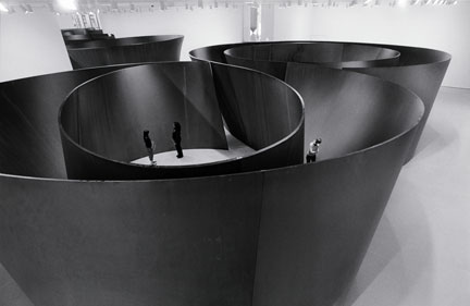
Richard Serra
Sequence, 2006
Weatherproof steel
Overall: 12'9" x 40' 8 3/8" x 65' 2 3/16" (3.9 x 12.4 x 19.9 m)
Collection the artist
(c) 2007 Richard Serra / Artists Rights Society (ARS), New York
Photo: Lorenz Kienzle
We looked at the show for three consecutive days, and I often looked at the same pieces again and again on the same visit, to try and experience and not necessarily think about the spaces. Second, I wanted to see if the more I was familiar with the works if my experience changed. Sequence is fantastic and is a blending the languages that would have been separate sculptures only ten years ago at MoCA. It is like Snake and the Torqued Ellipses have been combined to create a new sculpture. The piece is constantly unraveling and coalescing as you bounce from one interior space to the exterior and back agian. The interior spaces are remarkable enough, but each piece of steel in these sculptures is defining an interior and exterior space. The steel that is concave on one side, is convex on the other so the spatial readings multiply as you navigate through and around the sculptures. There is rigor and discipline that is sometimes at odds with the beautiful sensual quality of the curves. These sculptures are an extraordinary achievement and this strange to say about one of the most famous artists in the world, but I do not think that he has been given enough credit for the work he has produced. These sculptures are revolutionary in every sense of the word. I could not help but wonder that if these sculptures were buried in the sand for a thousand years, would a future archaeologist would believe that an artist had constructed them just for the experience of the space, or maybe more accurately, to understand how our bodies navigate complex spaces.
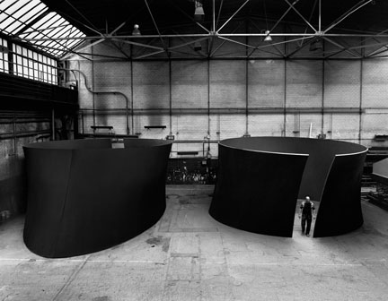
Richard Serra
Torqued Torus Inversion, 2006
Weatherproof steel
Two torqued toruses, each overall: 12' 9" x 36' 1" x 58' 9" (3.9 x 11 x 17.9 m),
plate: 2" (5.1 cm) thick
Collection the artist
(c) 2007 Richard Serra / Artists Rights Society (ARS), New York
Photo: Lorenz Kienzle
I have left my favorite piece of the new work for last, Torqued Torus Inversion. Torqued Torus Inversion are two sculptures, each of them is exactly the same at 12' 9" x 36' 1" x 26' 6 1/ 2", but one of them is turned upside down relative to the other. In a way I think that this piece is the key to all of the work since the Torqued Ellipses because it shows you exactly the difference between a curve that comes toward you, or a curve that leans away from you, changes your perception of the space. When you first compare the two sculptures, each space seems so unique that you can't imagine that the two sculptures are inversions of one another. One of the first things I noticed is that in the one that opens toward the bottom, the ellipse at the top channels that the light into the space in a way that would have been appropriate for space by Le Corbusier or Louis Kahn. This is neither here nor there but it felt more architectural, or perhaps it is space that has a lot of resonance with spaces created by architects. The other Torqued Torus compresses you at the line of the floor but opens toward the ceiling and is literally exhilarating. Of course, the cuts for the entry into these spaces provide a fantastic cross section of the curvature of these pieces. Again, it is strange that as you walk around the outside of the pieces that you have no indication of the character of the space on the inside.
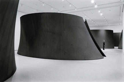
Richard Serra
Torqued Torus Inversion, 2006
Weatherproof steel
Two torqued toruses, each overall: 12' 9" x 36' 1" x 58' 9" (3.9 x 11 x 17.9 m),
plate: 2" (5.1 cm) thick
Collection the artist
(c) 2007 Richard Serra / Artists Rights Society (ARS), New York
Photo: Lorenz Kienzle
I wonder if when he was working on these pieces was he looking for a relationship of geometry and spatial experience that would work both straight up and inverted or did he create a space that he realized would work inverted as well. In a way his work has come full circle since a piece like a Clara-Clara which was all about the experience of not only convexity and concavity, but also the transformation of the experience of the space when a plate is tilting toward you or away from you. There is a sort of clarity to the binary logic by making a shape and then inverting it for a completely different experience.
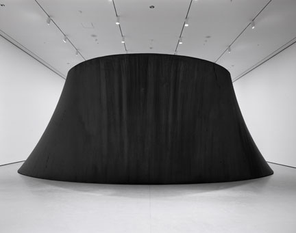
Richard Serra
Torqued Torus Inversion, 2006
Weatherproof steel
Two torqued toruses, each overall: 12' 9" x 36' 1" x 58' 9" (3.9 x 11 x 17.9 m),
plate: 2" (5.1 cm) thick
Collection the artist
(c) 2007 Richard Serra / Artists Rights Society (ARS), New York
Photo: Lorenz Kienzle
Like I said before, Serra has thought harder about space than any artist, ever. He has devoted his life to study of the way that space might be navigated and understood. It might be the space of the room or the way that elevation contours shape a volume of space in a landscape, but he has thought long and hard about different ways of accessing its potential. Sometimes the most appropriate response is by one of his signature steel sculptures. At other locations the best way to address the space might be through one of his paint stick drawings where the oil stick is applied on an 1" thick. Still other times, especially when he was younger, the most appropriate response to situation might be to make a film.
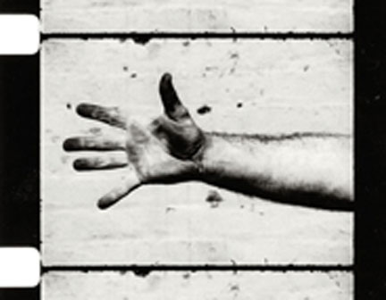
Richard Serra
Hand Catching Lead
Film
Museum of Modern Art, New York
(c) Richard Serra
I was a little disappointed to walk through the show to find that most of the work were his steel sculptures. The danger is that if they are not presented in the appropriate context they become like caricatures to his approach. His steel sculptures are great but if you can not have access to thinking and the original impetus that created the work, you can not go very far. If MoMA is not going to do a true retrospective of Serra's work, then who will? That is why the show is a missed opportunity. If Serra has devoted his life to thinking about space, his raison d'etre, why didn't he do an installation in the atrium where we could have experienced one of his site specific installations first hand?
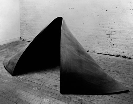
Richard Serra
"To Lift", 1967
Vulcanized Rubber
Photo by: Peter Moore
(c) Richard Serra 2007
That is why I felt a little stunted walking through the show. Somehow at the last second, there was always something about the installation of the work that made his work seem to be presented in a way that was incompatible with previous installations of Serra's work. It might have been the Plexiglas railing around the Prop pieces, or the higher ceiling for Delineator, or the inability to properly walk around Torqued Ellipse IV in the sculpture garden. I am sure there are good reasons for each of these: The Prop pieces really are propping lead plates against the wall and if someone walks into one of them, or is not paying attention, it is a dangerous situation. Maybe dropping the ceiling for Delineator was too expensive because of all the lighting and fire sprinklers would have to be relocated. The sculpture garden is small and Serra's sculptures are big, so perhaps there would have inevitably been a problem. But it is still the cumulative approach of all these decisions, whether they are justified or not, that somehow misinterprets the raw experience of seeing Serra's work. In a place like the atrium, where we might have experienced one of his site specific installations first hand, we were treated to work by other artists, besides Newman's Broken Obelisk, that really do not have anything to do with his way of thinking.
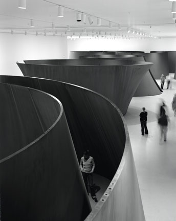
Installation view of Richard Serra Sculpture: Forty Years in the second-floor Contemporary
Galleries at The Museum of Modern Art. Shown: Sequence. 2006. Weatherproof steel. Collection the
artist. Torqued Torus Inversion. 2006. Weatherproof steel. Collection the artist. Band. 2006. Weatherproof steel. Los Angeles County Museum of Art. Gift of Eli and Edythe Broad. (c) 2007 Richard Serra / Artists Rights Society (ARS), New York
Photo: Lorenz Kienzle.
Serra is at his best when with completely rigorous logic, he creates spaces that are open ended and ultimately indefinable. It allows the viewer to participate in the creation of his spaces. I just wish the show had let us see more of it. This show would have been the perfect way to reframe some of the ideas that drive his work. Like I said earlier, no sculptor has put more thought into the problems and pleasures of navigating space than Richard Serra so lets see more of the paths that he has created. Serra at his most powerful is, for me, not necessarily through his large steel sculptures, but in his way of thinking of developing space. It his approach to materials combined with the constraints and potential of a given environment that yield such an enriching experience. Serra's work, and his thinking, are more than what just looking at his steel sculptures would reveal.




![[TypeKey Profile Page]](http://www.portlandart.net/nav-commenters.gif)