
|
||
|
Portland art blog + news + exhibition reviews + galleries + contemporary northwest art
|
||
Jenene Nagy's False Flat at Linfield Gallery 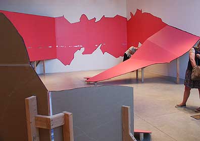 False Flat (detail) Taking over the entire Linfield gallery Jenene Nagy's False Flat is one of the more ambitious solo shows in recent Portland history, with the added promise of a creating a lot more headroom for work her to expand. Until recently I had questioned whether Nagy (PORT's business manager) was going in a fruitful direction but after the controversial The Hook Up group show it was apparent she had made a major breakthrough by simplifying and working larger. 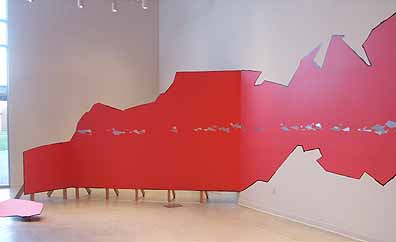 False Flat is the first solo outing to expand on that development earlier this year and at over 5 times the size of that large sampler it is quite an eyeful. Kudo's to Linfield College and curator Cris Moss for championing new and exciting work. In the last 10 months they've really stepped up. Nagy's construction consists of flat planes of electric pink paint. This coating of color courses over the original gallery walls and drywall structures. The overall effect is of color traversing the space like a railroad with the viewer's eyes as the train; sometimes the rails are running on flat white parking lots (gallery walls) and at others it is crossing a series of man-made trellises. This river of pink consistently flows over flat or faceted walls mimicking interior decor paintjobs and the time tested paint on panel option. It's like Tomma Abts work on growth hormones. 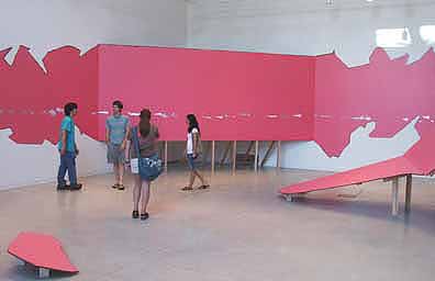
Nagy's installation is partly an analog for human industriousness, which is complicated by the often jagged ridgelines that are occasionally punctuated by flat planes resembling billboards or a drive in theater. It also calls to mind the southwestern landscapes of the Roadrunner cartoons and the heart stopping crags of the Columbia River Gorge (carved by biblically proportioned glacial floods). This information suggests that the distance between cartoons and the great outdoors as a mediated and civilized or "dry walled" experience isn't as wide as most might expect. In fact the old route 66 paradigm of billboards, the land and gas stations is so common we don't see it anymore. 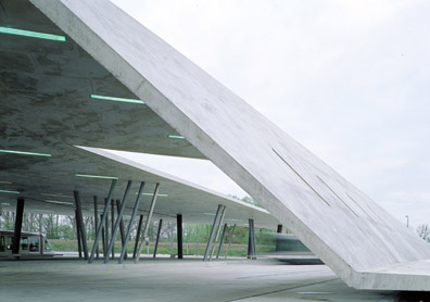 Hadid's Car Park © Helene Binet It also reminds me a bit of Zaha Hadid's Car Park and Terminus Hoenheim-Nord in France because it extends and blends the vernaculars of different types of space both interior and exterior like an unfurled carpet. The difference here is that Nagy's work is free of function, borrows more from geography (and earthquakes) and can operate purely as an experience. 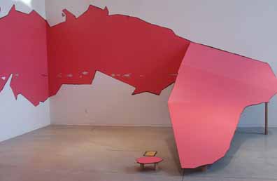
This natural/manmade reading is further enhanced by shiny chrome triangles that glint at the viewer as they walk by. Are they headlights, bumpers, reflective warnings or the waters of the Columbia River or the Pacific Ocean glinting on the horizon? It isn't a separation of man and nature it is an artificial leveling of the two, not unlike an urban rock climbing wall. False Flat acts as if Nagy has blended the hotrod, roadside attraction billboards and scenic views into a suburban experience that doesn't feel suburban. Instead it feels like the disorientation one gets from architecture by Rem Koolhaas, Zaha Hadid, Daniel Libeskind and Thom Mayne whose Caltrans building in LA is an architectural billboard. Still it is most obvious precedents are the dislocation produced by Robert Smithson's work and to a lesser extent the woozy body awareness one gets from Richard Serra's torqued steel. 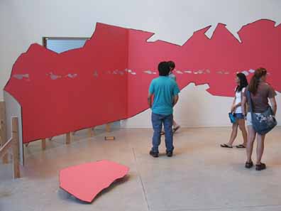
Also, Nagy's open poetic rawness of the materials is indebted to Richard Serra and Richard Tuttle but with a distinct twist, the work resembles stage design and movie backlots, creating a cinematic experience for the viewer. True, Nagy's work is still evolving and hasn't reached the kind of elemental poetry found in work by Tuttle, Serra, Jessica Stockholder or even Katarina Grosse but she's awfully smart so I'm not going to cut her any slack here. This is solid, interesting work that with a just little more spatial-conceptually woodshedding could be international star making material. Still, I like False Flat a lot more than the put on fetished rawness of Urs Fischer who seems to be milking September 11th and ripping off Gordon Matta Clark with his drywall installations (I prefer Fischer's other work). Ditto for Felix Schramm. 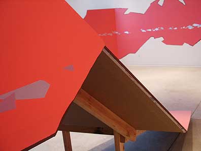
The difference between current art stars is that Nagy seems to have more innate staging aspects than Katarina Grosse (who uses the space given her more pragmatically to airbrush lush neon paint) and seems to be more balanced between creation and destruction than Urs Fischer who seems to evoke destruction and loss. Like her friend Stephanie Robison's work there is a pop element here but Nagy's work is sportier, more Nike, Adidas and skate park like too. Maybe Nagy could channel some of the modular pragmatic/spatial interventions found in the work of Renata Lucas? Still Nagy's on a different path, one that incorporates design, urban sprawl and the wilderness into a kind of built environment/amusement park/movie set/apocalypse redevelopment. It is also exciting that False Flat seems to both support and reject a Greenbergian reading of "flatness" as well… and people wondered how the Greenberg collection relates to the local scene? Nagy's development here makes sense as Portland is rapidly redefining itself as a center of design, urban planning, green space, rapid real-estate development and of course art and like a lot of local artists like Joe Thurston, Jacqueline Ehlis, Sean Healy, Jesse Hayward, Brenden Clenaghen, Stephanie Robison, Laura Fritz, Bryan Schellinger, Ellen George, Tom Cramer, Matthew Picton, Joe Macca and Chandra Bocci etc. Nagy is also channeling an interesting zeitgeist where design + materials and spatial presence = very different and interesting art that asks questions about how we live as a function of design and materials. Also, besides Bocci, Healy, Ehlis and Picton none of these artists has made a single piece or body of work of comparable size to False Flat and it further ups the ante for a peer group that has become increasingly active and popular beyond the Northwest. Nagy is some of the freshest new blood on the west coast and would have outshown a lot of the work at the Hammer's Eden's Edge show. The difference is the Northwest's craggy spatial character which has seeped into the process, kinda like Clyfford Still meets Katarina Grosse via Gordon Matta Clark if he hadnt had issues with his dad. 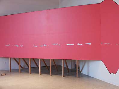 True, size doesn't automatically equal quality but False Flat is a convincing solo by Jenene Nagy due both to its disorienting and reorienting visceral experience and its sucessful scale. The gestalt here complicates the manmade and natural environments in a way that puts the viewer in their own subjective movie set. False Flat makes a statement by filling big shoes, hitting important and difficult issues like the artifice of entertainment, wilderness, the built environment, the role of painting in installation art as well as creating a cinematic set for viewers to engage. Something about False Flat really rings true, so keep an eye on this one. Posted by Jeff Jahn on September 06, 2007 at 12:25 | Comments (0) Comments Post a comment Thanks for signing in, . Now you can comment. (sign out)
(If you haven't left a comment here before, you may need to be approved by
the site owner before your comment will appear. Until then, it won't appear
on the entry. Thanks for waiting.)
|
| s p o n s o r s |
 |
 |
 |
 |
 |
 |
 |
 |
 |
 |
 |
 |
 |
 |

|
Site Design: Jennifer Armbrust | • | Site Development: Philippe Blanc & Katherine Bovee | |
