
|
||
|
Portland art blog + news + exhibition reviews + galleries + contemporary northwest art
|
||
Heart of Darkness: Eden's Edge at the Hammer Museum
There is a proliferation of thousands of signs competing for your attention, and on that Saturday at least, it was all brought together under a beautiful warm blue sky. Sunset is a great connector and reveals the essence of Los Angeles in a way that movies or literature can never quite capture. Curated by Gary Garrels, Eden's Edge: Fifteen L.A. Artists, at the Hammer Museum until September 2, is a similar cross section of the art scene of Los Angeles bringing together work of artists as diverse as Ken Price, Lari Pittman, Matt Greene, Liz Craft, Anna Sew Hoy and the late Jason Rhoades. I felt that when I was walking through Eden's Edge, I was traveling up river on my own trip wandering through the various studios of Los Angeles artists and wondering how deep the river really goes.
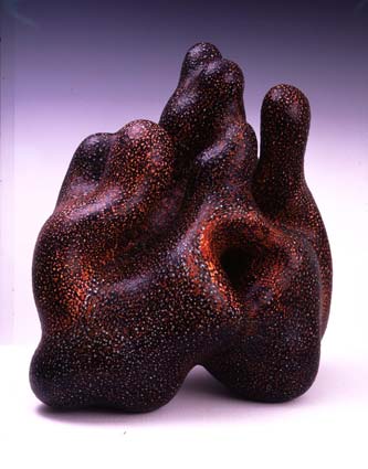
Los Angeles is physical and visceral, a land of sun tans and small bathing suits especially in the summer. Maybe that is why New Yorkers have always been slightly suspicious of what happens in Los Angeles because from the outside it seems too easy. Sex, sun and glamour are its biggest exports and Ken Price gives a us a way to feel and explore the surfaces of those bodies, at least with our eyes. The sculpture is constantly puckering and bulging, alternately revealing and concealing. It is like the way the old Chinese painters describe the body as mountains and valleys. One explores the sculpture the way you interact with another human body except that the more you explore, the more it changes so that you are never quite sure what you are looking at. Are the sexual references real or are you projecting those experiences on to his sculptures? You are never quite sure and he keeps you off balance by never explicitly letting you know one way or another. I found Price's work compelling sculptural equivalents of the dramatic changes of scale and distortions that you find in De Kooning's paintings. De Kooning was able to turn a thumb into a thigh into... well, you can use your imagination from here. In Price's work, you are never quite sure of what you are looking at so it is up to you make your own sense of the experience.
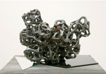
Also, I was reminded off Araki's photographs of beautiful Japanese girls tied up in strange and interesting ways. In both cases, the ropes changes parameters of the body or object so the language of the experience so that is richer and more complex. Dark Cloud Version II sits on partially on a white mirror and partially on a black so not only is the piece doubled in the reflection of the mirror but it also provides a two dimensional graphic equivalent of the interaction of the solid and voids of the main sculpture.
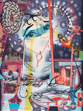
To me Pitman's paintings are about the movement of the body walking down the street. The things that we see are flattened together in our minds that is usually different from the original experience. Pitman makes images of the signs, patterns and textures and compresses them into create a critical mass that can start a nuclear reaction. When the painting works, the images go nuclear and the paintings completely transform from being an accumulation of images into a sort of transcendental state where everything has its place and the world is experienced holistically.
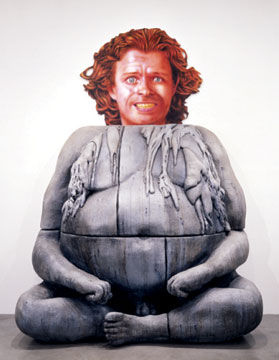
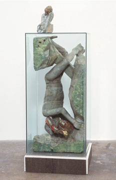
The piece is a weird mixture of the language of painting and sculpture. It reminds me of those children's books that as you flip through you can combine different heads with different bodies. The painting panel was pretty clever because unlike most painting you do not sink into the space of the picture plane. In this case, the head is read as a depiction, like a trompe l'oeil, and explodes off the wall. The body is also strangely inert and you read it not as a single piece but as an accumulation of individual blocks. The way that it is assembled reminds of great sculptures of Angor Wat. The whole piece reads as an inversion about the way you feel and depict space in different dimensions. Despite it girth, the monochromatic gray color and the large joints between the units of the body, flatten its presence in a way that is closer to painting than to sculpture, or perhaps redefining the preconceptions of sculpture with the language of painting. These inversions make the piece a lot more complex than you might realize if you thought the sculpture was a big slap stick joke.
Monica Majoli's beautiful but faceless drawings like Hanging Rubberman #3 look like they were imported straight from the sex clubs on Sunset. Painted in beautiful washes of gray, pink and orange the images depict a faceless body in various positions in a rubber suit with dildoes placed in unusual locations. Anonymous sex is one thing but it is strange that these images that are so clearly about sex and yet so divorced from acknowledgement of the forms and contours of the human body, but I am sure was her intention. If sex is sometimes about procreation, these drawings are about the seed. We do not know anything about the person that inhabits the suit. They could be male or female, happy or sad, we just do not know. It is the disconnect from the body, or maybe a soul, that I find troubling. She is emphasizing human sex as being quasi-vegetal, divorced from the experiences and features that make us human. The effect is heightened by the mostly gray colors of the body and the background of the drawings are deliberately lifeless, like the body that inhabits the suit. She drains the life out of sex and we are left with are these drained, soft, limp gray shells, or perhaps seeds, painted in the colors of a sunset on a rainy afternoon waiting for Spring.
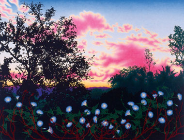
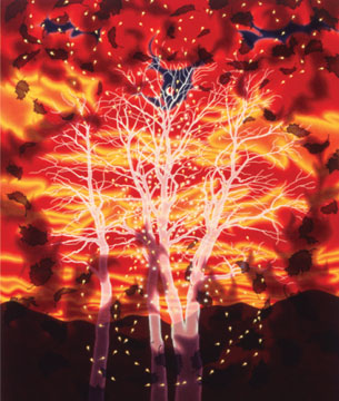
Her best paintings have a sinister black shadows in the middle ground the cast the foreground and background into high relief. In Fire, the black shadows bring out the unreal glow of the bright colors of the sky as if the sky and not the land was on fire. The appearance of the paintings is therefore always magical where the effect is more real than real, like a hyper lucid dream.
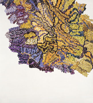
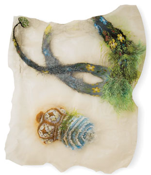
These small circles are then reconfigured to create and unusual and beautiful micro-landscapes. Perhaps because the circle is directionless, the forms that she creates are curling and spiraling waves that pulse across the paper. The effect is not unlike looking at things in a petri dish through a microscope. You are given a view to a whole other world with its own rules and language.
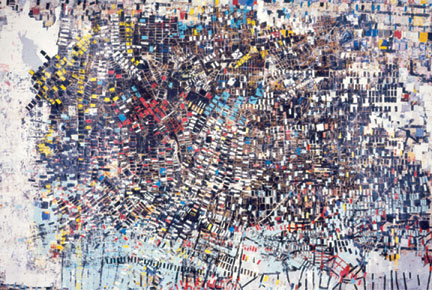
Mark Bradford's paintings like Black Venus are large assemblages of layered rectangles of cropped posters so experiencing the paintings are like looking down on strange, alien cities. The small, colorful rectangles give the work a repeating tempo that alternately flatten and deepens the space. His paintings remind me of the color paint chips in Rauschenberg's Rebus. He applies the rectangles not in a one long horizontal line but across a two dimensional, and occasionally three dimensional, plane. The paintings become accumulations of the textures and layered spaces. By varying the color of the rectangles, he is able to create a rich web of spaces in which the painting is both assembling and dissolving at the same time. When you look at the painting you float in this interstitial space where you are not sure about scale, and so you open to yourself to the space and the experience.
His drawings were equally beautiful through a relentless patterning created by pressing through carbon paper. In all of his work, he seems to be asking what place does art have in our lives, if the definitions of classical beauty no longer apply. For me, I have always felt that it is for each of us to decide uniquely, individually.
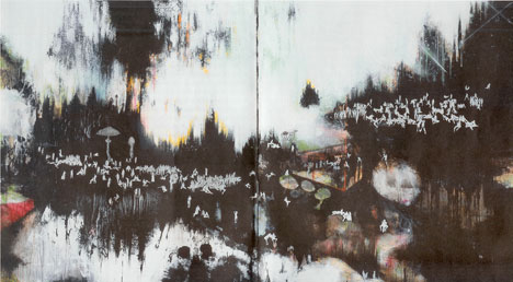
I could not shake the feeling the feeling that when I was looking at Matt Greene's By the Lust of the Basidiomycettes shall every perversion be justified (again, brevity of titles and reviews has no place in L.A.) from 2004, that it was a modern version Hieronymus Bosch's Garden of Earthly Delights. Although Greene's painting might have been called Penthouse Girls of the Aurora Borealis, it is a wonderful inventory of what the male mind must imagine that girls must do when they are left to their own devices. Actually there might be some males, amongst the hundred figures in the painting, it is just hard a little hard to tell. The painting is an epic panorama of sex, even if it is more or less limited to one gender. There is no solid ground, even the sky (or clouds or lights) comes dripping down on the playful participants. It is the inventory of participants and positions that reminds most of Bosch. When we look at his paintings, we are not participants, we are observers and most likely very far away. Although there are plenty of telescopes in Manhattan apartment buildings, it is the quality of being a voyeur that seems most like Los Angeles to me. Maybe because the people that you meet walking down the street, at least during the summer, are not really wearing very many clothes to begin with or maybe it is all the stories you hear of crazy parties in the Hollywood Hills. The sense that you are in the middle of something fun and exciting but somehow always separated from truly feeling that experience seems to be a critical part of living in Los Angeles. Maybe it is because Los Angeles is so big and there is always the unconscious fear that everyone shares, that there is always a better party going on somewhere else.
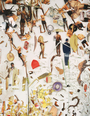
The inventory of body parts reminds me of the Japanese filmmakers that attempt to create a character whose is beauty is derived by combining the features of the twenty most popular idols. But Hundley presents his work in a deliberately flat footed way. The people in the piece are not movie stars or models, they just seem more or less or normal. I think it somehow reminds me of a car factory, where all of the parts of car are stored before they are assembled. Every piece is just hanging there, waiting to be used when it is needed.
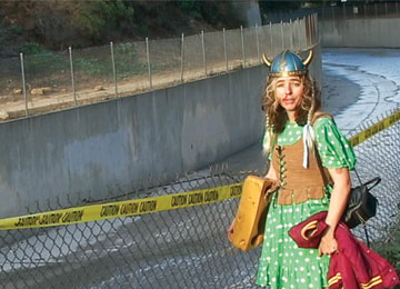
Is the piece about the woman who is performing a charming rendition of Led Zeppelin song on a piece of cheese on the side of the road or is it about the cars rushing by and the occasional siren. It made me wonder if each one of lives our life while the rest of the world, no matter what, quite literally passes us by.
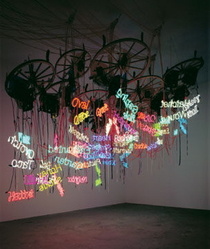
When you look at Rhoades' work, it is literally out of control. The work looks like there was a hurricane or a tornado in a neon shop. The pictures do not do the piece justice. They make the piece seem more arranged and designed than it actually is. There are about fifty neon signs all floating in different directions in space, suspended by wagon wheels and colored Plexiglas. The neon signs are different descriptions and slang for female genitalia but it is hard to concentrate on just one sign because you are overcome with the gestalt experience of the whole space. It is like Jason Rhoades ran through Bruce Nauman's neon signs and just kept going into place that nobody realized existed. At some level, the work feels like he left the language of the art world and went native, embracing the bright colorful signs of porn shops and strips clubs that are central feature of the life on Sunset. In his work, there are no more rules, "ideas", or cute sculptures. Everything that is not true breaks down. His work takes the chaos and confusion of the real world head on. He never backs down, never retreats, never surrenders. When you walk into the room you can almost feel him grab you by the back of the neck and force forward into the unknown. It is like being in a car with him and driving down Sunset at a 150 mph. It is so fast everything begins to blur together, it is extremely dangerous, and he never hits the brakes. As a passenger, or you when look at his work at the Hammer you have to come to terms that you are not in control, he is. Rhoades' work at his best is not fun or exciting, but terrifying. The Chandelier practically fills the chapel room and so you have no choice but to surrender to the experience. You are overwhelmed and can barely breath because it completely fills the space, and he just keeps relentlessly driving at you until the boundaries begin to dissolve and you discover a new unexpected freedom. He attacks and mocks you, always challenging you to take the next step and constantly trying to make you set yourself free. Your preconceptions and ideas begin to break down because they are revealed to be artificial constructions because they are based in ideas and not experience. It is about the body and not the mind. His work transcends the kitsch and irony that plagues most contemporary art, he found a way to push through veil of the everyday world and create a real experience. He does not quit until you discover your freedom. It is not about whether or not you like Chandelier, which is sort of beside the point, it is that you can not escape because it sucks up all of the air and space of the room. If you walk in the room, you have to deal with it, you have to enter his world. All of the theories, posturing, and ideas are either broken down or thrown away and you are left with a strange form of transcendence. At the end of the journey we find ourselves right back where we started in the real world but with a new vision, or at least a new way to see the world around us. Maybe we learned a thing or two about ourselves and Los Angeles along the way. The neon signs, the advertising signs, the strange colors of the buildings, the electric night of the 24 hour TV screens, and the ridiculously large palm trees are all equal fodder for the artist that is willing to embrace them and push through to other side. I think this the real value of Eden's Edge because it demonstrates that beauty in Los Angeles is definitely not just skin deep. It is deep well spring of an energy that sees itself very differently than most other cities. I learned that art in LA does not always have to be passive, that it can still engage Sunset Blvd. in its own language and that is does not have to be cloistered away in museums and galleries. In a city like Los Angeles that is constantly reinventing itself, maybe it's important that at the end of the journey we find death, and perhaps a new way of living. "They howled and leaped, and spun, and made horrid faces; but what thrilled you was just the thought of their humanity -like yours- the thought of your remote kinship with this wild and passionate uproar. Yes, it was ugly enough; but if you were man enough you would admit to yourself that there was in you just the faintest trace of a response to the terrible frankness of that noise, a dim suspicion of there being meaning in it which you-you so remote from the first night of ages-could comprehend. And why not? The mind of man is capable of anything- because everything is in it, all the past as well as all the future." Postscript- There are lots of ways of making art. Jason Rhoades chose his path through immersing you in a sea of neon signs and environmental installations because it seemed true to his experience of the world. There is a strange symmetry to his work and the way that he died but I think it would be a mistake to glamorize the tragedy of his life by making too much of the live fast, die young credo, especially as a path to making great art. This very partial list is a role call of the dead with a lot dysfunctional personalities and these are only people involved in the visual arts. I did not include film makers, writers, or rock musicians... There has to be a better way. Plenty of people throw their lives away and never make any kind of art all. Jason Rhoades made his choices about the way he chose to live his life. There is no glory or glamour in dying of a drug overdose, it is probably very dirty and sad, just ask the family he left behind. It was just a choice he made at one moment that perhaps had unexpected consequences. It does not make him a better artist. It might be helpful to look at Jason's work in terms of its restlessness. He was never satisfied until he started making art that took the objects and experiences that we have around us everyday and transformed them into a new way of looking at the world. He found transcendence in the neon signs of strip clubs and porn shops and in environments that when you first entered them, you could not believe was art. But it was art, and it was a new way of looking that crass consumer culture that we live in. He was like the antithesis of pop artists: Warhol, Lichtenstein, Rosenquist, and Oldenburg because like the culture he engaged in, his work was layered, complex, confusing, dirty, and you were never quite sure what you were experiencing. He was just way out there, looking at the world through a new lens that showed the cracks in the façade of society, and he made his art to exploit those fissures. Posted by Arcy Douglass on August 24, 2007 at 9:00 | Comments (5) Comments It was interesting how blase most of the artier Los Angelenos we met were about the show... a somewhat inevitable survey and I felt the same until the Rhoades piece, he makes other accumulators like Kieth Tyson and Lari Pitman seem so tame by comparison. A lot of the work was "MFA outsider art" from insiders but Rhoades delivered the goods. Other standouts were Anna Sew Hoy, Sharon Ellis and the Dodge & Kahn video. Hoy's macrame/ceramic works are so LA in the 70's I mostly related to them as childhood totems (I lived in Brea from 1976-1980). Hundley's work is pretty a unconvincing pastiche.... very MFA looking work, especially after the Rhoades it seems like such a calculated statement and effect that delivers on its lowered expectations. Ok the word I'm searching for there is "weak". Pitman's a legend but Rhoades truly delivers and ups the ante on the aesthetic the painter partly invented. Pitman plays Gorky to Rhoades de Kooning. Except that Pitman is no Gorky... more Max Beckman meets LA. LA's good with more energy than NYNY but besides the Rhoades I didn't see the "quantum" level of ass-kicking it will take to push LA's art beyond its real competition... Hollywood. Not really a new issue. Posted by: Double J Thanks for the thoughtful assessment. You're on to something with "a slow process of accumulation that generates an unexpected complexity" being a common element in the work chosen for this exhibition. I saw it in June and was knocked out by the Rhoades piece in that tight space; it just seemed to embody the glam and crassness of much of our image of LA. And you're right: this is one you really have to experience close up, in 3D, to feel the impact, just as those delicate Rebecca Morales patterns need to be seen close up to appreciate their detail and depth. The fine Bradford, Bishton and to a lesser extent Hundsley pieces all reward study of their exquisite detail in a way that's hard to appreciate on a computer screen. Hope you also got to see WACK!, the feminist art historical survey that took over the Geffen (formerly Temporary) Contemporary, and the amazing Dan Flavin tribute at LACMA, one of the most mind blowing I've ever seen. Both of those demanded capacious space, and got it; adequate space is often a problem in Portland. Posted by: brett Thanks for that interesting review. I really enjoyed this show and I liked picturing it again with your geographic anecdotes. Garrels was criticized for making what some felt were obvious choices, but I like how the show really captures the LA aesthetic- Hollywood glitz meets 6th Ave seediness with a fair amount of laid-back beach vibe thrown in. I was blown away by Rebecca Morales (I'd never seen her work before) and Eliot Hundley (seen it but liked it a lot more this time). I also really liked the very non-LA clunkiness of Monhan's sculptures. I could imagine a huge installation like some mixed-up anthropology museum. Matt Greene's work is, from a native Northern Californian's biased perspective, the most quintessentially LA. It's ambitious and artificial and the mix of glamor and grit initially seduces me, but no amount of digging reveals an interesting formal or conceptual vision. His show at Peres drove home that his agenda is as vapid as it seems. Although I've always liked Lari Pittman and Jason Rhoades, neither work resonated beyond the initial visual euphoria this time. On the way home I imagined what a Portland version of that show would look like- I really liked how each artist had his or her own space- I wish more group shows followed that model. Posted by: inexile I liked that there was more than one work from each one of the artists (except Jason Rhodes) and that each of the artists were given, more or less, their own room. Having more than one work from the artist was nice because you could the sense of how their work was progressing or what kind of parallel ideas that they were following. The feeling for me was like walking through the studios of fifteen artists from LA. Not necessarily best, but not the worst, just the ones that fit Garrels' aesthetic. I was okay with that. I think anytime a group show tries to be definitive (think Whitney Biennial) I think they run into trouble. I thought that the work was presented in a way that made it look beautiful whether you liked the work or not. Liz Craft's space was maybe 30' by 20' and it was just filled with the motorcycle and the hippie. The work could just breathe. I think the space is also important for the person who walks through the show. A little extra space or an under hung room might give them a chance to catch their breath and get ready for the second half. Like an intermission. It would be great to have a group show like this Portland but perhaps more importantly, at least for me, I would love to see it at a venue in which each individual work could be presented in the best possible way. Most of the shows are a little overcrowded and sometimes poorly lit. I would love to see a show where the work was just presented in a way that it looked great. Thanks for your nice comments. Posted by: Arcy It is the last weekend for the show and it is great so many Portlanders saw it.. in some cases we have artists who bo similar things better, other cases it really highlights the differences. We definitely have a more Northern, high-minded sensibility... civics are more respected in PDX than LA which is a kind of squatter's camp that turned into a huge sprawling city. Im not against that, that has its own chaotic charm. To that the Rhoades was amazing... and the whole show seemed to set him up as King Kong... all of the other artits used some of the vernacular he used but his wor was the most promethean and not just because he's gone. As far a group shows in Portland go I agree... most are way overhung, that is why Organism's Model Behavior doesnt cram stuff onto every wall, nook and cranny. Each artist's work needs to breathe and a curator should be sensitive to space... Bruce Guenther's Camoflauge show does that too. If the work is any good it deserves some space and sensitive treatment. I suspect the CNAA awards are designed to give each of the final artists beathing room too. The crammed "more participants are better" anti-aesthetic shows have lost all appeal. If a show is worth putting up it's worth not cluttering it up like some sort of gladiatorial demolition derby for art. It is about respecting the art. Posted by: Double J Post a comment Thanks for signing in, . Now you can comment. (sign out)
(If you haven't left a comment here before, you may need to be approved by
the site owner before your comment will appear. Until then, it won't appear
on the entry. Thanks for waiting.)
|
| s p o n s o r s |
 |
 |
 |
 |
 |
 |
 |
 |
 |
 |
 |
 |
 |
 |

|
Site Design: Jennifer Armbrust | • | Site Development: Philippe Blanc & Katherine Bovee | |




![[TypeKey Profile Page]](http://www.portlandart.net/nav-commenters.gif)