
|
||
|
Portland art blog + news + exhibition reviews + galleries + contemporary northwest art
|
||
Off the Plane and Into Space: THE HOOK UP at the New American Art Union
By exploring the rich area of cross fertilization between painting and sculpture, the show THE HOOK UP at New American Art Union provides real insight into new ways that art can get off the wall and interact with the viewers in real space. Though these ideas are not new they are becoming increasingly relevant. You could plot a pretty clean line of development from Malevich and the Russian Constructivists through Picasso's flat metal sculptures to Ellsworth Kelly's ability to make art that interacts with the space of the room. Historically, these artists have questioned the viability and relevance to contemporary culture of using the rectangle of the picture frame as a picture window into some place else, which in the past has probably been painting's greatest strength. If you look at The Mona Lisa, you are looking through the window set-up by the picture plane, you do not share the same space. The Renaissance invention of perspective was an attempt to make the space of the picture plane coherent with the space of the room and the way that the human body sees space. The art that is exemplified by Kelly which is the conceptual precursor to this show is about something else. It is, in a sense, post-perspective. You inhabit the picture and the space in real time. Five hundred years of art history in two paragraphs. So what does this have to do with curator Jesse Hayward's show? Well, everything.
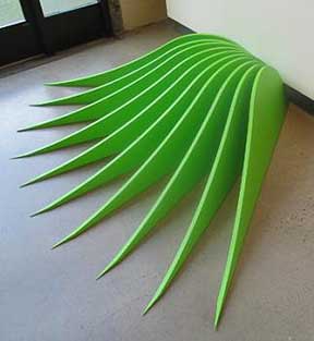
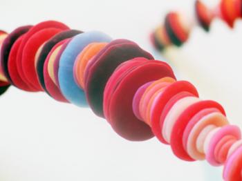
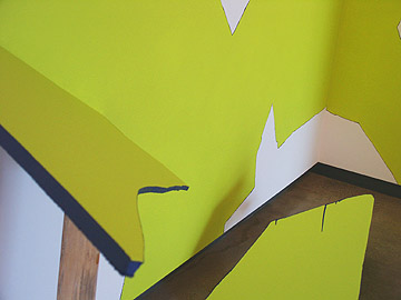
You start off looking at (PORT writer/cofounder) Jeff Jahn's piece Where We Go from Here . It does not cleanly sit on the wall but rather sits between the wall and floor. Not quite painting, not sculpture, but something else. His work creates a boundary that articulates a volume of space between the wall and the floor. The piece is made of a series of planes that are all cut in a triangular/ agave leaf shape that converge on a single center line that is supported through friction to the wall. The bright green gives the work all kinds of organic references. Because it sits adjacent to the wall but extends out over the floor, it sets up a territory that changes the experience of the room as well as changing as you walk around the room because your line of sight coincides with different parts of the work. Next is Ellen George's beautiful LaLaLalia. Her piece is like a beautiful Hawaiian lei that is made of different shades of red polymer resin rather than flower petals. The piece works in two ways: first, it calls into question the solidity of the wall because you can imagine the the resin necklace somehow going into the wall and comes back out again. It is pretty cool that a single gesture of form and color can destabilize a space by turning a solid wall into an ephemeral plane. The second way the piece works is that it becomes an offering to the soul of the wall, if there is such a thing,in the same way that you leave flowers at the foot of a statue of the Buddha. I was surprised that such a small piece could elicit such a strong reaction and be so successful in transforming the space.
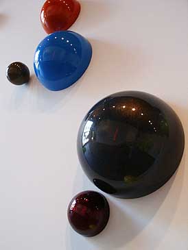
Jacqueline Ehlis's Glitter installation of powder coated spheres and half-spheres are placed in an organic way, creating connotations of either the celestial bodies in the night sky or for those of you that drink too much, bubbles in champagne. The spheres are in different sizes and the play between the full and the half spheres gives the work a great vibration and rhythm that carries through the piece and enhances the free-floating quality of the work. The powder coating is in a rainbow of different colors that range from yellows, reds, blues all the way to deep blacks. The black ones were my favorite because you get a beautiful iridescent black rainbow effect which also reflects the whole space of the gallery. In the show so far: Jeff articulates the volume of space in front of the wall, Ellen penetrates the wall to make it whole, and Jacqueline obliterates the wall by implying that the wall does not count, only spheres matter. The white space of the wall is turned into an ambiguous, almost liquid, middle ground in which float these spheres. It is fun too look at Glitter because as we are tied to our everyday lives who wouldn't want float and interact with one another as gently as those spheres.
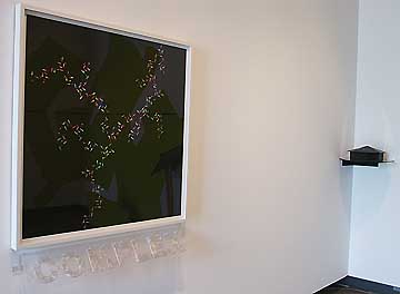
It is important to realize that each piece in the show looks different because it shapes space differently. Sometimes a piece might change the space of the wall while another one might work with the space inside of us. TJ Norris's Placebo Complex is a beautiful digital print of drug capsules that are arranged in a way that suggests a variety of natural features from rivers to the veins in which drugs might actually do their work. You can really see TJ's hand inside the print because you can see the way that each pill was placed, lit and colored. TJ's brought a more three-dimensional quality to the piece by placing the word "complex" in clear extruded plastic that is filled with clear pills. This assemblage is tilted off the bottom of the print, bringing it more into the space of the viewer. His piece is perhaps more about an inner space, rather than an outer space.
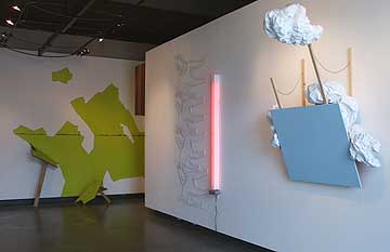
(PORT staffer) Jenene Nagy's Meadow is a striking example of pushing back out of the space of the gallery. The overall effect is like an abstract trompe l'oeil in which the wall is shattered to reveal a bright and luminous space just out of reach. The effect works because the painting on the wall works well with the painting on the floor. In Jenene's case, her painting works because she turns the surface of the wall into a plane as thin as a piece of paper.
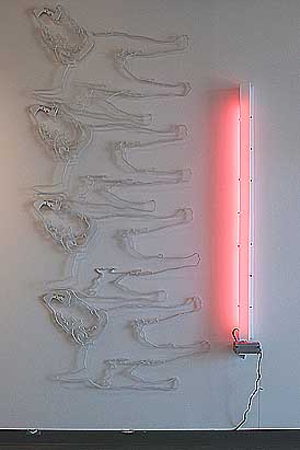
Sean Healy's Neighborly which is made of cut outs of sniffing dogs lit by a bright pink fluorescent light is also very fun. One can imagine all the societal/ sexual/ clubbing references for these dogs under a pink light but I will leave that for the PORT readers to explore for themselves because I know that all of you have very vivid imaginations. The piece works because the fluorescent light provides the rosy glow that you might find at midnight on a club floor. It is like dogs, or like people. I was surprised to see that what is implied or might be read into the Ehlis' floating spheres becomes explicit and emotional in Healy's work. In Ehlis' Glitter we float along the surface of the wall bouncing into one sphere after another which is like meeting one person and then going on to the next. In Healy's work, I suppose it is more like heavy petting as we meet and examine everybody we come across with the obvious sexual undercurrent. I am not even sure if Ehlis is necessarily interested in the same sort of questions and experiences that is the basis of Healy's work, but the installation makes for an interesting dialog and Healy makes you re-read a lot of the other work in the gallery in new ways.
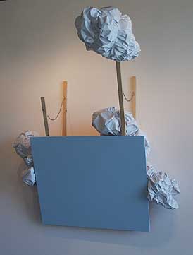
Stephanie Robison's Now Available is a tilted, blue, painting-panel that has these bundles exploding from the top and sides. The sticks and the tilting of the panel and the exploration of the front and back of a painting is to me coming right out of Jasper John's work. In both cases, there is a fascination with what exists behind the picture plane and how to open up that space to the viewer. The fabric bundles explode from behind the painting like pop-corn and are a nice material complement to the flatter panel. It is like combining the crushed metal language of John Chamberlain and the flat box of Donald Judd into the same piece. Looking at the panel, which is blue on the front and red/orange on the back, is like watching a dam give way. This lively, dynamic quality is a counter point to more static pieces in the show. The color on the back of the panel is also interesting because you see its color reflected on the wall. It reminds you that every plane, and potentially every painting, has two sides. THE HOOK UP at the New American Union presents a new way to explore some more modern ways of taking wall-space off the wall. Jesse Hayward did a great job curating such a wide variety of work and mediums into the confines of the gallery. You can feel Jesse's steady hand behind the selection of the work, making sure that the artists provided work that was not only true to their own language but also played well with the other work in the show. The result is remarkably coherent and clear statement about the different ways that artists can work on, in, and around the plane of the wall. This show is about breaking and rebuilding. At the New American Art Union until June 30, 2007 Artist Talk Saturday June 23rd 1-3PM Posted by Arcy Douglass on June 15, 2007 at 9:41 | Comments (1) Comments wow Posted by: Adios Motherfuckers Post a comment Thanks for signing in, . Now you can comment. (sign out)
(If you haven't left a comment here before, you may need to be approved by
the site owner before your comment will appear. Until then, it won't appear
on the entry. Thanks for waiting.)
|
| s p o n s o r s |
 |
 |
 |
 |
 |
 |
 |
 |
 |
 |
 |
 |
 |
 |

|
Site Design: Jennifer Armbrust | • | Site Development: Philippe Blanc & Katherine Bovee | |


![[TypeKey Profile Page]](http://www.portlandart.net/nav-commenters.gif)