
|
||
|
Portland art blog + news + exhibition reviews + galleries + contemporary northwest art
|
||
New Seattle Art Museum opens, designed by Portland architect 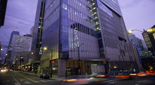 Most of you know the Seattle Art Museum is opening its new wing this week, designed by Portland's own Allied Works Architects. It opens to the public next Saturday and to members today. The building itself is pretty conservative and won't dethrone Rem Koolhaas' library as the most awesome structure in Seattle but in some ways that's good, Ive grown weary of stunt architecture for museums. Seattle is a city that collects architects and it is nice that this building is designed to deflect attention to what kind of art Seattle collects. I toured the new facilities a few weeks ago with SAM's new contemporary curator Michael Darling. For less subjective details check out SAM's design & stats pages here. Some impressions: The old Venturi wing spaces now have a spacious feel… I'll credit Michael and the other curator's hang of the over 1 billion dollars in donated art to the collections. I have no idea why Northwest institutions typically overhang and cramp their collections but SAM doesn't do that for the first time I can remember. (Will the Portland Art Museum thin things out now that that building has been have been up for over a year? It's true they have been tweaking the installations already, why not go all the way?) 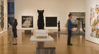 The Wright galleries at the new SAM The new Cloepfil and Co.'s galleries are nice but except for the large gallery with the Do-Ho Suh they remind me a lot of Taniguchi's MoMA galleries. This lack of personality isn't a bad thing as it forces the curators to create all of the compelling moments via the art. Personally, I like it when 21st century art spaces challenge the art somehow. Then again my favorite galleries are the barrel vaulted spaces at Chicago's MCA and those have a very subtle personality defined by what s going on spatially with the ceiling (the Do-Ho Suh room at the new SAM has that). The new galleries have a pretty seamless transition from the old Venturi galleries. Though I prefer museums with distinct architectural voices like the Des Moines Art Center (Saarinen, Pei, Meier), Walker Art Center (Barnes, Herzog & de Meuron) or The Milwaukee Art Museum (Saarinen, Calatrava). Instead this has that slick Seattle vibe which makes sense, SAM is in the downtown grid not in a park setting like DAC, MAM or PAM. It has a downtown corporate vibe, meaning the only really memorable statements come from the art and how it is installed. The stars: the Gerhard Richter room and the porcelain room (Ill explain). First I have to say Gerhard Richter is PERFECT for Seattle. All of the works, donated by local collectors are of the brooding/slick/reserved variety or the atmospheric/brooding/reserved variety; there aren't any take over the room painterly-bombastic/controlled abstractions here. The net result is devastating and I like it better than any of the rooms in his retrospective a few years ago. Still, Gerhard Richter is the German painter Americans are most comfortable with. He doesn't seem to scream like Kiefer does and it is a room worth the trip (though I like Kiefer better than Richter). The porcelain room with is dramatic lighting, mirrors and darkness is utterly fascinating. I should note the Tiepolo for the ceiling wasn't quite installed yet when I visited a few weeks ago. Other standouts: The Warhol Double Elvis (1964) is given lots of space and displayed with its additional silver panel added by Warhol for his retrospective in Seattle. The Pollock has never looked better either, though it is sad it is under glass (Seattleites are notorious for touching art, they really are horribly bad about it…). The Clyfford Still is also an excellent one similar to the masterpiece we saw in Portland recently. Still spent some significant years growing up and working in Washington State so I'm really happy about having this on display. I also love the aboriginal art galleries, always a highlight when I visited SAM in the past. Now they are given their own space in the Fisher galleries. 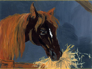
Kilimnik's "Dinner" As far as the contemporary stuff goes the Katarina Fritsch and a tiny Karen Kilimnik steal the show. The Kilimnik is of special significance to me as Seattle's sorely missed Linda Farris was responsible for bringing it to SAM (along with a truckload of other great pieces). Kilimnik's painting of a horse is so tiny but it speaks louder than even the Cai Guo-Qiang does for me (which feels like pointlessly bombastic mall art, though it is purposefully so). The strong presence of Asian artists like Murakami, Chiho Aoshima, Do-Ho Suh and Cai Guo-Qiang keep it from feeling like a pure mini MoMA and remind us yet again the Pacific Northwest is in many ways tied closer to Asia than the East Coast. Overall a serious expansion, and a museum worth visiting more often (I would frequently skip it and visit the Henry instead). True, SAM's collection's makeup doesn't have many surprises but I like what Darling has done with the contemporary install. It has some energy and a lot of dignity. Still, the building itself almost begs to be messed with and as the curators move things around I'm certain its reserve will act as the unobtrusive foil it was designed as. Seattle's challenge will be to not become precious or static with its new museum space and its role in the community (the Northwest artist space is a situation pregnant with promise, especially its connection to the Bronson award). The hope for Seattle is that SAM will lead and be allowed the luxury of making mistakes as a living art city, when I speak to artists up there they often feel the ecology is hemmed in, scripted and sarcastic, where the less original and arid thinking is applauded (don't worry in Portland we encourage the under-informed too often, every city has its own issues). The new SAM is something to be proud of but they have to push their community to be more than just a showcase. The new SAM has to bring about new possibilities to help everyone get over the city's self consciousness as a small big city with big money. Notable to many Portlanders there will be a 35 hour marathon party starting on the 5th, check here for details Check out The Oregonian's interview with the architect too Update: Jen Graves goes ga ga over the install in the Stranger (Darling is an animator, very different from his predecessor... Seattle needs this and I think new SAM gives them more permission to test the art viewing audience. Still, it's gonna take the SAM curatorial staff a bit of time to really tune the spaces, new aquisitions will only help, this is just a first draft. It is true the old SAM space kinda stunk, this one breathes.) Also, thanks to Jen at the Stranger (if only the merc was as good) Christopher Hawthorne writes about SAM's new digs. Posted by Jeff Jahn on May 01, 2007 at 22:07 | Comments (3) Comments "...Ive grown weary of stunt architecture for museums" I think it's short-sighted not to expect museum buildings to be every bit as leading in their design as the art they house. But worse you call such efforts 'stunt architecture' drawing a line between what is possible and what is acceptable. And if artists should be called on to achieve greatness in their work, why should we work against architects to do the same. Posted by: Ibid. Well Im certain you know architecture is a more compromised activity than visual art because it's so expensive to produce and tied to functionality. By "stunt architecture" I'm not saying the stunts arent convincing or worthwhile, sometimes they are and the transcend stunts (Gehry's concert hall in LA). Recently though the exterior stunts have overshadowed the need for some of the interiors duty as show spaces. For an art museum art must be the boss. Still, I love Wright's Guggenheim, I don't dislike idiomatic space I just think it takes certain civic circumstances to make it possible and Seattle isn't in that kind of civic place right now. They seem more eager to broadcast a message seriousness than one acting like a place where radical ideas spring from. It is honest. Also, I agree with you of course... I dont see my statement as an either/or situation. Yet, Cloepfil's design is good enough to age well. Besides, Seattle was shell shocked after Venturi opening and the Holl closing.... Seattle as a community simply could not be expected to be flashy about its new museum and it's a respectable decision, though not an exciting one. For me the primary function of the building, especially one that is focused on aesthetics, has to trump the need to get architectural accolades (respectable is respectable after all). Could they have gone farther?... sure, and I pointed out how conservative it is. The thing about all institutions is one has to look at how resources are allocated and highlighted, in this case SAM needs to develop a world reknown curatorial reputation before flashy architecture would work. Had they tried to go flashier it would have simply strengthened Seattle's art world reputation as a place with money but generally conservative taste in art. True, the new SAM reiterates this fact but it doesn't yodel it from the top of a mountain. It gives SAM room to move, let's see how the followthrough takes shape. To compare it with PAM, who has had a steady stream of cool shows like Hirst, Paine and now Kehinde Wiley... I think they will need something similar, along with a needed series of major travelling contemporary exhibitions. PAM has yet to do that final bit, though it's on their front burner. Posted by: Double J Double J - a terrific response. Of course I couldn't help smiling about your adoration of Wright's Guggenheim, as you're no doubt aware it was criticized - mostly by artists - as being overpowering to the art and unkind to artists. Since then artists from Claes Oldenburg to Matthew Barney have created art in Wright's building that has both acted on it and been acted upon by it. The discussion over art and architecture continues! Posted by: Ibid. Post a comment Thanks for signing in, . Now you can comment. (sign out)
(If you haven't left a comment here before, you may need to be approved by
the site owner before your comment will appear. Until then, it won't appear
on the entry. Thanks for waiting.)
|
| s p o n s o r s |
 |
 |
 |
 |
 |
 |
 |
 |
 |
 |
 |
 |
 |
 |

|
Site Design: Jennifer Armbrust | • | Site Development: Philippe Blanc & Katherine Bovee | |


![[TypeKey Profile Page]](http://www.portlandart.net/nav-commenters.gif)