
|
||
|
Portland art blog + news + exhibition reviews + galleries + contemporary northwest art
|
||
Mississippi May or may not? 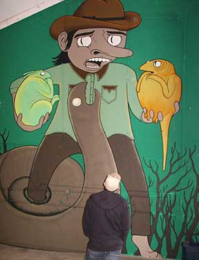
Ryan Shank's mural "Friendly Times With Old Smellyneck" Warehouse shows have a near mythological status in the art world as spaces pregnant with possibilities and as benchmarks of ambitions. Historically, exhibitions like Damien Hirst's Freeze or the goings on at Forcefield's Fort Thunder have introduced new tight knit casts of art world characters and counter movements designed to change very local expectations and redirect the gaze of art viewing audiences. In theory at least, they present a challenge to the status quo and in the case of Hirst or Forcefield, they had lasting effects. Portland has had a ton of warehouse shows; many are good with sustained curatorial merit like last month's Retinal Reverb which practically begged to be evaluated seriously. Others like the 2003's Modern Zoo were pretty much messy or scattershot free for alls with an "energetic" mandate to fill space, with rare moments of interest as the other extreme. Generally, warehouse shows work best when they are noninstitutional. When hitched to an institution they simply become signposts for the host, diverting attention from the artists and usurping the whole raison d'etre. Another guerilla or noninsitutional show, Mississippi:May was not as sophisticated, sustained or focused as last month's Retinal Reverb, but it still holds a good many new names to watch. As ambition goes M:M succeeds more as a scrappy community flowering, a reminder more than a watershed for new standards. That said, several artists deserve some attention and since today is the show's last day it's time to oblige... Overall, Mississippi:May's character seemed more street than any warehouse show Ive ever seen in Portland. It's just more evidence that Portland is always shifting and continues to attract interesting artists who are generally not served by institutions or galleries. It also means those institutions directly involved in serving and developing emerging Portland artists need to address the kind of adventure found here and cultivate their next steps. 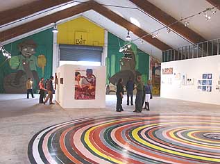 Shanks (background), Wallace (middle), Grey (foreground) First off, the space is memorable and bizarre, a giant A frame warehouse that has intrigued me for years. Think 50,000 square foot Howard Johnsons... I'm glad someone is putting it to use before it is torn down for a large condo development in Portland's hot North Mississippi neighborhood. Initially M:M wasn't encouraging. The outside entranceway was rather Burning Man with two rows of dragon's teeth and it seemed more stagecraft than strong conceptual statement. Once inside though the two giant murals by Ryan Shanks were visually arresting. The Wild West themes of the murals were appropriate as Portland's hyperactive cultural landscape doesn't have a lot of barbed wire yet. In contrast to most of the work here the murals were well scaled to the enormous room. It also got points for not ripping off Barry McGee or his late wife Margaret Kilgallen. I also found the hastily assembled white walls at the beginning of the show distracting. It would have been better to have made half as many decent looking walls or just let the space be what it was. This is the biggest danger in warehouse shows, asking the space to be what it isn't without the requisite budget. Highlights: 
Ansell's Caitlyn Julian Ansell's stop motion video of squawking meat detritus in the sink was disgusting while reminding me of Sesame Street short as filmed by Dr. Mengele. Ansell's installations had merit too, especially the one with a naked creature in a hamster cage with the name Caitlyn on it. Sure contemporary sculpture has a whole department devoted to convincing fleshy things but I like the use of the cage here as well. In general, Ansell's dioramas were interesting but the overall install was so crowded with junky furniture and other pointless details that it detracted from the mood. Next time either recreate a convincing bedroom populated with strange creatures or remove anything extraneous beyond the cages and creatures. 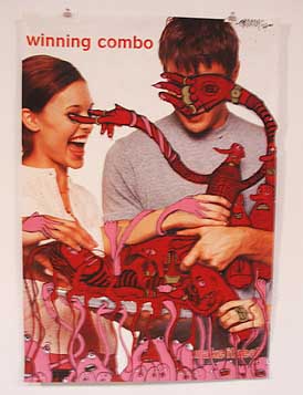
The altered poster "Winning Combination" by Joshua Wallace (the show's lead organizer) was also very well done. Loaded with cartoony pheremonal action on a pop support it reminded me of Franz West's kinky pop paintings along with a touch of Carol Dunham. This was the strongest work in the show. 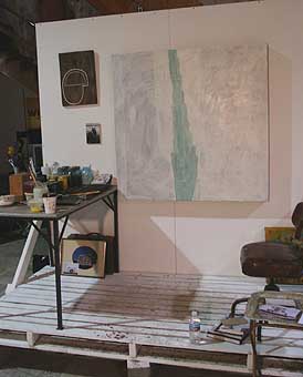 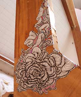 Unidentified artist worth identifying One (as yet unidentified artist) climbed a support beam with doodley billowing details. An entire room of this would be fantastic. I also liked how the installation by Dante Fugazzotto and Daryl Bergman blurred utilitarian and graphic elements. Something about how it functioned as a stage and a painting could be developed further. Misses and near misses: Asa Kennedy's heart shaped plastic books looked like street fair totchkes. There was also a collection of cassettes and an Atari 2600 video game cartridge, a nice hipster homage to the 80's but that's all it was. A near miss was the big circular installation by Issac Grey (from Oklahoma) consisting of neapolitan colored concentric rings around a central reflective dome. Titled, "You See What You see," it evoked a meeting of Jim Lambie and Anish Kapoor on a $45 budget. Maybe it is not the worst way to spend $45 and looked alright from across the room. It showed some spatial consideration but up close it looked hasty or like a neglected playground feature, which has its own charm. 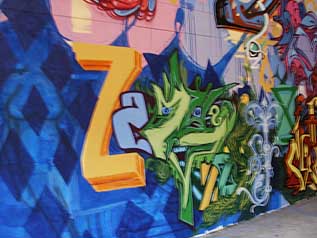 Initially, most of the graffiti work wasn't as interesting as the stuff I regularly see around town, but this green faced dragon(?) had character and a complicated series of folds making up its figure. The graffiti wall became more developed as the show went along Most of the installations mostly seemed like hasty BFA level work but all made good use of light. The best of this group was Alesha Wessler's "Vena Cava" a paper mache cave that still could use some refinement. Other artists to watch: 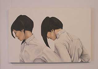
Lauren Taylor's untitled portraits 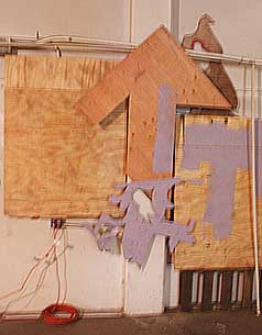 Ben Sault's crazy construction in the back was also very cool and probably unintentionally so… it is a kind of street fueled Richard Tuttle. A few of these in a nice gallery would be a shot of adrenaline to the old white box. In closing, none of this was particularly earth shattering but one of the best things about Portland is how the scene allows people to develop in these settings. In many other places you might be expected to be fully developed right after the BFA or MFA but here many end up doing it while working as a barista or in food service. It might not be the quickest, most glamorous way for an artist compared to Chelsea's freshly minted MFA from the Yale/Columbia formula but I think it complicates the work. There really is something to making the work less of a commodity product and more of the fringe lifestyle. It's a scenic route that often fosters the most memorable art. I'm not certain if any of the artist in Misssisssippi:May will become art stars in Portland (or anywhere else for that matter) but the show demonstrates that Portland supports and is still looking for something new and undiscovered, despite it's lack of institutional support for these artists. In that vacuum the created their own temporary institution and we should keep an eye on this crew. It would be nice to see something really ambitious and well done... and personally Ive pretty much done my last mondo sized non-institutional warehouse show (some of the artists are now in MoMA and The Met's collections). Which is to say, it is up to a new generation now. Today is the last day of this show with a silent auction and party running till 11:00 PM Posted by Jeff Jahn on May 31, 2007 at 15:40 | Comments (0) Comments Post a comment Thanks for signing in, . Now you can comment. (sign out)
(If you haven't left a comment here before, you may need to be approved by
the site owner before your comment will appear. Until then, it won't appear
on the entry. Thanks for waiting.)
|
| s p o n s o r s |
 |
 |
 |
 |
 |
 |
 |
 |
 |
 |
 |
 |
 |
 |

|
Site Design: Jennifer Armbrust | • | Site Development: Philippe Blanc & Katherine Bovee | |

