
|
||
|
Portland art blog + news + exhibition reviews + galleries + contemporary northwest art
|
||
Hereto, Where Art Thou? (by TJ Norris) 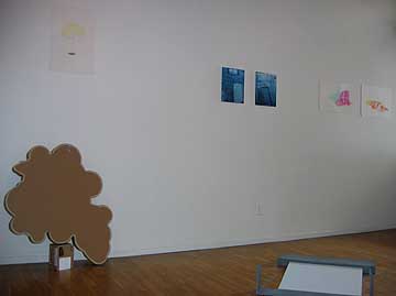 Installion view (L to R) Jesser, Talasco, Bawa(foreground & partial) & Clay "We're all kind of basically involved in the same thing, putting up a blank of some kind and filling it in." - William Wiley Blank - Exploring Nothing is the latest curatorial conundrum from Atlanta-based aquaspace (aka artist/curator/writer Avantika Bawa) on view through the month of May at Tilt Gallery & Project Space. Essentially, Blank is a small group exhibition of eight artists (including Bawa herself) who are exploring the ambiguous, esoteric space of the intangible, sourcing the impossible scope of nothingness. Without delving too deeply into the sing-song Seventies to take umbrage with one Billy Preston ditty that plays on "nothing" in all its triviality, one believes that the embodiment of this work, yonder side of physics, has been well coordinated on the walls, floor and window of said project space. The undercurrent of horror vacui is very much understated here. In the fitting of eleven works into a space under 500 feet square, keeping a needed balance of white space, the installation is a feat in and of itself. For the cenophobic among us, know that there's neither empty walls nor a sense of claustrophobia awaiting you, these works simply utilize the space well. 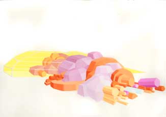 Lauren Clay's Little Compound Contenders Take for instance the two candy-colored gouache pieces (Little Compound Contenders and Little Compound Abiders) by Lauren Clay, each posing as fictitious CAD drawings, or some form of futuristic skyline or perhaps a set of escape pods. The solid white void and crisply rounded paper corners give the work a faux elegance, and heightened graphic sensibility. The artist appears fearless in the world of neo-neon and these pert works on paper are more like flavors than colors. Clay deviates from any subscribed palette when composing these crystalline villages that are as cartoony as they are architectural. Aside from being uninhabited spaces (or objects) the works' sense of emptiness seems somewhat superimposed. The effect recalls the spirit of retro sci-fi (Logan's Run, Star Trek, Blade Runner) sans the invasion of android life forms. New Yorker Victoria Fu's window-based video installation Deuce (running time: 8 minutes) trips the eye in its overlay of two tennis matches. Two women depicted at play, night and day. The superimposition of these athletes provides a well-edited composition that typifies the conventional repetitive nature of sports. The piece encapsulates something about the attention of the viewer in that it is probably one of the few times you would catch me glaring at the tube at something as yawningly mundane. What is offered here is a shotgun glimpse into the duality between choreographed cookie-cutter resolve (precision?) of reenactment versus the improvisation of chance. What's missing is the roar of the crowd, and though one side is fated to win, the loop is locked within a repeat cycle, offering only a bit of a doppelganger effect. 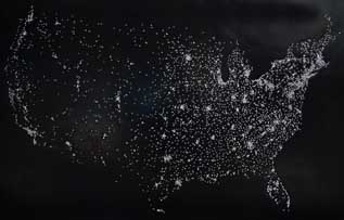 Maxwell's Demon (USA II) Re-mapping the United States of America is a tall order in 2007. There's just something soulfully missing over and above the hills and dales. Leave it to a Brit to come up with a contemporary resizing of the lines that cross and divide us in the show's most eloquently simple work, Maxwell's Demon (USA I and II). Jonathan Field, also an art historian who teaches at the Savannah College of Art and Design, inadvertently advocates the metaphor of shooting blanks in these works that play on their own physical inversion. The first piece (in the back gallery) is made from white rubber, providing only the impressions (by way of removed rusted brass pins) of violent statistics in our urban centers. His stark, complementary piece in black hangs from the center point of the gallery wall and is pierced with brads, which outline our nation's primary power sources. The sparkle of the pinheads is readily flash, and though the depth of the puncture is less than an inch thick, the history lesson in capital dominance is miles wide. This work's simplicity, in its outline, could easily be seen as a space shot of the country by night. However, it captures a lasting reverberation in the wake of overpopulation, subsequently pondering every square inch of American soil. Perhaps a comment on civil engineering or developer playing God. Taking into consideration where we are in our eco-history this set asks poker-faced questions with a hint of arrogance. The word "blank" itself is rife with potential double entendre, as meaning substitute or even a chemical solution. Here, Bawa plays on architectural austerity with her sculptural work Mis-fed. She virtually draws in space with pre-fab lines constructed by the edges and surface of wood paneling. As this work sits just off-center upon the floor, it toys with the whole 'part-of-the-woodwork' cliché. The minimalist piece she deconstructs and reinvents here is one part installation and one part fusion of inanimate gesture, it's unplugged. Her reference to mechanical detachment has been formulated from an abrupt, yet elegant few components. What appears to be some kind of off-kilter printer-type contraption is actually a lovely metaphor for a skeletal set of broken bones, or archeological dig. That Bawa chose not to create a kinetic work, but rather to draw in three dimensions, something that may suggest an action, makes this work far more powerful than batteries could. Somewhere, between the fine lines of Blank, a subtext of loss and longing emerges. An emotional undercurrent peeks through the guise of each flat exterior, slightly weary and wise, but standing en guard. The voids and open-ended, empty pauses mute the space softly but surely. What lands is not quite the non-objective, layered formula of Malevich nor the erasing of a would-be masterpiece-cum-conceptual work of genius by Rauschenberg. Rather, Blank poses more cunningly in its slack-jawed stand-offishness. In Brett Osborn's Runaway Bride the stiff playing cards stand erect at nearly lifesize, parodying the gist of endgame, and perhaps mirroring the artist's own sense of death (life, relationships). One can't observe the work without recalling the falsified publicity stint of fellow Georgian Jennifer Wilbanks and her absenteeism at the altar. In much the same tonal range, work by NY photographer Traci Talasco leaves bare the weight of removed objects from a dog-eye view, a carpeted surface of an apartment floor that's been vacated. Is this a dwelling of someone who has been robbed or re-possessed? Perhaps it signifies the gestural allusion of what's left behind when one moves to a bigger, more deluxe apartment in the skies? 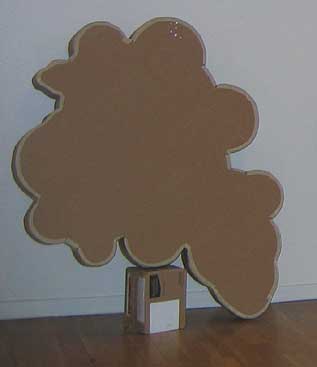 Jesser's How I see things and how I make things With a blank stare forward I was caught off-guard by Fred Jesser's How I see things and how I make things, which, by title at least, has a lovely ring to it. Outside of its process-oriented, poetic daintiness, a cloud-shaped box conceals something - perhaps thin air? The two-part piece contemplates the detached relationship between the surreal organicism of Mother Earth as jack-in-the-box and psychedelic free thought as depicted in the plain caricature of a lone puffy cloud. Resulting is a grown-up version of playing observational make-believe with pictures. The intention to build something hastily doesn't come across, but what does is a cleverly crude sealed box of suspended thoughts, even though it's propped by a much smaller, random cardboard box. The concern with the weight of the skies seems ridiculously heady, but its resonance with all things equivalent (see: Stieglitz) draws on the levity of real-time. The cumulus-like manifestation drawn from a suspended mass, as object, plays the joke on its very transitory nature. 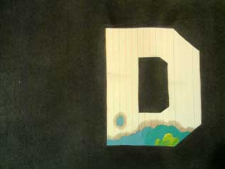
Drennen's Hollywood Beginning and Hollywood Ending Hollywood Beginning and Hollywood Ending is wordplay at its finest. Craig Drennen's punctuated diptych wryly plays on the flat visage of the ubiquitous sign atop the hills of 90210 (or thereabouts). Re-contextualized on paper Drennen has cast aside all the alphabetical innards between the letters that would recreate the actual sign. He's only left the bookends of "H" and "D" in all their vacant flatness. In fact, he's even rendered the letters in faux-finish, to appear as index cards cut to shape, and then doodled upon them. This wily gesture to emulate the mythical iconography of Tinseltown is sardonic in its emptiness. Here, contemporary superficiality meets with a double-edge sword. In essence, voiding the immediate reverence many tourists pay to the glitzy town's footprint. Blank: Slate or Stare? Blank is a calculated synthesis of informality. The potential for double takes or analogous interpretations make for a conceptually fit grouping that shows off its short-sleeved cleverness without an after taste. Bawa has graced the Northwest with a smattering of artists, many of whom are showing in this neck of the woods for the very first time, and hopefully not the last. This show is presented in collaboration with Drain: Journal of Contemporary Art and Culture. See it through May 26 at Tilt at the Everett Station Lofts, Friday and Saturday 12-5PM. *TJ Norris is a Portland-based multimedia artist, independent curator and freelance cultural writer. Posted by Guest on May 11, 2007 at 10:26 | Comments (0) Comments Post a comment Thanks for signing in, . Now you can comment. (sign out)
(If you haven't left a comment here before, you may need to be approved by
the site owner before your comment will appear. Until then, it won't appear
on the entry. Thanks for waiting.)
|
| s p o n s o r s |
 |
 |
 |
 |
 |
 |
 |
 |
 |
 |
 |
 |
 |
 |

|
Site Design: Jennifer Armbrust | • | Site Development: Philippe Blanc & Katherine Bovee | |

