
|
||
|
Portland art blog + news + exhibition reviews + galleries + contemporary northwest art
|
||
Beyond Representation: minimalist/postminimalist prints at PAM
Titled, "minimalism/postminimalism: Selections from the Collections of Jordan Schnitzer and His Family Foundation" this print and multiple show at the Portland Museum of Art is an exploration of the way that some of the best American artists of the '60s up until today explored the process and potential of printmaking. The show while being a little overhung for being about minimalism is a very interesting introduction to the different ways that each artist responds to the constraints and freedoms of print making. This excellent exhibition includes prints by some of the best American artists including Agnes Martin, Donald Judd, Richard Serra, Brice Marden, Josef Albers, Frank Stella and Sol Lewitt to name just a few. The show was co-curated by Annette Dixon and Marnie Stark of the Portland Art Museum and is on display until May 13. Painting and drawing happen in real time. An artist makes a mark that records a certain amount of time in its execution, and this is what makes looking at paintings and drawings so much fun. By experiencing a drawing or painting first hand you can create a very personal connection to an artist through his or her work. Although the difference in appearance between a drawing and a print might seem to be very minor, they are worlds apart in terms time, craft and technical skills. If in painting and drawing there is a potentially a one-to-one correlation between the mark and the experience, in printmaking, even if the gesture or the mark appears to be spontaneous, it never is.
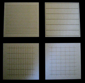
The process of printmaking has more in common with the mechanical process of film making than with painting or drawing. In both film and printmaking, an artist's (or director's) ideas are filtered through layers and layers mechanical processes in the attempt to create a high-quality end product capable of reproduction. In both cases, the most difficult thing for the artist is to attempt to navigate the mechanical process and to track an idea from initial conception to the finished print. Mark Mahaffey of Mahaffey Fine art says that the rich quality of looking at prints can be experienced on several levels. At first you might be drawn to the beauty of the prints and experience them as art. If you have a little knowledge of the process of printmaking it might also be satisfying to think about how the prints were made by thinking about how each layer of information is assembled to create the final print. It is always amazing to me that people are capable of understanding an image by disassembling it into its component plates of different colors or textures and then reassembling the pieces to form a coherent picture. The three screen prints of Agnes Martin's On A Clear Day from 1973 are one of my favorites in the show and a good precursor to what minimalism is about. On a Clear Day is a series of thirty screen prints exploring a variety of proportions and spaces of various lines and grids. I wish that all thirty prints in this series could have been included in this exhibition because it would have showed how Martin's embrace of the anonymous language of grids, lines and dots can carry an emotional message. Her work is like the bridge between Abstract Expressionism and Minimalism because her work conveys the emotional content of the work of painters like Barnett Newman, Mark Rothko and Jackson Pollock but within an austerity of lines and grids that later came to be associated with Minimalism. The big difference is that Martin was looking for an emotional response in her use of the graphic qualities of the grids and lines in her prints. I think in some ways that her three modest prints, each is only 12" x 12, are perhaps not only the most difficult prints to understand in the show but also the key to understanding the ways in which she inspired other artists to find new ways to express themselves.
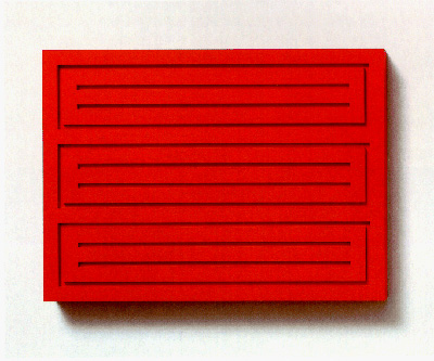
Part of what makes Agnes Martin's work so challenging is that there is nothing to hold on to because it seems like there is nothing more to the prints than just grids or lines. We are forced to ask ourselves if grids and lines could be used to make art. If Mark Rothko eventually found that the perfect way to express his emotions was through beautiful veils of shimmering colors, then Martin found that maybe the best way to express herself was to lose herself. In the late 50 to early 60s Martin found that the best way to lose herself was by experimenting with paintings that are made up of only lines, grids or dots. These are things that she did not invent, and I think that is why she found them attractive. In her writings, she talks about appreciating the egoless quality of the grid because there is no preferred perspective and that perhaps a series of simple horizontal lines might inspire someone to experience the same contemplation we normally experience in the desert or in front of the ocean. The series of prints from a On a Clear Day are an exploration of these ideas. Can we begin to experience peace by just opening ourselves to a grid or a series of horizontal lines? The grids and the lines are nothing but a gateway into ourselves. Unlike most painting and drawing, Judd's sculpture does not happen in real time. His sculptures are slow: slow to conceive, slow to fabricate, and slow to experience. Each sculpture is the product of a lot of labor, technical skill and inspiration that requires a collaboration of a lot different people and materials. It is no wonder that eventually Judd was attracted to the process of printmaking. The main room of the show opens with a beautiful red wood block print by Judd. If you look closely, you can see where the ink puckers up on the surface where it was pressed between the block and the paper which highlights the tactile difference of prints on the one hand, and machine made sculptures on the other. On the opposite wall hang three Judd multiples that are probably not very different than the block that Judd used for his print. It makes you wonder if the wood blocks that he was using were so beautiful on their own that he thought they deserved to be sculptures by themselves. When you look closely around the inked edges of the print you can see a slight yellowish halo. I think this is the created from the edge of the wood block or it is oil from the ink that is beginning to seep into the paper. The halos do not detract from the experience of the print and in fact give it an earthy, grounded quality which works well with the abstract image of the print.
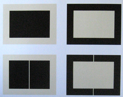
Judd's Untitled prints on the adjacent wall are really a beautiful example of spatial interchangeability of positive and negative spaces. Although there a few variations on this series of prints, I believe some were also printed in other monochrome colors such as red and blue. A few later editions involved combining multiple colors, but I think that the black ones are the best. Because of their strong graphic quality, they come closest to Judd's aspiration of pushing the space out of the print so that as Stella eloquently put it in 1964 "what you see is what you see." There is no illusion and there is no representation-just the interchangeability of blocks of color on a piece of paper and to Judd's credit he is able to make art out of it. It is in these prints that he comes closest to one of the painters that he really admired, Barnett Newman. Newman wrote in 1947 right before he found his way as a painter: "To put it philosophically, the European is concerned with the transcendence of objects while the American is concerned with the reality of metaphysical experience." Newman thought that the best way to articulate the metaphysical experience was to declare space and not represent it. I think this is where Judd was heading in these prints. They were both striving to place the viewer in the reality of our everyday experience. I think that Newman's expression of the real experience is an idea that was also central to Judd's idea of taking sculpture off the pedestal and putting in on the floor. He wanted us to be able to experience his sculpture and prints in real time with our own bodies and without recourse to some sort or representation of something else or some abstract idea outside of ourselves. The process of printmaking often give prints a rich variety of textures and surfaces that are unique to printmaking and do not have an equivalent in painting or drawing. Whether it is the embossing of the plate or the raised edges of ink in an etching, there is tactile quality to the very best prints that make them works of art in their own right.
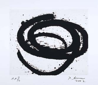
When you look at the Serra's etchings at the end of the exhibition, one of the first things that you notice are the beautiful raised and pitted surface of the ink. These are not flat images, and the raised ink gives the print a beautiful three-dimensional quality. The larger print Vesturey III was actually printed by master printer and current Portland resident Mark Mahaffey. Like most etchings, these were printed from copper plates, in which the acid literally eats into the surface of the copper to produce the negative of the final image. Before the print is pulled, ink fills in the recesses left by the acid, and when it is printed it gives the image the rich three-dimensional texture of the ink. As beautiful as the Serra prints are, the plates that are used to produce the prints are even more beautiful. I had a chance to see one of his copper plates being rinsed at Gemini GEL, and it was one of the most beautiful objects I ever saw.
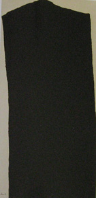
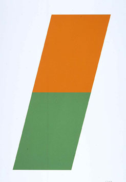
Ellsworth Kelly's prints Black Variation 2 from 1973-75 and the earlier Orange/Green from 1970 are by contrast, are totally flat and barely rise above being a simple graphic. Other than the feeling of the shapes, they really do not have much in common with the beautiful paintings that he was making at the same time and whose images are similar to the prints. I think part of this has to do with the scale of his prints, if they were bigger they might have been better, but for me they really lack the tactile qualities that are found in the best prints. Robert Ryman is famous for his white paintings that allow the viewer to explore a paintings surface created entirely by white brush strokes that may or may not overlap small patches of color. True to form, two of Ryman's Untitled prints from six aquatints are a similar study of the process of printmaking by looking at aquatinting's effect on a piece of paper. Although not quite white, shifting more to a very pale orange or peach, the difference of the aquatint on the paper versus the paper alone is profound and a beautiful print created from a very simple process. The other three Ryman prints Conversion, First Conversion and Second Conversion I found to be a slightly more problematic. In one long case, there three more or less white prints with two tacks pushed through each of the prints at various locations. Besides his interest in white paintings, there is also a parallel line of thought in Ryman's work in which he is very interested in exposing the way the paintings hang on the wall and perhaps pursues the goals that nothing should be hidden and that perhaps even the hangers could be beautiful and part of the piece. I believe that the tacks in these prints are part of this line of thought because you still need a fastener to hang the drawings on the wall. The tacks are put through the paper at very specific locations determined by the artist and hammered in a very careful manner so as to not damage the print. The trade off is that a viewer who is not familiar with Ryman's work might miss the subtle gradations of the whites in the color on the aluminum print or the subtle mixing of peach and blue in the other two prints because they just look at the tacks. There might also be a whole crucifixion undercurrent here but you can decide for yourself. Next to the selection of Ryman's prints is a print by Dorothea Rockburne. The main effect of the print is that it is a beautifully folded piece of paper. I thought that this was a very beautiful print because it recognizes the intrinsic qualities of paper and uses those properties to make a print. I imagine there must be some good stories about how they were able to fold all of the prints in the edition in exactly the same way because it sounds like a very difficult process. Also after you finally get the fold right, you can't even store the prints flat because it would destroy the fold. But the print is beautiful so maybe it was worth it.
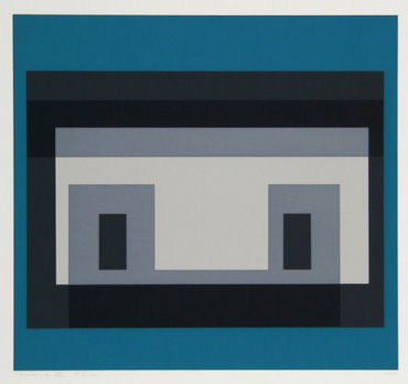
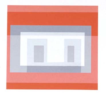
The hallway in front of the exhibition is filled with spectacular prints by Josef Albers and Frank Stella. The Albers' prints are a series of screen prints called Ten Variants. In each print the geometry of a series of overlapping rectangles is exactly the same, but in a way that is central to Albers' understanding of art, the colors change from one print to the next, which completely changes the way the space in each print is perceived. The color combinations are spectacular and good examples of a maximum effect through minimal means. I have always found Albers prints to be more successful than his tremendously influential Homage to the Square paintings. The texture of the masonite panels that he used to paint on always gets in the way of actually perceiving the relationships of the colors, but screen printing seems like it is the perfect medium for his ideas. Although Albers is not traditionally thought of as a minimalist artist, I think of him as an influential teacher from an earlier time, these prints based on theme and variations of colors and spatial perception fit in perfectly in with the theme of the show. The print examples of Albers, Kelly, and Martin in this exhibition all use the silkscreen process but in completely different ways. I think Albers' are probably the best, simply because the color combinations are so unpredictable and astounding. Martin's prints feel much lighter, almost like they float slightly above the surface of the paper. For her prints, the silkscreen process is very sympathetic to her ideas about painting and what she wanted to achieve with these prints. Kelly's more recent lithographs of his freehand drawings of plants are much more successful than the earlier prints. At the time, maybe he felt like the almost commercial flatness of these prints might have made them daring, but after forty years in a world in which we are a saturated with modern graphic design, they lose that edginess.
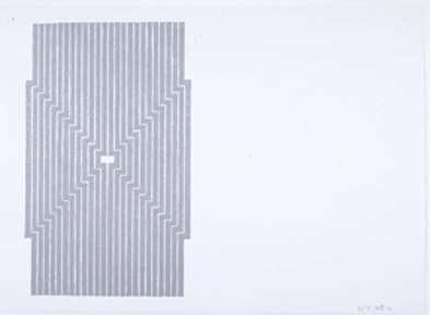
Across the hall from Albers' prints, are selections from a series of extremely beautiful prints of Frank Stella's Aluminum paintings called not surprisingly the Aluminum Series. Stella's Aluminum paintings came right after his black enamel paintings when he switched to aluminum paint and tended to try and get rid of the corners and often times the center of his paintings. The bright, reflective quality of the aluminum paint pushes back at the viewer, so that unlike the black paintings you are not drawn into the space of the painting but kept on the surface. I had never seen the prints of the Aluminum paintings before and it was a little surprising that for a painter who was so obsessed with the flatness of his paintings, these lithographs you can see the marks of his lithograph crayon, which gives the prints a softer quality that is antithetical to the ideas of the paintings. He also made an interesting choice in the composition of the prints because the images never sit squarely in the middle of the page but often sit far near the side edges of the paper. I suppose he was thinking about making the image float in space, maybe as way of disconnecting the space and pattern of the image from the space of the paper. These are really beautiful and sophisticated prints, and it was a pleasant surprise to come across them in the hallway because they set the tone for the exhibition. I wanted to end this part of the review by talking about one of my favorite artists, Sol LeWitt who passed away last month. If Martin's work opened up the potential of Minimalism, I think LeWitt's approach will carry it far into the future. Unlike most other artists, LeWitt's work is not driven by the way an object, painting, or print should look. He is more interested in the results that might generated by repeating a set of instructions. No ideas, no compositions, just instructions. If the instructions are repeated often enough, he found that he might be able to open a new or unexplored territory in art. I think that because his approach is prescriptive rather descriptive he lays the ground work for an art that is totally outside of himself, the art exists in the language of ideas and instructions. In that sense his work is non-representational in the extreme. On the hand, at least for living objects, his instructions are just the DNA to allow these prints to generate themselves. From that perspective, his art would be deeply organic not in terms of the way something look but in terms of process. He was interested in the process, the materials and how they could be used in a rigorous way to open some new ways of making art. Is the art in the print, in the instructions or just the idea? I suppose that everyone has to decide for themselves but in my opinion it is in all of those places. I think that he moves us farthest from the fetish of the artist's technique and into worlds that we would have never expected to have art.
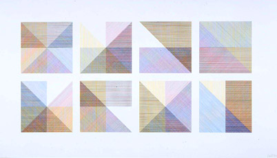
LeWitt's prints in this exhibition are no exception. The title of one of the prints (and the instructions for it fabrication) is Eight Squares with a Different Color in each Half Square (Divided Horizontally, Vertically, and Diagonally) from 1980. The print is about the way that different variations of colored parallel lines could overlap to create a new series of colors and tones. It is remarkable that there is no privileged view in this print. If it meets the requirements, then each square is a good as the next. The print is not about single "perfect" square but it is about the totality of its variations. He puts the squares right next to each other so that we can evaluate the results for our self. There is nothing about taste, selection, or art theory, it is a process that is completely open and free. Maybe it is even something that everyone could do. LeWitt, was a remarkable artist, and his great gift is that he gave art back to us. It is interesting to see these prints in a room that I normally, associate with traveling exhibitions of old master paintings. In fact, you even have to walk down hallway lined with old paintings even to get to the show. I found the juxtaposition really striking, and I was reminded of the fragility of the traditional printmaking process. Making prints, while they are often extraordinarily beautiful, is often an expensive, slow process that like a movie requires considerable technical skill and more often than not a considerable investment of time and money. It seems like today, society is always striving to produce things faster and cheaper, which seems at odds with the traditional approach with printmaking. I wanted to asked one of the best printmakers in the city, Mark Mahaffey of Mahaffey Fine Art, about where he saw printmaking going in the future. He felt that prints will always be relevant because they fill a specific need, they are high quality works of art and are available at a reasonable price. So that even as the technology changes, the need is still present. Printmaking will just continue to evolve with technology, health concerns, and the needs of the artists.
The minimalism/ post minimalism print show is a great introduction to the way that these artists are looking at the medium of printmaking. There are also great prints by Ken Noland, Sean Scully, and Brice Marden. Although the Marden prints do not really hold well if you have seen the drawings that these prints are based on. When I am looking at these prints I have always found it helpful to remember that the finished print is a fraction of the process and that behind every print is a whole battery of plates, stones or wood blocks that each have fragments of an image that are assembled into the final image. The show also demonstrates that printmaking has the continuing ability to stay relevant by evolving with the needs of the artists and the community. I hope this is the first of many contemporary print shows at the museum, or perhaps a room dedicated to contemporary prints like at MoMA, because printmaking is still relevant and the recognition of its value is long overdue. Posted by Arcy Douglass on May 08, 2007 at 10:00 | Comments (1) Comments Thanks so much, Arcy Douglass, for this account, which, following my visit, really helped my understanding and appreciation. These were all huge names in the visual arts, and we usually know quite a bit less about their prints and where a particular artist's prints fit in to the world of printmaking and technique. I appreciate your care and sharing here, look forward to more. Posted by: Erling Post a comment Thanks for signing in, . Now you can comment. (sign out)
(If you haven't left a comment here before, you may need to be approved by
the site owner before your comment will appear. Until then, it won't appear
on the entry. Thanks for waiting.)
|
| s p o n s o r s |
 |
 |
 |
 |
 |
 |
 |
 |
 |
 |
 |
 |
 |
 |

|
Site Design: Jennifer Armbrust | • | Site Development: Philippe Blanc & Katherine Bovee | |


![[TypeKey Profile Page]](http://www.portlandart.net/nav-commenters.gif)