|
||
|
Portland art blog + news + exhibition reviews + galleries + contemporary northwest art
|
||
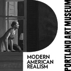
PAM logo banished to the aybss of bad design  The New PAM logo... experiences the power of dissatisfaction Savvy people are applauding Brian Ferriso's decision to can the gawd awful new logo for the museum. I was the first to write about the issue but it wasn't a big secret, several trustees of the museum were not happy with it either and we had some funny kvetching sessions about it. Thankfully, Ferriso has a very sophisticated sense of design (among other things) and it's a good thing too because Portland's design industry is huge and we've been waiting for some up to date design action at Portland's top tier institutions, including the museum. Posted by Jeff Jahn on April 04, 2007 at 11:38 | Comments (2) Comments Yeah, the new logo is completely atrocious. Being one of those many Portland designers, I was appalled that the "new" PAM was going to represent itself with such student-grade work. Posted by: Calvin Ross Carl At the private opening for Jordan Schnitzer's Minimalist/Postminimalist print show Ferriso made a point of telling the crowd how important minimalism's influence was on design, it was no accident. That is one great show BTW! The the whole series of Judds are an awesome display. Posted by: Double J Post a comment Thanks for signing in, . Now you can comment. (sign out)
(If you haven't left a comment here before, you may need to be approved by
the site owner before your comment will appear. Until then, it won't appear
on the entry. Thanks for waiting.)
|
| s p o n s o r s |
 |
 |
 |
 |
 |
 |
 |
 |
 |
 |
 |
 |
 |
 |

|
Site Design: Jennifer Armbrust | • | Site Development: Philippe Blanc & Katherine Bovee | |


![[TypeKey Profile Page]](http://www.portlandart.net/nav-commenters.gif)