
|
||
|
Portland art blog + news + exhibition reviews + galleries + contemporary northwest art
|
||
RE:Dude's Night Out 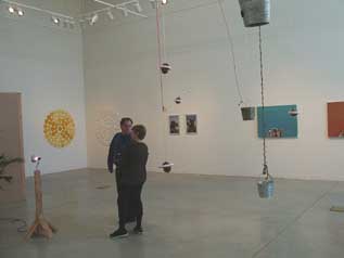 When Cris Moss tapped into a circle of friends at the last minute for the show "Re: dudes night out" at the Linfield Gallery, he unexpectedly dug deeper into one of the more prominent undercurrents of the Portland art scene, translocated or transposed territory. The intention of the show (on an extremely tight time schedule) was to show how a group of artists might relate to one another as a social network rather than though shared ideas about work, process, or some overall theme. Strangely, although the artists work in a wide variety of mediums, most of the artists seemed interested in one way or another in transposing one idea about space or territory into another so that when it is placed in a new location it is transformed into something completely different. 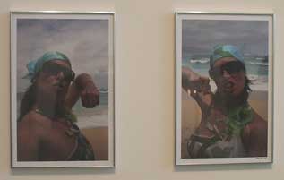 Marne Lucas' Blow and Hole (2004) The easiest way to illustrate this idea is to take the example of the Marne Lucas' photographs. In the exhibition, there are two photographs of her taken on a Hawaiian beach with a slightly overcast sky. Marne is in her bathing suit and sunglasses but is also wearing a bandana like a do rag, a gun necklace (very bling), and has written hole and blow respectively on the knuckles of each hand. To make the idea perfectly clear, she also put aluminum foil over the upper row of her teeth. The photographs are of her holding her fists to the camera so that you can read her knuckles one at her time. It is hard to tell, but it looks like she could have been holding the camera with the hand that you do not see. So what is a white girl dressed like a rapper or a gangster doing on a beach in Hawaii? I do not know, but that is the point. Is it the juxtaposition of two very different social stereotypes (the beach bunny and the rapper) that make it funny and ironic? Her work is a blending of all of these seemingly opposite ideas: urban/suburban, white/black, rich/poor, and masculine/feminine just to name a few. One set of ideas are transposed to a new location (or body) for a completely different meaning. 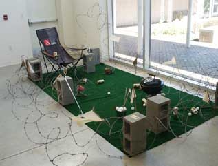 Paul Middendorf's Guerilla Consumption Paul Middendorf's installation "Guerilla Consumption" is a cheap well worn lounge chair on green Astroturf littered with Miller "High Life" beer cans, with a barbeque and surrounded by rows of barbed wire. It is hard not think about territory and control, when you see an area of fake green glass surrounded by barbed wire and the hobby of choice is golf. Logos of all kinds of multinational companies are sprayed in gold on the turf and the concrete blocks that support the barbed wire. We have seen all this before and like so much of what is happening in the world, it is okay if you have your own little territory where you have things to eat, beer to drink, golf to play but it absolutely sucks if you are on the other side of the barbed wire. I mean once you start thinking about the ideas that this work ties into, the reference keep snowballing: America, immigration, the roles of multinational companies, the war in Iraq, Democrats and Republicans, weekends, tail gate parties, and golf. To me, his piece is a really ugly self portrait of what is happening in America. The real irony is that there are a lot of people that would feel very comfortable sitting on the chair on the green Astroturf. 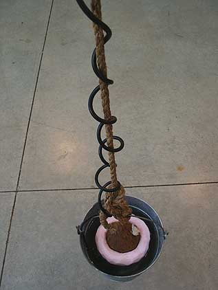 detail of Conkle's Hypnosystem Cluster 5 (2007) coconuts, meteorite, coral, shell, crystals, speakers, rope, motors etc. soundtrack by Marssares When you first walk into the gallery, the first thing that you see are all kinds of coconuts hanging from the ceiling and with tropical music playing. There are wires, buckets, coconuts, water, more wires, crystals, and meteorites to list a few of the materials. What is this and what does it mean? I don't know but I do know that it is Bruce Conkle's contribution to the show. Bruce's piece is sort of beyond any rational explanation but it is fascinating system and hypnotic none the less. Is about futuristic coconut trees? That coconuts will some day grow to be the size of planets and take over the solar system? That coconuts need life preservers to swim? The use of coconuts in Oregon is exactly the sort of idea of translocation that ties it so well into the rest of the work of the show. There are coconuts that are speakers, coconuts that spin like planets, coconuts that swim, coconuts that are surrounded in foam and covered in crystals and meteorites. To me, it means that at some level in his installation, the coconuts stop being coconuts and are transformed into other things, and it makes me think about the environment, outer space, the solar system and how it all might be connected. 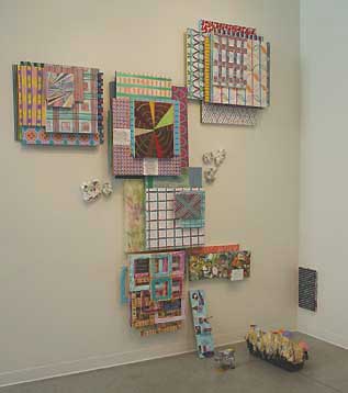 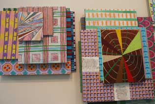 Jesse Hayward's WITHIN THE HOUR (2007) + detail Jesse Hayward paintings and constructions called "WITHIN THE HOUR" push the boundary of painting and sculpture as code. His installation is made of stacking paintings one on top of the other so that they have a real feel physical presence. You can think of them like a ziggurat attached to the wall. The installation has more than thirty paintings and spreads over two walls if only tentatively. It is like the viewer is hit with the double barrel shot gun of the patterns of the paintings and the larger structures that they form. It is interesting example of moving painting not only away from the plane but into three dimensional space and the volume of the room. In order to achieve that, each individual quality of each painting is de-emphasized, even though each panel is very well painted, so that they can become part of the larger structure. The work creates a lot tension between the space within the paintings and physical presence of the painting as a object so the overall effect is not unlike creating a new topography by building a landscape over the surface of the wall. 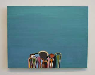 David Corbett's Untitled (2006) David Corbett installed some beautiful enamel paintings that are not unlike the experience of watching inverted lava lamps. The blobs float upward rather than downward and have interesting anthropomorphic connotations. 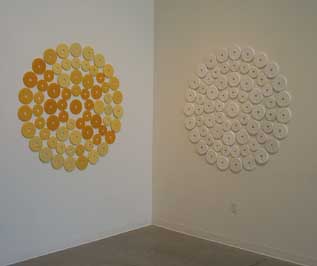 Sean Healy's Miami Beach (2006, retitled 2007) Sean Healy casts of weights (Miami Beach) are a great example of inverting the masculine associations of weight lifting so that they become like large beautiful flowers on the gallery walls. 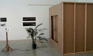 On the wall: Todd Johnson's photographs, foreground: Jesse Durost's Cathedral (2007) Jesse Durost's, pin hole camera (Cathedral), was a little hard to see in the day light but is a nice idea. It is amazing how a screen completely changes your perception of the environment. 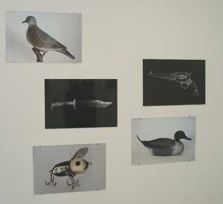 Todd Johnson, clockwise from the top: DD-2 (Dove Decoy),P-1 (Pistol), D-2 (Duck Decoy), FL-1 (Fishing Lure), K-1 (Knife) all 2007 Todd Johhnson's photographs of guns, knives, and decoys are really beautiful and produced with amazing craft. To boot they are provocatively arranged with menacing opended associations... wry, loaded and ambiguous. The deadpan objects he collects as photographs are seasoned with the mysteries of the desire to collect, yet they are completely transformed so that they begin to take on a life of their own. A fascinating private stash shared publicly on a so-called dude's night out. Until April 13, 2007. At the Linfield Gallery, 900 SE Baker St., Mcminnville OR. 503.883.2804 Posted by Arcy Douglass on March 22, 2007 at 10:14 | Comments (11) Comments the transposition of territory is a huge theme in contemporary art today... I consider Liebeskind's Holocaust Museum in Berlin to be the prime example but there is also Julie Mehretu etc. I think it stems from how travelled artists tend to be these days plus the pervasiveness of eletronic communication (like PORT). The massive influence of Smithson and Gordon Matta Clark cannot be discounted either. All of these Poirtland artists travel and it shows. It's all location location location. Hmmm let's start making an incomplete list of Portland artsts obsessed with translation of space: Portland does transposed space really well... this could be a good show. Location, Location, Location Posted by: Double J Is there an editing process that the writers of PORT go through before they publish? Aside from the elementary school level read of the work and apparent lack of creative thinking the writing is incoherent: "So what is a white girl dressed like a rapper or a gangster doing on a beach in Hawaii? I do not know, but that is the point." "What is this and what does it mean? I don't know but I do know that it is Bruce Conkle's contribution to the show."
In addition, your thesis doesn't apply to the majority of the artists: "Strangely, although the artists work in a wide variety of mediums, most of the artists seemed interested in one way or another in transposing one idea about space or territory into another so that when it is placed in a new location it is transformed into something completely different. " There is no theme, other than social network and that seems to be the point. Vague. Vague. Vague. Try again. Posted by: concernedcitizen
Surely you can do better, writer. If i wanted expository writing and mediocre thinking I would go elsewhere... Posted by: moustaches_afar Glad that this show incited such passion but rhetorically those charges don't hold up, might I suggest a closer and more heuristic read. The text refutes your claims. For example: though Arcy admits at first when discussing Conkle's work that he doesn't "know" he ends the paragraph with an informed subjective and critical take, "To me, it means that at some level in his installation, the coconuts stop being coconuts and are transformed into other things, and it makes me think about the environment, outer space, the solar system and how it all might be connected." Hardly vague or incoherent, the take on Conkle's work also supports the writer's thesis, which I didnt buy until I read this review. One can't cherry pick quotes out of context and make an effective argument. Sure it is a group show with lots of different agendas but the emergence of a coherent theme is worthy of exploring. Also, it's an extremely common reviewer's technique to explore the challenges of a work before offering an opinion. Jerry Saltz does it constantly and it's a kind of very valuable critical conceit. It's valid and typical approach, especially in group shows which are inherent melanges. Lastly, all of the artists except Corbett nicely figure into Arcy's transposition/translation of location thesis and even then it could be argued his work has a relationship to aboriginal art. Also, as horizontal paintings they inherently reference a kind of landscape. The re-title of Healy's work fits it into the emergent theme as does the fact that the weights are translations out into a gallery context. Posted by: Double J It would seem that this review and not this show is inciting such passion. I don't really think I could look closer and give it a more heuristic(aren't they about the same thing??) read. This writing is barely readible and the concern is justified. **(text removed by mod: no personal attacks in PORT comments, warning)** BBTW, isn't any piece of art inherently an attempt to "transpose" the viewer/information? Posted by: clarklovins CL Sorry it's not your cup of tea, the show by its nature has a kind of disjointed aspect but most group shows come off that way (Ive done some editing of it BTW, we are adding an editor for reviews very soon as part of the site ramp up). What is interesting is how everything seems to belong together here. Arcy merely provides an angle for dicussing it. Personally, I see a theme of collecting collections. The show itself had a huge buzz (because it is a very important social clique) and the review just adds to it Also, the rule is no personal attacks in PORT comments, you've been warned. I don't completely buy this theme but it's an interesting way to approach the show and not make it series of book reports. Regarding definitions: heuristics are a bit like common sense applied to overarching gestalts. A close reading is actually quite different. Employing both tools is just a way to check how the show is interpreted. Yes most art is a transposition... hence the need for territory in the mix. Posted by: Double J Almost every writer - no, EVERY writer - can benefit from at least a copy editor. Posted by: lsd JJ The joke just isn't funny when the punch line is omitted. Posted by: clarklovins I agree, Ive wanted a copy editor for some time (PORT is the first publication Ive written for that didnt have one)... it has only recently become feasible and Im looking forward to it. As far mod-ing comments, PORT's policy has always been no personal attacks, (yes I did laugh)... Jokes are fine as long as people aren't insulting eachother, it brings the comments down to a baser level and PORT isn't a forum for that kind of thing. I do find it interesting that this show of "a social clique" makes for a more polarized discussion that seems driven by similar social factors. It's a really good show, go see it if you havn't already. Posted by: Double J Thanks for responding to the review. I did not know it was going to stir up such a storm. I wrote the article as I was preparing to go the hospital for surgery and it was a little rushed. Any mistakes in the article are my mistakes and not Jeff's. Yes, I can use a copy editor. Lesson learned :) I am a little surprised by some of the reactions this review has stirred up. I view writing on PORT as an open ended collaboartive process with whoever takes the time to read an article. I think that the art's community as whole is smarter than any individual within that community. I wrote the article as way of starting up a dialog with readers of PORT, so that we can learn from one another, and not as some sort of final statement. I still hope that we can overlook the shortcomings about my writing style and talk about what brought us here in the first place: the art. Posted by: Arcy Young critics learn by taking a few lumps... besides it's still more involved than most everything Ive ever read in newsprint around here. Group shows are especially tricky to write about. I take it as a compliment to the site that people find it so crucial. With the redesign we willbe able to have more guest writers. So those of you who have expressed an interest email me about your ideas. Thanks for reading Jeff Jahn Posted by: Double J Post a comment Thanks for signing in, . Now you can comment. (sign out)
(If you haven't left a comment here before, you may need to be approved by
the site owner before your comment will appear. Until then, it won't appear
on the entry. Thanks for waiting.)
|
| s p o n s o r s |
 |
 |
 |
 |
 |
 |
 |
 |
 |
 |
 |
 |
 |
 |

|
Site Design: Jennifer Armbrust | • | Site Development: Philippe Blanc & Katherine Bovee | |


![[TypeKey Profile Page]](http://www.portlandart.net/nav-commenters.gif)