Portland art blog + news + exhibition reviews + galleries + contemporary northwest art

recent entries

Early September Links
Labor Day Weekend Picks
Museumy Links
Wendy Given at Vernissage
Mid August Links
Grace Kook-Anderson in Conversation
Portland Art Adventures
Early August Art News
August must see picks
End of July News
Alia Ali's Borderland at Bluesky
Mid Summer Reads

recent comments

Double J
Reiko Sundahl
Calvin Ross Carl
Double J
Calvin Ross Carl

categories


Book Review
Calls for Artists
Design Review
Essays
Interviews
News
Openings & Events
Photoblogs
Reviews
Video
Links
About PORT

regular contributors


Tori Abernathy
Amy Bernstein
Katherine Bovee
Emily Cappa
Patrick Collier
Arcy Douglass
Megan Driscoll
Jesse Hayward
Sarah Henderson
Jeff Jahn
Kelly Kutchko
Drew Lenihan
Victor Maldonado
Christopher Moon
Jascha Owens
Alex Rauch
Gary Wiseman

archives


Guest Contributors
Past Contributors
September 2018
August 2018
July 2018
June 2018
May 2018
April 2018
March 2018
February 2018
January 2018
December 2017
November 2017
October 2017
September 2017
August 2017
July 2017
June 2017
May 2017
April 2017
March 2017
February 2017
January 2017
December 2016
November 2016
October 2016
September 2016
August 2016
July 2016
June 2016
May 2016
April 2016
March 2016
February 2016
January 2016
December 2015
November 2015
October 2015
September 2015
August 2015
July 2015
June 2015
May 2015
April 2015
March 2015
February 2015
January 2015
December 2014
November 2014
October 2014
September 2014
August 2014
July 2014
June 2014
May 2014
April 2014
March 2014
February 2014
January 2014
December 2013
November 2013
October 2013
September 2013
August 2013
July 2013
June 2013
May 2013
April 2013
March 2013
February 2013
January 2013
December 2012
November 2012
October 2012
September 2012
August 2012
July 2012
June 2012
May 2012
April 2012
March 2012
February 2012
January 2012
December 2011
November 2011
October 2011
September 2011
August 2011
July 2011
June 2011
May 2011
April 2011
March 2011
February 2011
January 2011
December 2010
November 2010
October 2010
September 2010
August 2010
July 2010
June 2010
May 2010
April 2010
March 2010
February 2010
January 2010
December 2009
November 2009
October 2009
September 2009
August 2009
July 2009
June 2009
May 2009
April 2009
March 2009
February 2009
January 2009
December 2008
November 2008
October 2008
September 2008
August 2008
July 2008
June 2008
May 2008
April 2008
March 2008
February 2008
January 2008
December 2007
November 2007
October 2007
September 2007
August 2007
July 2007
June 2007
May 2007
April 2007
March 2007
February 2007
January 2007
December 2006
November 2006
October 2006
September 2006
August 2006
July 2006
June 2006
May 2006
April 2006
March 2006
February 2006
January 2006
December 2005
November 2005
October 2005
September 2005
August 2005
July 2005
June 2005

contact us


Contact us

search


syndicate


Atom
RSS

powered by


Movable Type 3.16

This site is licensed under a


Creative Commons License

Wednesday 03.28.07

« Pandering to indie filmmakers | Main | Perplexing Conundrums and the Light in the Midst: Sue Coe at PNCA »

Marie Watt at PDX

watt30_big.jpg
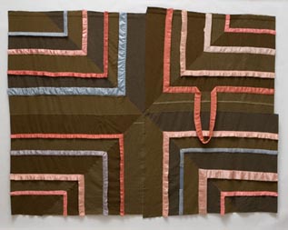
Marie Watt, Ledger: Tread Lightly, 2007
Reclaimed wool blankets, satin binding thread, 92 1/2" x 121"

Wool blankets are hung on the walls and piled on the floor of PDX Gallery like well-worn, well-traveled canvases. They've been claimed and reclaimed, frayed , cut, recut, unraveled and resown. Some have been altered out of existence, with wood or cast bronze replacements left in their stead.

Providing warmth, concealment and protection, blankets are useful at the intersection of two of our primary needs--clothing and shelter--and evoke equally deep and basic associations. These materials have accrued even more conceptual heft through Marie Watt's allusions to the work of several 20th century artists, as well as Native American spiritual symbols. This underlying network of ideas adds depth and interest to Tread Lightly, but ultimately, each work succeeds or fails on the strength of its formal qualities.

watt32_big.jpg
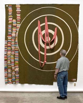
Marie Watt, Threshold, 2006
Reclaimed wool blankets, satin binding, thread, 123" x 117"

The most successful wall pieces set up a play of tensions between dull, lint-colored military blankets and the Easter egg colors of satin trim culled from the wool blankets favored by civilians. Threshold reprises Jasper Johns's target paintings, marrying his flat iconography to Eva Hesse's "anti-form." The crafty homemade aesthetic of Watt's work is disarming; the pink satin evokes the slack remains of crepe paper party decorations, but could just as easily be representative of blood pouring from the bullet wounds that target practice imitates.

The wobbly bullseye has an absurd charm, casually fusing thanatos with arts 'n crafts aesthetics. Ledger: Tread Lightly, is similarly abject, a ragtag cousin to Frank Stella's black paintings. It presents a paradox: minimalism that's anything but clean and simple. Like Mary Shelley's Dr. Frankenstein animating his monstrous creature, or Margaret Mitchell's Scarlett O'Hara tearing down curtains to make herself a poverty-concealing gown, Ledger embodies the poignance of the creative impulse at its most desperately resourceful. The composition is mesmerizing: nesting right angles of pink and baby blue keep leading the eye out of the picture plane while the dropped loop in the upper right keeps pulling it back to the center.

Several wall works comprised of circular forms of colored blocks fail to leave much of an impression. Their lack of internal tensions or compositional flair relegates these wool-on-wool pieces to a supporting role.

watt42_big.jpg
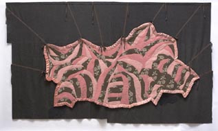
Marie Watt, Catastrophe, 2007
Reclaimed wool blankets, satin binding, thread, 92" x 158"

Catastrophe takes on the horrors of Abu Ghraib, but the result is a slack tangle of ambitious good intentions. A stylized blanket form is attached to ties which can be lifted to reveal a pile of bodies based on images from the prison. Two issues undermine the work's power. The Advent Calendar-style presentation feels gimmicky. Additionally, the image revealed by lifting the flap is roughly as alarming as a patchwork quilt. There's nothing striking about the semiabstract composition of swatches bordered by prominent white stitching. The piece seems to promise a revelation it doesn't deliver. Catastrophe is most powerful in the closed position. The flowered quilt that covers the bodies brings to mind burial, and floral tokens of remembrance--funeral flower arrangements and Lieutenant Colonel John McCrae's famous poem about W.W.I, "In Flanders Fields the poppies blow/Between the crosses row on row."

In Cross, a scar-shaped bubble of red satin between even stripes of dull wool forms a luxurious wound. Like an abstract crucifix, it inspires contemplation of suffering without forcing the issue.

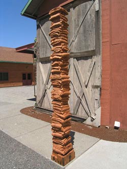
Sculptural piles of blankets in wood and bronze complement the wall pieces. Bronze in particular captures the delicacy of wool and satin in way that's visually captivating. Staff: Custodian is rich in associations. Polished areas refer to the height at which different family members hold a walking stick. The thin bronze Staff is reminiscent of Brancusi's Endless Column and Giacometti's disappearing thin men. The strata of tiny blankets look like a tower of lost wallets, little blankets for wrapping up our means and identities. Considering the contested but oft-repeated story of smallpox-infested blankets being offered as deadly gifts from settlers to Native Americans, the pile of blankets can be viewed as a memorial. Regardless of the specific association, the sculpture has an elegant, elegiac presence.

watt24_big.jpg
Marie Watt, Canopy (Odd One), 2005
Reclaimed fir, 102" x 11" x 11"

The wooden sculptures have strong totemic associations and hover just above human height. The rhythmic movement from top to base, through the contours and patterns of the wood, is beautifully evocative of natural phenomena that are simultaneously static and in motion, such as waterfalls and fires.

Tread Lightly illuminates blankets specifically, but its primary gift to the viewer is a heightened awareness of the raw materials--wood, cloth and metal--that constitute the basis of an ever-more-complex material culture.


Posted by Jessica Bromer on March 28, 2007 at 5:28 | Comments (11)


Comments

Along with Casey Watson at Motel, and Jason Fulford at Quality Pictiures this show has an amazingly good hang.

A lot of PDX shows seem to become diffused by the space but Watt's show really makes use of it and anchors the viewer's experience.

Ive alway liked what Watt did but this is the first show that was really convincing for me. She's stepped up a level.

Those giant blanket towers she did in Washington DC a while back are still her ultimate pieces though .

Posted by: Double J [TypeKey Profile Page] at March 28, 2007 10:36 AM

If I follow the logic of your last sentence, an exhibition of Elllen George would teach us about polymer clay? Bruce Conkle, a workshop on aluminum foil, and Sean Healy would cover resin and glass casting?

Posted by: jerseyjoe [TypeKey Profile Page] at March 28, 2007 10:55 AM

That's probably too simple a read because each material brings its own baggage... it isn't just a craft seminar. That last sentence alludes to the previous ones where raw material's have a conceptual life of associations of their own. Raw doesnt mean "unloaded."

It could easily mean just the opposite.

Conkle and Healy are conceptualists who pragmatically switch mediums in accordance to the desired message. Watt has focused on blankets here and it is a study in what can be done with that iconography as it shifts between mediums.

George is different, she is more about form and associations than material.

Posted by: Double J [TypeKey Profile Page] at March 28, 2007 12:47 PM

Because I'm not reading between the lines, doesn't mean that the read is too simple. Her concluding sentence seemed like a cop-out, like everything she had said previously was blah blah blah and the thing that she really got from the work was a new appreciation of wood, cloth, and metal. Which is fine, but why bother with the rest?

Posted by: jerseyjoe [TypeKey Profile Page] at March 28, 2007 01:01 PM

Or maybe you are cherrypicking for something that could possibly look like a cop out, especailly without context.

The entire piece was about how Watt utilizes loaded materials yolked into a conceptual framework. Jessica simply used it as a way to say that these ever-more-complex materials are the ever more complicated message.

of course it's your read... honestly, I'm glad it provoked you. (we will have a lot of reviews this week)


Posted by: Double J [TypeKey Profile Page] at March 28, 2007 01:16 PM

The logic used in my last sentence is actually meant to be combined with the logic used throughout the review. In fact, I generally use sentences in combinations specifically in order to form more complex statements. Blah blah blah being more than the sum of its parts.....

To rephrase and expand on my closing thoughts: The work is loaded with interesting allusions both intended and unintended. Because Watt uses various materials that we interact with constantly, each viewer will bring his or her own diverse associations to the work. "Tread Lightly"'s impetus--the formal and conceptual issues brought up by the objects we call blankets--need not necessarily guide the viewer's exploration of the work. If the work has a strong enough physical presence, i.e. if wood, cloth and metal are used effectively, the viewer will be motivated to contemplate the work further. For example, the wooden sculptures hold interest for me, but that interest has everything to do with the abstract form of the wood-both natural and sculpted-and very little to do with blankets. I aimed to juxtapose a focus on Watt's effective or ineffective use of materials against a focus on the show's occasionally labored blanket theme. I wasn't juxtaposing the value of the raw materials against the value of the finished artwork. My appreciation for the finished artwork is expressed in the body of the review. As far as I can tell, I never stated that what I gleaned from this exhibition had anything to do with what might be taught in a craft-based workshop. I got what I generally get out of good art from this exhibition--a heightened awareness of the objects, images, etc. directly in front of me AND a slightly altered perspective on the world outside. My final paragraph refers to the latter while the body of the review mostly refers to the former. The final statement is neither intended to encapsulate nor stand apart from everything I stated previously.

Posted by: Jessica Bromer [TypeKey Profile Page] at March 28, 2007 07:32 PM

This review basically hit the nail on the head for me. Catastrophe was far too forced, but all the other pieces were fantastic. Not one piece in very prominent in my memory, but when they are placed in the context of each other, the drab pieces of forgotten cloths become vibrant and alive. A surprisingly good show.

Posted by: Calvin Ross Carl [TypeKey Profile Page] at March 29, 2007 01:40 AM

Catastrophe was my fav... but I wasn't so sure about the peek a boo aspect.... Still as a physcal object it made the rest of the room sing. I've always wanted a statement from Watt instead of preciousness. This was it...

Posted by: Double J [TypeKey Profile Page] at March 29, 2007 09:44 AM

I totally agree Jeff. The piece at first was amazing. It is big and beautiful, and eerie with the feet protruding from the mound, but the whole "peek a boo" aspect is what killed it for me. It was most powerful for those few seconds when I was just curious about what was beneath the mound of cloth. Then another person in the gallery went and played peek a boo with it and ruined it for me.

It felt like an issue that many Portland artists have... "well I have these sculptures, but maybe a sound element will make them stronger." No! It was just the one piece that lost focus for me. Still, amazing show and I was extremely happy to view it, so there is certainly something being done right.

Posted by: Calvin Ross Carl [TypeKey Profile Page] at March 29, 2007 12:07 PM

has anyone here seen Jim Betsy's take on ..Marie Watt? posted on ..Seattle's Artdish forum pages .."Decor v Concept. 3 NW Post-Medium artists." ..?
http://www.artdish.com/ubbcgi-bin/ultimatebb.cgi?ubb=get_topic&f=3&t=000330
lot a food for thought
why isn't JB writing on these ..PORT pages? he has at Artdish posted a ..provocative gallery hop overview of Portland shows the last ..3 months running (and other ..smart stuff besides) ..arguably more insightful than ..anything posted here

Posted by: Reiko Sundahl [TypeKey Profile Page] at April 17, 2007 03:58 AM

Well he has never asked, we are going through a redesign of the site and it will allow us to have more guest writers.

Personally, I found that gallery hop to be a bit of glance... we do things a little more in depth here like my McCormick and Sorenson Reviews. Jessica's review here is more formal in tone too. Check out the reviews.

I think its important that PORT's staff critics have their own voice and the chance to build up a body of work that adds weight to their critiques of individual shows.

Posted by: Double J [TypeKey Profile Page] at April 17, 2007 09:24 AM

Post a comment

Thanks for signing in, . Now you can comment. (sign out)

(If you haven't left a comment here before, you may need to be approved by the site owner before your comment will appear. Until then, it won't appear on the entry. Thanks for waiting.)


Remember me?


s p o n s o r s
Site Design: Jennifer Armbrust   •   Site Development: Philippe Blanc & Katherine Bovee