|
||
|
Portland art blog + news + exhibition reviews + galleries + contemporary northwest art
|
||
Sean Healy: Supernormal at Elizabeth Leach
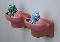
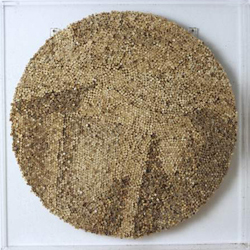
In his solo show at Elizabeth Leach, Sean Healy continues to mine nostalgic content, this time turning his gaze towards the high school hallways, musty gyms and hushed libraries of adolescence. Recalling a prototypical high school ecosystem, the works in Supernormal serve as varied tributes to what seems to be an exclusively male cast of bullies, nerds, smokers and other misfits. Here, Healy describes, memorializes and subverts the workings of the social systems that play out within high school walls. The varied and primarily sculptural work in Supernormal will seem familiar to anyone who saw Healy's last show at Elizabeth Leach's former downtown space. Healy uses everything from seductively colored, semitransparent resin casts of everyday objects to a series of awkwardly cropped photographic portraits. Even when Healy delves into iconography like aluminum cutouts of cartoonish animals or uses unapologetically sentimental vintage '70s wallpaper, he retains a level of detachment and tastefulness through his formal sensibilities. Healy is no doubt adept at creating work using a wide range of "high" and "low" materials, and his ability to create formally engaging and varied work is well-showcased in Supernormal. But, despite the thematics that are repeatedly cited throughout the exhibition, its success relies in large part on Healy's skill in creating compelling objects. At times, it seems like the scholastic themes that run through the exhibition merely provide a foil for the more interesting visual experimentation at play, and the resulting work doesn't gain much heft from its conceptual origins. Healy carefully selects both materials and forms that are utterly likeable and have immediate impact. The objects and subjects that he chooses are commonplace, but transformed when cast in seductively transparent resin or given a candy-colored veneer. The visual qualities of these works are far more engaging than the literally adolescent subject matter that inspires them, in part because the sculptures work so well as stand-alone objects. Most of the individual works revolve around simple punning to meld content with form. Class Ring is comprised of a circle of precisely crafted faceted glass gems mounted like trophies on the wall. A similar set of oversized faux gems literally climbs the gallery's central pillar, alluding to social climbers and markers of status. Presumably not coincidentally, the ascending display of gems also seems to be engaged in a rather parasitic relationship with the architectural structure of the gallery in which it resides. Two monochromatic clusters of weight-lifting discs arranged neatly on one wall reference the promises of Spring Training, and a diminutive barricade of multi-colored cast resin pencils form a Test Protector to defend against the wondering eyes of would-be cheaters.
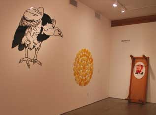
In other work, Healy creates stand-ins for the characters that populate the archetypal high school social strata that he imagines. A large wall-hung cut aluminum work depicts a black vulture cast as the ominous figure of the Bully, while the adjacent wall features the hapless chickens that play the part of the Bullied. In The Student Body, the only photographic series in the show, Healy subverts the time-honored tradition of the senior photo, shifting the lens downward towards the corporeal student body to reveal the uncomfortable and awkward poses normally positioned safely outside of the photographic frame.
Posted by Katherine Bovee on September 28, 2006 at 12:19 | Comments (1) Comments Although a lot of people will read this purely as a high school themed show it's more of a theater for power relationships that can be applied just as easilly to office politics or the art world. It's actually a kind of open ended institutional critique where the viewers themselves seem to be put in a kind of theater of social/power politics by the layout of the show. Snidely critical like Kippenberger, clean and reflexively directed like Ruscha its daring but I sense Sean is really developing something here. Its good but I see how this can really grow... Ruscha's famous LACMA on fire or EVIL (done in the artists blood) or some of Baldesari's work are the roots here. Ive seen the show about 5 times and more so than any other show on display in Portland right now it gets better each time. At first I couldn't get much of a read on the room eventhough Ive seen most of this work long ago. Then it kind of opened up as I watched others in the room. It's notable because unlike most Portland shows it takes a bit to open up. Those wanting instant gratification will be annoyed... and that is a good card to play. Posted by: Double J Post a comment Thanks for signing in, . Now you can comment. (sign out)
(If you haven't left a comment here before, you may need to be approved by
the site owner before your comment will appear. Until then, it won't appear
on the entry. Thanks for waiting.)
|
| s p o n s o r s |
 |
 |
 |
 |
 |
 |
 |
 |
 |
 |
 |
 |
 |
 |

|
Site Design: Jennifer Armbrust | • | Site Development: Philippe Blanc & Katherine Bovee | |


![[TypeKey Profile Page]](http://www.portlandart.net/nav-commenters.gif)