
|
||
|
Portland art blog + news + exhibition reviews + galleries + contemporary northwest art
|
||
Grey|Area reviewed by Avantika Bawa 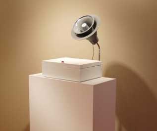 sculpture by j.frede Grey|Area, curated by TJ Norris at the Guestroom Gallery in Portland, Oregon is an aptly titled show, which exhibits the work of thirteen West Coast artists. The works in the show include a range of media that either deliberately or unknowingly resist immediate and easy categorization. Instead they confidently straddle established genres, revealing in the process the scope of overlapping territories. By drawing attention to serendipitous details, a tactile minimalism and the often unseen, this overlapped grey area becomes a huge platform that initiates thought and provokes debate. What is it that makes this overlapped space -- this blur -- a space worthy of exploration? This question resonated as I navigated the show. Ample sunlight makes the initial entrance into Guestroom appealing, though the divide of the physical space into two different galleries is awkward. Granted the very presence of both spaces is commendable, I would suggest an extended frosted plexiglass divide that could retain the ample sunlight in both the galleries while also clearly marking out the two spaces. At first glance the works emit different auras that create a visual fragmentation; what holds them together in this already fragmented space is the use of grey in all of the works and the inclusion of color to create the chromatic grey of the walls. The mild pulsation between the chromatic and achromatic greys emitted by the gallery space and the works it features generates a positive energy, allowing for a fluid and engaging navigation between the (un) conscious states of mind/being as intended by the curator in his statement. Bringing to mind Johannes Itten and his theories on the Contrast of Saturation this pulsation also adds a subtle yet desirable tension. The works that spoke to me immediately (in part due to their sheer mass and odd shape) were Alert by Los Angeles artist sound sculptor j.frede, Postscript (T.W, L.C., N.S, A.M., L.C., D.B.) by Portland-based sculptor and performance artist David Eckard and Nest by Daniel Barron from Olympia, WA. Alert by j.frede creates cold synaesthetic experiences of sight, sound and touch that are unusual and strangely reminiscent of cold war hysteria. If one were to imagine a piece of post war minimalist art with an industrial tone, it may resemble this formally tight work. Consisting of a white box and a steel grey megaphone, it sits on an unassuming white pedestal but when the red button on it is triggered, it lets off an endless drone that builds up in pitch and harmony as seconds pass. Who was it alerting and what was its message? The absence of a clear-cut audience or message adds an ominous mystery reminding its engager to fear the unknown. Eckard's investigation of endurance, duration and randomness through his piece Postscript (T.W, L.C., N.S, A.M., L.C., D.B.) creates not only a beautiful sculpture but interesting drawings as well. It includes a spherical glass container with an unlit wick to which was attached a framing device that held a panel of board. It was apparent that the smoke of this apparatus when lit created the ethereal marks on the additional panels that were elegantly displayed besides it. The work draws attention to a mysterious experimental mark-making process that embraces the futile thereby allowing chance to take over control. I would be interested to see either the performance itself or evidence of it. In its current state it resembles an archaic piece one might see at a museum of unworkable devices. Maybe then, this enigma is a good thing? 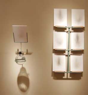 David Eckard's "Postscript (T.W, L.C., N.S, A.M., L.C., D.B.)" While the aforementioned works walk the more sculptural and performative, conceptual and political lines of the show, the paintings in grey|area lean more obviously towards a singular medium, immersing themselves in the identifiable (but not necessarily easy) realm of abstraction. Abi Spring's heavily layered blue silica monochromatic work, White Peace comes across as a contemporary and painterly equivalent of Rauschenberg's Erased DeKooning. I enjoyed the visual refrain of a complexity created through the use of monochrome blue and heavy sanding. Hers is the only work hung in front of a white wall, a sensible decision given the vast blueness of the piece that would be significantly altered with any color behind it. The Liz Taylor Piece - a book on the actress with pages that are aggressively collaged by multimedia, guerilla-style artist Scott Wayne Indiana, has some interesting components but is too overwrought and literal making it an odd bird in a show with quieter and greyer tone. Flipping through this book and then looking at his painting The Diamond Cutter which hangs nearby, makes the painting appear as a pleasant and well-behaved version of the ideas attempted in the book. The passive aggressive veiled layers of tinted and desaturated hues add to a subliminal mystery. Distancing the book from this work would give it an even stronger presence. Much like the paintings, the photographs in the show share a similar affinity towards abstraction. In these one can notice an obvious and noteworthy dialogue on organic and geometric references. The organic oddity in the photographs by Chris Komater, Daniel Barron and Jamie Drouin create a surreal yet conceptual experience that draws attention to crossovers in the realm of film and digital media. These crossovers would resemble works by artists such as Mariko Mori, Luis Bunel and Dizga Vertov if one could visualize them morphed. TJ Norris' photographs on the other hand initiate thought of geometric abstraction. I was particularly drawn to his diptych, (untitled) grey|area. The work included the image of an uneven grid of partially chipped white cement blocks and to the left of the diptych were white squareish abstract marks of a similar size to the blocks. This photograph is formally tight and by echoing itself it becomes curious and clever. Perhaps it needs to be larger and left alone on its wall, sans the other work, (untitled) signs. Several of the other 2D works in the show felt a bit too trapped in tradition. This obviousness with the narratives they evoke appear a little disparate from the satisfying ambiguity and grayness of the works. 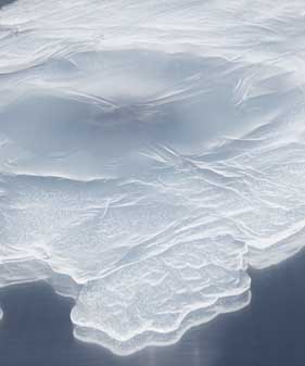 detail of Laura Fritz's "Illuminant" The subtlety and honest simplicity in the delicate works of Laura Fritz, Ty Ennis and Ellen George provides an effervescence that encourages the viewer to pause and ponder. In Laura Fritz's Illuminant, the controlled incidentals of production such as pours, spills and ripples work successfully to create a curiosity and inspire feelings of attraction and unease, as stated by the artist in her statement. The looseness and randomness created by a spill of some sort of polymer and the industrial stand on which it rests draws attention to the odd juxtaposition of the object and the stand itself. What is it that is controlled I ask, the stand or the spill? Does it even matter? 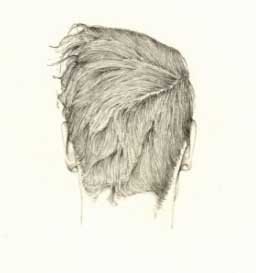 drawing by Ty Ennis Control again is consciously executed in the delicate line work of Ty Ennis' commendable ink drawings that speak of a hand that knows how to resist. These ink portraits boldly linger on the boundary of the finished vs. unfinished, adding an appealing freshness to them. The questionable degree to which the three pieces on display are linked prompt the viewer to consider whether the pieces would be better served by either extreme-much more or far less a divide. With Ellen George's Little City, I am reminded of the sweetness a precious work of craft can elude. It has a magical quality and appears to be conjured out of strands of the clay that now forms the topography of a ghost town with mass and an acknowledgeable presence. Some of the recent works I saw by the artist at her solo show at PDX Contemporary came close to seeming too crafty and formulaic. Perhaps the absence of color and the solitude of Still enabled it to stay away from the same accusations in this show. 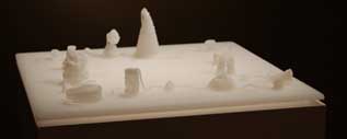 Ellen George's "Little City" On the whole I enjoyed the show, its candor and the boldness with which the curator trespassed areas of blur and successfully accommodated the work of thirteen varied artist. With the excessiveness of the art market/world today and its tendency to constantly categorize, subcategorize and pigeonhole, a show that blurs boundaries and addresses the plentiful in a state of nothing is refreshing. It was the perfect finale for my week in Portland, a fine gulp with a taste that lingers. Information on the Guestroom site is available at Guestroom Gallery Avantika Bawa is a visual artist and curator, based in Atlanta, Georgia. She is Co-founder and part of the Editorial board of Drain - Journal for Contemporary Art and Culture Posted by Guest on July 25, 2006 at 17:03 | Comments (1) Comments To this very day, whenever I see David Eckard's "Postscript," my mouth just drops open and drools, even though I have seen it countless times. Something about it still fascinates me. Maybe it is the idea of making the invisible visible, but then again, isn't that kind of the job of all artists. Posted by: Calvin Carl Post a comment Thanks for signing in, . Now you can comment. (sign out)
(If you haven't left a comment here before, you may need to be approved by
the site owner before your comment will appear. Until then, it won't appear
on the entry. Thanks for waiting.)
|
| s p o n s o r s |
 |
 |
 |
 |
 |
 |
 |
 |
 |
 |
 |
 |
 |
 |

|
Site Design: Jennifer Armbrust | • | Site Development: Philippe Blanc & Katherine Bovee | |


![[TypeKey Profile Page]](http://www.portlandart.net/nav-commenters.gif)